|
| Group |
Round |
C/R |
Comment |
Date |
Image |
| 2 |
Apr 17 |
Comment |
I would be very happy with a shot like this Malibika �“ Harry and Shirley probably said it all. I do like the diagonality in the image, and as Shirley said, “stopping at the eye” �“ sawtooth and textures really come out, and the bokeh is very pleasing in my view. I envy you folks who have access to the exotic possibilites of jungle wildlife. |
Apr 10th |
| 2 |
Apr 17 |
Comment |
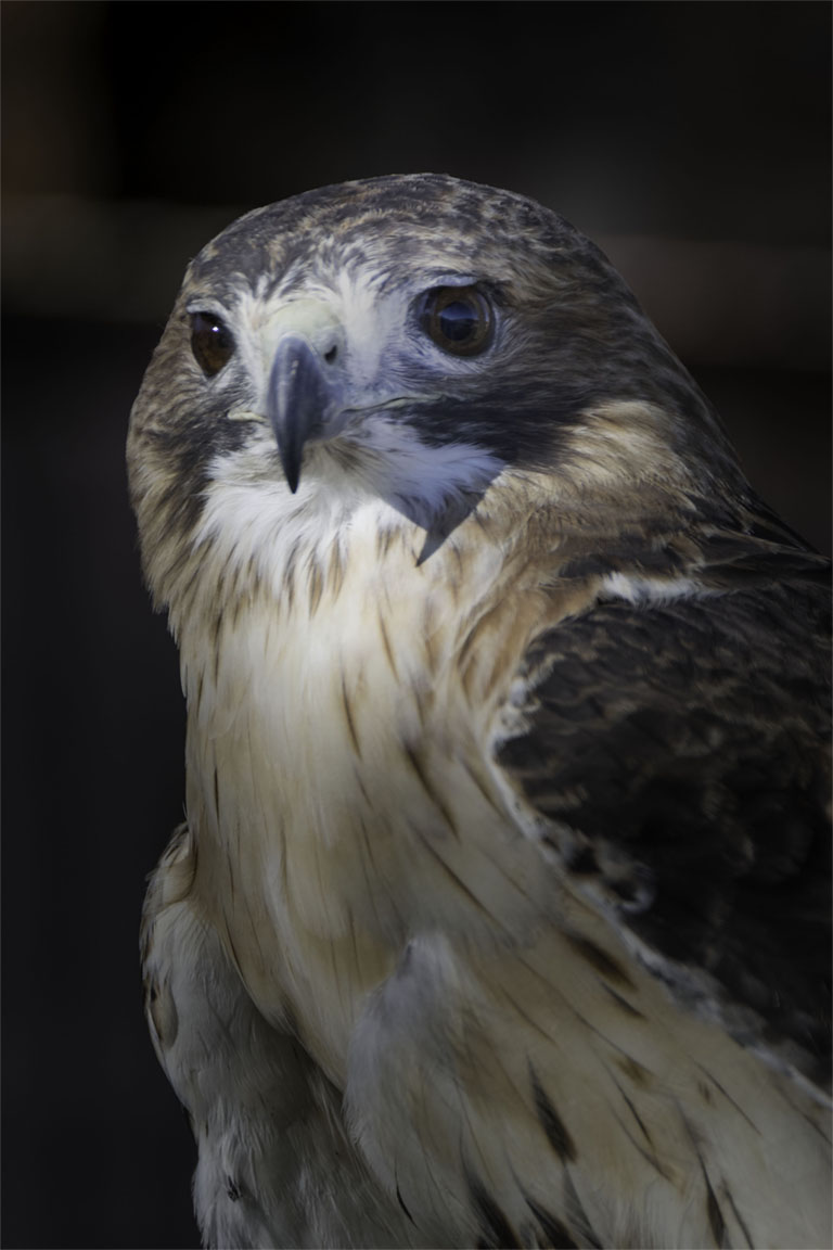
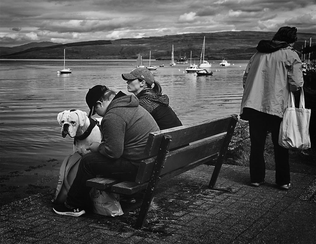
Very nice shot Al. I do like the dramatic wing spread �“ those cross wind landings can be tricky! I probably would go along with the comments about a darker background and cropping a little tighter. I have spoken to a few of the “birders” in our club and they seem to think that jumping the ISO to at least 1000 (even in daylight) makes for a sharper image for flight shots �“ I guess because the shutter speed would be increased in aperture mode. They say that any added graininess is immaterial and that it is not really noticed in a print. I am not necessarily a wildlife shooter, but must try it sometime �“ just a few shots to test it out. |
Apr 10th |
| 2 |
Apr 17 |
Comment |
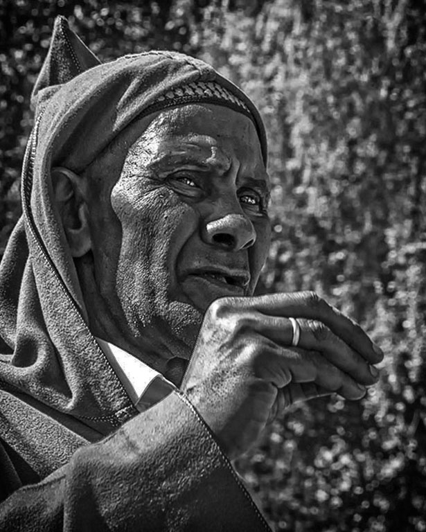
Hung �“ Very colorful picture �“ the color “red” seems to dominate half of our group shots this month and your photograph with the young monk’s orangish/red robe makes for a dramatic composition. The arm of the youth, the arm of the contributor, along with the greenish strap form diagonals which combine to draw my eye to the action �“ what is actually taking place? �“ a coin in the pot. You might even try cropping tighter around that action and thus avoid the foot problem as previously noted. By all means leave that facial expression in if you do. Do you think there is a significance to the orange or red? �“ there must be. |
Apr 10th |
| 2 |
Apr 17 |
Comment |
Very nicely done Shirley �“ I really appreciate the high contrast yellows and reds against the deep dark background. Trying to think about what to write here brought me back to thoughts of painterly works. Check out “Oriental Poppies (1928) - Georgia O'Keeffe”. Amazingly, to my way of thinking, you have incorporated the same yellows, reds and blacks in your shot as she did in her painting! “Red Hills and Bones” also incorporates a similar color composition �“ red being a bright color creating feelings of excitement and intensity �“ which to me is beautifully portrayed in your shot as well. There are many other of O’keeffe’s works with this excitingly beautiful composition - so when did you take lessons from her?
And thanks for your comments �“ I had a polarizer on for this one and usually use “manual” mode and bias it about a third to two thirds of a stop under exposed �“ play with it later in PS. At ½ sec, I’m sure I was on a rock. I’m not overly pleased with it overall, but like the water on the rocks �“ Harry did a nice crop for me.
|
Apr 10th |
| 2 |
Apr 17 |
Comment |
Harry �“ this one works for me. I like the overall gray effect with the burst of red - nice. Michael Orton (Michael Orton Photography) has perfected an overall softening effect that has become very popular in the photo world (some say too popular) that I have been trying to use. It’s pretty easy to do in Photoshop and I think this image would be a great candidate �“ supposedly you can leave certain areas sharper than others (such as your ripe pomegranate). I’m not sure it would be effective on a jpeg, otherwise I would try it on your shot. I like both your color and overall composition �“ nice one.
And thanks for your comments/crop on mine �“ it improved the shot greatly. If I put something on DD and you have the time, change as you see fit. In most cases the improvements are well justified.
|
Apr 10th |
5 comments - 0 replies for Group 2
|
5 comments - 0 replies Total
|