|
| Group |
Round |
C/R |
Comment |
Date |
Image |
| 24 |
Sep 22 |
Comment |
This is the first image with ICM that I like. Most are too jumbled, but this has plenty of detail. It’s almost like you blended two offset images into one. Very interesting, Pinaki! |
Sep 16th |
| 24 |
Sep 22 |
Comment |
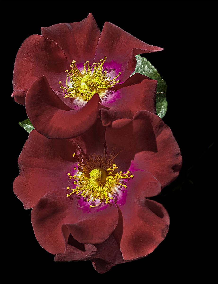
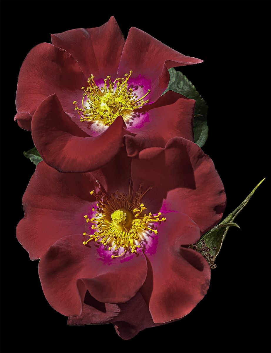
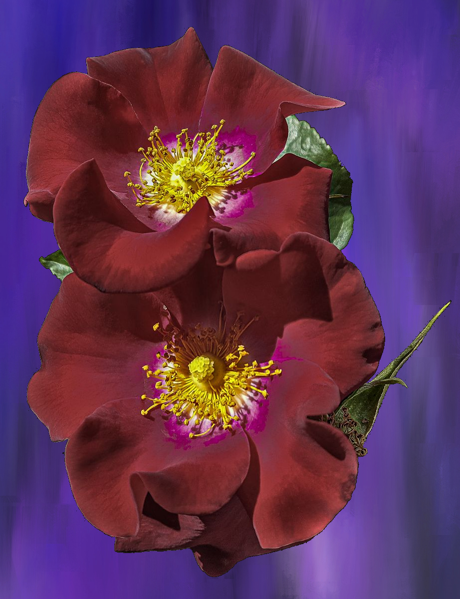
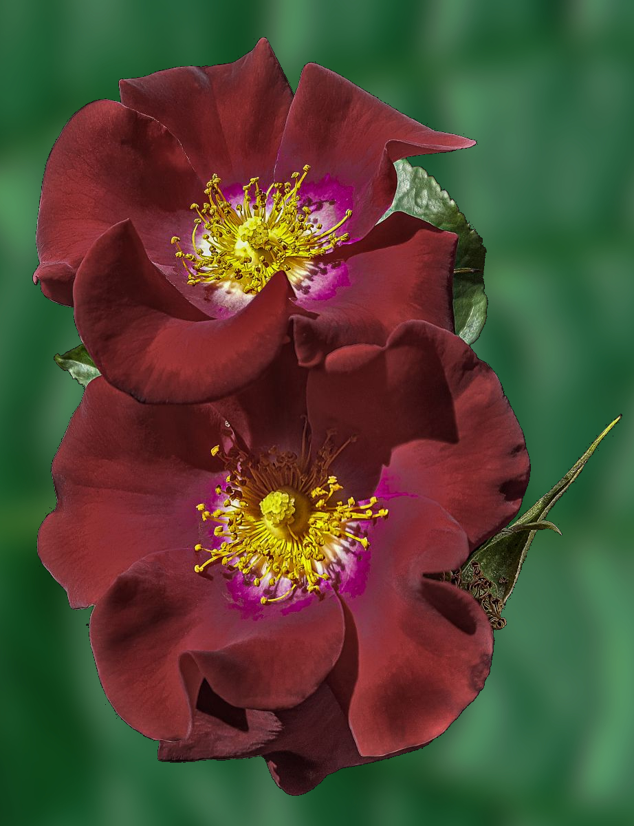
Very lovely flower capture, Lynne! It really pops against the slightly soft background.
I did find the glow from your lighting a little harsh. I brought it down with an HSL adjustment and added some targeted burning to bring out some dimensionality. Thoughts? |
Sep 16th |
 |
| 24 |
Sep 22 |
Reply |
How’s this? |
Sep 16th |
 |
| 24 |
Sep 22 |
Reply |
How’s this? |
Sep 16th |
 |
| 24 |
Sep 22 |
Reply |
Or this? |
Sep 16th |
 |
| 24 |
Sep 22 |
Reply |
How’s This? |
Sep 16th |
 |
| 24 |
Sep 22 |
Reply |
How’s This? |
Sep 16th |
 |
| 24 |
Sep 22 |
Reply |
Hmmm. I can see that the leaves at the top are somewhat bright, but I thought the leaf at the bottom was interesting. Guess I need to reconsider that. Hmmm |
Sep 16th |
| 24 |
Sep 22 |
Reply |
Appreciate your thoughtful remarks. d:¬{D |
Sep 16th |
| 24 |
Sep 22 |
Reply |
Something to consider. Appreciate the suggestion. |
Sep 16th |
| 24 |
Sep 22 |
Reply |
I will try that, Carol. Thanks. |
Sep 16th |
| 24 |
Sep 22 |
Comment |
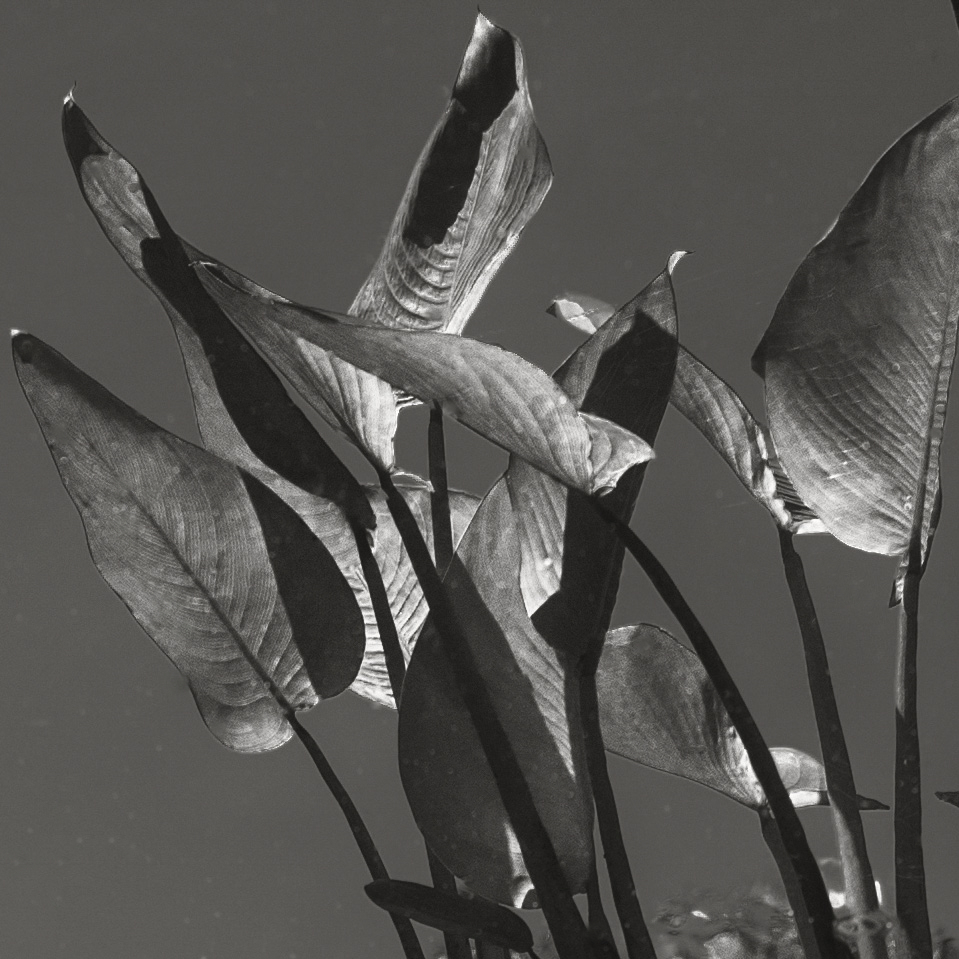
I do like the treatment of this section of your original. However, the large spots scattered throughout the image come across to me as unresolved dust spots and take away from the lines and textures that you present.
I removed the spots and offer the result for your consideration: |
Sep 16th |
 |
| 24 |
Sep 22 |
Comment |
Truly artistic, Fred! The texture works well.
I wonder about the flower on the right, especially since it’s cut off. I also find the top right quadrant a bit harsher than the other quadrants and could use some softening. I would also suggest demarking the poet’s name with a preceding dash perhaps? Thoughts? |
Sep 16th |
| 24 |
Sep 22 |
Comment |
You did a marvelous job with this image (beyond the question of orientation). The attention you paid to the background really sets the right mood. This is now belonging on the wall, for sure. |
Sep 16th |
| 24 |
Sep 22 |
Reply |
I studied both for a while and I concluded Bev is right on this one. By reversing the direction, you put more emphasis on the stem, while the original orientation puts more emphasis on the flower. |
Sep 16th |
| 24 |
Sep 22 |
Comment |
Great job compositing the butterfly in, Bev! I think the stroke works well, too. I think I would have preferred to have the area outside the stroke more blurred, though. |
Sep 16th |
| 24 |
Sep 22 |
Reply |
Thank you so much. This is why smartphones are killing the DSLR market. |
Sep 6th |
| 24 |
Sep 22 |
Reply |
I can see that. |
Sep 5th |
6 comments - 12 replies for Group 24
|
| 53 |
Sep 22 |
Comment |
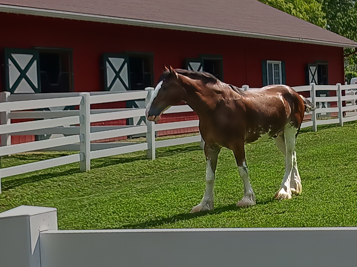
Here’s the image after being run through Topaz’s new Photo AI. What do y’all think? |
Sep 16th |
 |
| 53 |
Sep 22 |
Reply |
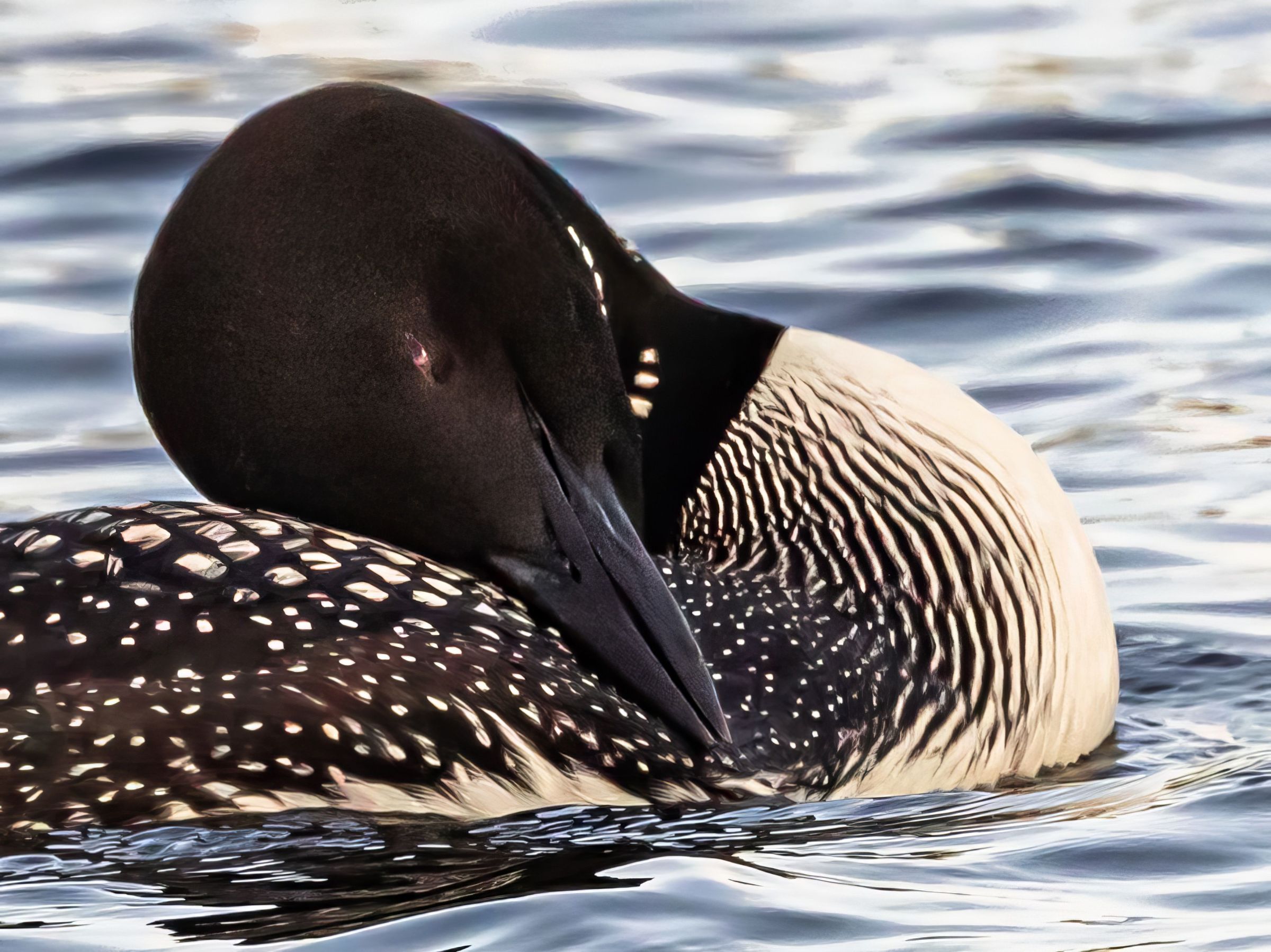
As a comparison, here’s a version after running your image through Topaz’s new Photo AI. Thoughts? |
Sep 16th |
 |
| 53 |
Sep 22 |
Reply |
I like it. It improved the composition and helped pop the horse. |
Sep 16th |
| 53 |
Sep 22 |
Comment |
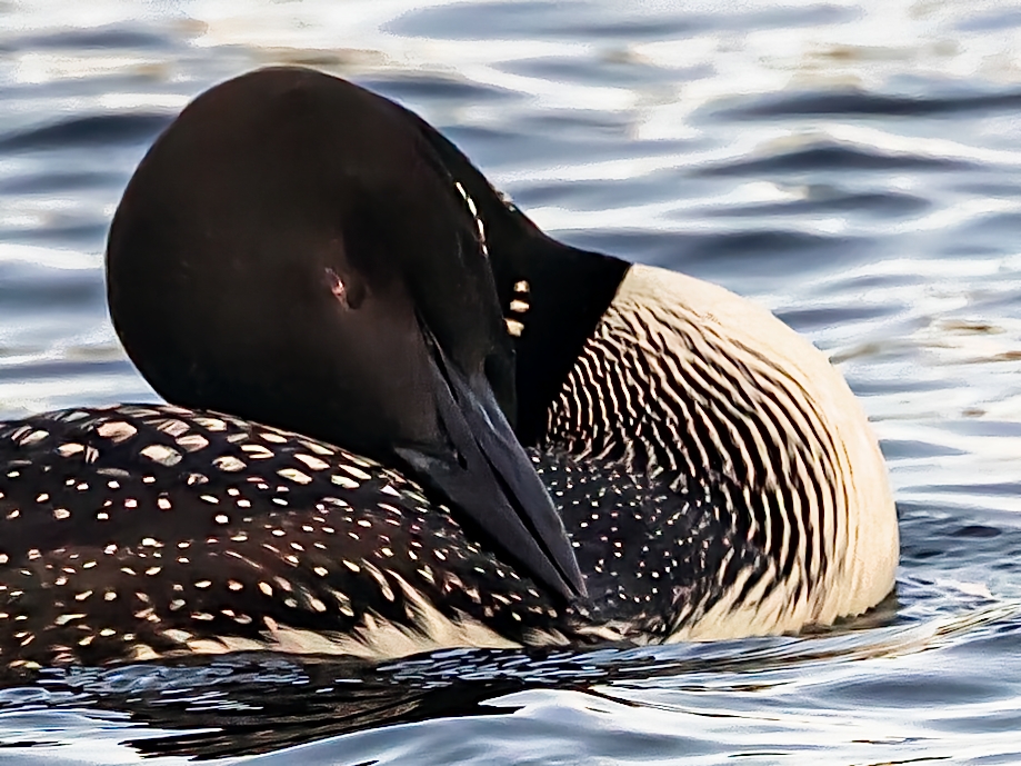
How are you liking your mirrorless? I missed the boat on those and now can’t afford one. d:¬{(
Nice shot with an effective story. I did find it a bit noisy, so ran it through On1 NoNoise AI. Thoughts? |
Sep 15th |
 |
| 53 |
Sep 22 |
Comment |
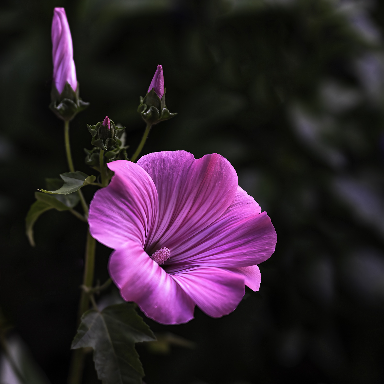
Gorgeous flower, Brian. I’m quite jealous. Wonderful detail and texture.
I agree with Arabella about the distraction and took a shot at removing that, cropping to better frame the flower, and a bit of dodging and burning to bring out more dimensionality. Thoughts? |
Sep 15th |
 |
| 53 |
Sep 22 |
Comment |
This is dreamy like a painting. Can you share a bit about how you arrived at this result? |
Sep 15th |
| 53 |
Sep 22 |
Comment |
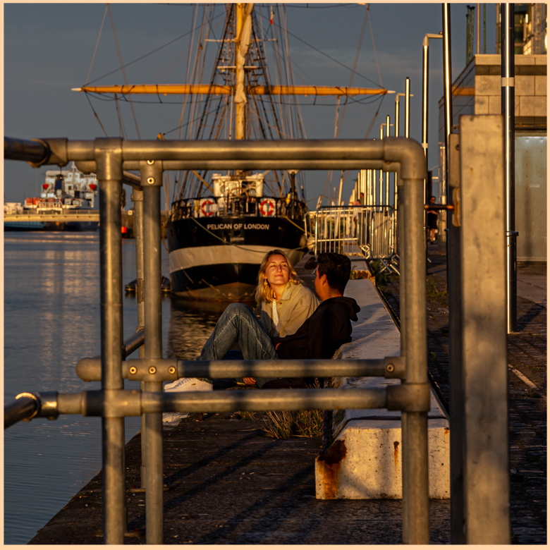
Good eye! I agree with Arabella that the right side is a little distracting. I think her crop takes the inner square off center, though, which takes away from the overall effect.
I did crop a bit, but kept to the orientation you chose, lightening the right side and the shop in the distance, dodging the couple a bit, and adding a stroke around the outside to emphasize the squares. Thoughts? |
Sep 15th |
 |
| 53 |
Sep 22 |
Comment |
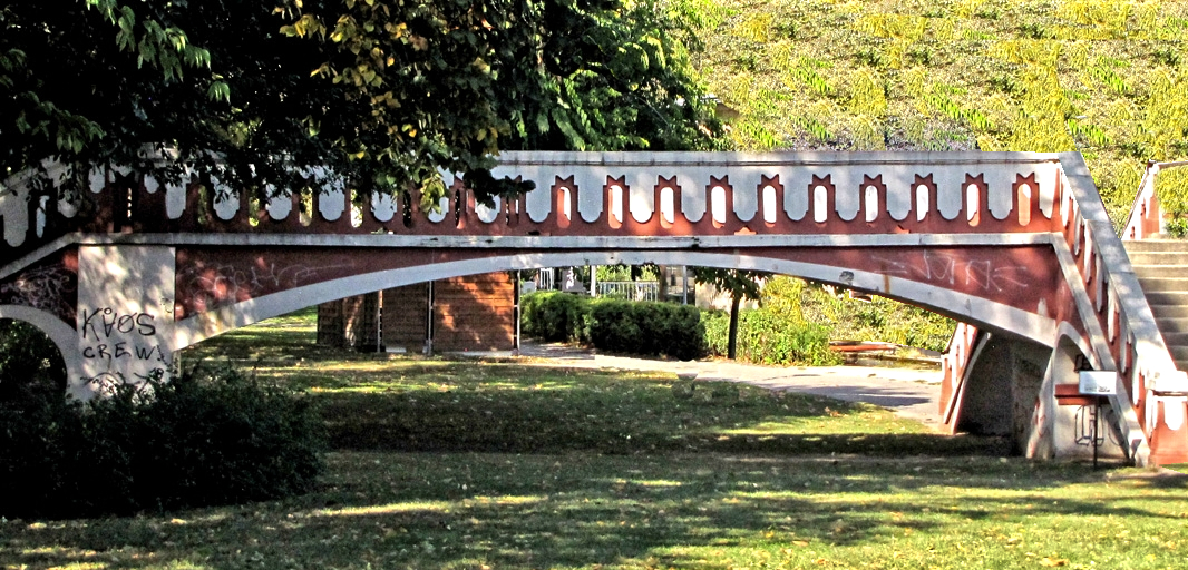
Interesting bridge. Too bad you didn’t have more time to frame it so the bright areas didn’t overwhelm the right side.
I had a go at cropping some out and using the clone stamp to fill in the rest with something else. Thoughts? |
Sep 15th |
 |
| 53 |
Sep 22 |
Comment |
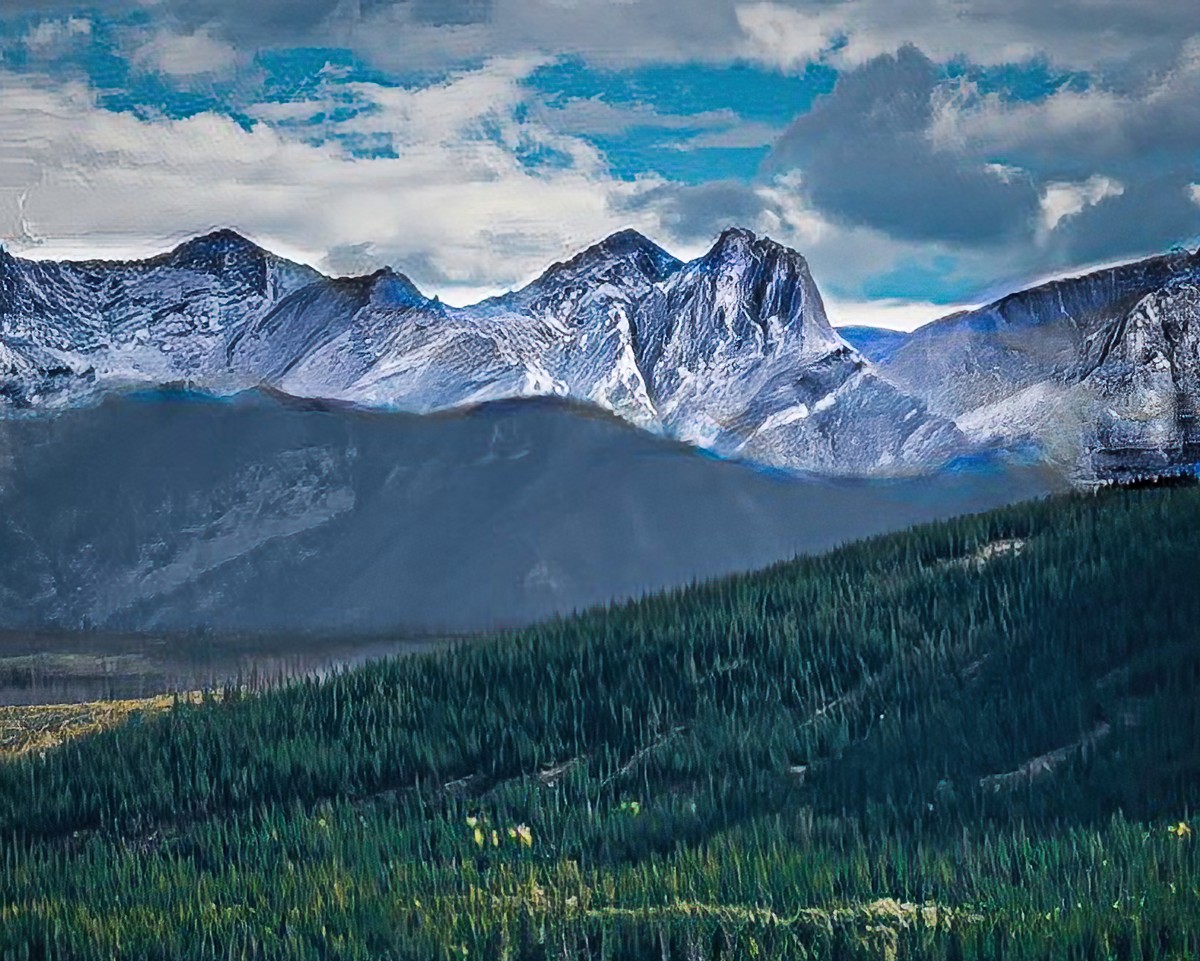
and here’s the landscape image: |
Sep 15th |
 |
| 53 |
Sep 22 |
Comment |
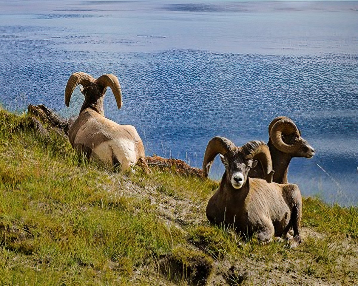
I’m seeing two great but different images here: 1) the rams along the beach; and 2) the luscious 3 zone landscape - trees, mountains, and sky. Here’s the image of the rams: |
Sep 15th |
 |
8 comments - 2 replies for Group 53
|
| 95 |
Sep 22 |
Reply |
Be my guest. d;¬{D |
Sep 24th |
| 95 |
Sep 22 |
Reply |
A little arty for a change. d;¬{D |
Sep 17th |
| 95 |
Sep 22 |
Reply |
Thank you so much, Gloria. I am happiest with my macro work when the viewer can experience something that’s otherwise unnoticed. |
Sep 17th |
| 95 |
Sep 22 |
Comment |
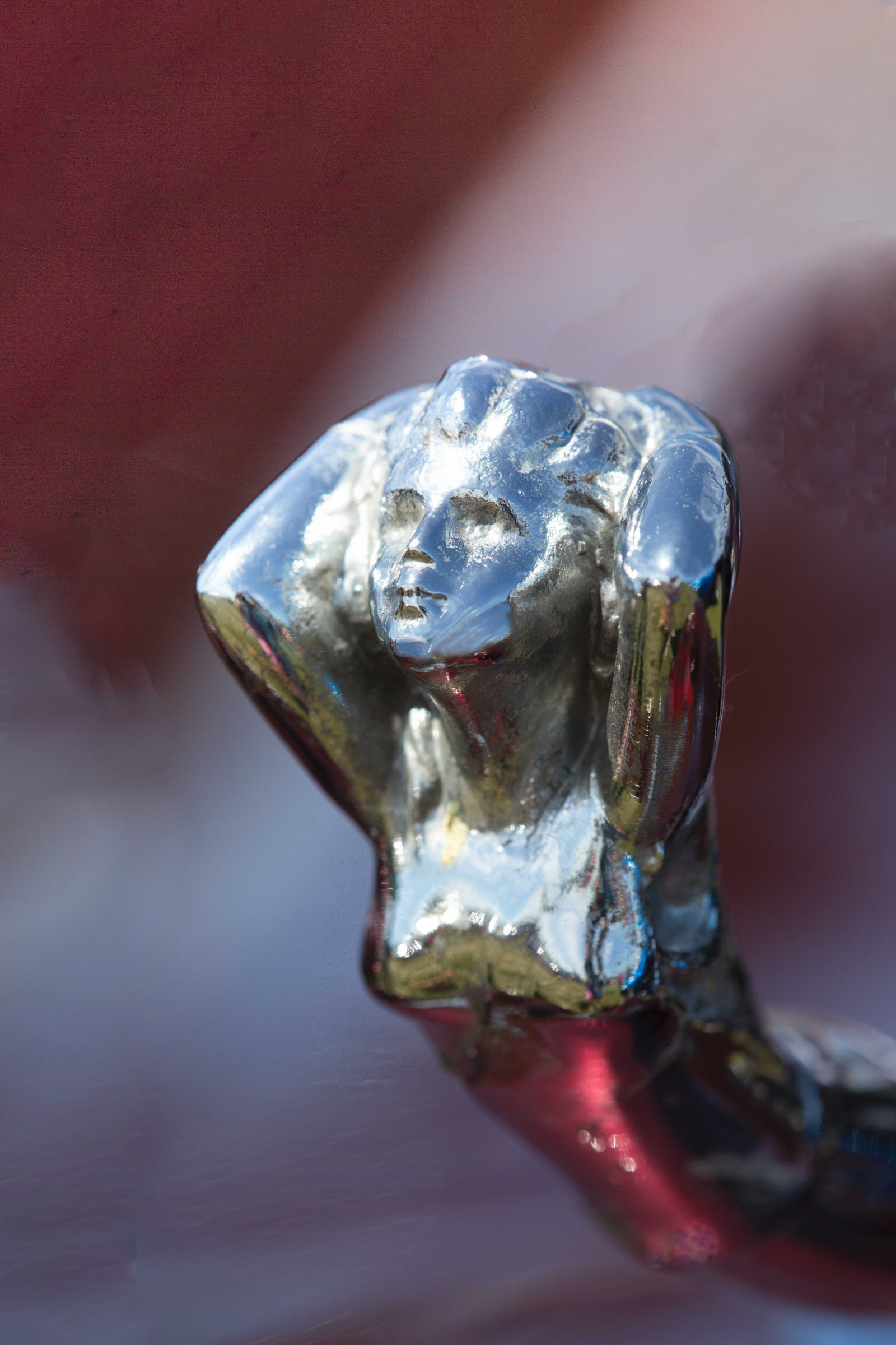
I enjoyed this image a lot and find it in keeping with your personal style. Because this is a chrome figurine, hotspots are pretty much expected. I do agree that there’s not enough room on the left and top, leading to a weaker composition.
I took a shot at adding to the canvas. Thoughts? |
Sep 16th |
 |
| 95 |
Sep 22 |
Comment |
I’m curious about the size of the stone. When I compare the “Original” with the main image, the Original is actually much more in focus from front to back and side to side.
Taking 3 rows of 3 images, how are you merging them? Are you merging each row or 3 and then merging the 3 results? |
Sep 16th |
| 95 |
Sep 22 |
Reply |
Thanks, Stuart. I should have done a stack but ran out of time. I’m trying to remember to slow down and take more time with my macro work. |
Sep 16th |
| 95 |
Sep 22 |
Comment |
Shooting a live insect in a container is definitely a challenge. You must be patient and wait for it to stop - they do eventually. Then quickly fine-tune your focus and shoot.
For a first attempt, this came out quite well, actually. I certainly didn’t do as well on my first attempt. d;¬{D |
Sep 16th |
| 95 |
Sep 22 |
Comment |
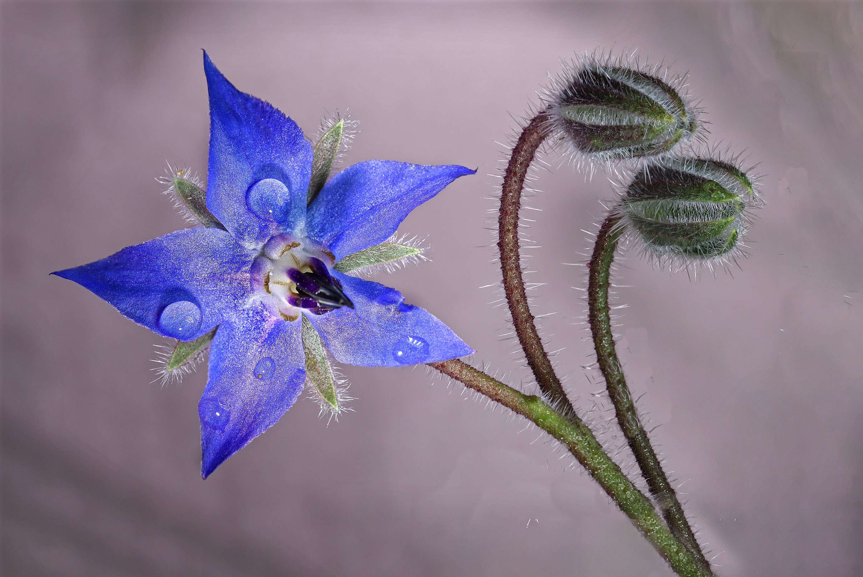
Love the stack - great detail where it should be and soft where it shouldn’t.
As a composition, I feel you crowded the image on the right with not enough room for the orientation of the buds. I also feel your lighting on the open flower was a bit too hot.
I tried expanding the image on the right and bottom, and darkened the flower a bit. Thoughts? |
Sep 16th |
 |
| 95 |
Sep 22 |
Comment |
I think you achieved an image worthy of the wall, Gloria. I'm curious as to the size of the leaves.
Since you were shooting with a tripod, you could always shrink the aperture to f8 or f11 and likely get all of the leaves in focus. Actually, as an art piece, it doesn’t matter that the back edges are a little soft. |
Sep 16th |
5 comments - 4 replies for Group 95
|
19 comments - 18 replies Total
|