|
| Group |
Round |
C/R |
Comment |
Date |
Image |
| 24 |
Jul 22 |
Reply |
In Photoshop or Affinity Photo, choose Filter > Blur > Average Blur on the layer. |
Jul 19th |
| 24 |
Jul 22 |
Comment |
That was a very large aperture for such a small flower. Your image bridges the gap between my 2 loves - floral and macro. I’ll admit the thought of “bending” the focus with a lensbaby intimidates me and runs perpendicular to my striving to have everything in focus. I think you've done quite well with and I applaud your willingness to explore new avenues of artistic photography. d;¬{D |
Jul 19th |
| 24 |
Jul 22 |
Comment |
I very much appreciate the effect you created in-camera. As you noted, it is very painterly - one would never guess this is basically SOOC. Your capture skills far exceed many floral photographers, and certainly mine by a long way.
From a composition standpoint, I personally find your main blossom a bit crowded against the top and left and the other flowers are almost an extension of the main flower. Guess I'm too grounded in old ways of thinking. |
Jul 19th |
| 24 |
Jul 22 |
Comment |
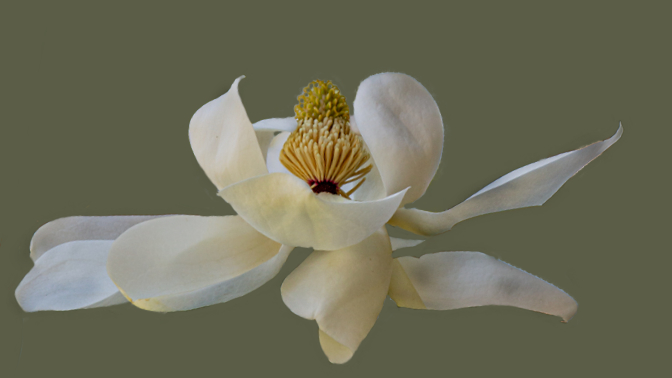
Love magnolia blossoms - the curves of the petals and the pop of yellow-gold of the stamens and carpals. There was a couple of trees in a park near my former home and I miss capturing them when they bloom.
For me, the dark leaves are pulling too much focus from the beautiful flower. I took a different approach from your original. I isolated the flower on its own layer, removed it from the background layer, and applied an average blur to the background layer, which presents a color that is an average of all the colors present. This is by no means a finished image, since I didn't have enough time to refine the selection of the flower, but it demonstrates another way to show off the blossom. |
Jul 19th |
 |
| 24 |
Jul 22 |
Comment |
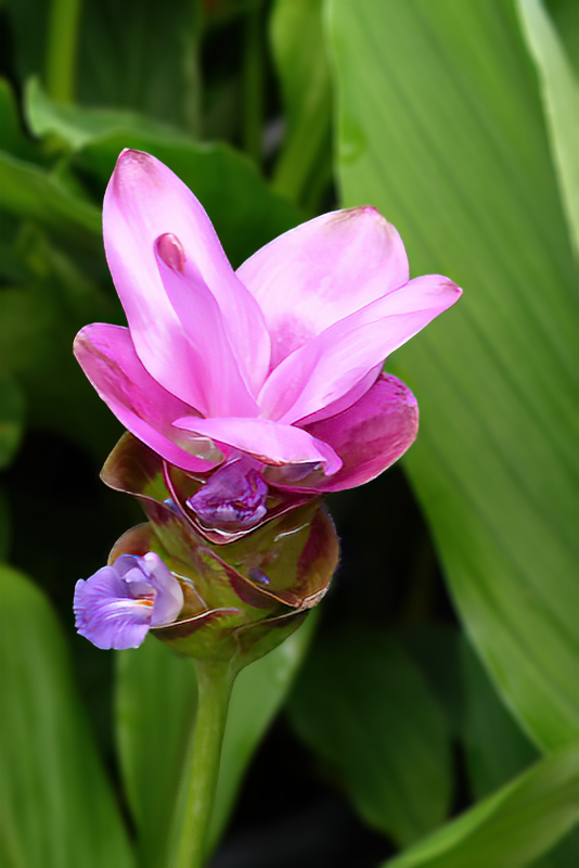
Lovely flower presented well with the new background. A little soft in the focus, but not uncommon when shot in a Home Depot flower market. I confess to doing the same quite a bit at the local hardware chains. They’re a great source of flower subjects.
I took your image into Topaz Sharpen AI, then isolated the flower onto its own layer, removed it from the background layer and then blurred the background a bit to help the flower pop out a bit more. Finally, I flipped the image horizontally as it seemed to me a stronger composition. |
Jul 18th |
 |
4 comments - 1 reply for Group 24
|
| 53 |
Jul 22 |
Comment |
I find myself a bit confused by this image. The focus point “appears” to be the clouds since they are 2/3 of the image, but the eye is drawn to the small patch of ground that makes up the other 1/3. There's not enough variety in the ground to hold interest, yet the eye is drawn there for relief.
I would love to see the original color version of this one. |
Jul 15th |
| 53 |
Jul 22 |
Comment |
Excellent capture, Brian. You managed to display interesting movement in rocks - no easy feat. The eye is drawn into the image and pulled through to the edge and back. Powerful! |
Jul 15th |
| 53 |
Jul 22 |
Comment |
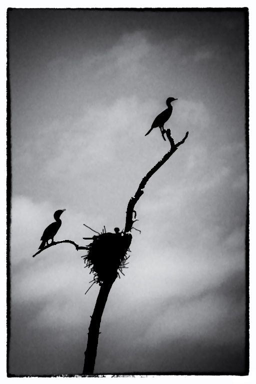
I agree that monochrome is a good choice for this image. The leading line of the branch works well to draw the eye through the image.
However, your conversion made branches and lower cormorant come across rather dingy. I took the image into Affinity Photo and turned the birds, nest and branch into a silhouette. Thoughts? |
Jul 15th |
 |
| 53 |
Jul 22 |
Comment |
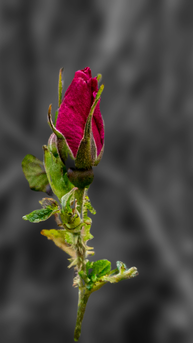
I have incorporated both Arabella's and Albert's ideas in this version. I further blurred and darkened the background and cropped to a more effective composition. Thoughts? |
Jul 15th |
 |
| 53 |
Jul 22 |
Comment |
The three distinct zones each are vastly different and offer a lot to study. I agree about the contrast and found the angle of the shot a bit confusing to my eye.
I took your image into Affinity Photo and rotated it, using the grass line as a “horizon”, added contrast and a boost of the blue in the sky. I finished it off with some targeted dodging and burning to add some dimensionality. Thoughts? |
Jul 15th |
 |
| 53 |
Jul 22 |
Comment |
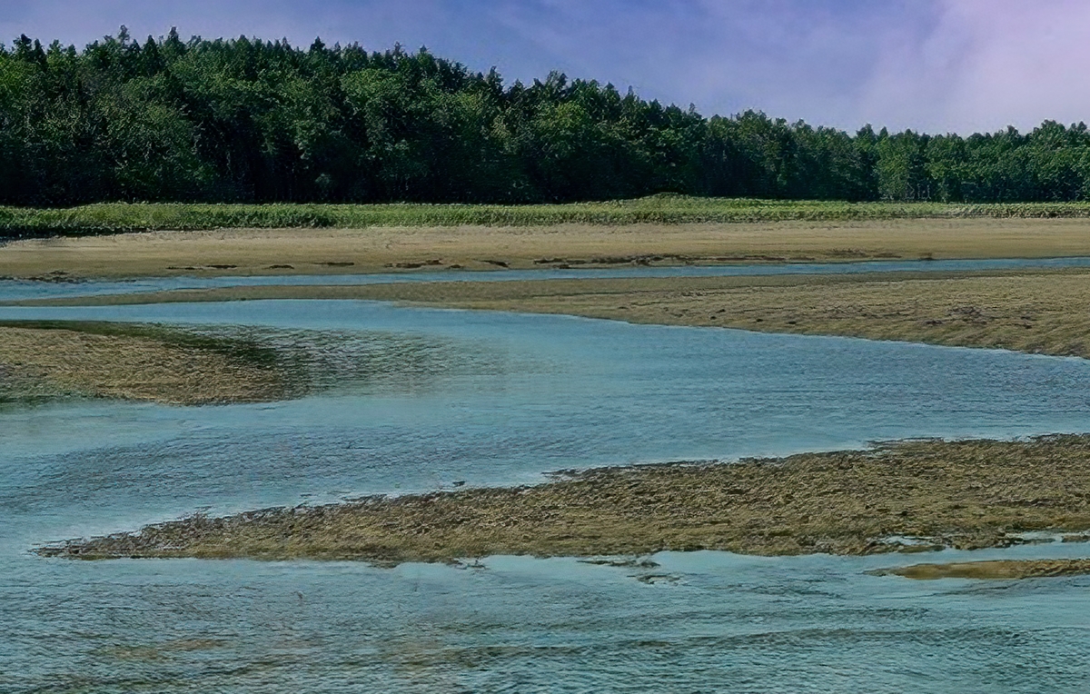
I agree that this is a lovely scene. It's easy to see why the kids were enjoying it.
Based upon your response to Arabella, I decided to remove the human element (and a few other distracting elements). What do you think? |
Jul 15th |
 |
| 53 |
Jul 22 |
Reply |
Hmmm - tire tracks. I hadn't thought of that. That might be a challenge. |
Jul 15th |
| 53 |
Jul 22 |
Reply |
Can you explain? |
Jul 15th |
| 53 |
Jul 22 |
Reply |
Why thank you! I know it can be better, just not sure which direction to take. |
Jul 9th |
6 comments - 3 replies for Group 53
|
| 95 |
Jul 22 |
Comment |
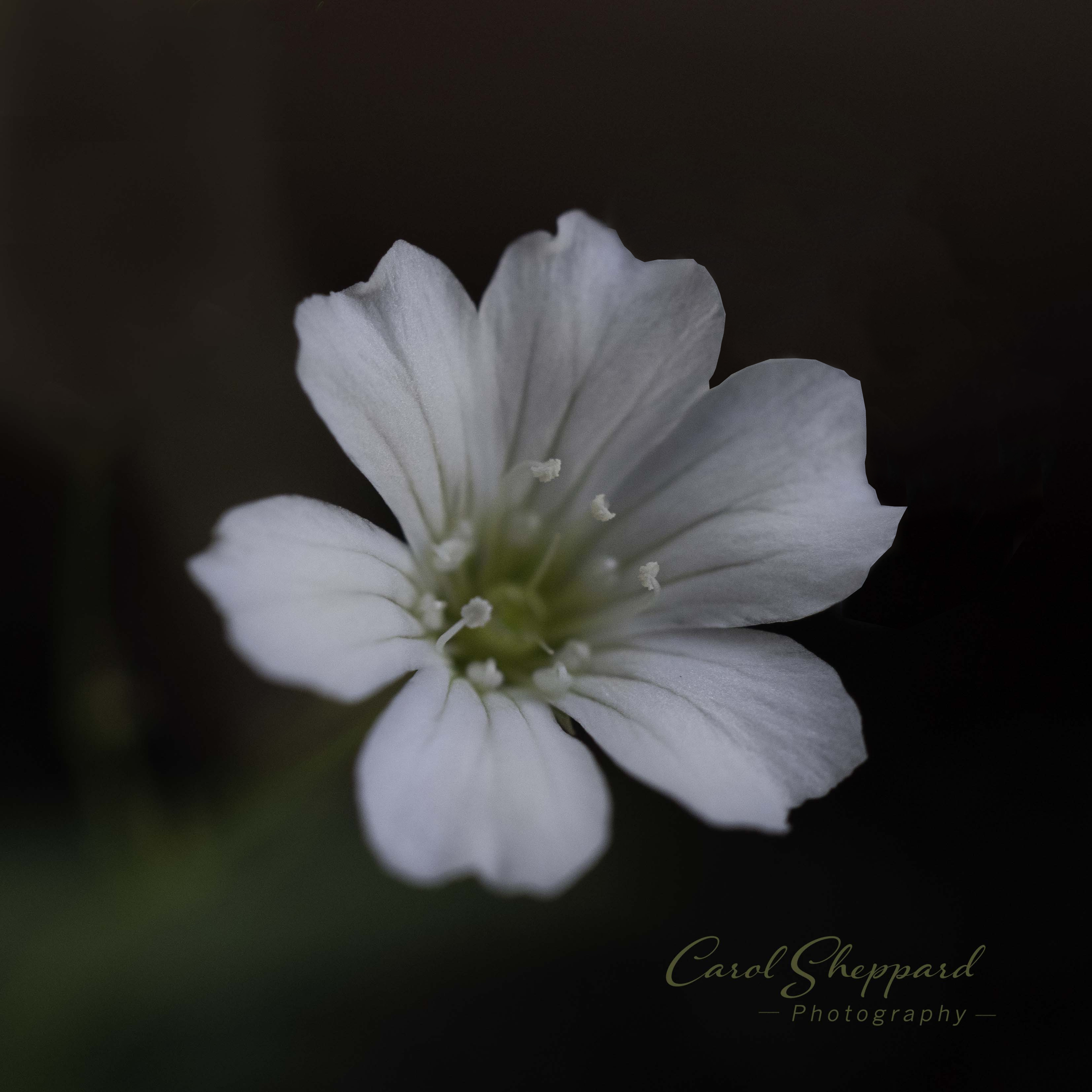
Love the flower and the way it flows into the dark background. The fact that this is handheld is amazing - I could never get this in the wild without a tripod.
I do find the background flower distracting as it pulls some focus away from the foreground flower. Here's a version without it. Thoughts? |
Jul 15th |
 |
| 95 |
Jul 22 |
Reply |
I appreciate your comment, Keith. I like it when I can take something that’s normally trod under our feet and look closer to see what we usually miss. |
Jul 15th |
| 95 |
Jul 22 |
Reply |
Thanks, Pat. I spent a lot of time lighting this one and was quite pleased with the outcome. |
Jul 15th |
| 95 |
Jul 22 |
Comment |
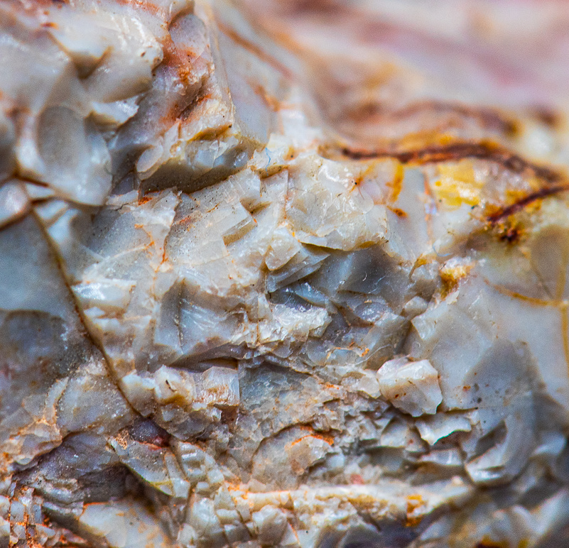
Macros of rock can be really interesting to study, and this is no exception. Good choice for this month's submission, Pat.
For a single capture, you got a lot of detail in the important part of the image. Perhaps the light was a little harsh, producing some specular highlights. Consider adding a polarizer to your macro lens to help take control of that.
I agree with the others that the red and blue end up being distracting. I took your image into Affinity Photo and cropped so that only the white part of the rock was showing. I then finished it off by adding some targeted dodging and burning to emphasize the dimensionality of the rock. Thoughts? |
Jul 15th |
 |
| 95 |
Jul 22 |
Comment |
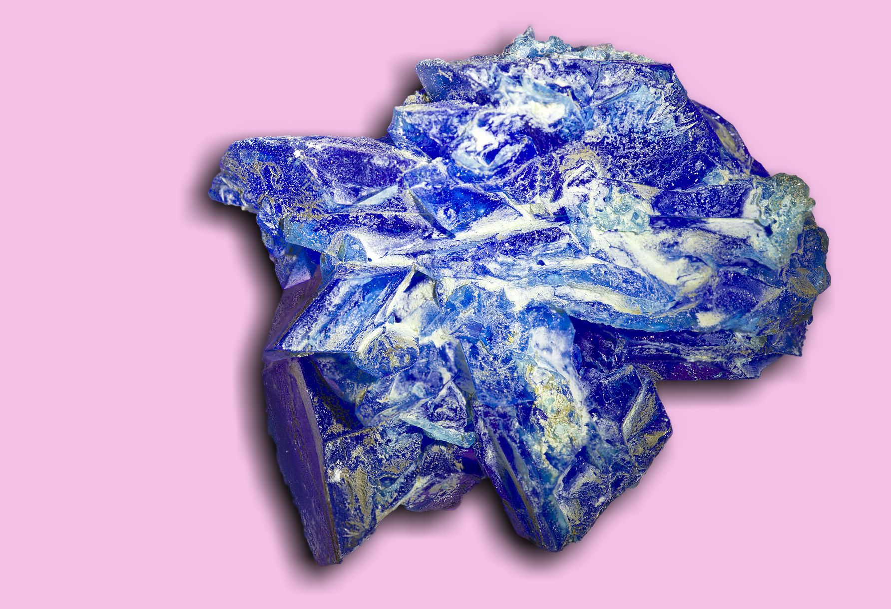
I actually think the background color works well with the blues in the crystal. For me, as with the others, the shadow is a major distraction. I think a shadow makes for more dimensionality, but a little goes a long way. The crystal, however, is quite fascinating. It’s almost like looking through a clear chunk of glass at the earth’s surface from space.
I took your image into Affinity Photo and isolated the crystal from the background. Then I added a fill layer close in color to the original background color, created a duplicate of the crystal that I filled with black, offset it it slightly from the crystal, then blurred it. Finally, I cropped the image slightly to better fit the result. Thoughts? |
Jul 15th |
 |
| 95 |
Jul 22 |
Comment |
Wonderful capture, Fran. Sharp and soft where needed. Background is superb. Keep up the good work. |
Jul 15th |
| 95 |
Jul 22 |
Reply |
Thanks, Carol. I thought it came out well and makes a common weed flower seem more than it's typically seen as. |
Jul 9th |
| 95 |
Jul 22 |
Reply |
I think I see what you mean. Guess I should have used a third lighting arm. d:¬{( |
Jul 9th |
4 comments - 4 replies for Group 95
|
14 comments - 8 replies Total
|