|
| Group |
Round |
C/R |
Comment |
Date |
Image |
| 53 |
May 22 |
Reply |
Hmmm . . . While the high contrast turns this into a high key image, I think it eradicates too much detail. I also feel you cropped in too tight on the left, cutting off some of the lifts. |
May 24th |
| 53 |
May 22 |
Reply |
YES! That looks so much better! Thanks. d:¬{D |
May 24th |
| 53 |
May 22 |
Reply |
That's something the viewer has no frame of reference for. d;¬{D |
May 24th |
| 53 |
May 22 |
Comment |
I think this is great as it stands. As Miriam said, the detail is amazing and there's a lot for the eye to enjoy. The border works well, too. Bravo! |
May 24th |
| 53 |
May 22 |
Reply |
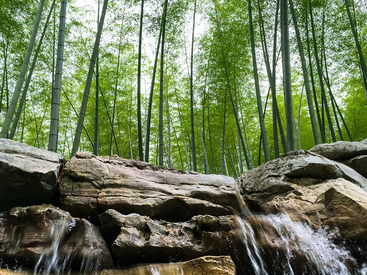
Here's a version with the trees having precedence. Thoughts? |
May 24th |
 |
| 53 |
May 22 |
Comment |
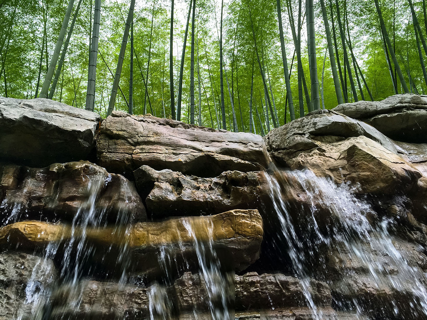
Great detail, exposure, and colors in the smartphone image. The one thing for me is that my eye can't decide which is the focal point of the image - waterfall or trees. Both are strong elements and are given equal emphasis.
Here's a version with the waterfall having precedence. Thoughts? |
May 24th |
 |
| 53 |
May 22 |
Comment |
Another way cool image from you. I especially appreciate that you didn't convert this to monochrome as the colors are more effective.
I did find that there was a lot of noise, so I ran it through Topaz Denoise AI and removed a couple of distractions in the water. Thoughts? |
May 24th |
 |
| 53 |
May 22 |
Reply |
You felt it was too much? I thought it was just a subtle change. |
May 24th |
| 53 |
May 22 |
Reply |
That really brings out detail in the trees. Nice! d:¬{D |
May 24th |
| 53 |
May 22 |
Reply |
That helps the image a lot! d:¬{D |
May 24th |
| 53 |
May 22 |
Reply |
Don't let me stop you. d;¬{D |
May 24th |
| 53 |
May 22 |
Comment |
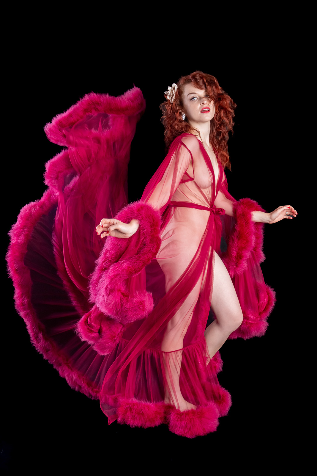
You definitely captured motion in the robe and the nude is tastefully done.
I would suggest brightening her eyes and mouth to help the viewer connect with her more. Thoughts? |
May 24th |
 |
| 53 |
May 22 |
Comment |
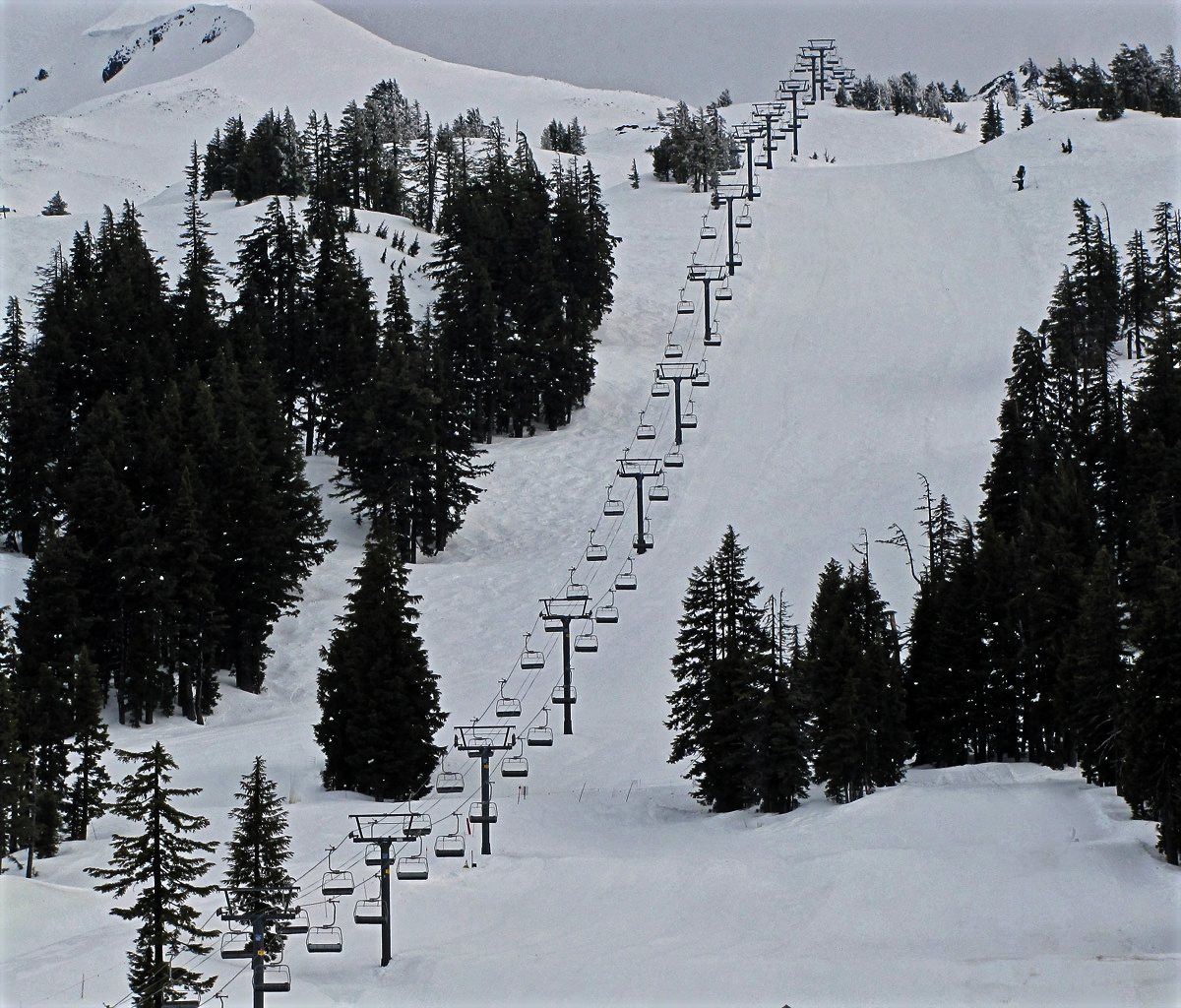
I really like the composition of this image. The lifts form a great leading line that draws the eye through the image.
There were a few minor distractions around the image which I removed in my redo. I also increased contrast, reduced brightness, and added clarity to bring out more detail and textures. Thoughts? |
May 24th |
 |
5 comments - 8 replies for Group 53
|
| 95 |
May 22 |
Comment |
While the composition is a bit tight as others have pointed out, I think it works and the eye is pulled right into the in-focus area. The outer petals act as a frame for the inner petals that are, then, the star of the image. Very enjoyable study. |
May 24th |
| 95 |
May 22 |
Comment |
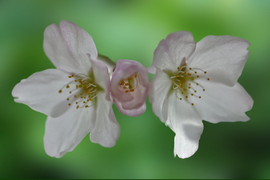
I don't have anything constructive to add to what has already been said by others. I wanted to see what this would look like with some leaves in the background. Thoughts? |
May 24th |
 |
| 95 |
May 22 |
Reply |
I see what you're saying. I knew there was something missing and you've brought it to light (pun intended). d;¬{D |
May 24th |
| 95 |
May 22 |
Reply |
I thought about doing that, but also thought they broke up the monotony of the pattern. I see what you're saying, though.
Here's a redo with those distractions gone: |
May 24th |
 |
| 95 |
May 22 |
Reply |
Thanks, Pat! These things were falling from the neighbor's tree constantly and it finally struck me (literally) that this would be a suitable macro subject. d;¬{D |
May 24th |
| 95 |
May 22 |
Comment |
This is so cool, Pat! Like Stuart, I never would have guessed what this was without the explanation, but that doesn't really matter as it's very pleasing to study and I think it's worthy of being mounted to the wall. The colors, the detail (and softness), and the composition all are great! Bravo, Pat! d:¬{D |
May 24th |
| 95 |
May 22 |
Comment |
Excellent stack, Stuart! Detail where it should be and softness in the background - end result is your subject popped successfully. The colors are attractive and make for interesting bands.
My only suggestion would be to clean up the small hair (?) just left of center, which tends to pull focus a bit. |
May 24th |
| 95 |
May 22 |
Reply |
Stuart was explaining to Keith the methods for taking the images and then merging them. |
May 24th |
| 95 |
May 22 |
Comment |
Have to agree about the background - very tiring on the eyes. Otherwise, I find this to be an interesting study. Can you give us an idea of the actual size of this seed pod?
I replaced the background with a darker color found within the pod, as well as reduced the blank space around the pod. Thoughts? |
May 24th |
 |
| 95 |
May 22 |
Comment |
I'm sorry to say I have to agree with Stuart. There's lots of areas in focus, but none of them keep focus long enough to give the viewer a sense of what this image is about.
I applaud your use of extension tubes to get even closer to your subject - that was my 3rd level of macro experimentation after using my macro lens for a while, effectively doubling my potential magnification and, conversely, greatly reducing my DOF. |
May 24th |
6 comments - 4 replies for Group 95
|
11 comments - 12 replies Total
|