|
| Group |
Round |
C/R |
Comment |
Date |
Image |
| 53 |
Apr 22 |
Comment |
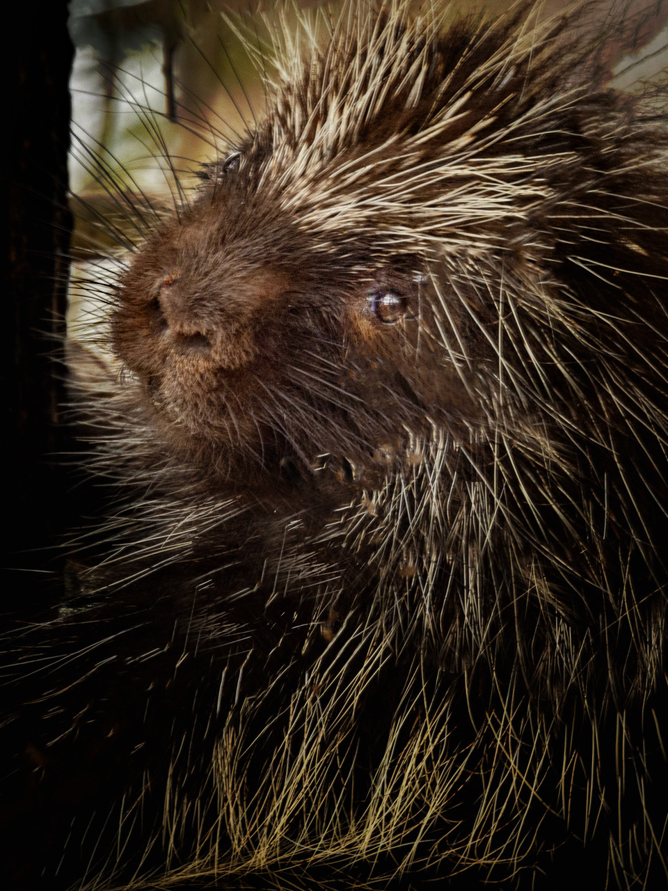
Looks so cuddly, but, OH MY, better not! d;¬{D
I wanted to bring out its eye a bit more so did some dodging and burning. Thoughts? |
Apr 20th |
 |
| 53 |
Apr 22 |
Comment |
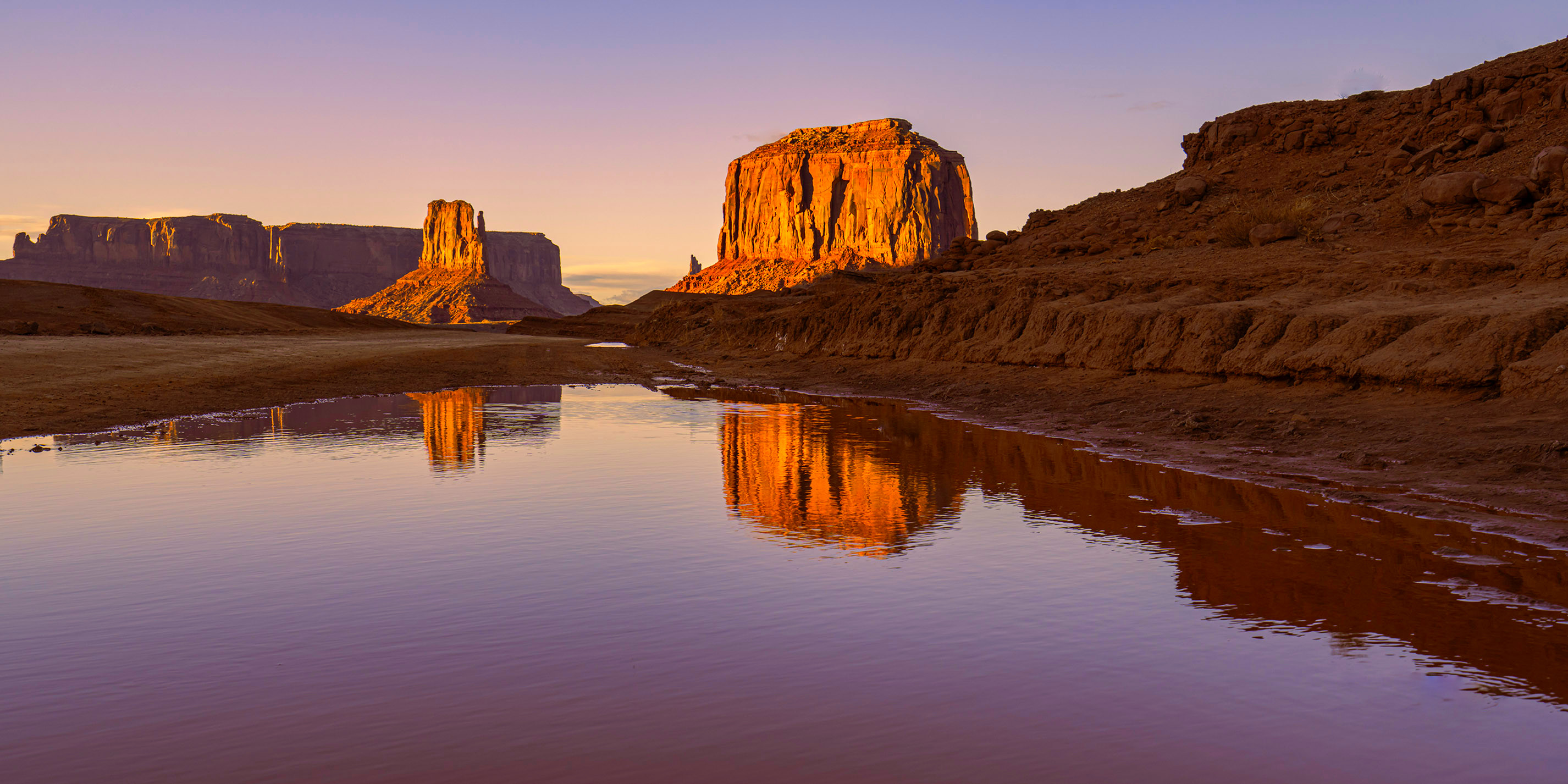
Good angle and very lucky to have found still water in this iconic landscape. I removed a few distracting elements and did some targeted dodging and burning to add a bit more dimensionality to the scene. Thoughts? |
Apr 20th |
 |
| 53 |
Apr 22 |
Comment |
Wow! Great wall piece for an office. The colors pop and the shapes provide a lovely journey for the eyes. Nothing to be changed that I can see either. |
Apr 20th |
| 53 |
Apr 22 |
Comment |
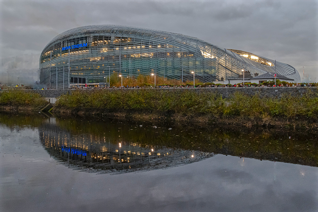
Don't bin it - work it. I took this into Affinity Photo and removed much of the distractions from the scene and its reflection. I'm working from a remote into my desktop, so don't have my tablet, but this should give you an idea of what can be done. Thoughts? |
Apr 20th |
 |
| 53 |
Apr 22 |
Reply |
This makes a totally different statement by unifying the colors into luminance tones of the sepia color. This makes the sculpture appear more like plants that are part of the landscape rather than an artificial construct added to a desert landscape. Interesting! |
Apr 20th |
| 53 |
Apr 22 |
Comment |
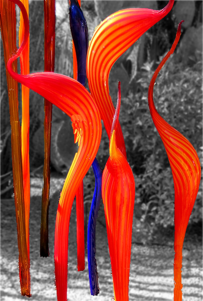
The colors are so inviting and really pull the eyes into the image. I can certainly understand the draw to photograph this sculpture.
I found the background a bit distracting, so I took the image into Affinity Photo, selected the sculpture and copied it to its own layer, then used a Black & White adjustment to make the background monochrome (borrowing from Miriam's idea), and then applied a light Gaussian blur. I think it helps the sculpture pop a little more. Thoughts? |
Apr 20th |
 |
| 53 |
Apr 22 |
Comment |
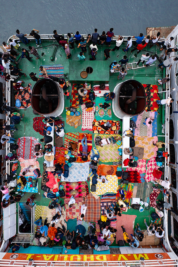
Fascinating! Miriam stole the words I would use - “patchwork quilt”. Thi is sorta chaotic, while simultaneously organized in a pattern.
While I don't care for the water at the top, I realize it's necessary for context and so that a bunch of heads don't get chopped off in a crop. Perhaps change the color of the water?
I took the image into Affinity Photo, selected the water, and used an HSL adjustment to change the hue to a shade of blue. Thoughts? |
Apr 20th |
 |
| 53 |
Apr 22 |
Reply |
I agree about the hooves. It was a compromise because they sort of blended with the dirt in the original and I was having issues with the blend. [sigh] |
Apr 20th |
6 comments - 2 replies for Group 53
|
| 95 |
Apr 22 |
Comment |
Very fortunate to have had the opportunity to visit Costa Rica. Everyone I know who has been had gotten some really special wildlife images and this is no exception. Great colors and composition. I do find it a bit over-exposed, but that's a fussy nitpick on my part. d;¬{D |
Apr 20th |
| 95 |
Apr 22 |
Comment |
Great subject and the orange is a good choice for the background. I think your lighting was a bit too close and caused some flaring. Some of this can be controlled by a polarizer during capture or with post-processing after the fact. |
Apr 20th |
| 95 |
Apr 22 |
Comment |
Great composition, Pat. The slight diagonal really gives more dimension to the image. Well done with all aspects.
Now that you have that rail, it's time to set your lens to 1:1 and get much closer. d;¬{D |
Apr 20th |
| 95 |
Apr 22 |
Comment |
Agree with Carol about the lighting - very even. Added plus is that there are no specular highlights. The blue of your background is very similar to the lab jack stand that's part of my macro rig. It does complement the shell well.
My only suggestion would be to add some targeted dodging and burning to bring out more dimensionality. |
Apr 20th |
| 95 |
Apr 22 |
Comment |
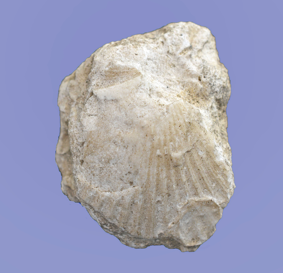
Good subject for macro. As others have indicated, this shifts from a shell to the imprint of a shell. There are some things that you can do to solve this visual dilemma. The background you chose is a nice blue -I'm very partial to blue - but this shade is actually making it difficult to focus on the subject.
I chose a different color blue in this redo that will hopefully remedy this issue. I also did some targeted dodging and burning to bring out more detail in the imprint. Thoughts? |
Apr 20th |
 |
| 95 |
Apr 22 |
Comment |
Hmmm. Both images give focus to different aspects of the subject. The color version emphasizes the hue and saturation of the pink, while the mono version forces us to observe the luminosity variations. Both are lovely studies, but I have to admit my partiality to the color version. |
Apr 20th |
| 95 |
Apr 22 |
Reply |
Unfortunately, the head was very damaged, so I didn't give it any real attention. |
Apr 17th |
| 95 |
Apr 22 |
Reply |
Thanks, Fran. I'm excited to give it a go, too. d;¬{D |
Apr 17th |
| 95 |
Apr 22 |
Reply |
That's what hooked me into trying macro in the first place. d;¬{D |
Apr 17th |
| 95 |
Apr 22 |
Reply |
Yes, Bernie. This is actually at the beginning of "extreme" macro. On one of the macro channels I follow, the guy uses 10x microscope objectives to get twice as close as this one. It's rather mind-boggling, actually. d;¬{D |
Apr 12th |
| 95 |
Apr 22 |
Reply |
The next subject is safely contained in a sealed canister and is quite deceased. d;¬{D |
Apr 8th |
| 95 |
Apr 22 |
Reply |
When threatened, they roll into a ball, similar to armadillos.
This was a rather beat-up specimen. I have a better one I'll work on for next month.
Yeah, the lighting is not ideal for sure. Still getting used to using the Adaptalux system while moving to the new home we just closed on yesterday. d;¬{D |
Apr 7th |
6 comments - 6 replies for Group 95
|
12 comments - 8 replies Total
|