|
| Group |
Round |
C/R |
Comment |
Date |
Image |
| 53 |
Feb 22 |
Reply |
Hmmm I'll have to experiment. |
Feb 18th |
| 53 |
Feb 22 |
Reply |
Thanks, Brian. What would you do with the original? |
Feb 18th |
| 53 |
Feb 22 |
Reply |
Can you demonstrate what you're suggesting? |
Feb 18th |
| 53 |
Feb 22 |
Comment |
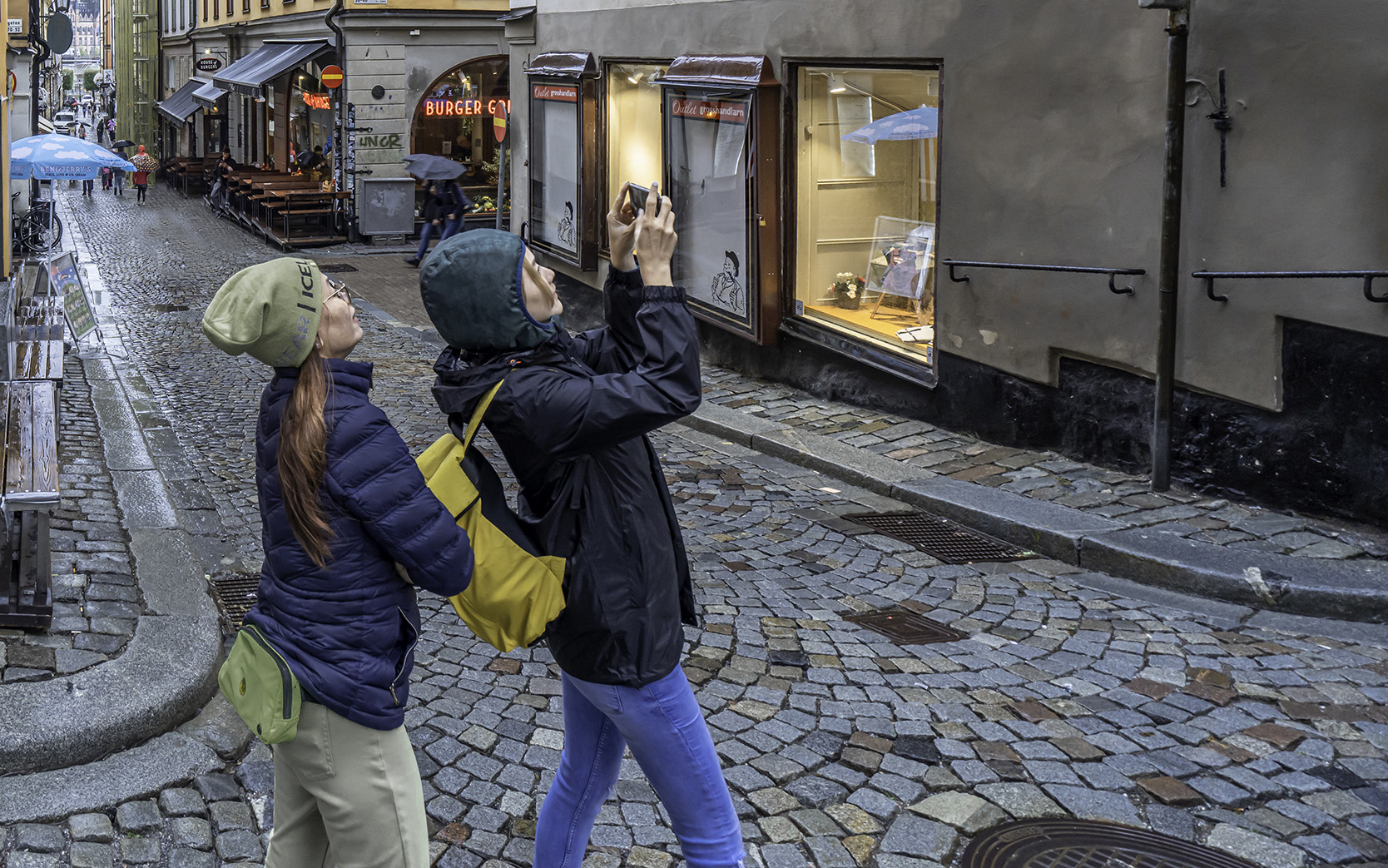
From a photojournalism standpoint, this is a great shot, with great focus, composition, and exposure.
From a pictorial perspective, the colors of the cap and fanny pack of the woman on the left are too bright and pull focus from the overall scene. Reducing their luminosity will help that. |
Feb 14th |
 |
| 53 |
Feb 22 |
Comment |
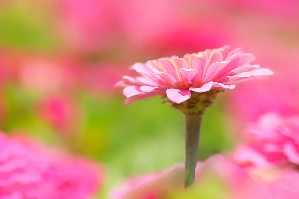
Love the colors and the softness - very dreamy!
Only suggestion I can make is to remove the halo along the edges of the stem. What do you think? |
Feb 14th |
 |
| 53 |
Feb 22 |
Comment |
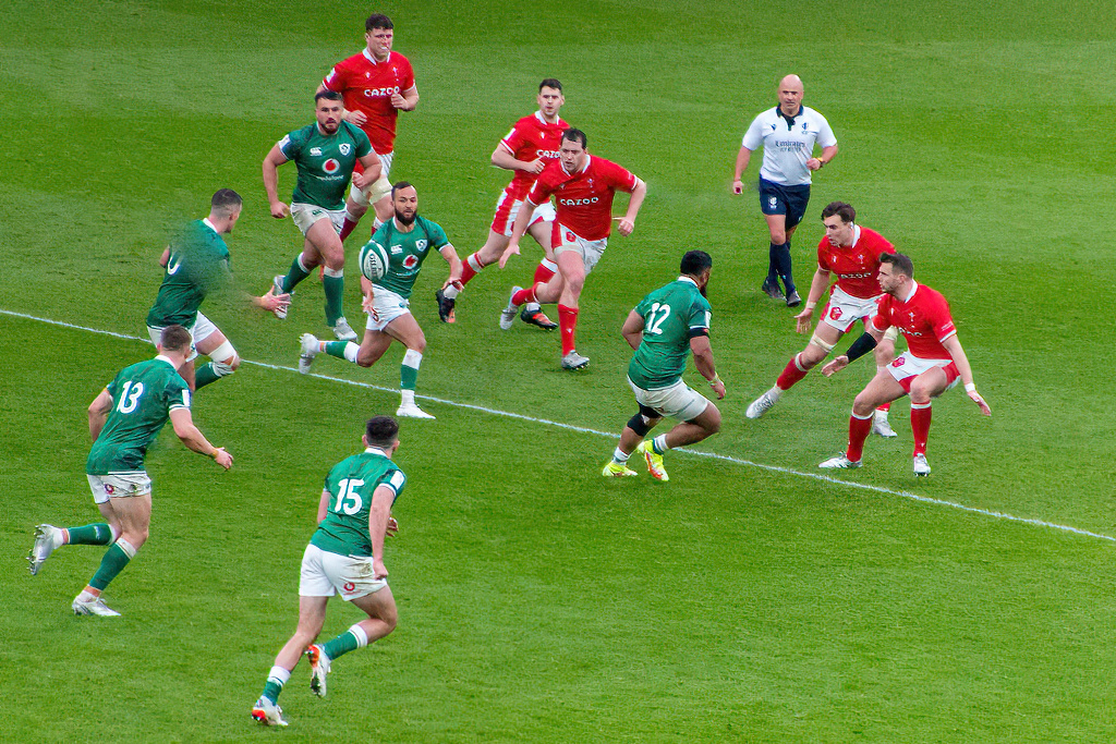
You got a lot of action in the capture, especially freezing the ball. The expressions are very intense! Overall, I think the composition and exposure are quite good.
Beyond being slightly soft in the focus, I found the line that runs at an angle through the left third of the image a distraction. I ran it through Topaz Sharpen AI, then into Affinity Photo to remove that line and do a bit of cleanup. What do you think? |
Feb 14th |
 |
| 53 |
Feb 22 |
Comment |
I love this rusty bucket, Rusty! d;¬{D It's an interesting study once the distracting elements are removed as Miriam demonstrated. It pops nicely from its surroundings and starts the mind working on figuring out what it was used for. Nice find! |
Feb 14th |
| 53 |
Feb 22 |
Comment |
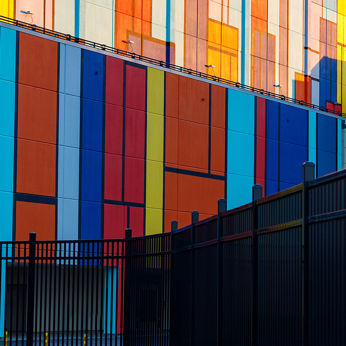
You do find the most interesting places to photograph! Love the colors and shapes here. The fence acts as a leading line, pulling the eye into the colorful wall of the building.
Aside from the removal of the distracting elements that Miriam suggested, I felt a square crop that removes the light blue wall from view might make for a stronger composition. What do you think? |
Feb 14th |
 |
| 53 |
Feb 22 |
Reply |
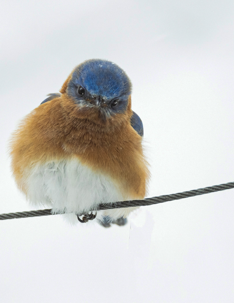
The only issue I have with your change is it darkens the eyes too much. If you mask out your changes around the eyes it would be much better. The eyes are way too important to hide. |
Feb 9th |
 |
| 53 |
Feb 22 |
Reply |
Nice job with the edit, Miriam! d:¬{D |
Feb 9th |
| 53 |
Feb 22 |
Reply |
Like this? |
Feb 9th |
 |
| 53 |
Feb 22 |
Reply |
Hmmm...You're generating ideas... |
Feb 9th |
5 comments - 7 replies for Group 53
|
| 95 |
Feb 22 |
Reply |
Not soon enough for me!!! d;¬{D |
Feb 18th |
| 95 |
Feb 22 |
Reply |
Dick States was often on my case about specular highlights in my macro images. I still forget from time to time. It's so much easier to point out someone else's mistakes. d;¬{D |
Feb 18th |
| 95 |
Feb 22 |
Comment |
Your images often have a dreamy quality and this is no exception. The large aperture ensured softer edges, yet there's enough detail even there for the eyes to drink in.
There is a lot of yellow, but as Pat has pointed out, the splashes of orange on the petal tips keep the yellow from being overwhelming.
Your edit on the lower right corner helped a lot as the black and blurry yellow pulled some focus. |
Feb 18th |
| 95 |
Feb 22 |
Comment |
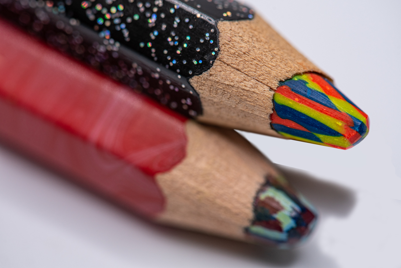
Excellent job pulling our eyes to the tip of this multicolor pencil. The focus is where it should be and soft in the rest. This makes for an artful study.
Though odd numbers are typically better, this is a guideline, not a hard and fast rule. I personally find the third pencil in this image a bit of a distraction. Here's a quick edit to remove that third pencil: |
Feb 18th |
 |
| 95 |
Feb 22 |
Comment |
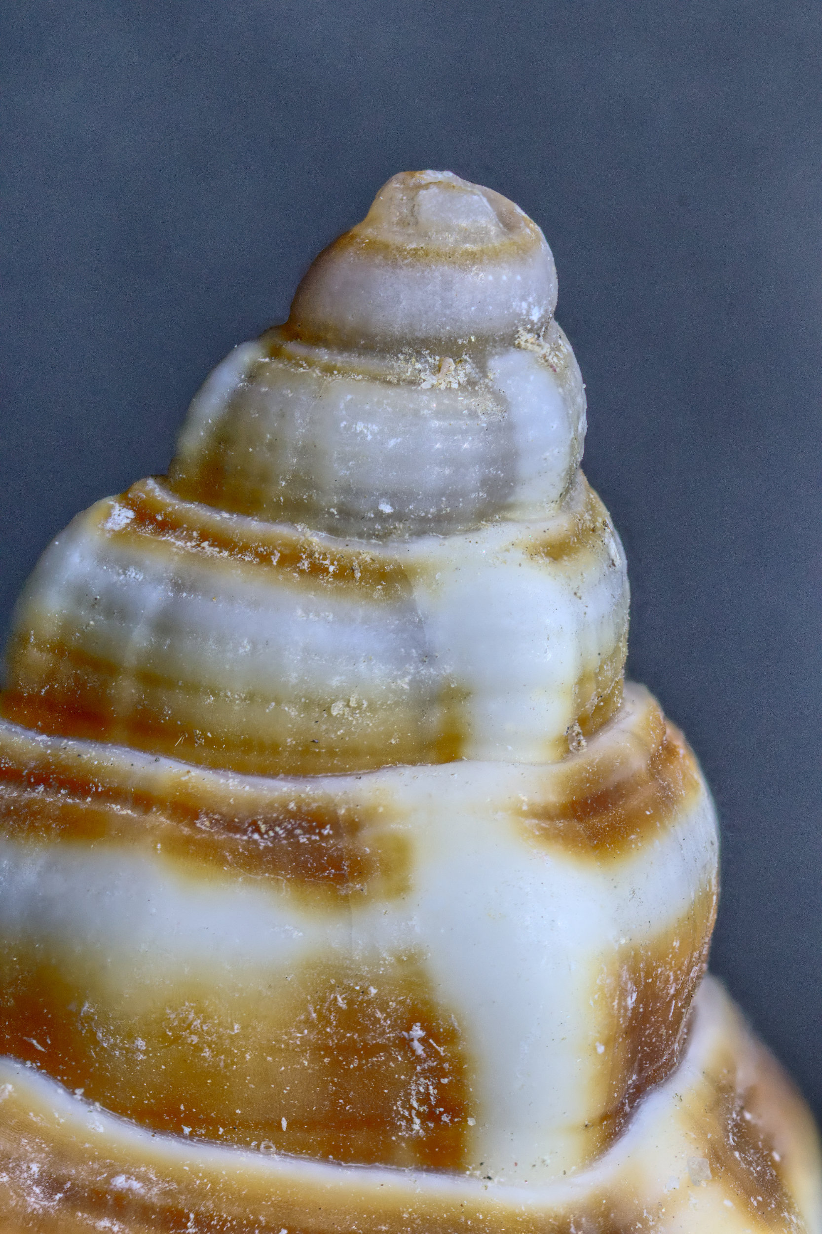
I think this is an excellent subject for a macro study. There's lots of curves and textures that show up in macro that aren't visible to the naked eye (why don't they ever call it a nude eye?).
Though I'm rather ADD about debris on my macro subjects, I find that I don't mind the white specks on this one as they give a contextual element to the image. However, some of those white specks are actually specular highlights and I do think those have to go: |
Feb 18th |
 |
| 95 |
Feb 22 |
Reply |
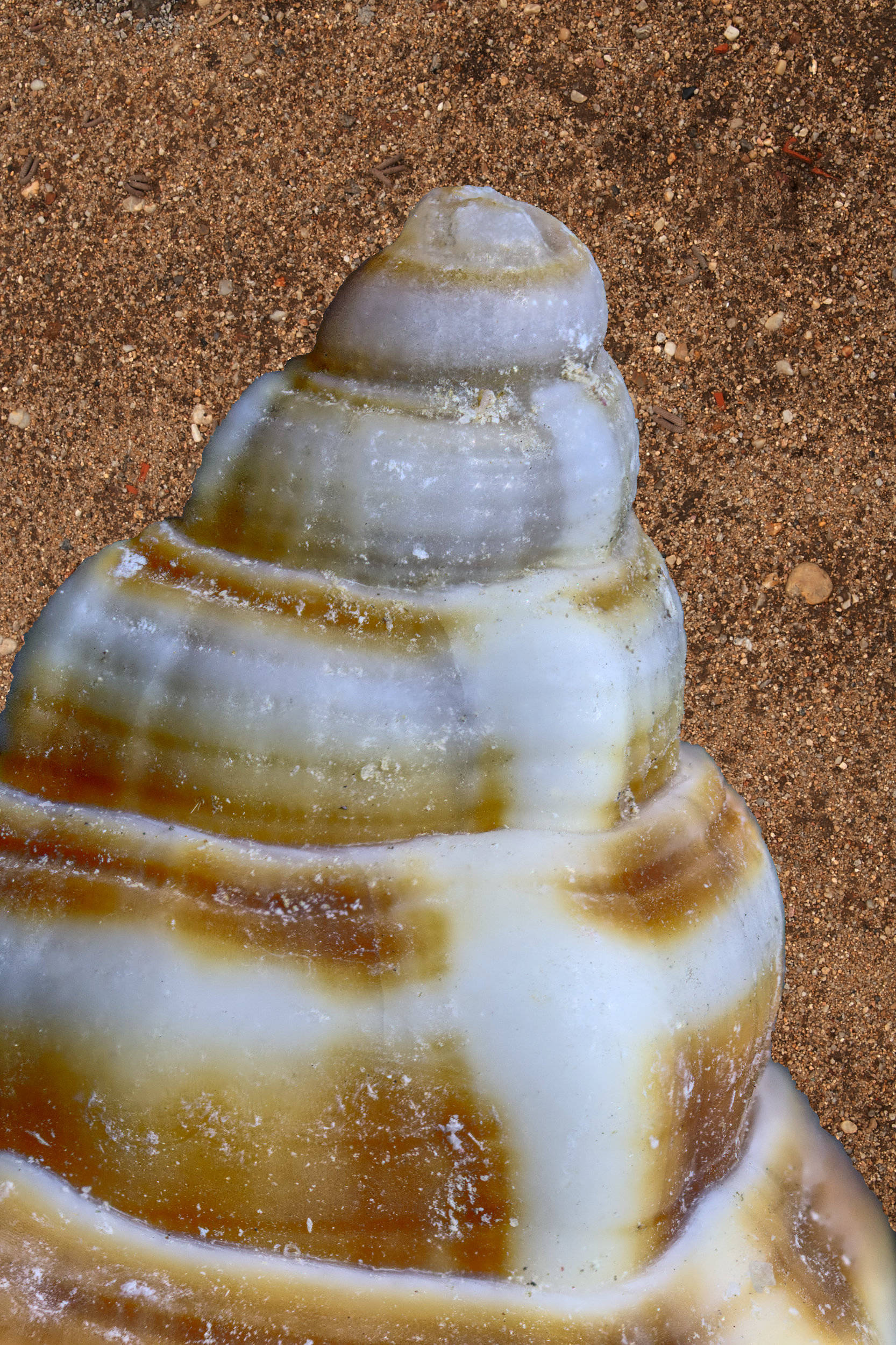
How about some sand in the background? |
Feb 18th |
 |
| 95 |
Feb 22 |
Comment |
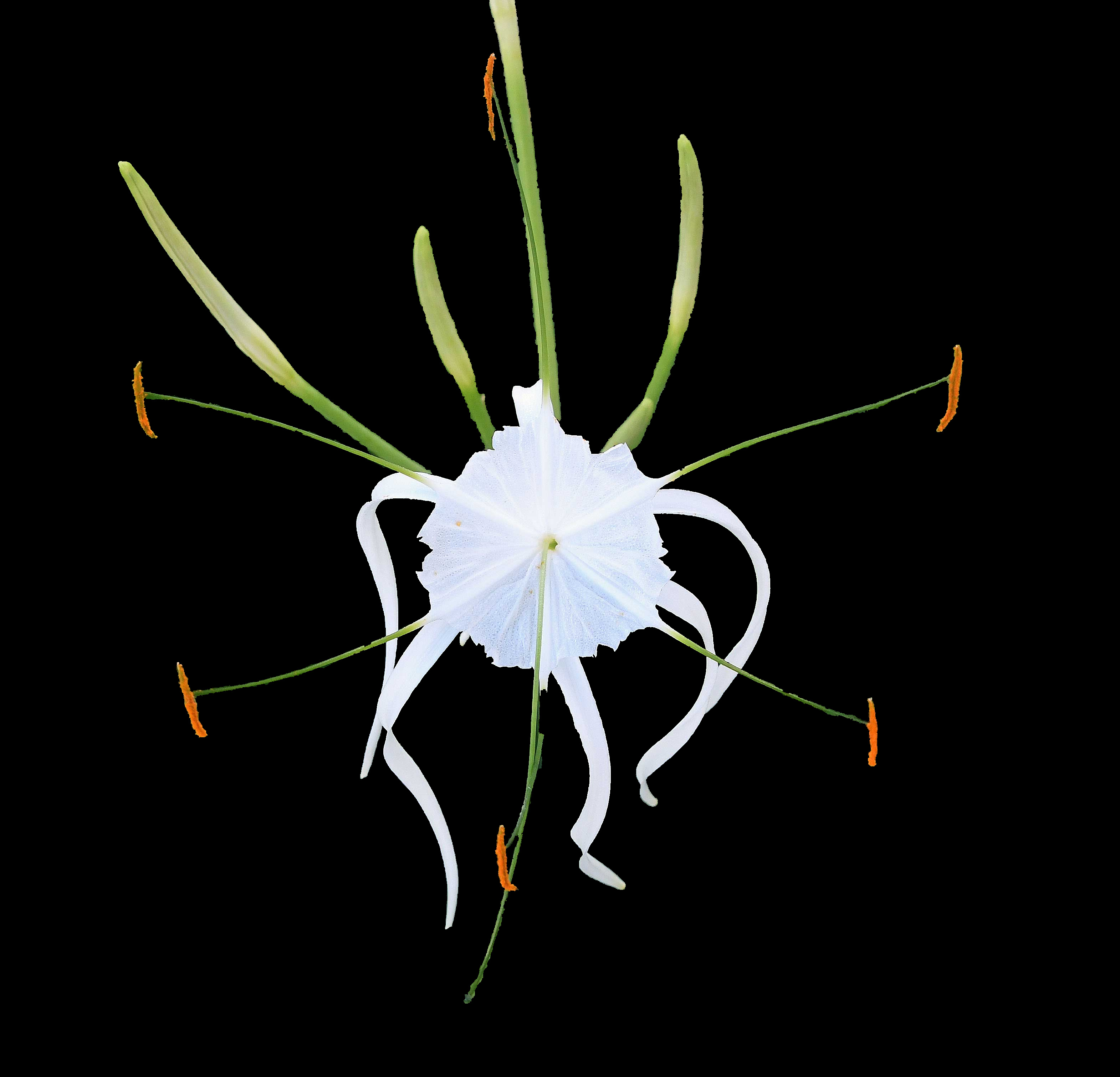
Welcome, Bernie! I've never seen one of these before. So delicate - so small. I'm not sure what else could have been done to preserve the whole flower without including all the foliage beneath, aside from removing the background completely. |
Feb 14th |
 |
| 95 |
Feb 22 |
Reply |
I definitely will play with this more. I ran out of time to have something to share. d:¬{( |
Feb 14th |
| 95 |
Feb 22 |
Reply |
I agree - I'm not totally happy with the direction I took, but still wanted to experiment. There's always next month. d;¬{D |
Feb 14th |
| 95 |
Feb 22 |
Reply |
I'm glad you see nothing wrong. How about whether there's anything right? d;¬{D
Frankly, the original concept would have been better as a closeup rather than a true macro. |
Feb 14th |
4 comments - 6 replies for Group 95
|
9 comments - 13 replies Total
|