|
| Group |
Round |
C/R |
Comment |
Date |
Image |
| 53 |
Mar 21 |
Reply |
Well, doggone it! d;¬{D |
Mar 24th |
| 53 |
Mar 21 |
Reply |
How's this: |
Mar 24th |
 |
| 53 |
Mar 21 |
Reply |
It would appear that was a new term for most of us. d;¬{D |
Mar 24th |
| 53 |
Mar 21 |
Reply |
You are too kind. What about it makes it more striking in your view? |
Mar 20th |
| 53 |
Mar 21 |
Reply |
No, I'm talking about the individual programs Denoise AI and Sharpen AI. The versions in beta are quite a bit faster than the versions currently in release. |
Mar 17th |
| 53 |
Mar 21 |
Reply |
I'm a big fan of the those Topaz programs and use them a lot. I'm also a beta tester for Topaz and you're going to love the next release of Denoise AI and Sharpen AI. d;¬{D |
Mar 17th |
| 53 |
Mar 21 |
Reply |
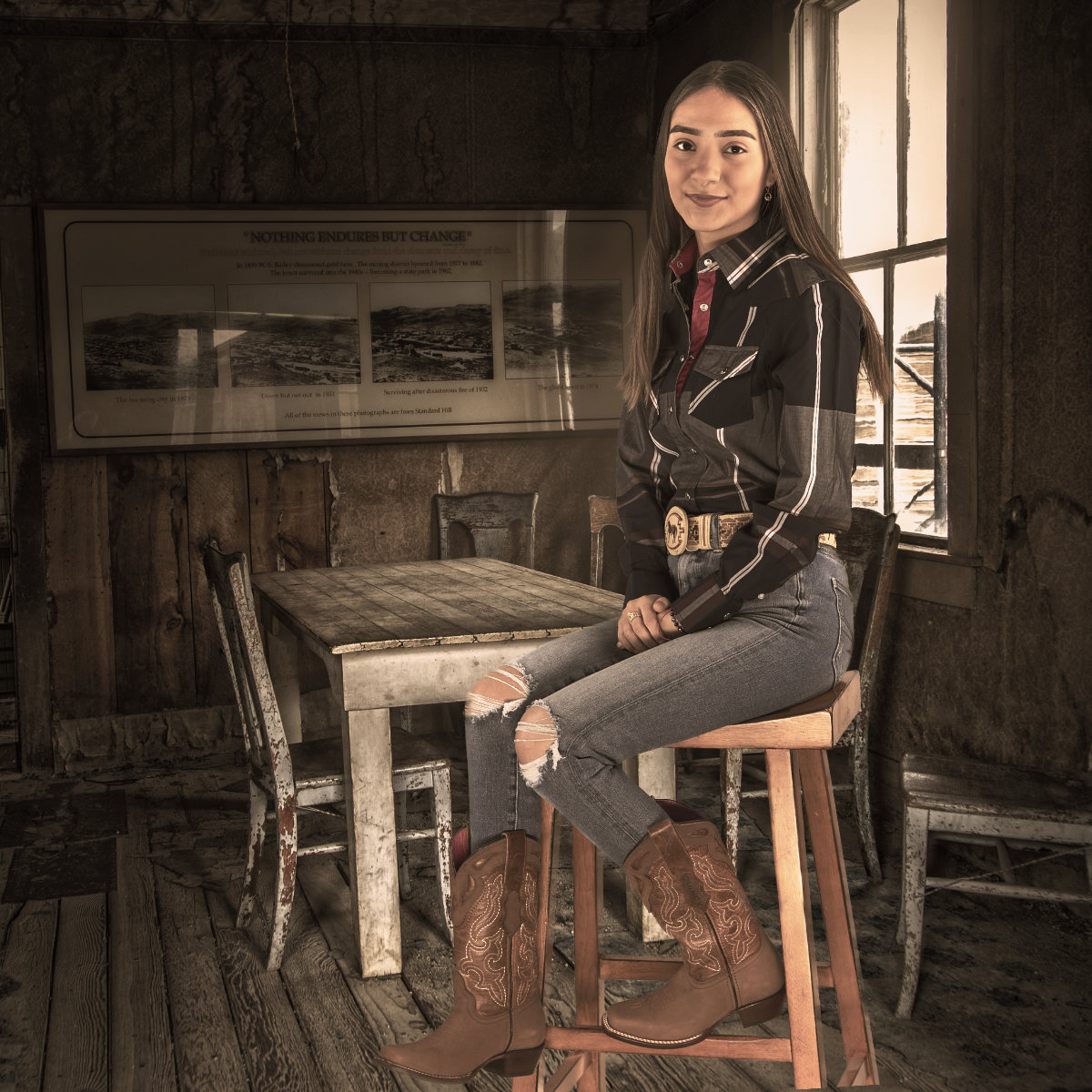
I found a collection of various backdrops in a variety of themes. This one was from the Wild West theme. Seemed to fit with her outfit. I added a LUT to bring her colors in line with the scene. |
Mar 14th |
| 53 |
Mar 21 |
Comment |
I bet you had a lot of fun with that app. Did you have trouble choosing one to submit?
I briefly played around with various editing apps on my tablet but found that my fingers were too big to finesse things. Guess I'm just too old to learn very many new tricks. d;¬{D
The twists your app created worked very well with the curved shapes of the mushrooms. Miriam's noise reduction polished it off nicely.
If you have other versions, please share. d;¬{D |
Mar 13th |
| 53 |
Mar 21 |
Comment |
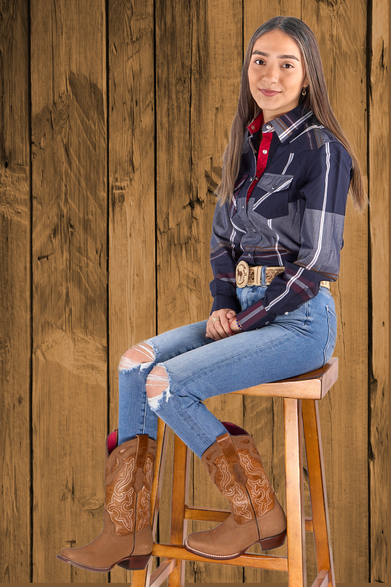
Here's a version with her in a setting. What are your thoughts? |
Mar 13th |
 |
| 53 |
Mar 21 |
Comment |
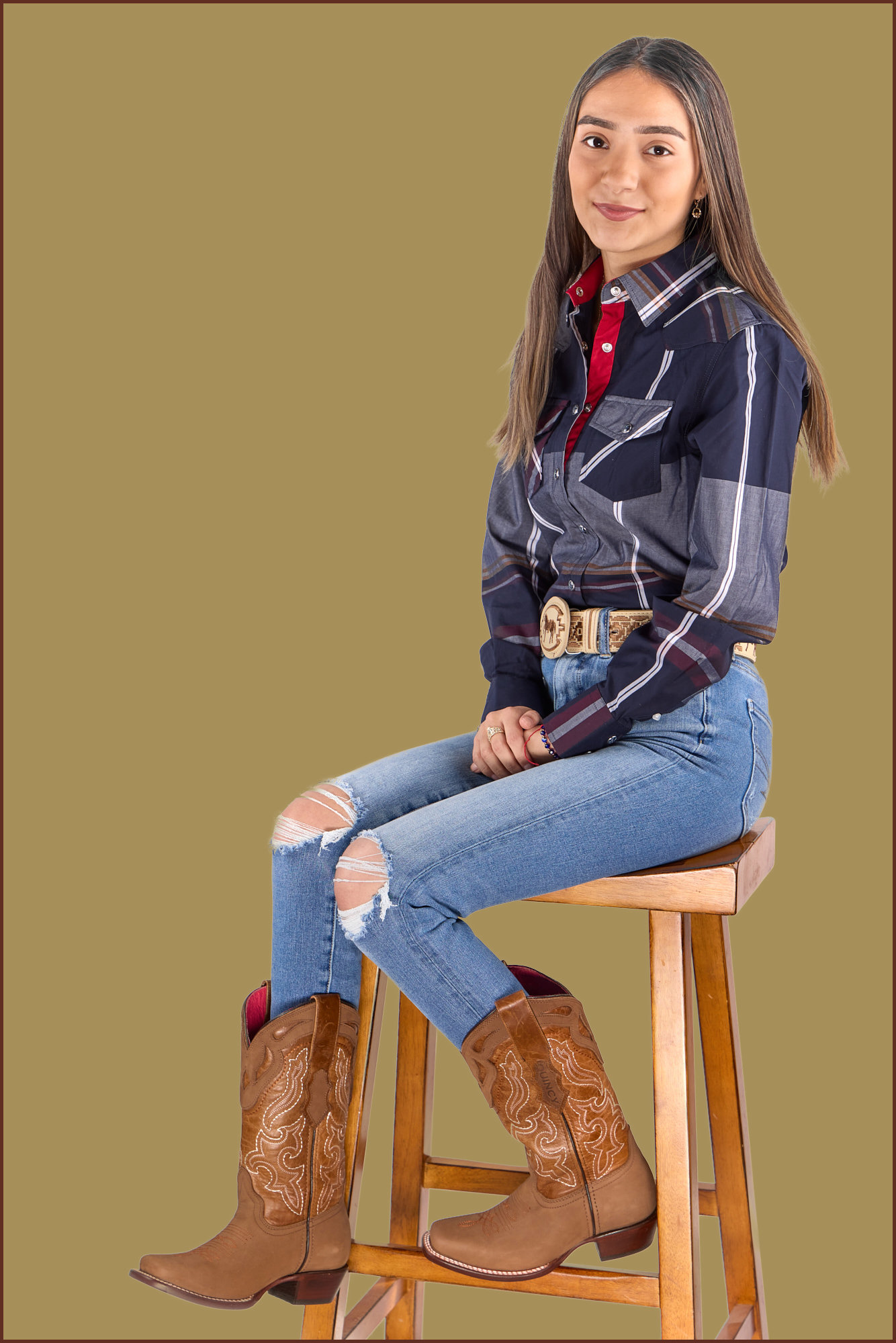
Lovely portrait, Dan. She is poised but not stuffy. The exposure, detail & colors are great. Perhaps she would do better against a colored background or a setting, as the white is just too bright. What do you think about this version with a colored background? |
Mar 13th |
 |
| 53 |
Mar 21 |
Comment |
Oh my! What an incredible sky!!! I hope you have this printed on a wall somewhere, cause that's where it belongs! I've got nothing I can suggest to improve this. |
Mar 13th |
| 53 |
Mar 21 |
Comment |
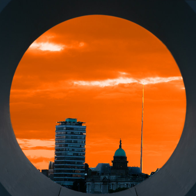
This is a neat perspective in viewing a skyline, through an opening of the foreground building. I agree that the square crop is best, but perhaps you have cropped in too tight to the circle of the “eye”, which is removing too much information about the foreground.
I played around with the original to better reveal the foreground and tried to get close to your treatment of the sky, though I didn't have the time to refine that. What do you think? |
Mar 13th |
 |
| 53 |
Mar 21 |
Comment |
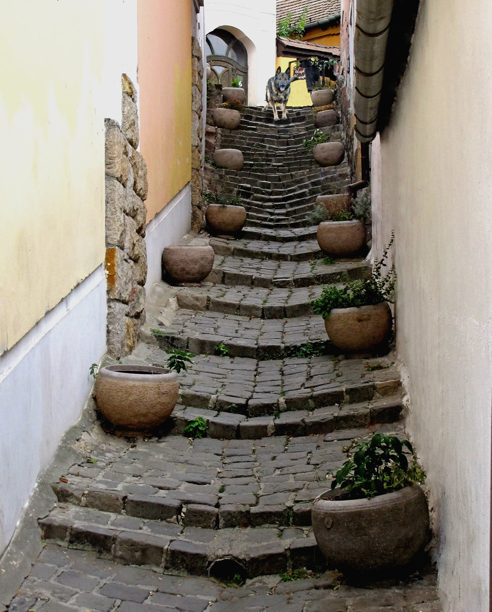
Cool find! That must have been an incredible trip! I wish I was up to trips like this and that travel was even possible.
This cobbled stairway naturally leads the eye into and through the image. If only there was more to see at the top of the stairs.
You know me - I had to have a go at adding something for the eye to discover and add some excitement: |
Mar 13th |
 |
| 53 |
Mar 21 |
Comment |
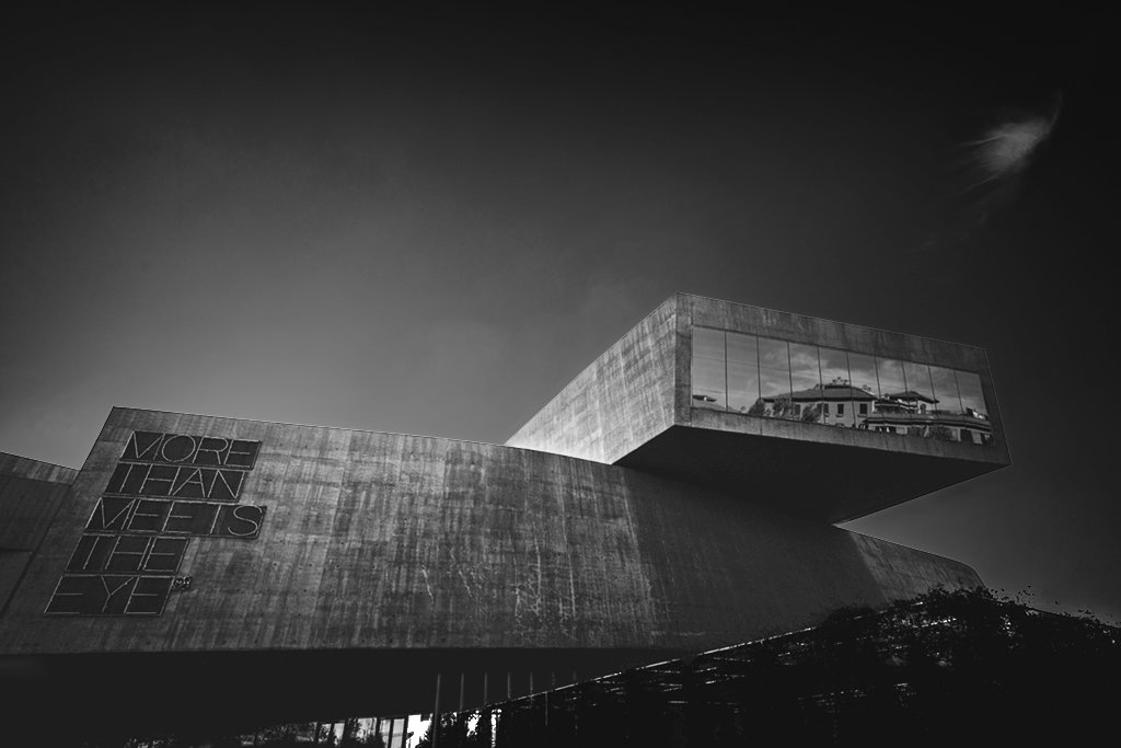
I love architectural images like this. You found an interesting angle to capture this from and monochrome is certainly the right presentation. Perhaps this image can be improved with dodging and burning to add more dimensionality. Here's my quick D&B workup as an example: |
Mar 13th |
 |
| 53 |
Mar 21 |
Reply |
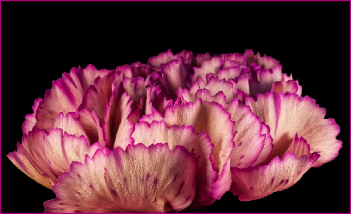
That's another way of saying 'border'. |
Mar 9th |
| 53 |
Mar 21 |
Reply |
Like this? |
Mar 2nd |
 |
| 53 |
Mar 21 |
Reply |
The pencil shavings appearance is what caught my eye as well.
What suggestion can you make about the keyline? |
Mar 1st |
7 comments - 10 replies for Group 53
|
| 95 |
Mar 21 |
Reply |
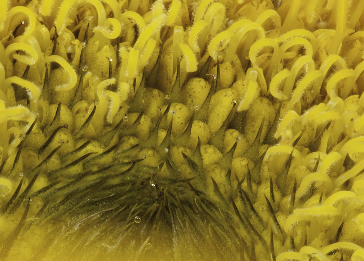
These results are each quite a bit different. The AP and HF images are fairly close and took about the same amount of time to merge. The FP result is darker and auto-cropped, which may be a setting - I had just re-installed the program prior to using it for this test.
What do you think of the 3 results? |
Mar 17th |
| 95 |
Mar 21 |
Reply |
Finally, the Helicon Focus merge: |
Mar 17th |
 |
| 95 |
Mar 21 |
Reply |
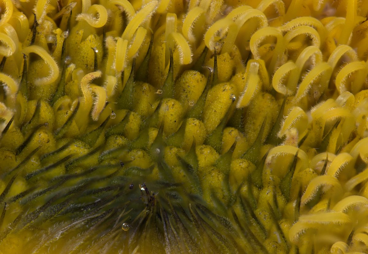
Now the Focus Projects merge: |
Mar 17th |
 |
| 95 |
Mar 21 |
Reply |
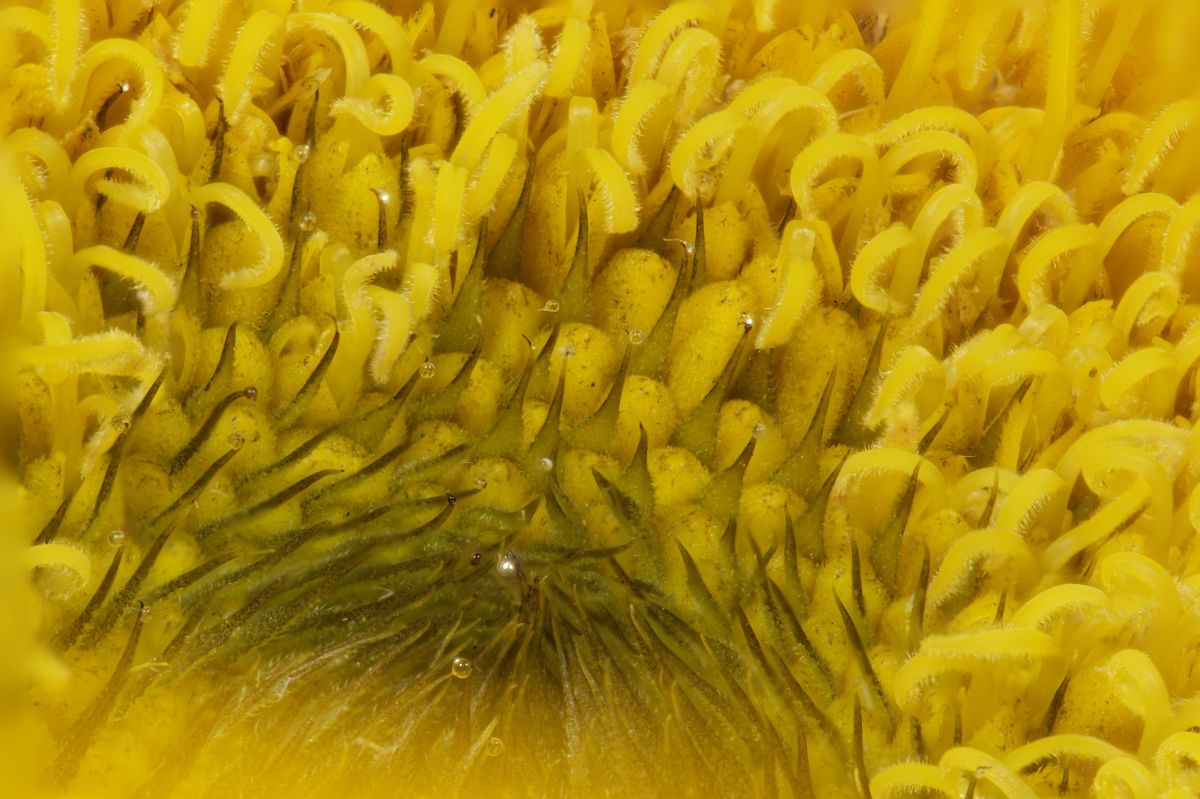
Here's a 20-image stack, done in each of the 3 programs - Affinity Photo, Focus Projects, & Helicon Focus. These were merged from the RAW images and are otherwise untouched. 1st is Affinity Photo's merge: |
Mar 17th |
 |
| 95 |
Mar 21 |
Reply |
Mums are often part of inexpensive supermarket bouquets, so I've been capturing them for quite a long while. Our eyes are accustomed to the overall look, but moving in close makes for a very different experience.
I used to compete but haven't for 3 years. I sort of plateaued in the eyes of judges in my club and my scores started to decline a bit and the excitement disappeared for me. As a competition judge, I work to keep that in mind as I'm evaluating images. |
Mar 17th |
| 95 |
Mar 21 |
Reply |
As with any new approach to image capture, there are accommodations that must be made along the way to make them usable. I'm working on a way to employ bottom lighting with my microscope to what I can accomplish. You may see some results in the near future. d;¬{D |
Mar 16th |
| 95 |
Mar 21 |
Reply |
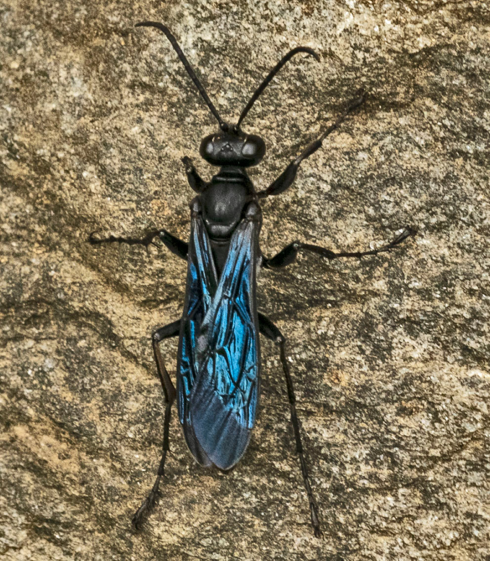
If this surface the wasp was standing upon was not so mottled, I think it would have readily appeared sharp to everyone. We often make snap decisions based upon a limited study, a problem judges have when evaluating images for less than 15 seconds - in your case, you would have lost points for a soft subject. Makes you think, eh? |
Mar 16th |
| 95 |
Mar 21 |
Reply |
The petals on the top right appear to be bending away from the camera, while the petal on the bottom right appears to be angled towards the camera. It may be that you didn't start far enough away from the flower and didn't go deep enough towards the flower.
The thing about digital that was so exciting to me was being able to try things and find out right away if they worked, as well as being able to take more angles and have more to choose from in post. On the other side of the coin, film forces one to be more thoughtful about each shot as there's a cost involved in developing. With focus stacking, more is better. I always start out a little in front of the sharpest close point and continue until everything looks fuzzy on the LCD. Lately, I typically take the stack right into Helicon Focus to see if I got enough. If I need more, the camera and subject is still setup to add to the stack.
It's also important to pay attention to the sides as it's easy to have tunnel vision on the center, only to be disappointed in post to have softer sides than expected. The Crop tool is your friend in those instances like this. |
Mar 14th |
| 95 |
Mar 21 |
Comment |
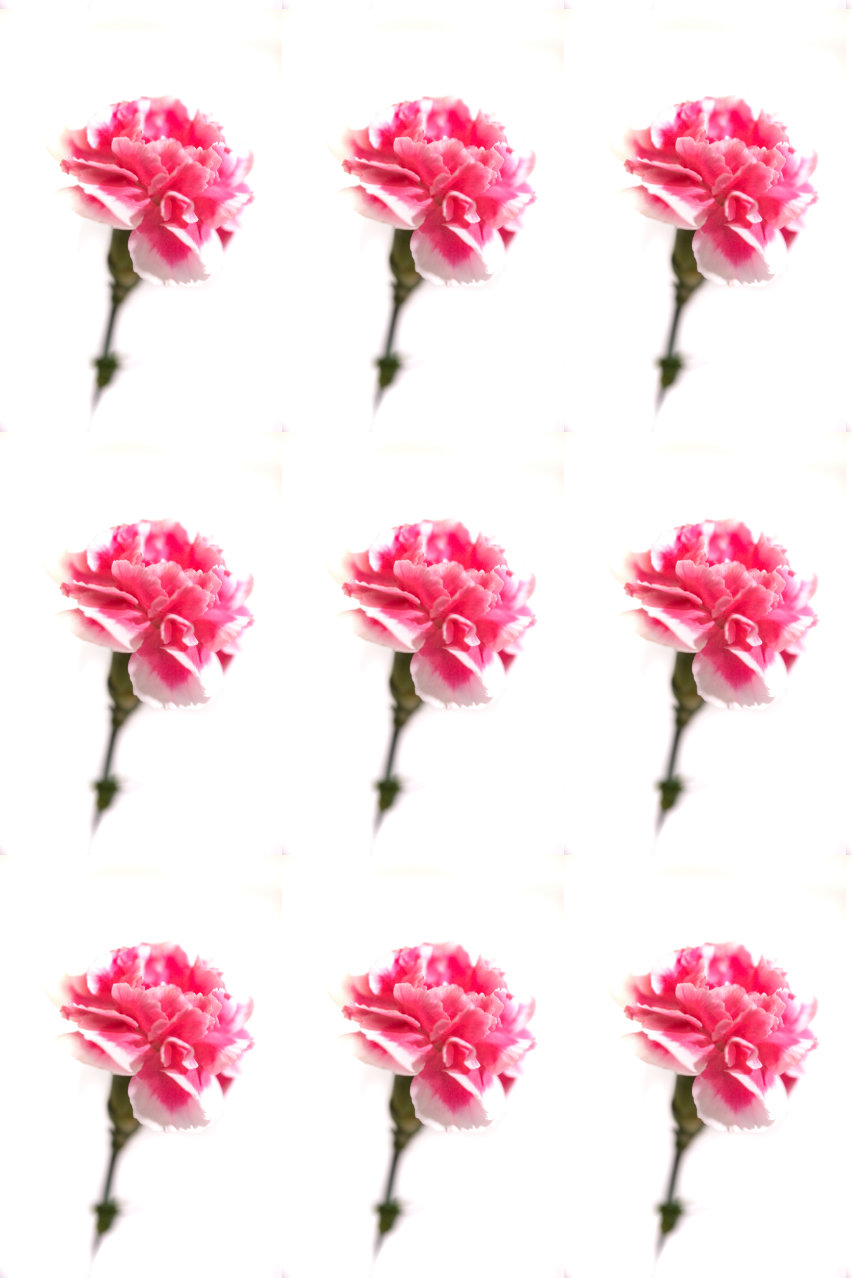
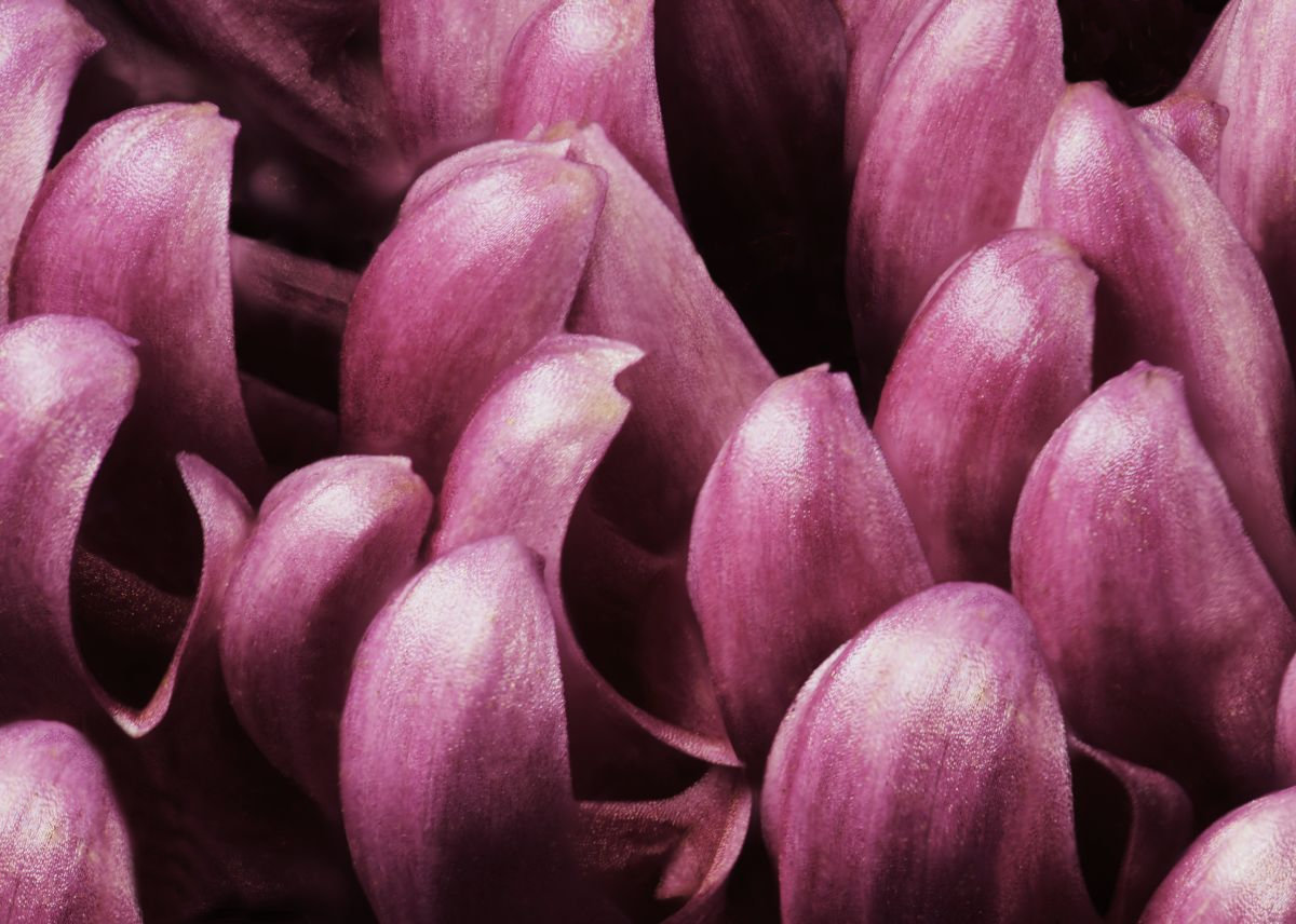
Normally in macro, we want to see everything tack sharp, but this shows that a soft image with very little DOF can work well also. Very pretty and could work well as a wallpaper pattern. |
Mar 14th |
 |
| 95 |
Mar 21 |
Comment |
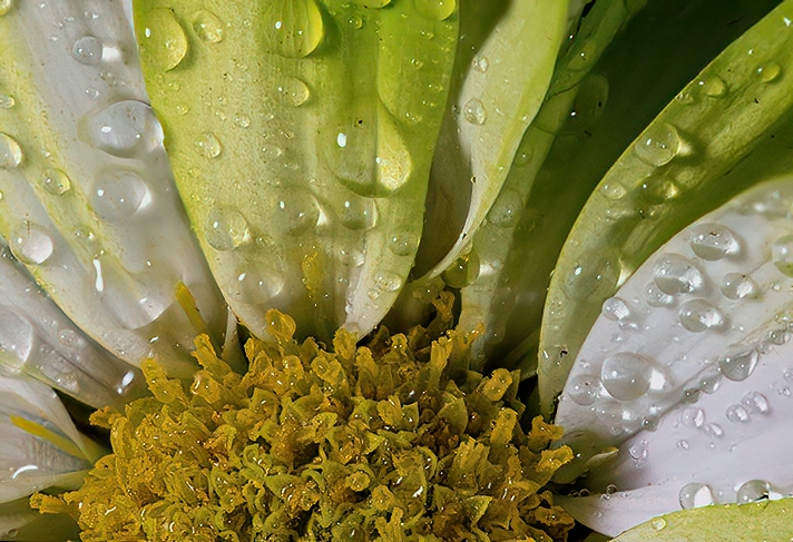
I am quite impressed with your stack, Barbara. This puts a lot of my early efforts to shame.
I learned, after a while, that it was always better to take too many images rather than too few, and my stacks started to really improve. The other key is consistency in the movement of the rail, which helps the software do a better job of picking out the sharp bits from each. Experimenting with different increments will help you determine the best choice for your lens setup. Once you figure that out, stick with it and takes lots of shots.
I cropped some of the soft areas out and ran it through Topaz Denoise AI. What do you think? |
Mar 13th |
 |
| 95 |
Mar 21 |
Reply |
See below for my rework. |
Mar 13th |
| 95 |
Mar 21 |
Reply |
See below for my rework. |
Mar 13th |
| 95 |
Mar 21 |
Comment |
Here's a redo with the suggestions given so far: |
Mar 13th |
 |
| 95 |
Mar 21 |
Comment |
It does look like a wing, though I'd have no idea from what insect. You managed to capture a lot of detail in this stack. The only thing missing is the iridescence normally seen in insect wings from farther away.
Was your lighting from below or above? I can't really tell from the image or your description.
This is the second time you've talked of using Focus Projects. Are you really finding it better than Affinity Photo for your stack merges? I may have to revisit it. |
Mar 13th |
| 95 |
Mar 21 |
Comment |
While it does appear a bit soft initially, I don't think it really is. Studying closely, I think it's the wasp's shadow that's making the image appear soft.
To test my theory, I took your image into Topaz Sharpen AI and played with the settings to try and improve the image. No luck, and it usually will fix soft images quite well.
Next, I did some cloning work, with this result: |
Mar 13th |
 |
5 comments - 10 replies for Group 95
|
12 comments - 20 replies Total
|