|
| Group |
Round |
C/R |
Comment |
Date |
Image |
| 11 |
Apr 20 |
Comment |
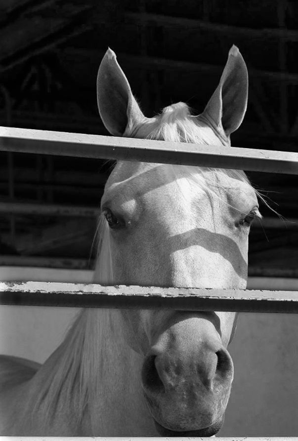
That horse is really keyed into you at this moment - definitely the right time to capture. I agree that you must keep the ears - they're an important part of the story and the look. There are a few things you can do to help this image along: straighten along the bottom bar; remove the top bar; darken the bars that cross over the horse (too difficult to remove; brighten its eyes; remove tiny distractions like the fly in the lower right; crop a bit. Here's my rendition showing those edits:
|
Apr 17th |
 |
| 11 |
Apr 20 |
Comment |
I think something in between Jim's rendition and your Original 2 would be best. The straight mono is definitely a better choice, and softening the background helps, but it should also be darkened slightly to help the Tom pop out of the background more. |
Apr 17th |
2 comments - 0 replies for Group 11
|
| 53 |
Apr 20 |
Reply |
OMG - I think you're right! d8¬{O |
Apr 20th |
 |
| 53 |
Apr 20 |
Reply |
ACR is Adobe Camera Raw, the engine behind the Develop Module of Lightroom. |
Apr 20th |
| 53 |
Apr 20 |
Reply |
I use Topaz ReMask to do most of my mask work. Their new AI Mask is different enough to slow me down. |
Apr 19th |
| 53 |
Apr 20 |
Comment |
This has become a lovely painting through your processing. I haven't explored much in the way of phone post-processing, though I'm taking a course online for phone photography. There's so much to learn.
There are some distracting elements here that I think should go, especially the brown triangle in the lower-right corner. I personally find the spent flower beneath the main subject is also pulling some focus. Here's my redo: |
Apr 17th |
 |
| 53 |
Apr 20 |
Comment |
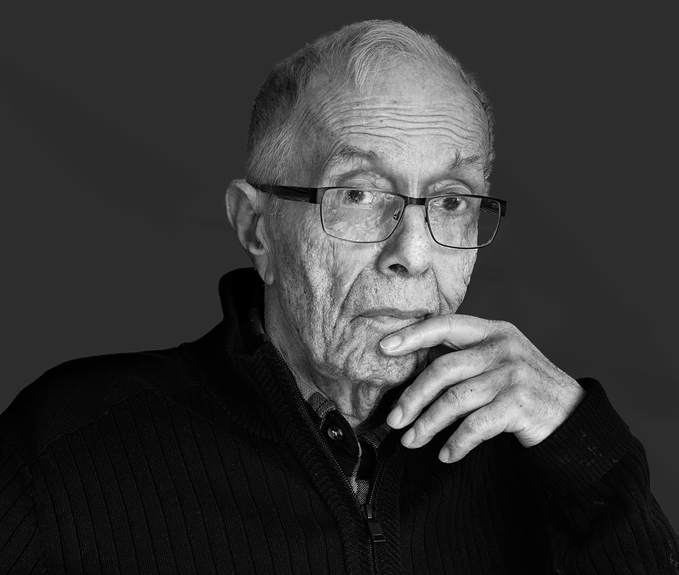
Great pose for your stepfather - very contemplative, as though he's remembering something about you that you probably don't know. d;¬{D
I have to agree that the chair is rather overpowering - even in the monochrome version. We want to focus on the subject, not his surroundings. I suggest removing those surroundings so we can really see him.
I have done that here, replacing the background with a shade of grey that seems to compliment him. I also cropped some from the bottom and right to place his eyes on a third line. Finally, I did some dodging and burning to add more depth. What do you think? |
Apr 17th |
 |
| 53 |
Apr 20 |
Comment |
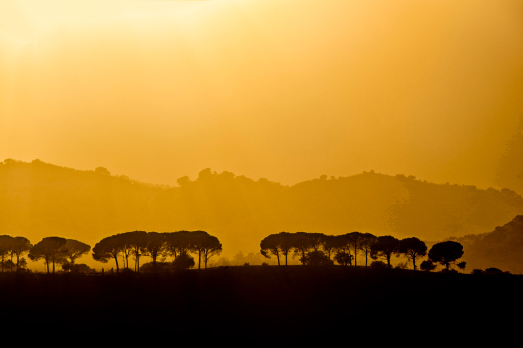
What a scrumptious setting and the color pallette is the right choice. My only beef is the sun flare bleeding into the silhouetted foreground. By applying a Levels adjustment targeted to that section of the image, you can reduce that effect and create a stronger composition. |
Apr 17th |
 |
| 53 |
Apr 20 |
Comment |
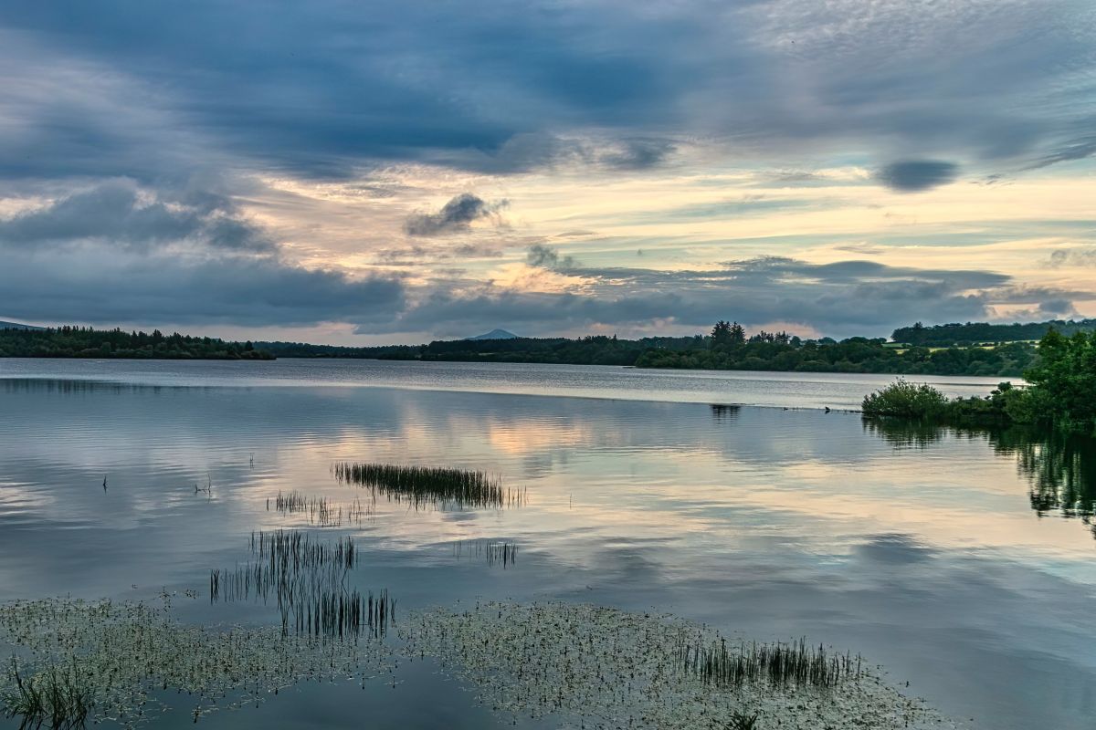
Lovely spot. I think you made a big improvement in your choice of toning and exposure adjustment. It has introduced some noise (only seen on close inspection), so you may consider adding some judicious noise reduction.
As it stands, it will make for a good background. For it to stand on its own, though, you might consider adding some contrast and cropping some from the bottom and left to make a stronger composition. What do you think? |
Apr 17th |
 |
| 53 |
Apr 20 |
Comment |
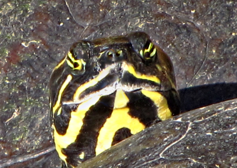
Quite the look you were getting - kinda like, "Who are you?"
This turtle is very much blending into its shell and the shell of the 2nd turtle. Also, the sunlight (or your flash) caused some over-exposing of its face.
I lightened the shells a bit, cleaned up some of the bright spots around its face by using the Clone Stamp and the Burn tool and brightened its eyes a bit with the Dodge tool. What do you think? |
Apr 17th |
 |
| 53 |
Apr 20 |
Comment |
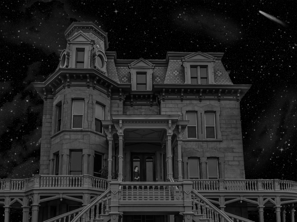
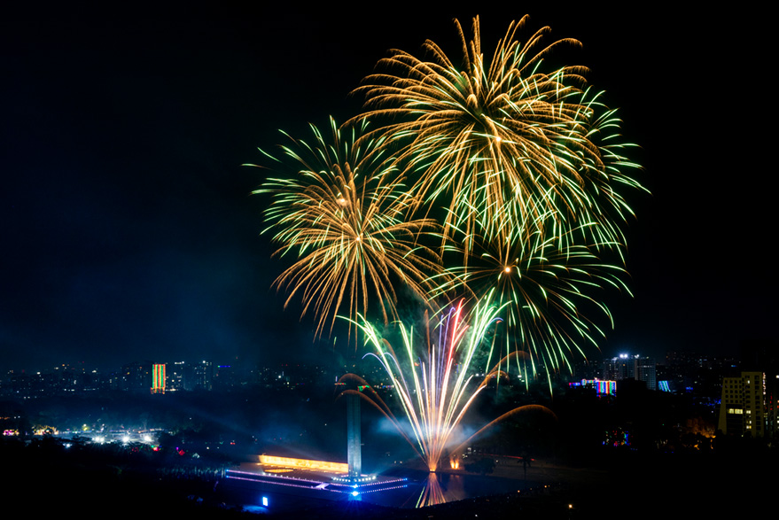
Great result from a 12-second exposure. Fireworks photography can be tricky, especially when doing such a long exposure. One of the chief downsides to a long exposure at night is parts being exposed too much. In this case, the sky and the smoke from the exploding fireworks is distracting from the majesty of the colorful lights in the sky.
To combat this, I opened this image in ACR, increased the highlights, reduced the shadows and blacks, and added a bit of dehaze to reduce the smoke. I also cropped in from the bottom and right to remove some of the dark areas of the image that did not contribute to story. |
Apr 17th |
 |
| 53 |
Apr 20 |
Reply |
If you look at the original, that was even more apparent. I captured this from a low angle and tried to correct it in ACR. Now that you point it out, I obviously didn't go far enough. d:¬{( |
Apr 10th |
| 53 |
Apr 20 |
Reply |
Definitely has a more haunted house feel now. Very creative choices, indeed! d:¬{D |
Apr 4th |
6 comments - 5 replies for Group 53
|
| 95 |
Apr 20 |
Reply |
This crop finishes the image nicely! d:¬{D |
Apr 9th |
| 95 |
Apr 20 |
Reply |
Thanks for the link! d:¬{D |
Apr 9th |
| 95 |
Apr 20 |
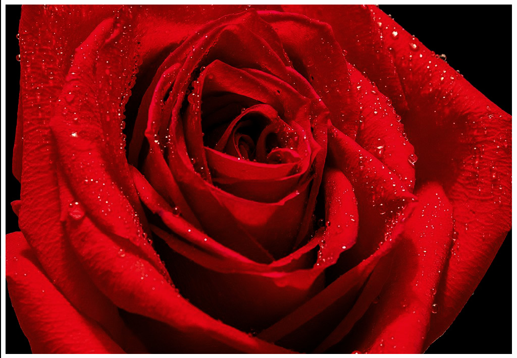
Comment |
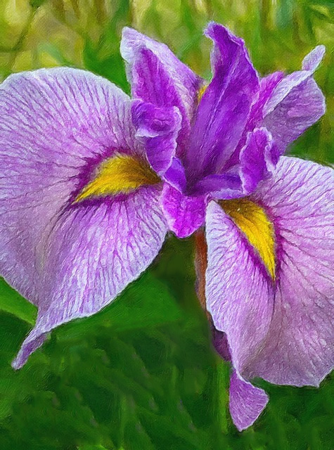
Lovely rose, Barbara. There's nothing like the curves and textures found in rose petals. The addition of water drops helps to define some depth and helps magnify the texture of the petals.
Red is very tricky for cameras. There is a tendency for the camera's sensor to become overwhelmed by brightly lit red, as is happening a bit in this image. To compensate, you should add a Hue/Saturation adjustment layer, choose Reds for channel, move the Saturation slide to the left slightly (around -10 to -15) and the Lightness slider a tiny bit to the left (around -1 or -2). Moving the Hue slider a tiny bit to the right will restore the color lost from adjusting the other 2 sliders. I would also suggest adding a Levels adjustment layer and moving the middle pointer under the histogram slightly to the right to increase the contrast. Do these things before adding a border as discussed in the thread with Stuart. |
Apr 6th |
 |
| 95 |
Apr 20 |
Reply |
To add a border in Elements, try the following:
1. Add a blank layer above
2. Select the Marque Tool or press M on your keyboard
3. Click just inside the upper left corner and drag to just inside the bottom right corner.
4. Press Shift-Ctrl-I (Shift-Command-I on a Mac) or click on Select, then Inverse
5. Click on Edit, Fill Selection, choose Color... for Use, choose your color, then click [OK] on the Color dialogue, and finally click [ OK ] for the Fill dialogue.
6. Press Ctrl-D (Command-D on a Mac) or click on Select, Deselect
If you want to adjust the border, Press Ctrl-T (Command-T on a Mac) to adjust the position of the border. |
Apr 6th |
| 95 |
Apr 20 |
Reply |
I have safeguards in place that prevent the use of certain character combinations that hackers use to do bad things via forms. CURL is one such combination.
I added *bend* in place of your intended word. |
Apr 6th |
| 95 |
Apr 20 |
Comment |
Excellent capture, Bill! I can no longer manage handheld (too much shake in my hands), so I am envious of you achieving this one. How far away are you able to take a shot like this with the 150mm lens? I have to get fairly close with my 60mm. |
Apr 6th |
| 95 |
Apr 20 |
Reply |
Thank you, Barbara! This was one of my first attempts at extreme macro and I was fairly happy with the result. Spiders are an interesting subject, I think, because of the many separate eyes rather than the typical compound eyes of other insects. I'm looking forward to finding another creature model. d;¬{D |
Apr 6th |
| 95 |
Apr 20 |
Reply |
This is a common wolf spider - body length c. 15mm (not including legs). This is somewhere between 1.5x and 2x magnification. This is a post-mortem stack.
I wasn't really going for an artsy look. This is one of my early extreme macro stacks - only 15 images. I was most interested in the detail in the body, especially the "face". |
Apr 6th |
| 95 |
Apr 20 |
Reply |
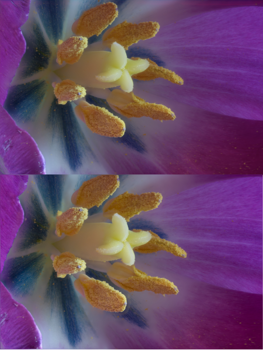
Before I saw your reply, I had tried out Affinity with the stack I submitted last month and, I was quite pleased to see, the result was actually a little bit better than what I got out of Helicon Focus. I've attached a comparison of the 2, with the Affinity version on top. There is very noticeable haloing around the bottom stamen in the Helicon output, which I had to clone out. It's barely noticeable on the Affinity version. This is, of course, the fault of the stack ultimately. My rail is very cheap and does not move as with the precision needed for the best stacks. Someday I'll be able to afford a better rail. d:¬{(
I'm glad you merged your stack in Affinity. I might not have tried it again and missed out a great tool.
On1 Photo Raw 2020 has added some adjustments to their focus stacking filter, but it will only process a maximum of 14 images, so it's not very useful for Macro stacks, but probably okay for landscape stacks that are usually under that maximum number of images.
I just received a reversing ring in the mail yesterday and will be experimenting with a reversed 35mm lens soon. This will hopefully get me even closer than I can now with my macro lens and extension tubes. |
Apr 5th |
 |
| 95 |
Apr 20 |
Comment |
Nicely done, Stuart! Just the right amount of DOF to define your subject with the background showing a nice gradual blur. I don't know if I would have thought to keep the *eye* as I typically clean that sort of thing out early in the process.
How did you like dealing with the stacker in Affinity Photo? I haven't tested it out since 1.8 came out. Previous versions left me wanting more, and Helicon Focus always seemed to do a better job. This came out fine, so I may have to revisit Affinity Photo, especially with the most recent update to 1.8.3 earlier this week. |
Apr 4th |
3 comments - 7 replies for Group 95
|
11 comments - 12 replies Total
|


