|
| Group |
Round |
C/R |
Comment |
Date |
Image |
| 11 |
Mar 20 |
Comment |
What a magical place, Henry. I can see why you had to work it. Mono is definitely the right choice for toning. It's a bit dark for my tastes, but still a striking image. Main issue I have is the bare branches in the upper left corner, but I'm not sure how best to remedy that. |
Mar 10th |
| 11 |
Mar 20 |
Comment |
This image has excellent tonal range in the mono version and those clouds are simply spectacular, Jim! The leading lines are good, but tend to send the eye away from the scene, but that's very minor in the composition. You have implied movement in the foreground boat which adds to the story. I really have no suggestions to make on this one - you gots a great image there, Jim! d:¬{D |
Mar 10th |
| 11 |
Mar 20 |
Comment |
In case y'all are wondering about my Dodging and Burning technique:
˙ add a blank layer at the top of the stack
˙ set it's blend mode to Overlay
˙ select the Brush tool (B), and set it's opacity to 5%.
˙ paint with black to burn and white to dodge, building up the darkness or lightness with as many strokes in an area to taste.
With this workflow, you can turn a grey circle into a sphere by just painting with white and black. |
Mar 10th |
| 11 |
Mar 20 |
Comment |
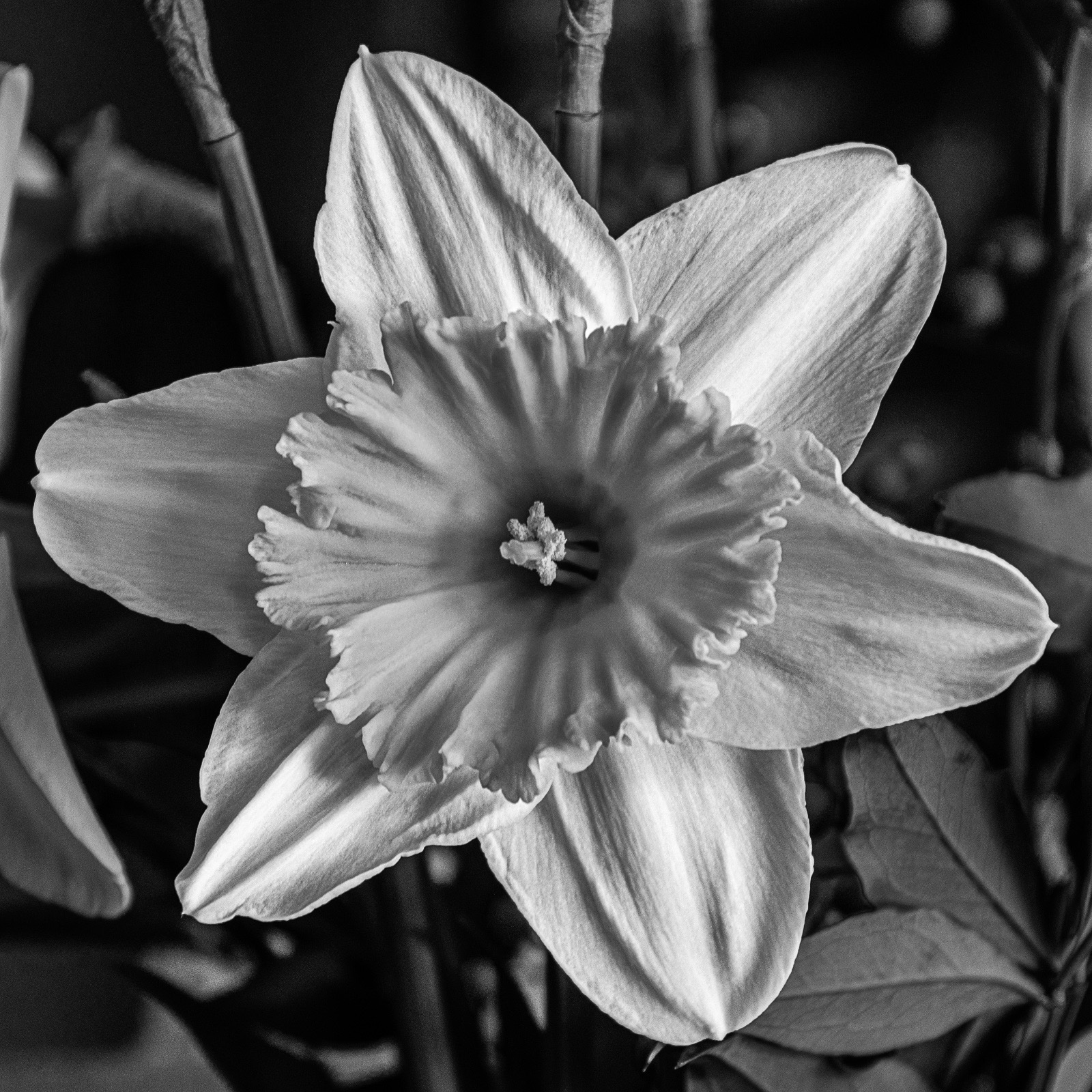
I'm afraid, Allen, that it's a "No" from me on your inversion. I much prefer your mono conversion (Original 2), which brings out a lot of texture from the flower.
Of course, I think a bit of D&B (not Dunn & Bradstreet) would help bring out more depth, as surprising as that may seem coming from me. d;¬{D |
Mar 10th |
 |
| 11 |
Mar 20 |
Comment |
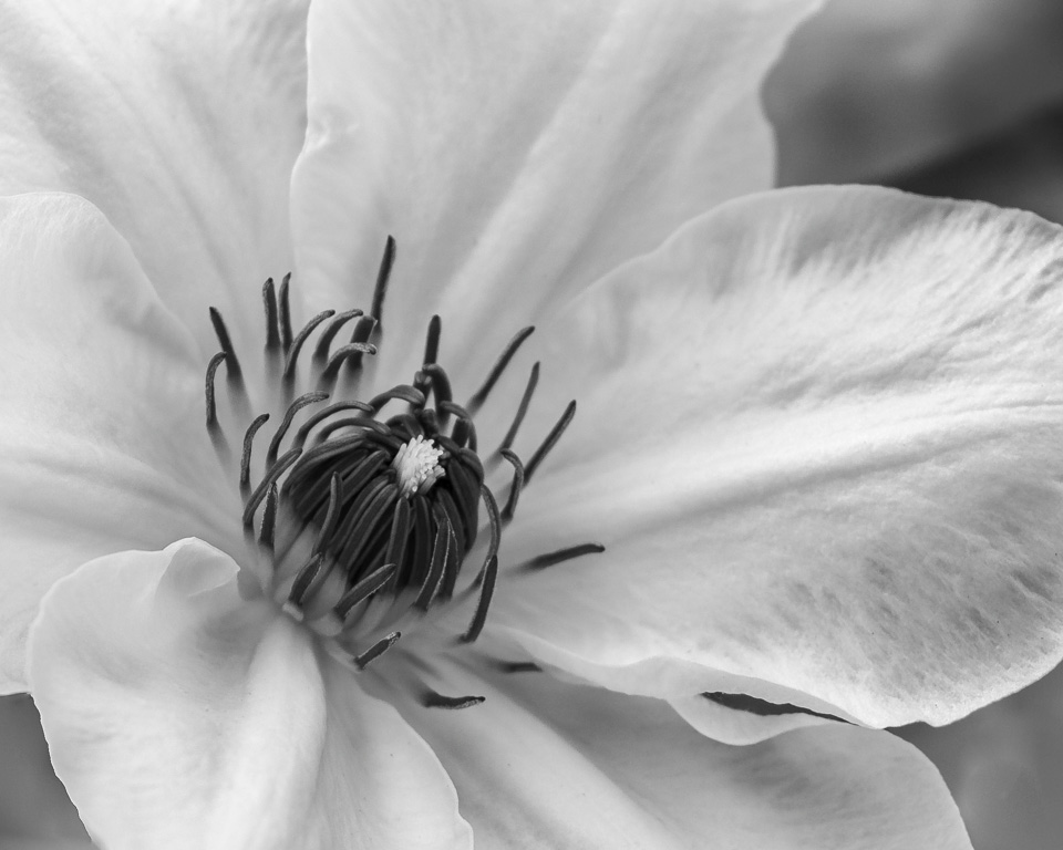
OMG, what a gorgeous flower! The stamen are so delicate and graceful. Definitely a good pick for study.
I think you would have been better off to darken the luminosity of the greens in your conversion to give more tonal variation between the petals and the bottoms of the stamen. While a high key approach makes for a dreamy image, I personally find the loss of texture calls for some dodging & burning to bring it back. I know that surprises you coming from me. d;¬{D |
Mar 10th |
 |
5 comments - 0 replies for Group 11
|
| 53 |
Mar 20 |
Reply |
Now that's a lovely idea - no surprise there! d;¬{D |
Mar 26th |
| 53 |
Mar 20 |
Reply |
That works well, Dan! |
Mar 8th |
| 53 |
Mar 20 |
Comment |
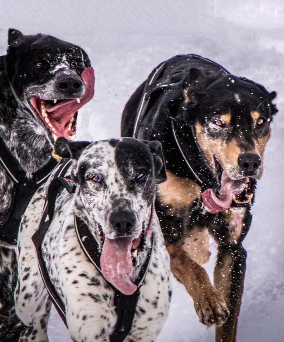
As a photojournalistic image, this tells a great story of the intensity and effort of the sled dogs at work. You did a great job freezing the motion here and giving the viewer a close glimpse of their speed and determination. My only issues are the top left dog's head being cut off by the edge of the image and the bright reds that pull focus.
I also found some chromatic aberration along the right side of the top left dog, so ran this through Adobe Camera Raw to correct that and remove some of the noise. Then, I added more space at the top and simulated the top left dog's head. Then I removed all the distracting elements so that the viewer can focus on the dogs and brightened their eyes a titch. Thoughts? |
Mar 8th |
 |
| 53 |
Mar 20 |
Comment |
This portrait tells a powerful story and it really evokes an emotional response. My only issue is the background. While in one sense it adds to the story in that this once athletic man is fading away, my sense of tonality is bothered by the subject fading into the background. I replaced it with black to really focus the eye on the person. Thoughts? |
Mar 8th |
 |
| 53 |
Mar 20 |
Reply |
Excellent job, Miriam! Great choice for this subject. |
Mar 8th |
| 53 |
Mar 20 |
Comment |
This is simply super, Brenda! The shadow patterns, being off-angle as they are, really draw the eye in. Then we're met by a little furry surprise of the bunny saying welcome and adding a touch of softness and curves to the harsh lines of the shadows. Excellent composite that shows no indication of the edit it entailed. Remarkable! |
Mar 8th |
| 53 |
Mar 20 |
Comment |
This is excellent, Miriam! The composition is spot on and you have the iconic puffin with its typical meal! Colors, focus, and exposure are super and the background bokeh finishes it well! I can't think of a thing that need to change here. Bravo! |
Mar 8th |
| 53 |
Mar 20 |
Comment |
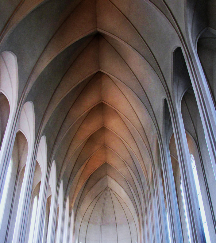
A fascinating place to capture images, Rusty. I envy you the experience, for sure.
Dan is right about the bright areas at the bottom center. I would be more inclined to crop them out so that the focus will be on the ceiling where it should be. A bit of dodging and burning can help add some depth. Here's what I mean: |
Mar 8th |
 |
| 53 |
Mar 20 |
Comment |
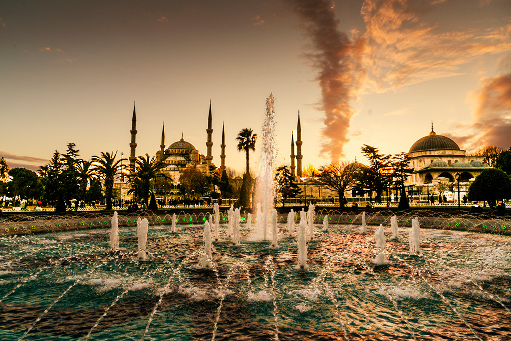
What an incredible location, Rohan! There is so much to see, and that is, perhaps, my issue with this image. The foreground is this lovely fountain, then we see the silhouettes of some buildings, and finally the clouds, which are the most colorful elements and tend to pull focus. These elements are competing for our attention and that only confuses the eye.
I suggest you work on the foreground (fountain), midground (buildings) and background (sky) separately. I sectioned these three and took the foreground and midground into Adobe Camera Raw separately to bring those elements more into the image. I will tackle the sky on another day. Thoughts? |
Mar 8th |
 |
| 53 |
Mar 20 |
Reply |
That helps to reveal the fountain, which is the foreground element. There is still a lot of conflicting elements here. |
Mar 8th |
| 53 |
Mar 20 |
Reply |
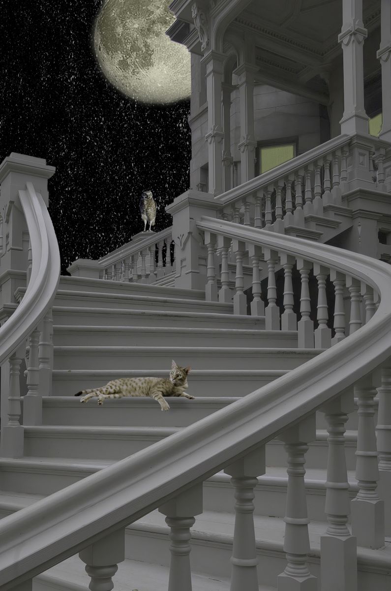
Reduced the glow around the moon. No fairy or bunny, but I did add an owl and a pussycat. Better? |
Mar 8th |
 |
| 53 |
Mar 20 |
Reply |
You don't ask for much, do you! d;¬{D |
Mar 7th |
6 comments - 6 replies for Group 53
|
| 95 |
Mar 20 |
Reply |
Depending on your camera and computer or phone, you can actually automate the process. Some cameras have the ability to take a stack via menu selections. Others can be managed by a Helicon Software program called Helicon Remote, which will connect to your camera and actually take the shots for you. I don't have the right equipment for those 2 options, so I employ a cheap focus rail, which allows me to physically move the camera closer and closer to the subject in tiny increments. This is a tedious process, but I think the outcomes are worth it. There are automated rigs that can do the moving without you doing a thing, but they cost hundreds of dollars. |
Mar 19th |
| 95 |
Mar 20 |
Reply |
I was referring to the physical dimensions - length and width. |
Mar 19th |
| 95 |
Mar 20 |
Reply |
Much better. I sometimes get too timid with my final sharpening for fear that structures will get too crispy. You arrived at a good balance. Thanks! d:¬{D |
Mar 13th |
| 95 |
Mar 20 |
Comment |
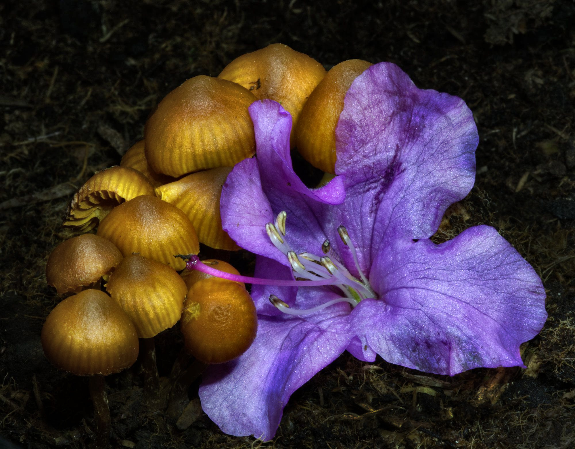
Cool composition, Stuart. The flower really spices up the image, which would probably have been cool enough with just the tiny fungi.
I'd love it if the manufacturer would let me try out the Adaptalux system, cause it's likely the only way I'll get my hands on one. It's a bit pricey for my wallet I fear. Oh well.
I found this image a bit flat, actually. Perhaps it was the direction of your lights. It really calls for dodging and burning and a bit more contrast to bring out the depth. |
Mar 10th |
 |
| 95 |
Mar 20 |
Reply |
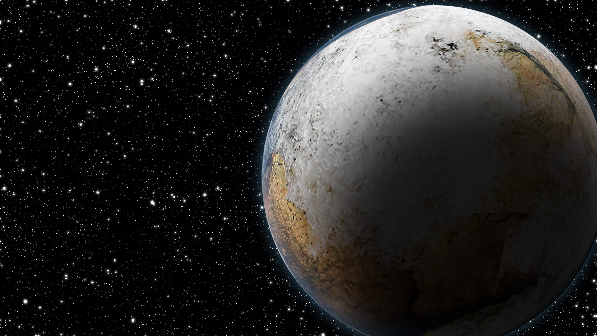
Just for fun, since I'm in the process of creating planets from textures, I thought I'd use your image for a trial. What do you think? |
Mar 10th |
 |
| 95 |
Mar 20 |
Comment |
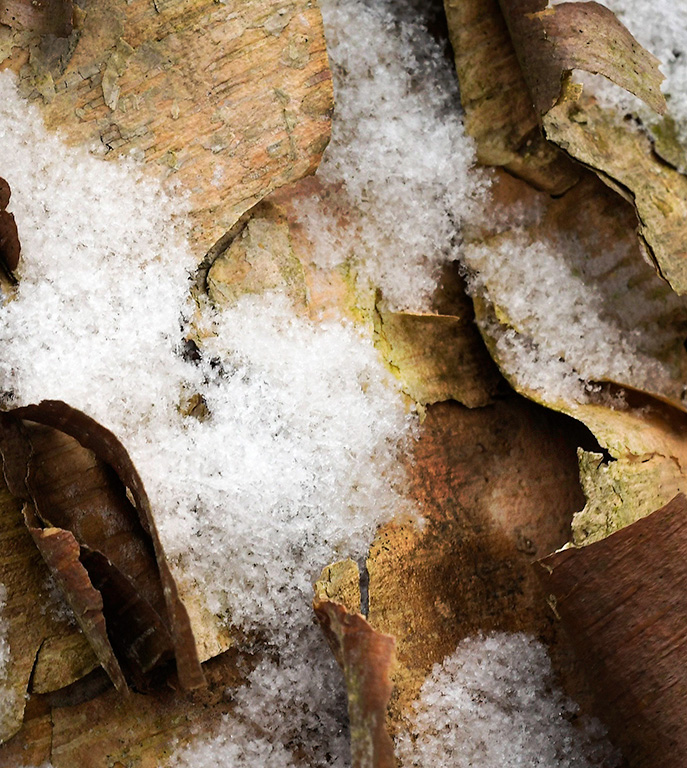
Interesting subject, Bill. I'm wondering what area this represents - based upon the snow crystals it must be fairly small.
I agree with Bob about creating more depth with targeted dodging and burning. I've taken the liberty to apply a bit as demonstration.
|
Mar 10th |
 |
| 95 |
Mar 20 |
Reply |
I'm undecided about the petals on the left, too. And, yes, it's a little crowded at the top, but I didn't notice it until the stack was done. I suppose I should have fudged it a bit, but, then again, felt that the important focal point was the pistil, followed by the stamen. Decisions, decisions. d;¬{D |
Mar 3rd |
2 comments - 5 replies for Group 95
|
13 comments - 11 replies Total
|