|
| Group |
Round |
C/R |
Comment |
Date |
Image |
| 6 |
Feb 20 |
Reply |
I added a layer below the image that I filled with black. Then I selected the flower, added a layer mask and, viola, a black background.
I have several black things I place behind the subject, but they almost always come out looking lighter than black. |
Feb 19th |
| 6 |
Feb 20 |
Reply |
I have to wholeheartedly agree with Dick on this. The three small circles would be too small in the image if all of the pencils were shown. |
Feb 19th |
| 6 |
Feb 20 |
Comment |
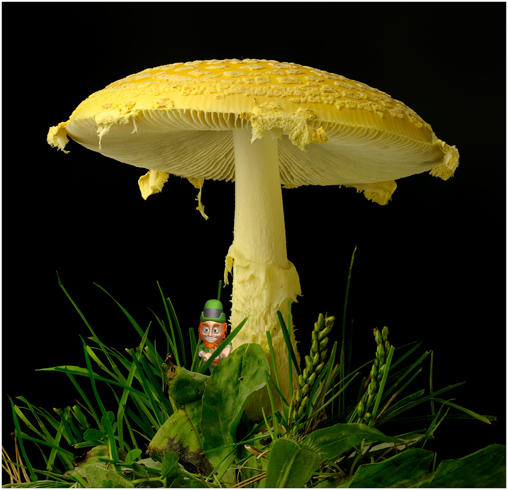
Just because I was in a playful mood, I decided to add a little surprise to your image. Be sure to click on the thumbnail to see it larger. d;¬{D |
Feb 19th |
 |
| 6 |
Feb 20 |
Comment |
As usual, Dick, you have demonstrated your mastery of the camera and post-processing. How could anyone suggest changes to something that's complete? Bravo!!! |
Feb 19th |
| 6 |
Feb 20 |
Comment |
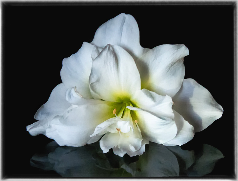
This is absolutely gorgeous, Janet. The reflection, the lighting, the border - definitely an image that belongs on the wall!
Only minor improvement I can suggest is a little dodging and burning on the petals to add a touch more depth. |
Feb 19th |
 |
| 6 |
Feb 20 |
Comment |
I have seen a lot about the Adaptalux system lately, especially for macro subjects. The flexibility of the light arms allows for a lot of control of your lighting it would appear. A bit rich for my wallet, but I can dream. d;¬{D |
Feb 19th |
| 6 |
Feb 20 |
Comment |
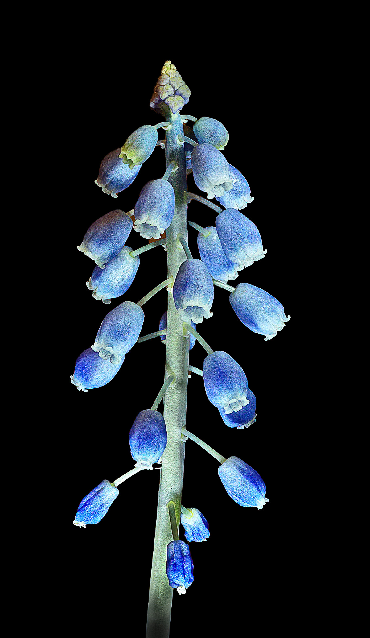
Great subject - I envy you the opportunity.
Aside from the issue of the background being a bit busy, I felt it was also too bright. I also noted that the subject has some noise present, perhaps from too much sharpening.
I ran it through Topaz AI Denoise, removed the background, added some contrast and a touch of sharpening. What do you think? |
Feb 19th |
 |
| 6 |
Feb 20 |
Comment |
Lovely flower! As others have said, the only flaw here is the ever-exposure of the center.
I took the liberty of replacing the grey background with black, adding some contrast, and then applied selective dodging and burning to add depth. Thoughts? |
Feb 19th |
 |
| 6 |
Feb 20 |
Reply |
By the "whole circle" do you mean zoomed out to the other ends of the pencils? |
Feb 18th |
| 6 |
Feb 20 |
Reply |
Some day I'll get me one of those. I keep saying that, but I guess it's time to do something about it. d;¬{D |
Feb 16th |
| 6 |
Feb 20 |
Reply |
It's almost too many choices. d;¬{D |
Feb 14th |
| 6 |
Feb 20 |
Reply |
It was very spur-of-the-moment, and my wife was very gracious to let me touch her pencils before she got to use them. d;¬{D |
Feb 12th |
| 6 |
Feb 20 |
Reply |
You're right, of course, that there is an infinite range of possibilities with these pencils. I took these straight out of the box - would never modify my wife's art tools, ESPECIALLY before she gets to touch them. d;¬{D |
Feb 8th |
| 6 |
Feb 20 |
Reply |
Now I'm wondering what your image looks like. d;¬{D |
Feb 3rd |
6 comments - 8 replies for Group 6
|
| 11 |
Feb 20 |
Comment |
Fascinating result, Henry! I love the contrast between light and shadow presented here, with your light areas bright but not over done. Definitely a piece for the wall! Bravo! d:¬{D |
Feb 20th |
| 11 |
Feb 20 |
Comment |
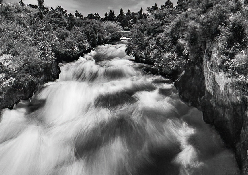
You definitely captured the turbulence, and mono puts the emphasis there rather than the surroundings.
I agree with Henry about the slight tilt. I do have a problem with the noise in the trees, which is quite heavy closest to the bottom.
I corrected the tilt, applied some denoise only in the areas needed, and did some spot dodging and burning in the water. |
Feb 20th |
 |
| 11 |
Feb 20 |
Comment |
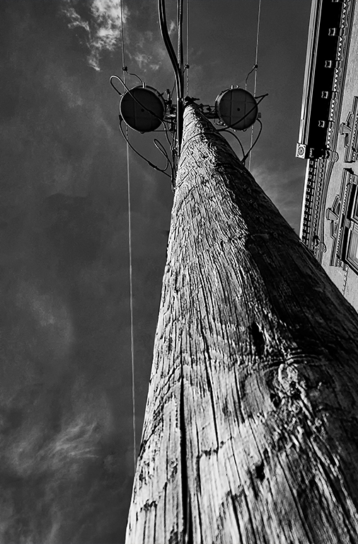
Definitely mono for this image, Jim, and it was a good idea to remove the sign. The perspective is quite disconcerting at first, as though some strange creature is staring at me. Quite startling, actually.
I think there's a battle for focus here between the pole and the building. I tried cropping out most of the building and I think this might work better. Thoughts? |
Feb 20th |
 |
| 11 |
Feb 20 |
Comment |
Stunning, simply stunning! Mother and child, with everything else stripped away. At first glance, it seemed burned out, but in a moment, the contented glow in the mother's face drew me in and held me captive. Monochrome was the perfect presentation and your crop gave us exactly what we needed to see the story. Bravo, Sharron! If I needed a maternity shoot, I'd pick you. d;¬{D |
Feb 20th |
| 11 |
Feb 20 |
Comment |
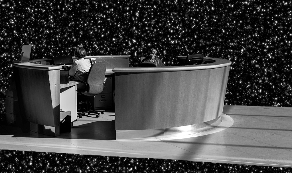
This has an other-worldly feel to it - the desk is so isolated and disconnected from everything, as if they were on a precipice.
With that in mind, I replaced the black with a starfield. Thoughts? |
Feb 19th |
 |
| 11 |
Feb 20 |
Reply |
I do believe you added the necessary finishing touches to Victor's image. Great eye! d:¬{D |
Feb 19th |
| 11 |
Feb 20 |
Comment |
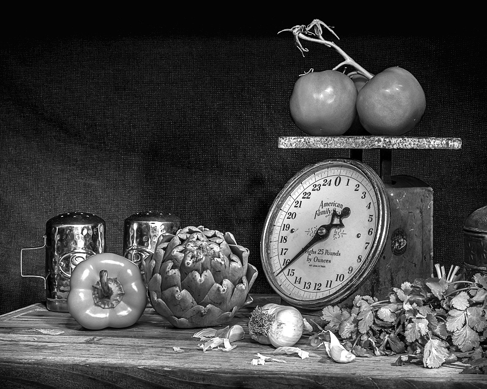
I must agree with Allen about the flatness of your result.
I took a different route - I did boost contrast some, then brightened the subject and darkened the background using curves. A little bit of sharpening finished the process. |
Feb 19th |
 |
| 11 |
Feb 20 |
Comment |
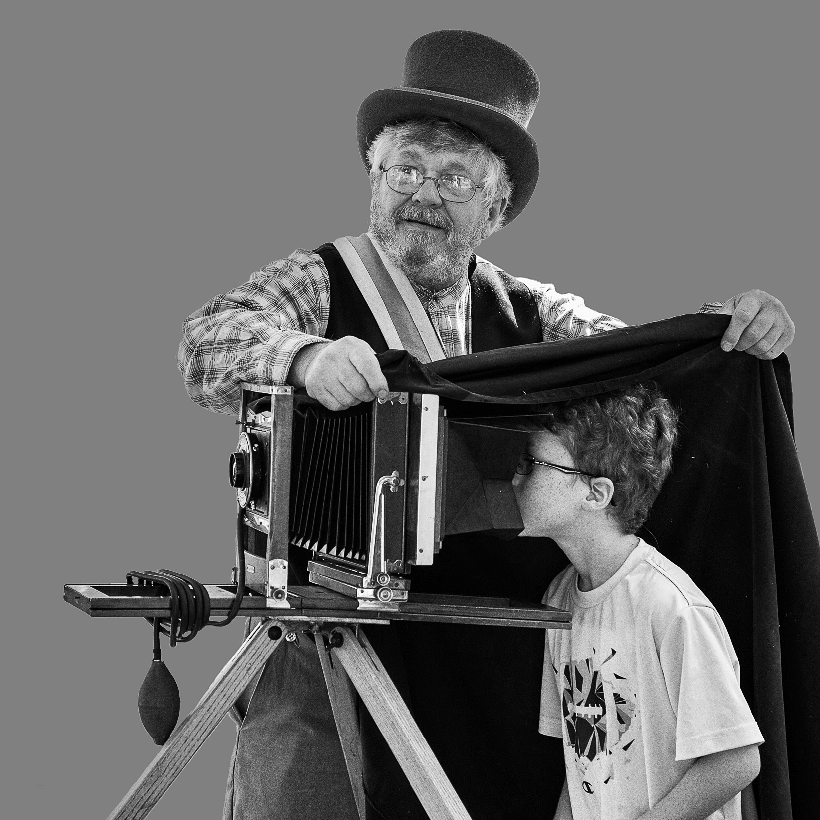
This is so much fun - really tells a good story!
I do find the canvas behind them distracting. Here's a version with a 50% grey background and a bit of space added on the top and left. Thoughts?
|
Feb 19th |
 |
7 comments - 1 reply for Group 11
|
| 53 |
Feb 20 |
Reply |
LOL! And they work for kibble! d;¬{D |
Feb 20th |
| 53 |
Feb 20 |
Reply |
All the best with that! |
Feb 17th |
| 53 |
Feb 20 |
Reply |
Duplicated the image; selected just the sun and copied it to its own layer; cloned it out of the duplicate of the image; moved the isolated sun layer just off the cables; added a bit of soft glow around the sun by adding a layer, using the elliptical marquee tool to select a circle larger than the sun with a feather of 50 pixels, filling that with white and reducing the opacity a lot so that it was just a hint. |
Feb 16th |
| 53 |
Feb 20 |
Comment |
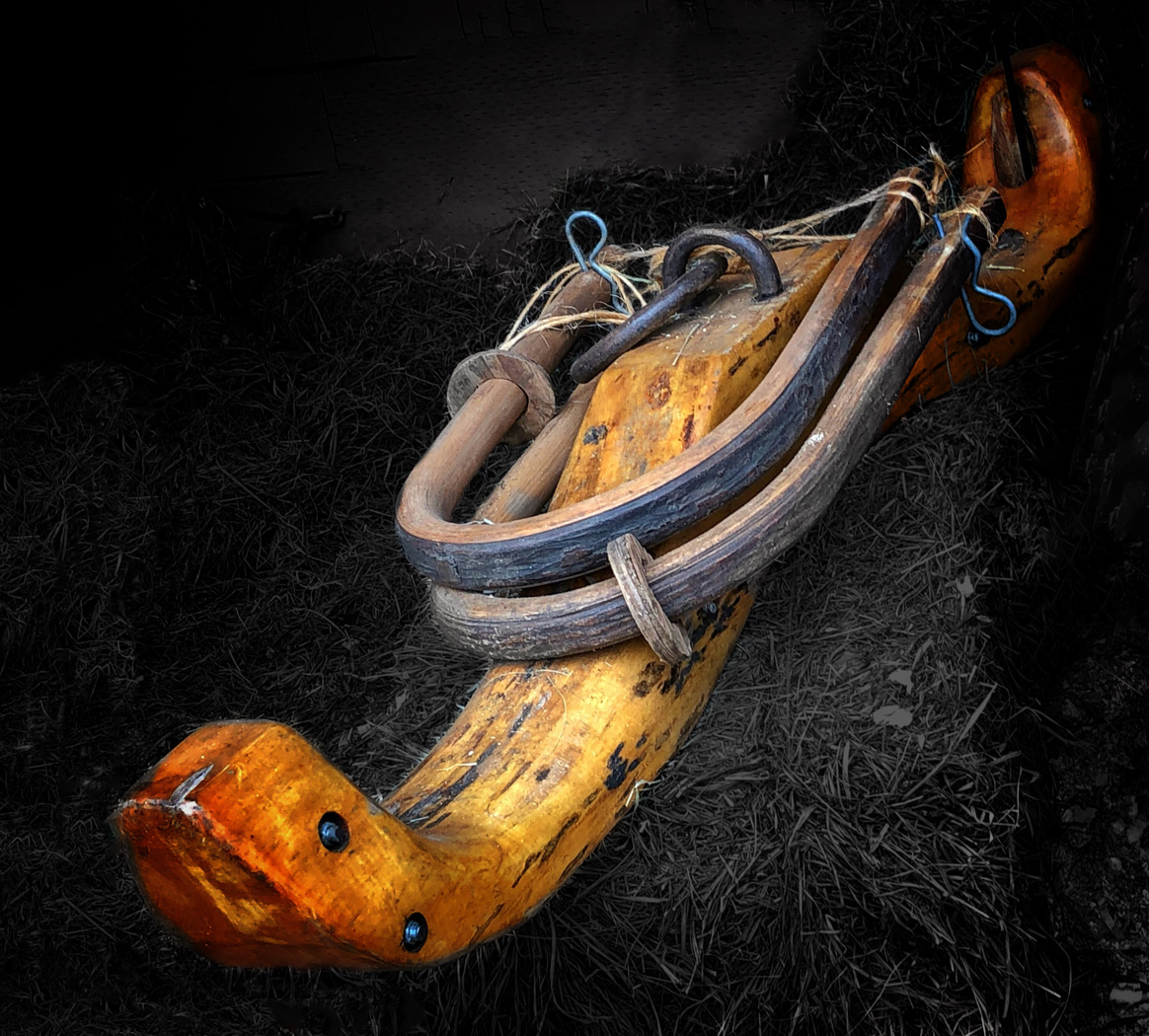
This is so different and fascinating to study. I like that you desaturated everything but the yoke - it stands out better that way.
The thing that bugged me the most was that the yoke was in contact with the left edge of the image. So, I added some space to the left of the yoke by expanding the crop and having it content-aware fill the new space. Then, I darkened the hay around the yoke so it would pop even more. What do you think? |
Feb 16th |
 |
| 53 |
Feb 20 |
Comment |
This image is poetic! The different lines, shapes, tones & textures make for such a wonderful image. If you even consider doing anything more to this image, it would be a crime. Bravo!!! d:¬{D |
Feb 16th |
| 53 |
Feb 20 |
Comment |
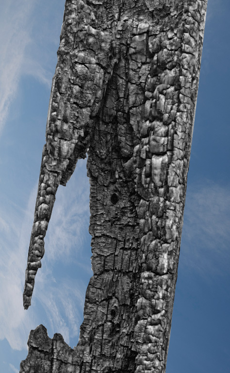
What a great find, Brenda! There's so much to study in the charred remains of this tree - so striking!
I agree that monochrome is a natural choice for this subject, but I found the background really took away from the tree. So, I masked out the background and replaced it with a blue sky with wispy clouds. Thoughts? |
Feb 16th |
 |
| 53 |
Feb 20 |
Comment |
What an amazing capture! I definitely don't think you should crop anything, as the buildings give needed context. Great moment, without a doubt.
Yes, you knew I had to try . . . here's my rendition with the sun nudged over just enough to move it off the cables. Thoughts? |
Feb 16th |
 |
| 53 |
Feb 20 |
Comment |
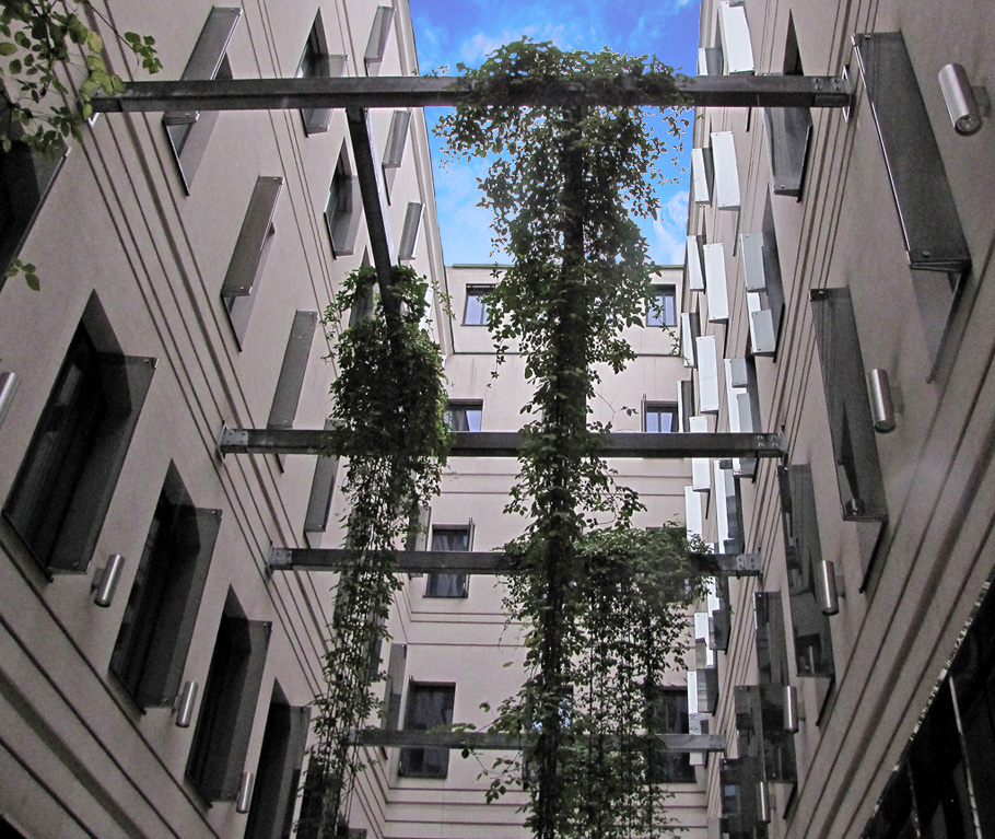
I love the perspective of this image - the converging lines, etc. There's a nice rhythm to it.
I find that monochrome may rob this image of some of that rhythm, so I tried replacing the sky to give it a dash of color at the nexus of those lines. I have some other things I want to experiment with this, but we'll start with this: |
Feb 16th |
 |
| 53 |
Feb 20 |
Comment |
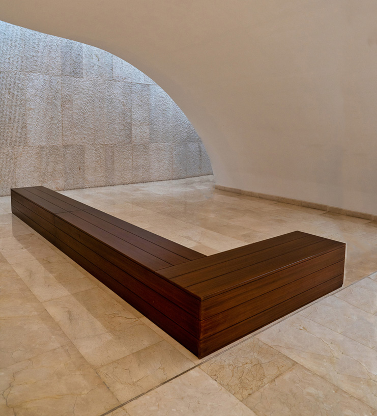
Good eye, Rohan! I love the curves & lines and the variety of textures in this space.
For me, the legs are a distraction rather than a point of interest. Dan's comment puts it well, in that the man is found later, not right away.
With that in mind, I had a try at removing the man, cropping some from the top and adding a little to the right for more of a square view. Thoughts? |
Feb 16th |
 |
| 53 |
Feb 20 |
Reply |
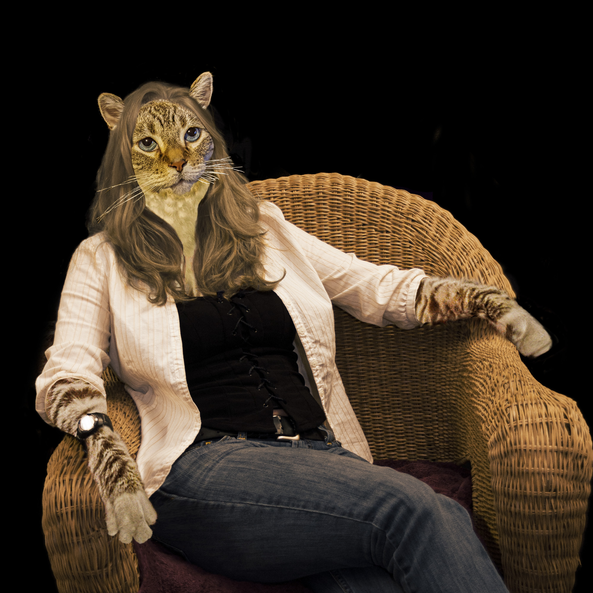
It was a fun afternoon putting it together, for sure. I just added a rework of the image. Please let me know what you think. d;¬{D |
Feb 16th |
| 53 |
Feb 20 |
Reply |
<...purring...> Thanks, Rusty! I've added a rework of the image. Is it any better? |
Feb 16th |
| 53 |
Feb 20 |
Reply |
Thanks, Dan. I've added a rework of the image. Tell me what you think. |
Feb 16th |
| 53 |
Feb 20 |
Comment |
Here's some reworking based upon your feedback. Tell me more! |
Feb 16th |
 |
| 53 |
Feb 20 |
Reply |
Ah . . . good point! I didn't see it until you pointed it out! |
Feb 10th |
| 53 |
Feb 20 |
Reply |
Which hand? |
Feb 10th |
| 53 |
Feb 20 |
Reply |
I see what you mean about the hairline. I'll definitely work on that. Thanks! d:¬{D |
Feb 9th |
7 comments - 9 replies for Group 53
|
20 comments - 18 replies Total
|