|
| Group |
Round |
C/R |
Comment |
Date |
Image |
| 6 |
Jan 20 |
Reply |
Fortunately, she had something there to recover! d;¬{D |
Jan 28th |
| 6 |
Jan 20 |
Reply |
I suppose I over-reacted to Dick's comment.
Thank you for your thoughtful comments about my image and freedom of expression.
Stacking, which is short for focus stacking, involves taking a series of images where each image is focused deeper into the subject. These images are then “stacked” together, revealing the in-focus parts of each image merged together into one image. Another way to look at it is a series of slices of the subject that are then assembled together into the whole subject.
This is done because getting so close to a subject, like the boxelder bug in this case, results in a very shallow DOF. In order to capture everything in focus, a single image will have some areas out of focus. The best solution we have is to take several images, each focused a little closer to the subject, so that, when assembled in Photoshop or another piece of software like Helicon Focus, every part of the subject will be in focus.
I hope my explanation makes a little sense. I'm sure Dick can explain it better. |
Jan 27th |
| 6 |
Jan 20 |
Reply |
Thank you, Salvador! |
Jan 21st |
| 6 |
Jan 20 |
Reply |
Thanks, Janet. These bugs are a major nuisance around here (midwest), showing up at the end of summer. They are very good at making their way into homes. |
Jan 21st |
| 6 |
Jan 20 |
Comment |
As usual, Dick, your botanical images are near to perfection. We all enjoy the exquisite detail of your stacks - you set a very high benchmark for us. |
Jan 14th |
| 6 |
Jan 20 |
Comment |
This really pops, Janet. Long study does reveal very minor flaws, but I think this image has great impact and the colors really pull the viewer in. Well done! d:¬{D |
Jan 14th |
| 6 |
Jan 20 |
Comment |
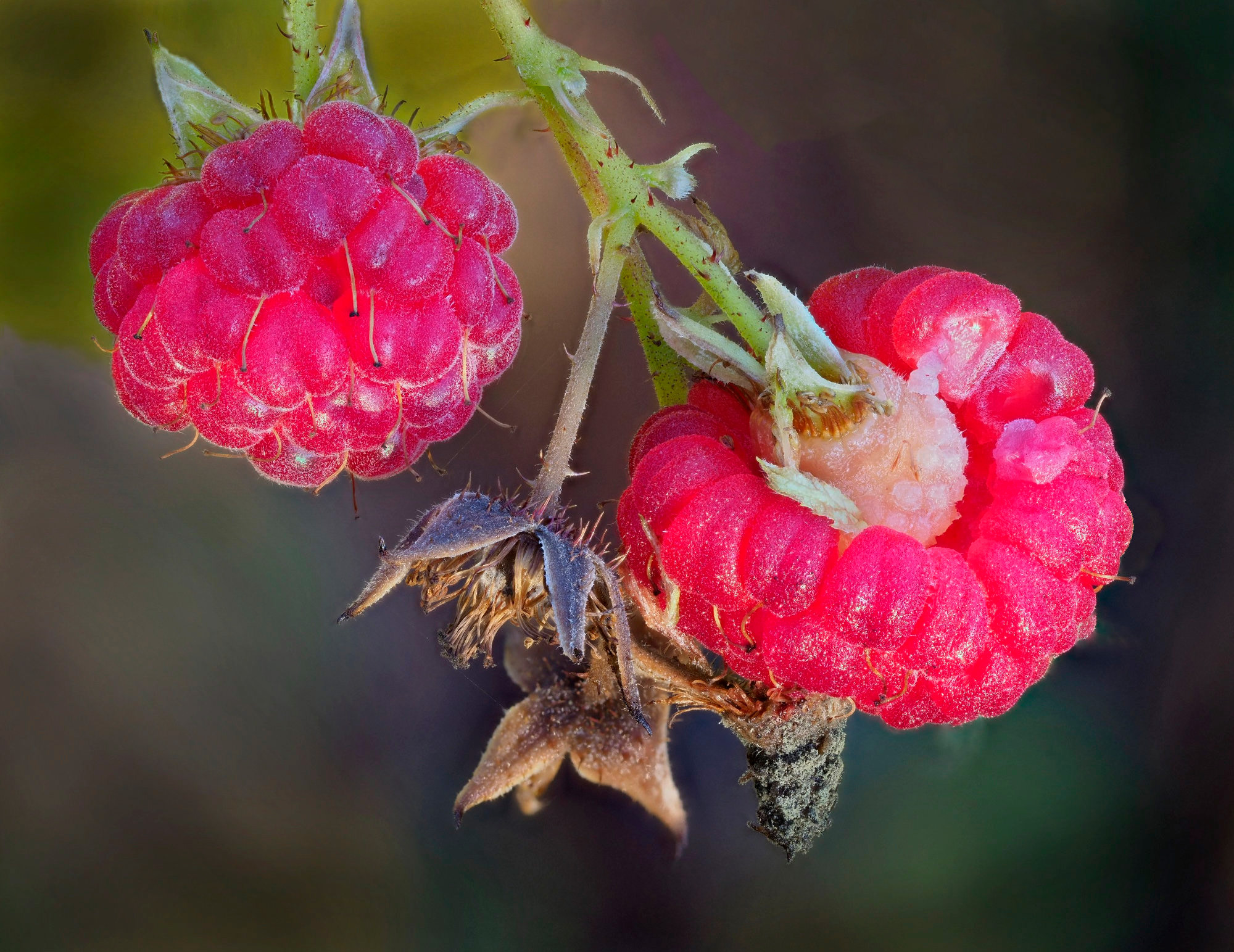
Great stack, Stuart! Amazing detail throughout the berries, yet nice bokeh in your background.
For me, while the leaf adds some context, I think the composition is hurt by the inclusion of the leaf, which pulls some focus away from the berries. |
Jan 14th |
 |
| 6 |
Jan 20 |
Comment |
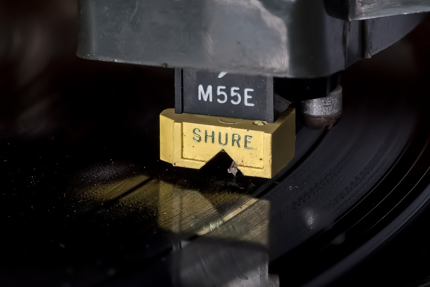
Wonderful idea for a macro subject and your capture has great detail and tonality. Like Stuart, I am distracted by the bright triangle at the top and, also, the blob of grey near the bottom. For me, cropping these out should help address these points. |
Jan 14th |
 |
| 6 |
Jan 20 |
Reply |
I had a huge collection of vinyl for many years and, owing to my name, ALWAYS used Pickering cartridges. d;¬{D |
Jan 14th |
| 6 |
Jan 20 |
Comment |
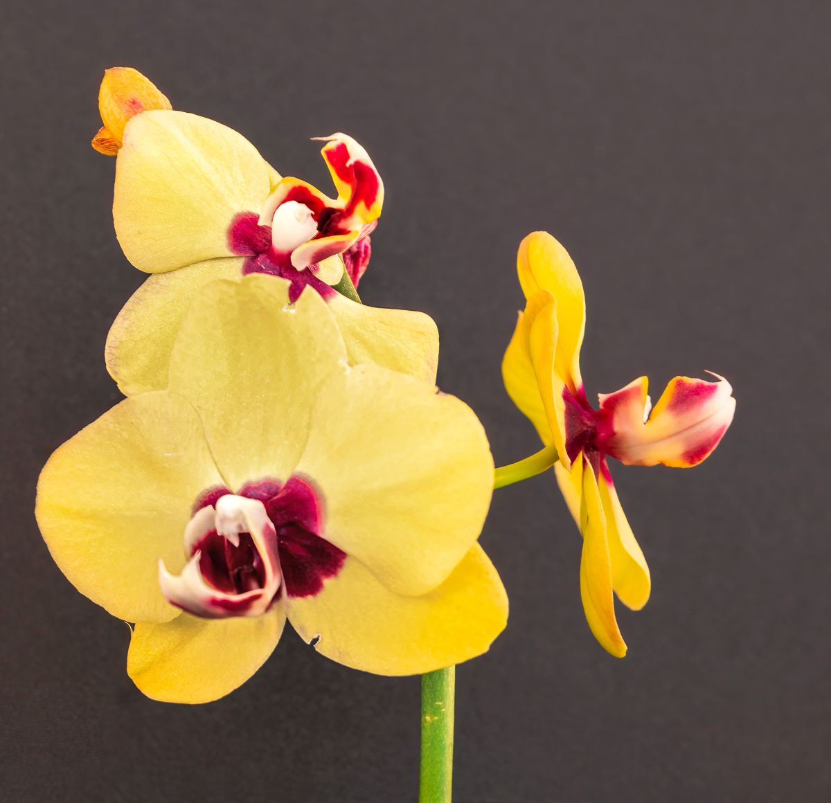
I certainly can't add any more useful suggestions for capturing images as Stuart and Dick have given you (and the rest of us). What I can do is suggest ways to rescue your image.
I processed your image in Topaz Sharpen AI to sharpen the focus some, then into ACR to reduce the highlights & exposure of the main orchid; add some contrast, clarity & texture to it. Finally, I did a little dodging and burning to add a tiny amount of dimension to it. Thoughts? |
Jan 14th |
 |
| 6 |
Jan 20 |
Reply |
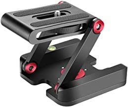
Rather than a full-on tripod, which of course is preferred, you could get something like this for table-top use:
https://www.amazon.com/Neewer-Folding-Aluminum-Compatible-Camcorder/dp/B07GF9C2SY/ref=sr_1_14?crid=1OTD6B7T94JT7&keywords=tripod+heads+for+cameras&qid=1579030810&sprefix=tripod+heads%2Caps%2C300&sr=8-14
I have a similar one and it's quick and easy for certain situations and would be easier for you to manage while you heal. |
Jan 14th |
 |
| 6 |
Jan 20 |
Comment |
This is where I've taken this image so far: |
Jan 14th |
 |
| 6 |
Jan 20 |
Reply |
Poor word choice on my part, for which I apologize. I'll admit to feeling chastised for my subject choice and I wasn't expecting that from you.
Ultimately, my goal with this insect was to be able to study it in a manner I cannot with the naked eye and present it as well as possible with the editing skills I possess. I didn't know if there was any value in pursuing this image further, and thus I opened it up for feedback. This is my understanding of the purpose of these study groups. If you prefer that we do not use dead subjects in this group, be assured I won't do that again. |
Jan 14th |
| 6 |
Jan 20 |
Reply |
Yes, alas, this is a deceased boxelder bug. I came upon it while cleaning the windowsill above our bed that always has curtains drawn. I had never captured one, so I thought it a colorful subject to get a macro shot of. Sorry if it offends you, certainly not my intent. I wasn't aware of any rules about insect captures only being live. I don't normally seek out dead things to photograph. d:¬{( |
Jan 14th |
| 6 |
Jan 20 |
Reply |
As you surmised about the right antenna, it is angled away from the camera. |
Jan 13th |
6 comments - 9 replies for Group 6
|
| 11 |
Jan 20 |
Comment |
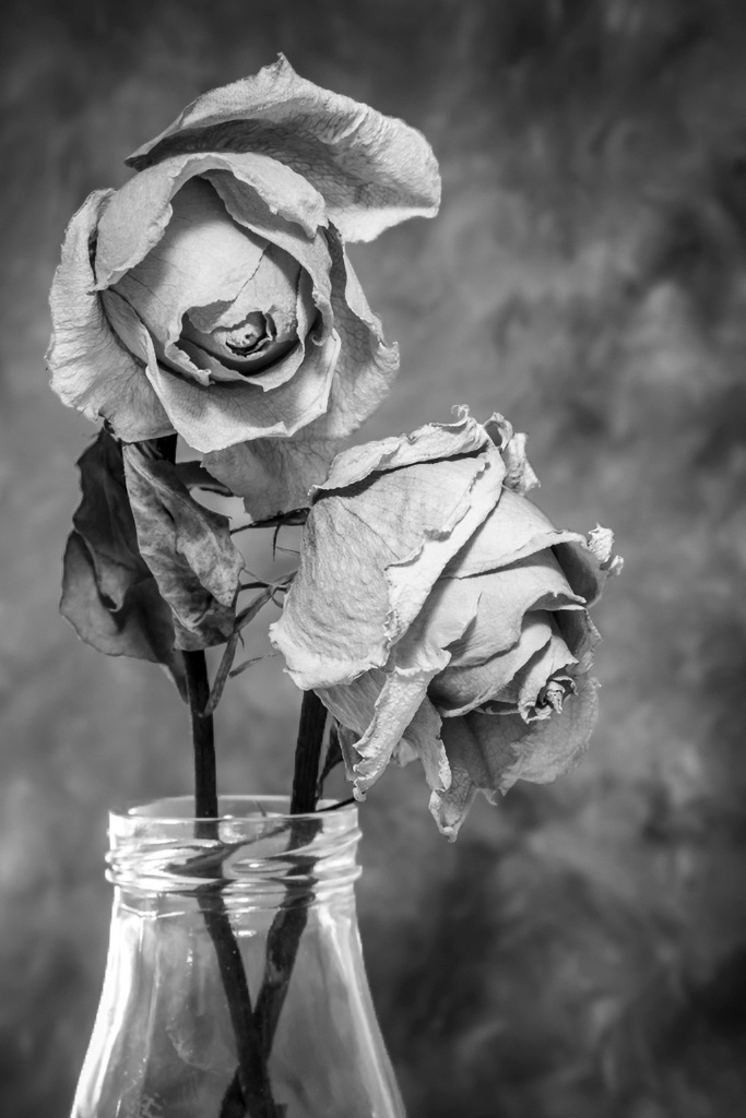
I had a chance to pull your image into PS today and removed the sepals. While there, it occurred to me that the background was a little bright, so I darkened it some to help the roses stand out a bit more. Thoughts? |
Jan 14th |
 |
| 11 |
Jan 20 |
Comment |
I'm a sucker for roses and do agree that mono really brings out the texture that color conceals. I also agree with Henry's balancing of the right rose to match the tone of the left one. My only other suggestion would be to clone out the 2 sepals - the one at the left side and top of the left-hand rose. I feel they interrupt the curve of the flower. |
Jan 13th |
| 11 |
Jan 20 |
Comment |
What did you use for your conversion, Jim? |
Jan 7th |
| 11 |
Jan 20 |
Reply |
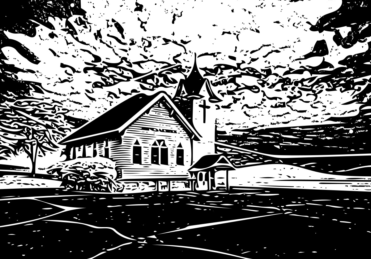
Oh, I completely agree about the church being in the middle. The only way to correct that would be a different angle when capturing. I also find the asphalt very interesting, but overpowering to your subject.
I had to try Photoshop CC's new feature within their Libraries tool and turned your image into a shape - sort of a woodblock from your image. What do you think? |
Jan 6th |
 |
| 11 |
Jan 20 |
Reply |
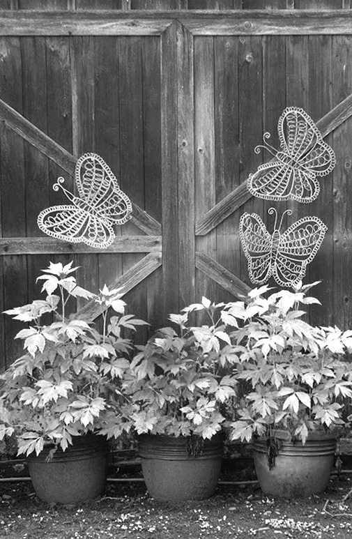
Here's my conversion using those saturated colors: |
Jan 6th |
 |
| 11 |
Jan 20 |
Comment |
Your image has great exposure and detail, and your crop establishes a good composition. I do find this a bit flat tonally. Monochrome is all about lights and darks and the contrast between the two. Sometimes, when planning for a mono conversion from color, it's best to boost the saturation of certain colors in advance so that there's more control of the shading when you convert.
This is your original with the greens and red over-saturated: |
Jan 5th |
 |
| 11 |
Jan 20 |
Comment |
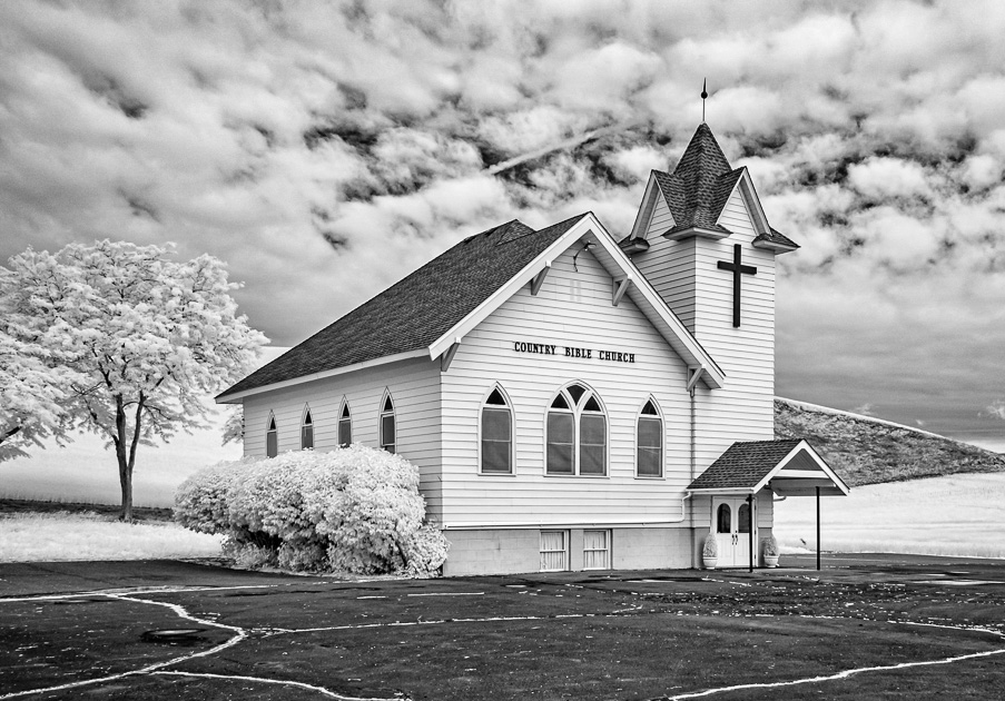
Excellent capture, Henry! I've never done IR myself, but iot's fascinating to see the different perspective it gives when the greens become white.
I instantly noticed the lines in the asphalt and that becomes the focal point of the image, but I wonder if that's what you really intended. As the rest of the image is largely white, the seeks refuge in the dark areas initially. I also found the darker ground to the right out of place in this IR view.
I suggest cropping some from the bottom and right to focus the eye on the church and increase the contrast a bit to better differentiate the church from its surroundings. |
Jan 5th |
 |
| 11 |
Jan 20 |
Comment |
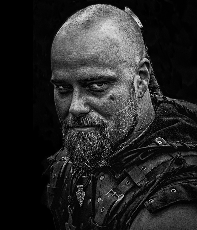
I used to be one of those characters back in my 20's in California, actually choreographing sword fights for the stage and streets of the Faire.
You definitely achieved a gritty look with this image, telling a story of a man who's seen a lot of blood, guts & gore in his career as a soldier. Powerful!
That said, here come my nitpicky observations: there is some natural haloing around his face that is getting emphasized by the conversion; his right eye is rather dark; and he's crowded against the left edge of the image.
I removed the background, added some space to the left side of the image and did my typical dodging and burning to bring out his eyes and add some depth to his face. Thoughts? |
Jan 5th |
 |
| 11 |
Jan 20 |
Comment |
I think the reason this image did not do so well is your subject feels compressed or squeezed by the angle of the shot and the fact that the road was quite narrow. Also, though it naturally has a leading line, this line leads the viewer out of the image instead of into it. Stephen's horizontal flip really doesn't help, because most of us prefer lines that go left to right and it does not correct the compression.
I think Victor has the right idea, creating portraits from the clusters of people in the caravan. There's a lot to work with here and I can see many images coming out of this capture. d;¬{D |
Jan 5th |
| 11 |
Jan 20 |
Comment |
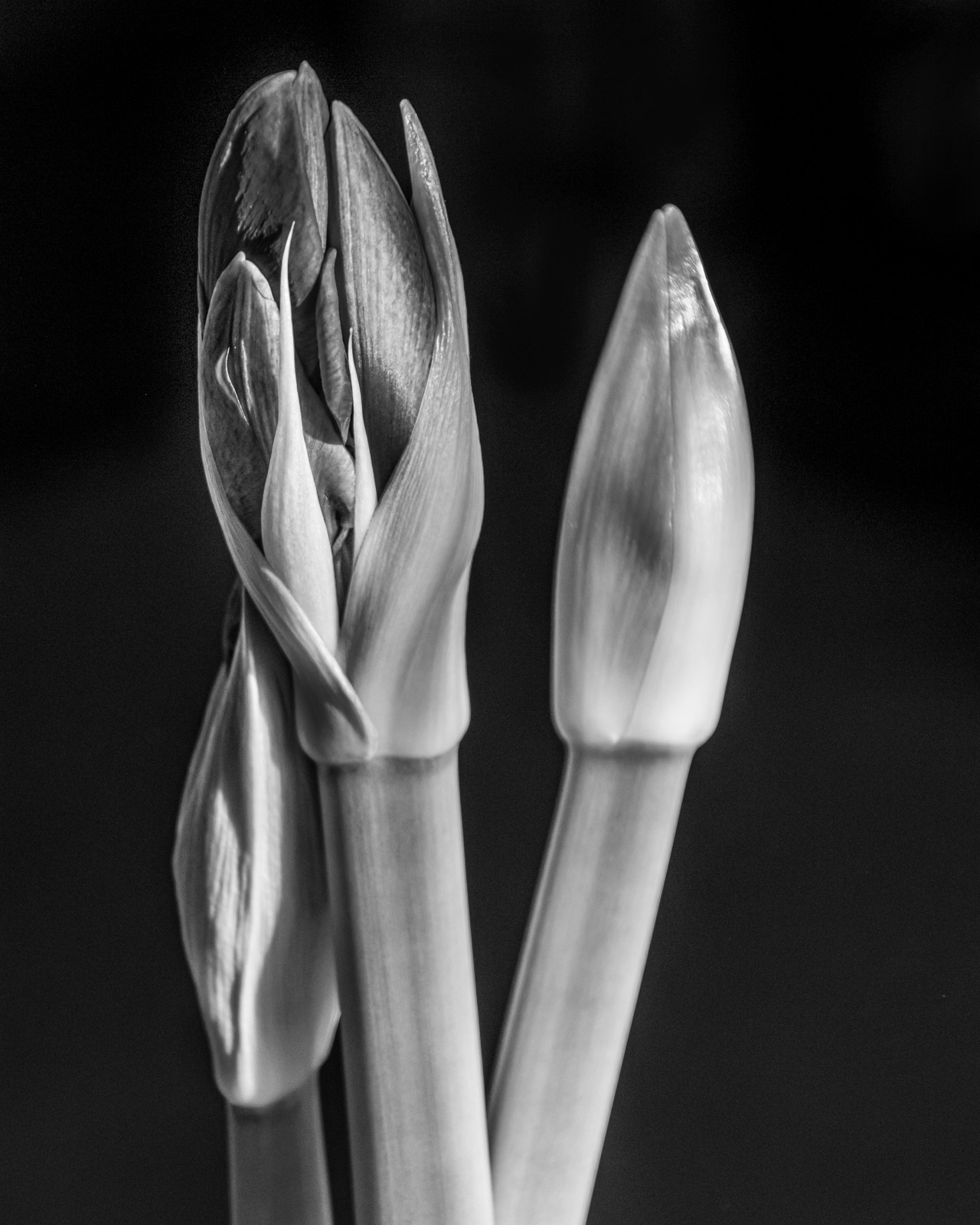
I love this! Such a great subject for a mono study.
The only thing I see this needs is a bit more depth, since the conversion flattened the image slightly. This can be accomplished with some targeted dodging and burning. |
Jan 4th |
 |
8 comments - 2 replies for Group 11
|
| 53 |
Jan 20 |
Reply |
I will have a go at that. We'll see what I can do. d;¬{D |
Jan 13th |
| 53 |
Jan 20 |
Comment |
This is just luscious, Brenda! The composition you chose displays the bridge so well and the treatment you chose is very fitting. I think this is ready for the wall and I can't think of anything to suggest to improve it. |
Jan 6th |
| 53 |
Jan 20 |
Comment |
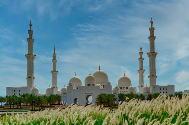
Miriam was thinking the same as I. Your image, as presented, focuses on the wind-blown plants in the foreground, which dominates the scene. I'm also bothered by some vertical streaking in the sky.
I cropped it similarly to Miriam and then took it into Luminar 4 and replaced the sky with something similar but without that streaking. Thoughts? |
Jan 6th |
 |
| 53 |
Jan 20 |
Reply |
Here you go: |
Jan 6th |
 |
| 53 |
Jan 20 |
Comment |
Here's a version with the buildings straightened and a more subtle sky: |
Jan 5th |
 |
| 53 |
Jan 20 |
Reply |
I agree that you were much more subtle with your sky change and that makes more sense. Guess I lost my way. d:¬{( |
Jan 5th |
| 53 |
Jan 20 |
Reply |
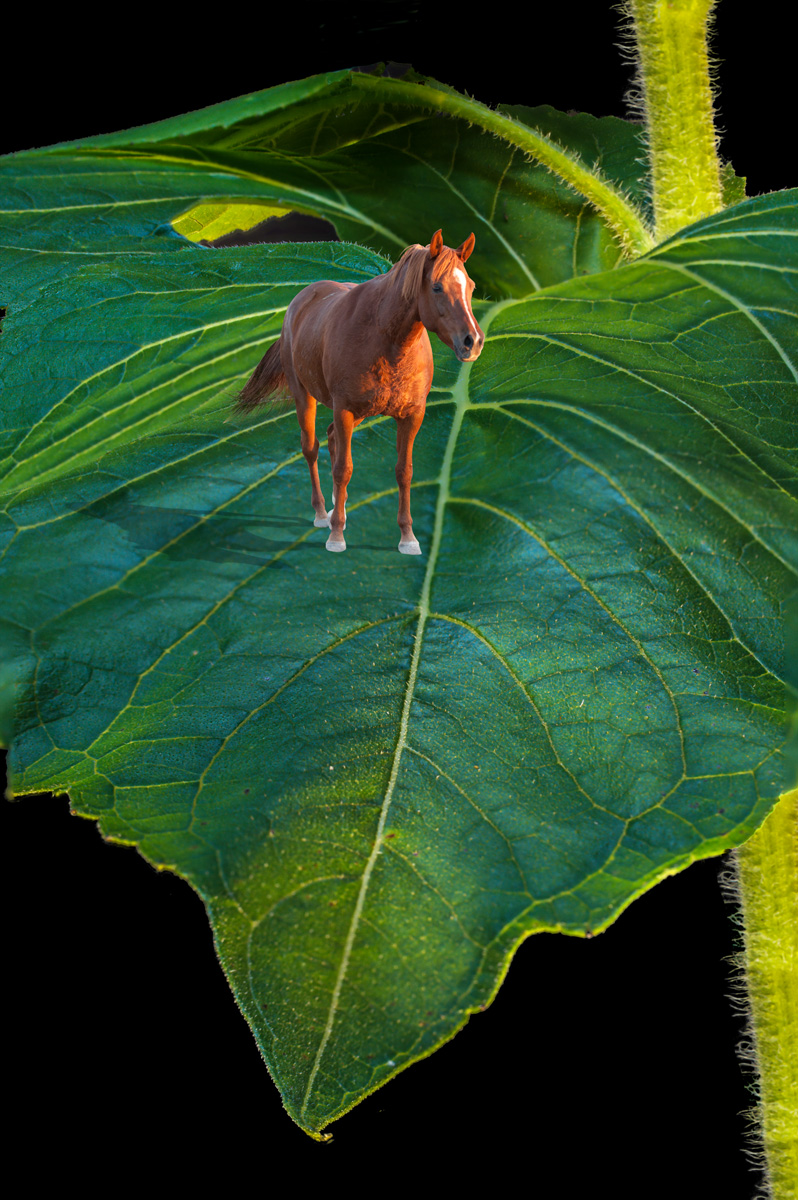
Wow, I didn't know they were available on the Emerald Isle! d;¬{Ã�
I think I got the gist of what you're showing me. Is this what you intended? |
Jan 5th |
 |
| 53 |
Jan 20 |
Reply |
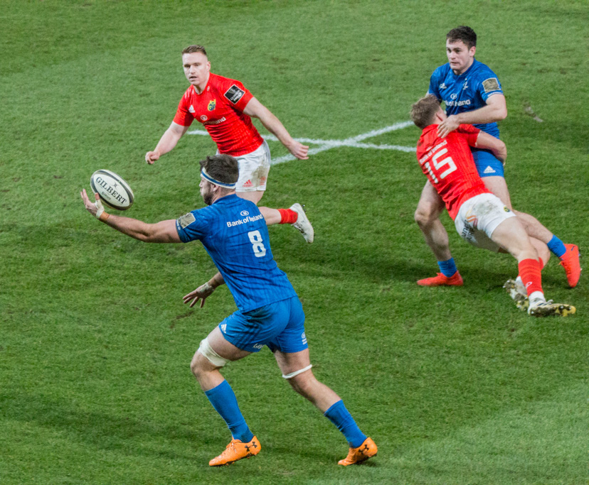
Your crop makes for a stronger focus on what's happening close to the ball, but including the other 2 players tells more of the story, especially for those unfamiliar with rugby.
My dad was a rugby champion in college, but I have never watched a game. From what little I have seen, it looks like it could be a rather brutal sport, especially without all the protective gear that American football players have. Definitely too physical for me, even when I was a younger man. d;¬{D |
Jan 4th |
| 53 |
Jan 20 |
Reply |
Almost every lens introduces some distortion, especially wide-angle lenses, or point 'n shoot cameras focused for a wide shot. This is called barrel distortion, where edges start to round in the shape of a barrel. Most programs like Lightroom, Adobe Camera Raw (in essence the engine of Lightroom's Develop module), On1 Photo Raw, Capture One, etc, have ways to autocorrect this sort of lens distortion. There are also tools in programs like Photoshop to modify an image to correct this, which is what I chose on Rusty's image. |
Jan 4th |
| 53 |
Jan 20 |
Comment |
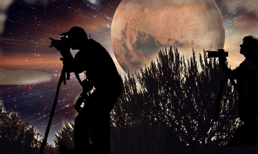
That's so cool, Arabella! I agree with Miriam about the story, as though the photographers are missing an amazing picture to the side of them. Or maybe, what they're photographing is even more fantastic.
For me, the "noise" from the original sunset picture doesn't totally fit the look of this image, and the blobby vignette looks kinda like a mistake. I darkened the photographers and removed the vignette from the bottom. Thoughts? |
Jan 4th |
 |
| 53 |
Jan 20 |
Comment |
You hit this one out of the park, Dan! Everything is spot on: your exposure, focus, tonality, composition and story. You definitely have a winner and I'll be looking forward to more from this series. d:¬{D |
Jan 4th |
| 53 |
Jan 20 |
Comment |
Yes, this is a great action shot! You captured great exposure, detail, and story here, and the colors really pop! I do feel like there's too much open space to the left of the action, which places that action in the center, thus weakening the composition. Cropping a little from the left should correct that: |
Jan 4th |
 |
| 53 |
Jan 20 |
Comment |
That must have been quite a trip, Rusty. Closest I've been to being out of the country was a day trip to Juarez, Mexico - not something that inspired me to try it again.
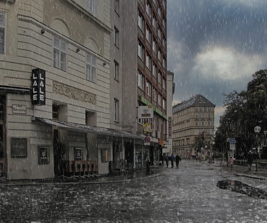
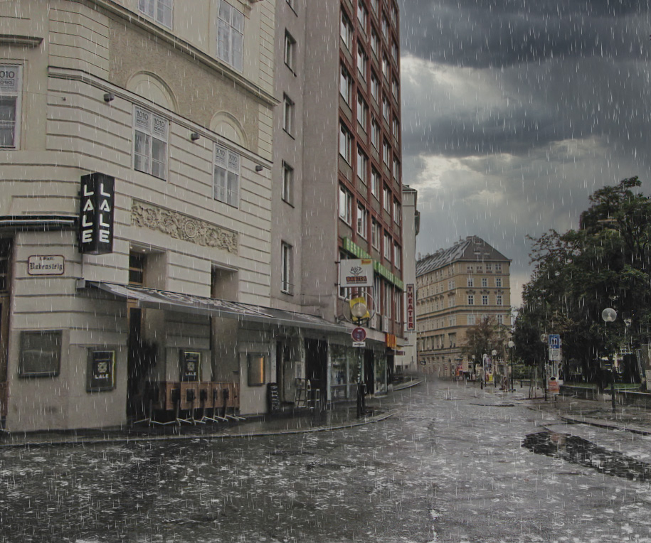
I like the mood of this image, but feel it lacks focus. The bright sky in the upper right is a bit overpowering. The people draw one's focus a bit, but they are far enough away to leave me searching for something else. I also find that the building on the far left is distorted inward some, which is distracting.
I decided to do something a little different to this image to create a different story. First, I removed the people. Next, I compensated for the distortion in the building with the Warp portion of the Free Transform tool. Then the fun really began . . .
I took the corrected image into Luminar 4 and used its AI Sky Replacement filter to add stormy clouds to the sky. Then, into AutoFX's GRFX Studio to add rain puddles to the ground and falling rain to the scene overall. Thoughts? |
Jan 4th |
 |
| 53 |
Jan 20 |
Reply |
Hmmm . . . Perhaps shrinking the horse a bit will give him some more headroom. Hmmm . . . |
Jan 4th |
| 53 |
Jan 20 |
Reply |
Can you expand on these points? |
Jan 4th |
7 comments - 8 replies for Group 53
|
21 comments - 19 replies Total
|