|
| Group |
Round |
C/R |
Comment |
Date |
Image |
| 6 |
Dec 19 |
Reply |
I actually considered that, but it seemed like I was losing too many petal ends in the process. Hmmm. |
Dec 18th |
| 6 |
Dec 19 |
Reply |
Frequency Separation allows you to work on color and texture separately. To work on the hot spots, you would use colors from the surrounding areas to the hot spots to heal them without affecting the texture.
https://affinity.help/photo/en-US.lproj/pages/Retouching/retouch_frequencySeparation.html |
Dec 14th |
| 6 |
Dec 19 |
Reply |
You certainly demonstrated the full DOF in your stack. I was looking at it more from the visual impact point of view. d;¬{D |
Dec 14th |
| 6 |
Dec 19 |
Comment |
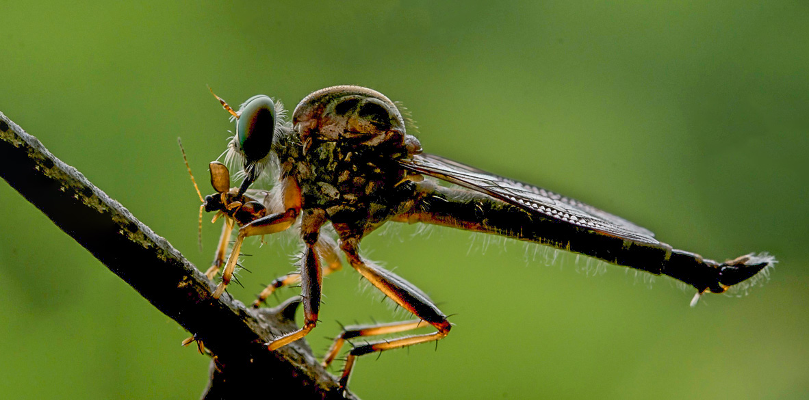
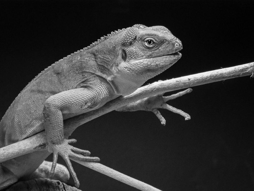
Well, Larry covered it very well. I have to agree that, as an experiment, you've likely learned a great deal. If you intended for us to check out this creature's wings, you could have included less of the scene so that became the definite subject.
I wanted to see more of the total scene, so took your image into ACR and lowered the whites & highlights, boosted the shadows and blacks, and applied a bit of sharpening to bring those minute hairs into view. As Larry suggested, I added a bit more room on the left. What do you think? |
Dec 14th |
 |
| 6 |
Dec 19 |
Comment |
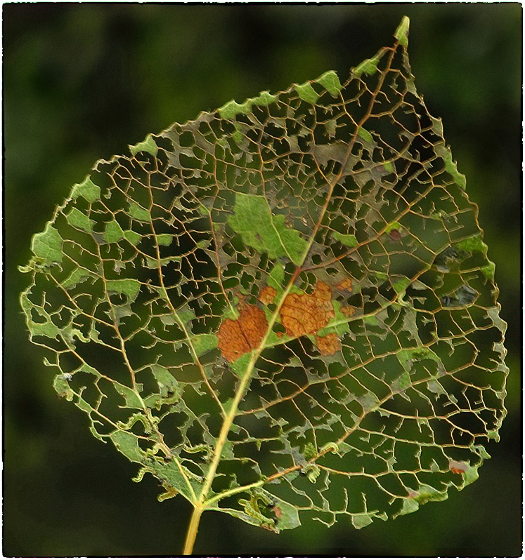
Another amazing subject for macro! Exquisite detail and pops so well against the black! A textbook Richard States botanical, indeed. You are the master and we, the students. d;¬{D |
Dec 14th |
| 6 |
Dec 19 |
Comment |
I might not have noticed the worms without your description as they are VERY tiny. Once I did see them, I see that there are ten of them - they've been very busy indeed.
For being captured with a point n shoot camera, you got some great detail and this is very interesting to study.
I tried running this through Topaz Denoise AI which smoothed the background and enhanced the detail a bit, making the worms a little more visible. What do you think? |
Dec 14th |
 |
| 6 |
Dec 19 |
Comment |
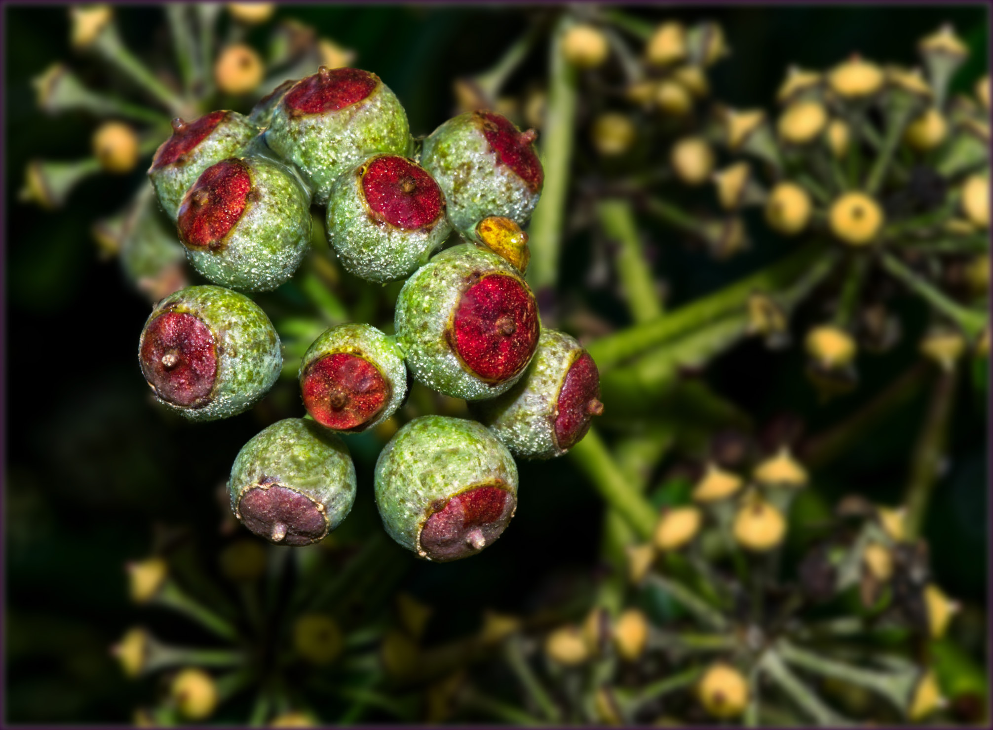
Excellent detail, especially with f14! I don't know if I could have stood around in the cold to do stacks, so a single image would have to do it for me, too.
I found that the flash produced a lot of hot spots on the berries which were distracting, as were the yellow buds around the berries. You might consider adding some sort of diffusion to your flash set up to minimize those hot spots in the future.
I added a slight blur and darkening to everything but the berries, than did some frequency separation to correct the worst of the hotspots. What do you think? |
Dec 14th |
 |
| 6 |
Dec 19 |
Comment |
Great detail throughout, Salvador! Your stack was successful.
I found the image a bit too hot for my eyes. By adding some contrast I think it will balance the tones a little better. I also found the metallic surface that shows in the bottom left corner to be a bit of a focus draw - perhaps cropping that out would help. Here's my attempt at these suggestions: |
Dec 14th |
 |
5 comments - 3 replies for Group 6
|
| 11 |
Dec 19 |
Comment |
Welcome to DD and to Mono group 11, Henry! You certainly started off with a bang! Great composition, detail, exposure and tonal range. Your mono conversion turns a nice shot into a real winner, leveraging the tones in the original that are lost in the muted colors. This is finished enough that I have no suggestions to make. |
Dec 14th |
| 11 |
Dec 19 |
Comment |
I can just hear it saying, “What you looking at?”
Great separation from the background and super detail! The only thing I would suggest is some targeted dodging and burning to add some dimensionality - you know that's my thing. d;¬{D |
Dec 14th |
 |
| 11 |
Dec 19 |
Comment |
This one belongs on a wall, for sure! Mono is perfect for the lines and shapes of this composition. I can't really see anything that needs to be adjusted here - Bravo! |
Dec 14th |
| 11 |
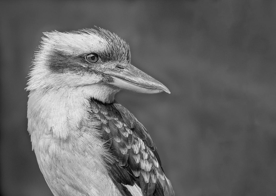
Dec 19 |
Comment |
I love the detail you brought out in this bird. I think I prefer your background, with less distractions, but perhaps a tad bit darker. I agree with Henry about the extra space to the right for the bird to be looking into.
Here's my rendition with a bit more space, slightly darker background, and a wee bit of dodging and burning for some extra dimensionality: |
Dec 14th |
 |
| 11 |
Dec 19 |
Comment |
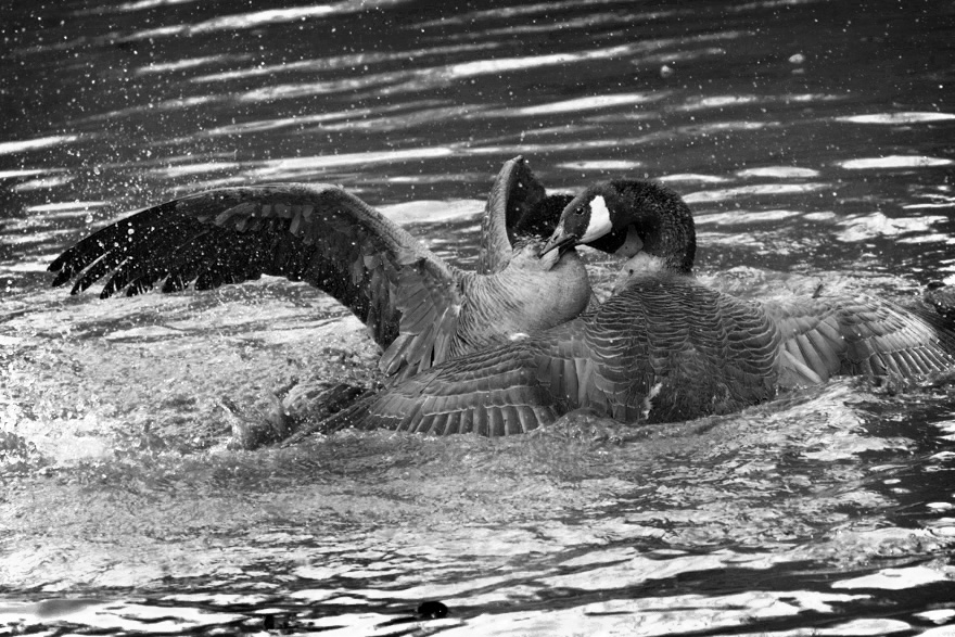
What a capture - definitely RPRT! So much drama and action, making me want to see a follow-up image of the aftermath! Mono is the right choice for this as the color version is too muted.
Because of the muted colors of the original, the resulting mono image is limiting detail in the birds, who are the star of the show. I tried to bring out more detail in the birds and their territorial struggle. I also added a subtle vignette as Henry suggested. What do you think?
|
Dec 14th |
 |
| 11 |
Dec 19 |
Comment |
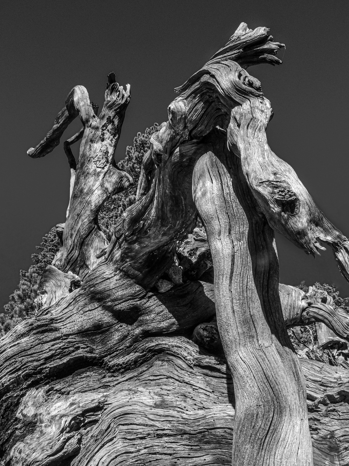
I think your final result really helps the textures of the tree jump into focus. The tonal range is nice and broad, making for a delightful study of the intricacies of the twists in the wood.
I noted two nitpicky things: the little bit off greenery at the middle right edge did not translate well into mono and becomes a bit of a distraction; and your selection along the natural arch at the middle right left some haloing.
Here's my rendition with fixes: |
Dec 14th |
 |
| 11 |
Dec 19 |
Reply |
Welcome to #11, Henry!
I like your approach and have not tried that myself, so will have to experiment now. Thanks for the tip! |
Dec 12th |
6 comments - 1 reply for Group 11
|
| 53 |
Dec 19 |
Reply |
And your favorite??? <...drumroll...> |
Dec 13th |
| 53 |
Dec 19 |
Reply |
Ooooo . . . a collaboration in the making??? d;¬{D |
Dec 13th |
| 53 |
Dec 19 |
Reply |
The extra space in front of the horse would really improve the composition. Great suggestion, Dan! |
Dec 13th |
| 53 |
Dec 19 |
Reply |
I guess it's safe to say that Miriam's off to a great start with our group!!! |
Dec 13th |
| 53 |
Dec 19 |
Reply |
I think the square crop gives the best view of all. The enhancement with Luminar 4 made it pop more.
How are you liking Luminar 4? I've been a Luminar user since the 2018 version and think some of the tools are pretty amazing, though I think the overall performance of 4 is woefully lacking, especially since it doesn't make use of the GPU. |
Dec 8th |
| 53 |
Dec 19 |
Comment |
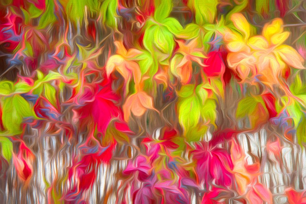
Your processing turned this rather painterly, which makes the image much easier to study, as the original is rather busy and it's difficult to find a focal point. The colors really pop and I like that you changed the greens into a more golden hue.
This inspired me to play with your original and I ended up in Topaz Studio 2, and applied the Swirly Strokes II Look. d;¬{D |
Dec 7th |
 |
| 53 |
Dec 19 |
Comment |
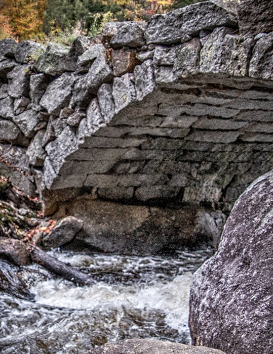
Both images are well captured, with good exposure, focus, and tonal adjustments. I must say that I prefer the Original 1 version as it gives more context to the bridge.
Using that, I would suggest cropping out a little from the right and bottom, adding some contrast, some targeted dodging and burning, and a bit of sharpening. Here's my example: |
Dec 6th |
 |
| 53 |
Dec 19 |
Comment |
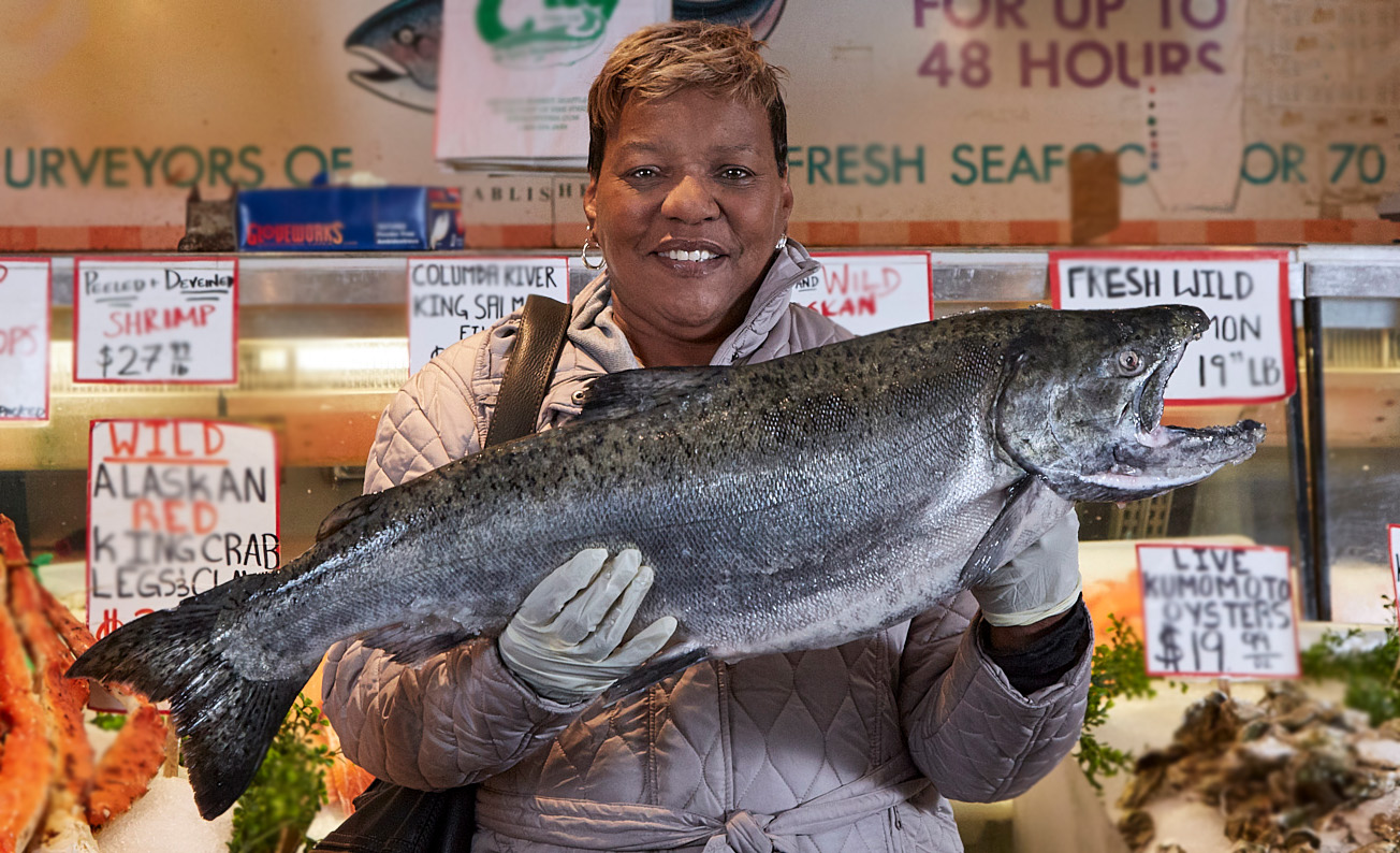
Quite the "catch" (pun intended). Balancing the lighting was very important and you did a good job.
From a straight photography point of view, this image has a lot of distractions. Having the woman holding the salmon, makes her the main focal point, yet the market is your real "intended" subject. Since the image does not have the business name prominent, it makes more visual sense to focus the viewer's attention on the woman with the fish.
To that end, I cropped some from both sides, making this a more normal horizontal image rather than a pano. I then removed the worker's arm, and blurred the background with the Blur tool.
In addition, I removed some of the hot spots on her face and on the fish. What do you think? |
Dec 6th |
 |
| 53 |
Dec 19 |
Comment |
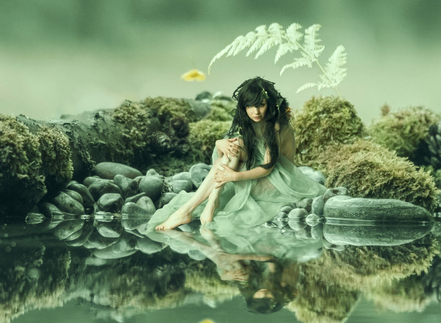
What a wonderful start with our group!!! “Not great at creative...” WRONG!!! You have no right stating that, Miriam! This is a wonderful composite, demonstrating a well-developed eye for combining separate images into a cohesive whole.
Your pieces fit together artfully and nothing looks “shopped” at all. Only thing missing from the reflection is the yellow flower to the left of her head.
My suggestion for completing this is to remove the tree, which pulls focus from your main subject, reproduce the yellow flower in the reflection, crop some of the left to focus the attention on your nymph, and apply a soft color wash to the whole image to give a more woodsy feel to the scene. Here's my result:
|
Dec 6th |
 |
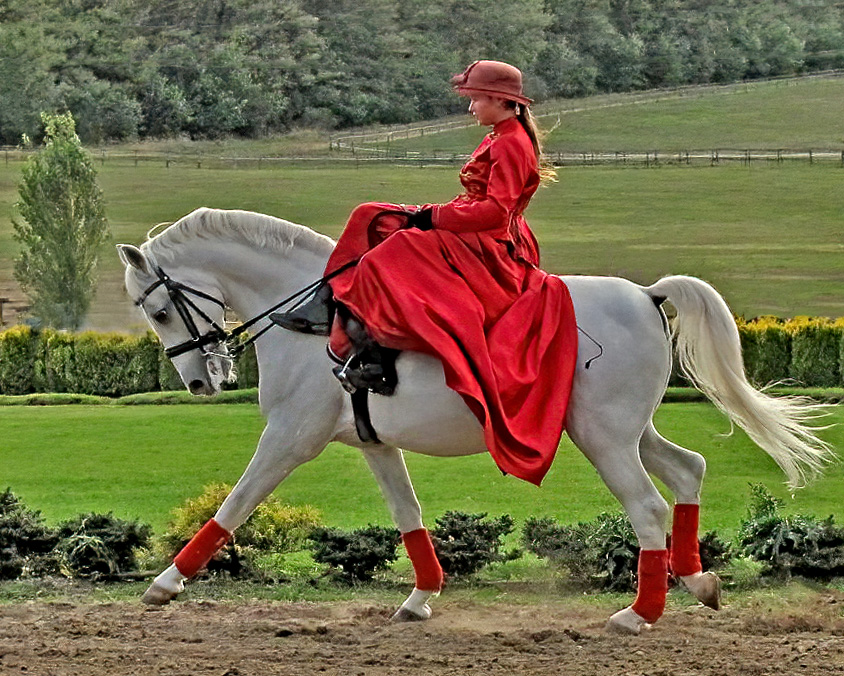
| 53 |
Dec 19 |
Comment |
Beautiful horse and rider, and both are showing an intense concentration and poise. With a little tweaking, this can be outstanding.
I would start by leveling the image, as it appears like the horse is headed uphill. Healing the powerlines near the top is also important, as would a bit of contrast and sharpening. Suggested would be removing the cattle. Here's my quick result: |
Dec 6th |
 |
5 comments - 5 replies for Group 53
|
16 comments - 9 replies Total
|


