|
| Group |
Round |
C/R |
Comment |
Date |
Image |
| 6 |
Nov 19 |
Reply |
You captured a great image for me to work with! d;¬{D |
Nov 26th |
| 6 |
Nov 19 |
Reply |
Your results are a testament to that. I also reject the bulk of my captures as they will be lacking something important that cannot be compensated for in post. d;¬{D |
Nov 21st |
| 6 |
Nov 19 |
Comment |
You were definitely in the right place at the right time for this capture! Removing the busy background finished it nicely! Thanks for sharing this with us! d:¬{D |
Nov 21st |
| 6 |
Nov 19 |
Reply |
Alas, this is the way it was shot - I have not cropped this capture. I have other versions that give more petals and focus less on the center of the flower. I knew there was something not right, but I couldn't see it myself. d:¬{( |
Nov 21st |
| 6 |
Nov 19 |
Reply |
I agree with your composition change, Janet! This really leads the eye into the image. Thank you! |
Nov 21st |
| 6 |
Nov 19 |
Comment |
You have floral images down pat, Dick! You are the master and we are the fledgling students learning at your feet! d;¬{D |
Nov 21st |
| 6 |
Nov 19 |
Comment |
This is awesome, Janet! I can't think of anything to add to what's already been said, nor can I think of anything to improve your great capture! Bravo!!! d:¬{D |
Nov 21st |
| 6 |
Nov 19 |
Comment |
Great subject! Like Dick, I've thought about doing something like this but have never gotten around to it. Maybe we should have a round where we all experiment with this type of subject???
As I mentioned on Salvador's image, after suggestions by Dick and some reading here and there, that for stacks it's best to use your lens' sweet spot, which for my macro lens is F8. Helicon doesn't seem to care how many images you throw at it, but you need to be careful that your subject doesn't have too deep an area to cover.
In the case of this image, the red wire certainly pulls focus, but not enough to hold the eye there. For me, your detail is good but the angle of the image feels like it's leaning a bit to the left because of the large cylindrical capacitor(?). |
Nov 21st |
| 6 |
Nov 19 |
Comment |
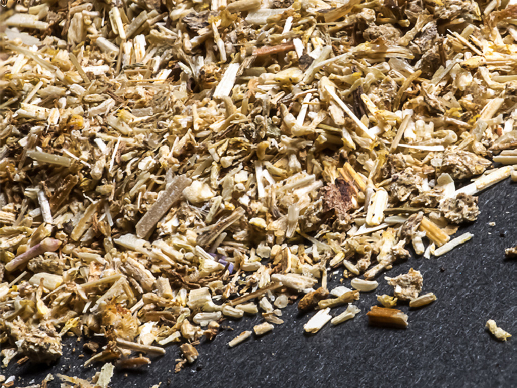
To add to what Dick discussed, it's best to find your len's sweet spot, which is commonly somewhere in the neighborhood of F8 - F16. When you do your stack at that aperture, you'll have less distortion and a better blend in Helicon.
regardless, your image appears sharp throughout, so you did succeed ultimately. I found your composition a bit weak with background on top and bottom, but not on the sides. I cropped it horizontal instead of the vertical and eliminated the top background area. We still get to study the intricacies of the tea leaves in the context of the cardboard background. What do you think? |
Nov 21st |
 |
| 6 |
Nov 19 |
Comment |
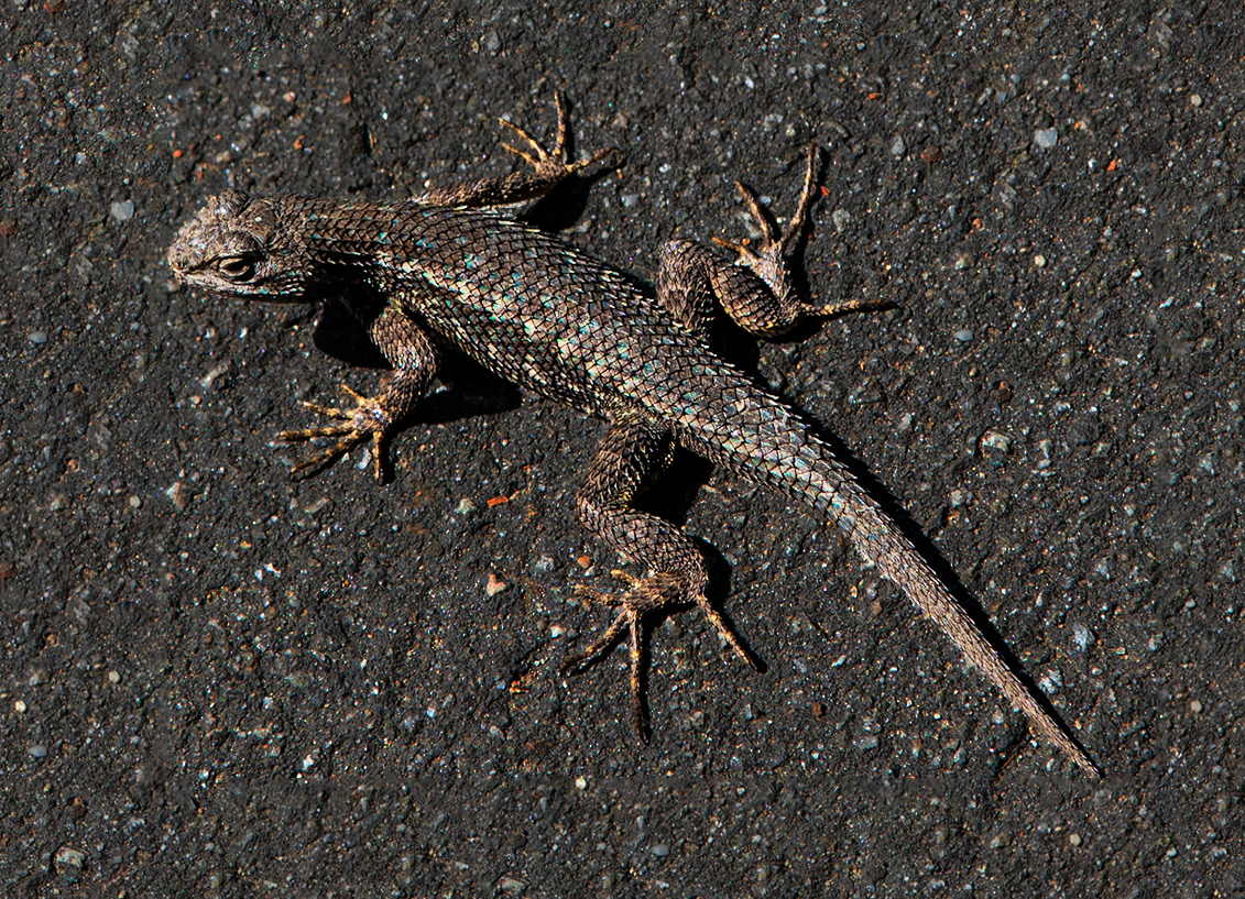
Here's another approach, along the lines that Stuart & Peter are suggesting.
I increased the canvas size a bit all around and filled it with the asphalt background using Content-Aware Fill. Then, I selected the lizard and copied it to another layer. Ctrl-Clicked on that new layer, inverted the selection, expanded the selection by a few pixels, applied a Brightness/Contrast filter to the original layer, darkening and adding a bit of contrast. What do you think? |
Nov 21st |
 |
| 6 |
Nov 19 |
Reply |
Hmmm . . . Definitely food for thought, Stuart! |
Nov 8th |
6 comments - 5 replies for Group 6
|
| 11 |
Nov 19 |
Reply |
The beauty of capturing images in my home studio setup is taking as much time as I need. Certainly, if I was in the field with a breeze blowing, a higher ISO would be warranted to keep my aperture small for detail, risking the added noise of a higher ISO.
I thank you, though, for the attaboy! d;¬{D |
Nov 26th |
| 11 |
Nov 19 |
Comment |
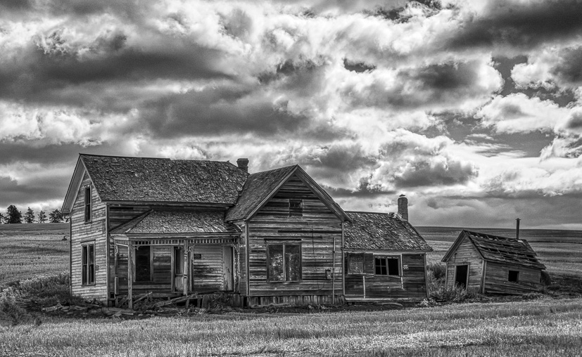
This, for me, has two subjects that compete a bit for our attention - the sky and the buildings. I love both, but think, considering the title, that you gave too much of the composition to the sky which has loads of drama.
I cropped a bit from the top and left, putting the house in a stronger position I think. What about you? |
Nov 21st |
 |
| 11 |
Nov 19 |
Comment |
Creepy good, Jim! The negative version adds a lot of interest to an otherwise rather flat image. This forms a lot of geometric patterns for the eyes to investigate. Fun! |
Nov 21st |
| 11 |
Nov 19 |
Comment |
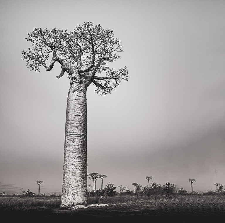
This really pops, Sharron! Allen's word, aggressive, is quite appropriate here. I think perhaps you might have gone a little too far, with the result that the trunk turned but crispy. Still, I'm pleased with the results.
I do have an issue with the composition, having the tree in the center is slightly weak. I realize that it's hard with this to move it off-center. So, I tried adding a bit more to the width, employing some Content-Aware Fill and Cloning to add some space to the right of the tree. What do you think? |
Nov 21st |
 |
| 11 |
Nov 19 |
Comment |
Definitely a regal portrait of the king of beasts! I really love the angle of his head especially.
I had to play with it some and here's my result. I boosted the contrast a bit and did my usual dodging and burning to add some depth and pop his eyes a bit. What do you think? |
Nov 21st |
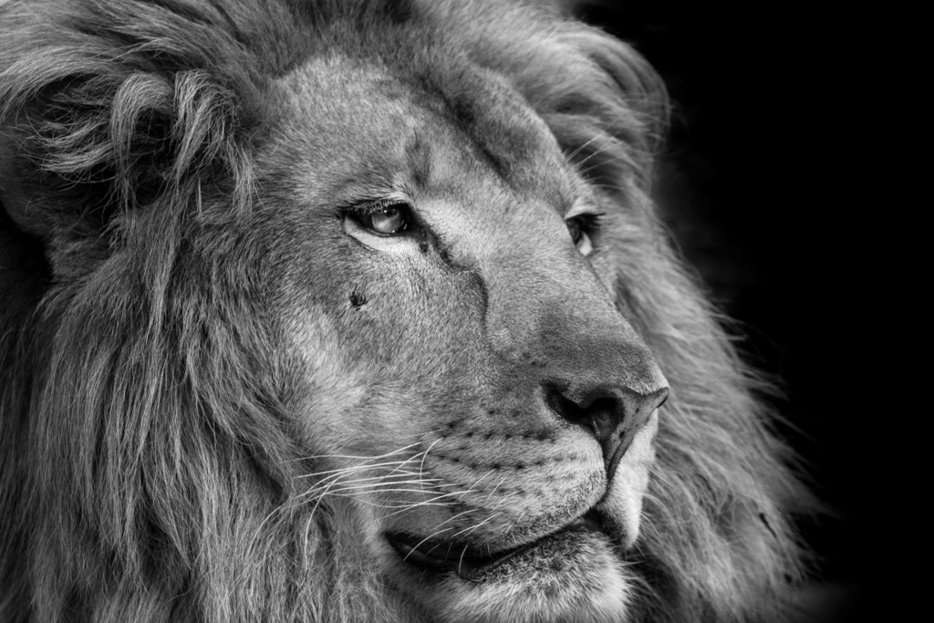 |
| 11 |
Nov 19 |
Comment |
Lovely flower and a strong conversion, accentuating the nuances of texture and light in the bloom. My only wish would have been for you to use a slightly smaller aperture so that the petals were sharp from front to back.
Lisa's crop does a nice job of focusing the eye into the flower more, as well as removing some of the distractions in the background. |
Nov 21st |
| 11 |
Nov 19 |
Reply |
Hmmm - this has promise. I think that, with a white background, it might be better to soften the edges of the petals so they fade into the white. |
Nov 19th |
| 11 |
Nov 19 |
Reply |
<...blush...> thank you! d:¬{D |
Nov 4th |
| 11 |
Nov 19 |
Reply |
Thank you, Donna! Maybe it's all in my head! d;¬{D |
Nov 4th |
5 comments - 4 replies for Group 11
|
| 18 |
Nov 19 |
Comment |
So very clever, Kerstin! Your blend is excellent and the expression on your face matches so well with the sphinx. The sepia tone and sketch effect really finish the concept well. This would make for a great postcard or greeting card! Bravo! d:¬{D |
Nov 21st |
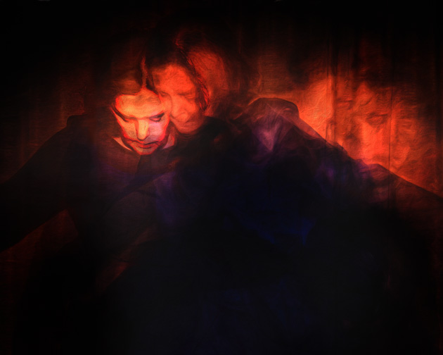
| 18 |
Nov 19 |
Comment |
The faces are the key to this image for me, especially the ones more translucent. I played around and came up with a crop that emphasizes the faces and added contrast while lowering the brightness to help reveal more of the face detail. I realize it's not your vision, but those faces really grabbed me and I wanted to see them better. d;¬{D |
Nov 21st |
 |
| 18 |
Nov 19 |
Reply |
Thanks, Jennifer. What do you think of my rework below? |
Nov 21st |
| 18 |
Nov 19 |
Reply |
(" . . . with or without a fork") LOL!
See below for my result . . . |
Nov 21st |
| 18 |
Nov 19 |
Reply |
See below . . . |
Nov 21st |
| 18 |
Nov 19 |
Reply |
I agree, but haven't found the right combination yet . . . |
Nov 21st |
| 18 |
Nov 19 |
Reply |
See my change below . . . |
Nov 21st |
| 18 |
Nov 19 |
Reply |
See my changes below . . . |
Nov 21st |
| 18 |
Nov 19 |
Comment |
Thanks all for the input. I think the correction this needs is something running away. To that end, I put this together. Thoughts? |
Nov 21st |
 |
| 18 |
Nov 19 |
Comment |
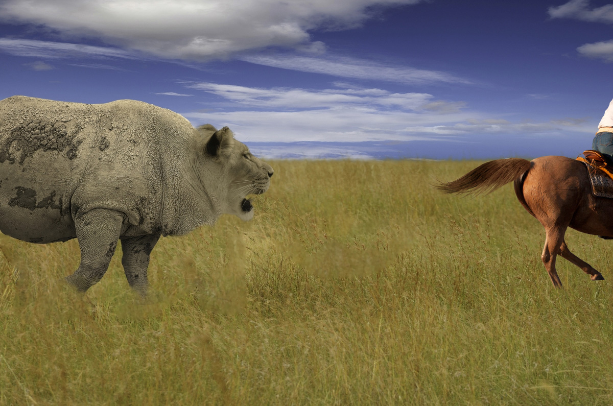
Yes, adding the person and dog or the walker definitely tells a stronger story! I think the effect is very appropriate for this foggy image and turns it inot a real piece of art! |
Nov 21st |
| 18 |
Nov 19 |
Comment |
Way cool, Mark! Yes, the shadows need some adjustment and the middle cat is a little less opaque than fitting, but your choices of cats and their positions make for a great composition. With a little work, this will be killer! |
Nov 21st |
| 18 |
Nov 19 |
Comment |
Very geometric and colorful, Ian! I think I agree with Mark, though, that the colors may be OTT. I keep coming back to this and changing my opinion, so take this with a grain of salt. |
Nov 21st |
| 18 |
Nov 19 |
Comment |
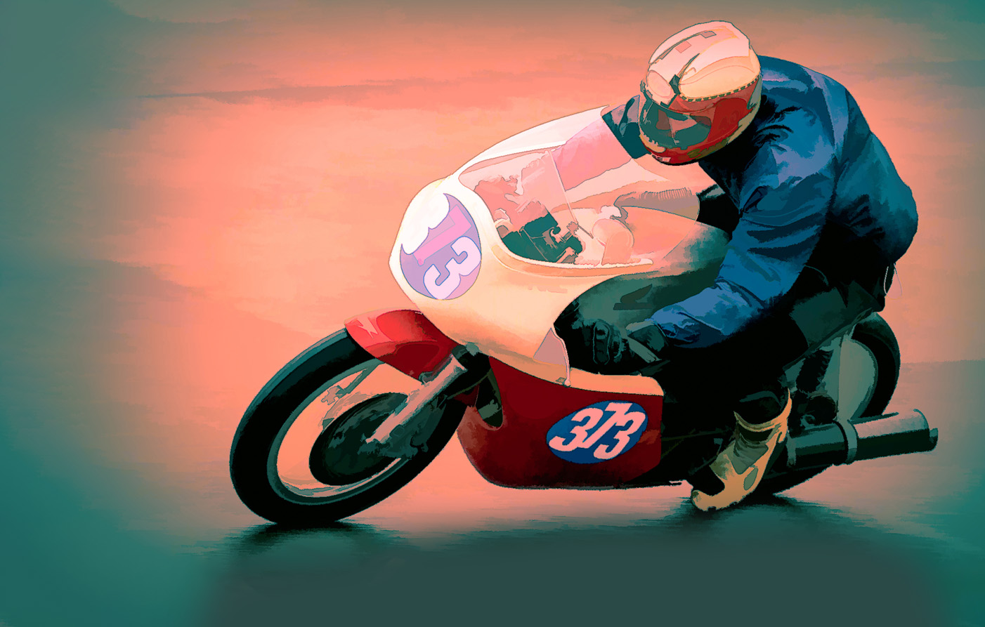
Overall, I think this effect works well. While it might be interesting to see something to give more movement to the image, I'm more concerned with the composition, which is crowding the bike some. I add a bit to the canvas on theleft and bottom to give the bike some room to move into. What do you think? |
Nov 21st |
 |
| 18 |
Nov 19 |
Reply |
Another great idea, Jerry! My mind is really working now. d;¬{D |
Nov 3rd |
| 18 |
Nov 19 |
Reply |
What a wonderful idea, Mike! Hmmmm. |
Nov 3rd |
7 comments - 8 replies for Group 18
|
| 53 |
Nov 19 |
Reply |
First I selected the cook, pan & sink, and copied them to another layer, created a selection from that new layer, expanded the selection by 5 pixels, and on the original layer, did a Content-Aware Fill. Then, on that original layer, I added a Brightness & Contrast adjustment layer, in which I lowered both the brightness and contrast. Finally, I applied a Gaussian Blur to the original layer to add a touch of blur. I did have to burn the pan in the upper right a bit so it didn't shine too much. |
Nov 23rd |
| 53 |
Nov 19 |
Comment |
Miriam is so right! This is a masterpiece! I honoestly can't think of a thing to improve upon your success! d;¬{D |
Nov 21st |
| 53 |
Nov 19 |
Comment |
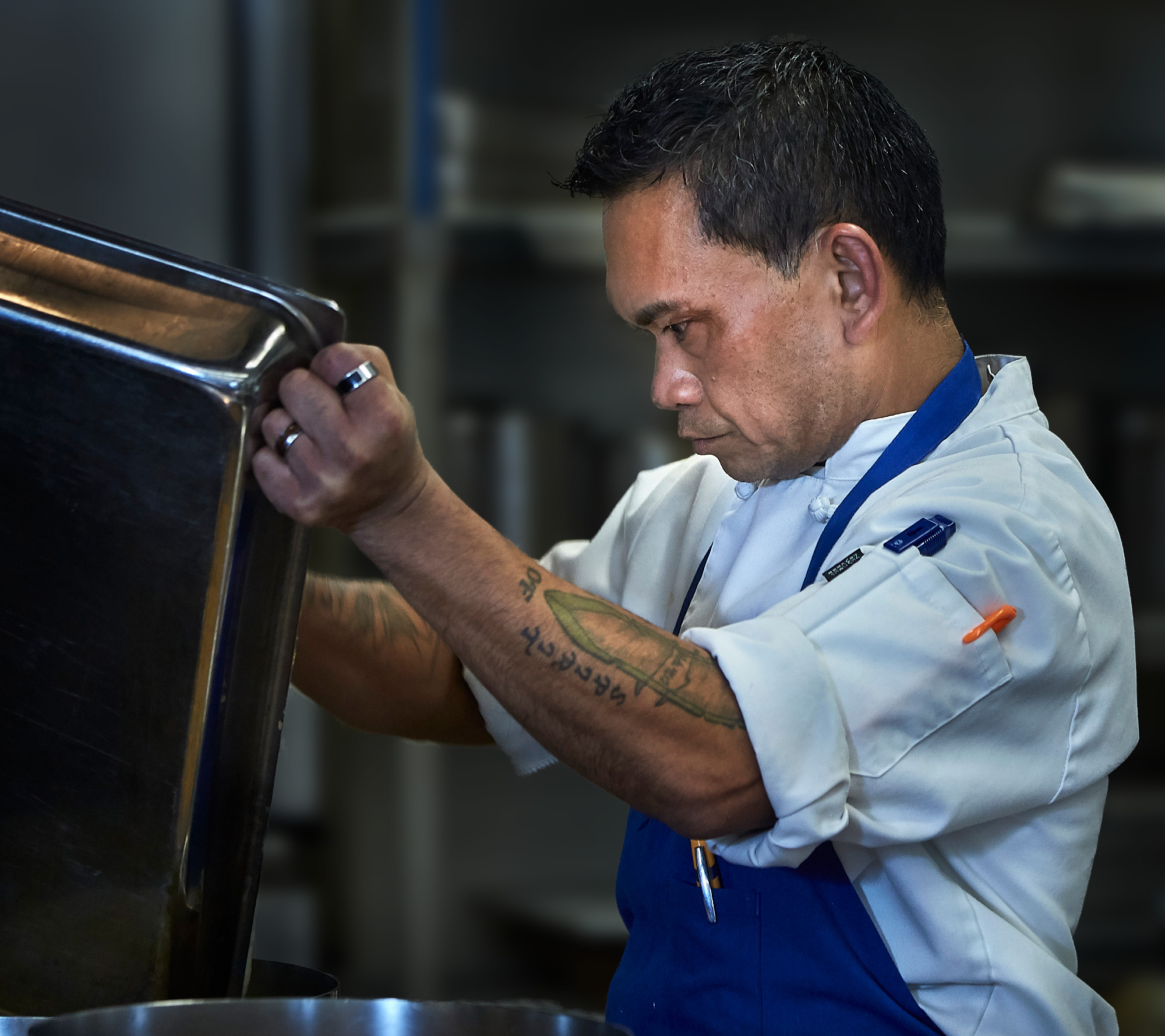
This guy is so intense! I can almost feel the tension in his body! Great capture, indeed.
I agree about the background being a little distracting. I had a go at blurring and darkening the background enough to still set the scene but not distract as much. What do you think? |
Nov 21st |
 |
| 53 |
Nov 19 |
Reply |
Here's a subtle oil paint effect. What do you think? |
Nov 21st |
 |
| 53 |
Nov 19 |
Comment |
This is such a lovely happenstance! The blurriness of the ducks gave a painterly effect of movement, surrounded by the luscious fall colors reflected in the water. The result is very soothing, calming my restless soul. Thank you for sharing it! d;¬{D |
Nov 21st |
| 53 |
Nov 19 |
Comment |
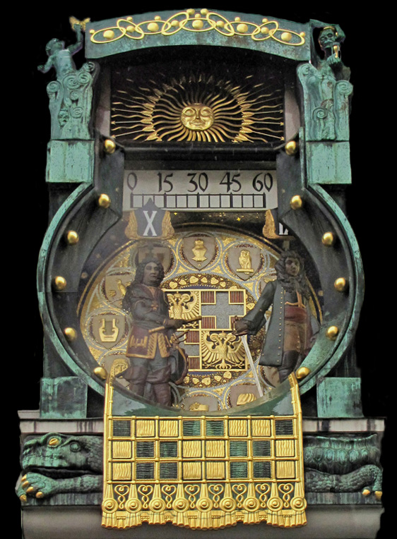
What an incredible find, Rusty, and such exquisite detail in your capture!
There was a bit of perspective problem because of the angle you captured this from. Using Free Transform to rotate and correct that helps. There is also an area on the left that is cloudy - perhaps some moisture on the lens? This can be corrected with some dodging and burning and targeted contrast.
I took the liberty of cropping tight, like Arabella did, and removing the background, as I so often do, to further help the details of this clock pop. What do you think? |
Nov 21st |
 |
| 53 |
Nov 19 |
Reply |
Ooooo! I can hear the fiddler now! d:¬{D |
Nov 21st |
| 53 |
Nov 19 |
Reply |
Thanks for visiting Mark! I appreciate your feedback! d:¬{D |
Nov 21st |
| 53 |
Nov 19 |
Reply |
Anybody who knows me knows a pun is almost always intended. d;¬{D
I am honored that my humble image can be put to use in furthering your PS explorations! d:¬{D |
Nov 12th |
| 53 |
Nov 19 |
Reply |
This version will likely give me nightmares, Peter! Thanks for that! d;¬{Ã� |
Nov 12th |
| 53 |
Nov 19 |
Reply |
Thanks for visiting us here in 53 and sharing that, Donna! d:¬{D |
Nov 10th |
| 53 |
Nov 19 |
Reply |
I have some of those and some PS actions as well. I'll have to give that a try. d;¬{D |
Nov 10th |
4 comments - 8 replies for Group 53
|
22 comments - 25 replies Total
|


