|
| Group |
Round |
C/R |
Comment |
Date |
Image |
| 6 |
Oct 19 |
Reply |
I found another one and have done just that, Salvador. d;¬{D |
Oct 24th |
| 6 |
Oct 19 |
Reply |
That is the same one I'm using. Took a while to get used to, but now it's working pretty well for me. |
Oct 22nd |
| 6 |
Oct 19 |
Reply |
When spiders die, their legs pull in. In an effort to have it look alive, I cropped and cloned out those pulled in legs. |
Oct 21st |
| 6 |
Oct 19 |
Reply |
Thanks, Dick! I've been working hard on it. Been watching several videos of late. |
Oct 20th |
| 6 |
Oct 19 |
Comment |
This image is outstanding! I actually think your composition is fine as it is - don't mess with that! I do agree with Stuart about the stuff to the left of the beetle as it's somewhat distracting. Otherwise, you have a powerful image! d:¬{D |
Oct 15th |
| 6 |
Oct 19 |
Comment |
WOW, what a composition! Amazing DOF and color in this image. I want to touch them to see if they feel as good as they look. Simply amazing! I look forward to your image each month as I learn so much from your work. Thank you! d:¬{D |
Oct 15th |
| 6 |
Oct 19 |
Comment |
This is fascinating to study. I especially like how the tendrils of one of the seeds are wrapped around the pod tip. I envy your ability to do macro work handheld as my hands shake too much.
Great capture this month. I have no suggestions for improvement! Bravo!!! d:¬{D |
Oct 15th |
| 6 |
Oct 19 |
Comment |
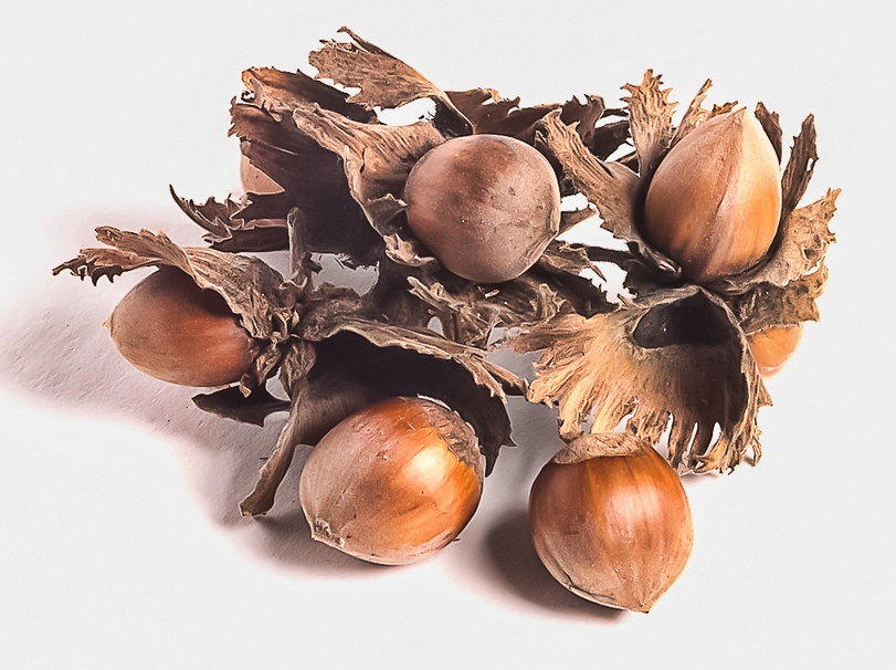
Love foxgloves and how delightful to have them growing in your garden! Between our brown thumbs and the voracious chipmunks here, we don't have much luck with flowers most of the time, with the exception of the sunflowers that sprout from what falls out of the bird feeders. d:¬{(
I don't think Janet's crop works as it cuts off too many blossoms. Your rework I think is a much stronger composition. And you removed the noise and darkened the flowers so that they pop more! Much better!!! d:¬{D |
Oct 15th |
| 6 |
Oct 19 |
Comment |
What an outstanding tableau you created and captured to share with us - very compelling and a delight to study.
I think the background being white is okay if there's not too much of it. The amount of white you have does tire the eyes in my opinion. I would suggest adding a touch of contrast to help the subject pop a bit more and cropping some of the background all around: |
Oct 15th |
 |
| 6 |
Oct 19 |
Comment |
This is a wonderful subject captured very well. As mentioned by Stuart, your extreme ISO has made the image a bit noisy - not too bad online, but very noticeable when I study this offline at full size. As he said, you'd be much better off using a tripod and keeping the ISO much lower. I pretty much have to use a tripod for most of my macro work because of my somewhat shakey hands.
The composition is fairly strong with a nice leading line from left bottom to right top without sending the viewer out that corner. I can't agree about cropping on the right as I feel it crowds things too much, especially with all the open space to the left. Cropping a bit from the left makes more sense, not because it centralizes the subject but more for the symmetry of the empty space on each side: |
Oct 15th |
 |
| 6 |
Oct 19 |
Reply |
Because of the restraints of the DD site, yes, this is a lower resolution version.
I have all the Topaz AI products - I'm one of their beta testers - and I have not be very impressed either. Their Denoise AI is a regular part of my workflow and I sometimes use their Gigapixel AI for enlarging for prints. |
Oct 15th |
| 6 |
Oct 19 |
Reply |
That demonstrates it well, Stuart. I try to be judicious with sharpening, not wanting to overdo it and have things get too crispy. You seem to have struck a good balance here. Thanks! d:¬{D |
Oct 10th |
| 6 |
Oct 19 |
Reply |
Good idea, Janet! Thanks! d:¬{D |
Oct 7th |
6 comments - 7 replies for Group 6
|
| 11 |
Oct 19 |
Reply |
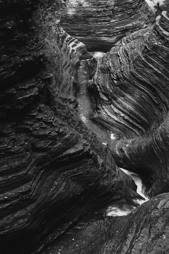
I'd say you want to find a point between this level of darkness and the original lightness. Water has a different texture and luminance than rock and needs to be differentiated from the rock without compromising its natural qualities. In your latest rendition, it's hard to tell it's water in the rather straight upper section. |
Oct 21st |
| 11 |
Oct 19 |
Reply |
I like the left side here, but I think you went too dark with the water. |
Oct 21st |
| 11 |
Oct 19 |
Reply |
Excellent idea for an approach to fixing that. Thanks, Jim. d:¬{D |
Oct 21st |
| 11 |
Oct 19 |
Reply |
I guess I should say you "spotted" the problem here. d;¬{D |
Oct 21st |
| 11 |
Oct 19 |
Comment |
I really like the strata on the right side. Like Allen, I thought the water was odd-looking, and definitely, those legs gotta go. What I really wanted to see was some of the shadow areas on the left to be brought out some. Here's my attempt at balancing things - burning a bit on the right side & water and dodging the left a bit to try and bring up the shadows: |
Oct 19th |
 |
| 11 |
Oct 19 |
Reply |
It is close to Halloween, after all. d;¬{Ã� |
Oct 17th |
| 11 |
Oct 19 |
Comment |
The geometry of this image is amazing! And the off-center composition actually leads to a bit of optical illusion - or maybe I need my meds adjusted again! d;¬{D
My only issue with this is the lack of tonal variation from your conversion of the greenery, though you may have intended that in order to keep the focus on the geometry. Hmmmm. For me, the foliage being tonally merged into the scene makes it look kinda messy. I tried finding a good tonal balance, but it eluded me I'm afraid. Definitely need to get them meds checked! d;¬{D |
Oct 17th |
| 11 |
Oct 19 |
Comment |
Great photo and a truly wonderful story. I suppose the subtitle could be: No Means No!!! d;¬{D
Seriously, star shots are not an easy proposition, at least for me. I went to a meteor shower shoot and basically failed despite having expert guidance available. Aargh!!! To have your "model" posed in just that spot was amazing, though I have to say the color version is much better! The Milky Way really gets lost in monochrome. |
Oct 17th |
| 11 |
Oct 19 |
Reply |
Do you have a title in mind for your vision? |
Oct 17th |
| 11 |
Oct 19 |
Comment |
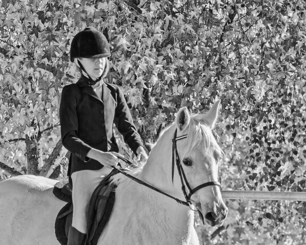
This is quite different, Allen! Certainly a difficult conversion to keep the rider from being swallowed by the leaves.
I do find that the horse is a bit too bright and, despite the contrasting black of the rider's coat, the brightness of her horse is tiring to the eyes. A bit of dodging & burning could help that, though: |
Oct 15th |
 |
| 11 |
Oct 19 |
Reply |
Thanks for your honest point of view. I'm not sold on the monochrome version, but thought it does work because the color version is very desaturated. |
Oct 4th |
| 11 |
Oct 19 |
Reply |
Undoubtedly! d;¬{D |
Oct 1st |
4 comments - 8 replies for Group 11
|
| 18 |
Oct 19 |
Comment |
I have to disagree with the others here. I really like this as it is and find your rework lacking the expressiveness of your submission. I would never guess this was a beach scene, but that's why you named it "Breathe." It's moody, and colorful and I like how it caused me to let go of my preconceived ideas of colors and shapes and let the image take me someplace new and invigorating. Thank you! d:¬{D |
Oct 19th |
| 18 |
Oct 19 |
Reply |
Thanks, Jennifer. It was so dull in its normal state, I just had to do something with it! d;¬{D |
Oct 19th |
| 18 |
Oct 19 |
Reply |
You're right about balancing the space at the top and bottom. Don't know why I didn't see that. SMH |
Oct 19th |
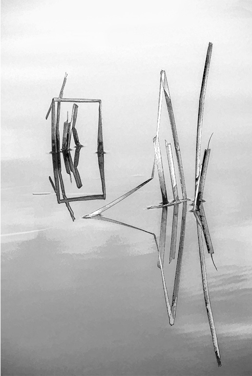
| 18 |
Oct 19 |
Comment |
This is magical, especially since it's basically SOOC! I could study this for a long time and not grow tired, despite all the white. Truly amazing, Mike! Nothing to be changed here. Bravo! |
Oct 19th |
| 18 |
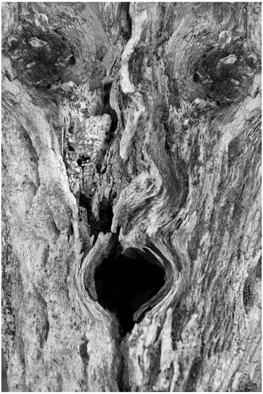
Oct 19 |
Comment |
I see it if I study it a while, but it's not really apparent soon enough. I had a go at burning the "eyes" to make them more visible (pun intended), and sharpened the fuzzy bits some: |
Oct 19th |
 |
| 18 |
Oct 19 |
Comment |
Once you corrected the image's horizon, it was finished and a lovely rendering that tells an inviting story. Trying something to turn it into a night scene might be even more inviting. Monochrome is okay, but I find your edition a wonderful result. Well done, sir! d:¬{D |
Oct 19th |
| 18 |
Oct 19 |
Comment |
This treatment really gives the subject movement, despite being a frozen moment. I would never have thought to use an approach like this. Well done and I can't think of a thing to be improved. |
Oct 19th |
| 18 |
Oct 19 |
Reply |
The best way I found was to start clicking each of the looks, even if the thumbnail doesn't look promising. Once you find one that's interesting to you, play with the controls to fine-tune it. |
Oct 3rd |
| 18 |
Oct 19 |
Reply |
Studio has definitely become my goto software for getting creative! Its AI Remix holds endless possibilities for taking the mundane to something so very different! d:¬{D |
Oct 3rd |
| 18 |
Oct 19 |
Reply |
Thanks, Andrew! Obviously, it takes the right subject and the arrowhead shape of the moth seemed to lend itself to this arrangement. d:¬{D |
Oct 3rd |
| 18 |
Oct 19 |
Reply |
Thanks, Mark! High praise indeed! d:¬{D |
Oct 2nd |
| 18 |
Oct 19 |
Reply |
Yikes! Maybe I'll change the name to Quadramoth! d8¬{O |
Oct 1st |
5 comments - 7 replies for Group 18
|
| 53 |
Oct 19 |
Comment |
You really captured the action well! Your image has a lot of action despite the motion being frozen. And the intensity of the driver's faces adds even more to the story.
My suggestion is to darken the background a lot, especially the tower and remove the distraction of the the pole on the right: |
Oct 14th |
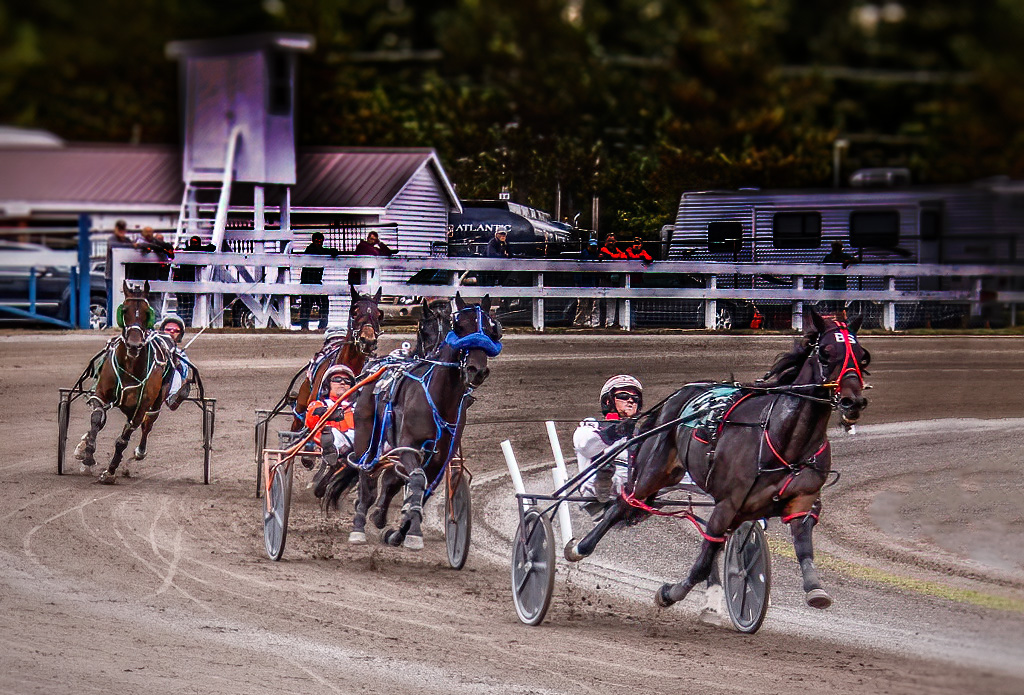 |
| 53 |
Oct 19 |
Comment |
SO much better than the previous version which hid her face. I think a lot of darkening is in order as there are a lot of distractions in the background. I did a bit of burning all around to demonstrate: |
Oct 14th |
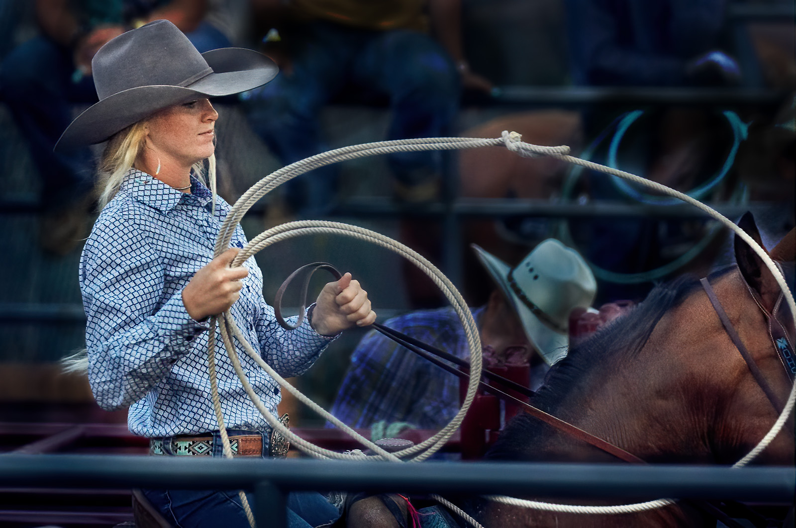 |
| 53 |
Oct 19 |
Comment |
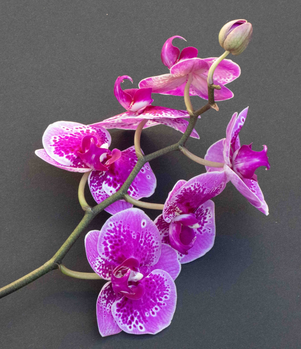
This is so serene and so ready for a wall in a place that needs its calming influence. It's also sporting lovely pastels - so different from your typical monochrome works. d;¬{D
Out of curiosity, I tried my hand at converting this to monochrome. What do you think? |
Oct 14th |
 |
| 53 |
Oct 19 |
Comment |
This Owl Park is definitely a place I'd like to visit someday. d;¬{D
Very striking owl and the background you chose, with such firey colors, really adds drama.
I agree with Dan about the artifacts - they're noticeable just enough to be a bit distracting. I also think the composition would be stronger with the orientation flipped horizontally and a little more room added for the owl to be looking into: |
Oct 14th |
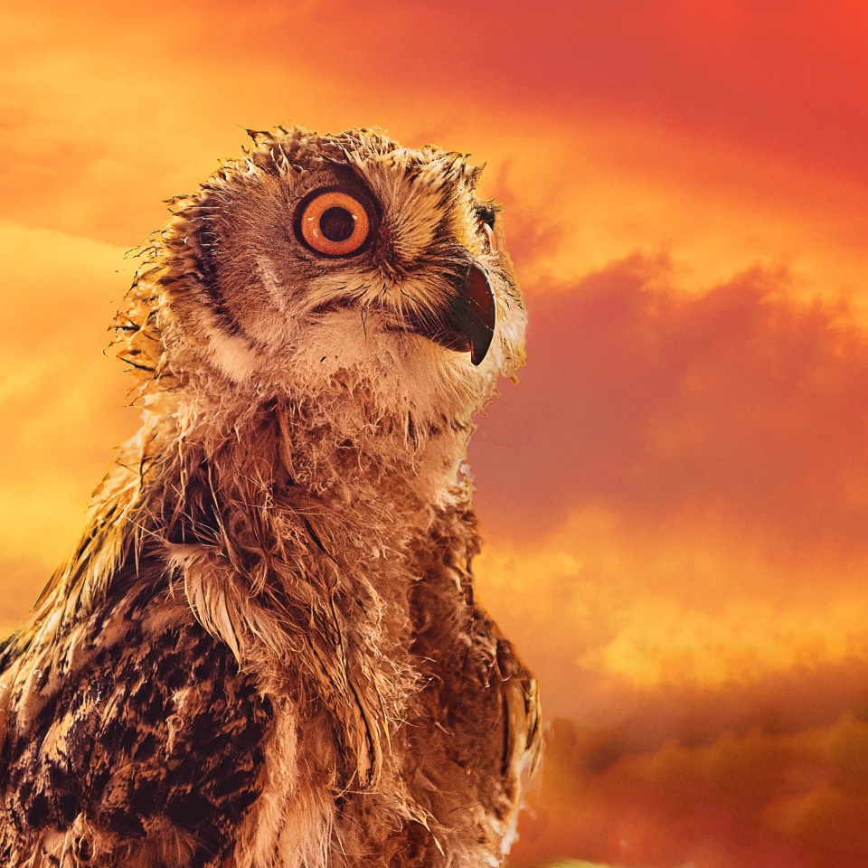 |
| 53 |
Oct 19 |
Reply |
I don't have much control over my phone's camera settings, unfortunately. Yes, the head isn't in focus as much as I'd like, but at least it is enough to be recognizable. |
Oct 14th |
4 comments - 1 reply for Group 53
|
19 comments - 23 replies Total
|


