|
| Group |
Round |
C/R |
Comment |
Date |
Image |
| 6 |
Sep 19 |
Reply |
Yes, I used a clip-on macro lens - they're quite small and literally clip right over the phone's camera lens. Not sure what the effective aperture becomes as a result, similar to the effective focal length when I use extensions on my DSLR.
The orientation I have here is the natural one, though I actually prefer Dick's rotation better for the story. |
Sep 24th |
| 6 |
Sep 19 |
Reply |
You can get fairly inexpensive clip-on lenses that literally clip on to your smartphone over the back camera lens and turn it into either a macro, telephoto or wide-angle lens. There are more expensive solutions that involve a special case, but my cheapy set of clip-ons work fine for me and live in a little microfiber bag in my pocket. When your DSLR isn't handy, I think you can see it's a viable fill-in. You can get a better idea about them here:
https://www.fabathome.net/best-phone-camera-lens/ |
Sep 11th |
| 6 |
Sep 19 |
Reply |
So much better, Dick! That was the finishing touch it needed! Thanks! d:¬{D |
Sep 10th |
| 6 |
Sep 19 |
Comment |
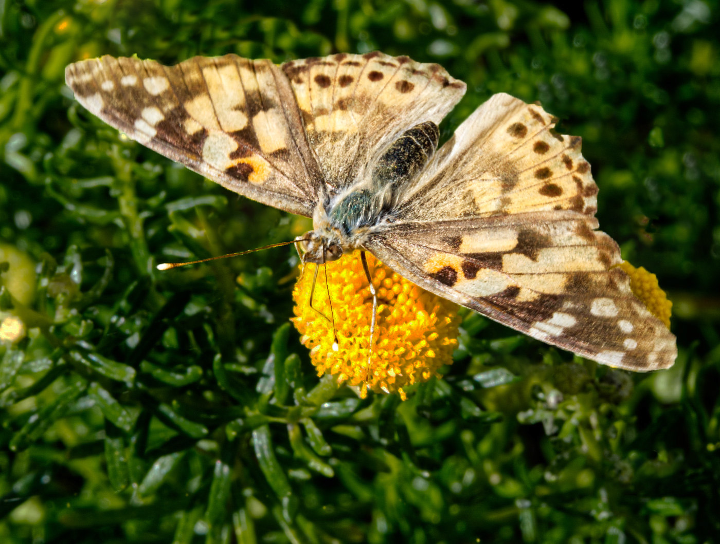
What an interesting insect - never seen anything quite like it before. I'm surprised your DOF is so shallow with an f-stop of 13. Based on the size of the insect you have only a very short focus! Would love to see the front of the spider, with its faux eyes. Perhaps a higher ISO would allow you to use an even smaller aperture in the future. |
Sep 10th |
| 6 |
Sep 19 |
Comment |
As usual, an exquisite botanical capture! I especially like the lighting which softly pops the flowers from the dark background. Couldn't possibly suggest a thing to improve upon this. |
Sep 10th |
| 6 |
Sep 19 |
Comment |
Cool stuff, Janet! Great exposure and detail and I especially like the contrast between the seaweed and the concrete. Perhaps a slight crop of the right side to conceal the bit of concrete under the seaweed there, but not really necessary in the big scheme of things. |
Sep 10th |
| 6 |
Sep 19 |
Comment |
Nice capture of the butterfly - it's nice when you can be in the right place at the right time. d;¬{D
I think the butterfly is still being overwhelmed by its surroundings. You might consider darkening the background quite a bit and removing some of the other flowers so that the butterfly gets the attention it deserves! |
Sep 10th |
 |
| 6 |
Sep 19 |
Comment |
OMG, that's amazing, Salvador! A fascinating subject for macro and your stack captured great detail throughout! The soft pastels of the fruits against the off-white surface is very easy on the eyes, too. Definitely a piece for the wall! |
Sep 10th |
| 6 |
Sep 19 |
Comment |
Hmmm . . . without your explanation, I'd be at a loss as to what I was looking at. The exposure and detail are great and the color choice really brings out the details of the texture, but it also conceals the identity of your subject. My mind's eye says this must be very worn leather that has torn where it at its thinnest. This is not a bad thing, of course, just what my mind translates this into. d;¬{D |
Sep 10th |
| 6 |
Sep 19 |
Reply |
Of course you're probably right, but I was attempting to make more of a story. Guess that didn't come across well enough. d:¬{( |
Sep 10th |
6 comments - 4 replies for Group 6
|
| 11 |
Sep 19 |
Comment |
I think this works well as a mono image and you managed to emphasize the animals and de-emphasize the location. You have a nice tonal range and your exposure and focus are great. While I do think the water should be cropped out, the mother's position calls for more space to the right - your current crop is too tight there. |
Sep 10th |
| 11 |
Sep 19 |
Comment |
Mono is just what this image needs and your final choice of sepia feels better for the subject. Nice tonal range and lots of nooks and crannies to explore with your eyes here. |
Sep 10th |
| 11 |
Sep 19 |
Comment |
Allen's observation and fix is precisely what I was thinking. You've got an amazing capture here and it doesn't need extra "help." If you were sold on the brightness, I would suggest bringing up the shadows on the right and the bottom, which would balance the lighting from a different perspective. |
Sep 10th |
 |
| 11 |
Sep 19 |
Comment |
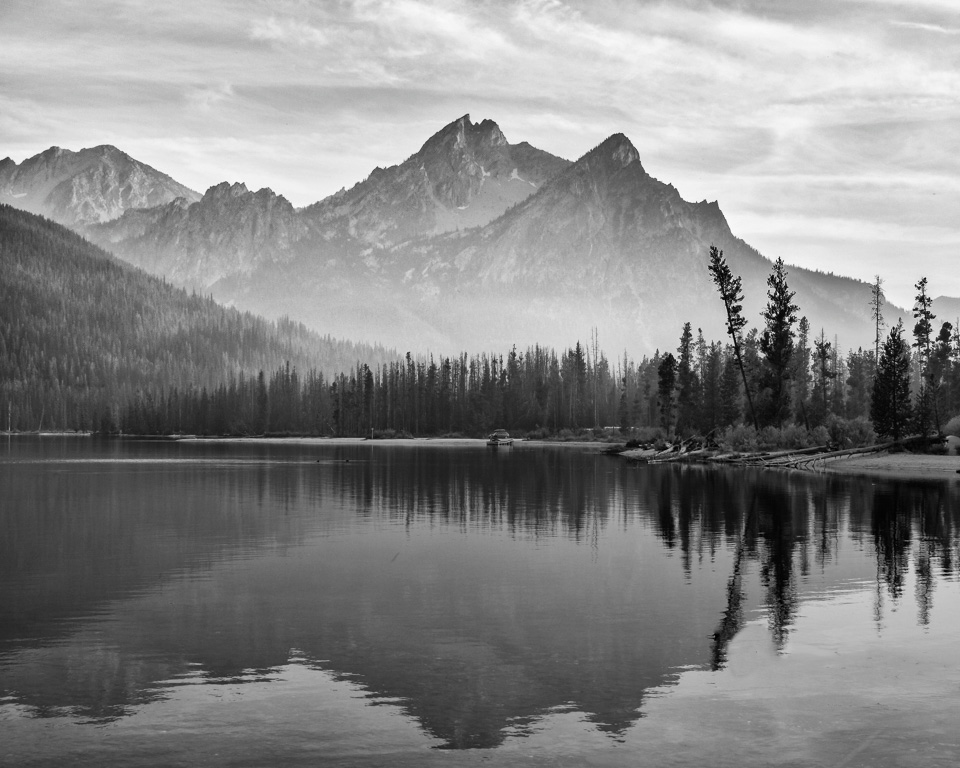
While the color version is okay, the mono version really works so much better. As others have indicated, the mountains in the back need a bit more something - probably contrast. As it stands, the reflection has more contrast than the mountains do and that feels odd. The other minor distraction (minors can be quite distracting) is the log in the water in the lower right. Here's my take on it: |
Sep 10th |
 |
| 11 |
Sep 19 |
Comment |
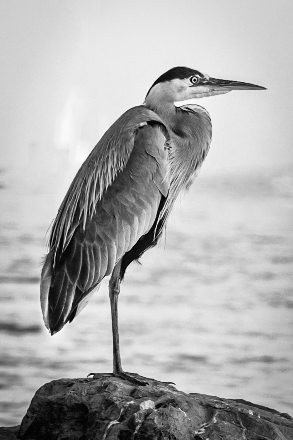
This image was made for mono! I must agree about the blurring items on the horizon. I think they should go away. I would also suggest a bit of dodging of the bird's tail and its eye: |
Sep 10th |
 |
| 11 |
Sep 19 |
Reply |
The secret to the 24 focus adjustments is a $20 focus rail. d;¬{D
Yes, you have my permission to use my images. I'm all for education. d:¬{D |
Sep 7th |
| 11 |
Sep 19 |
Reply |
Don't feel bad - I looked it up a couple of weeks ago. d;¬{D |
Sep 7th |
| 11 |
Sep 19 |
Reply |
That's 2 votes for removing the calyx. d;¬{D |
Sep 7th |
| 11 |
Sep 19 |
Reply |
I typically add contrast with curves, and the real magic is the dodging and burning. Cameras flatten images into one plane - dodging and burning accentuates the hills and valleys of the subject. I once watched a video where the person added a 50% grey circle, and with only dodging and burning, turned it into a sphere.
I've tried a few different approaches to this and finally settled on adding a blank layer set to Overlay mode. Then with a soft brush set at 5% opacity, I brush with black to burn and white to dodge, building up the subtle color with however many strokes are needed to produce the desired effect. There, my secret is out! d;¬{D |
Sep 3rd |
| 11 |
Sep 19 |
Reply |
Okay, that's 2 votes for darkening the brighter petals.
I see what you mean by that little bit of calyx showing at the top right - it doesn't need to be there for continuity and it distracts a little. Thanks for seeing what I could not. d;¬{D |
Sep 3rd |
| 11 |
Sep 19 |
Reply |
I knew there was something and I just couldn't see it. |
Sep 3rd |
| 11 |
Sep 19 |
Reply |
Why thank you, Bev! Surely there must be something that you can suggest for improvement. |
Sep 2nd |
5 comments - 7 replies for Group 11
|
| 18 |
Sep 19 |
Comment |
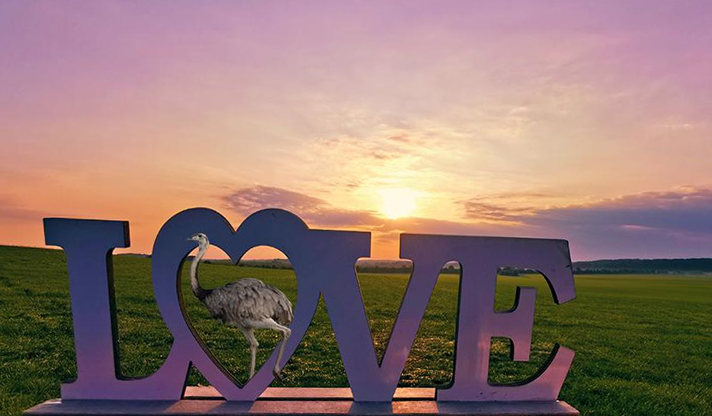
Very clever use of elements, Kerstin! I agree that the sign needs to be leveled and, perhaps, some of the sky cropped out to better focus the eye on the Nandu stepping through the sign: |
Sep 21st |
 |
| 18 |
Sep 19 |
Comment |
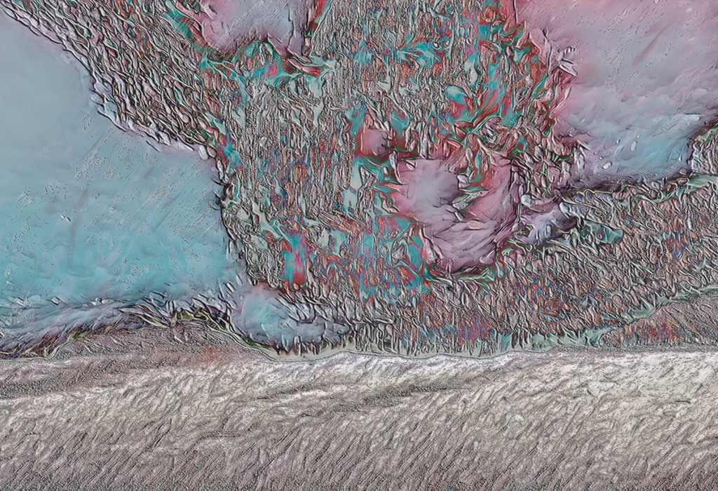
I both like this and don't like this. One thing I tried was rotating the image and found that 180� made a little more sense to my pea brain - a sense of grounding by what came of the sky in your creation. In either case, I like the swirls of color, especially the magenta and cyans the are splashed here and there. |
Sep 21st |
 |
| 18 |
Sep 19 |
Reply |
I don't know, mike. Do you have a color that you think would work better? I tried a variety of colors and nothing worked as well for me as the black. |
Sep 21st |
| 18 |
Sep 19 |
Comment |
This is creepy good, Mike. The eyes and mouth bring this to life, like a sci-fi movie where the computer gives itself facial features to make the humans it "serves" feel more comfortable. I hope this doesn't show up in my dreams tonight!!! d;¬{D |
Sep 21st |
| 18 |
Sep 19 |
Comment |
I find the light fascinating and definitely think the sentiment you added is applicable, but find the lettering a bit too subtle, getting lost in the twists and turns of the lamp. |
Sep 21st |
| 18 |
Sep 19 |
Reply |
Like this perhaps: |
Sep 21st |
 |
| 18 |
Sep 19 |
Comment |
This could very well be what the maker of the sculpture sketched before fashioning the piece. Excellent interpretation and the background you chose sets it off so well. Even your edge treatment if spot-on for the image. Bravo, Ian! |
Sep 21st |
| 18 |
Sep 19 |
Comment |
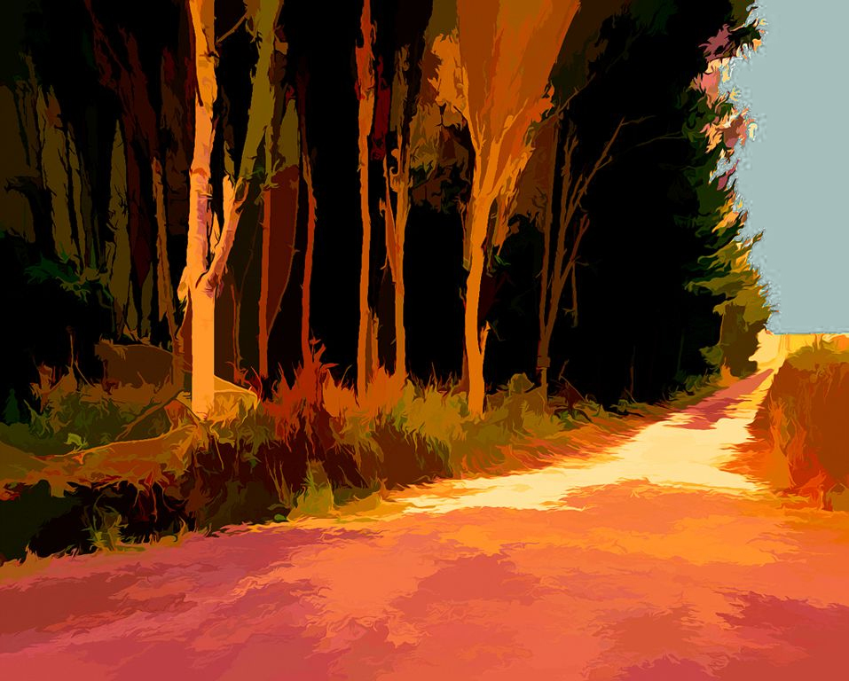
I love the effect on the trees and the road, but the shade of blue clashes a bit with the rest of the palette. I think something between the blue you chose and the original white sky would blend in better: |
Sep 21st |
 |
| 18 |
Sep 19 |
Reply |
They are now called "Looks" and are on the right column next to the Filters. If you know the name of the preset from the original Studio, you can search for it in Studio 2 |
Sep 16th |
| 18 |
Sep 19 |
Reply |
In Topaz Studio and Studio 2, it's one of the presets in Studio or one of the looks in Studio 2 and can be found by searching on the word Molten. |
Sep 14th |
| 18 |
Sep 19 |
Reply |
It's still missing some tools, like clone/heal and adding other images, but it has come a long way from the short beta version I got to play with. It's certainly a work in progress but will ultimately be a great creative tool.
The move of the presets, now known as Looks, to the right side along with the filters makes better sense to me. |
Sep 10th |
| 18 |
Sep 19 |
Reply |
I'm really enjoying Studio 2. Still lacking a few tools like clone/heal, but the creative tools are aplenty here. d;¬{D |
Sep 2nd |
| 18 |
Sep 19 |
Reply |
Come back and share what you come up with. d;¬{D |
Sep 1st |
6 comments - 7 replies for Group 18
|
| 53 |
Sep 19 |
Comment |
Now that everyone has had an opportunity to weigh in on this image, with so many great results, I'm afraid my edit was less than stellar by comparison. I had removed the background and the bee that was starting to do its job pollinating the flower. Here it is: |
Sep 27th |
 |
| 53 |
Sep 19 |
Reply |
That's very tight on the center. Can you share your thoughts on why? |
Sep 27th |
| 53 |
Sep 19 |
Reply |
Thanks for the play by play - this is how we all learn to do things we haven't tried. d;¬{D |
Sep 18th |
| 53 |
Sep 19 |
Reply |
That is truly lovely! Can you share your workflow to reach this great result? |
Sep 18th |
| 53 |
Sep 19 |
Reply |
Yes - an improvement! Great job! d:¬{D |
Sep 18th |
| 53 |
Sep 19 |
Reply |
You're right, I believe. Here's an edit attempting to do just that: |
Sep 18th |
 |
| 53 |
Sep 19 |
Comment |
What a friendly looking fellow to start your stay with us, Vera! Welcome to Group 53 and thanks for sharing such a smile!
While the background is a little distracting, it's only noticeable a while after studying that pose - it really looks like it's smiling at us. You did a marvelous job finding the right angle. Aside from perhaps placing it in a different location, I don't see anything that needs to be done here. |
Sep 17th |
| 53 |
Sep 19 |
Reply |
Welcome to our group, Vera! I do hope you will join the fun and show us what you would do with this image Show us YOUR stuff!!! d:¬{D |
Sep 16th |
| 53 |
Sep 19 |
Reply |
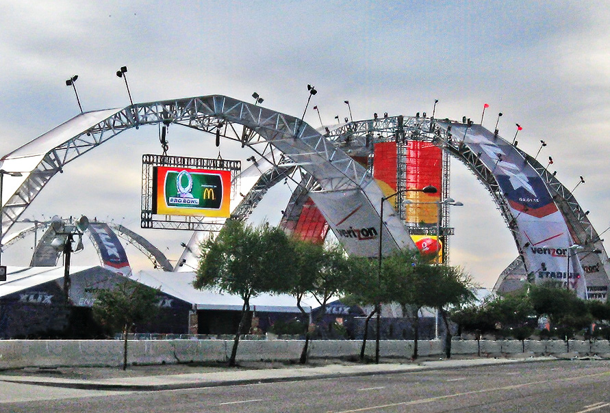
Temporary??? Quite the structure for temporary. Glad you got the chance to capture it! d:¬{D |
Sep 14th |
| 53 |
Sep 19 |
Reply |
Hmmmm. Another very different interpretation. I especially like the way the background turned out! Thanks, Brenda! |
Sep 14th |
| 53 |
Sep 19 |
Reply |
Oooo. This made it crispy in a good way! Thanks for sharing, Rusty. |
Sep 14th |
| 53 |
Sep 19 |
Reply |
True. It's on my list of things to try. d;¬{D |
Sep 10th |
| 53 |
Sep 19 |
Reply |
I like this one even better! d:¬{D |
Sep 10th |
| 53 |
Sep 19 |
Reply |
I'd love to try this but don't have enough room in our freezer to make it work. d;¬{D |
Sep 10th |
| 53 |
Sep 19 |
Reply |
We know you love your monochromes! d;¬{D
My only issue with this conversion is it obscures the pops of color that banners provided. Perhaps if you worked some more with the individual color channels you'd still get some pop there. |
Sep 10th |
| 53 |
Sep 19 |
Reply |
Link worked fine. Reading up on it now. d;¬{D |
Sep 10th |
| 53 |
Sep 19 |
Comment |
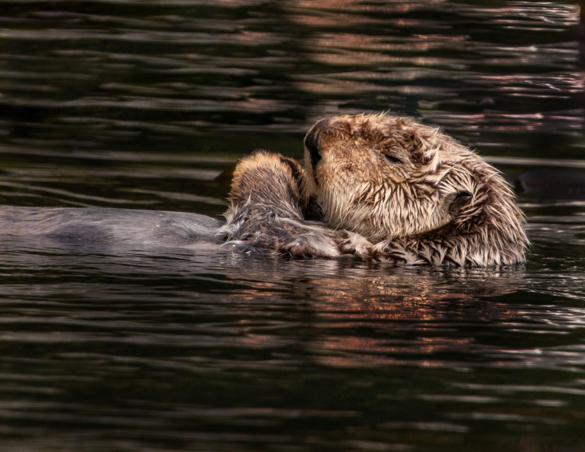
Makes me want to take a nap - but it doesn't take much these days for me to nod off. d;¬{D
I would suggest removing the kelp at the top of the image as it distracts a bit. I also think darkening the water around the otter would help it to hold more focus:
|
Sep 10th |
 |
| 53 |
Sep 19 |
Comment |
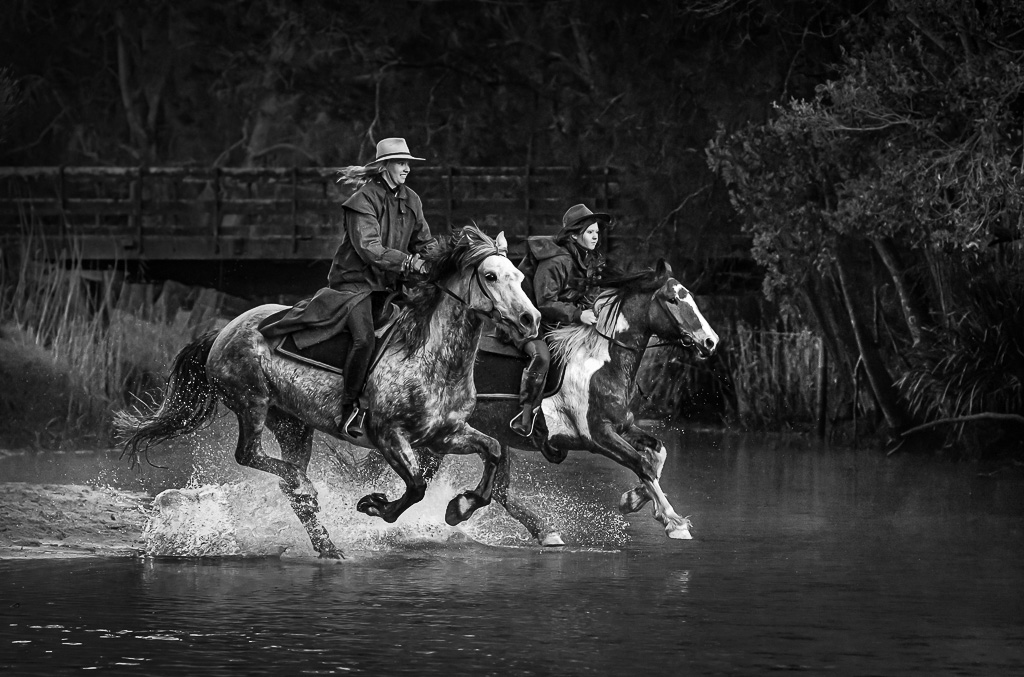
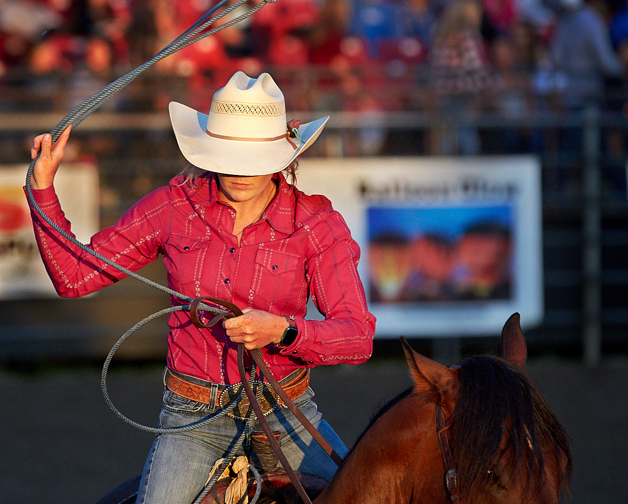
I really enjoyed this image! It tells a good story, especially the intense concentration of the rider. Good overall exposure, great detail, tonal range & composition.
There were a few visual distractions that need attention. For instance, her hat is very bright, as are her hands. There are a bunch of little things, like the area inside the bend of her left arm (on our right) being too bright, the shadow of the horse's ear on her arm, etc. Tiny things that pull a bit of focus away from the story: |
Sep 10th |
 |
| 53 |
Sep 19 |
Comment |
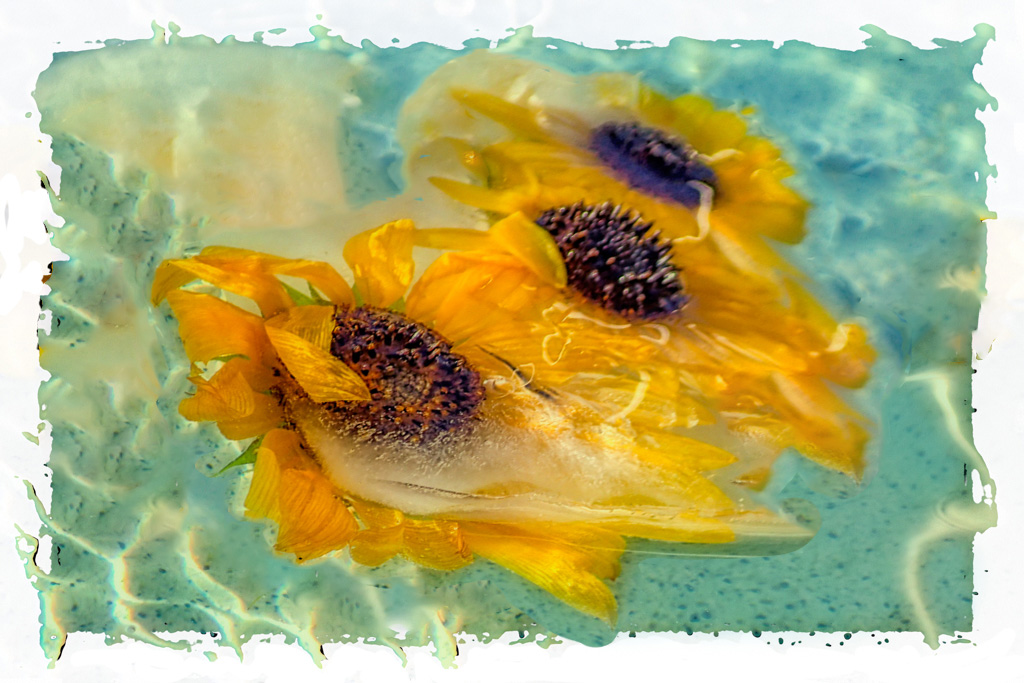
That's amazing. Where did you read about that technique of freezing the flowers? I'd love to learn more about that.
While I love the effect, I found your composition a bit cluttered. I tried removing a couple of flowers and repositioning the rest:
|
Sep 10th |
 |
| 53 |
Sep 19 |
Reply |
Oh, this is so YOU, Arabella! You have really made this into a piece of art! I'm jealous of your creativity! Simply gorgeous! |
Sep 10th |
| 53 |
Sep 19 |
Comment |
What a cool structure! I know I'd have a lot of fun photographing this place, though I'd rather do it when there isn't a bunch of people milling about!
Like Dan, I felt this needed leveling and noise reduction, as well as the removal of distractions. Here's my rendition without all the stray human distractions: |
Sep 10th |
 |
| 53 |
Sep 19 |
Comment |
What an incredible building! I imagine you have a lot of images as there is so much to study here.
I kinda agree with Arabella that this is really 2 images together. My eye is automatically drawn to the top portion as it's lighter in color. After spending some time studying it and fantasizing how I might approach capturing it, I shift my attention to the archway and the room that it precedes. You have great exposure, detail and tonal range. Your Sony camera is serving you well, especially inside with a relatively low ISO! |
Sep 10th |
| 53 |
Sep 19 |
Reply |
I'm seeing a common approach regarding the crop. Interesting.
This really puts the focus on the center of the sunflower, giving the yellow petals a soft flame-like appearance. Very creative, Arabella! Thanks for sharing your vision! d:¬{D |
Sep 10th |
| 53 |
Sep 19 |
Reply |
Ooooo. This makes it look more like an actual sun! A fascinating combination of filters - I would never have thought to go this route. Thanks for brightening our day! d;¬{D |
Sep 9th |
| 53 |
Sep 19 |
Reply |
Thanks, Bev, for the clarification! d:¬{D |
Sep 4th |
| 53 |
Sep 19 |
Reply |
Wow, did you deliver on the details!!! This is excellent, both in sharing the details of what you did, but also a peek into your workflow as a well-seasoned photographer. I'm sure others will benefit from this "lesson." d;¬{D |
Sep 4th |
| 53 |
Sep 19 |
Reply |
Nice job, Stu! Can you share a little more detail about your post-processing steps? |
Sep 3rd |
7 comments - 20 replies for Group 53
|
24 comments - 38 replies Total
|


