|
| Group |
Round |
C/R |
Comment |
Date |
Image |
| 6 |
Aug 19 |
Reply |
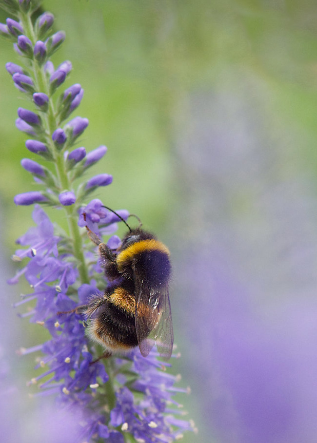
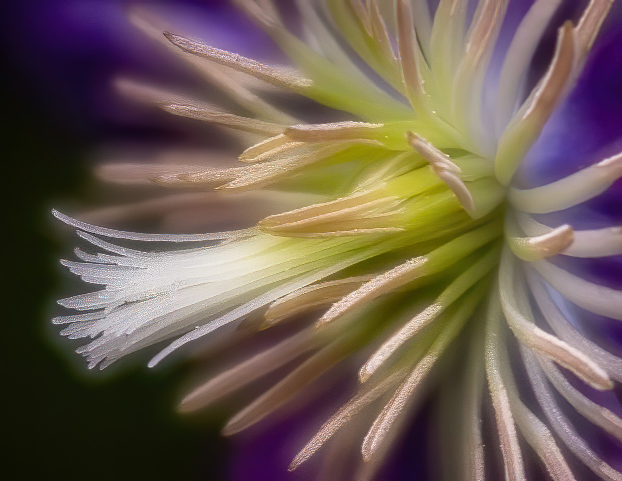
I had plenty of shots showing the inside of the flower. This is one where I was exploring the outside, which is typically ignored largely. |
Aug 22nd |
| 6 |
Aug 19 |
Comment |
Incredible drama frozen in this image!!! Wonderful detail where needed and I can make no helpful suggestions. |
Aug 20th |
| 6 |
Aug 19 |
Comment |
Simply gorgeous, Dick! Incredible DOF and texture, and the darkened foliage makes for an effective background. The bud to the side is a distraction, but it's not so distracting at first glance and does set a context for the main subject's locale. |
Aug 20th |
| 6 |
Aug 19 |
Comment |
Sometimes is better to have more of something out of frame than that same thing touching the edge, which caused a mild discomfort in the viewer who feels crowded. For me, in the case of your image, that discomfort only comes with long study, while the first viewing is quite pleasing to the eye. The fact is, the eye is drawn to the central red and yellow which is quite lovely. The border frames things nicely as well. |
Aug 20th |
| 6 |
Aug 19 |
Comment |
I actually love the dreamy effect you arrived at in your submission. While I agree with the right side being removed, I also agree with Sandra about the bee being off of center, hence this suggested crop: |
Aug 20th |
 |
| 6 |
Aug 19 |
Comment |
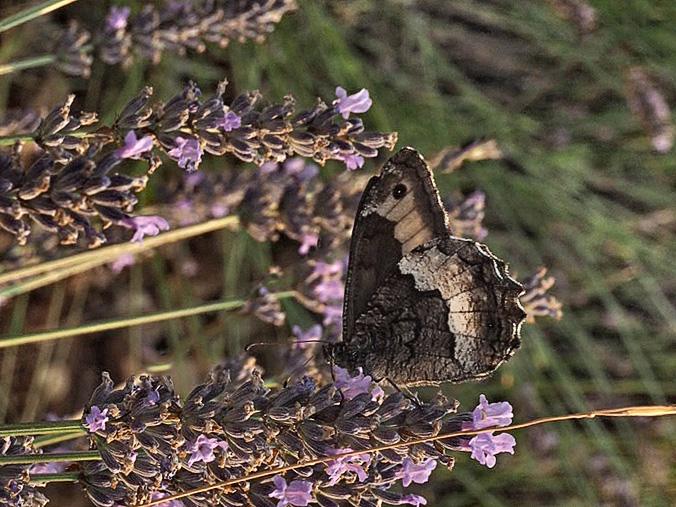
I know how hard it is to grab a butterfly in the wild. Just when you get the shot framed, it's off flitting to another place. Quite frustrating!
I agree with Dick about the right side not helping. As I started playing around with the crop, it occurred to me to try a different look, rotating the image to make for a different composition. Probably not very good, though:
|
Aug 20th |
 |
| 6 |
Aug 19 |
Comment |
Others have advised you well on using a smaller aperture and higher ISO to capture more DOF. The important thing is to keep taking more pictures, experimenting with different settings until you find the right combination for a given subject and lighting conditions. Luckily you're here amongst accomplished photographers who can gently guide you to where you want to go. They've certainly helped me a great deal. |
Aug 20th |
| 6 |
Aug 19 |
Reply |
I used to use that source for flower identification, but recently discovered Google's image search. I bring up http://images.google.com, then drop a JPEG I need to identify and it automatically searches for similar images. Works really well for figuring out specific models of automobiles. |
Aug 20th |
| 6 |
Aug 19 |
Reply |
WOW! A vote for the leaf as is! I'm afraid we're in the minority, though. d;¬{D |
Aug 20th |
| 6 |
Aug 19 |
Reply |
Thank you Dick - high praise indeed from the master of flower macro photography! d;¬{D |
Aug 20th |
| 6 |
Aug 19 |
Reply |
Thank you, Stuart. For me, HDR is all about giving me an extended control over exposure and the related elements. I have never liked the stereotypical HDR grungy "look". LR (& ACR which I use from within Bridge or PS), allows me to merge the bracketed images without applying any extra toning in a simple step. I don't do it as much as I used to, leaving it for those occasions where there's more shadow and highlight information than a single image can comfortably provide. |
Aug 20th |
| 6 |
Aug 19 |
Reply |
Thanks, Bill. I really liked the texture of the petals in contrast to the texture of the calyx (thick covering that protects the forming petals of new buds). |
Aug 20th |
| 6 |
Aug 19 |
Reply |
Yes, Salvador, you are correct - I was simply too lazy to maneuver my camera to a vertical orientation. |
Aug 20th |
| 6 |
Aug 19 |
Reply |
The only part of the image that I cropped was a little off of the left - the rest is the original composition of the image. Please see my response to Angela above for my framing choice. Bottom line is I was too lazy to rotate the camera to a vertical orientation and felt the leaf was not as important as the blossom, but it did provide an additional element with the veins of the leaf. Live and learn! d;¬{D |
Aug 20th |
| 6 |
Aug 19 |
Reply |
I set the aperture 1 click larger than the smallest possible, which is f27 in this case. Of the 3 images in the bracket, the fastest was 1/2 second - obviously, a tripod is a must and I always use one with my DSLR as I have too much shake in my hand.
You're probably right about the leaf. The original image is horizontal and I was most concerned in not cutting off the blossom at the top, figuring that the leaf was of less importance to the composition. I wanted more than just the flower, but should have considered how the leaf would have looked better not cut off. Guess I should have switched to a vertical orientation so that both would be fully captured. d;¬{D |
Aug 2nd |
| 6 |
Aug 19 |
Reply |
Thanks for stopping by, Angela and your positive feedback. Can you think of anything I can do to make this better? |
Aug 2nd |
6 comments - 10 replies for Group 6
|
| 11 |
Aug 19 |
Comment |
Oh, wow! A humdrum color image that really pops now in monochrome! While Allen's crop eliminates a minor distracting element, it centralizes the dragonfly which I feel weakens the composition. As you cropped it, we have a line that comes in from the right and then takes us right to the dragonfly. I wouldn't change a thing, Jim! |
Aug 21st |
| 11 |
Aug 19 |
Comment |
This is a perfect image for monochrome! It tells a strong story, showing the marching band members to the rear in the distorted reflection in the bell of the horn! I don't think you should change a thing! Wonderful perspective, indeed! |
Aug 21st |
| 11 |
Aug 19 |
Comment |
Certainly, Jim's version best depicts the horse and rider, but, as Allen so poignantly asserts, it does so at the expense of the important atmosphere of the blowing dust.
I suggest giving more definition to horse and rider, then introducing more dust into the image - I added some clouds at a low opacity then introduced some grain into them to try to approximate blowing dust. It's not quite right but a bit of a demonstration of the idea: |
Aug 21st |
 |
| 11 |
Aug 19 |
Comment |
I had to keep coming back to this one as I was really conflicted. I do really like the tones you've achieved, but the composition was wrong for an action shot, with the skier so close to leaving the frame. I played around and gave the skier more room to move into, while maintaining your lovely tones: |
Aug 21st |
 |
| 11 |
Aug 19 |
Reply |
The crop works - it's closer to square - but your revision, looked at full size, has a ton of noise which doesn't work for me. |
Aug 16th |
| 11 |
Aug 19 |
Reply |
I'll get on that right away! d;¬{D |
Aug 16th |
| 11 |
Aug 19 |
Reply |
Why thank you, Bev! Can I be so bold as to ask what about it makes it "superb" in your eyes? |
Aug 4th |
4 comments - 3 replies for Group 11
|
| 18 |
Aug 19 |
Reply |
I've never heard of a vault filter before. Can you tell me more about it? |
Aug 30th |
| 18 |
Aug 19 |
Comment |
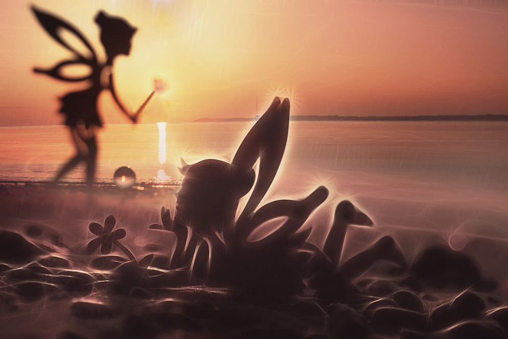
Way cool, Kerstin! Minor revisions will make this even more magical. Yes, the hard distractions in the background have to go, they don't match the feel. I also had a thought about the left-hand fairy, holding a wand that becomes the sun: |
Aug 22nd |
 |
| 18 |
Aug 19 |
Comment |
Hmmmm. This is an image for long contemplation. At first it seems way too busy. As I rest with it, though, themes begin to fade in and out again. I find a bit of a horse's face, a dragon, flowing lava, a smirking face, and on and on and on . . . It reaches out to the kid in me and begs him to come and explore. Guess this is my way of saying your image works for me. My only suggestion would be to have a more organic edges that flow from the shapes rather than the straight edges that abruptly end the show. Maybe that's my kid resisting the parental boundaries! d;¬{D |
Aug 22nd |
| 18 |
Aug 19 |
Reply |
Wow! That's a radical change! Looks like it's back to the drawing board for me. d;¬{D |
Aug 22nd |
| 18 |
Aug 19 |
Comment |
Well, if nothing else, this images has sparked a lot of suggestions. Hmmmm. Guess I just didn't take this far enough. d:¬{( |
Aug 22nd |
| 18 |
Aug 19 |
Comment |
The green aside, since you've already taken care of it, I find the bright horizontal area from Original 2 doesn't quite fit here with your fantastic backgrounds. Brushing in a bit from Original 3 over that area makes more sense to my eye. |
Aug 22nd |
 |
| 18 |
Aug 19 |
Comment |
So, did you "see" the eyes in place before you took the shot, or after? |
Aug 21st |
| 18 |
Aug 19 |
Reply |
My thought exactly - conger eel!!! |
Aug 21st |
| 18 |
Aug 19 |
Comment |
This is spectacular, Ian! It's bold yet whispy, loud but ethereal. I can't think of a thing to suggest to improve this flight pulled out of mediocrity. Bravo! |
Aug 21st |
| 18 |
Aug 19 |
Reply |
I was on the beta team for Studio 2 - they only had it in beta for a week - and it's coming along nicely. Once they add the rest of the tools it will be a killer creative tool. |
Aug 21st |
| 18 |
Aug 19 |
Comment |
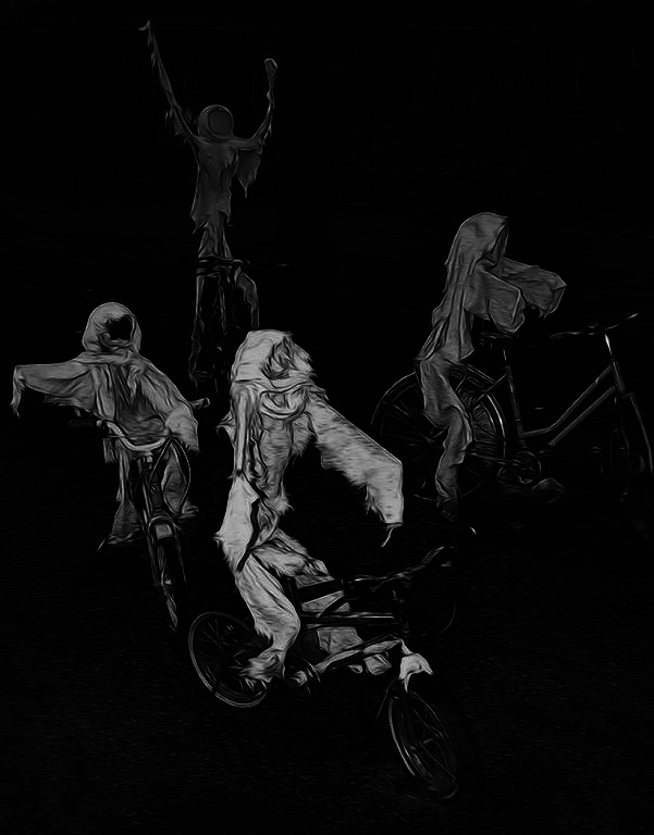
There is something to be said for Jennifer's assertion about 3 vs 4, but there is a balance to the 4 ghosts here that I like. You might consider taking most of the background out, except for the foreground, so that the tree and grass and house don't pull focus: |
Aug 21st |
 |
| 18 |
Aug 19 |
Reply |
You mean like this? |
Aug 3rd |
 |
7 comments - 5 replies for Group 18
|
| 53 |
Aug 19 |
Reply |
Nice of you to drop by, Georgianne! I've never thought of having that much open space above, but I do see a value in it. d;¬{D |
Aug 27th |
| 53 |
Aug 19 |
Reply |
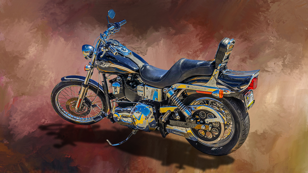
Not a biker babe, eh? d;¬{D
By weird perspective, you're referring to the angle of the shot? I do tend to get down fairly low when I'm taking vehicle shots (when my old knees can handle. which is less and less).
As far as the shadow, it is copied from the original in order to ground the vehicle in the painted background. Otherwise, the vehicle floating tends to weird people out. d;¬{D |
Aug 23rd |
| 53 |
Aug 19 |
Reply |
From what I just said, here is what I think would make sense for blurring the arch: Crop out much of the arch, blur it and the water in front of it a tiny bit and darken them, while adding more contrast and brightness to the "background". Here's my attempt: |
Aug 23rd |
 |
| 53 |
Aug 19 |
Reply |
I think the issue with blurring the arch is its position in the image, which compositionally would be the main subject, with the water being the foreground and the area inside the arch the background. However, the "background" is more or less central to the image, so it almost needs to be sharp as well. This is certainly a visual conundrum. d;¬{D |
Aug 23rd |
| 53 |
Aug 19 |
Reply |
Yeah, it bothers me some. The mask work on motorcycles is a very long and tedious process and sometimes I just run out of steam about the cleanup. |
Aug 23rd |
| 53 |
Aug 19 |
Comment |
Everything works in this image except the grain, which I think pulls too much focus. Here it is with the grain reduced via Topaz Denoise AI - it still has that dreamy quality without the distraction: |
Aug 16th |
 |
| 53 |
Aug 19 |
Comment |
Yes, a bit of cropping, a subtle vignette, and some brightening of the boy's eyes: |
Aug 16th |
 |
| 53 |
Aug 19 |
Comment |
If the framed Empire State bldg is the important point, then other distractions should be eliminated. People, vans, banners, etc., so cropping, cloning and a vignette could help: |
Aug 16th |
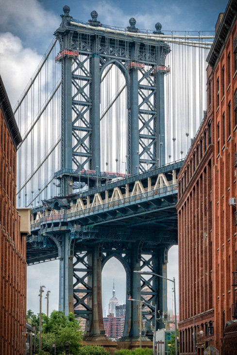 |
| 53 |
Aug 19 |
Comment |
What an interesting shot of a scene within a scene. You have great detail for being on board and likely moving.
Definitely needs to be leveled, and some noise reduction as your camera likely used a high ISO to handle the light. I added a bit of contrast to the background rocks to help them pop a little more: |
Aug 15th |
 |
| 53 |
Aug 19 |
Reply |
It can be a slow process, depending on your machine. The bigger the brush, the longer it takes to process a stroke, so it can take a while.
I found some new brushes designed for painting in Photoshop and have started experimenting with creating some more backgrounds from scratch. Here's an example: |
Aug 15th |
 |
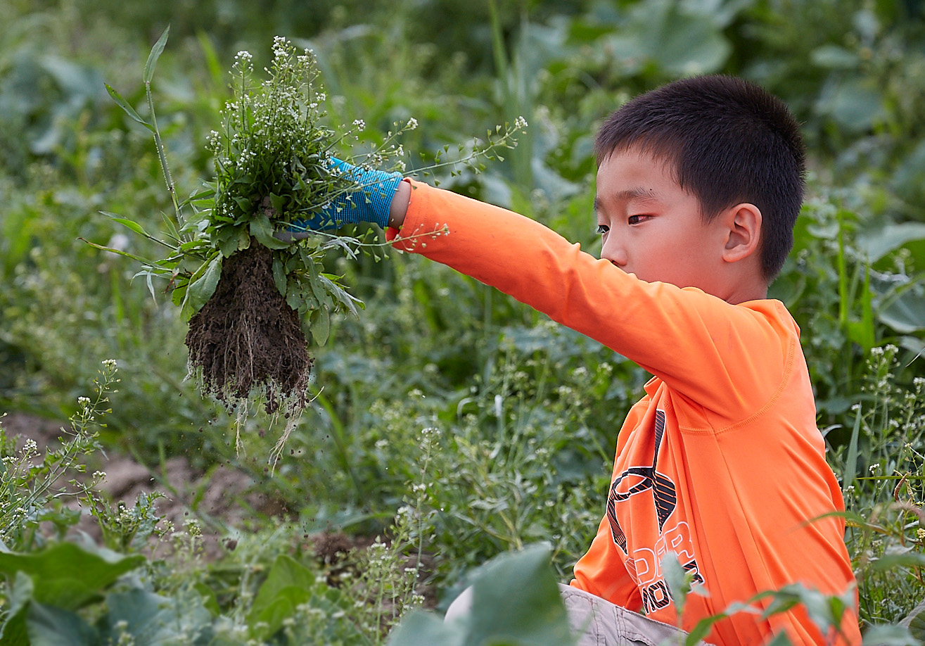
| 53 |
Aug 19 |
Comment |
Here's the results with the suggestions made so far: 1) gave a little more room at the top; and 2) lowered the opacity on the shadow a bit. What do you think now? |
Aug 15th |
 |
| 53 |
Aug 19 |
Reply |
I have found that without the shadow, the bike or car look like they're floating in space. The shadow grounds the subject. So, I need to ease up on the shadow a bit it would appear. d;¬{D |
Aug 14th |
| 53 |
Aug 19 |
Reply |
Thanks, Larry! Very good feedback and I will adjust accordingly. This is what I love about the DD study groups! d:¬{D |
Aug 6th |
| 53 |
Aug 19 |
Reply |
Thanks, Bev! I do agree - that and the toning done in ACR makes it look quite different. |
Aug 4th |
| 53 |
Aug 19 |
Reply |
Regarding the bike's angle, it is the same as the original, though filling the image more in the result. Also, the toning done in ACR gives it a very different look.
In the sense that I used the Smudge brush with a large brush tip in PS to move colors around in a dark landscape image, I feel that I did, in fact, paint the background. I have several like that I've made over time from photographs of different things. |
Aug 4th |
5 comments - 10 replies for Group 53
|
| 81 |
Aug 19 |
Comment |
How delightful! You did a great job with the faces - I can't draw to save my life! I especially enjoyed the worried face you put on the egg in your hand. Great story and I'm sure your club will be laughing big time when this hits the screen! d:¬{D |
Aug 2nd |
1 comment - 0 replies for Group 81
|
23 comments - 28 replies Total
|


