|
| Group |
Round |
C/R |
Comment |
Date |
Image |
| 6 |
Jul 19 |
Reply |
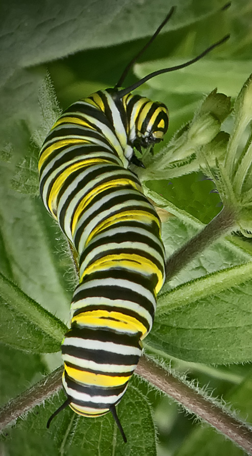
Mine is an older smartphone (Samsung Galaxy S6), and I have no ability to manually control the focus, so stacking is out I'm afraid. And I didn't do any PP on the phone - desktop PS, with an assist from Topaz ReMask 5 for the masking.
I have tried taking shots more from the side, but, without being able to control the aperture, the auto aperture tends to be too large for enough DOF for my tastes. My image in group 53 this month shows this: http://psadigital.org/group53/image.php?iid=38014 |
Jul 25th |
| 6 |
Jul 19 |
Reply |
Checkout https://www.youtube.com/channel/UCdQ_ZkYaMe6qPoueUyPQgpQ (Photoshop Training Channel), https://www.youtube.com/channel/UCc0_OX4mqSoRecj3IgJTLtg (photoshopCafe) & https://www.youtube.com/channel/UCMrvLMUITAImCHMOhX88PYQ (PiXimperfect) for starters. d;¬{D |
Jul 24th |
| 6 |
Jul 19 |
Reply |
Thanks, Sandra! I've spent many hours honing my post-processing skills and I never seem to know everything I need in a given situation. Fortunately, there are many good teachers out there in YouTubeland that are excellent at training. d;¬{D |
Jul 23rd |
| 6 |
Jul 19 |
Reply |
If I'd had my DSLR with me, I would have as it would have been more interesting as you indicated. With my smartphone, I don't have as much control over DOF. |
Jul 23rd |
| 6 |
Jul 19 |
Comment |
While my eyes track from left to right, it's not really a factor with this great capture! Perhaps cropping a bit from the right will strengthen the composition, but I found that my eye stayed glued to the spider - maybe because it looks like it could jump at me any moment! d;¬{D |
Jul 19th |
| 6 |
Jul 19 |
Reply |
You more likely to have your phone with you wherever happen to be, as I was during this shopping excursion. d;¬{D |
Jul 19th |
| 6 |
Jul 19 |
Reply |
Not bad for a smartphone pic, eh? Thanks! |
Jul 19th |
| 6 |
Jul 19 |
Comment |
Absolutely marvelous, Dick! Wonderful depth and texture - it looks like I can reach out and touch it! Bravo!!! |
Jul 19th |
| 6 |
Jul 19 |
Comment |
Right place at the right time! I like Dick's flip but prefer the brighter look of your version. I flipped and rotated it as Dick did, but only boosted the contrast some to help the caterpillar pop a bit more: |
Jul 19th |
 |
| 6 |
Jul 19 |
Comment |
My hat's off to you, Stuart - I would never dream of trying a focus stack handheld like that. Great job! Great detail and well composed. |
Jul 19th |
| 6 |
Jul 19 |
Reply |
I think your treatment of the flowers finished this quite well, Salvador! |
Jul 19th |
| 6 |
Jul 19 |
Comment |
Very unusual subject, Salvador! I do think Janet's orientation of it reads better to me. I'm also seeing a blur along the left side of the stalk that should be addressed - or better yet, strip the background away entirely: |
Jul 19th |
 |
| 6 |
Jul 19 |
Reply |
High praise indeed, Dick! Thank you so much!
d:¬{D |
Jul 3rd |
| 6 |
Jul 19 |
Reply |
Thanks, Bev! d:¬{D |
Jul 2nd |
5 comments - 9 replies for Group 6
|
| 11 |
Jul 19 |
Reply |
It all depends on what you want the viewer to focus on. Enhancing detail in what, in this case at least, is a background element is likely a wasted effort and a possible distraction from your subject element. |
Jul 26th |
| 11 |
Jul 19 |
Reply |
You're right, of course. I was concentrating on the blossom and didn't even see the orphan leaf at the bottom. |
Jul 26th |
| 11 |
Jul 19 |
Comment |
Yes, confusing. Without the surfaces that are being reflected in the water shown in the image, it is difficult to interpret what we are seeing. Reflections are generally an accentuation of a scene but don't typically do well on their own. |
Jul 20th |
| 11 |
Jul 19 |
Comment |
Vertical crop works best with a flower like this. I feel it should be cropped with the flower on the left third line because of its curve to the right.
I also agree about more contrast, but I think it's only needed on the flower, as well as some dodging & burning to add some more depth. Thoughts? |
Jul 20th |
 |
| 11 |
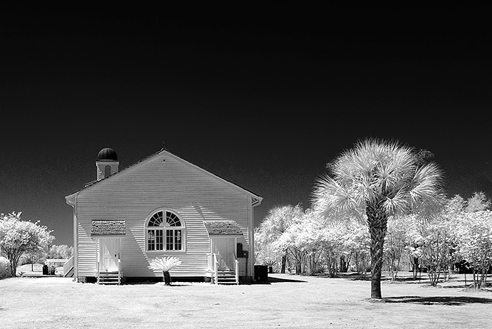
Jul 19 |
Comment |
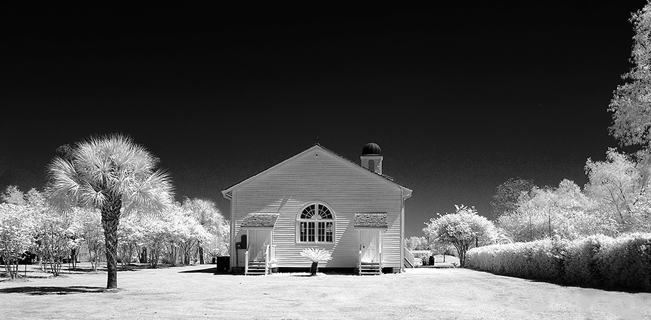
Striking image, Jim! The added contrast and darkened sky really pops the church.
Like Sharron, I'm having some issues with the shadows on the right. I cropped out the gate and cloned out the shadows and came up with this: |
Jul 20th |
 |
| 11 |
Jul 19 |
Reply |
Something like this, Sharron? |
Jul 20th |
 |
| 11 |
Jul 19 |
Comment |
I think your monochromed original (Original 2) has much more impact. With a bit more contrast, as Jim suggests, but cropping out the left-hand background element, this becomes very wall-worthy to me. Then again, what do I know? d;¬{D |
Jul 20th |
 |
| 11 |
Jul 19 |
Reply |
For my eyes, Allen's crop left too much space at the top. Because of the tree's lean, I think there should be more room for it to "move" into, though I know it's not going anywhere. d;¬{D |
Jul 20th |
 |
| 11 |
Jul 19 |
Comment |
Thank you all for your positive feedback. I guess this means the image turned out better than I thought. d;¬{D |
Jul 20th |
| 11 |
Jul 19 |
Reply |
I think you went a bit too far with darkening the path, which is an important leading line through the image. Perhaps midway between what you've done and Lisa's would be best. d;¬{D |
Jul 20th |
| 11 |
Jul 19 |
Comment |
Best choice for this over-exposed image. It brings out the texture nicely. The path is an effective leading line, drawing the eye into the image. Good job! |
Jul 20th |
| 11 |
Jul 19 |
Reply |
From your lips to their marketing dept's ear! Thanks! d;¬{D |
Jul 20th |
| 11 |
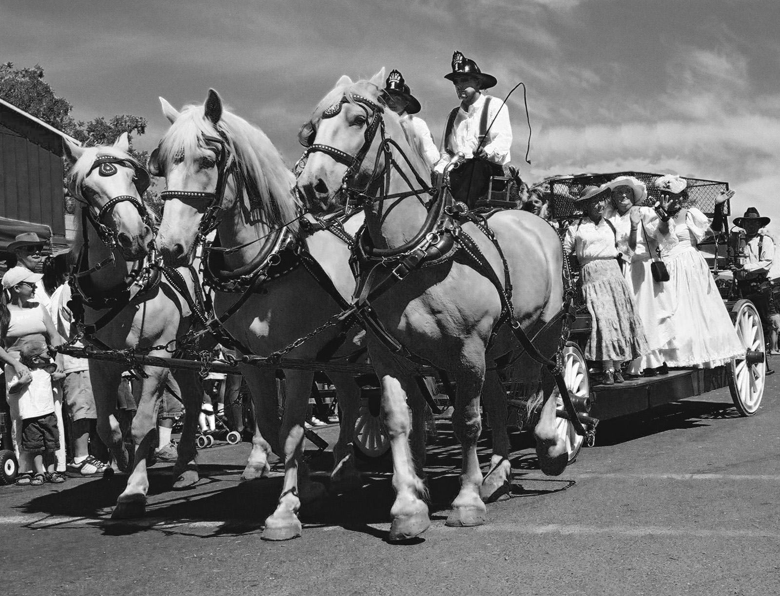
Jul 19 |
Comment |
Jim is right that this image is much stronger as a true mono, seeing as the original has very little tonal range.
Because there's so much on the white side of the tonal scale in your result, I thought the image could use a broader range, so pushed the yellows darker to separate the horses out some, then a lot of strategic burning to add a bit more depth: |
Jul 19th |
 |
| 11 |
Jul 19 |
Reply |
I must agree about the trees - they distract a bit, especially with most of the tones being so bright! |
Jul 19th |
7 comments - 7 replies for Group 11
|
| 18 |
Jul 19 |
Reply |
In actuality, a full-sized version is several megabytes in size and will not fit within the confines of the website. I will definitely, though. work on the diffusion |
Jul 28th |
| 18 |
Jul 19 |
Comment |
This was made to hang in a gallery! While it bears no resemblance to its origin, the transformation is mesmerizing and I could study it for a long time without growing tired of it. Bravo!!! |
Jul 21st |
| 18 |
Jul 19 |
Comment |
I'm quite late out of the gate this month and all that I would say has already been offered. I'll simply say it's uber-creative and beyond anything I could imagine. d;¬{D |
Jul 21st |
| 18 |
Jul 19 |
Reply |
That's the very thing that popped into my head when I saw this, Andrew! No fair getting there first! d;¬{D |
Jul 21st |
| 18 |
Jul 19 |
Comment |
I really like this, Mark. I can see this on a postcard or poster advertising the feel of Arizona. A little difficult to read the word "sunset", but the scene helps the eye interpret the letters. Certainly an appropriate treatment for an iconic silhouette. d:¬{D |
Jul 21st |
| 18 |
Jul 19 |
Reply |
Although your first result with the word sunset was a bit difficult to read, this is easier to read but overpowers the scene behind. I much prefer your first piece. |
Jul 21st |
| 18 |
Jul 19 |
Comment |
Definitely see the Buzz look, though it's very light and doesn't change much in the image except the sky and the Cadbury sign, the latter of which has taken on a purple color cast that spills onto the ground behind it, making it quite different from the rest of the image. Was this intentional, as I found it a bit distracting? |
Jul 21st |
| 18 |
Jul 19 |
Comment |
I like the effect on the windmills and the water, but am not too crazy about its impact on the other objects around the windmills. It's reminiscent of when I first wake up and my eyes aren't quite focusing yet. d;¬{D |
Jul 21st |
| 18 |
Jul 19 |
Comment |
There is a motion inherent in this image that conflicts conceptually with the quiet posture of studying a book. The question for me is which direction is the movement - are you moving towards me or is the room racing away as you're transported in your imagination by the book you're studying? It certainly draws the eye into the image! d:¬{D |
Jul 21st |
| 18 |
Jul 19 |
Comment |
Well, it's apparent I spent too much time on the effect without considering the image itself. Thanks for helping me see what should have been obvious. d:¬{( |
Jul 20th |
| 18 |
Jul 19 |
Reply |
I know that, Mike. I'm referring to the animation software and how it works. |
Jul 4th |
| 18 |
Jul 19 |
Reply |
I agree photographically, but the software would end up moving the background more as well - that is my conundrum. |
Jul 4th |
7 comments - 5 replies for Group 18
|
| 53 |
Jul 19 |
Reply |
Cool! It already had a spooky look without anything done. Great find! Thanks for sharing. d:¬{D |
Jul 19th |
| 53 |
Jul 19 |
Comment |
Wow! Powerful pair of pussycats!!! I like Dan's adjustments, too.
Here's my take - dodging and burning to add more depth and seriously darkening the right corners:
|
Jul 19th |
 |
| 53 |
Jul 19 |
Reply |
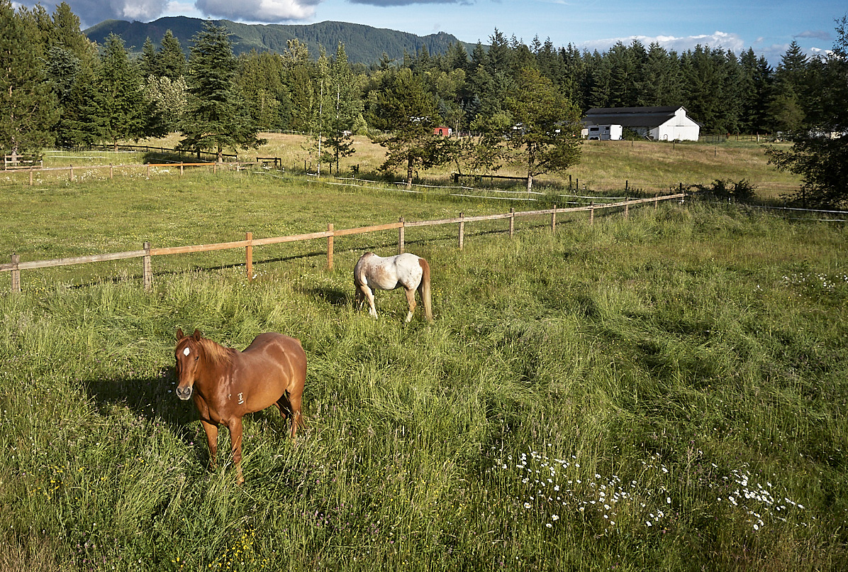
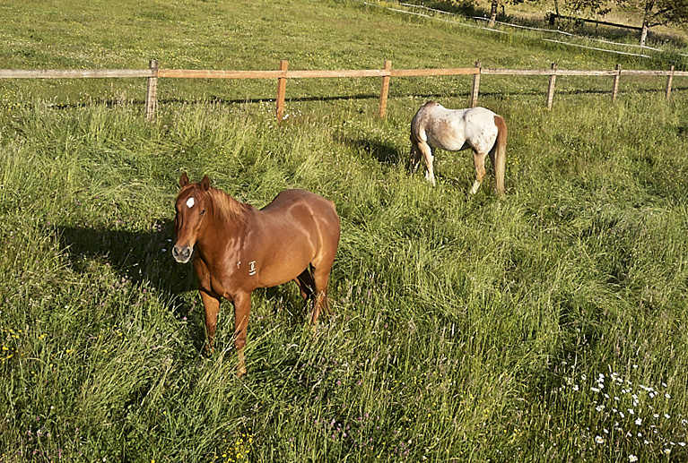
If the horses are just a foreground piece, then this crop, from the left and top, is a bit stronger: |
Jul 19th |
 |
| 53 |
Jul 19 |
Comment |
Lovely scene! I must ask, though, what are we to focus on? The title indicates the horses, but the fence-line is an effective leading line that pulls our eyes away from the horses into the rest of the scene.
To focus on the horses, here's my suggested crop: |
Jul 19th |
 |
| 53 |
Jul 19 |
Comment |
I love the effect of Glow on this. I can never get a good look out of Glow and have long since given up. Now I see your result and I might try it out again. I guess I've never found the right image to work with. I'd be curious to see what you started with, which might help us all see what you saw in the original capture. |
Jul 19th |
| 53 |
Jul 19 |
Comment |
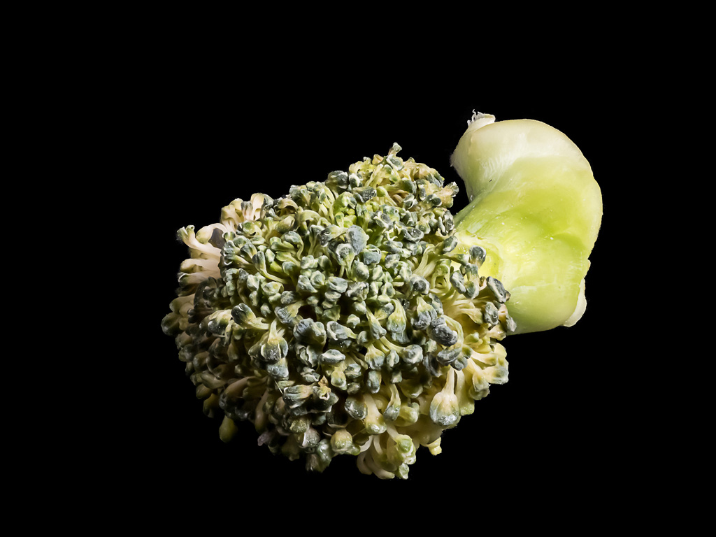
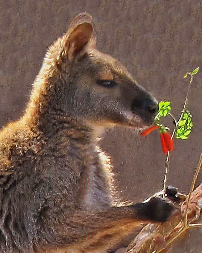
Great timing to capture the pop of red before he munched it down. The composition is good and, as I indicated earlier, removing the noise was an important step.
I took things a little further and cloned out the sunny area in the background, reduced the saturation slightly in the flower, and did a bit of dodging and burning to balance the image out some more: |
Jul 19th |
 |
| 53 |
Jul 19 |
Reply |
Reducing the noise certainly helps. It's something to consider doing early on in your post-processing. I've been using Topaz Denoise AI most recently and it does a great job at removing noise without sacrificing detail. |
Jul 19th |
| 53 |
Jul 19 |
Comment |
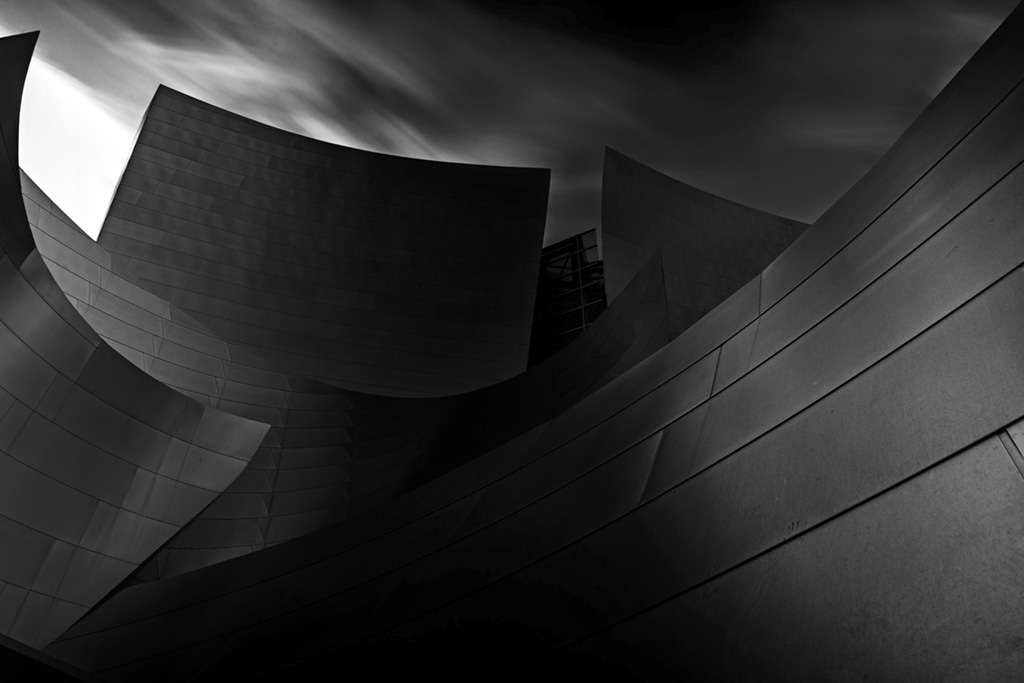
Very moody, Rohan! This is, though a tab bit over dark, a lovely blend of hard and soft, shadow and light. The curve of the wall contrasts nicely with its hard appearance.
It would be interesting to see the original image so that we can see how far you brought it in post-processing.
Here's my bit of adjustment to try and bring back some detail in the dark center: |
Jul 19th |
 |
| 53 |
Jul 19 |
Reply |
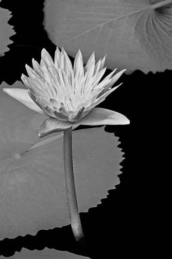
The flipped petal is what drew me to this flower. Thanks! |
Jul 19th |
| 53 |
Jul 19 |
Reply |
Thanks, Rusty! Not bad for a smartphone pic, eh? |
Jul 19th |
| 53 |
Jul 19 |
Reply |
I agree. I felt the folded over petal gave this some natural depth and interest. |
Jul 19th |
| 53 |
Jul 19 |
Reply |
Do you think that the soft focus on the back petals is not too noticeable? |
Jul 12th |
5 comments - 7 replies for Group 53
|
24 comments - 28 replies Total
|


