|
| Group |
Round |
C/R |
Comment |
Date |
Image |
| 6 |
Jun 19 |
Comment |
Excellent capture! The detail is superb, and though a bit of glare, it does bring out a bit more of that detail so my eye isn't bothered.
For me, the leaf is a minor distraction as it doesn't give scale to the millipede, which is all I'm interested in studying when you get right down to it. |
Jun 22nd |
| 6 |
Jun 19 |
Comment |
Perfect!!! One of my favorite flowers, captured exquisitely with your stack! Your flower stacks are the bomb!!! |
Jun 22nd |
| 6 |
Jun 19 |
Comment |
Wonderful image to study! My eye is delighted with all their is to see here. Lovely capture. I think your second crop finishes it nicely. Wouldn't change a thing after the crop!!! Bravo!!! |
Jun 22nd |
| 6 |
Jun 19 |
Comment |
Very colorful and good detail! I have to agree with Dick about the subject confusion. This is further complicated by the distortion caused by the curve of the glass on the bottom sphere pulling too much focus. I think you'd be better off including more of the container to better establish the story of what we're seeing. |
Jun 22nd |
| 6 |
Jun 19 |
Comment |
Love the detail in this capture - everything is sharp without being crispy!!!
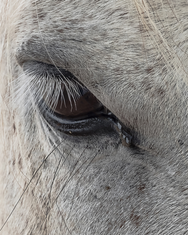
While I can see that the fly is a point of interest, I feel like it fights with the horse's eye for focus, and I would rather study a horse's eye than a fly any day. I also agree about the hairs that are covering the eye.
Here's my rendition, removing the fly and the distracting hairs, adding some contrast and cropping away from the square. Thoughts?
|
Jun 22nd |
 |
| 6 |
Jun 19 |
Reply |
Thank you, Janet! This one was kind of a balancing act in my mind. I didn't want the petals to be the main thing, yet I wanted them to show good detail in general. It can be a stressful dilemma for someone like me. d;¬{D |
Jun 14th |
| 6 |
Jun 19 |
Reply |
I will try that. I always am leery of making whites too bright for fear of tiring the viewer's eyes. Perhaps I backed off too far here. d:¬{( |
Jun 14th |
| 6 |
Jun 19 |
Reply |
I actually applied some sharpening - I typically do - but didn't want to overdo it with such a soft subject. |
Jun 5th |
5 comments - 3 replies for Group 6
|
| 11 |
Jun 19 |
Reply |
Hardly - I can't use my DSLR without a tripod. The light actually was fairly bright since it was outside. |
Jun 23rd |
| 11 |
Jun 19 |
Comment |
Very entertaining image, Jyoti! I particularly like the size difference between the penguins (large) and the humans (small), almost like a monster movie scene.
I agree with Sharron about the crop - removing some from the left has balanced the composition well. You might consider removing the human the is intersected with the left-hand penguin as well. |
Jun 22nd |
| 11 |
Jun 19 |
Comment |
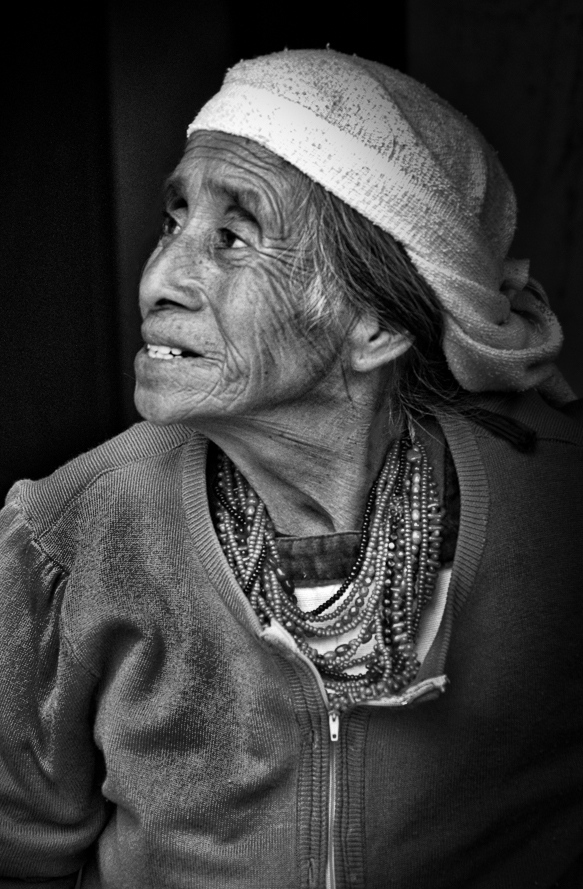
Powerful image, Jim! I admit I wondered about the noose and dot too, especially since they're not present in the color version you offered as an original. I thinking cropping from the right and bottom will make for a stronger composition. I also took the liberty of removing some of the stray hairs on the left side of her face to give it a stronger profile. Finally, I darkened her blouse on the left to take it down some and brightened her eyes and teeth slightly. Thoughts? |
Jun 22nd |
 |
| 11 |
Jun 19 |
Comment |
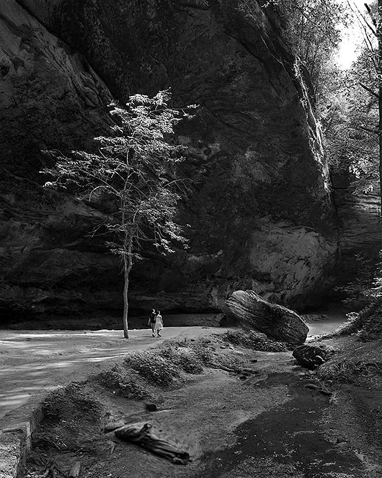
The sky is not really a bother here as it offsets the dark areas on the left. You have great detail here and nearly 3 zones of interest, although the foreground is too sparse to fully count and the log that might have been a foreground subject is too far back to qualify and actually proves to be a bit of a distraction. To strengthen the composition, you need to pull the "horizon" line off center, preferably down.
I cropped some from the bottom and right to put the horizon on the bottom third line and the small tree on the left third line. I also removed the people underneath the overhang and a few stick and stones in the water to have less distractions. Finally, I used a liquify on the log to give it a little more presence as a foreground element. Thoughts? |
Jun 22nd |
 |
| 11 |
Jun 19 |
Comment |
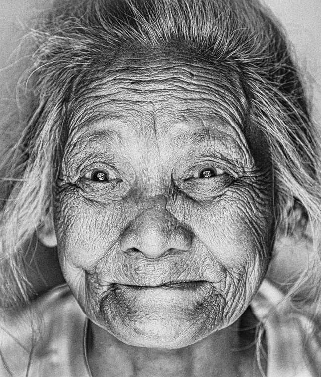
Powerful image, Sharron! Such character and vitality in this face. I do find the shadows in your conversion a bit dark. I applied the Subtle Glow filter in Silver Efex Pro to soften them a bit: |
Jun 22nd |
 |
| 11 |
Jun 19 |
Comment |
Great job with the detail here, Lisa! Nice sharp edges, contrasted with the curves of the wires. A bit too dark along the bottom of the image, which is a wee bit distracting. |
Jun 22nd |
| 11 |
Jun 19 |
Comment |
My goodness that was a long shot! Your post processing rescues the chick from the tangle of branches and needles - it's all but hidden in the original.
I'm afraid there's still too much foliage in the shot, while I realize you're already a bit beyond the limit of the capture. It reminds me of trying to get some shots of an osprey chick in Yellowstone, which the rangers were keeping everyone very far back from and the strongest lens we had was a Tascam 100-400mm that wasn't quite up to the task of bringing the chick into view successfully, especially with only a monopod to steady the camnera with. <...sigh...> |
Jun 22nd |
| 11 |
Jun 19 |
Reply |
I use Topaz ReMask 5 for the bulk of my mask work - beats Photoshop's Select & Mask tool by far! d;¬{D |
Jun 20th |
| 11 |
Jun 19 |
Reply |
It was an overcast day, shortly after a rain, and the light was just as I like it. Thanks, Sharron! d:¬{D |
Jun 14th |
6 comments - 3 replies for Group 11
|
| 18 |
Jun 19 |
Comment |
This image really pops, Jennifer! While Mike's modifications clean it up, I'm kinda partial to your result as is. It has impact, even if it has an even number of trees. The lighting is especially sweet! Great job!!! |
Jun 22nd |
| 18 |
Jun 19 |
Comment |
I like the treatment overall, but I wish the path was a little more visible to lead me into the image better. As it stands, it's like the path is cut off by the foliage, blocking our travel into the scene. |
Jun 22nd |
| 18 |
Jun 19 |
Comment |
Though a tighter crop gives more focus to the windmill, I actually prefer your rendition, Mark. It tells a great story just as it is. Bravo!!! |
Jun 22nd |
| 18 |
Jun 19 |
Comment |
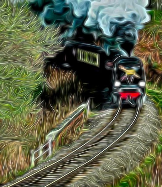
Interesting creation, Andrew. I'll admit I'm on the fence about the left side as well. Here's what I came up with, cropping on the left and right to make this a vertical. Thoughts? |
Jun 22nd |
 |
| 18 |
Jun 19 |
Comment |
Hmmm . . . an artistic treatment of a photograph of a photograph. It does turn this image into more of a pastel/color pencil interpretation, so it definitely qualifies for our theme in this group. I think I'll leave the controversiality of this for others to wrestle with. d;¬{D |
Jun 22nd |
| 18 |
Jun 19 |
Reply |
I will have to experiment with that, Jennifer. We'll see what I can do. d;¬{D |
Jun 14th |
| 18 |
Jun 19 |
Reply |
I will have to look closer at the catchlights - I hadn't noticed that. Guess I was too close to the subject. d;¬{D |
Jun 14th |
| 18 |
Jun 19 |
Reply |
Thanks for the suggestion and demo, Mike! |
Jun 4th |
5 comments - 3 replies for Group 18
|
| 53 |
Jun 19 |
Comment |
I was privileged to be on the beta team testing Topaz Denoise AI and have made it a regular part of my workflow since its full release, replacing NIK Denoise as my noise reduction tool of choice. |
Jun 16th |
| 53 |
Jun 19 |
Reply |
See my reply to Arabella above. d;¬{D |
Jun 16th |
| 53 |
Jun 19 |
Reply |
I selected the top section with the Rectangular Marquee tool, copied it, moved it lower, added a layer mask and smoothed out the hard edge on the bottom, then cropped to the new "top" of the image. |
Jun 16th |
| 53 |
Jun 19 |
Comment |
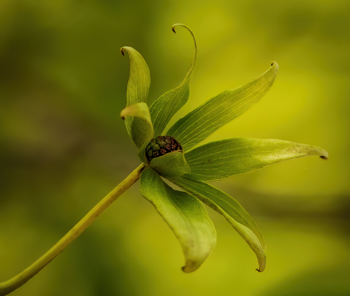
Lovely image! Really like the leading line of the stem on the diagonal and the dreamy green and brown background.
I agree with Dan about the noise and also feel that flipping it horizontally will improve the composition. My example here has done that and then run it through Topaz Denoise AI. Thoughts? |
Jun 15th |
 |
| 53 |
Jun 19 |
Comment |
This is so very different from your sheering image from last year! Your crop and darkening of the background have successfully removed it from being a distraction, focusing us on the interaction between sheep and woman. The detail in sheep and woman is excellent. The exposure is a tad bit dark which has an effect on the mood of the image as I'll discuss in a moment.
I must say that this image looks like the woman is doing something cruel and painful to the sheep, especially with the terror that shows in its visible eye and the woman's left hand not visible behind the sheep. My casual knowledge of the process tells me she is merely positioning the sheep to begin the process, but the image tells a different story. |
Jun 15th |
| 53 |
Jun 19 |
Comment |
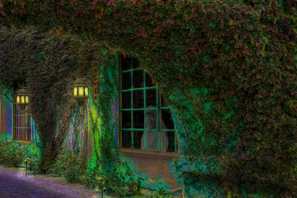
This is eerie, indeed! I almost expect a ghostly person to be peering out the window. I kinda agree with Dan about the amount of ivy-covered wall that dominates the right of the image, but I also think it gives some dimension to the image.
You certainly inspired me to play with this: I turned on the lights, darkened the central window and added a spectral figure looking out to make things a bit more eerie. Thoughts? |
Jun 15th |
 |
| 53 |
Jun 19 |
Comment |
If you "played in the Elements sandbox," you were doing what you should be doing. We all learn from experimentation. No matter how many videos I watch about how to do things, it doesn't really gel until I roll up my sleeves and try it myself, further changing things to make it my own.
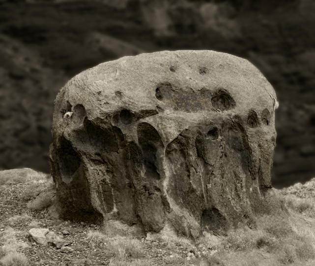
This rock is so distinct and otherworldly that I can see why you were compelled to emphasize that. I think your vignette is too close to the rock and obscures its features somewhat.
Here's my take: I rotated it slightly to straighten it, converted to monochrome with a sepia tint (as Dan suggested), then selected the background and applied some Gaussian blur and darkened it a bit so that the rock stood out more. Then I applied selective dodging and burning to give the rock more depth. I realize this was not your vision for this image, but I think it brings the viewer into closer contact with this amazing find. Thoughts? |
Jun 15th |
 |
| 53 |
Jun 19 |
Comment |
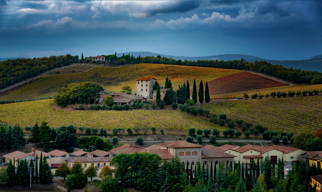
A lovely scene you found! Lots of nice layers and leading lines. I think the image could use some more contrast and some dodging and burning to add some depth. You might also consider, as Arabella and Dan suggest, cropping the sky some. However, in doing so, it would be better to remove some of the sky below the clouds rather than cropping out the clouds (in essence moving the clouds down) as they add some texture consistent with the landscape. Here's an example: |
Jun 15th |
 |
| 53 |
Jun 19 |
Reply |
For me, this is too tight a crop, but perhaps I'm too close to the image to see what you're saying. I'm looking forward to what others think about this. |
Jun 15th |
| 53 |
Jun 19 |
Reply |
Can I ask your thinking on the crop? |
Jun 14th |
6 comments - 4 replies for Group 53
|
22 comments - 13 replies Total
|