|
| Group |
Round |
C/R |
Comment |
Date |
Image |
| 6 |
Apr 19 |
Reply |
Yes, but you have the opportunity to edit the mask on each layer of the stack to correct that. It certainly doesn't compare to Helicon, but I've found it to be a decent runner-up. |
Apr 15th |
| 6 |
Apr 19 |
Comment |
Exquisite! I very much enjoyed studying this image, Dick! Thanks for sharing it with us and your method of capture. |
Apr 12th |
| 6 |
Apr 19 |
Comment |
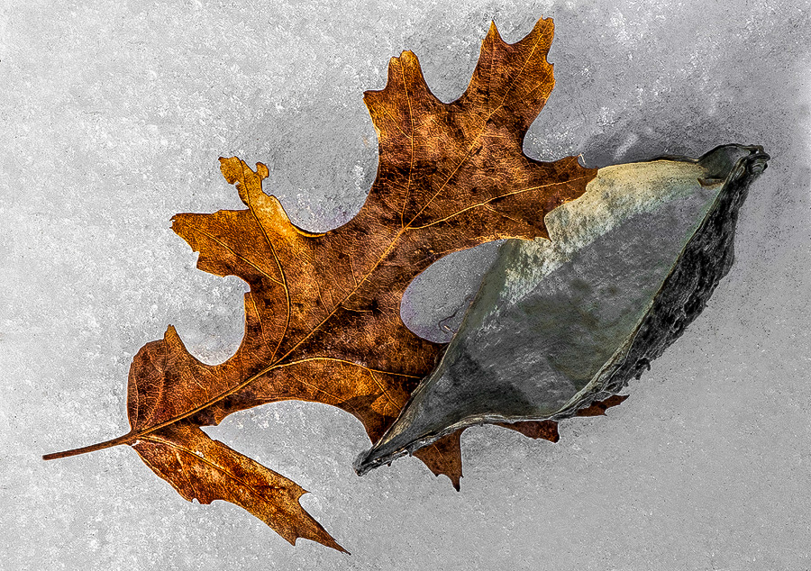
Taking Dick's rotation as a start, I used Stuart's suggestion and cloned out the pod's stem, then did a bit of dodging and burning to try and add depth to the interior of the pod. Not sure I succeeded, though: |
Apr 12th |
 |
| 6 |
Apr 19 |
Reply |
Again, you and I agree about the orientation. |
Apr 12th |
| 6 |
Apr 19 |
Comment |
Affinity Photo did a pretty good job on the stack. Before I purchased Helicon, Affinity Photo was my choice for stacking.
I really like this, despite, as you say, it not being very pictorial. It certainly qualifies as a macro!
I like the composition, but I find your exposure was off a bit. I did a bit of selective dodging and burning to try and compensate: |
Apr 12th |
 |
| 6 |
Apr 19 |
Comment |
I agree with Stuart and Dick's suggestions, but felt just one more tweak for the sake of composition would be better - adding a little space to the left for the creature to move into: |
Apr 12th |
 |
| 6 |
Apr 19 |
Reply |
Agreed - this is the better composition, Dick. |
Apr 12th |
4 comments - 3 replies for Group 6
|
| 11 |
Apr 19 |
Reply |
Ahhh, but that's easier said than done! d;¬{D |
Apr 25th |
| 11 |
Apr 19 |
Comment |
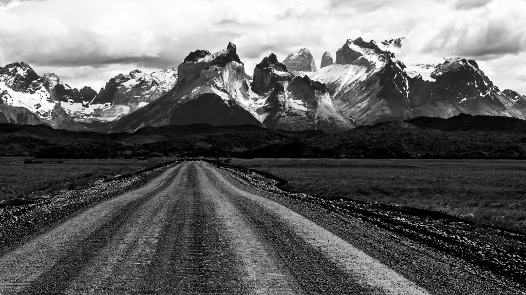
I definitely envy your experience! Awesome landscape and very appropriate for monochrome.
I would suggest darkening the road slightly, so that it serves as a means of drawing the eye to the mountains, and selectively dodging and burning the mountains to give them more depth, and, perhaps, remove a few distracting elements along the road: |
Apr 16th |
 |
| 11 |
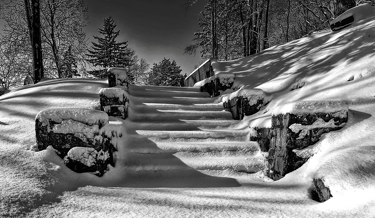
Apr 19 |
Comment |
Excellent choice for monochrome. Lots of texture in the snow has given the image depth and making me want to hear that snow crunching under my boots.
I would suggest darkening the sky to de-emphasize it so that the eye stays on the stairs and the snowy surrounding: |
Apr 16th |
 |
| 11 |
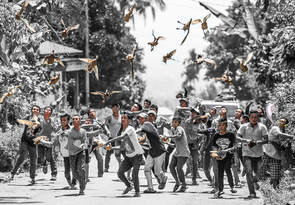
Apr 19 |
Comment |
OMG, what an experience!!! This is something where the image is so weird that it really needs the explanation for it to make sense. By the looks, it almost seems like the men are trying to throw something at the birds, not the birds themselves. Either way, it's an incredible visual.
What popped into my mind as I studied this is the idea of this being a good image for selective coloring, with the birds and the men's faces being the important elements of the image. Here's an illustration: |
Apr 16th |
 |
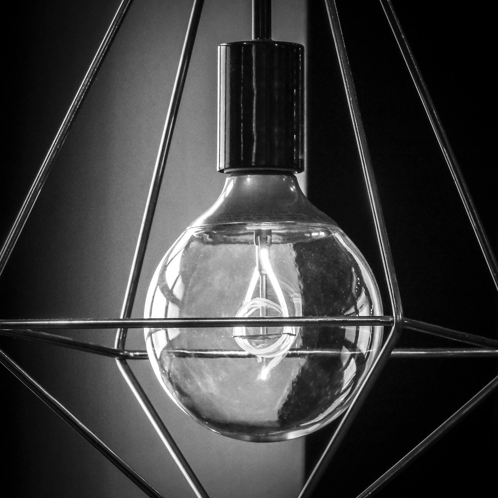
| 11 |
Apr 19 |
Comment |
Great eye to see the potential for this image! I can quite imagine that it wouldn't have the impact in color that it has in monochrome. You also did fairly well in capturing the glass without too much of the surroundings in the reflection. I don't really notice the cut off corners as my eye is drawn to the bulb.
A little more contrast in the bulb and some spot healing and this will be golden. |
Apr 16th |
 |
| 11 |
Apr 19 |
Comment |
What an amazing place and an equally amazing capture. I agree with Sharron about the bush and Jyoti about the dark areas. I also feel the large area of trees could use a bit more contrast. Here's my demonstration: |
Apr 16th |
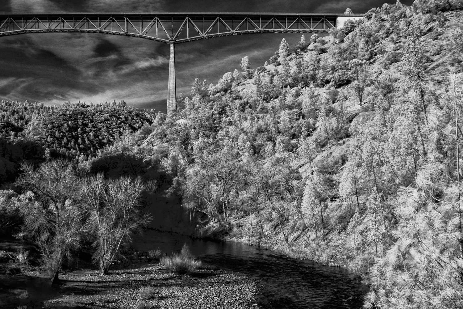 |
| 11 |
Apr 19 |
Reply |
I'll admit I'm quite happy with the color version, too. In some ways, though, the blue is a bit overwhelming. |
Apr 16th |
| 11 |
Apr 19 |
Reply |
I was in the right place at the right time and had the right tools to finish it off. Thanks, Sharron! |
Apr 15th |
| 11 |
Apr 19 |
Reply |
Thanks, Allen! It copies the image, flips it vertically, blurs it and uses a displacement map to add the ripples. Doesn't always work, but in this case, I got lucky. d;¬{D |
Apr 15th |
| 11 |
Apr 19 |
Reply |
Thank you, Bev. The water was added with a Photoshop action I created quite a while back based upon several tutorials I watched at the time. |
Apr 15th |
5 comments - 5 replies for Group 11
|
| 18 |
Apr 19 |
Comment |
I think the Fractalius effect works well here, achieving the dreaminess you were looking for. My suggestion would be to clone out the blue flowers before processing the image in Fractalius as the blue is distracting in the result. |
Apr 16th |
| 18 |
Apr 19 |
Comment |
A new talent has joined our crazy creative group - Welcome!
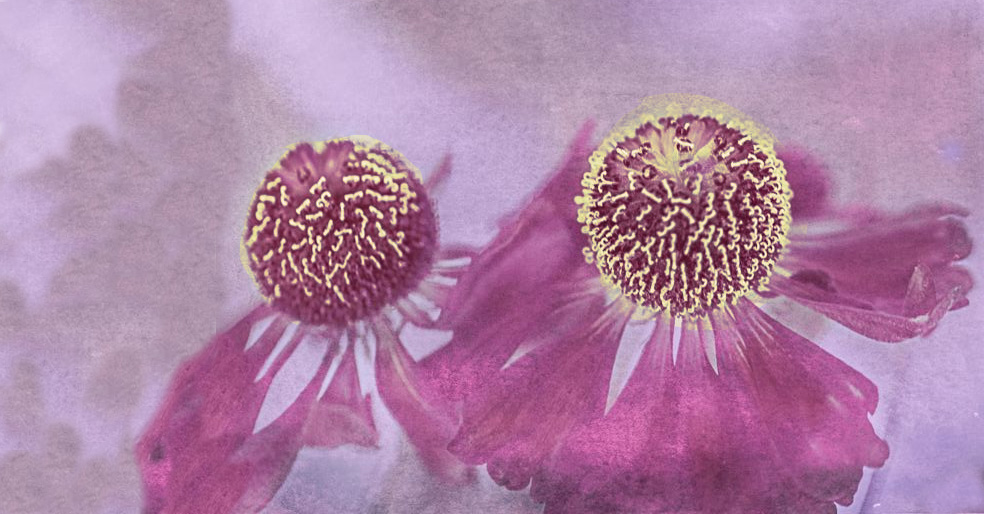
I love the effect that you've achieved with your flowers - very soothing and inviting and definitely something that could be developed for a wall somewhere. I do agree about the yellow stamens from Original 3, but prefer the purple coloring of your final result. I added the color of the stamens to your image and rotated it to the left 90 degrees and cropped it to give a different composition, cloning in material to fill the empty space I added. What do you think? |
Apr 16th |
 |
| 18 |
Apr 19 |
Comment |
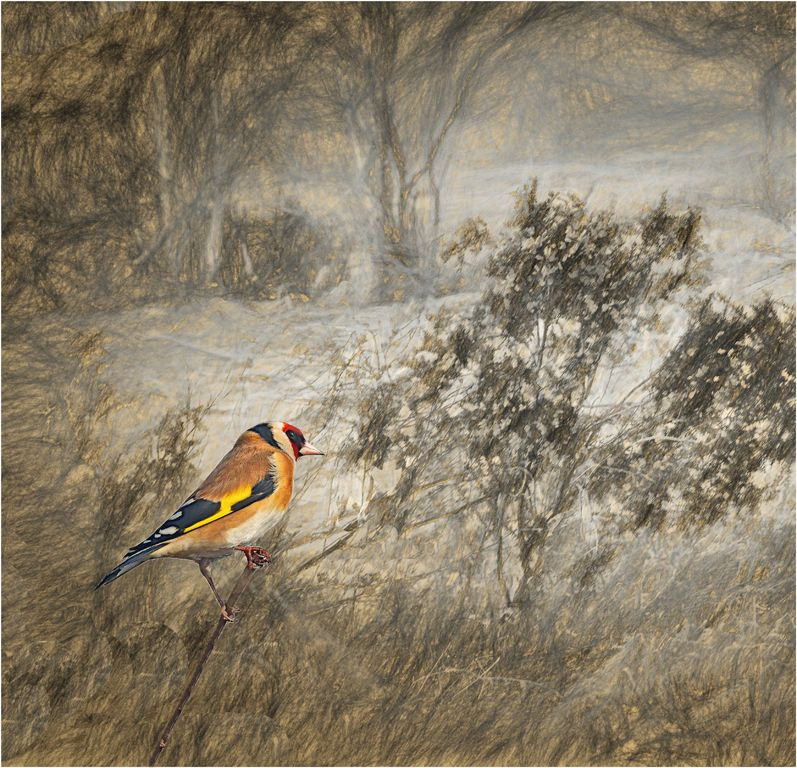
I love this. I think the bird is at a good size, but the branch it's resting on is too short to have it read as in the foreground. Try extending the branch to the bottom to give a more realistic dimension: |
Apr 16th |
 |
| 18 |
Apr 19 |
Comment |
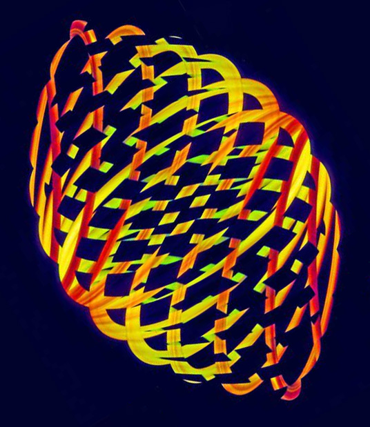
Have to agree with the others about the 4 corner copies - they are a distraction. If you want to minimize the negative space, try rotating the main image to the diagonal: |
Apr 16th |
 |
| 18 |
Apr 19 |
Comment |
An incredible conversion, Ian! Not everybody can make Glow work effectively, but this demonstrates that you can. Bravo!!! |
Apr 16th |
| 18 |
Apr 19 |
Comment |
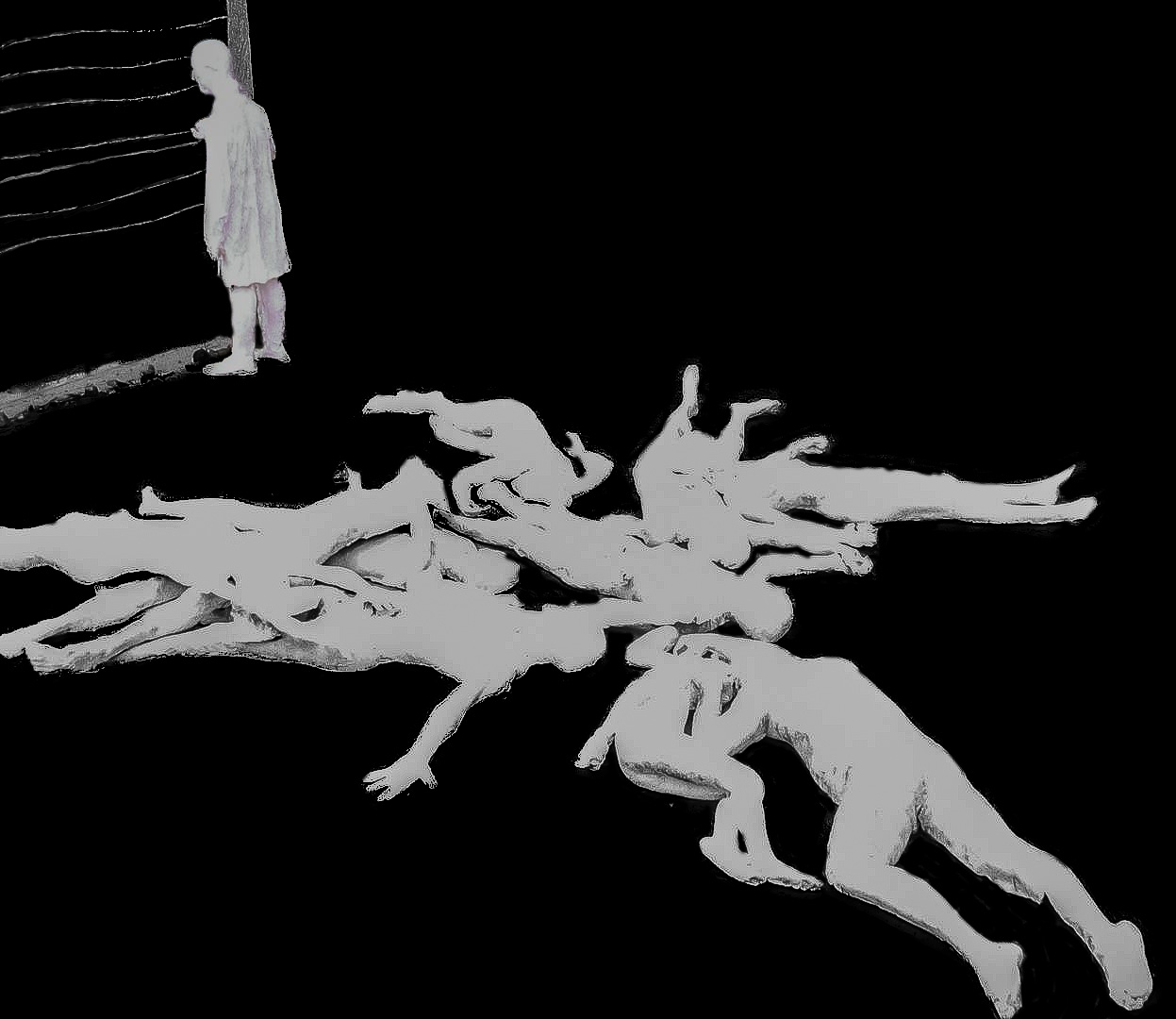
This scene is horrifying! I'm actually glad there are no details in the figures as it would be even more gut-wrenching.
Perhaps, if you remove all but the figures and the fence, it would have more impact: |
Apr 16th |
 |
| 18 |
Apr 19 |
Reply |
See my response to Jennifer for the result of one color brick.
The session was several years ago and I didn't have the Photoshop chops then. I may just have to track them down and send them this "new" version for a laugh! d;¬{D |
Apr 8th |
| 18 |
Apr 19 |
Reply |
Wasn't too sure what you meant in this case by diffuse. Can you elaborate?
I did try using a solid color background. What do you think about this one? |
Apr 8th |
 |
| 18 |
Apr 19 |
Reply |
Agreed, Barbara. See what you think with the brick all one color in my response to Jennifer. |
Apr 8th |
| 18 |
Apr 19 |
Reply |
It makes sense to simplify the background to make a support and not a distraction. I made the bricks & mortar all one color. I tried various shades of orange and the color just wasn't working. What do you think of the brick all one color? |
Apr 8th |
 |
6 comments - 4 replies for Group 18
|
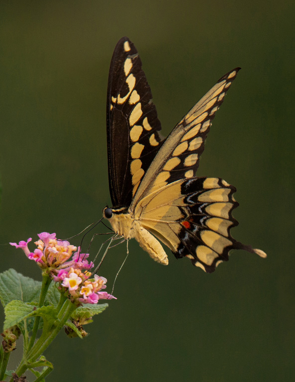
| 53 |
Apr 19 |
Comment |
Stupendous capture! The blurred background is good and the detail, exposure & composition of the butterfly and flower are spot on! My only suggestion is to darken the background a little bit to help the subject pop even more: |
Apr 12th |
 |
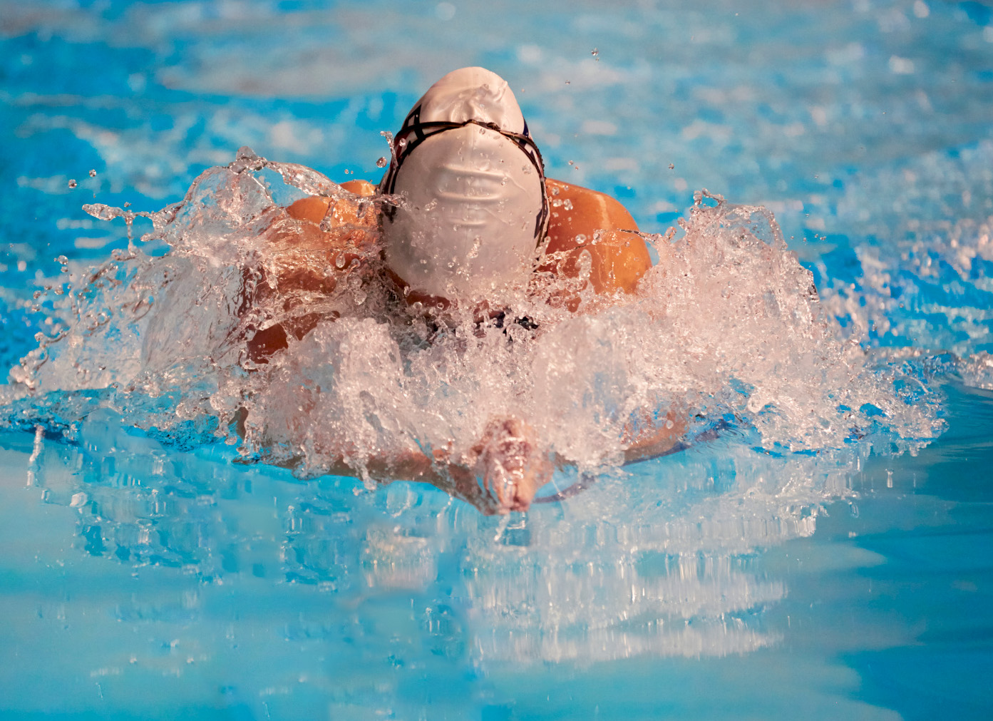
| 53 |
Apr 19 |
Comment |
Great action shot! As a former competitive swimmer, this really caught my eye! Super detail, exposure and composition.
My only issue is with the dark lane, which pulls the eye up and to the left out of the image. Here's a version with it cloned out: |
Apr 12th |
 |
| 53 |
Apr 19 |
Comment |
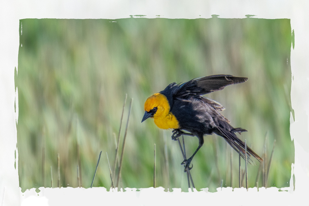
I think your crop is just right, placing the star of the image in a sweet spot. The border does lend itself to the image, especially because of the reeds. I do, however, find the reeds showing through the border at the bottom a little distracting. Here's a version with the border solid there: |
Apr 12th |
 |
| 53 |
Apr 19 |
Reply |
I've captured lots of pelicans in Iowa and Illinois, actually. |
Apr 12th |
| 53 |
Apr 19 |
Comment |
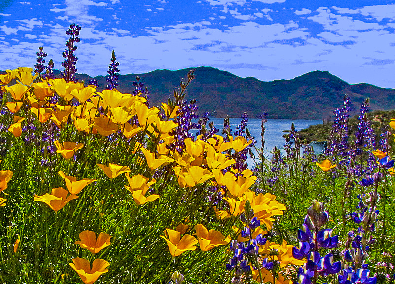
Agree with Dan about a different position. I've found that shooting from a variety of angles gives me more info at my desk to best craft a result. Wish I'd learned that much earlier in life.
I tried a different crop to give more emphasis to the yellow flowers, since the blue ones were largely over-shadowed by the yellows. I also played around with the sky to mute it a bit, and the water to give it a hint of color. I did this by adding a Solid Color adjustment layer, set to the blend mode of Color, and then masked to affect only the sky and water. |
Apr 12th |
 |
| 53 |
Apr 19 |
Reply |
I fully acknowledge that this image is a challenge. Most of the shots from that helicopter trip were awful and not worthy of bothering with. In 2008, when we took this trip (which I won or I'd never have made it Hawaii), I didn't have the post-processing skills to even consider doing something with this. Eleven years later and it's still a struggle. Ever learning, though, which is why I enjoy DD so much! d;¬{D |
Apr 12th |
4 comments - 2 replies for Group 53
|
19 comments - 14 replies Total
|


