|
| Group |
Round |
C/R |
Comment |
Date |
Image |
| 6 |
Mar 19 |
Comment |
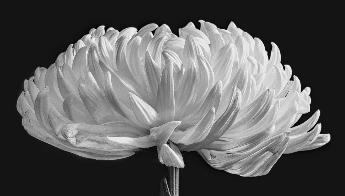
I think I agree with Sandra on the original composition. In either case, this is an incredible macro shot and I tilt my hat to you! d:¬{D |
Mar 23rd |
| 6 |
Mar 19 |
Comment |
I'll admit that I'm not a big fan of the Lensbaby look. SO much is out of focus that I over-examine the area in focus. As a Powerpoint slide, though, I can see the value! d;¬{D |
Mar 23rd |
| 6 |
Mar 19 |
Comment |
What a wonderful tableau, captured so well! I envy you the ability to put something like this together! Bravo! |
Mar 23rd |
| 6 |
Mar 19 |
Comment |
The thing I found that made the most difference in my stacks, aside from Helicon Focus, was a rail. I found one for $20 and it makes the process so much easier. I figure out my farthest starting and ending distances and increment between. |
Mar 23rd |
| 6 |
Mar 19 |
Comment |
Wonderful composition - it really helps us appreciate all of the flower. The dodging and burning made a huge difference in popping out the rest of the detail. |
Mar 22nd |
| 6 |
Mar 19 |
Comment |
It's important, when shooting handheld, to either have enough shutter speed to alleviate any camera shake or enough light on the subject to allow for a smaller aperture.
As others have already said. a tripod can be your best friend when shooting macro, because the tiniest movement is greatly magnified as we get close to our subject. At my age, using a tripod, or at the very least a monopod, is a requirement. d;¬{D |
Mar 22nd |
| 6 |
Mar 19 |
Reply |
Radius 8 & Smoothing 4. Usually use Method B, alternately A. |
Mar 8th |
| 6 |
Mar 19 |
Reply |
Thank you, Janet. I'll take all the praise I can get! d;¬{D |
Mar 8th |
6 comments - 2 replies for Group 6
|
| 11 |
Mar 19 |
Comment |
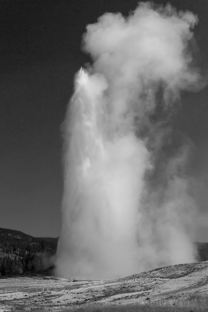
Here's my redo with the black tip corrected. |
Mar 29th |
 |
| 11 |
Mar 19 |
Reply |
Thanks so much, Jim! |
Mar 29th |
| 11 |
Mar 19 |
Comment |
Jim, I think you tried to minimize the surroundings to help the geyser pop, but the end result was to make the whole scene seem underexposed. Better to lighten the surroundings and give the geyser some context. Like this, perhaps: |
Mar 23rd |
 |
| 11 |
Mar 19 |
Comment |
Your corrections and mono conversion have turned a boring capture into a fascinating image. You pulled out such detail that demands to be studied. Great job! |
Mar 23rd |
| 11 |
Mar 19 |
Comment |
I think your mono result, even without the finishing touches Allen brought to the table, is so evocative! Where the tiny woman is overwhelmed by the window and colors in the original, the removal of color and making her the focal point let us meet her face to face. THIS is the image I would like to look at each day. Bravo! |
Mar 23rd |
| 11 |
Mar 19 |
Comment |
You took a nice image and brought out so much more with the mono conversion. Allen's edit added depth to the peaks. Consider doing some selective dodging and burning to the water and rocks to bring more life to that area. |
Mar 23rd |
| 11 |
Mar 19 |
Reply |
This helped bring depth to the peaks. Nice finish. |
Mar 23rd |
| 11 |
Mar 19 |
Comment |
Gorgeous, Allen! The arch of the one tree limb, curving into the tree on the left, provides a lovely natural framing for the snow scene.
I didn't notice the wires until Sharron tipped us off, so they are not really a distracting element they could be in a version of the scene without snow.
For me, the blue works better for a winter scene. It cools the scene down just a titch more, thus adding the "feel" of winter. The standard mono, without more white, has a dirtier feel. |
Mar 23rd |
| 11 |
Mar 19 |
Reply |
So I should fix that or not??? |
Mar 19th |
| 11 |
Mar 19 |
Reply |
Yikes! First impressions are important and your impression that it might not be real is troubling. d:¬{( |
Mar 18th |
| 11 |
Mar 19 |
Reply |
Good catch, Lisa. I really didn't notice it. That's what's great about this group - helping each other see what we're missing. d:¬{D |
Mar 16th |
6 comments - 5 replies for Group 11
|
| 18 |
Mar 19 |
Reply |
Thanks, Kerstin! It helps to have such powerful tools at my disposal, of course. d;¬{D |
Mar 31st |
| 18 |
Mar 19 |
Reply |
Valid point! |
Mar 23rd |
| 18 |
Mar 19 |
Reply |
Hmmm . . . For me, the black helps to pop the stained-glass effect. The square crop does give a different feel for sure and the rotation makes it seem more like flames. |
Mar 23rd |
| 18 |
Mar 19 |
Comment |
I'm sorry to be a spoilsport, but this just does not work for me. I'm not even able to articulate my reasons very well. I guess the main reason would be I don't find a story here. I think I need some of Ian's pills . . . |
Mar 23rd |
| 18 |
Mar 19 |
Comment |
I must agree about the four vs three. There's a balance of two and two without a bland symmetry, especially since the deer are positioned and looking differently. The treatment adds an artistic flair that really sets this apart. Bravo! |
Mar 23rd |
| 18 |
Mar 19 |
Comment |
This is so creepy! I find myself having to look away and then drawn to look again - kinda like a traffic accident. I think I better not take a nap today or I'll wake with a fright! d;¬{D |
Mar 23rd |
| 18 |
Mar 19 |
Comment |
From terribly mundane to terrifically magical! I especially appreciate that you had something outrageous in mind while you were capturing the images. Make sure you renew that prescription! d;¬{D |
Mar 23rd |
| 18 |
Mar 19 |
Comment |
What a majestic scene! There's a lot of depth and detail here. As Mark indicated, the effect is very subtle and doesn't read like anything's been done. I really like this! d:¬{D |
Mar 23rd |
| 18 |
Mar 19 |
Reply |
Cool! I appreciate you taking up the challenge! d:¬{D |
Mar 20th |
| 18 |
Mar 19 |
Reply |
This is very colorful, but a bit pale for my tastes. I guess, more than anything, we've proven just how much can be done so easily in a tool like Topaz Studio. d;¬{D |
Mar 20th |
| 18 |
Mar 19 |
Reply |
Did you start from my original or my result? I ask, because this looks very similar to the result but darker. |
Mar 20th |
| 18 |
Mar 19 |
Reply |
Thanks, Bev! You're welcome to download and post your results! d;¬{D |
Mar 19th |
| 18 |
Mar 19 |
Reply |
I'm thinking on a wall as it looks like stained glass? |
Mar 11th |
| 18 |
Mar 19 |
Reply |
Very different feel, entirely, Mike. I like how you think outside of the box. d;¬{D |
Mar 2nd |
5 comments - 9 replies for Group 18
|
| 53 |
Mar 19 |
Reply |
Quite frankly, I'm jealous of Arabella's image, and wish I had taken it. d;¬{D |
Mar 18th |
| 53 |
Mar 19 |
Reply |
The grain is because I did a screen grab rather than using the image she sent me to upload. My redo is simply a proof of concept so I didn't concern myself with a perfect mask, etc. As I was working on it, the grain was somewhat of a bother, but I elected to ignore it rather than start over. Guess you can call me lazy! d;¬{D |
Mar 18th |
| 53 |
Mar 19 |
Reply |
Yes, shadows are very important for a sense of depth, especially when the background has been replaced as I have done. |
Mar 18th |
| 53 |
Mar 19 |
Reply |
I actually worked to remove as much of the fringing as I could without driving myself nanners. And the center is darkened by design, though I can see where I might have gone too far. Hmmm . . . |
Mar 17th |
| 53 |
Mar 19 |
Reply |
Wow! I didn't really see that petal on the right, but have to agree with you about removing it. Thanks! d;¬{D |
Mar 17th |
| 53 |
Mar 19 |
Reply |
I think you're definitely right about darkening the stem. I think its presence is necessary to keep the flower from floating. I've done a lot of flower images with the blossom having no grounding element. I'm not sure why I decided to keep the stem in this case. Maybe you're correct about the flower floating being better. Hmmm . . . |
Mar 17th |
| 53 |
Mar 19 |
Reply |
I wrestled with the color. The actual color of the flower was closer to how I processed it, so that's what I stuck with eventually.
I'm not sure what you mean by "Do we need the stand?" Are you referring to my "helping hand" in the original photo? By the time I got to work on this carnation, the stem was fairly soft, to the clip stand was necessary to orient it as I needed it. |
Mar 17th |
| 53 |
Mar 19 |
Reply |
Thanks, Rohan. d;¬{D |
Mar 17th |
| 53 |
Mar 19 |
Comment |
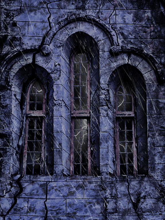
What a cool capture, Arabella! This is just loaded with possibilities, especially since you like doing different things with your images.
Jumping on Dan's suggestion, I went the route of making it haunted looking. Applied a couple of dark Photo Filter adjustment layers, then some lightning reflected in the windows, and finally some rain. Thoughts? |
Mar 17th |
 |
| 53 |
Mar 19 |
Reply |
The easiest thing to do is select the subject, in this case, the device, and remove the background. Add a solid color layer beneath, in this case, white. Duplicate the isolated subject layer and, the lower of the 2, double-click the layer to bring up the Layer Styles, add Drop Shadow to taste (usually 100% opacity and black), right-click on the style and choose Create Layer, hide the current layer, apply Gaussian Blur to the shadow layer to taste. |
Mar 17th |
| 53 |
Mar 19 |
Comment |
Excellent job adding the screen to the device. Looks real to me. The only issue I have is it's not grounded in space. A little shadow will give it depth and more realism. |
Mar 17th |
 |
| 53 |
Mar 19 |
Comment |
You have transformed what, I'm sure, was an interesting capture into something amazing. It immediately said cartoon face, with the shadows as eyes and the lights as eyebrows. Very reminiscent of vintage cartoons. I very much enjoyed this image. Bravo! |
Mar 17th |
| 53 |
Mar 19 |
Comment |
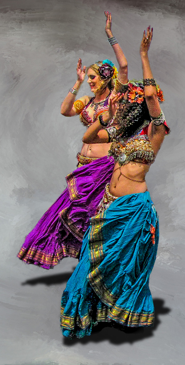
Belly dancers are so entertaining to watch and difficult to photograph. You managed to represent their movement though they are frozen in time. Great job!
For me, though, the background is very distracting. So, I removed it and replaced with an abstract one I created so that the focus is on the dancers completely. Thoughts? |
Mar 17th |
 |
4 comments - 9 replies for Group 53
|
21 comments - 25 replies Total
|


