|
| Group |
Round |
C/R |
Comment |
Date |
Image |
| 6 |
Feb 19 |
Reply |
You could always let the eatery use it for free with purchase information so that patrons would see your work. |
Feb 17th |
| 6 |
Feb 19 |
Reply |
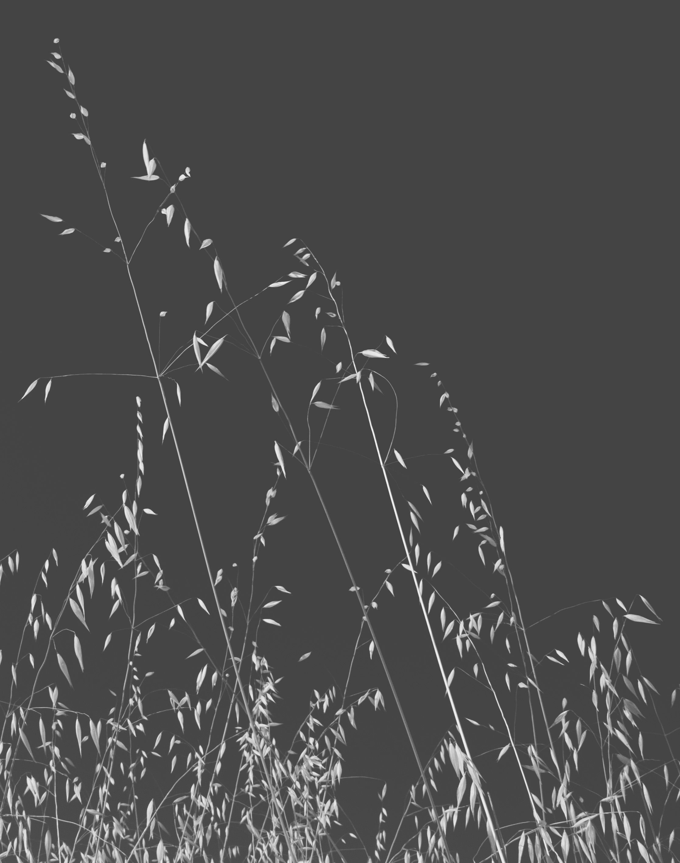
I hadn't noticed the petals on the top left! Thanks for catching that. This is one of the beautiful things about DD - we find the things others are too close to see. d;¬{D
I thought about a border but rejected the idea because of the edges of the flower being cut off. |
Feb 17th |
| 6 |
Feb 19 |
Reply |
I remember when I first started using Photoshop and how daunting all that Photoshop is can be. I have watched countless YouTube and Vimeo videos to learn how to do the things that are second nature to me now. There isn't a week go by that I don't watch videos to increase my understanding of this powerful tool. d:¬{D |
Feb 17th |
| 6 |
Feb 19 |
Comment |
Remarkable! While it does work in the traditional vertical orientation, I absolutely love the horizontal composition. I have nothing to suggest that could improve upon your results! |
Feb 17th |
| 6 |
Feb 19 |
Comment |
I think you created a wonderful tableau! Others have addressed the over-saturation of the reds and we can debate the left-to-right vs right-to-left forever without a clear resolution. Bottom line, you created something that is fun to study and it pleasing to the eye as it is. d:¬{D |
Feb 17th |
| 6 |
Feb 19 |
Reply |
You did a good job separating those seeds from under the forks to place them in another place. This does balance the composition for me.
For me, the composition is stronger with things reversed as Dick has done, but then I'm an accidental occidental. d;¬{D |
Feb 17th |
| 6 |
Feb 19 |
Comment |
Wonderful! I absolutely love scenes like this where a common object takes on a new life by simply lighting it from the side and producing fascinating shadows. I have no suggestions and can definitely see this on a wall in an eatery. d:¬{D |
Feb 17th |
| 6 |
Feb 19 |
Reply |
I certainly understand your reasoning for the title, but I feel you need to choose a subject - either the rose or the drops on the leaves. Having both in the image becomes confusing and there is a wrestling going on as to what the eye should focus on. We quite naturally look towards the flower first, so it is the natural focus for the image and Dick's version I think presents it the best. To remove the rose so that the eye stays on "the rain in my garden," we are left with most of the scene out of focus. |
Feb 17th |
| 6 |
Feb 19 |
Comment |
Welcome and thanks for the fascinating study! I would never have guessed this to be a plant, as it appears to be a distressed wall to my eye. Somewhere along the way, I lost the ability to notice things like this, so I envy your heightened awareness of your surroundings!
I think Dick has finished your image nicely, though I don't know if I would have cropped the top as he did. Certainly the bottom right corner proves a bit distracting. |
Feb 17th |
| 6 |
Feb 19 |
Reply |
While I do use a large black cloth behind most of my studio shots, a lot of my shots in the field end up with backgrounds I don't like but the subject is just right. I will spend extra time in Photoshop removing the background and replacing it with a black background layer. The best masking tool I've found, and I think I've then all, is Topaz ReMask. On1 Photo Raw 2019 has a new AI Masking Brush that can do almost as good. In either case, I will manually check and work the mask after ANY "automatic" tool. |
Feb 17th |
| 6 |
Feb 19 |
Reply |
Not intentionally, I assure you. Problem is, this was the best of the shots of this particular flower, so I made do. <...sigh...> |
Feb 4th |
| 6 |
Feb 19 |
Reply |
Thank you, Sandra, and Welcome! d:¬{D
Lightroom is a powerful tool and what I used almost exclusively a few years back. As time went on, though, there were more and more things I wanted to do that couldn't be accomplished in Lightroom. About a year ago, I stopped using Lightroom completely. The same tools available in Lightroom's Develop module is the Adobe Camera Raw (ACR) filter in Photoshop, so I can leverage the skills learned in Using Lightroom for years.
Be sure to watch training videos available on YouTube and Vimeo to learn as much as you can about Lightroom and other tools that can supplement the functions Lightroom has. |
Feb 2nd |
4 comments - 8 replies for Group 6
|
| 11 |
Feb 19 |
Reply |
Good job, Jim! Thanks! d:¬{D |
Feb 23rd |
| 11 |
Feb 19 |
Reply |
Wow! Thanks for catching that, Jyoti! I put up the wrong original, showing the capture just before this one! I feel pretty foolish, now. Here's the actual original: |
Feb 17th |
 |
| 11 |
Feb 19 |
Comment |
Dramatic piece, Jyoti! I don't envy you the hike you must have had to get there, but the results are certainly worth the effort. I think this is a very strong image, indeed!
I decided to have a try at doing some spot dodging and burning to add a bit more interest. What do you think and pardon my being so forward: |
Feb 17th |
 |
| 11 |
Feb 19 |
Comment |
Excellent capture that tells its story so well! I have seen many polar bear shots over the years and this is definitely one of my favorites. No suggestions but to put it up on the wall for all to see! d:¬{D |
Feb 17th |
| 11 |
Feb 19 |
Comment |
I'm a train fan and this is right up my alley! Well executed and I especially appreciate that you stretched it out, as the original was too squished. Locomotives like this lend themselves to mono treatments quite naturally! d;¬{D |
Feb 17th |
| 11 |
Feb 19 |
Comment |
This is quite surreal and pleasing to study! The contrast between the area inside the lines and outside is very compelling. I also found your description fascinating.
From a compositional standpoint, I find the dome disturbs the flow of the leading lines and pulls too much focus. This scene reads best as a "featureless" view for me. |
Feb 17th |
 |
| 11 |
Feb 19 |
Comment |
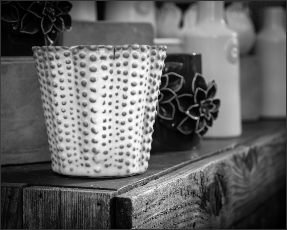
This is much better as a monochrome image than in color as it is tonally rich but lacking in color.
For me, the DOF is too shallow, with the black vase just behind the front vase just soft enough to be somewhat distracting. The white vase in front is the literal focal point but doesn't tell enough of the story and the softness of the rest does not support the story.
Perhaps it would be better to soften the white vase as well, letting the shelf be the focal point, which tells a more complete story: |
Feb 17th |
 |
| 11 |
Feb 19 |
Comment |
Very peaceful. For me, rather than brightening or darkening, I would even out the sky to the same shade of dark grey. Here's an example: |
Feb 17th |
 |
| 11 |
Feb 19 |
Reply |
I'm struggling with this image and your observations help. I wanted to keep this understated and for her to more subtly pull focus. d;¬{D |
Feb 17th |
6 comments - 3 replies for Group 11
|
| 18 |
Feb 19 |
Reply |
Hmmm . . . Interesting and simpler twist. Thanks for working on this. d;¬{D |
Feb 27th |
| 18 |
Feb 19 |
Comment |
Remarkable! This tells a marvelous story very well. I especially like the middle image having motion in the arm - the movie plays in the mind's eye quite effectively! Bravo! |
Feb 18th |
| 18 |
Feb 19 |
Comment |
Yes, after looking at Mike's redo and reviewing your comments, I must agree that I have things too spread out which dilutes the story I was trying to tell. d:¬{( |
Feb 18th |
| 18 |
Feb 19 |
Comment |
I agree with Alan about the face that emerges from this mirror composite. While it is very busy, as Ian indicates, it gives the eye a lot to study. It reminds me of a hidden object puzzle in a way. Either way, I really like it! |
Feb 18th |
| 18 |
Feb 19 |
Comment |
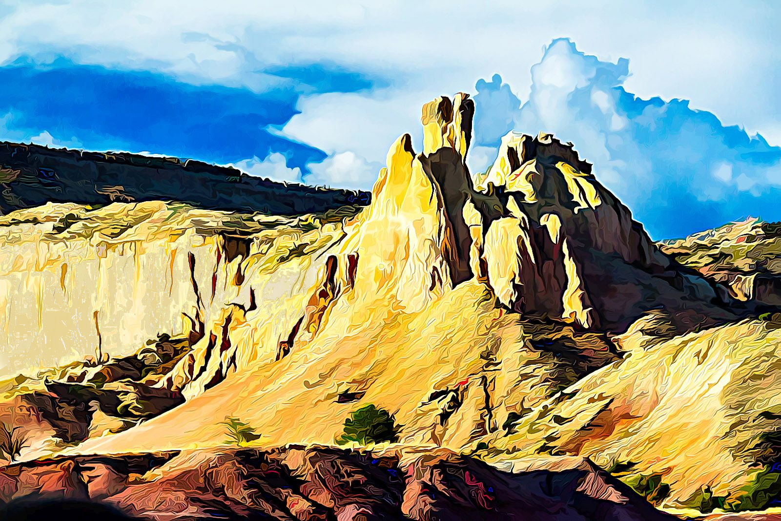
Great transformation of a standard desert image into something that really pops. Yes, there are a few nitpicks to complete this: small cactus in lower right; better lighting for the cactus and mountains; and large cloud that is a bit bright. These are fairly minor, though and the image reads well as it is. I did have a go at editing the nitpicks: |
Feb 18th |
 |
| 18 |
Feb 19 |
Comment |
This is amazing! You turned an interesting aerial shot into abstract art! I really enjoy studying this and love the action the colors bring to a static scene! Bravo!
I do agree with your modification as the top bit seems disjointed. |
Feb 18th |
| 18 |
Feb 19 |
Reply |
That's the bit that makes this a total hit! d:¬{D |
Feb 18th |
| 18 |
Feb 19 |
Comment |
This was very recognizable as the result of a Topaz filter. It really does take this good mountain landscape to the next level.
I must agree with the others about the brightness on the left side. Here's with that corrected some: |
Feb 18th |
 |
| 18 |
Feb 19 |
Reply |
Great catch, Richard! d:¬{D |
Feb 18th |
| 18 |
Feb 19 |
Reply |
You may well be right, Mike. |
Feb 3rd |
6 comments - 4 replies for Group 18
|
| 53 |
Feb 19 |
Comment |
Here's another tutorial on Frequency Separation that does an easy job of teaching it:
https://photoshopcafe.com/frequency-separation-silky-smooth-skin-photoshop/?mc_cid=dd0f477c13&mc_eid=1cf620636c |
Feb 19th |
| 53 |
Feb 19 |
Reply |
Geez! Everybody wants the duck!!! Nobody wants a swan! What the heck!!! d;¬{D |
Feb 19th |
| 53 |
Feb 19 |
Comment |
Wow, Arabella! What an overwhelming scene to take in! I certainly envy you the chance to see that. d;¬{D
I must admit that I prefer your original. Perhaps it's the amount of contrast and yellow in the water of your final result. That said, I can readily envision your image on the wall of a waiting room as there's much to keep your eyes busy. |
Feb 19th |
| 53 |
Feb 19 |
Comment |
Here's my rework on your Main image.
As you can see, I cropped out the monitor again.
In both of my reworks, I added a blank layer set to the blend mode of Color. Then, using the Brush tool, I sampled colors that fit and painted over the purple reflections.
Another method to remove color casts like this is to employ Frequency Separation, which creates two new layers: one contains just the color information and the other contains the details. Using the Color layer, you can replace the purple reflections with the proper colors. You can learn more about this here:
https://www.youtube.com/watch?v=ldhG9fmgC7o |
Feb 19th |
 |
| 53 |
Feb 19 |
Comment |
There are pluses and minuses for each image. Certainly, both are suffering from reflections in her glasses. The computer monitor is also pulling too much focus in both images because it is brighter. Any chance she would try poses without her glasses?
Here's my rework of Original 2, cropping out the monitor and working on removing the purple reflections in her glasses. |
Feb 19th |
 |
| 53 |
Feb 19 |
Reply |
Adding contrast to clouds must be done minimally or artifacts will begin emerging. You succeeded in smoothing out the artifacts somewhat, but it didn't take care of the haloing around the cross and along the top edge of the steeple. |
Feb 19th |
| 53 |
Feb 19 |
Comment |
I really like the image, though you got a little heavy-handed with your contrast in the sky. It caused a significant haloing above the steeple edge and around the cross, which is distracting. With a strong contrast adjustment like this, rather than applying the effect in Color Efex globally, it's better to use Control Points to apply the effect to the tones in the sky, which will mask off the hard edges and reduce the chance for haloing.
Since I didn't have the original to work with, I cloned out the haloing and then slightly reduced the contrast in the sky to smooth the artifacts. Thoughts? |
Feb 19th |
 |
| 53 |
Feb 19 |
Comment |
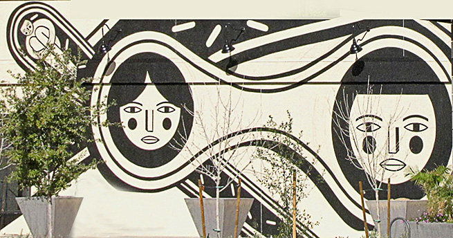
In the context of your full composition, the eye is confused by the natural draw of the bright mural and the sky and building above that are equally bright. Dan's crop helps, but there is still a lot of distraction above the mural.
I'm thinking that your real subject is the mural in the surroundings it lives within. To that end, I have cropped out the area above it completely, stretched the left end to square it off, and cleaned up some of minor distracting elements in front of it. Thoughts? |
Feb 19th |
 |
| 53 |
Feb 19 |
Comment |
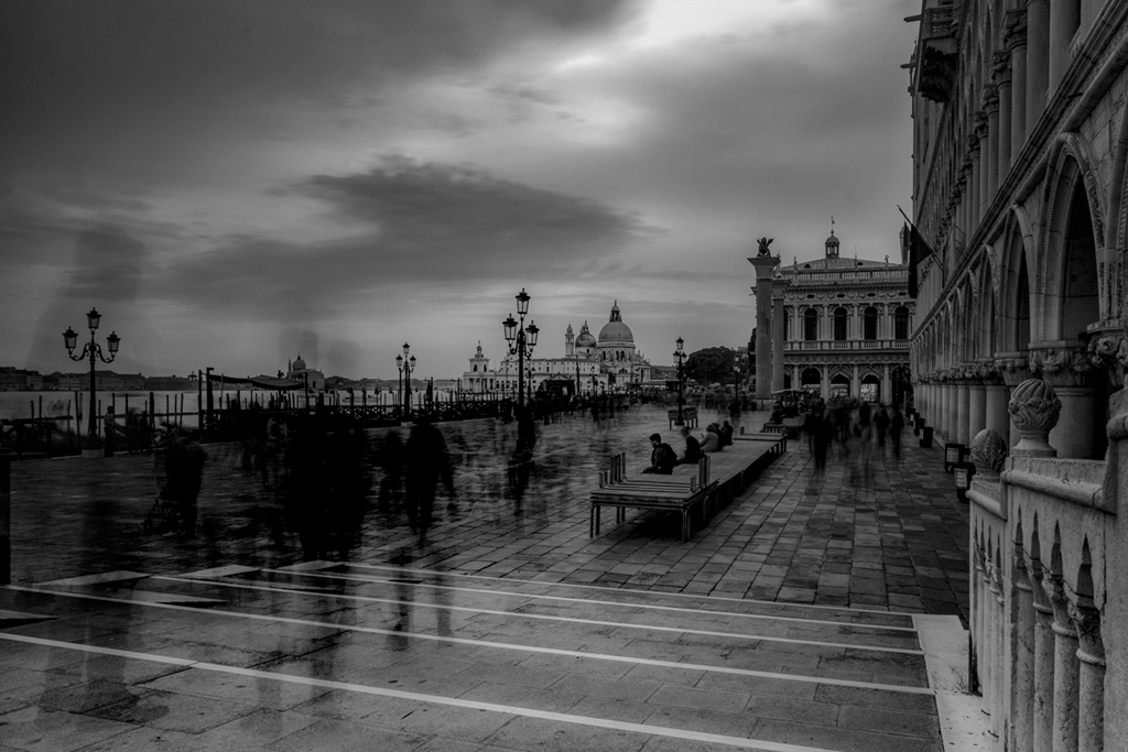
I find this image rather haunting. The darkness gives a sense of foreboding that is somewhat uncomfortable. I agree with the others about lightening the buildings only to alleviate the visual discomfort: |
Feb 19th |
 |
| 53 |
Feb 19 |
Reply |
Thanks for weighing in, Arabella! d:¬{D |
Feb 19th |
| 53 |
Feb 19 |
Reply |
I think you're both quackers! d;¬{D |
Feb 14th |
| 53 |
Feb 19 |
Reply |
LOL! |
Feb 13th |
| 53 |
Feb 19 |
Reply |
Thank you so much, Rohan. d:¬{D |
Feb 11th |
7 comments - 6 replies for Group 53
|
23 comments - 21 replies Total
|


