|
| Group |
Round |
C/R |
Comment |
Date |
Image |
| 6 |
Jan 19 |
Reply |
I created an action that does the following:
Creates a stamped layer (all visible layers merged into a new layer);
Copy that layer;
Invert the copy;
Set its blend mode to Vivid Light;
Group this layer with stamped layer;
Set group to blend mode of overlay;
Convert the inverted layer to a Smart Object;
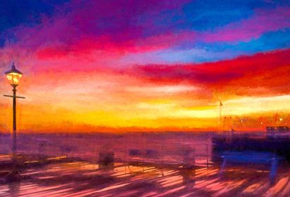
Add Gaussian Blur filter between 0.5 and 3 (to taste).
The group can be turned off/on and can be masked. The blur can be adjusted as needed because of the layer being a Smart Object. This is usually my final step before export, with the amount of sharpening set based upon whether the image will be printed of viewed online.
|
Jan 23rd |
| 6 |
Jan 19 |
Reply |
Thanks for adding to the positive feedback, Janet. I guess I can mark this one a success. d;¬{D |
Jan 22nd |
| 6 |
Jan 19 |
Reply |
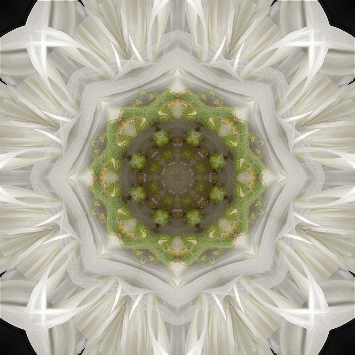
Thanks for visiting and sharing your thoughts! This blossom had been very white when I first purchased it. This shot was after it had been in a vase for several days and its age had darkened the white to more of an eggshell color. |
Jan 22nd |
| 6 |
Jan 19 |
Reply |
I really appreciate your kind words, Salvador! I thought it came out pretty good and it's good to know others agree. d:¬{D |
Jan 22nd |
| 6 |
Jan 19 |
Reply |
Thanks, Dick! This is high praise coming from you as I have been working a lot on my stacking!
Yes, I see what you're saying about the highlights. Will need to work on that. |
Jan 22nd |
| 6 |
Jan 19 |
Comment |
Very different for you, Dick! Isn't it fun to try new things? d;¬{D
I must agree with Salvador that the process has overexposed the highlights, but not enough to pose a serious distraction. Would perhaps look into adding some contrast to give it some more depth. |
Jan 22nd |
| 6 |
Jan 19 |
Comment |
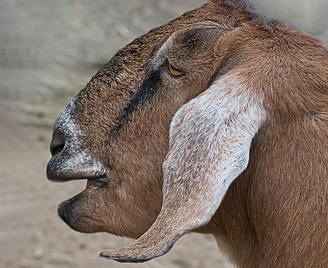
Great capture of the goat, though, as others have mentioned, it is a bit crowded. To that end I took the liberty of adding a bit to the top and left to illustrate the difference. Thoughts? |
Jan 22nd |
 |
| 6 |
Jan 19 |
Comment |
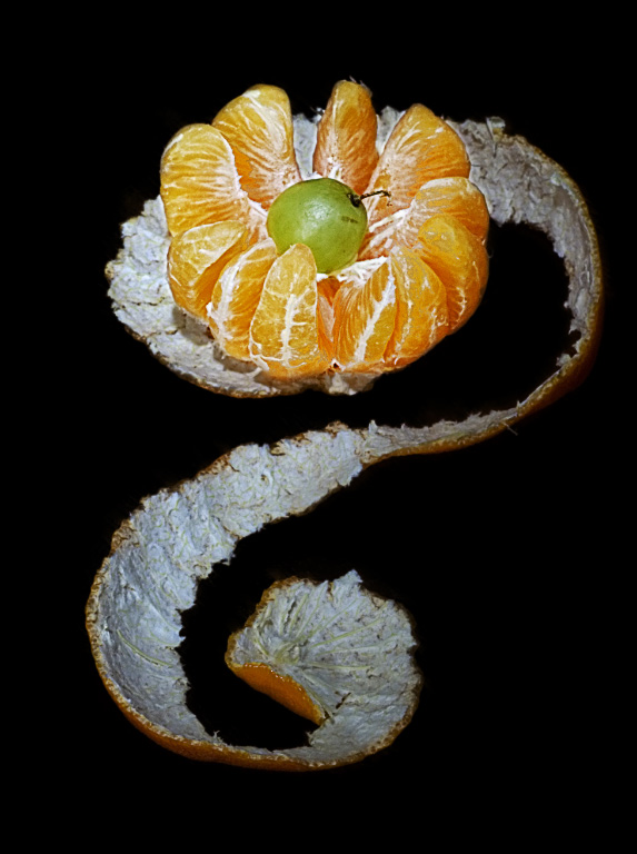
Hmmmm. Clever use of the peel as a leading line towards the "exploded" slices. Really catches the eye in my opinion. Must agree with the others about the grape. It is a creative addition, no doubt, but, ultimately, I found it distracting.
The direction of the light has given your image added dimensionality where it could have been flat if the light coming from the front.
I agree with Dick about stacking for this and a different background.
I took the liberty of changing the background to white, sharpening, reducing exposure & increasing contrast a tich. Thoughts? |
Jan 22nd |
 |
| 6 |
Jan 19 |
Comment |
Awesome capture! I agree with the removal of the blossom intersecting the wing. Cropping does help focus the eye on the scene better. If wording were to be considered, it would be easy enough to clone out the brown in the right corners. Either way, this is a stunner for sure! d:¬{D |
Jan 22nd |
| 6 |
Jan 19 |
Reply |
ACR is Adobe Camera Raw,the Photoshop equivalent to the Develop module in Lightroom. |
Jan 9th |
4 comments - 6 replies for Group 6
|
| 11 |
Jan 19 |
Reply |
I am humbled by your words. Actually, one of the things I have done in my variety of careers was teaching in an alternative school back in the 70's (math & music). As now, I have always found that I learn so much more while teaching than being taught. d;¬{D |
Jan 31st |
| 11 |
Jan 19 |
Reply |
I appreciate your kind words. d;¬{D |
Jan 31st |
| 11 |
Jan 19 |
Reply |
Thank you for the kind response! d:¬{D |
Jan 22nd |
| 11 |
Jan 19 |
Reply |
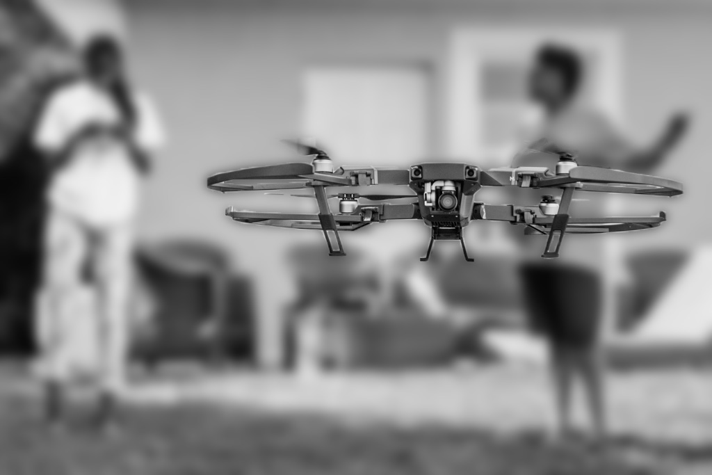
I copied the layer and applied a gaussian blur to it. Then I added a layer mask, blocking out the drone from the blurred layer. No sharpening was added. |
Jan 22nd |
| 11 |
Jan 19 |
Comment |
I agree with Lisa! This is a unique perspective and makes it look as though the drone has spotted the photographer and has come closer to check things out. Very nice!
You might try blurring the people in the background just a bit more to give more pop to the drone while still effectively telling the story. Thoughts? |
Jan 22nd |
 |
| 11 |
Jan 19 |
Comment |
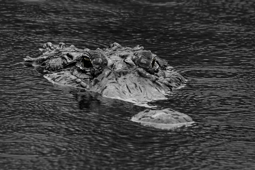
Hey, Jim! I was just working on a crocodile image yesterday, so this really hit home! d;¬{D
This is actually a very strong image and the alligator is very intimidating as is. I think a slightly tighter crop, darkening of the water and selective dodging and burning of the gator will help him pop a bit more. Thoughts? |
Jan 22nd |
 |
| 11 |
Jan 19 |
Comment |
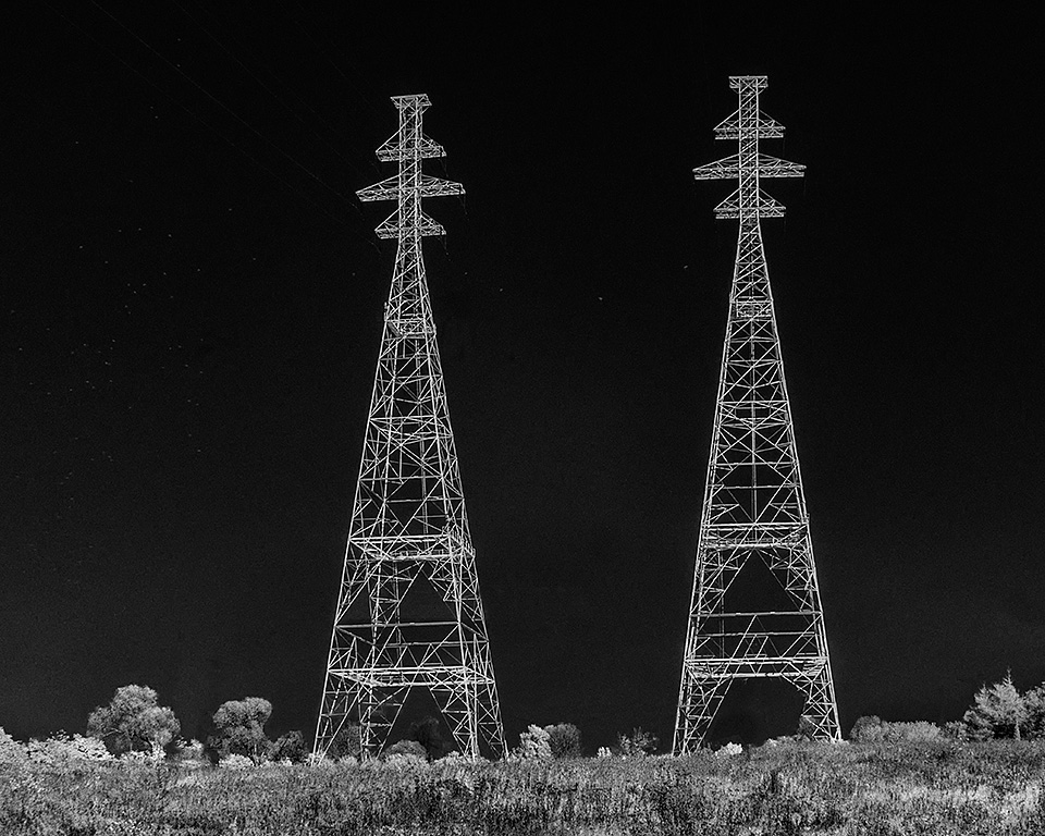
Wow! Those towers jump right off the screen for me! Great choice of format and conversion.
The small towers in the distance, both original and added by you, don't really read as being in the distance and ended up being a distraction for me. I took the liberty of removing them and the streaks of cloud around the left tower. Thoughts? |
Jan 22nd |
 |
| 11 |
Jan 19 |
Reply |
Thanks, Allen! So often I scroll past "soft" captures, looking for the sharp details we all so prefer. Something about this image talked me into staying a while and stepping outside the box. d;¬{D |
Jan 22nd |
| 11 |
Jan 19 |
Reply |
I find that the tradition grayscale coloring of mono sometimes doesn't prove beneficial, especially when there's not a lot of detail present. This is why I opted to go with pink and white instead. d;¬{D |
Jan 22nd |
| 11 |
Jan 19 |
Comment |
Oooooo! Scrumptious!!!
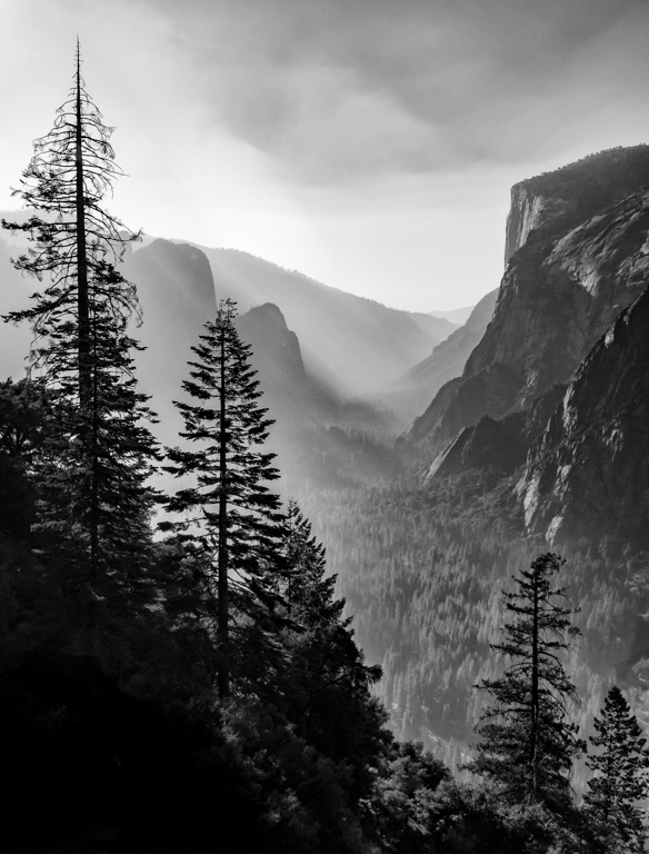
You took a nice but rather flat color image and, with your mono treatment, turned it into a wall-ready piece of art. This is reminiscent of Ansel Adams' work.
My only suggestion is to remove the lens flare that appears in your mono version at the base of the two trees on the left and the hotspot at the bottom left. I think they prove a bit distracting for me. |
Jan 22nd |
 |
| 11 |
Jan 19 |
Comment |
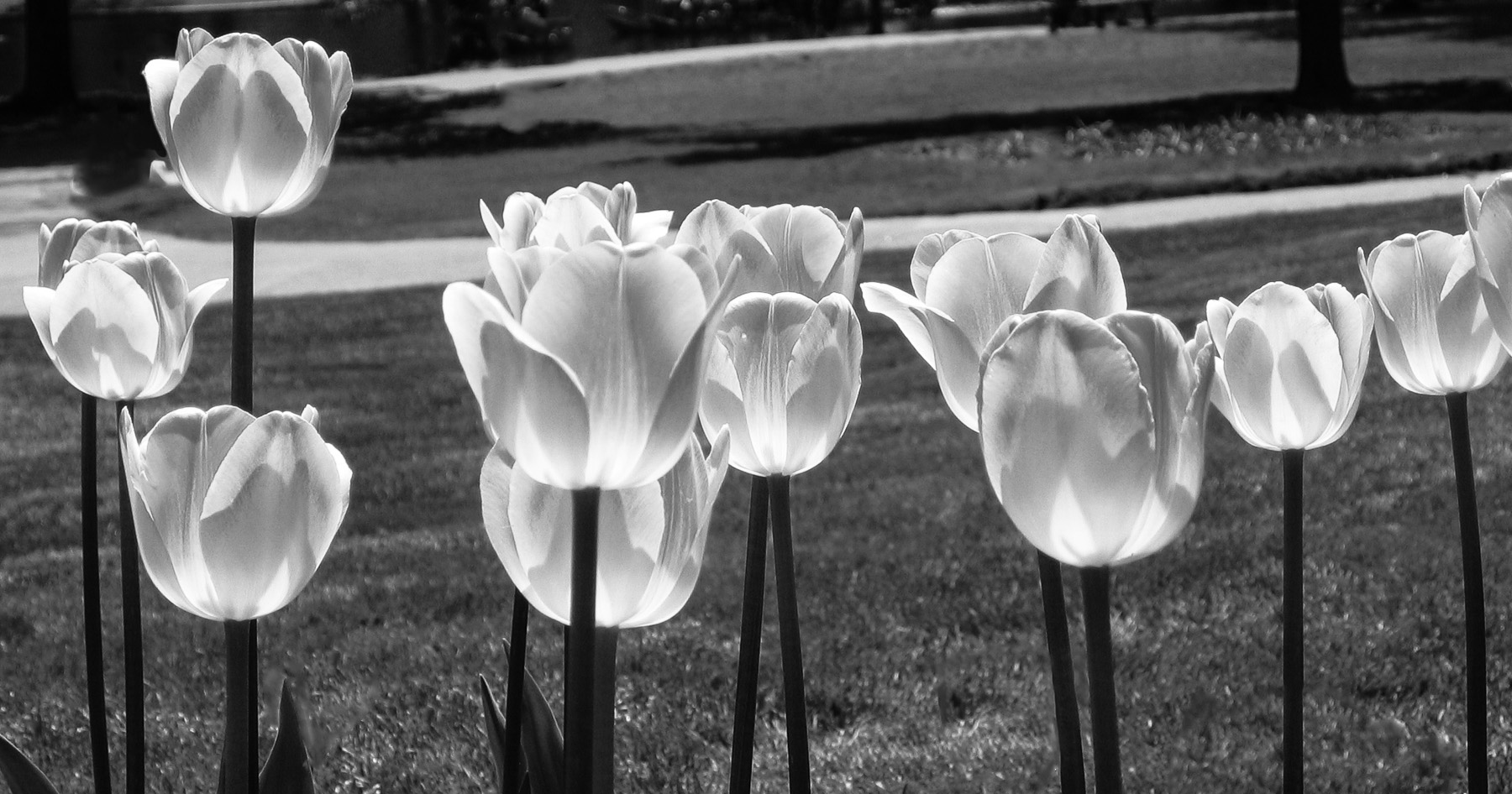
You managed to turn simple tulips into a unique lighting feature with this mono treatment! Your crop removes some of the more distracting elements present in the original for a better composition.
As I often do, I took the liberty to remove a few more distractions from the image: the blossoms along the bottom edge; the poles along the walk; and the people in the upper left. I also added a touch more contrast to the tulips to bring out a bit more detail. Thoughts? |
Jan 22nd |
 |
5 comments - 6 replies for Group 11
|
| 18 |
Jan 19 |
Reply |
Ooooo! Electric!!! Don't mind at all! d:¬{D This kinda has the feel of Topaz Glow. |
Jan 26th |
| 18 |
Jan 19 |
Comment |
I've used this technique to good effect on several occasions and you've definitely worked solid magic with it in this case. I do agree about the bottom left corner, but it's not that much of a distraction overall. |
Jan 22nd |
| 18 |
Jan 19 |
Reply |
Thanks, Mike! Now that you've said it, I do see what you mean about the kiwi look! |
Jan 22nd |
| 18 |
Jan 19 |
Reply |
Thanks, Ian! For me, darkening the center more gives this a harsher appearance. |
Jan 22nd |
| 18 |
Jan 19 |
Reply |
Here's one with the center a bit darker and cropped in: |
Jan 22nd |
 |
| 18 |
Jan 19 |
Reply |
Thanks, Mark! Is this enough darkening? |
Jan 22nd |
 |
| 18 |
Jan 19 |
Comment |
Amazing choices for this composite! I do think your reverse of the image, with the geese moving from left to right is a better choice of the two. No other suggestions for improvement. |
Jan 22nd |
| 18 |
Jan 19 |
Comment |
Another great start to the new year, Mark! I would never have thought of doing something like this. Works so well! Bravo! |
Jan 22nd |
| 18 |
Jan 19 |
Comment |
HNY Ian!!!
You have really transformed this image, from a dull capture to a vibrant & creepy story-teller. Great start to the year! |
Jan 22nd |
| 18 |
Jan 19 |
Comment |
HNY to you, too, Andrew!
Now, this has a lot of pizzaz! The colors really draw the eye in and it's so compelling! Quite the painting!
I agree with Mike about the bottom not adding anything to the image. Here's a version cropped as he suggested: |
Jan 22nd |
 |
5 comments - 5 replies for Group 18
|
| 53 |
Jan 19 |
Reply |
I saw something like it in a macro training video and finding it so inexpensive, just had to get it. It's made my closeup work much easier for sure! d;¬{D |
Jan 22nd |
| 53 |
Jan 19 |
Comment |
Oh, how moody and restful! I agree with the minor adjustments, but the image works even without them. That said, I went ahead and made those alterations, as well as cropping a bit from the bottom. Thoughts? |
Jan 22nd |
 |
| 53 |
Jan 19 |
Comment |
There is an intriguing story in this image, for sure! There is so much to study here, from the missing slats and sill, the twist of the curtain, the boxes, even the reflection of the tree. I especially enjoyed the variety of colors and textures in the wall below the window. Thanks for an interesting study! d:¬{D |
Jan 22nd |
| 53 |
Jan 19 |
Comment |
Nice shot! You did an especially good job with the texture of the wall - I can easily imagine the feel of the raised "fans" with your capture.
I agree with the cropping that Dan and Rohan did to remove the small plant in the lower right corner as it was a bit distracting. |
Jan 22nd |
| 53 |
Jan 19 |
Comment |
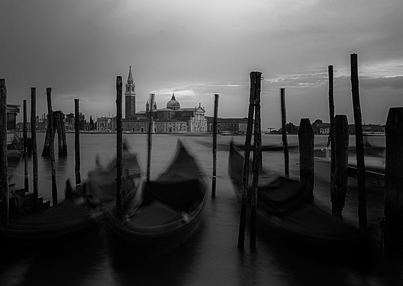
I agree that mono is a better choice for this image, though the color is very nice, too.
With such a long exposure, you achieved an interesting blend of sharp and soft that sets this apart from most Venice images.
I cleaned up the white mark in the lower right corner, cropped to remove the distracting lettering on the left and place the building in the distance into a sweet spot, and then applied a bit more sharpening to pull out more detail in the building and foreground pilings. Thoughts? |
Jan 22nd |
 |
| 53 |
Jan 19 |
Reply |
I tend to shoot flowers 2 ways: straight single shot, exposing for the highlights, and focus stacking to pull out as much detail as possible. This one happened to work well with a single shot. As you can see from the original, I use a device that holds the flowers in whatever orientation I desire. It's called an adjustable helping hand and costs under $10. Comes with 2 adjustable alligator clips and even a magnifying glass. |
Jan 22nd |
| 53 |
Jan 19 |
Reply |
Thanks, Rohan. Lately, I've moved my shooting place to the bench at the foot of our bed, with lovely window light to the right. |
Jan 22nd |
| 53 |
Jan 19 |
Reply |
Our local employee-owned supermarket chain, HyVee. Every time I'm there I study their $5.00 bouquets and grab one when it contains an interesting blossom or two.
I tend to take 2 series of shots: 1 when I first get the flowers home; then, after they've been in a vase for several days, I'll take another series of shots as their character has changed. |
Jan 22nd |
| 53 |
Jan 19 |
Reply |
Thanks, Rusty! I agree that Dan added just the right touch to take it to the next level. d;¬{D |
Jan 22nd |
| 53 |
Jan 19 |
Reply |
Your selective brightening finished it off nicely. I hadn't seen that at all. d;¬{D |
Jan 22nd |
| 53 |
Jan 19 |
Reply |
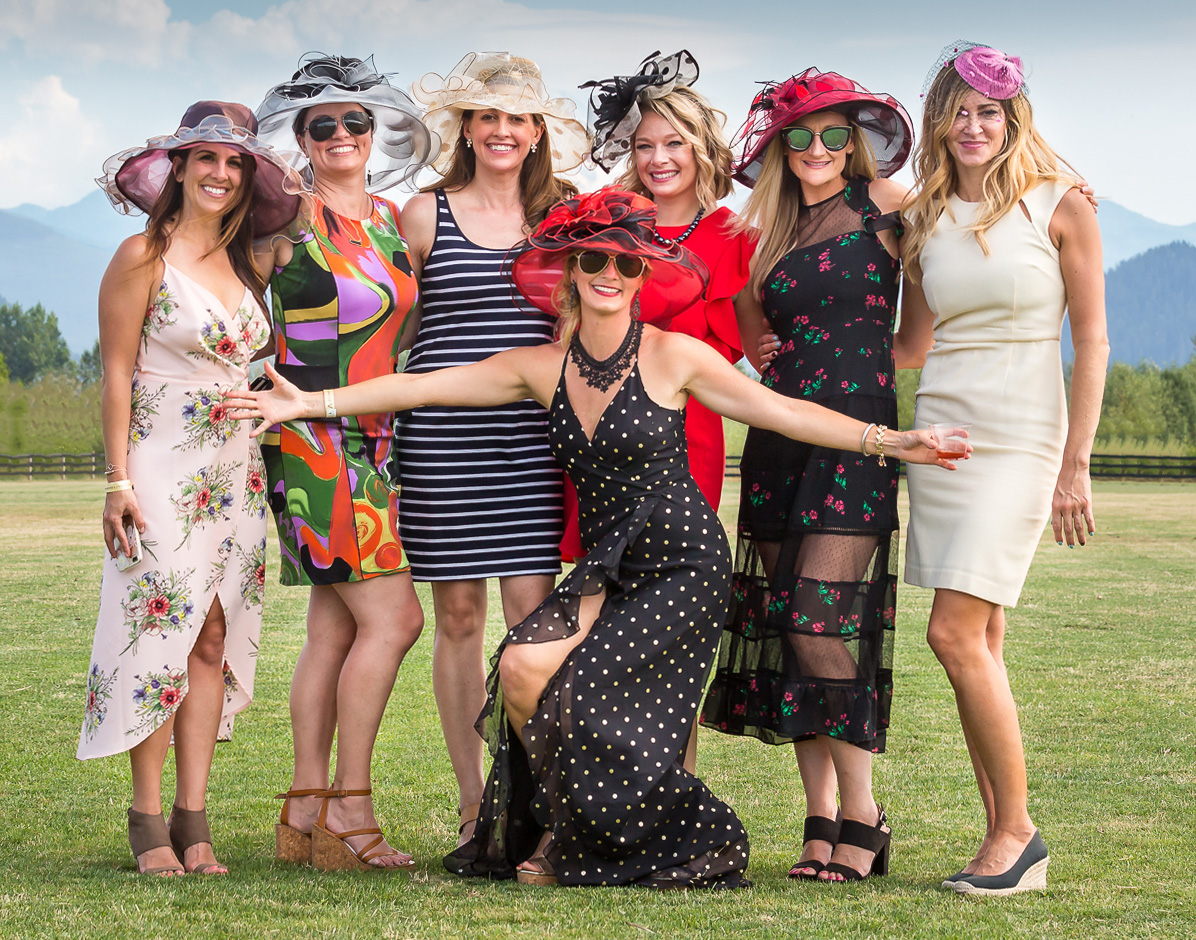
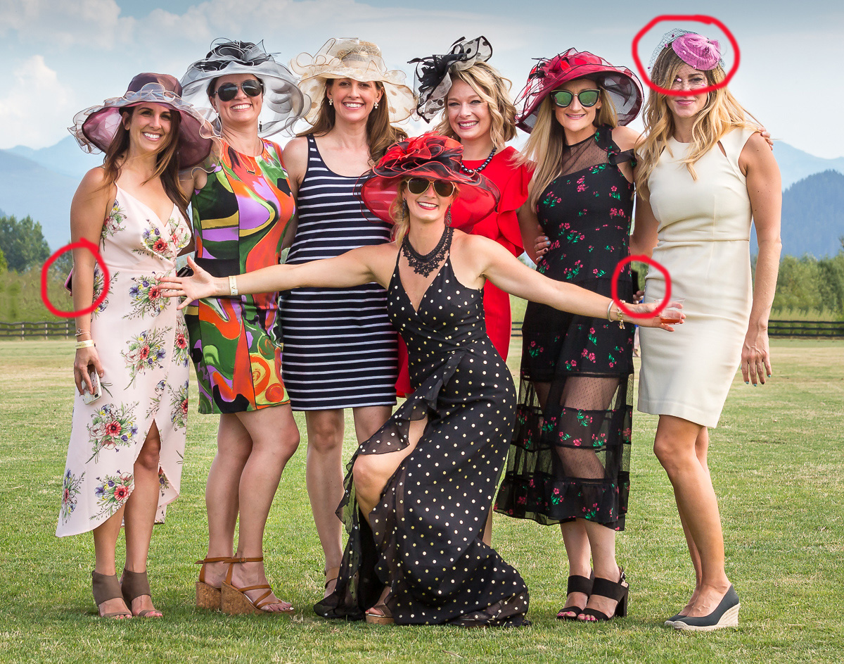
One further comment has to do with sunglasses. Photographers should always push to have them removed whenever possible before the image is captured. Failure to reveal 3 out of 7 ladies' eyes makes for a weaker image. |
Jan 3rd |
| 53 |
Jan 19 |
Reply |
While it would be a major ordeal to attempt a replacement of the hat on the tallest lady, the other 2 matters are rather simple: Select the area (I used the pen tool) and clone the areas on a new layer. I also used the liquify tool to slightly adjust the tallest lady's arm and body to give a subtly nicer shape. What do you think? |
Jan 3rd |
 |
| 53 |
Jan 19 |
Comment |
First off, I think this is a strong image and your crop works very well. My suggestions fall into the nitpicking category of post-processing.
Beyond what Mohan pointed out, I have circled in red the 3 problem areas I find with this image: The bit of cell phone showing on your left edge; the cell phone and person showing between the right 2 ladies; and the disparity of the tallest lady's hat from the rest.
Following will be my corrections. |
Jan 3rd |
 |
| 53 |
Jan 19 |
Reply |
I'm not sure about the yellow cast that Mohan added, but do agree about the minor straightening, though it's not really perceptible. |
Jan 3rd |
5 comments - 9 replies for Group 53
|
19 comments - 26 replies Total
|


