|
| Group |
Round |
C/R |
Comment |
Date |
Image |
| 6 |
Dec 18 |
Comment |
Wonderful product shot! Makes me want to reach out an touch it! Very well done and I can think of no suggestions to improve it. |
Dec 16th |
| 6 |
Dec 18 |
Reply |
I definitely like the darkening you did! Not sold on the crop, but darkening the bright areas helps considerably! Thanks, Janet! d:¬{D |
Dec 16th |
| 6 |
Dec 18 |
Comment |
Lovely, but I would expect nothing less from you. d;¬{D
I agree with Janet's assessment. My only wish is to view this a little closer. Great job, as usual, Dick! |
Dec 16th |
| 6 |
Dec 18 |
Comment |
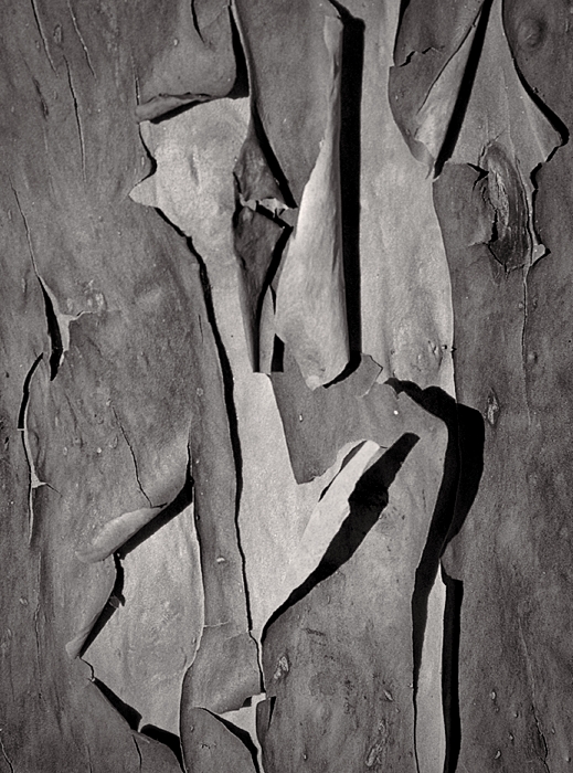
Before reading your description, I thought this was peeling paint. Guess you fooled me! d;¬{D
Closer study of the textures reveals the true "nature" (pun intended) of this image. There is great detail here and the shadows bring dimensionality to the image. The yellow is close to blown-out in spots, but is not so dominant that it distracts very much. I am delighted with this image and have enjoyed studying it! |
Dec 16th |
| 6 |
Dec 18 |
Reply |
After you mentioned mono, I just had to have a go at converting it using Topaz B&W Effects: |
Dec 16th |
 |
| 6 |
Dec 18 |
Comment |
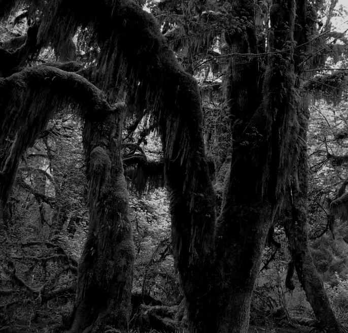
This is reminiscent of an x-ray image, I guess because the details and edges are white on black. I wasn't too sure at first, but studying a bit caused it to "grow" on me (pun intended).
Compositionally, Dick's orientation is stronger. My eye is troubled by so much being cut off - I'd rather see closer for more detail or farther away to see the complete plant, the latter being of more interest with this white on black look. |
Dec 16th |
| 6 |
Dec 18 |
Reply |
I've settled on "B" as my method in Helicon. It has done the best for me so far. |
Dec 16th |
| 6 |
Dec 18 |
Reply |
Thanks for the reference, Dick! |
Dec 8th |
| 6 |
Dec 18 |
Reply |
The aperture was F27, one stop off of the smallest aperture. Working in my home studio, I can set the camera on my tripod and, using a remote shutter release, click and wait. I typically go a half-step faster than the camera selects for shutter speed to ensure there are no blown out highlights.
I would have included more on the bottom, but the focus was getting soft there. |
Dec 8th |
4 comments - 5 replies for Group 6
|
| 11 |
Dec 18 |
Reply |
He shoots - he scores!!! d:¬{D |
Dec 16th |
| 11 |
Dec 18 |
Comment |
Can you share the original color version? I'd like to see what you started with. |
Dec 16th |
| 11 |
Dec 18 |
Comment |
A mono conversion definitely is the right route to go with this image, especially if you're going for spooky. For me, there are too many bright highlights to sell spooky, though. Plus, detailing the tree trunks as you have also tends to take away from what you're going for. By taking the highlights down to grey from their current whites and also darkening the tree trunks, you end up with a more spooky rendition: |
Dec 16th |
 |
| 11 |
Dec 18 |
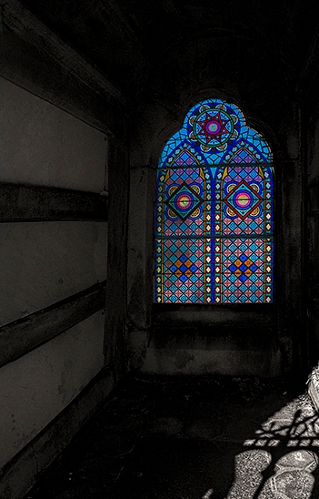
Comment |
While the concept of spotlighting the window by keeping it in color helps to give it more focus, the reflected light dominates the image and makes the colored window and afterthought. By cropping much of it out, you can give more emphasis to the colored window: |
Dec 16th |
 |
| 11 |
Dec 18 |
Comment |
Wow! This image is almost spooky! There is an otherworldly look to this mono treatment that holds my eye for a long time. Your efforts definitely paid off big time! Great job. |
Dec 16th |
| 11 |
Dec 18 |
Comment |
What a lovely creation! Comparing the color and mono versions, I do find that the mono version lets me see more of the detail in the grain of the wood. Unfortunately, the reflection of the surface the bowl is sitting upon conceals some of that in both versions. I was unable to reduce the glare enough to effect a positive result, though. Back to the drawing board for me. d:¬{( |
Dec 16th |
| 11 |
Dec 18 |
Reply |
I used the Quick Select tool to do the gross selection of the flower, added a layer mask, then adjusted the edges in the layer mask with the Brush tool. I've tried most of the external tools like Topaz ReMask, Franzis CutOut Pro & Vertus Fluid Mask and will sometimes use one or another, but they all have flaws and I typically have to manually edit the mask in spots anyway, so I most often just do everything in Photoshop. |
Dec 10th |
5 comments - 2 replies for Group 11
|
| 18 |
Dec 18 |
Comment |
I very much like this! I'm sure the folks on your list look forward to what you'll create each year! d:¬{D |
Dec 16th |
| 18 |
Dec 18 |
Comment |
I have to agree with Andrew on the number of planets. Fewer I think would make for a stronger composition. |
Dec 16th |
| 18 |
Dec 18 |
Comment |
Well done, Mark! I don't know as I would notice this and think of adding another eye as you've done. Brilliant! I've got no suggestions. |
Dec 16th |
| 18 |
Dec 18 |
Comment |
How's this for added contrast: |
Dec 16th |
 |
| 18 |
Dec 18 |
Comment |
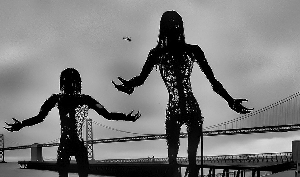
This reminds me of an old Japanese monster flik. The helicopter, dwarfed by the 2 "monsters" adds to that for me, as if it's trying to attack them.
I agree about the sky and suggest cropping come of it out: |
Dec 16th |
 |
| 18 |
Dec 18 |
Reply |
Ah, but you're looking at it knowing it was an area filled that way. Looking at the image without that pre-conceived idea, I think it fits in without looking like a copy. The patterning is in keeping with much that is found in the rest of the image. |
Dec 8th |
| 18 |
Dec 18 |
Reply |
See my reply to Jerry, below, for my results! d:¬{D |
Dec 7th |
| 18 |
Dec 18 |
Reply |
Well, Jerry, I did just that! Here's the result: |
Dec 7th |
 |
| 18 |
Dec 18 |
Reply |
That's an excellent idea, Jerry! Thanks! d:¬{D |
Dec 6th |
| 18 |
Dec 18 |
Reply |
Hmmm. I did nothing specific to fill in the other black spaces - that's the way the filter played it. I'll try playing around with it some more and see if it does a better job in the corner. |
Dec 4th |
5 comments - 5 replies for Group 18
|
| 53 |
Dec 18 |
Reply |
Here's another variation: |
Dec 18th |
 |
| 53 |
Dec 18 |
Reply |
Maybe like this? |
Dec 18th |
 |
| 53 |
Dec 18 |
Reply |
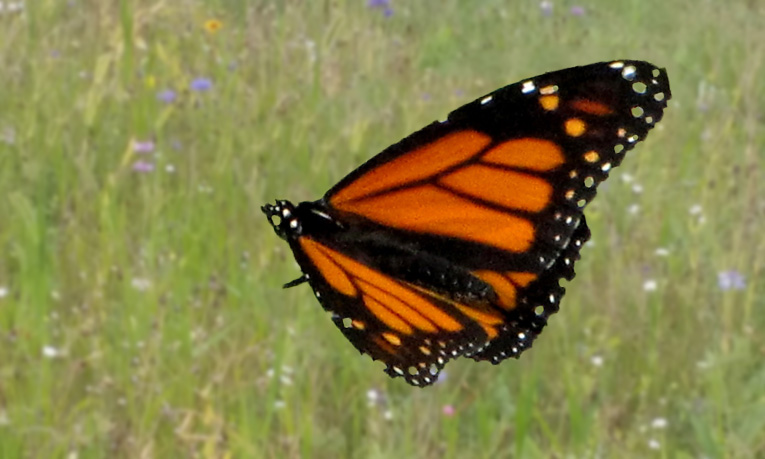
Here's my result.
First I copied the image, selected the butterfly and the leaf it was upon and applied that to a layer mask. I then Ctrl-Clicked the mask to re-select the area, expanded the selection by 2 pixels, Content-Aware filled the original layer to remove the butterfly and leaf, blurred that layer, sharpened the butterfly-leaf layer and exported. What do you think? |
Dec 18th |
 |
| 53 |
Dec 18 |
Comment |
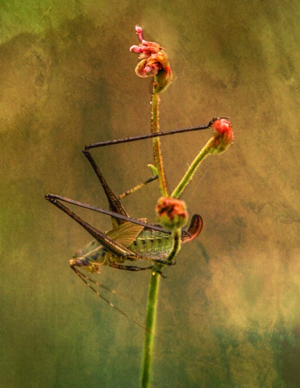
I definitely think your redo is the best of the lot. Increasing the brightness on the insect helps to draw the eye there more. Problem is the ed blossom at the top is the brightest thing in the image and where the eye goes first. So, if you want the insect to pull focus, you might consider darkening the flower at the top. In this example, I have burned the flowers and stems to help them blend into the scene a little more. What do you think? |
Dec 7th |
 |
| 53 |
Dec 18 |
Comment |
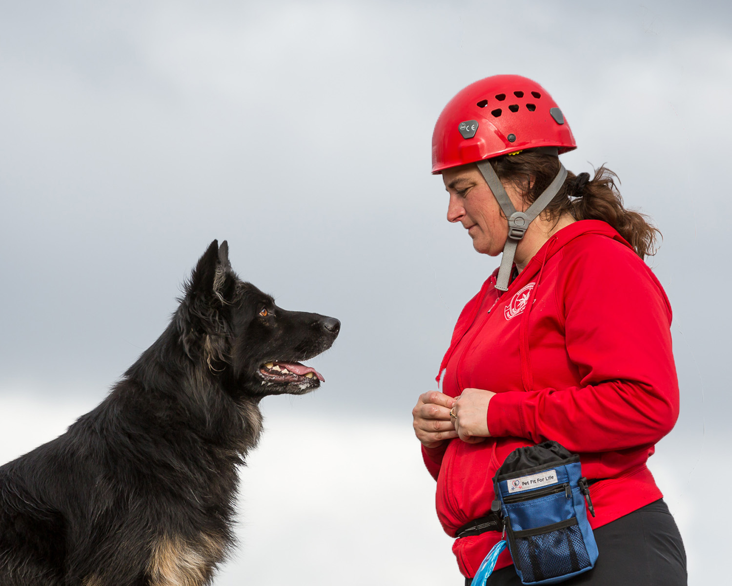
There is certainly a very intense interaction between trainer and trainee! The dog is uber-focused on what she has in her hand, so much so that I wanted to shift things so that the dog was focused on her face instead. I lowered her in the image so the dog's focus was on her instead of her hand. What do you think? |
Dec 7th |
 |
| 53 |
Dec 18 |
Comment |
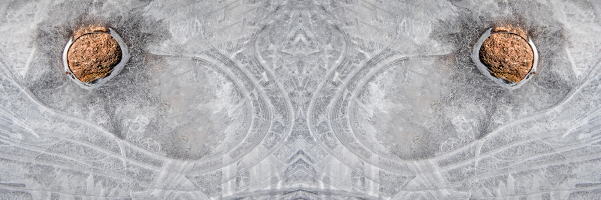
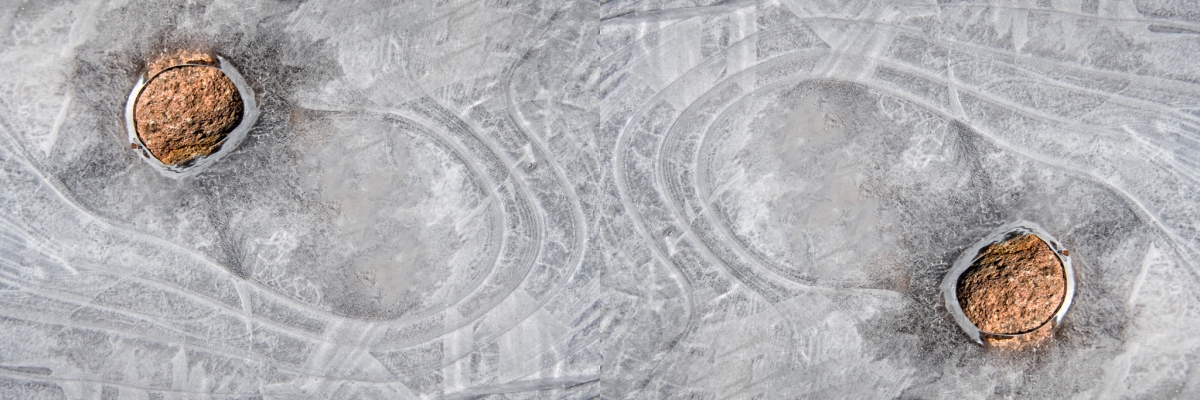
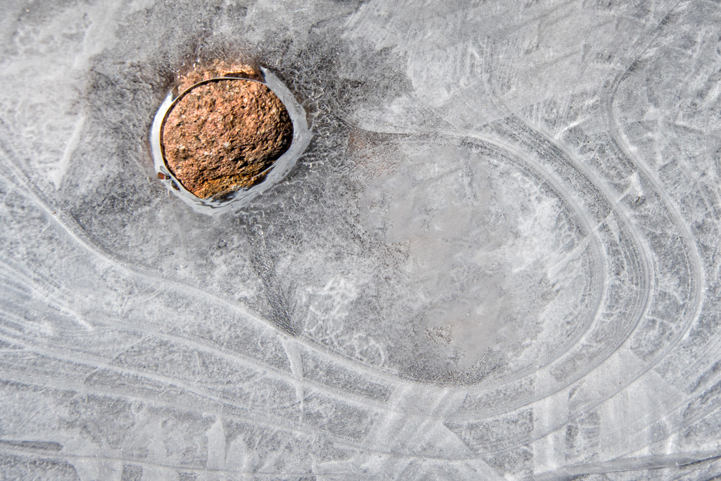
The stone, poking its way through the ice certainly is the main focal point of the image. The lines that find their way to (or away from) the stone give an interesting accentuation to the stone. One is left wondering what created those lines in the ice.
I removed some dark spots and rotated the image 180 degrees to place the stone in the upper left sweet spot and think it improves the composition slightly. Kinda reminds me of a face in this orientation. What do you think? |
Dec 7th |
 |
| 53 |
Dec 18 |
Comment |
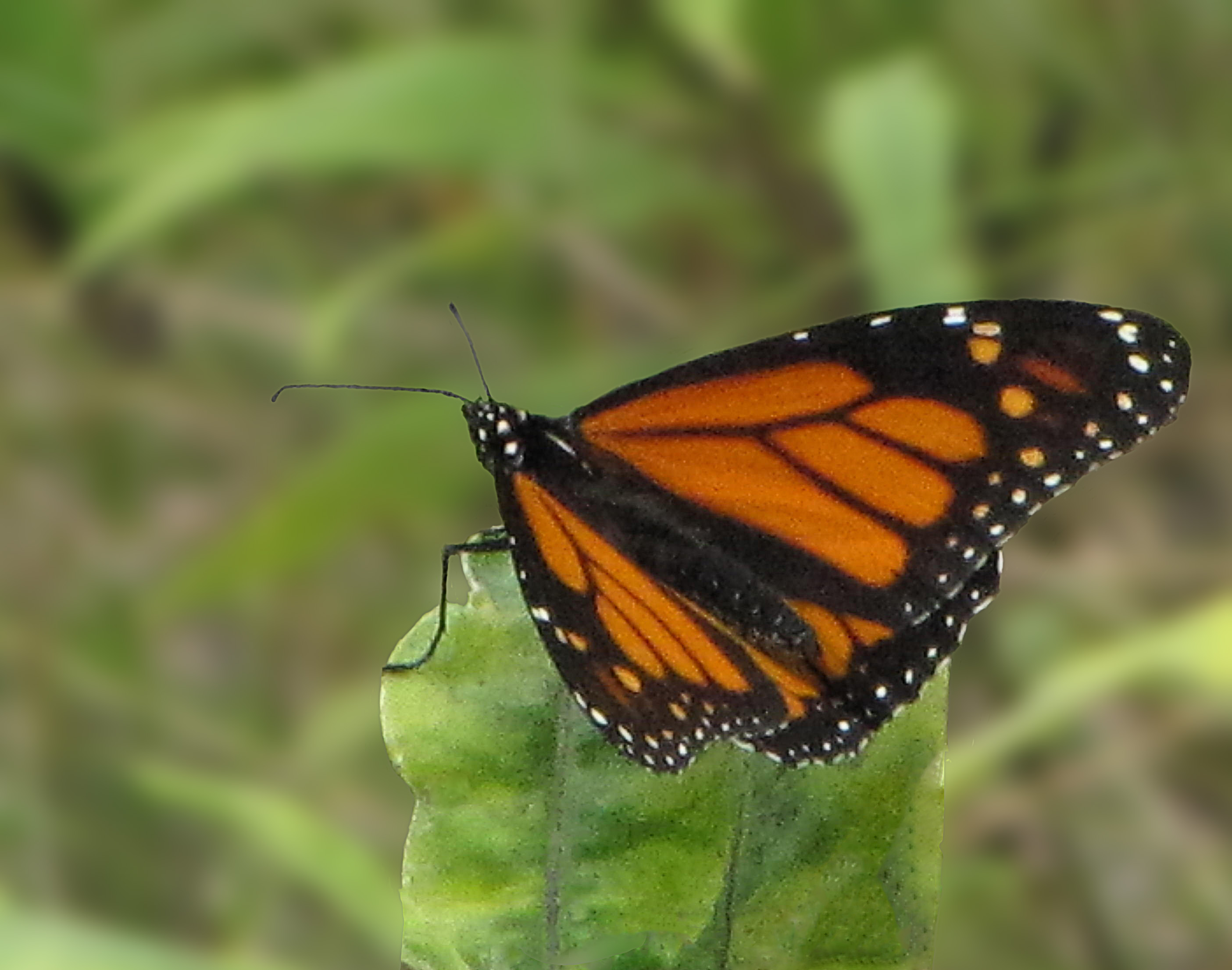
I would love to see the original image with the butterfly. Certainly, the field works well as a background for the butterfly, though it could use a little blurring to make things more realistic. As Dan and Rohan have indicated, the butterfly should be reduced a bit and perhaps placed off-center to the right for a stronger composition. I'd like to see the antennae as well. |
Dec 7th |
 |
| 53 |
Dec 18 |
Comment |
Lovely image, Rohan! I'm sure it was a wonderful experience to see it live. The composition is very strong, with the tree in the foreground and the house in the background as anchor points. The leading lines winding their way through the image bring the eye on an enjoyable journey. I wouldn't change a thing! Bravo! |
Dec 7th |
| 53 |
Dec 18 |
Reply |
Certainly my post-processing intensified the colors a bit, but the yellows are there in the original unprocessed version. Did you click on the Original to look at larger? |
Dec 7th |
| 53 |
Dec 18 |
Reply |
I didn't think of flipping it until the last moment. A common comment about my flower images has been about flipping the focal point and I almost forgot with this one.
I did a lot of focus stacking with the flowers in this bouquet but opted not to with this little bloom - it was only about 1.5" across and I felt it would be okay with such a small aperture. I sometimes grow impatient at the focus stack routine - like I have so many important things to do in a day. d;¬{D |
Dec 6th |
5 comments - 5 replies for Group 53
|
19 comments - 17 replies Total
|


