|
| Group |
Round |
C/R |
Comment |
Date |
Image |
| 6 |
Nov 18 |
Comment |
Exquisite image!!! I have no suggestions, though Dick's crop is probably the better composition. |
Nov 15th |
| 6 |
Nov 18 |
Reply |
I had used F32 in a single shot and forgot to open up the aperture for the stack. Sometimes I'm just too distracted by the wrong things.
Your crop and the flip make more compositional sense. |
Nov 15th |
| 6 |
Nov 18 |
Comment |
Awesome capture, Dick!!! I prefer your crop in the main image over "Original 2" and "Original 1" seems too soft because of the natural fuzziness. |
Nov 15th |
| 6 |
Nov 18 |
Comment |
Excellent capture, Janet! I like it all and glad I didn't encounter it without glass between us - I'm very allergic and have an instinctual fear of bees and wasps. |
Nov 15th |
| 6 |
Nov 18 |
Comment |
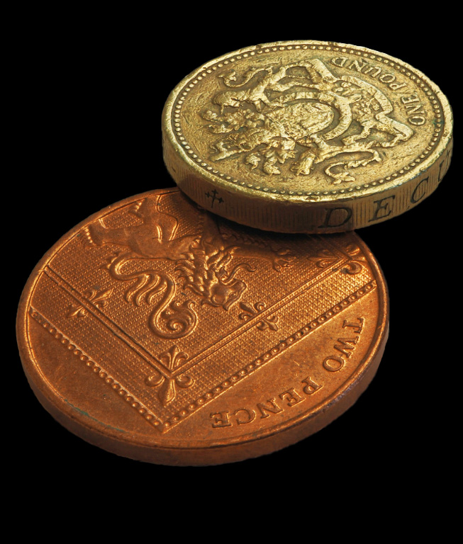
Here's a rendition with the background replaced with black and the coins brightened slightly. What do you think? |
Nov 15th |
 |
| 6 |
Nov 18 |
Comment |
Yes, the background is quite distracting from studying your subject. I blurred the background so as to help the subject stand out better. What do you think? |
Nov 15th |
 |
| 6 |
Nov 18 |
Comment |
Lovely image, despite the DOF issue already discussed.
I created a rendition that has the most fuzzy elements removed, and adding some selective sharpening to bring out some detail in the soft areas. What do you think? |
Nov 15th |
 |
| 6 |
Nov 18 |
Reply |
Hmmm . . . Quite frankly, I really hadn't noticed that soft petal at the back. Guess I was too close to it. That's why DD is so useful! Thanks for catching it! d:¬{D |
Nov 2nd |
6 comments - 2 replies for Group 6
|
| 11 |
Nov 18 |
Comment |
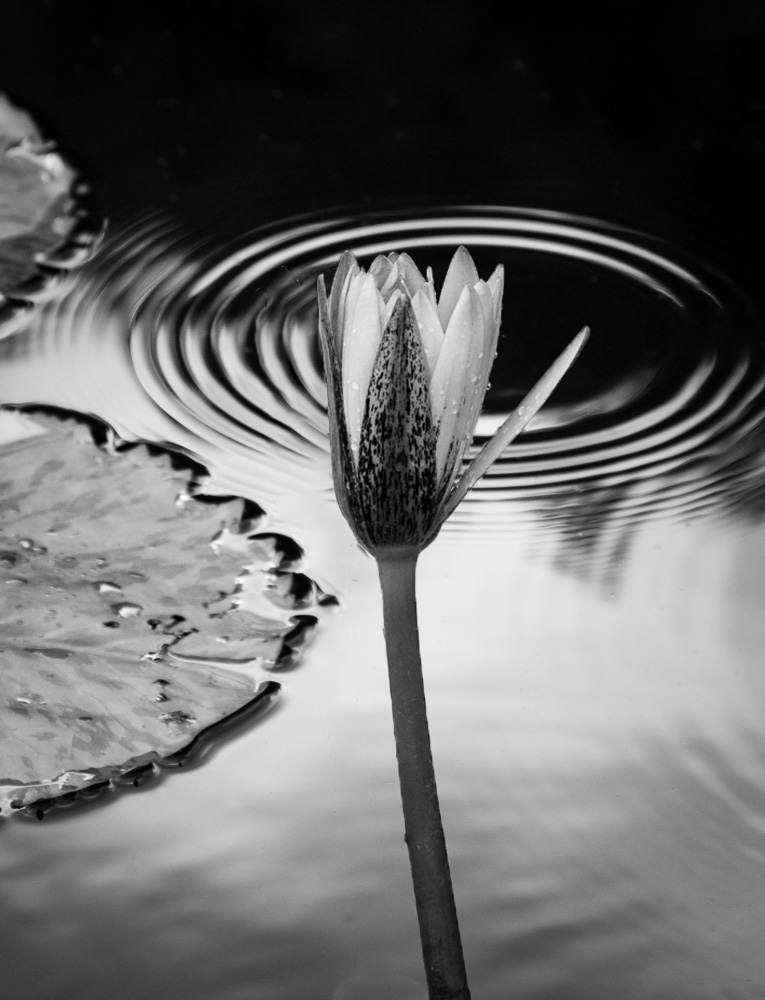
I definitely think the mono version pops! Great post-processing with this one, Jim.
I am a tiny bit bothered by the flower's position in the composition, as it is close to on center, but not on center or at a third line. Without the ripples, a bit of cropping on the right would have made for a stronger composition. A slightly different position for this shot with the ripples would have been better. Because the ripples become a third element of the background with the 2 lily pads, the placement of the flower - visually the subject (title notwithstanding) - becomes very important.
Shots like this can't really be planned for, and you did an amazing job of getting cool ripples in the right place of the image.
By isolating the flower and increasing its size slightly, then nudging it to the right a bit, I think it boosts the effectiveness of the composition. Thoughts? |
Nov 18th |
 |
| 11 |
Nov 18 |
Reply |
I think you're spot on with the rotation. Don't know why I didn't see that! Aargh! d;¬{D |
Nov 18th |
| 11 |
Nov 18 |
Comment |
This is definitely greatly improved in mono. Your crop and edits are spot on.
My eye is confused, though, on where to focus. The open door is a natural draw, but there isn't anything that I can make out to focus on. The open shutter above does the same thing.
This image is perfect as a backdrop, needing something in the foreground to focus on initially.
To illustrate, I added a horse as a focal point. What do you think? |
Nov 18th |
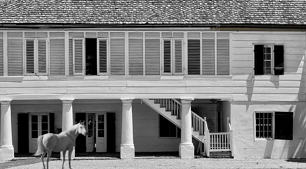 |
| 11 |
Nov 18 |
Comment |
I like how you vignetted this piece to direct the viewer's eyes to your subject. My only issue is the person walking away on the right side - it pulls attention from your subject. By reversing the person it adds an addition focus aid towards your subject. What do you think? |
Nov 18th |
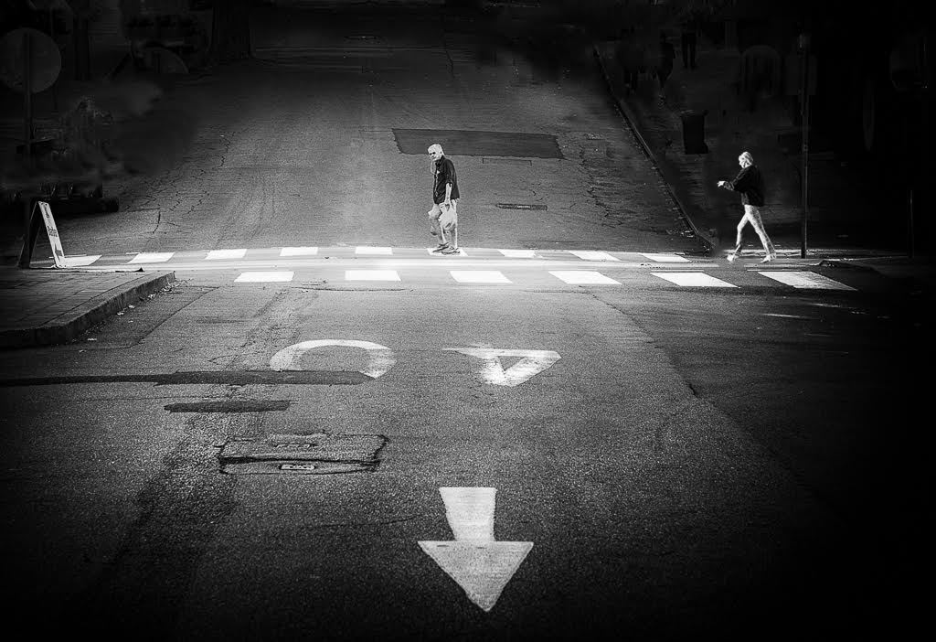 |
| 11 |
Nov 18 |
Comment |
By sharpening the mantis and cloning out the background (letting the flower merge into it), it really helps the mantis to pop! What do you think? |
Nov 18th |
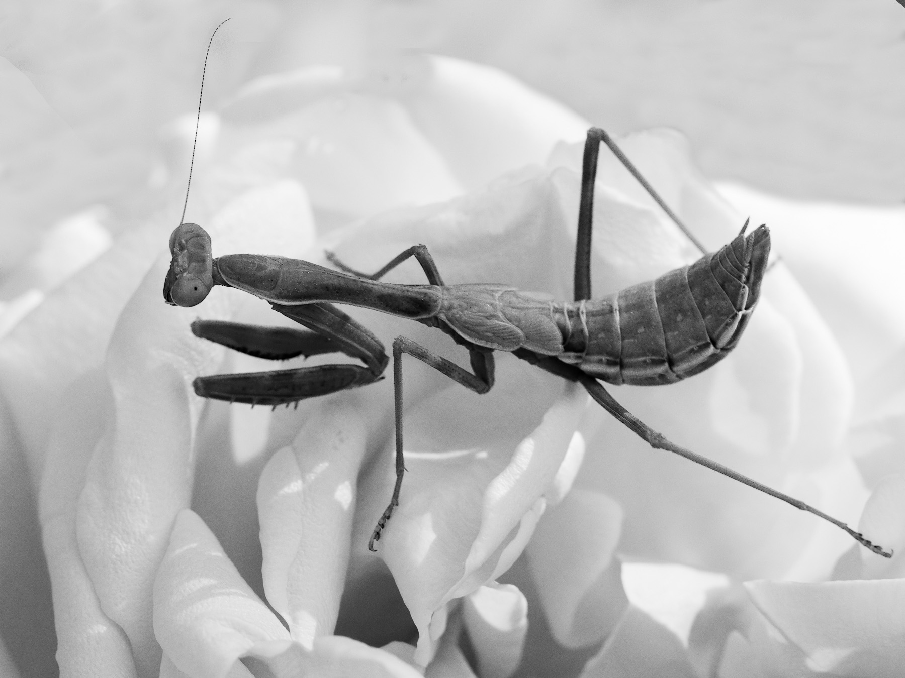 |
4 comments - 1 reply for Group 11
|
| 18 |
Nov 18 |
Reply |
LMAO! |
Nov 23rd |
| 18 |
Nov 18 |
Reply |
Leaf it up to me - I'll try it out! d;¬{D |
Nov 23rd |
 |
| 18 |
Nov 18 |
Comment |
I think the background came out really good and compliments the roses well. I do find the outer glow you added to the roses a bit heavy-handed and would much prefer only a lite application to better merge the flowers into the background so as to tell the story your title sets up. |
Nov 18th |
| 18 |
Nov 18 |
Comment |
While I agree that removing the letters finishes this the rest of the way, I frankly didn't notice them or the hooks until they were pointed out to me. The interaction of the lines and colors is quite pleasing and soothing to view. Well done!!! d:¬{D |
Nov 18th |
| 18 |
Nov 18 |
Reply |
You see a bird as the origin? It looks more to me as if this started as a lion. Come on, Mark, show us the start! The suspense is painful! d;¬{D |
Nov 18th |
| 18 |
Nov 18 |
Comment |
Although the original poster is certainly recognizable, you managed to make it your own with the mirroring and color changes. Good use of imagination to take this and make it something new and, frankly, better! Bravo! |
Nov 18th |
| 18 |
Nov 18 |
Comment |
The filter is a great choice for this image! It adds a shimmer to the scene that reads well for the bike-riding ghouls. I got no suggestions for improvement as I think it stands up tall on its own! |
Nov 18th |
| 18 |
Nov 18 |
Reply |
Basically, I will look at an element, like the shark in this case, then close my eyes and let my mind wander. If I don't fall asleep (more and more likely since I passed 60 a few years ago), ideas kinda float around and then I try and make sense out of them in Photoshop. |
Nov 13th |
| 18 |
Nov 18 |
Reply |
Why, thank you Stephen! Perhaps, though, you're marking yourself as being demented in your thinking like me! d;¬{D |
Nov 12th |
| 18 |
Nov 18 |
Reply |
I hear you about camera clubs! I quit 2 years ago after a season as the VP, and my outlook on things has vastly changed after distancing myself. My good friend who is the president of the club keeps after me to rejoin, but I just can't bring myself to take a step backwards. Another club opened in the area this fall and, since it was populated by many photogs from the club I was in, I declined their invitations as well.
It was a learning experience and my photography improved greatly over the time I was a member, but I reached a point where there was nothing new to push me forward and I was getting stale and bored. DD has managed to keep things fresh and open new avenues of thought for an old sod like me. |
Nov 9th |
| 18 |
Nov 18 |
Reply |
I guess this goes to show that the way my mind works is quite foreign to other creatives like you and Mike. <...sigh...> |
Nov 9th |
| 18 |
Nov 18 |
Reply |
This definitely illustrates your idea. |
Nov 1st |
| 18 |
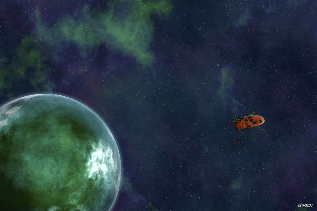
Nov 18 |
Reply |
Interesting that you see the planet's atmosphere as rim-lighting. The shadowing in the lower left of the planet visually implies the light coming from the top right. I guess not every eye interprets this the same.
Certainly seeing a beetle on a leaf floating in space makes no sense and confuses the viewer. That's more or less what I was going for. Guess the story is too “Out There.”. d:¬{( |
Nov 1st |
4 comments - 9 replies for Group 18
|
| 53 |
Nov 18 |
Reply |
Nicely done, Stephen! It's a very different image now! d:¬{D |
Nov 21st |
| 53 |
Nov 18 |
Reply |
I think that blurring only a portion doesn't work well - either all of the sheep or none would be better. The only reason I noticed the sheep butts is because they were pointed out - to me, they just read as sheep in general. |
Nov 18th |
| 53 |
Nov 18 |
Reply |
LOL! It can be real if you want it to be, at least in your mind! d:¬{D |
Nov 15th |
| 53 |
Nov 18 |
Comment |
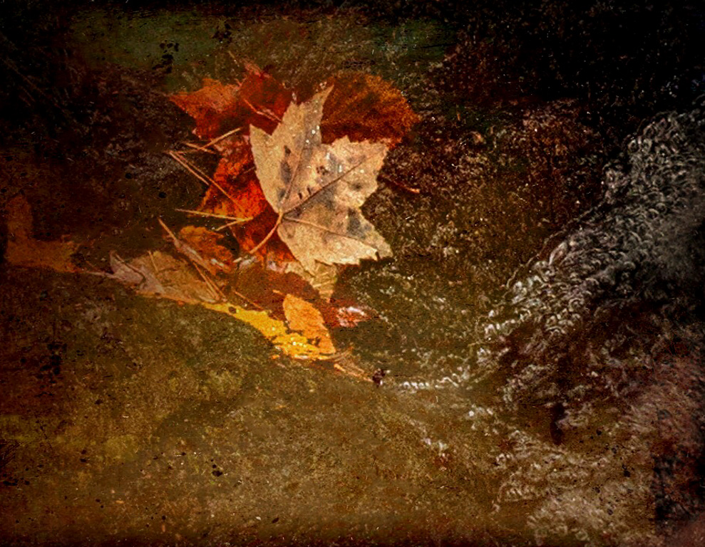
Lovely colors and shapes! I actually like your crop over the others. For me, there is a lot of "stuff" in the water that distracts somewhat. Here's a rendition with the "stuff" removed, giving more focus to the leaves and the water, plus a hint of sharpening: |
Nov 15th |
 |
| 53 |
Nov 18 |
Comment |
I like the colors and shapes a lot! The more I studied it, I grew bothered by the section at the bottom, so decided to try cropping that out. Once I'd done that, it seemed to want to be rotated to the right 90°. What do you think? |
Nov 15th |
 |
| 53 |
Nov 18 |
Comment |
Yes, Dan's crop from the original works better indeed. Since the dogs are focused to the left, having them without some negative space in that direction causes some discomfort for the viewer. The posteriors are not the focus so don't distract and, like Brenda points out, the various fur textures add interest in the background. |
Nov 15th |
| 53 |
Nov 18 |
Comment |
Here's a rendition with the shadows brought up to reveal more details, while keeping the sky dramatic: |
Nov 15th |
 |
| 53 |
Nov 18 |
Reply |
I will have to try that. I actually did reduce their size a bit before stopping at this point. |
Nov 15th |
| 53 |
Nov 18 |
Reply |
That's what I was going for, though it's obviously not a real thing, I wanted it to make some sort of sense. d:¬{D |
Nov 15th |
| 53 |
Nov 18 |
Reply |
Too bright? What if I toned it down some? |
Nov 15th |
| 53 |
Nov 18 |
Reply |
Ah, but it looks like one of them has the shark vs t-rex. Silliness! d;¬{D |
Nov 2nd |
| 53 |
Nov 18 |
Reply |
Wow! I had no idea they'd made a movie where a great white went up against a T-rex. How funny! d:¬{D |
Nov 2nd |
| 53 |
Nov 18 |
Reply |
Not sure what you mean by Sharknado. Is that a movie? |
Nov 1st |
| 53 |
Nov 18 |
Comment |
Definitely enter this into the contest, Dan! You have some nice background blur, a sharp foreground and a good composition.
I don't think it's over-sharpened, but rather the appearance of the bush immediately behind the ram tends to read that way. If it concerns you, mask off the sharpening on all but the ram and you'll be golden.
There are several methods to sharpen in Photoshop, including using Adobe Camera Raw, which is essentially Lightroom within Photoshop. Here's a tutorial that goes over several of the methods: https://www.youtube.com/watch?v=_tQu4OMlYso |
Nov 1st |
5 comments - 9 replies for Group 53
|
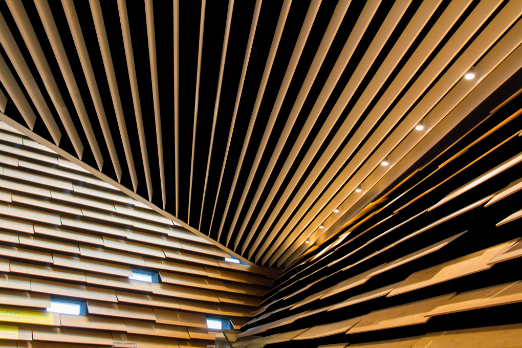
| 82 |
Nov 18 |
Reply |
Because of the variety of colors and shapes behind the slats, there is no 1-click method. After adding a black color layer below the image, I used the pen tool to select each opening and fill with black on the layer mask. Took about 15 minutes to clear the top and right side. I opted to leave the left side alone because of all lighting variations. |
Nov 3rd |
| 82 |
Nov 18 |
Comment |
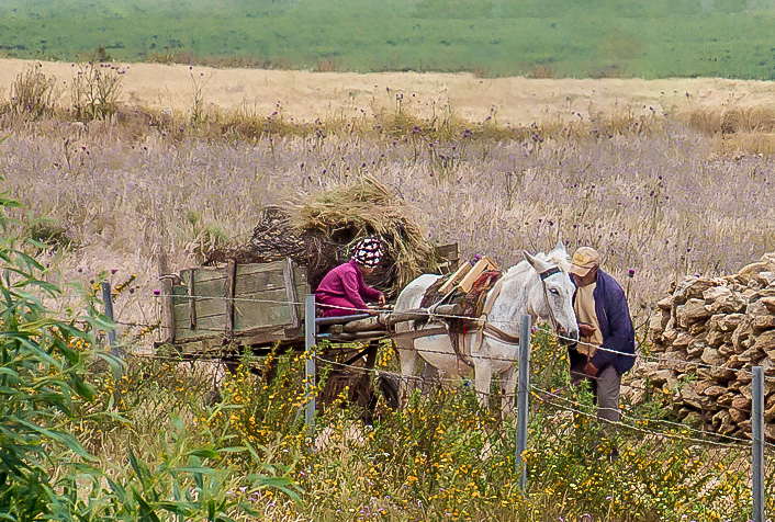
Great capture considering it was taken from a moving vehicle! Your image has a lot of detail and a lot of DOF for F8.
I would suggest cropping much of the image out to concentrate on the main subject. You could also consider removing some of the background distractions to better focus the viewer on the farm couple and their wagon. |
Nov 2nd |
 |
| 82 |
Nov 18 |
Comment |
Here's a rendition with the background structure removed: |
Nov 2nd |
 |
2 comments - 1 reply for Group 82
|
21 comments - 22 replies Total
|


