|
| Group |
Round |
C/R |
Comment |
Date |
Image |
| 5 |
Oct 18 |
Reply |
Barbara, you'll find Dehaze in either Lightroom CC Classic or Adobe Camera Raw within Photoshop. |
Oct 25th |
| 5 |
Oct 18 |
Comment |
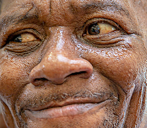
So expressive! Definitely calls for the viewer to study his face. In order to focus better on his expression, I cropped out everything but his facial features. I also opted to add a bit more sharpening and give him a bit of a smile. It's a sickness I know, but I sometimes feel the need to push too far. d;¬{D |
Oct 25th |
 |
| 5 |
Oct 18 |
Comment |
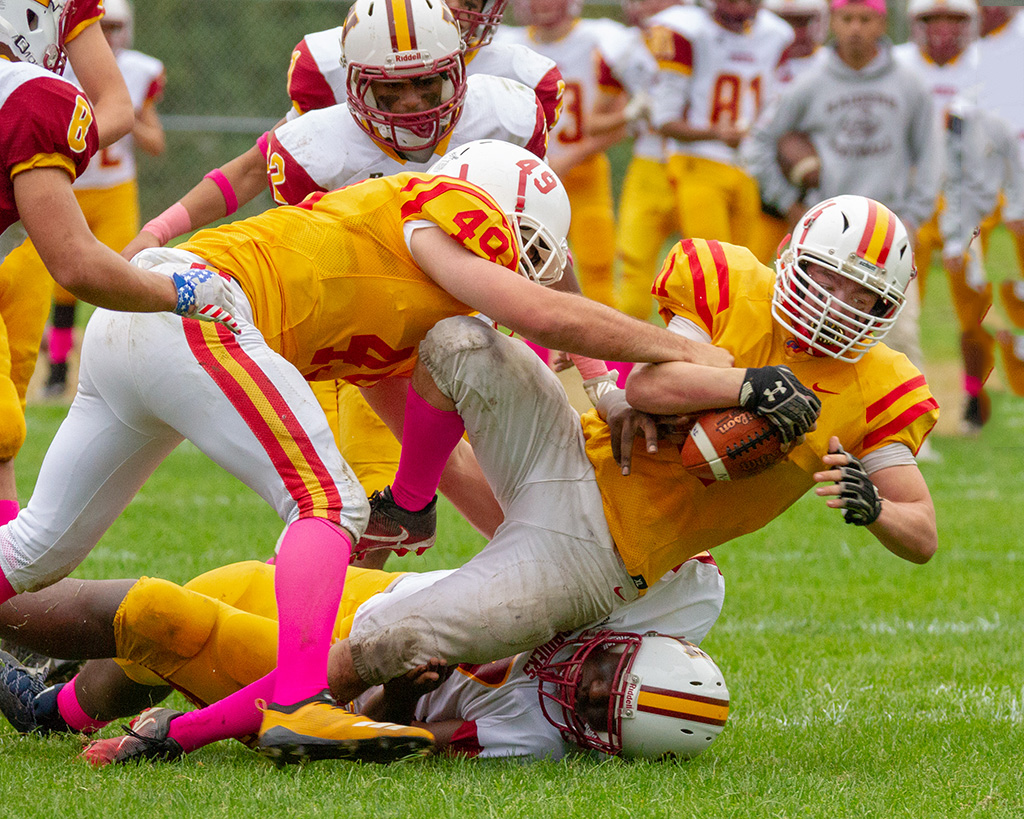
I agree with Nick about the person in black being removed as she's a bit of a distraction from the great action capture. The viewer is definitely pulled into the scene and I can almost feel the hit when your friend's son lands on the player already on the field. Amazing job! |
Oct 25th |
 |
| 5 |
Oct 18 |
Comment |
The shadows are the thing for me in this image. The larger shadow multiplies the edge, while the deeper shadow helps to define the same edge. The graffiti adds a further interest in contrasting a modern reference with something of seeming considerable age. A very interesting study, David! d:¬{D |
Oct 25th |
| 5 |
Oct 18 |
Reply |
You're right about the original and result - they are, in fact, identical. |
Oct 25th |
| 5 |
Oct 18 |
Comment |
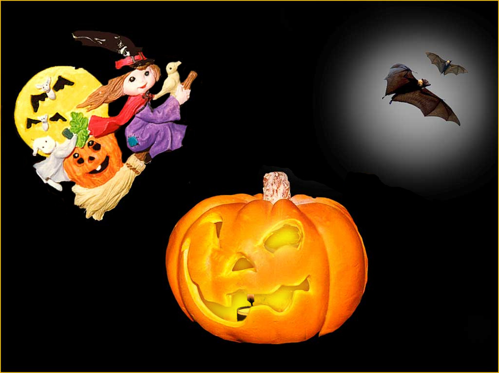
Quite whimsical, Barbara! It inspired me to play with some. I removed some brown around your witch, repositioned the pumpkin and added a tealight and glow within. What do you think? |
Oct 25th |
 |
4 comments - 2 replies for Group 5
|
| 6 |
Oct 18 |
Reply |
At home, I typically use only room light. Awat from home, I have a small LED flashlight I carry. |
Oct 16th |
| 6 |
Oct 18 |
Comment |
Excellent! Dick's crop is good, but I find no fault in your composition! No suggestions from me. |
Oct 16th |
| 6 |
Oct 18 |
Reply |
Yay! That is high praise from you about my stack. I'm shopping for a polarizer now. |
Oct 16th |
| 6 |
Oct 18 |
Reply |
I have struggled with stacks for quite a while, as you can see if you look at previous rounds. I do recommend Helicon to merge your stack - nothing I've tried beats it so far.
I also saw an interesting solution on a DIY video where they took clear plexiglass and created a windbreak for outside shooting, which doesn't block the background while shielding the subject from being moved by the wind. |
Oct 16th |
| 6 |
Oct 18 |
Comment |
As usual, you are a master at botanical images! I can't imagine anything improving this excellent work. |
Oct 16th |
| 6 |
Oct 18 |
Comment |
Perhaps you could post the original so we can see what you were up against in post? |
Oct 16th |
| 6 |
Oct 18 |
Reply |
When lighting becomes an issue demanding a higher ISO than is good for your camera (I have the same issues), using a tripod is so important and having even a flashlight to boost the exposure can make all the difference. My area tends to be very windy and outside shots are typically very problematic, so I take my subjects inside whenever possible. |
Oct 16th |
| 6 |
Oct 18 |
Comment |
This is very intriguing! Great idea to add more bend. This makes for a thoughtful study with the special lighting as it takes the fork into a different dimension, so to speak. I found myself studying it for quite a while, so you were successful in pulling me it to stay. d;¬{D |
Oct 16th |
| 6 |
Oct 18 |
Comment |
As Janet and Dick indicated, your lens being wide open kept your depth of field too low. When in low light, it is sometimes necessary to raise your ISO so that you can have more depth of field and higher shutter speeds to freeze the motion that's often necessary out in nature.
Dick's addition of contrast and structure certainly help, though I actually prefer your orientation of the subject.
You are definitely on the right track and this image is proof of that! Good job! |
Oct 16th |
| 6 |
Oct 18 |
Reply |
I almost never shoot handheld anymore as I have too much hand shake. I will definitely look into a polarizer when I get some extra cash. d;¬{D |
Oct 12th |
| 6 |
Oct 18 |
Reply |
Your changes finished the image nicely. Thanks! |
Oct 12th |
5 comments - 6 replies for Group 6
|
| 11 |
Oct 18 |
Reply |
Aw shucks! Guess it's back to the drawing board for me. At least I've given us all an example of what NOT to do. d;¬{D |
Oct 23rd |
| 11 |
Oct 18 |
Comment |
Lovely image telling a good story. It really draws you in to see what the animal is thinking. Allen added what I would have suggested to finish this. Great job! |
Oct 16th |
| 11 |
Oct 18 |
Comment |
You've done a great job in your conversion, exhibiting a good range of tones. My only suggestions would be to add a bit of contrast and structure/sharpening. I realize this is a personal preference, but I find your image a tiny bit soft. |
Oct 16th |
 |
| 11 |
Oct 18 |
Comment |
Excellent image with a nice range of tones, converted well in post. A professional look that would easily be found in a magazine or advertisement. No suggestions from me. |
Oct 16th |
| 11 |
Oct 18 |
Reply |
Usually the darkest tones in IR are from the blues, greys and blacks, which implies the palm trees might have had a blue cast to them possibly? |
Oct 16th |
| 11 |
Oct 18 |
Comment |
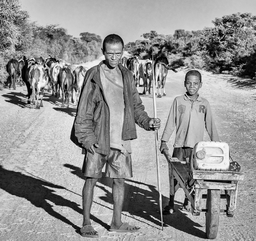
How interesting that the story we see is so different from the story behind it! Either in color or mono, the man and boy seem connected by more than a moment, with his spear showing a more primitive aspect and the boy's plastic jug a more modern one.
My only suggestion is to burn the 2 of them to help pop a bit more from their surroundings as they are clearly the subjects of this piece. |
Oct 16th |
 |
| 11 |
Oct 18 |
Comment |
When looking at the original, it's clear that it is a rock formation. While studying your mono version, it reads like it could be a jagged tree stump. Thus the conversion of the reds to darker grey changed the look considerably. The Wet Rocks preset is a good choice here as it pushes more contrast, accentuating the tonal range that's present. |
Oct 16th |
5 comments - 2 replies for Group 11
|
| 18 |
Oct 18 |
Comment |
Definitely reads as a painting rather than a filtered photograph. Well done. I can't think of more suggestions beyond what you've already taken into consideration. |
Oct 18th |
| 18 |
Oct 18 |
Reply |
Thanks, Dave! I very much appreciate you stopping by! d:¬{D |
Oct 18th |
| 18 |
Oct 18 |
Reply |
I guess this tells me my thought was more of a brain fart than a viable fantasy. Guess it's time to have my meds checked. d;¬{D |
Oct 18th |
| 18 |
Oct 18 |
Reply |
I actually didn't want it to look like it was under water, but rather the fish being in the air. Sounds like it needs more work indeed. |
Oct 18th |
| 18 |
Oct 18 |
Reply |
I'm not sure I understand your suggestion. Can you expand upon it? |
Oct 18th |
| 18 |
Oct 18 |
Reply |
This was definitely an experiment in bringing a stray thought to life. I was quite happy with the results on the shark, while the other fish were a struggle. Still needs work for sure. |
Oct 18th |
| 18 |
Oct 18 |
Comment |
So very fun, Kerstin! I would never have thought of giving the real person a rat's head like that! It makes him more a part of the wall art. Masterful composite, both in camera and beyond! |
Oct 18th |
| 18 |
Oct 18 |
Comment |
Incredible imagination, Peter! I think I would get lost wandering around in your thought processes.
I used PSP for years before venturing into the world of Adobe, though I'll admit to not exploring many of the filters in more recent editions. |
Oct 18th |
| 18 |
Oct 18 |
Comment |
Wow! Way out of the box, Mike!
While I agree with Ian that the contrast of the man's image and the cat's doesn't work, I would leave in the cat but give it some motion blur in keeping with the man and the chair. Otherwise, the cat looks out of place. |
Oct 18th |
| 18 |
Oct 18 |
Comment |
This doesn't quite work for me. The arches "M" is too large in relation to the Sheraton "S" and the background building muddies things up a bit. I'd love to see a rendition without the building and the "S" larger.
I realize the purpose of this was to illustrate capturing one's initials in one's environment with your smartphone, and that was done well. Beyond that context, the composition could be stronger is all I'm trying to say. |
Oct 18th |
| 18 |
Oct 18 |
Comment |
This definitely has the Topaz look - I could tell without reading your description. As Mark said, the red of the foreground boat is quite strong in contrast to the muted non-green tones in the rest of the image, including the reflection of the red in the water. I think it might work better with either the red matched to the reflection color, or the rest of the non-green colors saturated more to add to the comic book look of this treatment. |
Oct 18th |
| 18 |
Oct 18 |
Reply |
Lovely rendition, made better with removing the previously mentioned distractions. |
Oct 18th |
6 comments - 6 replies for Group 18
|
| 53 |
Oct 18 |
Reply |
Thanks, Rusty! d:¬{D |
Oct 23rd |
| 53 |
Oct 18 |
Reply |
My pleasure! d:¬{D |
Oct 23rd |
| 53 |
Oct 18 |
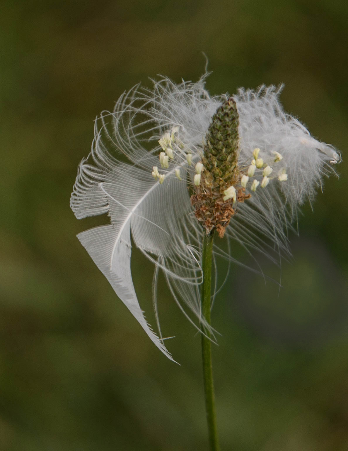
Reply |
The 2 elements, feather and plant, are, in one sense, so unrelated, yet, in this context, symbiotic. An amazing capture regardless! d:¬{D |
Oct 23rd |
| 53 |
Oct 18 |
Reply |
Not quite a match, composition wise, but it was a quickie! d;¬{D |
Oct 23rd |
| 53 |
Oct 18 |
Reply |
Ooooo . . . This is Way cool in color too, especially if you can remove that pink: |
Oct 23rd |
 |
| 53 |
Oct 18 |
Reply |
Like this? |
Oct 23rd |
 |
| 53 |
Oct 18 |
Reply |
Hmmm . . . That would make for an interesting edit . . . a sinking boat! d;¬{D |
Oct 23rd |
| 53 |
Oct 18 |
Reply |
She's still upstairs getting dressed! d;¬{Ã� |
Oct 23rd |
| 53 |
Oct 18 |
Reply |
Hmmm . . . Maybe he's responsible for the tracks? d;¬{D |
Oct 23rd |
| 53 |
Oct 18 |
Reply |
Darn! I don't have a pic like that, but what about a horse? d;¬{Ã� |
Oct 16th |
 |
| 53 |
Oct 18 |
Reply |
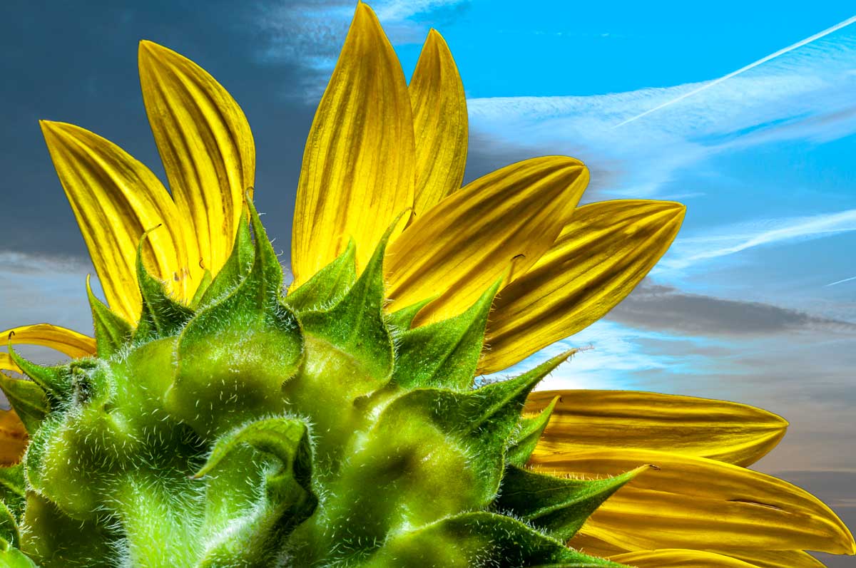
Agreed about the hue/luminance, and you're not the farthest from an expert, obviously. Course it's green AND yellow with the dominant color being green, which further complicates finding the right compliment or contrasting color. I actually applied a Photo Filter adjustment layer with a cool tone to adjust the sky, choosing a cooler one for the redo that Rohan suggested. Mainly, I was most concerned with having the flower pop, and I wasn't even thinking about the resulting hue in comparison to the flower. I can always trust this group to point me in the right direction, though! d:¬{D |
Oct 16th |
| 53 |
Oct 18 |
Comment |
I love this! It's simple yet complex. Would love to see the original as a way of comparison, but the monochrome works very well on this. No suggestions from improvement from me. |
Oct 16th |
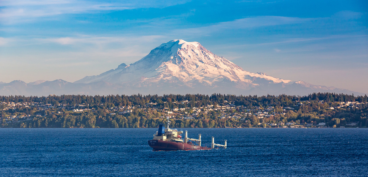
| 53 |
Oct 18 |
Comment |
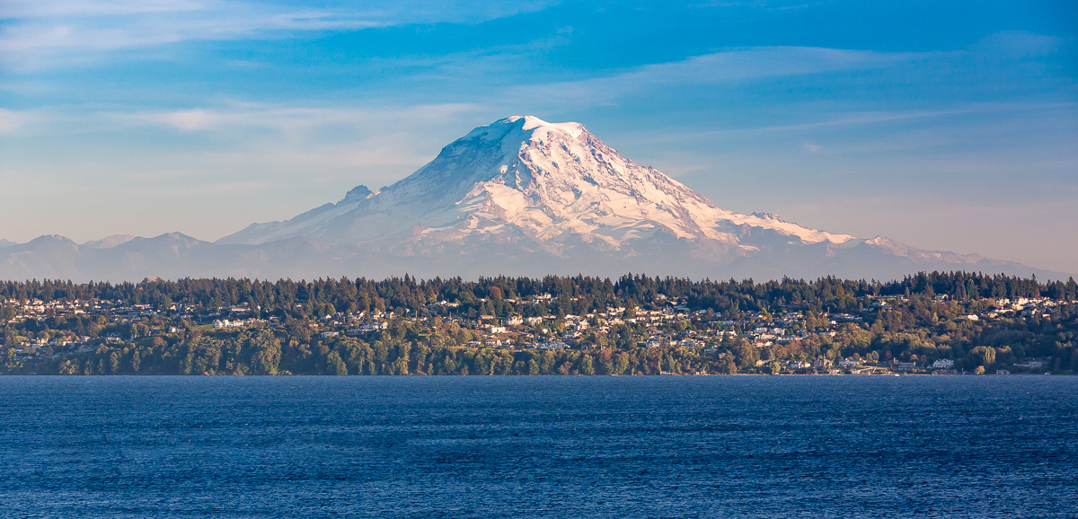
Lovely capture and you toned the mountain well. Changing this to a pano also works well, taking the focus off the water in the foreground. My only suggestion is to lose the boat and wake, which pulls focus from the rest of the scene. |
Oct 16th |
 |
| 53 |
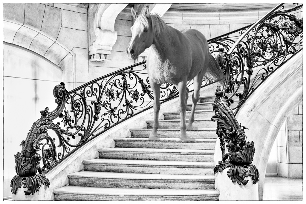
Oct 18 |
Comment |
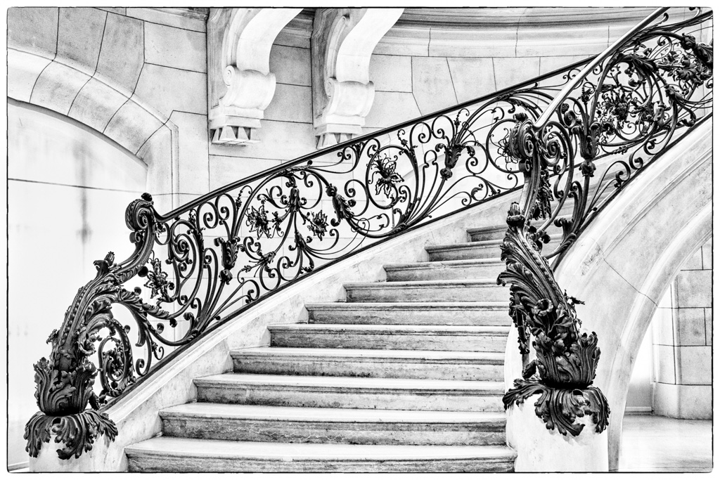
Awesome staircase and your mono treatment is spot on!
As Arabella and Rohan stated, cloning the black object under the stairs is a must to finish this. Here's my rendition: |
Oct 16th |
 |
| 53 |
Oct 18 |
Comment |
Good capture and an uphill battle for post-processing. Here's my suggestion (and result):
1. Copy the image and use the Quick Select tool to select the butterfly and flower it's on.
2. Add a Layer Mask based on that selection.
3. Using your brush tool, clean up the mask as much as possible with black to conceal and white to reveal.
4. Press Ctrl and click on the Layer Mask to select your finished mask.
5. On the original layer, do Edit -> Fill -> Content-Aware.
6. Then do Filter -> Blur -> Gaussian Blur (or Box Blur) to taste.
The more work you do on the mask, the better your result will be and will look more natural. |
Oct 16th |
 |
| 53 |
Oct 18 |
Comment |
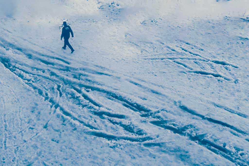
Taking the conditions you were faced with, you did a great job capturing all this detail.
There are several scenes contained in this image, which, as a whole, makes it difficult to find a point of focus. There's the road scene in the upper left, the building in the upper right, and, as Arabella pointed out, the tracks in the snow. I, too, found the tracks very interesting, so edited a rendition to focus just on that, leaving in the walking man as a scale reference. What do you think? |
Oct 16th |
 |
| 53 |
Oct 18 |
Reply |
Thanks for stopping by! I obviously have been deep in the sunflowers lately! d;¬{D |
Oct 16th |
| 53 |
Oct 18 |
Reply |
Here's one with the sky bluer: |
Oct 16th |
 |
| 53 |
Oct 18 |
Reply |
I ended up modifying the color of the original sky because it was muting the petals of the sunflower. Guess I chose poorly. d:¬{( |
Oct 16th |
5 comments - 14 replies for Group 53
|
25 comments - 30 replies Total
|


