|
| Group |
Round |
C/R |
Comment |
Date |
Image |
| 6 |
Sep 18 |
Comment |
Wonderful capture and insect to study. I'm looking forward to your next capture of it! d:¬{D |
Sep 22nd |
| 6 |
Sep 18 |
Reply |
Congratulations!!! |
Sep 22nd |
| 6 |
Sep 18 |
Comment |
Your original has my vote as well, while the filtered image loses something and muddies it in the center to some degree. Did you focus merge in Helicon Focus? |
Sep 22nd |
| 6 |
Sep 18 |
Comment |
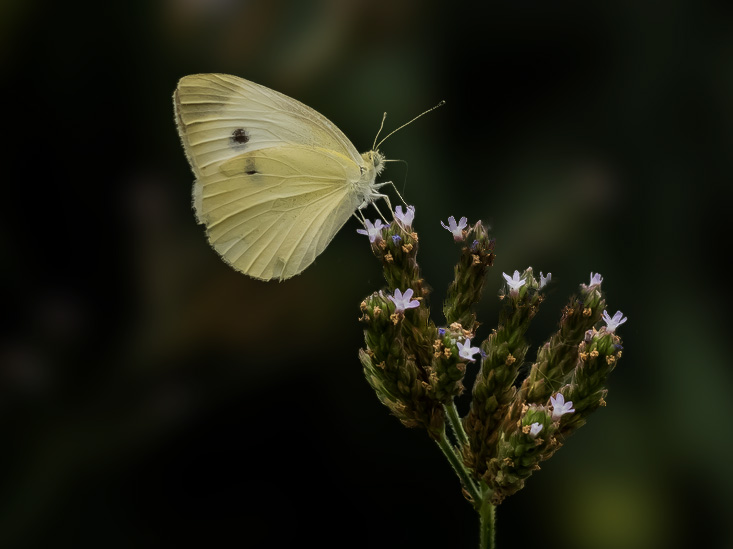
I agree with the others - wonderful capture. The position of the caterpillar and the damage to the leaf tells a good story. Though the spots on the background are somewhat noticeable on close study, I think the image stands on its own without cleanup. |
Sep 22nd |
| 6 |
Sep 18 |
Comment |
Agree with the others about the crop. In this version, after cropping, I selected the butterfly and flower head, copied them to their own layer, removed them from the background, blurred it and darkened it. The subject now stands out well from the natural surroundings without as much distraction. |
Sep 22nd |
 |
| 6 |
Sep 18 |
Comment |
Welcome to the group - you will obviously fit in quite well here. d:¬{D This is a wonderful introduction to your macro photography. I especially appreciate that it was handheld, something my handshake will not allow much anymore.
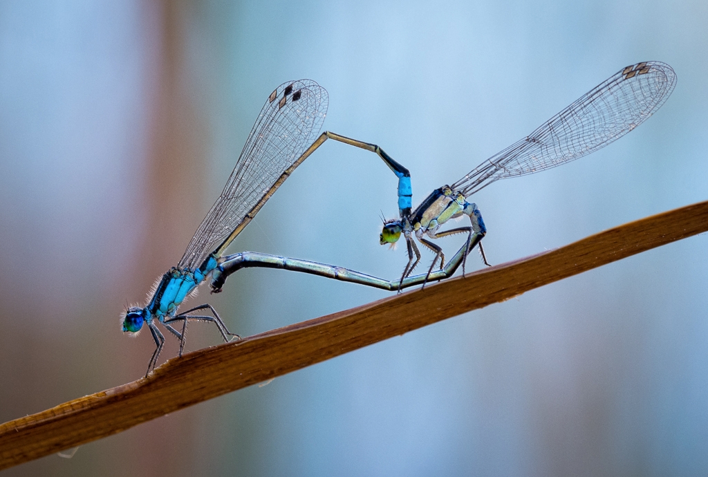
I agree with Dick about the orientation. I think you have plenty of detail in the wings. Where the detail is lost for me is in the bodies, especially the heads. I added some brightness and exposure to the bodies and heads and I think it brought out some more detail without getting crispy. |
Sep 22nd |
 |
| 6 |
Sep 18 |
Reply |
I don't compete anymore, though I'm still judging for PSA clubs. I knew this was not up to par, which is why it's here for study. d;¬{D |
Sep 6th |
| 6 |
Sep 18 |
Comment |
Guess I failed with this one. d:¬{( |
Sep 6th |
| 6 |
Sep 18 |
Reply |
Tripod. Extended range, nothing more. |
Sep 3rd |
6 comments - 3 replies for Group 6
|
| 11 |
Sep 18 |
Comment |
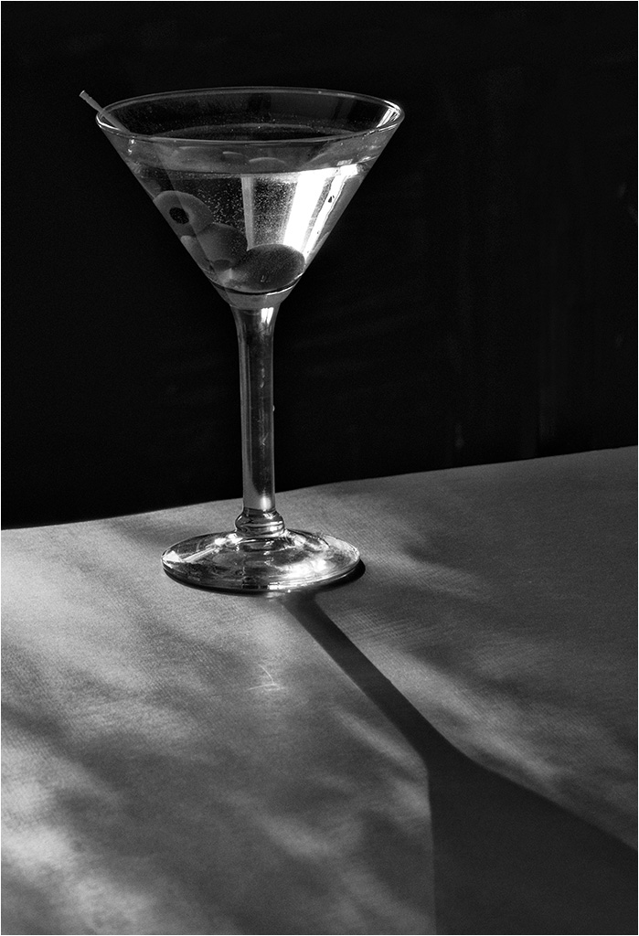
I think your mono version is so much stronger and interesting to study. Great tonal range and a lot for the eye to play around in. I don't have any suggestions for improvement - this stands on its own for me! |
Sep 22nd |
| 11 |
Sep 18 |
Comment |
Interesting study. I would never think to compose something like this - props to you!
I would like to see the reflection of the glass on the paper ending up much darker, in stark contrast to the bright glass against the black. Here's my attempt at that: |
Sep 22nd |
 |
| 11 |
Sep 18 |
Comment |
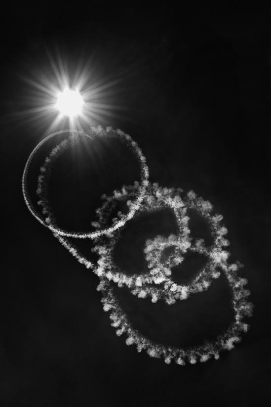
While I agree with Jim about the diagonal and definitely prefer the mono to the color version, I didn't much care for the added clouds. I also thought to tilt it in the other direction and found the composition a little more to my liking. What do you think? |
Sep 22nd |
 |
| 11 |
Sep 18 |
Reply |
I hope you like working with the rail. I just purchased one myself but haven't gotten around to working with it yet. I'm hoping it will allow me to be a bit more precise with my slices. |
Sep 22nd |
| 11 |
Sep 18 |
Reply |
Thanks, Jim! I've been playing around with focus stacking for a while now and still fight with the results. I think this was a success, though. d;¬{D |
Sep 22nd |
| 11 |
Sep 18 |
Comment |
Mono works great with this beast! Agree with Jim about the snout. I also prefer the original orientation of your subject, so had a go at that. I also added some pop to its eye. What do you think? |
Sep 22nd |
 |
4 comments - 2 replies for Group 11
|
| 18 |
Sep 18 |
Reply |
Wow! Guess this was an epic fail! d:¬{( |
Sep 14th |
| 18 |
Sep 18 |
Comment |
This is a fun use of the variety of tools at your disposal on your phone. Lately, I have begun using my phone more for taking images as it's always with me, takes a larger image than my DSLR, and doesn't require carrying a backpack full of equipment and lenses. Ultimately, I take better images with my DSLR, but my results with my phone have turned out remarkably well. Afterall, it's not the camera, but rather the person behind the camera that makes the picture. d;¬{D |
Sep 14th |
| 18 |
Sep 18 |
Reply |
Great use of alternate tools to facilitate turning a rose into a butterfly. However, did you think to do this? |
Sep 14th |
| 18 |
Sep 18 |
Comment |
This works extremely well! The tones of the birds fit perfectly with your sketch rendition of the forest. Well done, Mike! d:¬{D |
Sep 14th |
| 18 |
Sep 18 |
Reply |
While I agree with you about seeing the birds with the original background, fitting them correctly with the fog would have taken quite a lot of work. |
Sep 14th |
| 18 |
Sep 18 |
Reply |
It appears your original was likely too large for the system, which only allows for a maximum of 1Mb. Please try adding it again with its overall size reduced to within the maximum. d;¬{D |
Sep 14th |
| 18 |
Sep 18 |
Comment |
I agree with Mike and Mark in all ways. The lean is especially distracting, I'm afraid. d:¬{( |
Sep 14th |
| 18 |
Sep 18 |
Comment |
I agree with Mark about the sky. Here's my take on toning that down: |
Sep 14th |
 |
| 18 |
Sep 18 |
Reply |
You're probably right about the busyness. Once I added the horse, I kept seeing other places that could use an animal interacting, which led to the owl, hummingbird, cat, puppy, duck & pigeons. Guess it was a case of go big or go home, and since I was already at home, I might as well go big. d;¬{D |
Sep 14th |
| 18 |
Sep 18 |
Reply |
Hmmm. It never occurred to me that the bug was sizing up the horse as a meal. That is quite unexpected! In the story you're seeing, I would agree the other animals would have no purpose.
For me, the story is about the bug straining to take in all that's going on below and I thought it was fun to have several animals filling out the scene. Guess I failed in telling my story. d:¬{( |
Sep 14th |
4 comments - 6 replies for Group 18
|
| 53 |
Sep 18 |
Reply |
Taking your suggestion to heart, here's a different crop: |
Sep 22nd |
 |
| 53 |
Sep 18 |
Comment |
Love this! Very peaceful and inviting scene and I'm sure it conjures up memories for you.
Agree with the removal of the red buoy, and actually all of them as they all tend to be a bit distracting. Here's a rendition without them: |
Sep 22nd |
 |
| 53 |
Sep 18 |
Reply |
See my result below! d:¬{D |
Sep 22nd |
| 53 |
Sep 18 |
Reply |
See my result below! d:¬{D |
Sep 22nd |
| 53 |
Sep 18 |
Reply |
See my result below! d:¬{D |
Sep 22nd |
| 53 |
Sep 18 |
Reply |
See my result below! d:¬{D |
Sep 22nd |
| 53 |
Sep 18 |
Reply |
See my result below! d:¬{D |
Sep 22nd |
| 53 |
Sep 18 |
Reply |
See my result below! d:¬{D |
Sep 22nd |
| 53 |
Sep 18 |
Reply |
See my result below! d:¬{D |
Sep 22nd |
| 53 |
Sep 18 |
Comment |
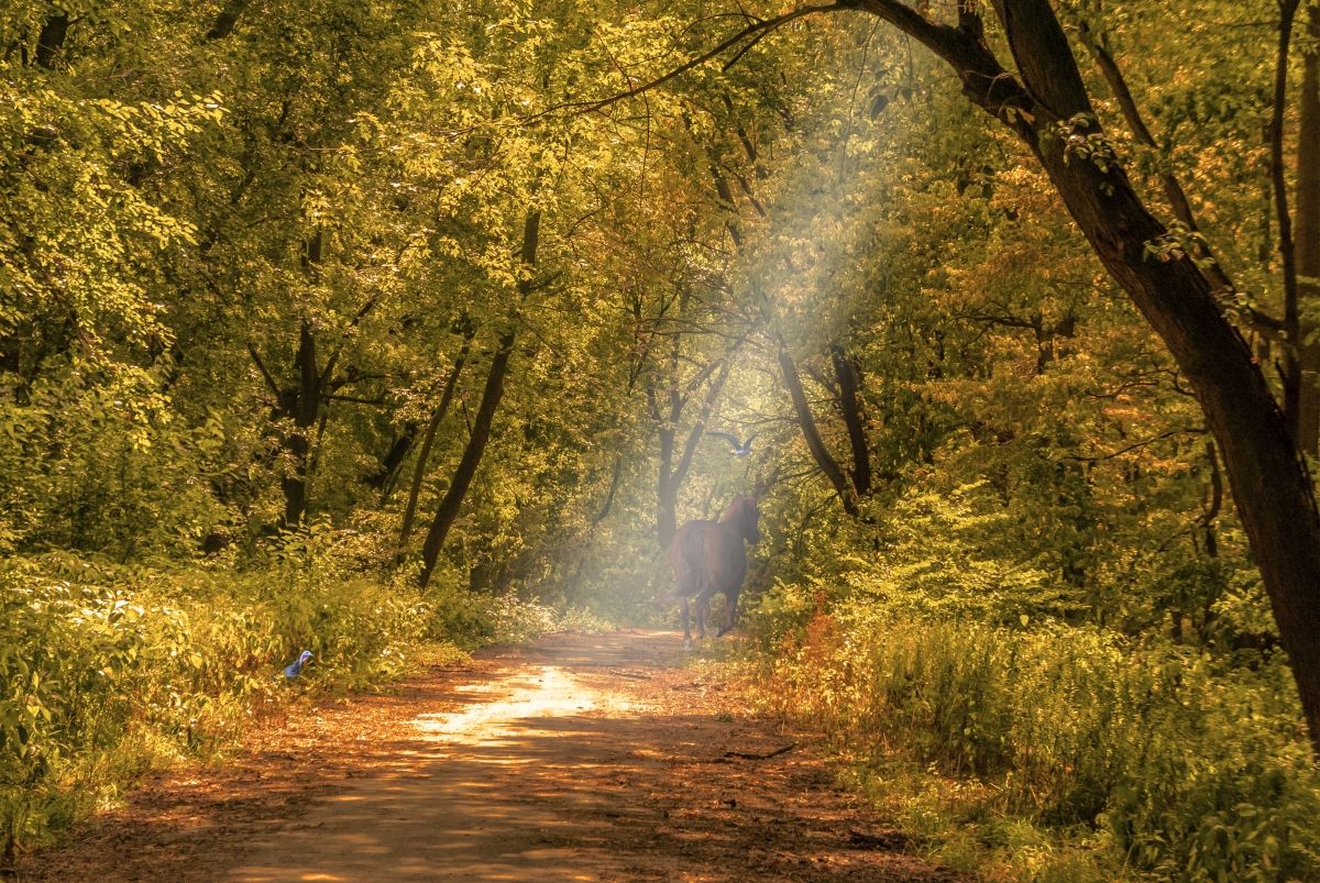
Thanks to everyone for joining the challenge! It was fun to see where everyone went with the image. Now on to my rendition.
The bright spot in the path made me think of a bright sunbeam lighting it, so I fabricated one coming down through the trees from the right. Of course, that wasn't quite enough for me, so I added a horse retreating down the path, then a bird flying above it, and finally a turkey (perhaps me symbolically) waiting for the traffic to die down. What do y'all think? |
Sep 22nd |
 |
| 53 |
Sep 18 |
Reply |
I think this is better proportionally. |
Sep 22nd |
| 53 |
Sep 18 |
Reply |
I like your vision on this. As I'll reveal momentarily, you came kinda close to where I went with this. Your idea definitely tells a story of an afternoon ride through a forest area and does so quite well. Only change I might suggest is to try and blend the 2 images so they have a closer tonal feel. |
Sep 22nd |
| 53 |
Sep 18 |
Reply |
Ooooo! That's WAY different! Looks like the view through a window in the rain to me. You truly transformed this to something new. Thanks for sharing your vision. d:¬{D |
Sep 22nd |
| 53 |
Sep 18 |
Reply |
Cool approach, Belinda! This never occurred to me and demonstrates your compositional moxie to find and exploit the natural leading line. Thanks for sharing! |
Sep 15th |
| 53 |
Sep 18 |
Comment |
Wonderful image for the wall in an office or bathroom! Just enough detail to tell the story without over-selling it. Only minor change I would suggest is to clone over the bottom left to remove the light blue rectangle. Even without that change, though, you have an amazing piece here, definitely worthy of the wall! d:¬{D |
Sep 14th |
| 53 |
Sep 18 |
Comment |
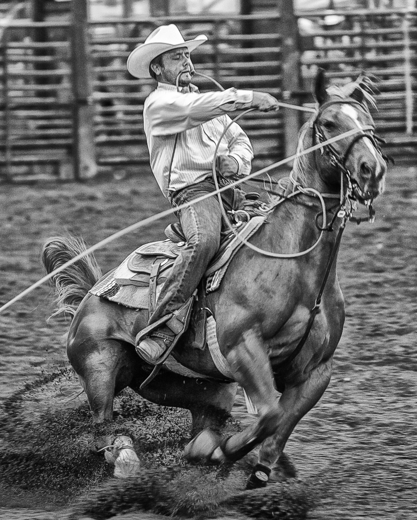
Exciting! Excellent freeze on the action and definitely tells an effective story!
Barbara is right about the overall tone being too bright. I took your image into NIK Viveza and added some structure and contrast to increase the drama. I also added some more structure to the rider's face and the horse's head to emphasize their intense concentration!
I also opted to crop in from the left as the horse was too crowded to the right with all that empty space away from their seeming direction of travel. Since the calf is off screen anyway, we don't need to see so much rope. |
Sep 14th |
 |
| 53 |
Sep 18 |
Comment |
Perfection! The simplicity of this immediately makes me stop and hold my breath for fear of disturbing the herons in their parade. I can't imagine anything added or taken away from this making it better in any way! Bravo!!! |
Sep 14th |
| 53 |
Sep 18 |
Comment |
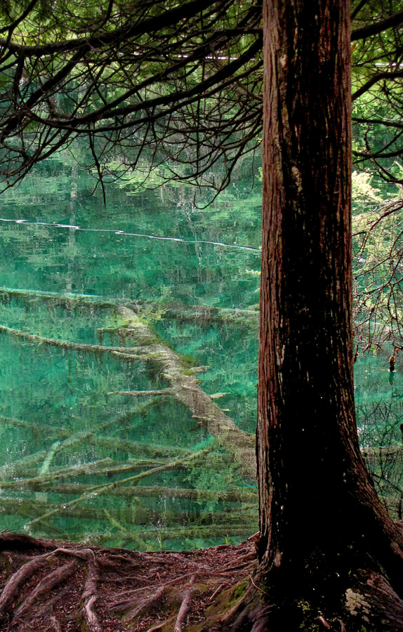
I really like this scene. Makes me want to lean against that tree and ponder the scene before me. d;¬{D
My only suggestion would be to bring out some detail in the tree trunk. Here's my attempt, using NIK Viveza to accomplish it: |
Sep 14th |
 |
| 53 |
Sep 18 |
Reply |
Here's a look at what I mean: |
Sep 14th |
 |
| 53 |
Sep 18 |
Reply |
Great minds think alike! When I upload my results, you'll see what I mean. d;¬{D |
Sep 14th |
| 53 |
Sep 18 |
Reply |
Thanks for stopping by and taking the challenge!
I like what you did, actually. It gives a totally different feel to the scene, making me think of the beginning of Fall with only some of the trees changing color at first. The gold leaves at top center become a focal point, which I feel this image needs, and others point out as well. Good job!!! |
Sep 14th |
| 53 |
Sep 18 |
Reply |
You might consider combining your rendition with Rusty's to add that wonderful detail yet retain the lovely colors she captured. |
Sep 11th |
| 53 |
Sep 18 |
Reply |
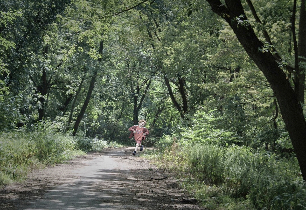
Yes, the additional structure to the scene helps blend the boy in better. You might also consider adding a slight color wash once the boy is added that will then equally effect both the boy and the scene. |
Sep 11th |
| 53 |
Sep 18 |
Reply |
How would YOU make it better? |
Sep 11th |
| 53 |
Sep 18 |
Reply |
I do like this overall treatment, especially with the painterly feel. I do wonder why you didn't apply the same treatment to the boy as well as he is now obviously an addition to the scene. |
Sep 11th |
| 53 |
Sep 18 |
Reply |
A fitting addition to the image, providing an immediate focal point and telling a story. As will be seen when I reveal my result, I went in a similar direction for part of it.
For me, the only issue is the intense red is a bit jarring for the green tones of the image, making it a bit obvious he was added later. As illustrated here, I would suggest toning down the red so he blends in better: |
Sep 4th |
 |
6 comments - 20 replies for Group 53
|
20 comments - 31 replies Total
|


