|
| Group |
Round |
C/R |
Comment |
Date |
Image |
| 6 |
Aug 18 |
Comment |
Excellent capture! Agree with Janet about the crop. Where was this captured? |
Aug 19th |
| 6 |
Aug 18 |
Reply |
Right again, Dick! Thanks! d:¬{D |
Aug 19th |
| 6 |
Aug 18 |
Comment |
Wow! I've never seen a flower like this before! Looks like it would attract hummingbirds, too.
Janet has it right about the leading line from the lower left leaf/petal for sure. I did find the reds at the top a bit over-saturated, but not enough to really worry about. |
Aug 19th |
| 6 |
Aug 18 |
Comment |
Cool capture! Good example of seizing the moment and taking advantage of an opportunity. As Tom K suggested, the removal of the second leg and a recrop to a landscape view I think helps your subject really pop! What do y'all think? |
Aug 19th |
 |
| 6 |
Aug 18 |
Comment |
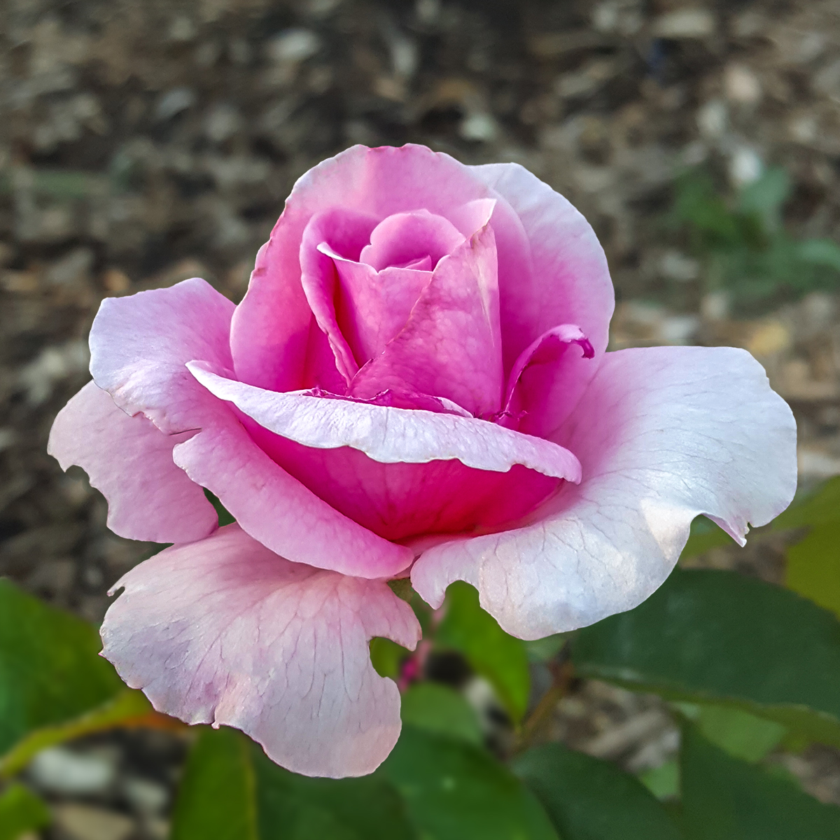
I really enjoyed studying this flower, which I'm thinking is a fleabane - is that right, Dick? The black background sets it off well and the square crop is definitely appropriate. I have no suggestions for improving an already great image. |
Aug 19th |
| 6 |
Aug 18 |
Reply |
Your crop saves the day with Salvador's image. The areas that were in focus are excellent and removing the closer heads is definitely the right step here. |
Aug 19th |
4 comments - 2 replies for Group 6
|
| 11 |
Aug 18 |
Comment |
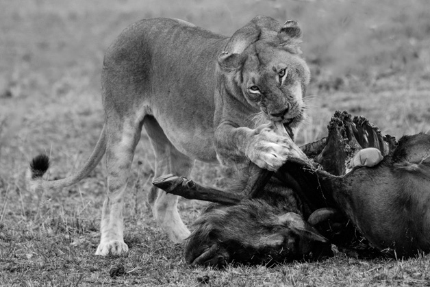
Wow! Though very gruesome, this is a fascinating image, which is but a glimpse of the story you witnessed first hand. Surely this was a trip to remember.
Here's my rendition, incorporating Allen's changes, a slightly different crop than Jim H's, and removing the carrion birds so the focus is the intensity of the lioness as she feeds. |
Aug 25th |
 |
| 11 |
Aug 18 |
Reply |
I think that crop helps focus your attention more on what the lioness is doing and less on the surroundings. The only thing better would be removing a couple of the carrion birds in the background. |
Aug 25th |
| 11 |
Aug 18 |
Comment |
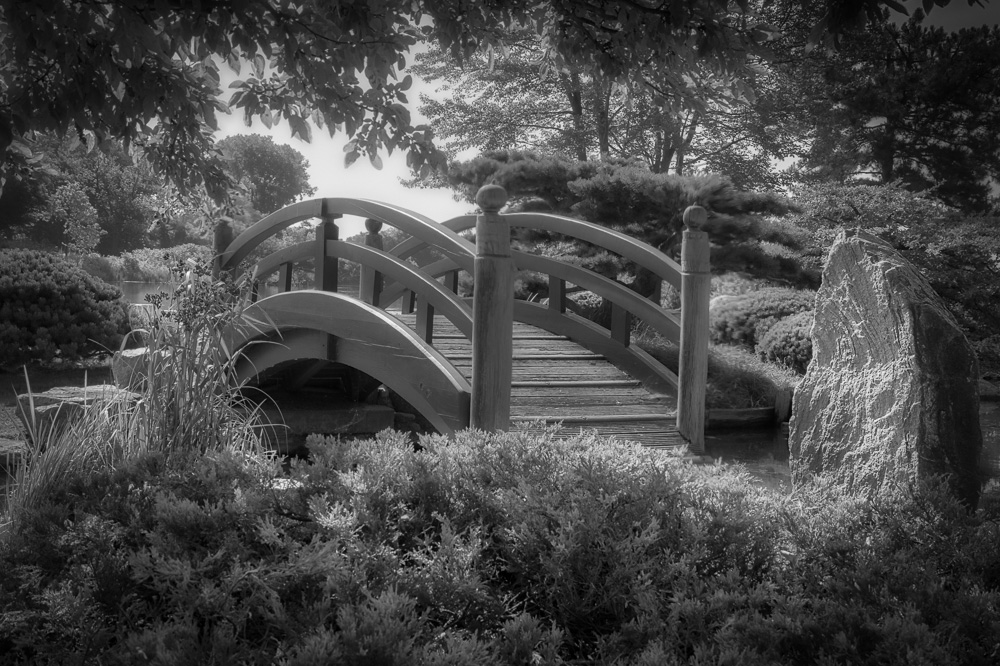
Your resulting image has a pseudo-IR feel to it. Jim's observation of the angle of the posts, while true, is not as bad as it could be and certainly doesn't justify cropping out the rock, which adds an abstract element to the architectural element of the bridge. I used the Liquify tool in PS, but there are other means to accomplish this, including the Upright tools in Lightroom. |
Aug 25th |
 |
| 11 |
Aug 18 |
Reply |
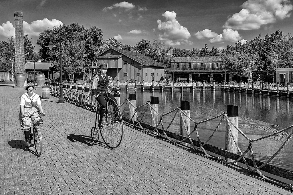
Hmmm . . . for me the shadow of the streetlight is a distraction as it's interacting with the kids on their bikes. When my eye should be roaming the scene, it keeps being pulled back to that shadow. |
Aug 20th |
 |
| 11 |
Aug 18 |
Comment |
All that comes to mind is: WOW!!! This is a superb mono image, PJ image, action image, story image! I can't think of a thing to suggest here as studying this simply blows my mind!!! Did I say WOW? d;¬{D |
Aug 20th |
| 11 |
Aug 18 |
Reply |
Thanks. Does it appear a bit dark to you? I keep having second thoughts about this one. d:¬{( |
Aug 20th |
| 11 |
Aug 18 |
Reply |
That's what I was going for, but I'm thinking something more is needed, though I'm not sure what. What would you have done? |
Aug 20th |
| 11 |
Aug 18 |
Reply |
Are you saying the hole is too dark? If I lightened that area, do you think it would be sufficient? |
Aug 20th |
| 11 |
Aug 18 |
Comment |
I'm still finding my way around IR images, and admit I'm very much a newbie. I like how the sky, trees and bench came out in your post, but my eye wants something different in the grass, perhaps burning or more contrast or I don't know what to bring out more of the tonal qualities there. I played with for a while and couldn't quite reach what I was looking for. Maybe it doesn't exist in an IR image, but I really feel that's what this image needs to finish it. Not a lot of help, huh? d:¬{( |
Aug 20th |
4 comments - 5 replies for Group 11
|
| 18 |
Aug 18 |
Reply |
Why not a fairy? I guess I lack the imagination. You're quite right that a fairy would make better sense, in a fantasy perspective, than a horse. My mind went to the absurd. d;¬{D |
Aug 26th |
| 18 |
Aug 18 |
Reply |
I like that! d:¬{D |
Aug 25th |
| 18 |
Aug 18 |
Reply |
Precisely! d;¬{D |
Aug 25th |
| 18 |
Aug 18 |
Comment |
Hmmm . . . This is not working for me. My eye wants to study the poppy and is being blocked by the dewy blade of grass. Perhaps, as Mark suggests, the grass could be moved off the flower, perhaps so that it's close to dripping on the flower rather than blocking the view of it. |
Aug 25th |
| 18 |
Aug 18 |
Comment |
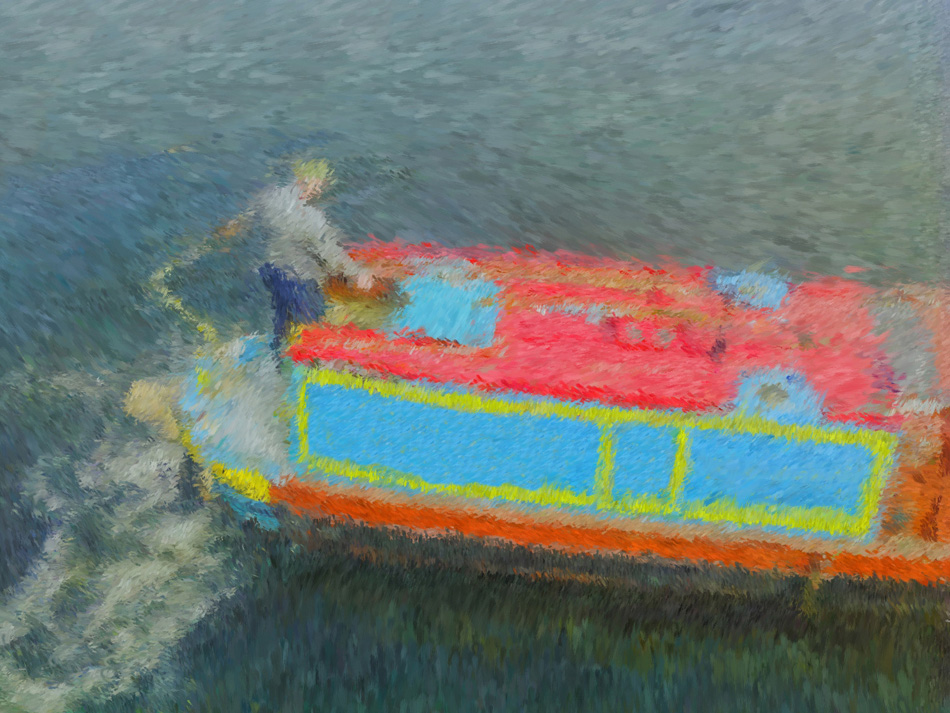
WOW!!! Your mind works in mysterious ways, Peter! I really like this and would never have expected such mundane images to come together is such a striking result. Your subtle use of the Twirl filter sells the intensity of the storm, while the stark simplicity of the boat and water serves as an extreme contrast. These contrasting elements really catch the eye and sends the mind reeling as it tries to make sense of what it's seeing. Bravo!!! |
Aug 25th |
| 18 |
Aug 18 |
Reply |
I have put it deeper as suggested - see below: |
Aug 25th |
| 18 |
Aug 18 |
Reply |
I agree. I moved the petal out some and reduced its size and deepened it - with a different horse that worked better for me. See below: |
Aug 25th |
| 18 |
Aug 18 |
Reply |
You're right, worth more work. See my result below: |
Aug 25th |
| 18 |
Aug 18 |
Reply |
That would certainly be more realistic, but not where I was headed with this project. See my rework below: |
Aug 25th |
| 18 |
Aug 18 |
Reply |
I ended up with a different horse - see below: |
Aug 25th |
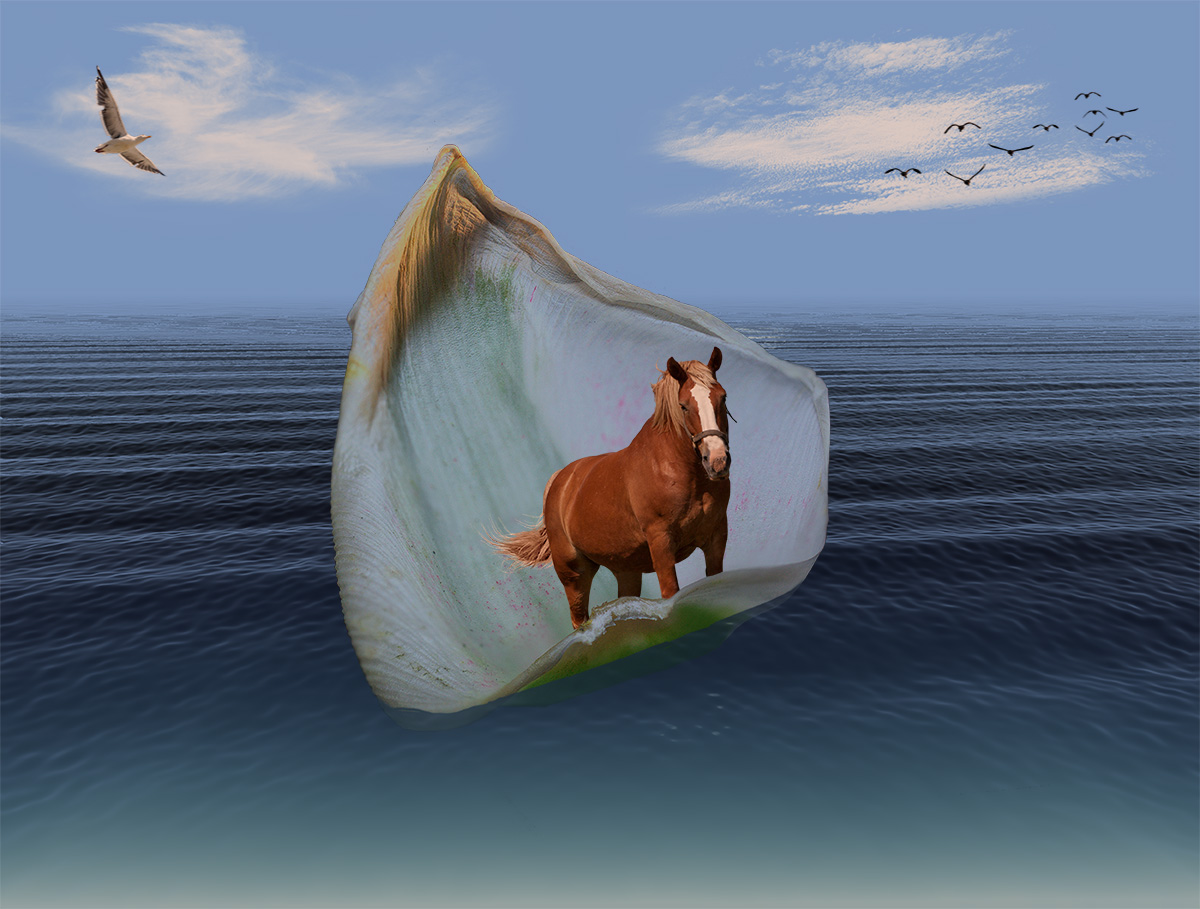
| 18 |
Aug 18 |
Comment |
Okay guys! Thanks for all the suggestions. I've incorporated many into this rendition with a different horse. What do y'all think? |
Aug 25th |
 |
| 18 |
Aug 18 |
Comment |
You took a rather blah and flat image and managed to create a painted scene that pops and provides a lot of eye candy! I'm not seeing what Andrew is regarding a blur around the boats. To be frank, I didn't really notice the boats as the eye is drawn to the buildings and then tends to float upwards towards the mountains in the background. Great job! |
Aug 25th |
| 18 |
Aug 18 |
Comment |
The fact that this is not the result of serious post-processing is quite a feat in itself. It looks like it was artfully put together, and that's creative enough for me. In the camera or after, the artistic result is what's important. Bravo!!! d:¬{D |
Aug 25th |
| 18 |
Aug 18 |
Comment |
I don't know if I agree with the smoke coming from the stack. This image doesn't read like a moving train to me. If you add the smoke, you'd need to blur the wheels and landscape some to sell the movement. I say leave it as is - you've succeeded in producing the railway poster look quite handsomely. Don't fix what's not broken. d;¬{D |
Aug 25th |
| 18 |
Aug 18 |
Comment |
I like the look with the exception of the lettering. My feel is you could remove the lettering rather than worry about making it look better with this painterly technique. I also thought it might be a better story without the partial boat in the top left. What do you think? |
Aug 25th |
 |
7 comments - 8 replies for Group 18
|
| 53 |
Aug 18 |
Reply |
That's what's great about post-processing - you can adjust the image to be all it can be and, only you will know that it wasn't captured that way. d;¬{D |
Aug 25th |
| 53 |
Aug 18 |
Comment |
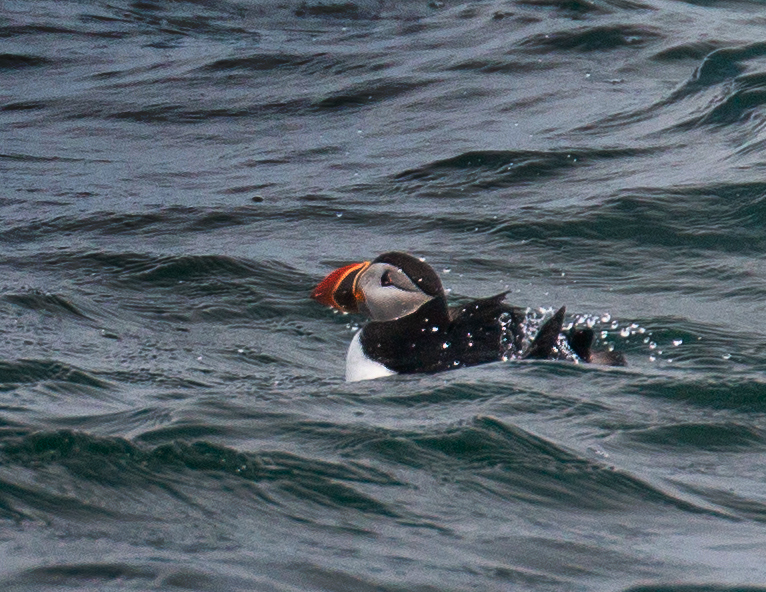
It would be cool to finally have an opportunity to photograph puffins. Glad you got the opportunity!!!
I like the composition here, but it was a bit hard on the eyes due to the bright water in areas. A targeted Curves layer to take them down a bit and then a bit of sharpening on the bird I think helps it to really pop out from the water. What do y'all think? |
Aug 19th |
 |
| 53 |
Aug 18 |
Comment |
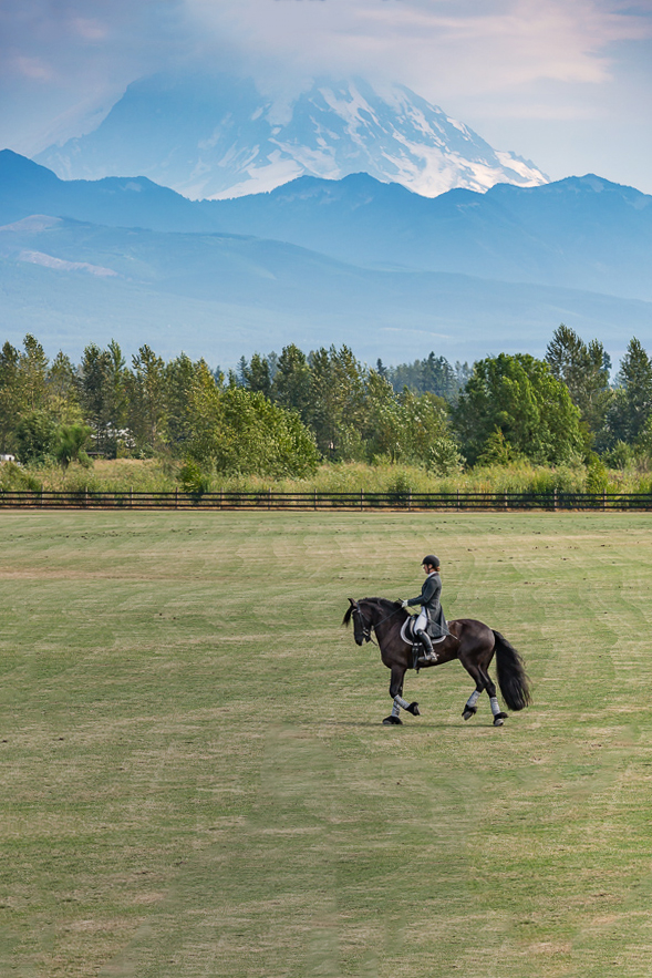
Definitely too narrow an image - the equestrian has to battle with the mountain for focus and both suffer.
Working from your original, I replaced the structure in the lower right with grass (by selecting that area and doing a Content-Aware Fill), then cropping to place the horse and rider at a sweet spot, straightening using the fence as the horizon. Then, I added some contrast to the mountain and reduced the luminosity and saturation of the grass. What do y'all think? |
Aug 19th |
 |
| 53 |
Aug 18 |
Comment |
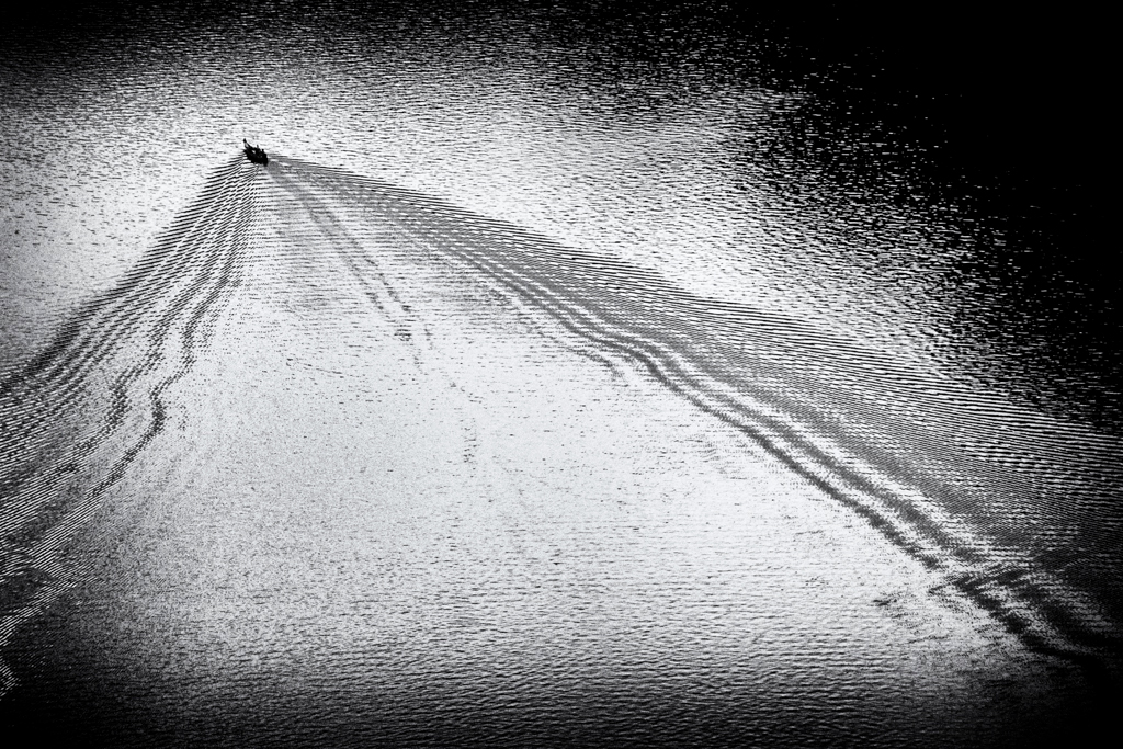
This works so well as a monochrome! I love the simplicity of it and the natural leading lines pulling your eye behind the tiny boat. Turning down the brightness in the center does help I think. What do you think? |
Aug 19th |
 |
| 53 |
Aug 18 |
Reply |
I agree, Rohan! |
Aug 19th |
| 53 |
Aug 18 |
Comment |
Mmmmmm! I instantly fell in love with this! Then, after a while, a small uneasy feeling started to creep in. It was almost as if I felt I was falling. Rotating it 180 degrees, a more conventional orientation (as seen in my redo) relieves that. Yet, there's something about your version that keeps drawing me back - almost like the bottom edge of a setting sun. Hmmmm. More study is needed! d;¬{D |
Aug 19th |
 |
| 53 |
Aug 18 |
Comment |
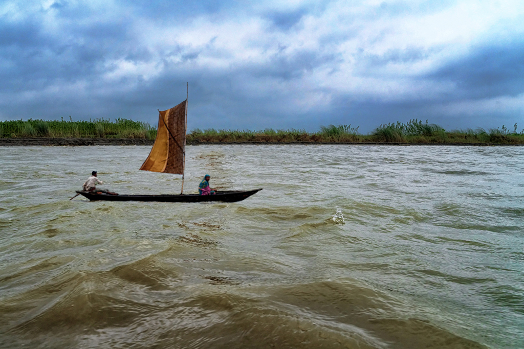
This image has a lot of potential. The perspective from the water level gives a lot of depth to the image, but the position of the boat along the shoreline loses impact.
I have moved the boat to a closer position and boosted the contrast in the sky. What do y'all think? |
Aug 19th |
 |
| 53 |
Aug 18 |
Comment |
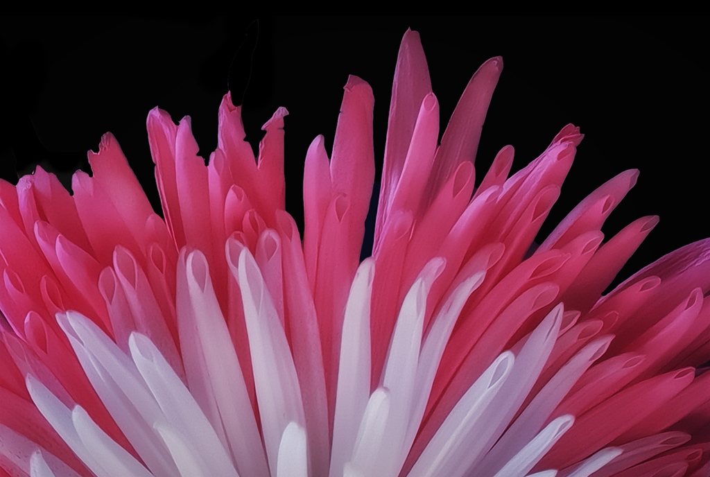
I think we have a consensus on how this should be treated. Thus, here's my redo: softened leaves to blend more with the background, but crisp edges to the rose petals. Thoughts? |
Aug 19th |
 |
| 53 |
Aug 18 |
Reply |
LOL!!! d:¬{D |
Aug 12th |
| 53 |
Aug 18 |
Reply |
I think your treatment of the background works well, but you've ended up blurring the outer edges of the rose in the process, making it too soft for my taste. Hopefully, others will weigh in. |
Aug 12th |
| 53 |
Aug 18 |
Reply |
Hmmm . . . I'm wondering how I should punish this naughty streak in you . . . vignetting sounds too tame. Or maybe you like it when someone vignettes . . . Hmmm d;¬{D |
Aug 11th |
| 53 |
Aug 18 |
Reply |
You'd see blurry leaves? d;¬{Ã�
I thought about doing that but felt they weren't enough of a distraction to warrant that. I take it you disagree? |
Aug 11th |
6 comments - 6 replies for Group 53
|
21 comments - 21 replies Total
|


