|
| Group |
Round |
C/R |
Comment |
Date |
Image |
| 6 |
Jun 18 |
Reply |
Excellent idea, Tom. I think you've hit upon the finishing touch this needs! Thanks!!! d:¬{D |
Jun 26th |
| 6 |
Jun 18 |
Reply |
It's not LIKE art, Dick - it IS art! d;¬{D |
Jun 23rd |
| 6 |
Jun 18 |
Reply |
Yes, that works too, though the fuzzy blossom in the upper-right background is a little distracting. |
Jun 23rd |
| 6 |
Jun 18 |
Comment |
Who knew that bees slept? Certainly differs from the idea of the "busy bee." d;¬{D
I think this is utterly wonderful, though Dick's crop takes it to the next level, for sure. I think you have a winner here, both in competition and printed and displayed on a wall. Bravo! |
Jun 22nd |
| 6 |
Jun 18 |
Comment |
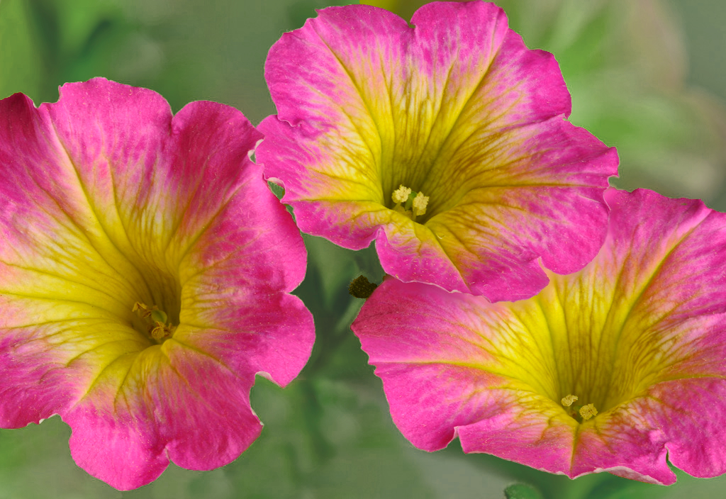
Lovely blossoms and definitely sharp and soft where needed. I wish the background were a little more green or brown to help the blossoms pop a bit more. Perhaps something like this: |
Jun 22nd |
 |
| 6 |
Jun 18 |
Reply |
Great discussion about DOF in Macro! This is meaty stuff and would likely scare off anyone who dislikes math. Fortunately, I was a math major in HS. d;¬{D
Of course, your precision with the distances of your slices must necessitate a rail I would think. That may be the problem with my stacks, as I choose my slices by eye. |
Jun 22nd |
| 6 |
Jun 18 |
Comment |
Fascinating image, with plenty to study. Definitely needs a detail boost, as Dick has demonstrated. I don't know if the flip was needed - it looks fine in either orientation. I'm not too keen on the yellow border as it's not connected with the palette of the bird or contrasted enough. Here's my pick for a border color: |
Jun 22nd |
 |
| 6 |
Jun 18 |
Comment |
I think this is a great choice of items for your composition, both for their color and their positioning along the diagonal. I must agree with Dick about the added structure/clarity/sharpening as the back petals are a little soft. Even without the detail boost, this is a strong image. |
Jun 22nd |
| 6 |
Jun 18 |
Comment |
I think Dick has applied the best fixes for this image. I think the overall image has a potential for many subjects and combinations thereof. Like Sathishkumar, I hope you got a lot more that you've been at work with. |
Jun 22nd |
| 6 |
Jun 18 |
Reply |
Thank you so much, Salvador! I picked 5 dandelions and captured well over a 100 images, most of which were fairly boring after editing - this one showed the most promise. d;¬{D |
Jun 16th |
| 6 |
Jun 18 |
Reply |
You're so on target with your refinements. You've made it all that it can be! Hooah! d;¬{D |
Jun 14th |
| 6 |
Jun 18 |
Reply |
Thanks, Janet. It was a labor of love. d;¬{D |
Jun 14th |
| 6 |
Jun 18 |
Reply |
YAY! I guess that means I done good, yes? d;¬{D |
Jun 11th |
5 comments - 8 replies for Group 6
|
| 11 |
Jun 18 |
Reply |
<...sigh...> Yes, there is that. It wasn't the most successful stack, but, for me, it was more a study of shapes and textures, so I excused the softness in spots. If this was a winner, I wouldn't be submitting it for study. |
Jun 28th |
| 11 |
Jun 18 |
Reply |
I avoided it like the plague for a long time, spending most of my time in Lightroom. Eventually, I had to bite the bullet and started watching YouTube videos. Look for teachers like Aaron Nace (http://Phlearn.com/), Dave Cross ( http://davecrossworkshops.com/ ), Anthony Morganti ( https://onlinephotographytraining.com/ ) and others. It's also good to Google specific tasks in Photoshop. I watch videos almost daily and have been doing it for 4 years now. |
Jun 23rd |
| 11 |
Jun 18 |
Comment |
Frozen chaos! I'm sure it was mesmerizing to watch. You managed a great amount of detail considering all the coming and going before you. Great job. Despite the limited tonal range, the animals are distinct from the muddy bank. I have no suggestions but to sit back and enjoy the memories it brings you! d:¬{D |
Jun 22nd |
| 11 |
Jun 18 |
Comment |
Gorgeous scene, Jim! It was good that the saturation was boosted in your intermediate image, which allows for more tonal adjustment once converting to mono. I think perhaps you went a bit dark in the midtones, which slightly flattened the image. Try using a blue filter to bring out more tonal variety, as I did here:
|
Jun 22nd |
 |
| 11 |
Jun 18 |
Comment |
Excellent job in PS! I spend a lot of time manipulating things there and I doubt I could do any better.
I would suggest bringing out more tonal variety in the "horse," as it tends to read a little flat with the brightness of the sky. I tried adding the original above the mono, changing the blend mode to Soft Light and masking everything but the "horse." What do you think? |
Jun 22nd |
 |
| 11 |
Jun 18 |
Reply |
Don't abandon the story! Instead, use it as a prelude to the even more daunting Grand Tsingy excursion. d;¬{D |
Jun 22nd |
| 11 |
Jun 18 |
Reply |
Thanks, Allen. That was my intent. I'm so addicted to color that I have to sometimes remove it to find other things to see. d;¬{D |
Jun 22nd |
| 11 |
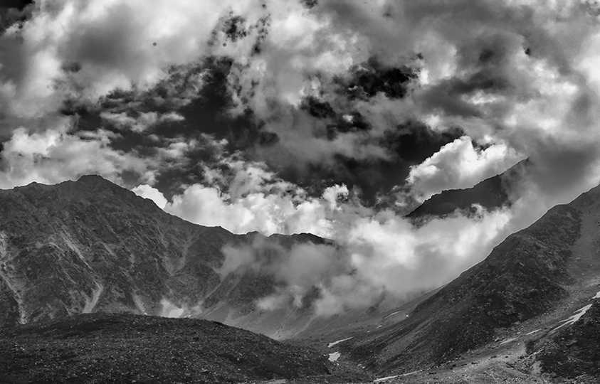
Jun 18 |
Comment |
As Allen said, the green and blue in the original soften the mountains for a better story. I feel the intensity of the clouds needs to take center stage in the monochrome version, so have cropped out the foreground buildings so they do not distract. What do you think? |
Jun 22nd |
 |
| 11 |
Jun 18 |
Comment |
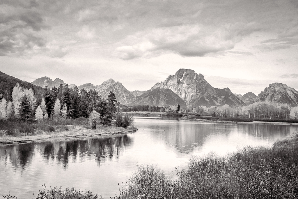
As Jim mentioned, this seems like a simple approach to what can be a difficult process. It has certainly worked to tonaly separate the water from the sky. Unfortunately, for my eye, this has ended up flattening the rest of the image so that there's little sense of depth, especially between the lake and the mountain range. I think that will require varying amounts of contrast and/or clarity to separate the midground and background from each other and the foreground. |
Jun 22nd |
| 11 |
Jun 18 |
Reply |
You're probably right, Jim. I have yet to get this down pat, by any stretch. |
Jun 14th |
5 comments - 5 replies for Group 11
|
| 18 |
Jun 18 |
Comment |
Definitely straightening the horizon helps finish this a lot! It's a fun idea and executed well. Will have to try my hand at something like this in the near future (before I forget about it amongst all the ideas floating around in my head). |
Jun 22nd |
| 18 |
Jun 18 |
Comment |
I think this is wonderful, Peter! I think the finishing touch would be having the large image on an easel rather than floating in space. That would make more sense with the background you chose. |
Jun 22nd |
| 18 |
Jun 18 |
Reply |
I was definitely in a "strange" mood when I chose the background color! d;¬{D |
Jun 22nd |
| 18 |
Jun 18 |
Comment |
Filling in the background by cloning was a good choice. Would like to see more effect on the flowers, though. If possible, I'd also suggest lowing the luminance of the greens so that the flowers aren't being swallowed. |
Jun 22nd |
| 18 |
Jun 18 |
Comment |
I also like both and thought it might be interesting to see both, so, here's my take on that: |
Jun 22nd |
 |
| 18 |
Jun 18 |
Comment |
Your result gave a more interesting sky that was darker and thus not a distraction. The texture gives the scene a slightly vintage look, in keeping with the subject. Sure to warm the heart of any tractor fan! d:¬{D |
Jun 22nd |
| 18 |
Jun 18 |
Comment |
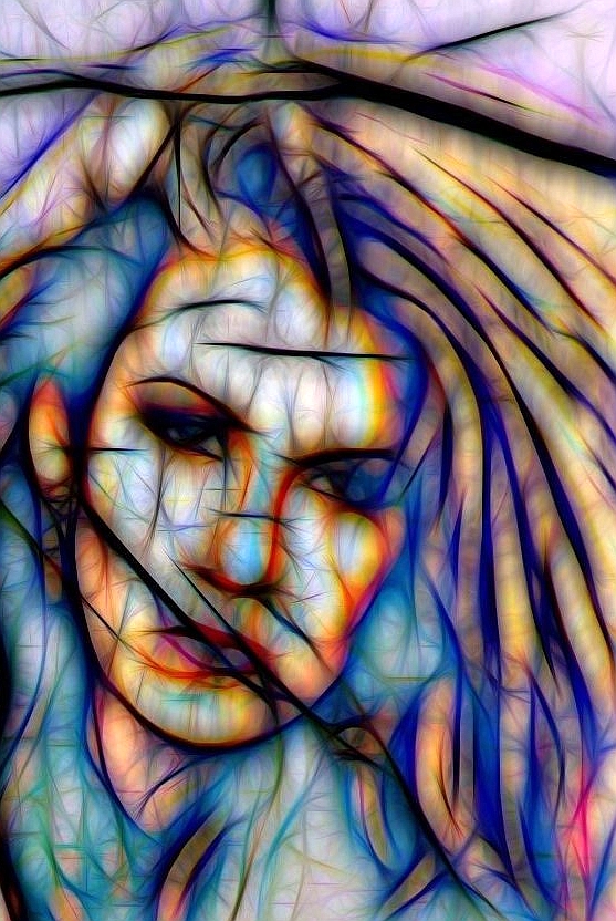
I wish I could see the original to get an idea of where this started.
I think it's a bit dark, especially in the eyes and the ink on the arm so that it loses detail and takes on a more sinister tone, which is fine if that's what you're going for.
Here's a version of just the woman and brightened a bit. Thoughts? |
Jun 22nd |
 |
| 18 |
Jun 18 |
Reply |
What would be your suggestion? Can you demonstrate? |
Jun 14th |
| 18 |
Jun 18 |
Reply |
Interesting. Do you think it really needs that much room? |
Jun 3rd |
| 18 |
Jun 18 |
Reply |
No fear of that. I haven't competed in over a year. d;¬{D |
Jun 1st |
6 comments - 4 replies for Group 18
|
| 53 |
Jun 18 |
Reply |
They didn't make it, Rusty. |
Jun 22nd |
| 53 |
Jun 18 |
Reply |
I'm still on an S6, which does amazingly well considering. d;¬{D |
Jun 14th |
| 53 |
Jun 18 |
Comment |
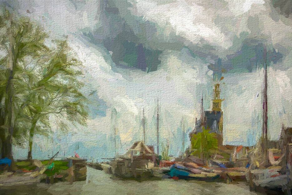
Finally, in keeping with the main Dutch Master, Rembrandt, here's a version in his style: |
Jun 14th |
 |
| 53 |
Jun 18 |
Comment |
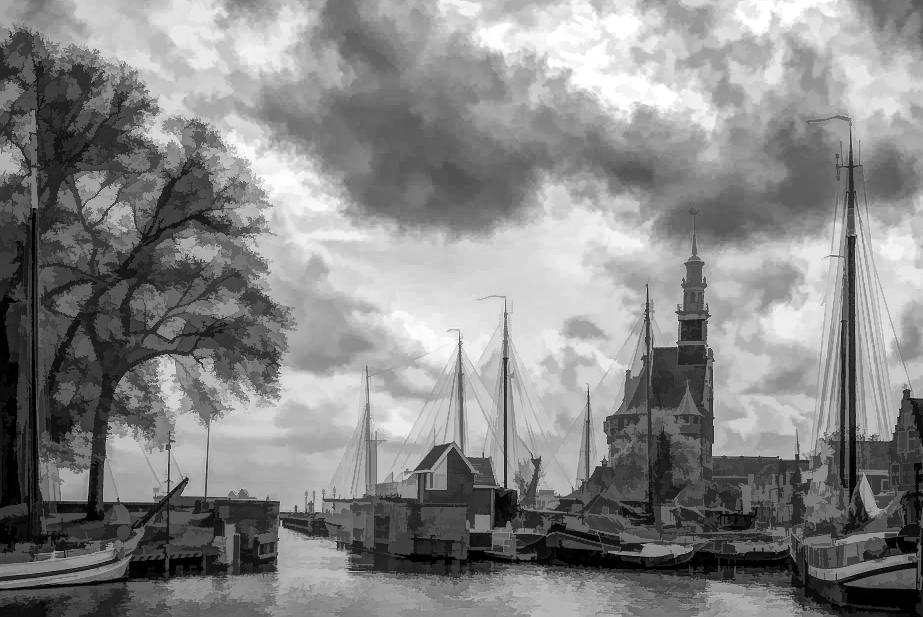
Here's a more colorful rendition, using the VanGogh w/ Canvas preset: |
Jun 14th |
 |
| 53 |
Jun 18 |
Reply |
Actually, I cropped a bit from the top and right side to have it fit the 3 to 2 aspect ratio. d:¬{D |
Jun 14th |
| 53 |
Jun 18 |
Reply |
Whole new idea for me. I'm a Nikon shooter, so I'm not likely to find a reasonable comparable lens. d:¬{( |
Jun 14th |
| 53 |
Jun 18 |
Comment |
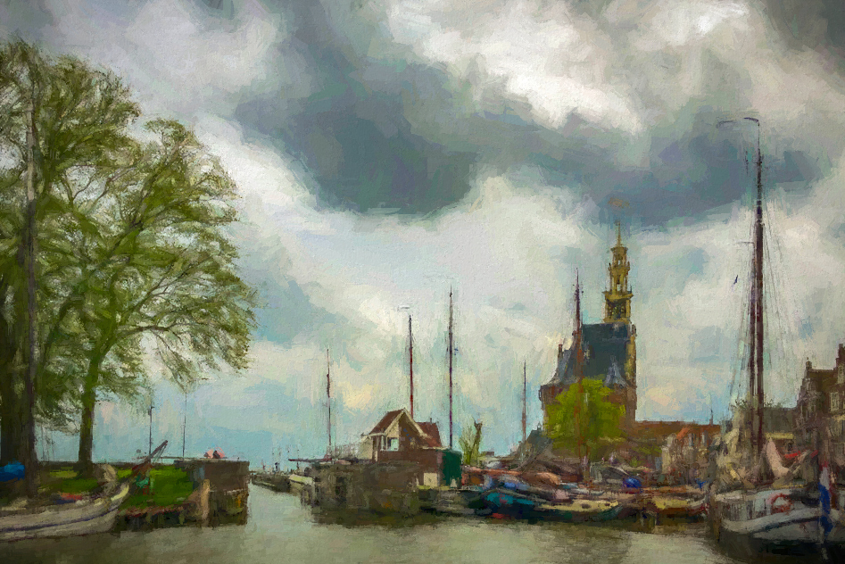
Very much agree about the Dutch Masters concept. And Dan's idea about "painting" effects is also fitting.
Didn't quite agree with Dan's crop, though. I felt converting it closer to a 2 by 3 gives more pleasing composition. I took this into Topaz Studio and applied the Black & White Impasto preset to give it a more painted look. Thoughts? |
Jun 14th |
 |
| 53 |
Jun 18 |
Reply |
So your 12 slices are not a change in focus but a change in magnification? I've never heard of that before. How does that work? |
Jun 14th |
| 53 |
Jun 18 |
Comment |
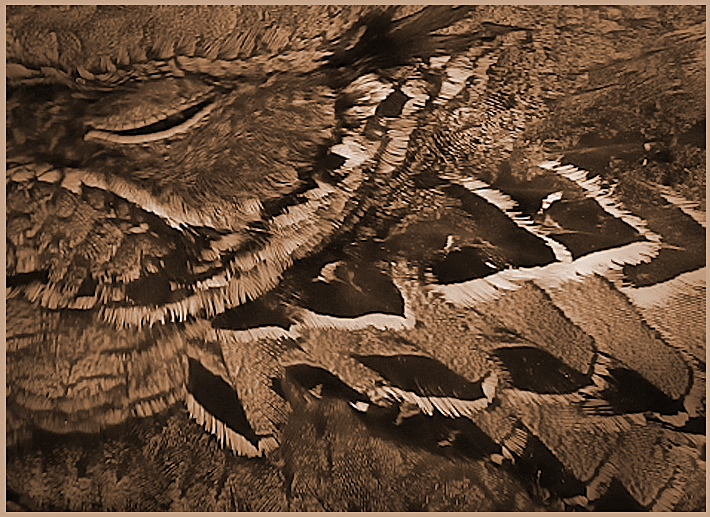
I like the image, though I find the Title rather disconnected. There was nothing in the background or on his person that demonstrated his profession. For me, his downward gaze spoke of sadness or defeat, so perhaps a title along those lines would be a better fit.
I found the background slightly distracting, especially in the upper right corner. Since it doesn't add to the story of the image, regardless of the title, I had a go at replacing it with a simple 2 Lil Owls texture (Blk Screen Col 1-22) and added a second copy of the man with the Soft Light blend mode @ 42% opacity to give him a little more depth. What do you think? |
Jun 14th |
 |
| 53 |
Jun 18 |
Comment |
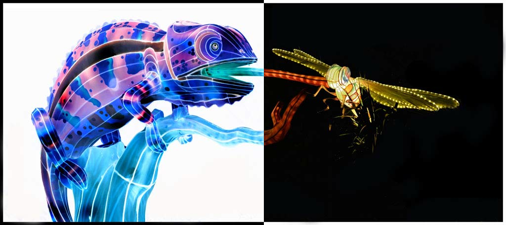
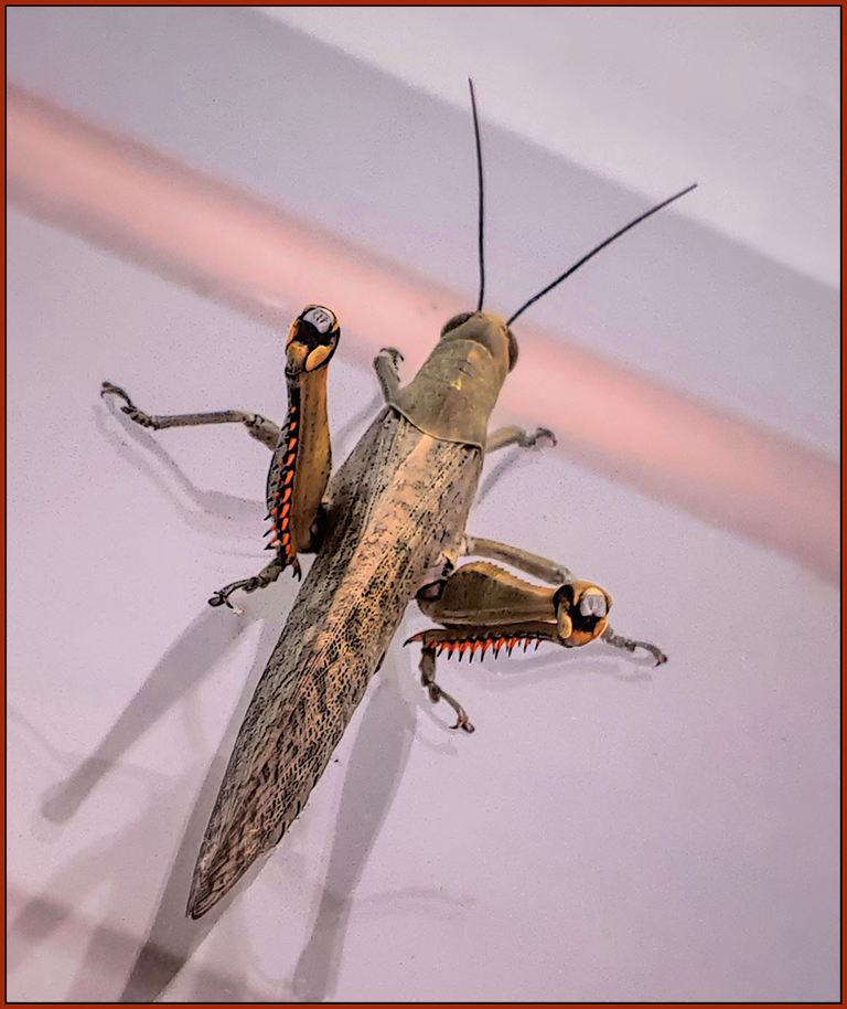
Which model Samsung phone do you have?
Great detail and effective composition with the insect on the diagonal. The lighting made for interesting shadows too.
My only problem was the amount of noise in the open spaces. Here's a version without: |
Jun 14th |
 |
| 53 |
Jun 18 |
Comment |
The filters removed the depth of the original, turning your image into something like an inebriated spider's web. Only thing that bothers me a bit is the "noise" between the filaments, but it also sorta fits, so you can ignore that I mentioned it. d;¬{D
Can you post the results from the other filters for comparison? |
Jun 14th |
| 53 |
Jun 18 |
Comment |
Very intense, Rohan. I think it will give me nightmares! Since you did a stack, can I assume this monster was deceased? d;¬{D
Did you use a rail to move the camera or change the focal length with the lens? |
Jun 14th |
| 53 |
Jun 18 |
Reply |
Good catch, Dan! That helped a lot! d:¬{D |
Jun 8th |
7 comments - 6 replies for Group 53
|
23 comments - 23 replies Total
|


