|
| Group |
Round |
C/R |
Comment |
Date |
Image |
| 0 |
May 18 |
Comment |
another rtest |
May 23rd |
| 0 |
May 18 |
Comment |
this is a test comment |
May 23rd |
2 comments - 0 replies for Group 0
|
| 6 |
May 18 |
Reply |
Glad it still works! Thanks for positive feedback! d:¬{D |
May 27th |
| 6 |
May 18 |
Comment |
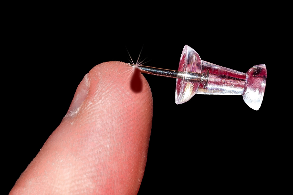
I have pulled back the exposure on the finger and added a bit of blood. Hopefully, it doesn't pull focus from the "point" of the image. d;¬{D |
May 27th |
 |
| 6 |
May 18 |
Comment |
Our resident flower expert has hit it out of the park again, especially after darkening the lower part of the stem. Dick is the king of focus stacking in our group, for sure! I've learned a lot from his comments, though I have a lot more to learn! |
May 27th |
| 6 |
May 18 |
Reply |
Yes, Tom is right about darkening the lower part of stem. It forces the eye to stay on the Iris where it belongs. The change finishes the image off nicely. |
May 27th |
| 6 |
May 18 |
Comment |
I love the detail in this image and the universal focus. I think Dick's flip works a little better for composition. I don't see the need for a diagonal orientation as the stem has some diagonal components already. Good find! |
May 27th |
| 6 |
May 18 |
Reply |
I think you're right with the flip, Dick. It gives more of an upward feel, while the original has a downward feel. |
May 27th |
| 6 |
May 18 |
Comment |
I like what you submitted, actually, just as it is. The flower pops and the eye is pulled in immediately. Yes, without the border is has more breathing room, but the border acts to keep your eye from wandering onto other things. I wouldn't change a thing - maybe that says something about me! d8¬{O |
May 27th |
| 6 |
May 18 |
Comment |
I have been experimenting with focus stacking for a few years now, with varied success. The best results come from a combination of good software like Helicon (I use Focus Projects Pro, by Franzis) and manual cleanup where the software makes the wrong choices.
Another method is to let Photoshop align and stack the images and go through each layer to adjust its mask to add and subtract from that layer's contribution to the stack. Very tedious but can lead to good results.
In that case of your test, I agree with the comments of others. Better to confine your result to the part of the image that is in focus than to just use what Helicon gives you.
By the way, Helicon has a companion app that can control your camera and automate the capturing of a stack - Helicon Remote. I've seen it demonstrated and it's amazing. |
May 27th |
| 6 |
May 18 |
Reply |
I know, right? |
May 9th |
| 6 |
May 18 |
Reply |
That was the Topaz Star Effects plugin. |
May 8th |
5 comments - 5 replies for Group 6
|
| 11 |
May 18 |
Reply |
Glad I could offer useful suggestions! d:¬{D |
May 28th |
| 11 |
May 18 |
Reply |
LOL! |
May 28th |
| 11 |
May 18 |
Comment |
On my one, and likely only, trip to Hawaii 10 years ago, we went on an all-day whale watch. All I managed to capture was some tails. We only saw one breach but couldn't get our cameras up fast enough. Lucky you!
Because whales are so large, providing a distant hillside for perspective is rather a wasted effort. Better to crop closer to the breach as Jim demonstrated.
As far as presets in Lightroom, you're better of working with the color sliders in the Black & White panel to best adjust the tones in the image to create more contrast as you see in Jim's example. |
May 27th |
| 11 |
May 18 |
Comment |
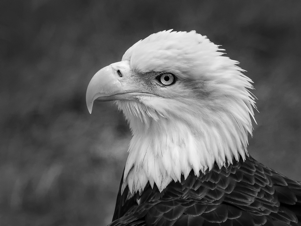
I think the image works well in mono. The background is a little noisy and a touch too bright, while the feathers, in both the head and body could use a boost in contrast to bring out more detail. Here's my rendition: |
May 27th |
 |
| 11 |
May 18 |
Comment |
This definitely is improved by conversion to mono and your subtle but important edits. Well done! I have nothing to suggest for improvements. |
May 27th |
| 11 |
May 18 |
Comment |
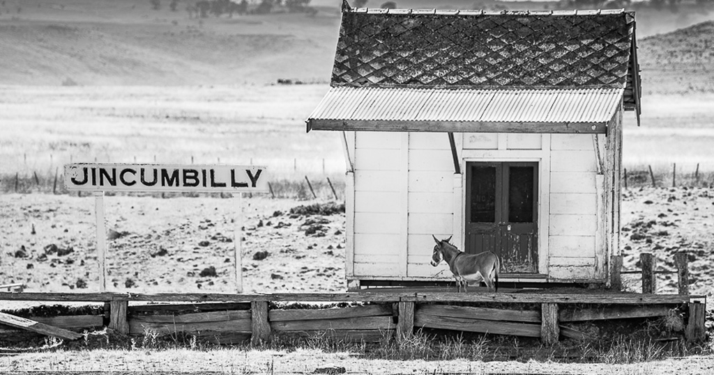
I agree with Allen, but I find the sign too disconnected from the rest of the image. So, in my rendition, I have moved the sign to the right, closer to the "station". What do you think? |
May 27th |
 |
| 11 |
May 18 |
Comment |
I recently went out of the side door of our house, which rarely gets used, and walked head first into a rather large web! Very unsettling!! My first thought after settling down was how it would have looked if I could have captured with my camera rather than my forehead! d;¬{D |
May 27th |
| 11 |
May 18 |
Comment |
While I personally don't care for this type of image, I can certainly appreciate its artistic merits. I agree with Jim and Allen about crops and have combined their suggestions with my own rendition. What do you think? |
May 27th |
 |
| 11 |
May 18 |
Comment |
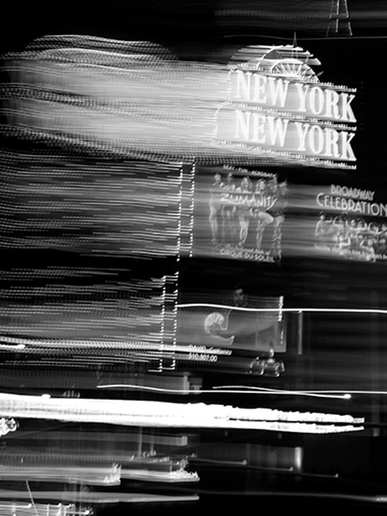
I definitely find the mono version to be better. The color version is almost too warm and tends to cloud the detail, while your mono rendition has brought all the detail into focus and retaining the nice star effect on the lights. I can't think of anything to suggest for improvements. This would make a great advertisement image. |
May 27th |
| 11 |
May 18 |
Reply |
The maker was no where in sight when I captured the image, so it may have been abandoned. |
May 6th |
7 comments - 3 replies for Group 11
|
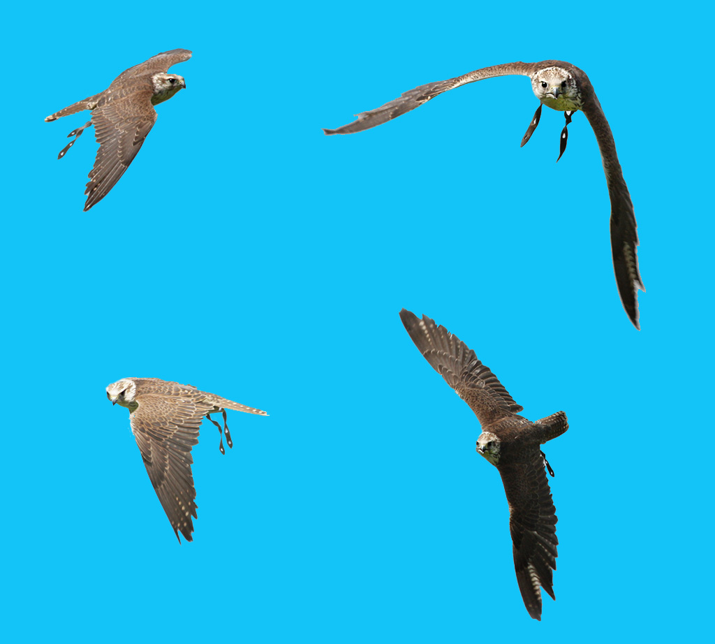
| 18 |
May 18 |
Comment |
Love the composite of the 4 images, but agree a different sky would help the birds pop better. How about this one? |
May 27th |
 |
| 18 |
May 18 |
Comment |
Love the grittiness in your resulting blend of images. Such drama! Can't think of anything to suggest. |
May 27th |
| 18 |
May 18 |
Comment |
Wow! Great result and also appreciate the detailed explanation of your process. No suggestions to improve as this is definitely finished as presented. Bravo! |
May 27th |
| 18 |
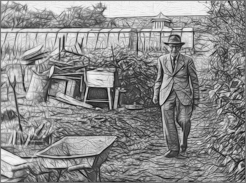
May 18 |
Comment |
I agree with the others about wanting to see his face more clearly. Here's a quick rendition bringing his face back some: |
May 27th |
 |
| 18 |
May 18 |
Comment |
Before I read your description, I was trying to figure out how you accomplished this look! Reading the description, I was actually somewhat disappointed! d;¬{D
As others have indicated, this is really not a "creative" image as it's not really modified, it's an effective look and really pulls the viewer in trying to absorb what is being seen. I really like it, even if you didn't teach me new special effect to add! d;¬{D |
May 27th |
| 18 |
May 18 |
Reply |
Hmmm. Do you really find them a distraction? |
May 12th |
| 18 |
May 18 |
Reply |
Thank you. That is precisely what I was going for. d;¬{D |
May 10th |
| 18 |
May 18 |
Reply |
That works well, too! |
May 10th |
| 18 |
May 18 |
Reply |
Ahhh. I will experiment with that, masking the effect a bit from the facial features. |
May 5th |
| 18 |
May 18 |
Reply |
So tell me your methods. For me, though, it does something to her eye I don't care for. |
May 5th |
| 18 |
May 18 |
Reply |
As an "artist", if you'll excuse the term, I assume that it won't work for everyone. Can you expand on the "more subtle approach" you're suggesting? |
May 5th |
5 comments - 6 replies for Group 18
|
| 53 |
May 18 |
Reply |
Appreciate that, Bob! d:¬{D |
May 31st |
| 53 |
May 18 |
Comment |
This certainly works for me. You cannot tell what you're looking at unless you study it really closely, which is not really the point. The lines and curves give it a techno-artistic feel and I can see it on an office wall in an industrial building! Bravo! d:¬{D |
May 21st |
| 53 |
May 18 |
Comment |
I do prefer your crop, Dan. For me, the great thing about this location is a lot of lines and angles and shapes to study - great eye candy. What bugs me, though, is all the people, some of whom are ghosted by the HDR processing. Here's my take, removing all but one of the people by a series of copies and clones. What do you think? |
May 21st |
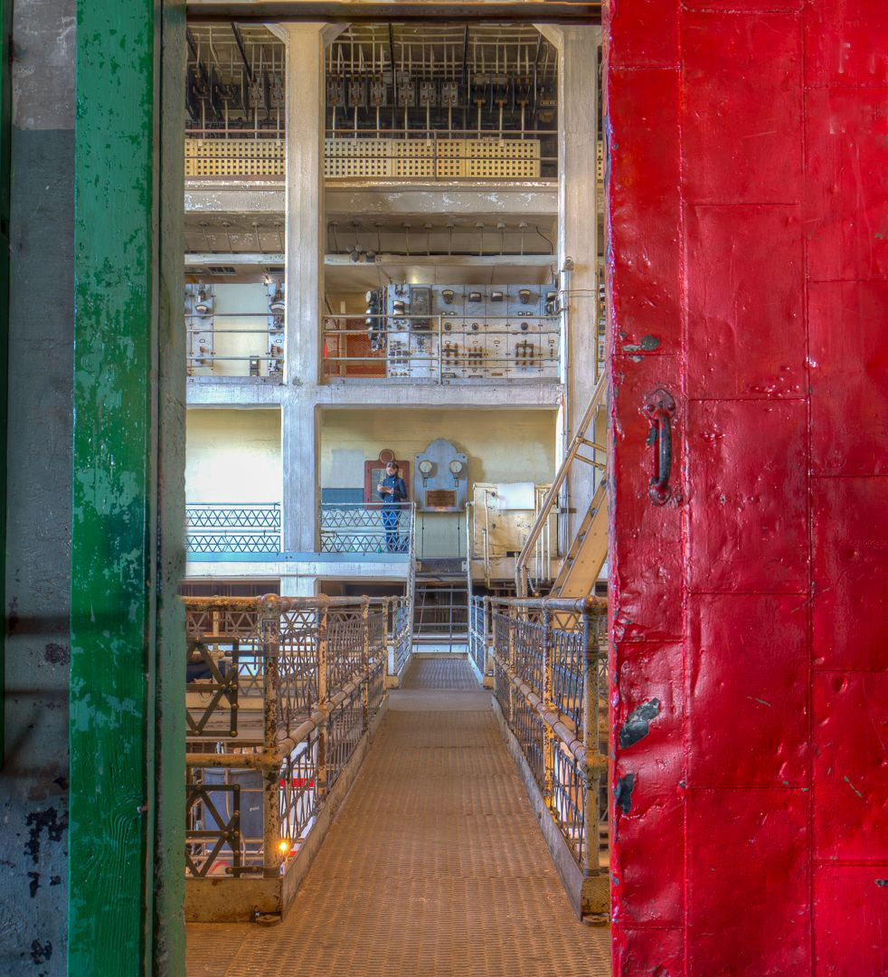 |
| 53 |
May 18 |
Comment |
I think Dan was headed in the right direction. I tried taking it a bit further to correct the perspective inherent in the angle you were forced to employ. Basically I used the Transform tool and, holding down the [ Ctrl ] key while pulling on the corners, I was able to simulate a more straight on view. This stretched the tractor out a bit, so I then used Puppet Warp to correct for that distortion. What do you think? |
May 21st |
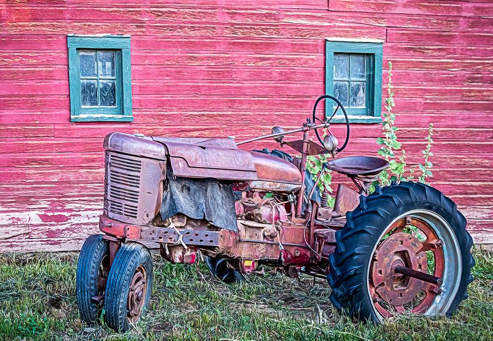 |
| 53 |
May 18 |
Comment |
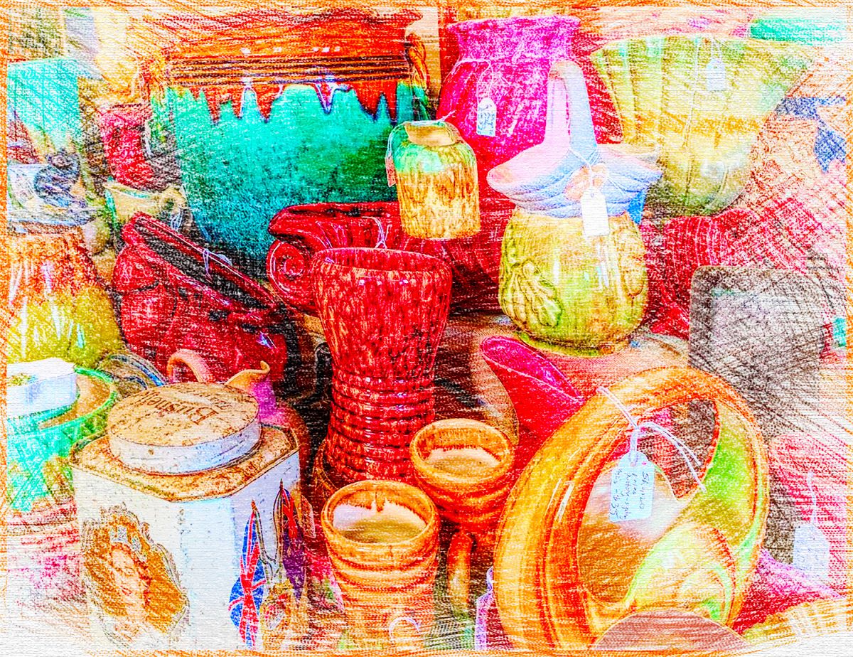
Here I am - off the wall yet again. Like, Dan, I agree that your submitted image holds more interest with its strong saturation of colors. While examining it, it reminded me of coloring when I was a kid, so I decided to turn your image into a crayon drawing. What do you think? |
May 21st |
 |
| 53 |
May 18 |
Reply |
I thoroughly enjoyed seeing everyone's interpretation of my base image. It really demonstrates the fact that we are all individuals in our artistic vision rather than fitting into someone else's mold (and I can get pretty moldy).
I know my issue with the lack of focus on this image a bit judgy, but that's because I've done a lot of image judging for PSA clubs in the recent past and can't seem to break out of that very well. I do think the red "lever" is a good leading line, while the coil seems a bit out of context to my eye. Bottom line is that my "opinion" is worth little and how this image effects you carries a great deal of value. d:¬{D |
May 21st |
| 53 |
May 18 |
Comment |
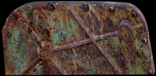
I love all the different textures and pieces in this image, but I have trouble figuring out what should be the main focus. Since the rust was the most prevalent texture, I selected out a section, warped it into a slightly different shape, and placed it against a black background. Not very pretty or strong a composition, but I like studying the texture. Silly me! d;¬{D |
May 21st |
 |
| 53 |
May 18 |
Comment |
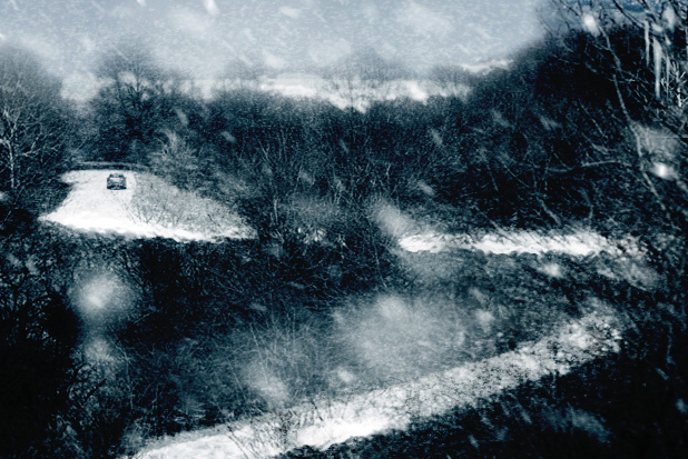
I went in a very different direction with this image - I know, it's a shock! d;¬{D
The bare trees seemed more in keeping with winter, so I created a snowy winter scene with snow on the ground, falling snow, some icycles, & bluish tone. Thoughts? |
May 21st |
 |
| 53 |
May 18 |
Reply |
Thanks, Rusty! I thought it changed the "atmosphere" of the image and gave it some depth as well. d;¬{D |
May 21st |
| 53 |
May 18 |
Reply |
Show us what you mean! d;¬{D |
May 21st |
| 53 |
May 18 |
Comment |
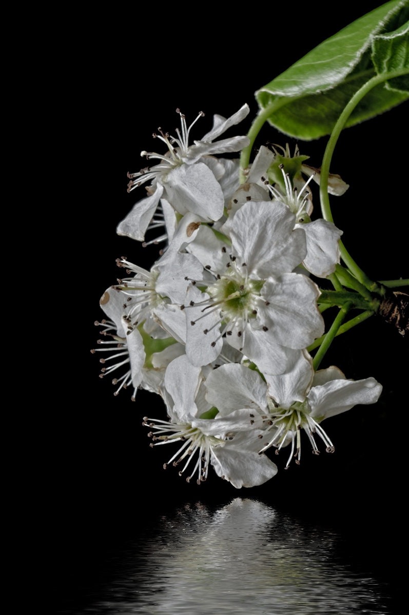
Thanks to all for weighing in on my blossoms. Here, at last, is my take on it. I rotated it 90° counter-clockwise; painted out with black the leaf that was now below; used a water reflection action I created about a year ago. What do y'all think? |
May 21st |
 |
| 53 |
May 18 |
Reply |
I like this, too! I think it's great how everyone has taken on the challenge! d:¬{D |
May 16th |
| 53 |
May 18 |
Reply |
That was rather fuzzy I'm afraid. Bummer! d:¬{( |
May 16th |
| 53 |
May 18 |
Reply |
Hmmmm. I would never have thought to add a white vignette. Really focuses the eye on the blossoms. What software did you use to add the vignette? |
May 15th |
| 53 |
May 18 |
Reply |
Ooooo! That's a very artistic interpretation. Thanks for sharing your process! d:¬{D |
May 15th |
| 53 |
May 18 |
Reply |
Thanks for sharing your process so we all can learn. d:¬{D |
May 12th |
| 53 |
May 18 |
Reply |
I like it! Can you give us details about what steps you took? |
May 12th |
| 53 |
May 18 |
Comment |
Any chance we could see the original? |
May 12th |
| 53 |
May 18 |
Reply |
Thanks, Bob, for being the first to take the challenge. I like the result and I imagine others will as well. d:¬{D |
May 11th |
8 comments - 11 replies for Group 53
|
27 comments - 25 replies Total
|


