|
| Group |
Round |
C/R |
Comment |
Date |
Image |
| 6 |
Apr 18 |
Comment |
Excellent image for your first one in the group. I would love to know about the story behind the capture. Even without the repairs Dick suggested, his crop removes the out of focus area to the left so that only the in-focus area remains, and should do well in competition. |
Apr 21st |
| 6 |
Apr 18 |
Reply |
Thanks, Tom! |
Apr 21st |
| 6 |
Apr 18 |
Comment |
It's quite clear that this would be a winning image. There's certainly nothing I could possibly suggest to improve it. |
Apr 21st |
| 6 |
Apr 18 |
Comment |
What a wonderful event to capture! Certainly a fascinating study. A bit confusing to the viewer at first glance, the story eventually unfolds as we sort out what we're seeing. I imagine the organization you were working with to count nests would very much appreciate seeing this image. d;¬{D |
Apr 21st |
| 6 |
Apr 18 |
Comment |
Wow! Great stack. How handy to have a camera that automates the shots for you! I'm envious!!
I like Janet's tweak to the composition also - it finishes the image well.
No suggestions for improvement from me. d;¬{D |
Apr 21st |
| 6 |
Apr 18 |
Comment |
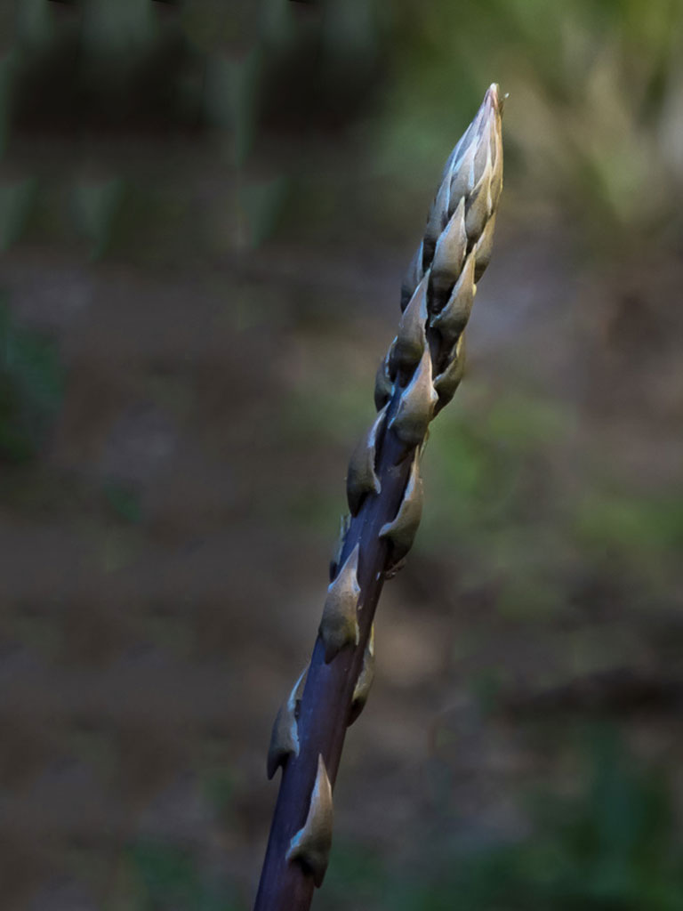
I'm in agreement with the others about the composition and the subject, and about the distraction of the background stalk. Here's a version without the distraction: |
Apr 21st |
 |
| 6 |
Apr 18 |
Reply |
Thanks, Janet. I will consider the crop. I fear that it will crowd the blossom, though. Time to experiment further. d;¬{D |
Apr 10th |
| 6 |
Apr 18 |
Reply |
Excellent choice on the reorientation. It does improve the composition! Thanks! |
Apr 7th |
5 comments - 3 replies for Group 6
|
| 11 |
Apr 18 |
Reply |
I appreciate that, Jim! |
Apr 24th |
| 11 |
Apr 18 |
Comment |
Excellent. Nothing needs changing from my perspective. This should do well in competition as it is. |
Apr 21st |
| 11 |
Apr 18 |
Comment |
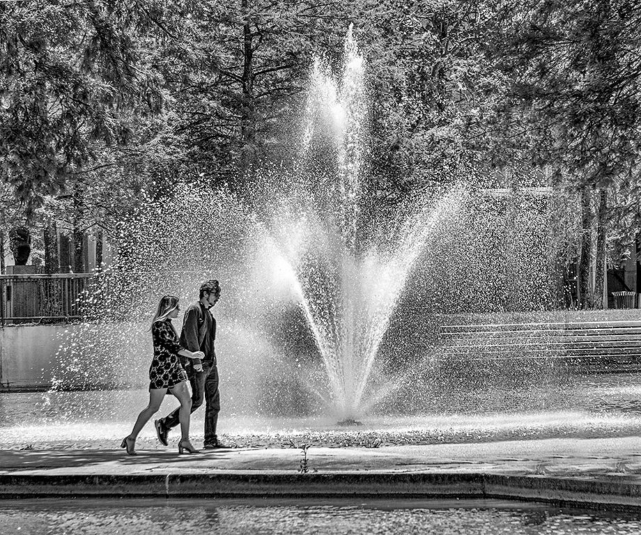
This image works well in both color and monochrome. The only thing that bothers me a bit in the monochrome version is the light pole, which for me competes with the couple for focus because of its position in the composition. I would suggest either cropping or cloning it out, and then flipping the image so the couple is walking to the right: |
Apr 21st |
 |
| 11 |
Apr 18 |
Reply |
Thanks, Allen. I've spent a lot of time with this particular image, working it in several ways to bring out the story and pull the viewer into her eyes. I think this is getting close. |
Apr 21st |
| 11 |
Apr 18 |
Comment |
Good balance of shape and contrast here. The curves of the branches meeting the rigid straight lines of the buildings tells an interesting story. I actually don't mind the converging buildings in the lower left corner as there are a lot of converging curves in the braches so it carries the these into the buildings for me. |
Apr 21st |
| 11 |
Apr 18 |
Comment |
I like this. You might consider reducing the clarity a bit as it's coming across a tad crispy. It would also be good balance out the tones by burning the top left leaf slightly so that it doesn't pull the immediate focus. This is definitely a case where monochrome works better than color. |
Apr 21st |
4 comments - 2 replies for Group 11
|
| 18 |
Apr 18 |
Comment |
A lot of fun again, Kerstin! I find myself looking forward to your images each month! I do with the dish with the entrance fee was fully in the frame. |
Apr 21st |
| 18 |
Apr 18 |
Comment |
I like this as it is. The treatment gives the sense the figure is walking towards us and into the flames. The monochrome of red and black tells the story effectively. No suggestions from me. |
Apr 21st |
| 18 |
Apr 18 |
Comment |
I love everything about this image but the geese, which have no treatment and thus are, for me, an obvious addition rather than a blended part of the composition. Their placement is fine, but their lack of treatment makes for a distraction. |
Apr 21st |
| 18 |
Apr 18 |
Comment |
Hmmm. I think the addition of the crosses causes confusion. I could see the one on the shirt remaining, but the others should go: |
Apr 21st |
 |
| 18 |
Apr 18 |
Comment |
I love Panos' actions! Nice to see his actions have gotten you acceptances already. No surprise there. This has taken a good but unremarkable image and turned it into something compelling. |
Apr 21st |
| 18 |
Apr 18 |
Comment |
I think Mike has it right - you've brought the mannequins to life with this fun interpretation. This image is nearly ready, I think. Nothing to suggest that hasn't already been. |
Apr 21st |
| 18 |
Apr 18 |
Comment |
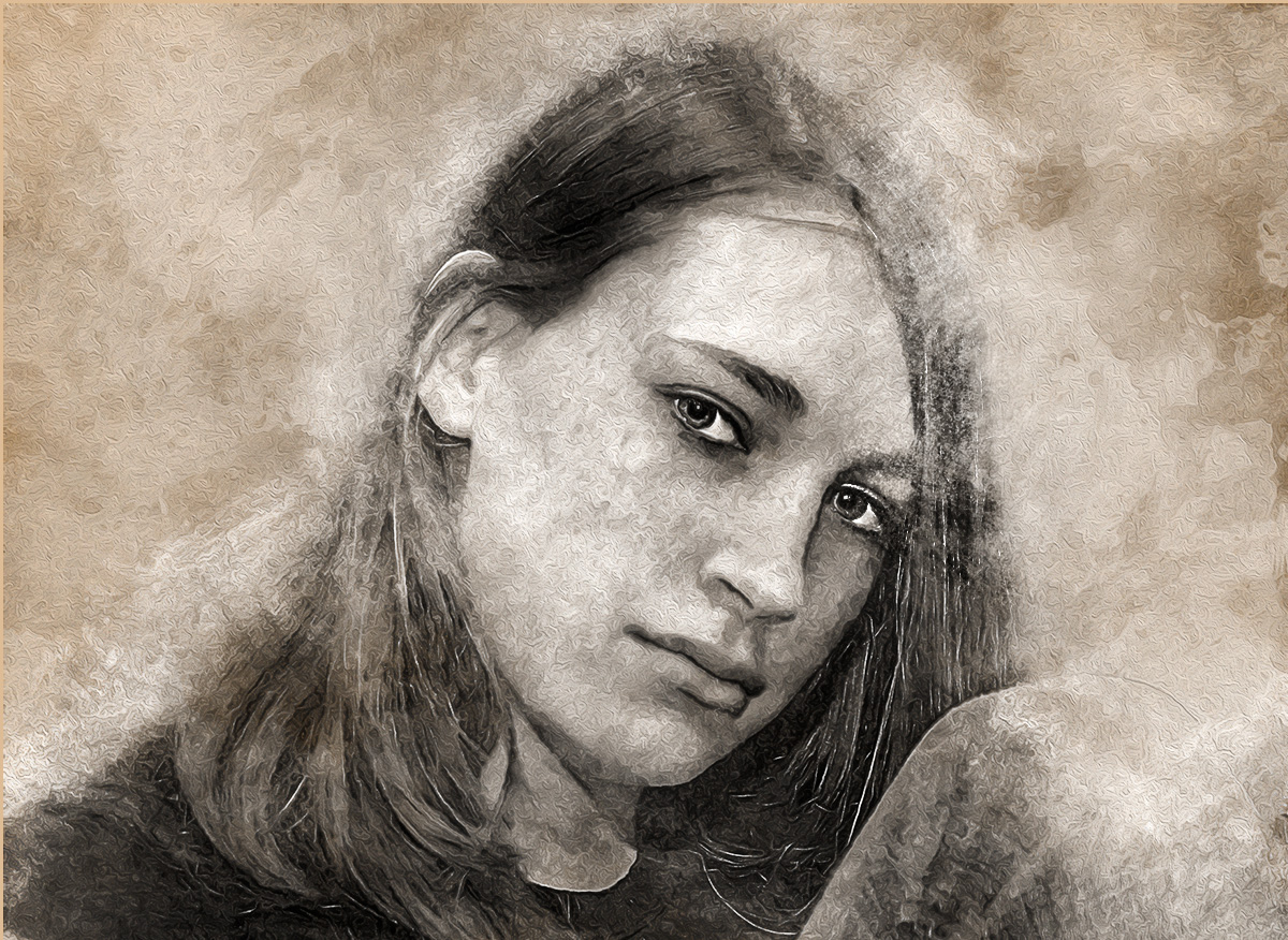
I've worked on the image based upon your suggestions, and here's the result. What do y'all think: |
Apr 8th |
 |
| 18 |
Apr 18 |
Reply |
Gotcha! Will work on that! d:¬{D |
Apr 2nd |
| 18 |
Apr 18 |
Reply |
Why remove the text? Did you find it distracting? I frankly don't notice it for quite a while, being pulled into her eyes right away.
Regarding her face, are you referring to the sorta foggy texture on her hair? Trying to fully understand your suggestions. d;¬{D |
Apr 2nd |
7 comments - 2 replies for Group 18
|
| 53 |
Apr 18 |
Reply |
The legs take too much of the composition in this one. |
Apr 9th |
| 53 |
Apr 18 |
Reply |
This one shows both the spin and the hand. I think this is the best option. |
Apr 9th |
| 53 |
Apr 18 |
Reply |
This angle is not as effective at showing the spin. |
Apr 9th |
| 53 |
Apr 18 |
Comment |
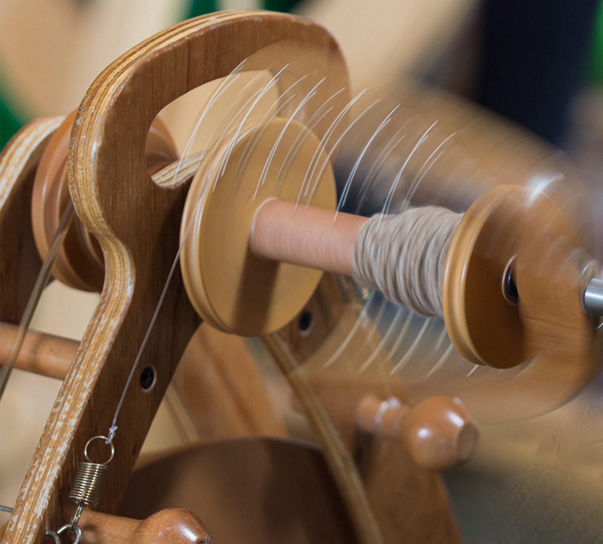
Great capture of the spinning part - definitely draws the eye in to study. I agree about the hand being a distraction.
I tried cropping in tight on the spinning wheel itself for a different feel. What do y'all think: |
Apr 8th |
 |
| 53 |
Apr 18 |
Comment |
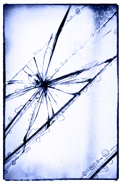
The first thing that pops into my head when viewing this is a spider traveling a spoke of its web. Once I get beyond that initial ugh factor, further study find this actually soothing as my eye traveled to the various "bubbles" that line the main "fault" lines. This image definitely demands more of the viewer's time as one delves deeper into its stories. I have no suggestions, except perhaps variations of color - maybe blue? |
Apr 8th |
 |
| 53 |
Apr 18 |
Comment |
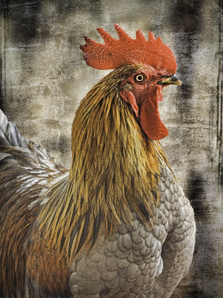
My wife would be crazy about this "chook", as she has roosters throughout the house - it's her fetish so to speak! Your addition of the texture makes this a real treasure. My only suggestions would be to brighten the eye, as already mentioned, and give some more definition to the feathers. I had a go at demonstrating this: |
Apr 8th |
 |
| 53 |
Apr 18 |
Comment |
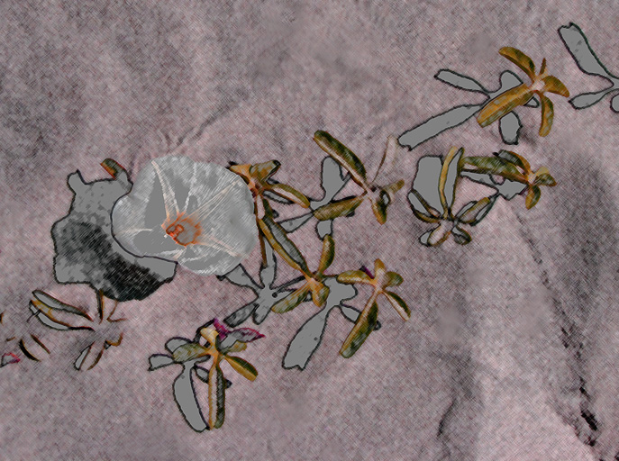
Very creative piece, Rusty. I especially like how the extremely dark shadows were muted to a soft grey, creating additional flowers for the composition. The diagonal orientation makes for a strong composition. I'm proud of you for taking a walk outside of the box with this one! My only suggestion is to remove a few distracting "spots" that work in the sand but not in this treatment: |
Apr 8th |
 |
| 53 |
Apr 18 |
Comment |
Now that you've removed the distracting element, this is a wonderfully executed image: great perspective, appropriate monochrome conversion, etc., etc. I think the sky is fine without further contrast in the sky might actually distract from the natural contrast of the hard buildings against the soft texture of the sky. Bravo!!! |
Apr 8th |
| 53 |
Apr 18 |
Comment |
Y'all put me through my paces on this one! I spent some time trying to apply your suggestions: I cloned out the stray hair on her face; recolored the background by adding a green layer in Color blend mode; & recolored her knees by brushing over the area with a darker blue layer in Color blend mode. I considered adding some vignetting, but wanted to get y'all's opinion on the changes so far. |
Apr 8th |
 |
| 53 |
Apr 18 |
Reply |
LOL! No, I'm a righty! d;¬{D |
Apr 4th |
| 53 |
Apr 18 |
Comment |
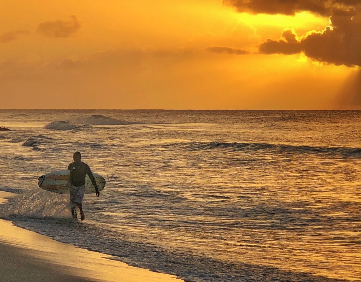
Gorgeous scene! Love the golden color and the clouds around the sun. My only suggestion is to flip the image horizontally. |
Apr 4th |
 |
| 53 |
Apr 18 |
Reply |
I will play with replacing the background and, if nothing else, lightening her knees. Thanks for the suggestions! d:¬{D |
Apr 4th |
| 53 |
Apr 18 |
Reply |
Good idea! I hadn't noticed that! These little suggestions can be so helpful. d:¬{D |
Apr 4th |
| 53 |
Apr 18 |
Reply |
Thanks. It is a backdrop we used to have - lost in a studio flood. |
Apr 4th |
7 comments - 7 replies for Group 53
|
23 comments - 14 replies Total
|