|
| Group |
Round |
C/R |
Comment |
Date |
Image |
| 5 |
Feb 18 |
Comment |
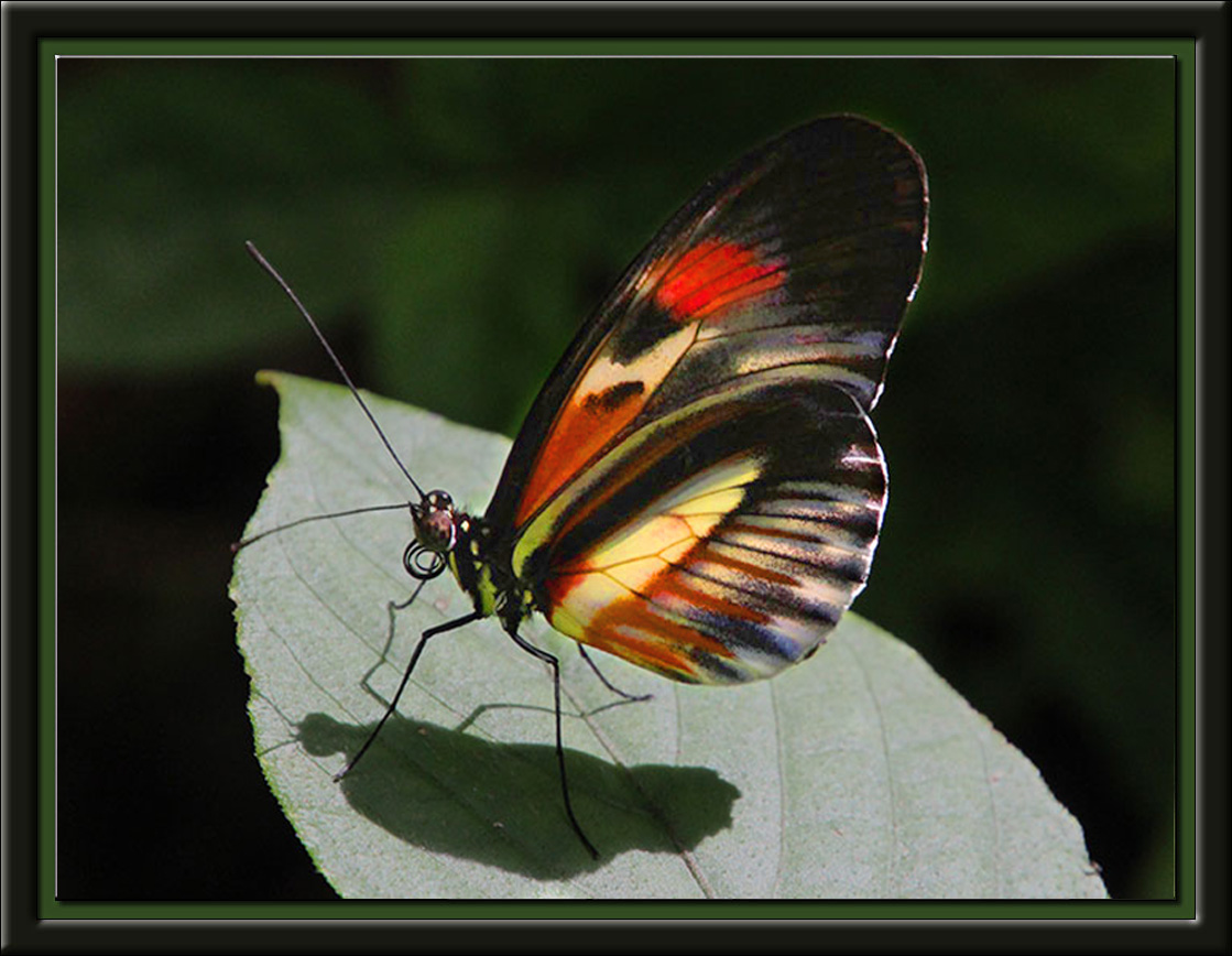
Lovely shot. One of my favorite things to do is to spend several hours in a butterfly house like this. This is certainly a fine example image from the day. Love the framing, too.
I note that there have been some artifacts and noise introduced in your attempt to brighten the background to help the wings pop. I had a try with a different approach, brightening the wings and increasing their saturation, and reducing the brightness of the leaf, which I felt was overworking the viewer's eyes. What do you think? |
Feb 3rd |
 |
1 comment - 0 replies for Group 5
|
| 6 |
Feb 18 |
Reply |
Thanks, Janet. Of course, you're right, as Dick so ably proved. d;¬{D |
Feb 27th |
| 6 |
Feb 18 |
Reply |
I completely agree with your re-orientation of the image. Wish I'd seen it, but I've found it's always easier seeing the fixes for someone else's images than my own. d;¬{D |
Feb 27th |
| 6 |
Feb 18 |
Comment |
While, in one sense, I agree with Tom that this is 2 images, I really like the contrast between the open and closed blossoms - the open bright and colorful, contrasted by the closed being darker and subdued. I think this tells an effective story. In either case, it is well photographed - as usual! d;¬{D |
Feb 27th |
| 6 |
Feb 18 |
Comment |
I must agree about the reflection being a distraction. Even if you could improve the reflection, it would likely take away from the main focus, which is what is going on inside the main shell.
I think you created an effective tableau. Still life is something I've tried and failed at - I just don't have the nack! Obviously, you do! d;¬{D |
Feb 27th |
| 6 |
Feb 18 |
Comment |
I think Janet has the best suggestion, indeed! Regardless, I enjoyed this image and found myself drawn into quite quickly! Good job! |
Feb 27th |
| 6 |
Feb 18 |
Comment |
I think Dick has come up with the best approach for this image, Salvador. Hope this strawberry proved tasty! d;¬{D |
Feb 27th |
| 6 |
Feb 18 |
Comment |
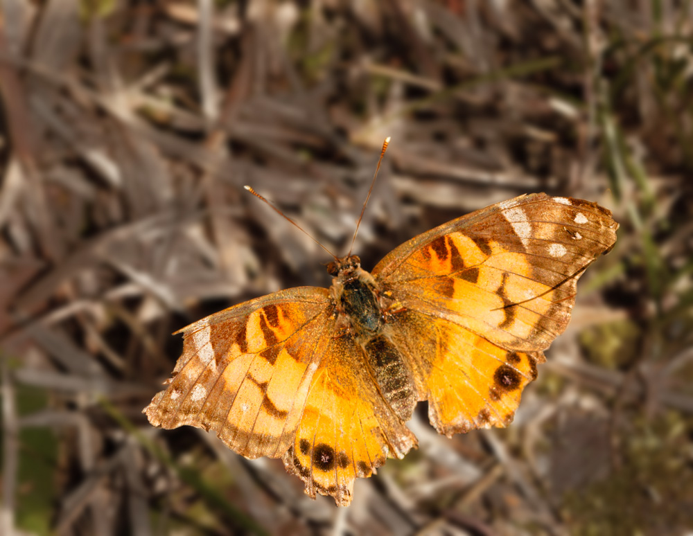
Here's a rendition with the background blurred and desaturated slightly to help the butterfly pop out: |
Feb 27th |
 |
| 6 |
Feb 18 |
Reply |
Yes, I've done a lot of focus stacking. Take a look at several previous rounds to see. d;¬{D |
Feb 21st |
5 comments - 3 replies for Group 6
|
| 11 |
Feb 18 |
Reply |
It is an odd image, which is why I chose to try and do something with it. Obviously, the sketch effect is not working well so far. <...sigh...> I tried. d:¬{( |
Feb 27th |
| 11 |
Feb 18 |
Reply |
The fuzz is actually the slight shadow on the background interpreted in pencil strokes. This is definitely a work in progress and the sketch process is not quite what I'd hope it would be so far. Guess it's back to the drawing board for me! d;¬{D |
Feb 27th |
| 11 |
Feb 18 |
Comment |
I think Jim, starting from Allen's crop, his finished this image off well. |
Feb 27th |
| 11 |
Feb 18 |
Comment |
You obviously were up against some difficult lighting in this instance. Jim H came up with a good solution as it helps the rhino pop some from the surroundings. |
Feb 27th |
| 11 |
Feb 18 |
Comment |
Wow! Can you say, Wow? I say, Wow! A lot of infrared images I've seen seem way overdone, but not in this case. The only thing I would have suggested, Allen already did. Bravo, Jim! |
Feb 27th |
| 11 |
Feb 18 |
Comment |
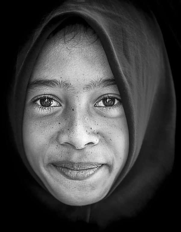
Welcome to the group, Sharron! Glad that you joined us!
You have a very strong image to start with this month! This is a face that draws you in and threatens to hold you captive for eternity! My suggestions to take this to the next level is add some contrast and clarity and, using her eyes as your horizon, straighten the image. Here's my take on it: |
Feb 27th |
 |
| 11 |
Feb 18 |
Comment |
This turned out great, Allen! The building really pops!!! I can only find one nitpicky thing - the main statue at the center front of the building. It looks like Photomatix burned it out a bit so that some detail is lost. Still, I'm really impressed at the results you came up with! |
Feb 27th |
5 comments - 2 replies for Group 11
|
| 18 |
Feb 18 |
Reply |
I will definitely continue to work with this, knowing it's not done yet. I'm really glad to have this way to get feedback to help me get to another level. d;¬{D |
Feb 27th |
| 18 |
Feb 18 |
Reply |
Thanks, Andrew. It has definitely been an experiment to get outside my normal post-processing and play around outside the box. d;¬{D |
Feb 27th |
| 18 |
Feb 18 |
Reply |
Thanks Kerstin for the kind words. I will try that! d;¬{D |
Feb 27th |
| 18 |
Feb 18 |
Reply |
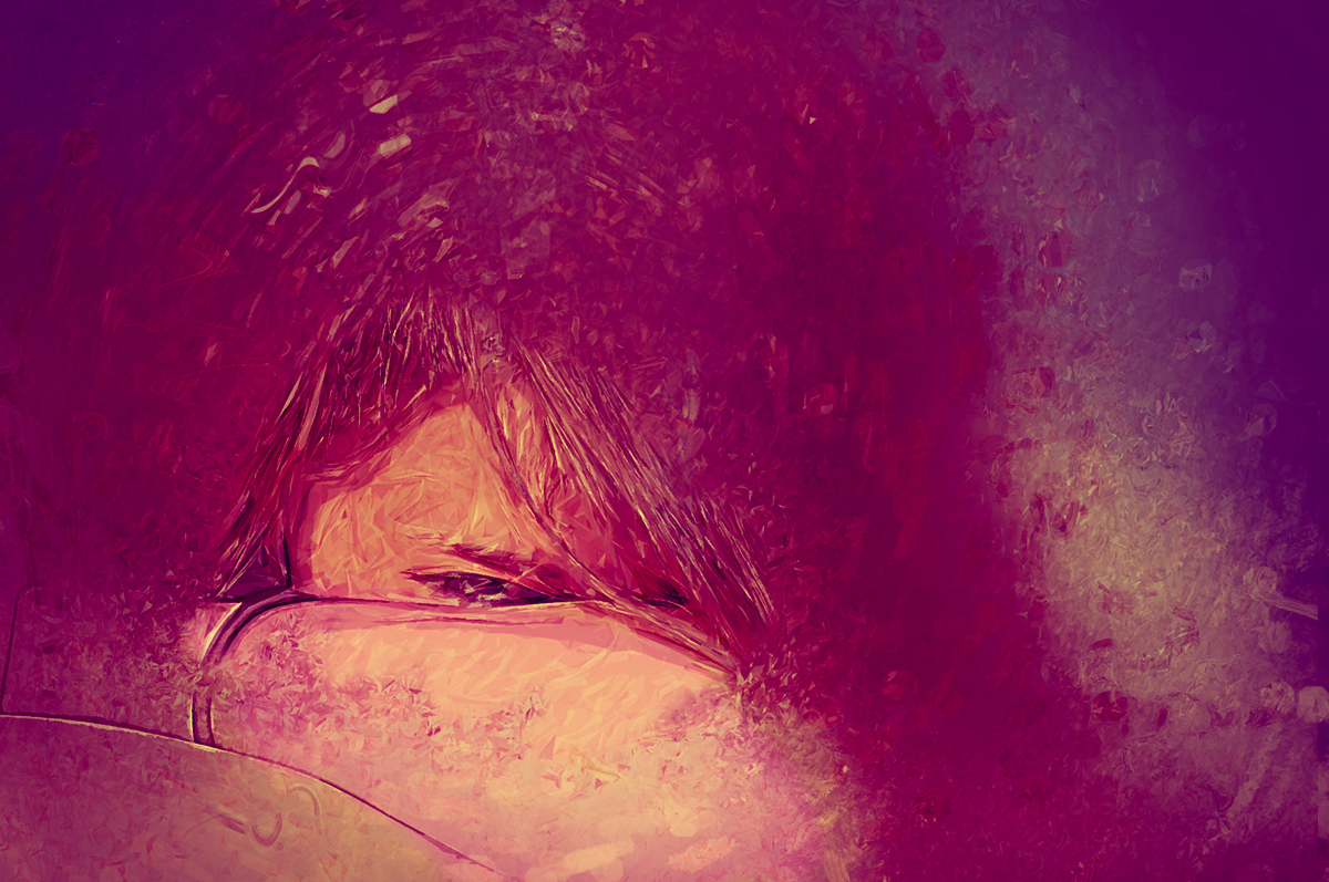
This girl was rather shy and I recall that this image took a bit of coaxing to get her to peek from behind her arms for us. To me, the magenta tones added an emotional reference to something akin to frustration. I will experiment with toning down the red some and see how it goes. Thanks for the suggestion. |
Feb 27th |
| 18 |
Feb 18 |
Comment |
Ahhh, a snail with dreams of living by the ocean! This is pure whimsy and made me LOL at first glance. Thank you so much for sharing your imagination with us! Only suggestion for me is to remove a bit from the right side for a stronger composition. |
Feb 27th |
| 18 |
Feb 18 |
Comment |
I love this, Mike! Very imaginative effects here. Works well with Kerstin's color treatment as well. Bravo! |
Feb 27th |
| 18 |
Feb 18 |
Comment |
While Kerstin's rendition takes this further, I like the simplicity. I applaud your vision to turn an ordinary paperclip into something so very different! However did you see that? Great job. |
Feb 27th |
| 18 |
Feb 18 |
Comment |
I'm afraid I must be having a dense moment. You have effectively processed this image and helped us to focus on the ruins. However, I'm not seeing anything that takes this outside of reality. Guess it's too subtle of a change for me. Sorry! d:¬{( |
Feb 27th |
| 18 |
Feb 18 |
Comment |
Hmmm. It certainly takes quite a while for the soldiers to come into focus! Once there, the image works really well, but before then, is very abstract. This can actually turn out as a good thing as long as your viewer takes the time to study this. Definitely a good piece for slowing down people in a busy area. |
Feb 27th |
| 18 |
Feb 18 |
Reply |
I began by masking off the area of focus - the bit of face in this case - and smoothing it for more of a posterized look, with the remaining image given a substantial blur. Next came broad splashes of color for "under-paint", followed by smaller splashes of color in a circular pattern for a quasi-impasto effect.
A lot of experimentation and serious rabbit-hole explorations along the way. d;¬{D |
Feb 8th |
| 18 |
Feb 18 |
Comment |
Here's a redo based upon the suggestions given so far: |
Feb 8th |
 |
| 18 |
Feb 18 |
Reply |
I see what you mean. In looking at it with your perspective, I should have darkened the arms so they don't pull so much focus. Thanks for the feedback. I have also worked to accentuate the line between arms. |
Feb 8th |
6 comments - 6 replies for Group 18
|
| 53 |
Feb 18 |
Reply |
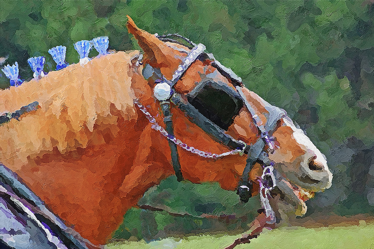
Cropped, recreated the border on the top and right, then used the Oil Paint filter to stylize it. d;¬{D |
Feb 27th |
| 53 |
Feb 18 |
Comment |
Excellent combination, Arabella! Can't really suggest a thing to improve this! Very peaceful! |
Feb 27th |
| 53 |
Feb 18 |
Comment |
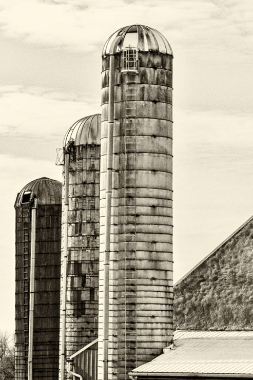
I like this image just as it is, with one exception. The slight lean of the farthest silo is somewhat distracting. I corrected the lean with DxO Viewpoint, resulting in the following: |
Feb 27th |
 |
| 53 |
Feb 18 |
Comment |
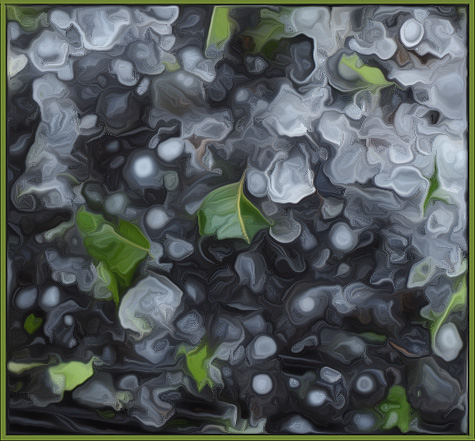
Interesting blend of shapes, colors & textures! I agree with the others about the mat. I decided to play around with it and came up with this: |
Feb 27th |
 |
| 53 |
Feb 18 |
Comment |
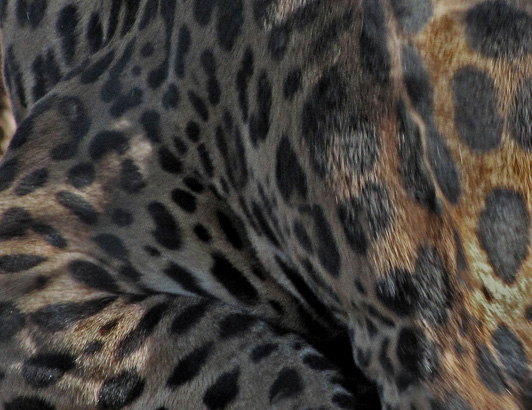
<...shaking head...> This is a tough one. I've spent hours at a big cat exhibit trying to get a decent shot, only to find when I got to my computer that none were usable. For me, the inability to see the cat's eyes is a deal breaker for me.
Because of that, I opted to change the focus on this image to a study of "Shapes and Spots". What do you think? |
Feb 27th |
 |
| 53 |
Feb 18 |
Comment |
Magical, simply magical! There's nothing I could suggest to improve upon this. Bravo!!! |
Feb 27th |
| 53 |
Feb 18 |
Reply |
At least this time I framed the original capture right! d;¬{D |
Feb 27th |
| 53 |
Feb 18 |
Reply |
Thanks, Natalie! See the reply I made to Rusty with those issues addressed. |
Feb 27th |
| 53 |
Feb 18 |
Reply |
Why thank you, Arabella. Sometimes it pays to look at past captures and see what percolates to the surface. d;¬{D |
Feb 27th |
| 53 |
Feb 18 |
Reply |
Thanks, Rohan. I thought it came out fairly well with some rough spots others found for me. |
Feb 27th |
| 53 |
Feb 18 |
Reply |
Thank you, Elinor! Means a lot! d:¬{D |
Feb 27th |
| 53 |
Feb 18 |
Reply |
I played around with some watercolor techniques and it just wasn't coming together for me. Guess I was just off that week. d;¬{D |
Feb 27th |
| 53 |
Feb 18 |
Reply |
Here's a redo addressing the issues you brought up: |
Feb 27th |
 |
| 53 |
Feb 18 |
Comment |
Good profile shot. Smiling is definitely better for advertising purposes, selling their being friendly. You say this is natural light, but I see hot spots on their faces that read as being from a flash. Where was your main source of natural light?
I have included my redo of this image. I removed the horizontal boards from the right side and replaced the bright garden view on the left with more of the cream color like the wall on the right. I also evened out the hot spots on their faces some. What do you think? |
Feb 3rd |
 |
6 comments - 8 replies for Group 53
|
23 comments - 19 replies Total
|


