|
| Group |
Round |
C/R |
Comment |
Date |
Image |
| 6 |
Jan 18 |
Reply |
Thanks for the positive feedback, Janet! d:¬{D |
Jan 22nd |
| 6 |
Jan 18 |
Comment |
I agree with Tom about the monochrome and contrast. Here's a version attempting that: |
Jan 21st |
 |
| 6 |
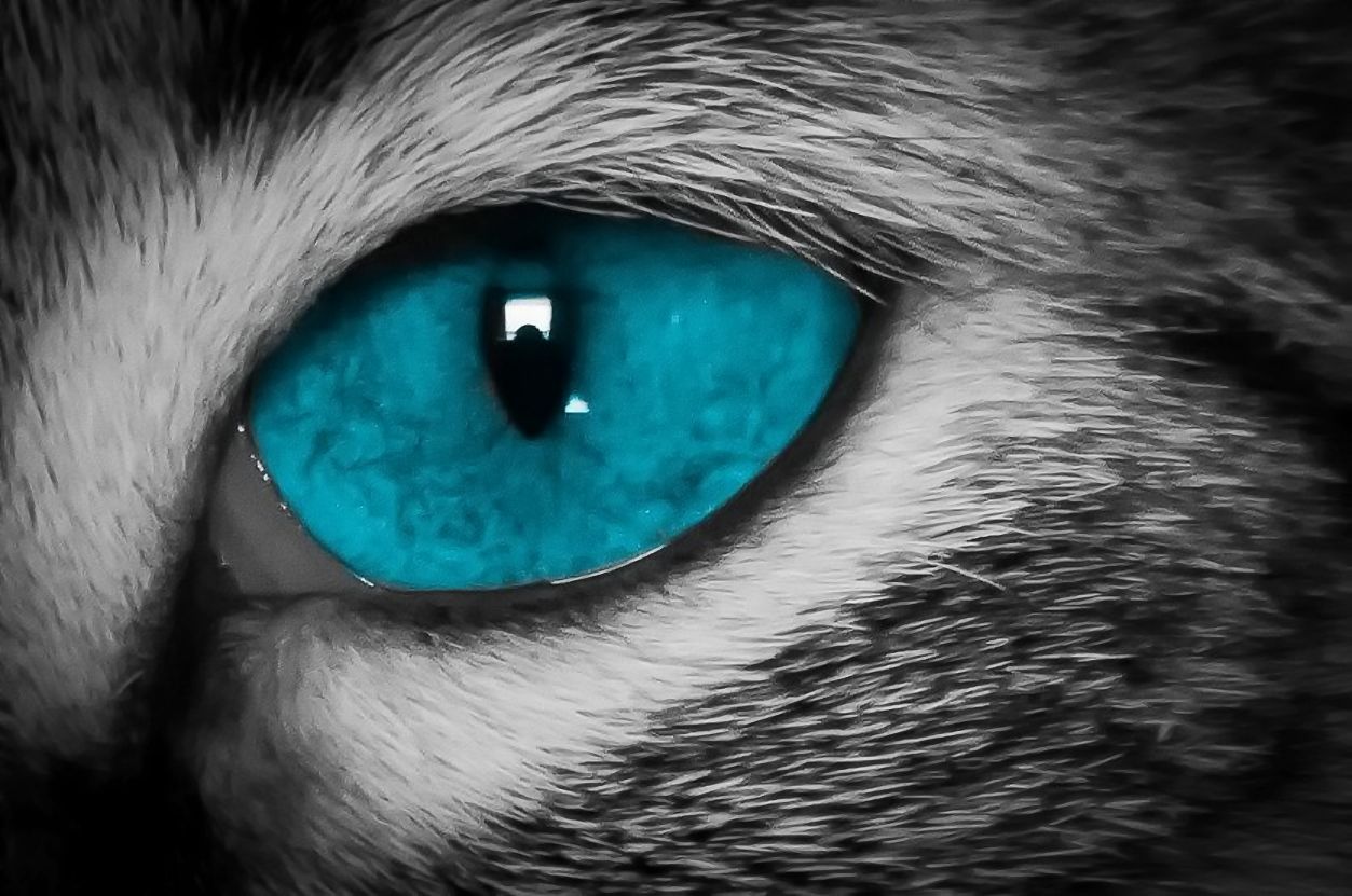
Jan 18 |
Comment |
I opted to leave the highlights in but process the iris a bit more, reducing the noise there. I didn't bother with the fur as I feel it's inconsequential to the subject. |
Jan 21st |
 |
| 6 |
Jan 18 |
Reply |
<...sigh...> I stated up front in my description that this was taken with a zoom lens as this cat would not sit still for a camera in his face. Yes, it's not a true macro, Dick, but it is a closeup study of my cat's eye and thus qualifies for DD's working definition of the macro category. If we're going to enforce a stricter definition in this group, I guess I'll be bowing out since I don't have enough quality equipment or expertise to measure up to everyone else. |
Jan 21st |
| 6 |
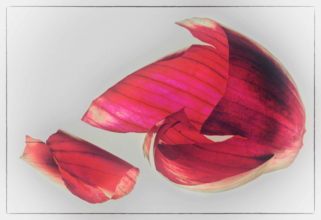
Jan 18 |
Comment |
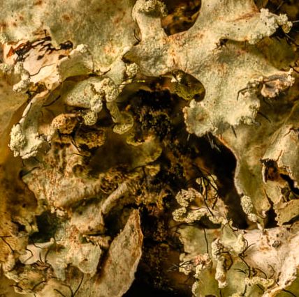
Wow, an organic substance that is no longer living! Quite a departure for you, Dick! I like the overall look here, but find the bright yellow from the light box tiring to my eyes. In this version, I have slightly desaturated the backghround and lowered its luminosity some to mute that. |
Jan 21st |
 |
| 6 |
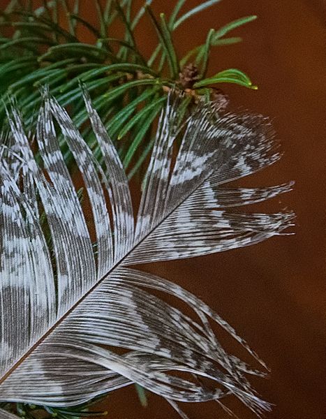
Jan 18 |
Comment |
I like the contrast between the soft feather and the hard needles that are actually similar structures. Makes for an interesting study, indeed!
I flipped your image vertically and horizontally, to have a leading line from the bottom left towards the top right and then following the branch towards the left again. I also added some clarity to the feather and cooled it slightly to blend it into the composition better. |
Jan 21st |
 |
| 6 |
Jan 18 |
Comment |
Bravo! Everything is working in this for me, including the accidental color you ended up with. No suggestions for change from me. |
Jan 21st |
| 6 |
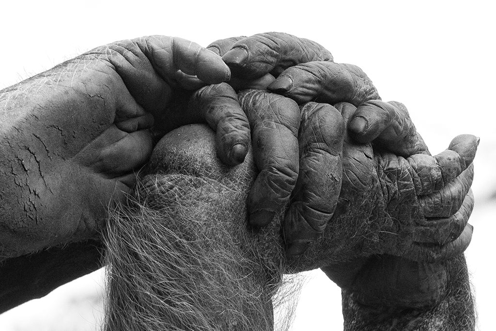
Jan 18 |
Comment |
Yes, Dick has presented the most effective composition with this image for my eye. But where, oh where, is this invisible chimp??? d;¬{Ã� |
Jan 21st |
| 6 |
Jan 18 |
Comment |
With Dick & Tom's comments in mind, I decided to try a square crop to give more structure to the composition, and then added some clarity and warming to accentuate the textures here. |
Jan 21st |
 |
7 comments - 2 replies for Group 6
|
| 11 |
Jan 18 |
Reply |
Thanks, Allen! It's been a good exercise for me to revisit these images with an eye towards monochrome, something I never considered when these images were captured. I'm learning more about the subtleties of tones and finding the optimum conversion of colors to tones. I'm thinking it will help with my color captures as well. d;¬{D |
Jan 24th |
| 11 |
Jan 18 |
Comment |
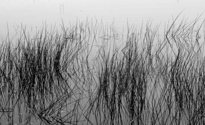
Although I like what Marie did, I also prefer your version and really enjoy the minimalist look with the subtle shift of shadows, lines and shapes. This is very soothing to study and I found myself wanting to stay much longer than I usually do on a study group image. Bravo! I wouldn't change a thing, quite frankly!!! |
Jan 21st |
| 11 |
Jan 18 |
Reply |
|
Jan 21st |
 |
| 11 |
Jan 18 |
Comment |
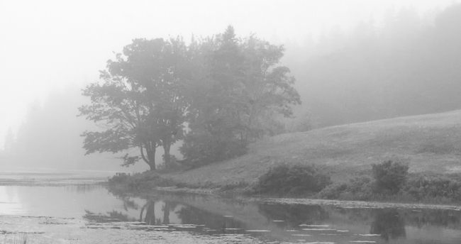
For me, this is really a blend of 2 distinct images. The lower portion is a lovely minimalist study of the grass in the water, while the upper portion sets a foggy morning tone where there is a softening of the edges. To demonstrate: |
Jan 21st |
 |
| 11 |
Jan 18 |
Comment |
Nice capture, Jim! Lots of tonal range represented here, which is just what you want in a monochrome.
I'm not having a problem with the clouds, as they are a background element of this image. Rather than brighten some of the snow, you might consider burning some of the brighter areas so that the image is less tiring for the eyes. |
Jan 21st |
| 11 |
Jan 18 |
Comment |
For me, this doesn't work as well in monochrome. I think some color boosts in the original would help sell this image better. With the blossoms white, they are pulling too much focus, leaving the stems looking rather cluttered. In the original, the greens are brighter in the stems helping them stand out equally with the lavender blossoms. |
Jan 21st |
4 comments - 2 replies for Group 11
|
| 18 |
Jan 18 |
Reply |
Thanks! I can see it pretty clearly! |
Jan 22nd |
| 18 |
Jan 18 |
Reply |
Mark, the image didn't take. Please try again. |
Jan 21st |
| 18 |
Jan 18 |
Comment |
Oh Kerstin - you are so very welcome here and will obviously fit in quite well!
Very creative image for your first round and the first of the year! Your treatment adds an ethereal quality to the fairy statue, which is quite appropriate.
My only suggestion would be to remove the base of the statue before doing your treatment as that part of the statue would be better not to glow. |
Jan 21st |
| 18 |
Jan 18 |
Reply |
Thanks, Kerstin! My mind works in weird ways sometimes, but even in the chaos, there's some order to it all! d;¬{D |
Jan 21st |
| 18 |
Jan 18 |
Comment |
Very fun, Mike! I immediately got what you were portraying and had no problem with the unrealistic nature of it. My one suggestion would be to bend the rainbow some more so the boy is more apparent in his riding the rainbow. |
Jan 21st |
| 18 |
Jan 18 |
Comment |
Wonderful! Or should I say Boootiful! Clever photoshop work, for sure! Would be interested to see the original smoke capture to gauge what you did to it. |
Jan 21st |
| 18 |
Jan 18 |
Comment |
This treatment has certainly brought out hidden detail in the trees, but the results to the sky give it more prominence than I feel it should have for a study of the trees. Part of the appeal of winter trees is their stark simplicity, especially against a more solid color sky. Here, I find it difficult to differentiate the trees and the sunset as they have been merged so tightly together. |
Jan 21st |
| 18 |
Jan 18 |
Comment |
Very interesting! It's clearly a pier, but not very clear what is at the left end as the glow removes so much detail from the original. I think you should remove the buoy and the boat before doing your treatment to even things out and remove the bulk of the distractions.
I'll admit I'm not much of a fan of Topaz Glow unless it is used very subtly, but in the extreme, as you've done here, it definitely transforms the image into something very different. |
Jan 21st |
| 18 |
Jan 18 |
Reply |
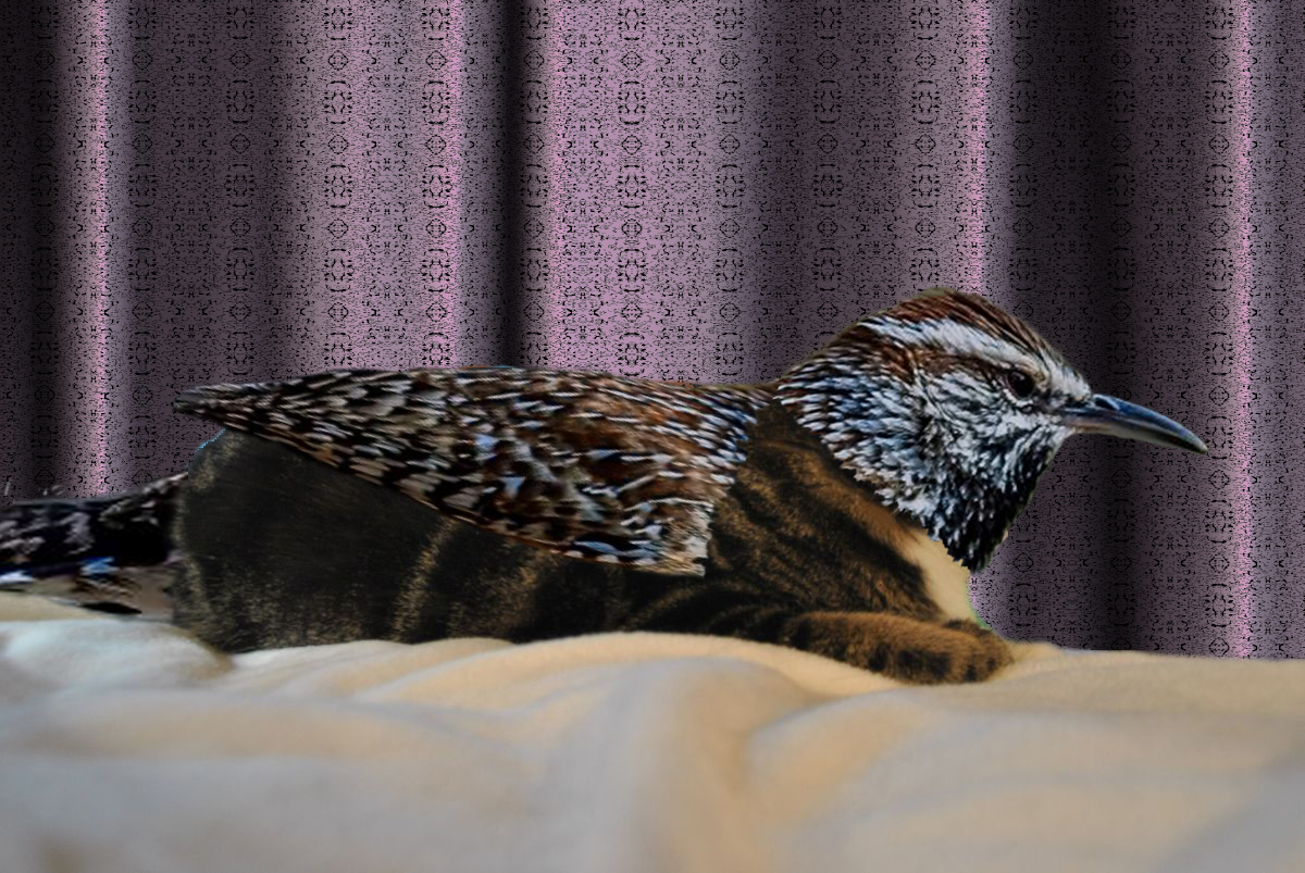
I did and it just didn't work as well. How would a kitty fly without wings and tail feathers? d;¬{D |
Jan 17th |
| 18 |
Jan 18 |
Reply |
Thanks! |
Jan 17th |
| 18 |
Jan 18 |
Reply |
Here's a quick attempt at reversing the process. The bird's feathers don't blend as well with the cat, but I gave it a go nonetheless: |
Jan 16th |
 |
5 comments - 6 replies for Group 18
|
| 53 |
Jan 18 |
Comment |
You did a great job with your post-processing of this image, removing the distracting elements and helping the eye to focus on your subject. Have no suggestions for improving on a fine image, Arabella! It's a keeper!!! |
Jan 21st |
| 53 |
Jan 18 |
Comment |
You got a winner here! I don't see that anything needs to be done to finish this. The composition is strong and the dogs' fur is enough different in shade from the snow that they show up well. Anyone who's been around dogs at play can instantly imagine what comes next for these two, so the image engages the viewer very well! Bravo!!! |
Jan 21st |
| 53 |
Jan 18 |
Comment |
Living in the midwest for over 25 years now, I can attest to it being unusual to have hay bales still out in the fields during the first (or any) snow. This image thus captures a unique experience and does it well. As I said in reply to Dan, his crop and darkening of the remaining sky finishes off the composition. |
Jan 21st |
| 53 |
Jan 18 |
Reply |
Yes. Cropping out some of the sky and darkening what remains helps to keep the eyes focused on the hay bales. That finished Brenda's lovely capture very well. |
Jan 21st |
| 53 |
Jan 18 |
Comment |
This immediately put me in mind of barnacles, which reach out from their hard mounds to capture whatever comes into their vicinity. This adds a sense of movement to what normally would be a static flower. I really like this!!! |
Jan 21st |
| 53 |
Jan 18 |
Comment |
Great location! You did a good job with the capture, which gives you lots of possibilities for composition and post-processing. Here's my take: |
Jan 21st |
 |
| 53 |
Jan 18 |
Comment |
Interesting study. I find myself waiting for this to morph into a circuit board or a blueprint. I really like the perspective and the muted colors with a central splash of yellow! There appears to be a small miniature golf course in the left side of the image. Good capture, Rohan! |
Jan 21st |
| 53 |
Jan 18 |
Reply |
Thanks, Natalie! I definitely will try to keep some fun in my work from time to time! Don't want y'all thinking I'm in a rut! d;¬{D |
Jan 21st |
| 53 |
Jan 18 |
Reply |
Yay! Weird and creepy were definitely what I was reaching for! I think I can count this a success after all. d;¬{D |
Jan 21st |
| 53 |
Jan 18 |
Reply |
Hmmmm . . . Not picturing this yet in my warped mind's eye, but will certainly play around with it. d:¬{D |
Jan 21st |
| 53 |
Jan 18 |
Reply |
At least you know what to expect in this room. Who knows what lurks behind the door of other rooms in my mind! d;¬{Ã� |
Jan 21st |
| 53 |
Jan 18 |
Reply |
I guess you could call it creative. Some might call it delusional. d;¬{D |
Jan 6th |
| 53 |
Jan 18 |
Reply |
Only thing in this world responsible for such creations is my wacky brain. d;¬{D |
Jan 6th |
6 comments - 7 replies for Group 53
|
| 62 |
Jan 18 |
Comment |
You continue to refine your distinct style, Gloria! I'm fairly confident I would recognize your work in the wild now. I so look forward each month to what you will share with us. Yes, the triangles are a bit distracting, but not enough to pull much focus away from the composition as a whole. I would never have guessed that the man on horseback began as a statue. Marvelous!!! d:¬{D |
Jan 21st |
| 62 |
Jan 18 |
Comment |
Angela picked the best word for this - gorgeous! The colors, the movement, the harmony! It's definitely ready for the wall! |
Jan 21st |
| 62 |
Jan 18 |
Comment |
Luscious! So much improvement in 2½ years! I can only pray this group helps me to improve so remarkably! d;¬{D |
Jan 21st |
| 62 |
Jan 18 |
Reply |
This is the direction I'm moving in lately, as I replied to Angela. We'll see if I'm headed in the right direction. d;¬{D |
Jan 21st |
| 62 |
Jan 18 |
Reply |
I think I'm going to move away a bit from watercolor and try some other things, especially with the wonderful examples everyone presents each month. I'm going to try jumping out of the box. We'll see how well I do. |
Jan 21st |
| 62 |
Jan 18 |
Reply |
Thank you, Elinor, for the kind words to such a newbie.
I see what you mean about the apples' orientation. Will have to play around with that to try and have a better base to start with. |
Jan 21st |
| 62 |
Jan 18 |
Comment |
Definitely lose the sky, Angela! You have created a marvelous flow of colors, rendering the sensuous nature of the blossom into a moving abstract. Simply lovely! d:¬{D |
Jan 21st |
| 62 |
Jan 18 |
Reply |
These apples were not from the supermarket, having come from the tree we had in our backyard at the time.
I will play around with your suggestions, Gloria. Thanks! |
Jan 13th |
4 comments - 4 replies for Group 62
|
26 comments - 21 replies Total
|


