|
| Group |
Round |
C/R |
Comment |
Date |
Image |
| 6 |
Dec 17 |
Reply |
I will have to try that. Thanks for the suggestion! d:¬{D |
Dec 28th |
| 6 |
Dec 17 |
Reply |
I was shooting aperture priority, so the camera made that choice. |
Dec 25th |
| 6 |
Dec 17 |
Comment |
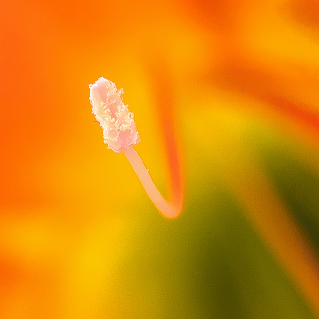
I agree with Tom and Dick that you have too much negative space that tends to swallow up the stamen. The colors are lovely and the detail in the stamen is spot on! I think Dick's crop, rotated to put the stamen on a diagonal would really finish this off! |
Dec 17th |
 |
| 6 |
Dec 17 |
Comment |
The delicate filaments do remind me of feathers, which is interesting in light of Janet's image this month. I also like the results from the Bi-Color filter. Really enjoyable capture from a unique moment in time.
My only suggestion would be to eliminate the crystals from the lower left corner, which pull focus away from the main cluster somewhat. |
Dec 17th |
 |
| 6 |
Dec 17 |
Comment |
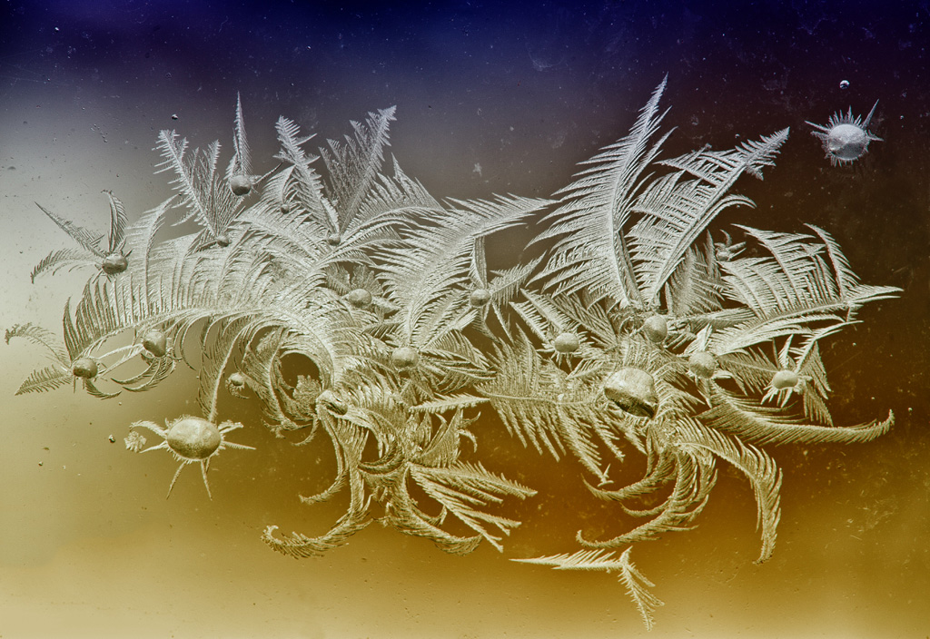
I very much enjoyed this. I will someday have to get some black plexiglass as the immediacy of the reflection come across so much better than from a mirror and a black backdrop. The whispy nature of the feather gives it an ethereal quality that demands the eye spend more time studying. Well done! |
Dec 17th |
| 6 |
Dec 17 |
Comment |
This is wonderful! The way the background is reflected and continued on the underside of the spoon makes for a fascinating study for the eyes. The diagonal leading line of the spoon handle stays within the image so as not to lead the eye outside. Bravo! I can't think of a thing to suggest for improvement! |
Dec 17th |
| 6 |
Dec 17 |
Comment |
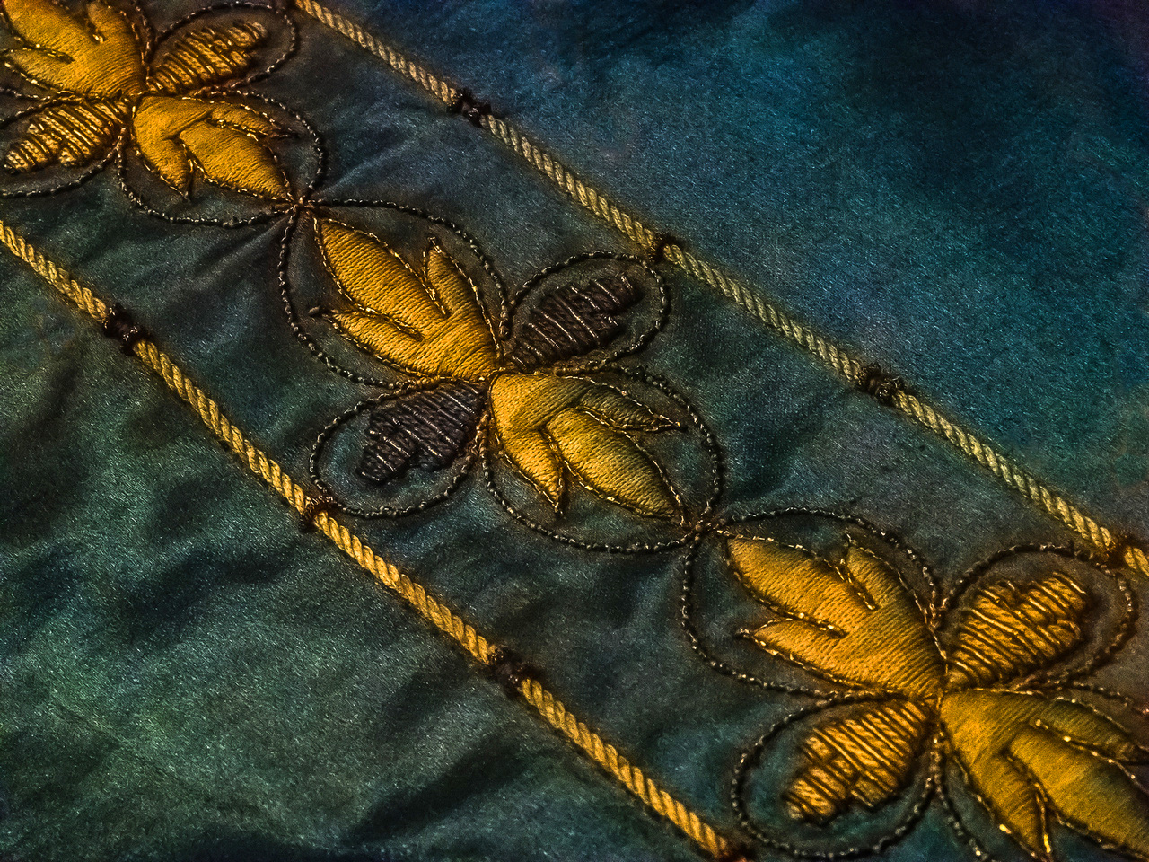
Lovely hand stitching! Imagine how much time it took to create this!!!
I very much like your diagonal composition and the detail you captured. I would suggest healing or cloning out the hot spots and slightly boosting the saturation to pump a little life into the colors that time has been harsh to. |
Dec 17th |
 |
| 6 |
Dec 17 |
Comment |
I hope you're on the mend, Toni! I certainly understand health getting in the way of using one's camera - it's been a few months for me, too. I did find out last week that they have succeeded in restoring my heart function to a normal level, though - YAY!
While this is an interesting capture, I feel it fails to effectively tell its story. The salamander is mostly out of focus, which is distracting right away. The feeding passengers aren't really visible until the image has been studied for a while and appear on a fuzzy section of the salamander, adding to the delay. Not sure how to remedy this once-in-a-lifetime shot, which is really interesting conceptually. |
Dec 17th |
6 comments - 2 replies for Group 6
|
| 11 |
Dec 17 |
Comment |
Great architecture image, Maria! It would be interesting to see the original. What was the problem you had with the perspective correction? |
Dec 17th |
| 11 |
Dec 17 |
Comment |
Powerful story here! You froze the action wonderfully! I find this image very compelling in monochrome and, as a competition judge, would score it fairly high. Yes, it would be great to have the eyes open, but this is not the type of image that should lose significant points for that as their eyes would be closed at the last moment of a mouth attack. I feel the context of the capture forgives the lack of eyes to show signs of life. As such, I have no suggestions for improvement and salute your marvelous image! d:¬{D |
Dec 17th |
| 11 |
Dec 17 |
Comment |
Your color image is definitely richer. Perhaps you should convert to monochrome in post, which will give you more control over the results. Your camera is evening out the subtle tones and adding too much contrast. I've attached a conversion of your color image to monochrome to show you what can be achieved with a well-toned color image in post. |
Dec 17th |
 |
| 11 |
Dec 17 |
Comment |
What a marvelous story your tableau and image tell! I also like how the speckled "skin" of the cat statue is reflected in the eyes of the mouse, thus showing how it has filled the mouse with fear! Nicely done and a very suitable subject for monochrome. Bravo! |
Dec 17th |
4 comments - 0 replies for Group 11
|
| 18 |
Dec 17 |
Reply |
LOL! I should have known! d;¬{D |
Dec 18th |
| 18 |
Dec 17 |
Reply |
Of course - I was just providing a proof of concept. d;¬{D |
Dec 18th |
| 18 |
Dec 17 |
Reply |
I hear what you're saying. Do you think something like that would pull too much focus, though? |
Dec 17th |
| 18 |
Dec 17 |
Comment |
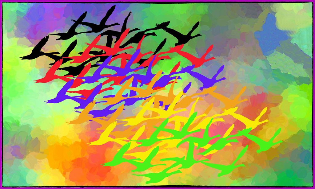
A very unique and creative composition! I think the colors & repetition, a la Warhol, work well together to tell a vibrant story of flocks in flight.
The border is a little vibrant, though pulled from image, and would probably best have its luminosity lowered a tad so as not to pull so much focus from the image itself. What do you think? |
Dec 17th |
 |
| 18 |
Dec 17 |
Comment |
How did you manage to have the shavings continuous like that?
For me, the star presents a distraction rather than an enhancement, as it's brightness pulls my eye away from the true subject. There is something to what Ian said as this is really not a significant manipulation of the image to tell a different story than the original would convey.
Still, your creativity comes out in the staging of the subject, which I think you captured well. |
Dec 17th |
| 18 |
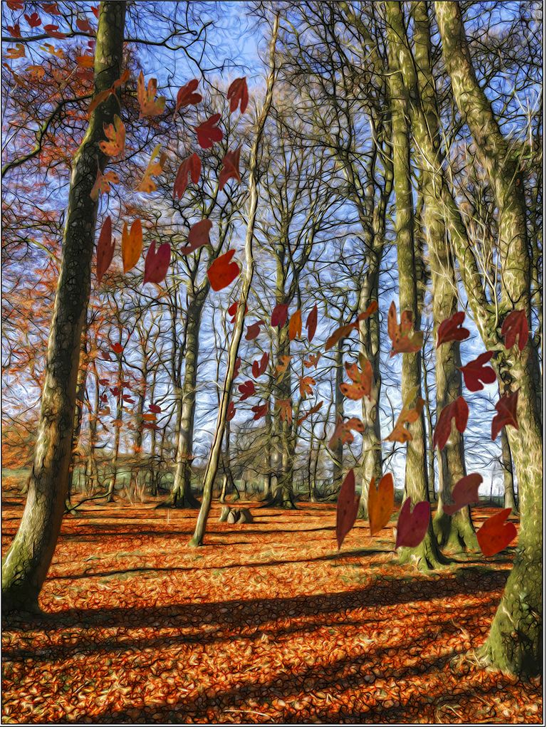
Dec 17 |
Comment |
Great improvement over the original! The vibrant leaves and painterly effect definitely bring life to this scene. You might consider adding a bit more life to this image by adding falling leaves. I've thrown in a few to kinda illustrate the idea: |
Dec 17th |
 |
| 18 |
Dec 17 |
Comment |
I guess the word for the day here is SINISTER! A very different interpretation of an odd original image.
I might suggest lightening the upper background and the left side of the red to make it more dreamlike rather than nightmarish. Thoughts? |
Dec 17th |
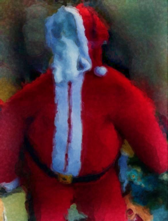 |
| 18 |
Dec 17 |
Reply |
Me neither, Ian. Strictly a PC guy. |
Dec 5th |
| 18 |
Dec 17 |
Reply |
I'll give that a try! d:¬{D |
Dec 1st |
| 18 |
Dec 17 |
Reply |
Guess I have my work cut out for me! d;¬{D |
Dec 1st |
4 comments - 6 replies for Group 18
|
| 53 |
Dec 17 |
Comment |
I guess I'm the odd man out here, but I prefer the color image you submitted. Its minimalist nature and effective composition does, like Natalie indicates, acts to calm the viewer. While the monochrome is also effective, it comes across a little artificial for me, while the color version gives more of a feeling of life and movement for me. I think you did a great job with this image and have no suggestions for improvement. |
Dec 17th |
| 53 |
Dec 17 |
Comment |
Here's a version with the guy cloned out: |
Dec 17th |
 |
| 53 |
Dec 17 |
Comment |
Very soothing minimalist image. I think your composition is good for this capture and wouldn't suggest cropping. The high-key look works exceptionally well here.
Just for grins, I tried really boosting the contrast to see what the sky would look like. What do you think? |
Dec 17th |
 |
| 53 |
Dec 17 |
Comment |
Superb, Natalie! I can see no need for any adjustments - you definitely got it right. Is this SOTC or did you make any changes to the original? |
Dec 17th |
| 53 |
Dec 17 |
Comment |
Here's a version with the overexposed areas toned down some. I also tried correcting the perspective some, but there was just too many odd angles to come up with a decent result. |
Dec 17th |
 |
| 53 |
Dec 17 |
Comment |
I like this a great deal! It reminds me of fossil impressions of prehistoric plants at first glance, and then the fact that this is actually hills and valleys becomes clear. It's as though there are 2 different stories told with this image. You clearly have a good eye to select this scene and capture it well. I have no suggestions for improvement! Bravo! |
Dec 17th |
| 53 |
Dec 17 |
Reply |
I've played around with this image a lot, using many different filters, plugins, and apps with it. This particular treatment pleased me the most of late. d;¬{D |
Dec 17th |
| 53 |
Dec 17 |
Comment |
Thank you, all, for the positive feedback! I'm really quite happy with the result and think it could so well in competition, if I did that sort of thing anymore. d;¬{D |
Dec 17th |
7 comments - 1 reply for Group 53
|
| 62 |
Dec 17 |
Comment |
Another wonderful example of your distinct style - I dare say your signature style as shown by many of your recent images. I think it would be wonderful to sit and watch you create your masterpieces! d;¬{D |
Dec 17th |
| 62 |
Dec 17 |
Comment |
You gave the model a very different look with your reinterpretation - soft and restful, even somewhat pensive, in contrast to the subtle attitude present in the original.
Like Angela, I do find the area above the flower in her hair a bit distracting. In addition, I think the flowers in the lower right pull a bit of focus from her face. Lastly, I would lighten her right cheek (on the left of the image) as it's looking a bit like a bruise. These are minor issues for me, though, as I think your result is very pleasing to the eye! I envy your technique!!! d:¬{D |
Dec 17th |
| 62 |
Dec 17 |
Comment |
Elinor stated it well - "wonderful energy." Though painted, it faithfully takes the viewer to the watering hole to share a sip with the impalas. Well done! |
Dec 17th |
| 62 |
Dec 17 |
Comment |
Wow! I can see why they were pleased with it. You definitely captured the essence of the breed in general and this dog in particular, based on the originals you were provided. Bravo!
I especially love the background you painted and then grounded with the wildflowers. You displayed the dog in a peaceful, pleasant place where he waits for his mistress to join him. Thanks for sharing him with us as well! |
Dec 17th |
| 62 |
Dec 17 |
Comment |
I guess the eyes have it. Will go back and work on that. Thanks, Angela and Elinor! d:¬{D |
Dec 17th |
5 comments - 0 replies for Group 62
|
26 comments - 9 replies Total
|


