|
| Group |
Round |
C/R |
Comment |
Date |
Image |
| 6 |
Nov 17 |
Reply |
I think that's better actually, as you brought out more of the yellows. What did you try? |
Nov 21st |
| 6 |
Nov 17 |
Comment |
This has the look of something alien that is ready to take a bite out of us, with the lighting and the moisture in the center. While the monochrome version looks good, I prefer the drama of the color. Very different!!! |
Nov 21st |
| 6 |
Nov 17 |
Comment |
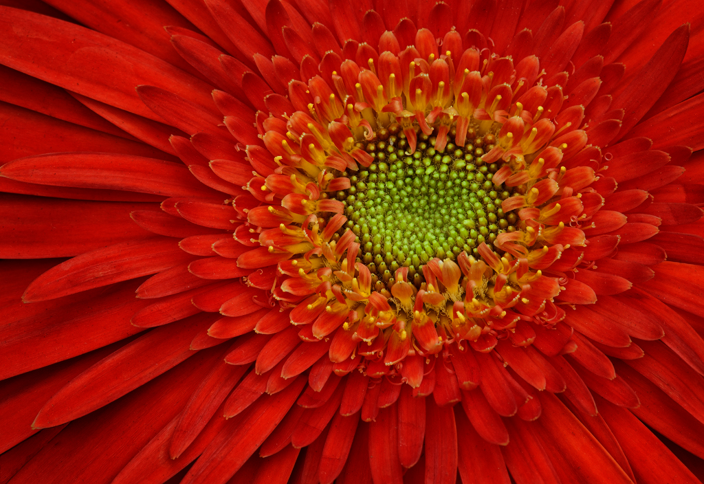
I agree with Tom that this is coming across as somewhat flat. I think that all the red is overworking my eyes and causing some loss of detail. I tried moving the midpoint to the right in a Levels adjustment to add a bit of drama. |
Nov 21st |
 |
| 6 |
Nov 17 |
Comment |
Way cool! Would never have thought of this as a subject to try. Actually, the lit match by itself would probably look cool, too. The diagonals work well to draw the eye. No suggestions for change. |
Nov 21st |
| 6 |
Nov 17 |
Comment |
Also agree about the harsh lighting. Either try to soften the light or use a tripod and take a long exposure with natural light. |
Nov 21st |
| 6 |
Nov 17 |
Comment |
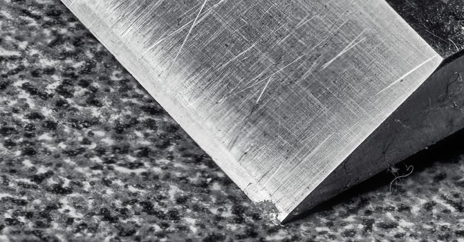
Here's my take on a crop for this image. I agree about the out of focus areas being a bit distracting, though I think the choice of monochrome is appropriate and "sharp" areas relly pop nicely! |
Nov 21st |
 |
| 6 |
Nov 17 |
Comment |
As I indicated in the description, this stack was captured 4 years ago, before I got further instruction here. My main "focus" in this experiment was to see how Affinity Photo did with its built-in focus merge, which, believe it or not, turned out 100% better than the merge in Photoshop. |
Nov 9th |
| 6 |
Nov 17 |
Reply |
Perhaps I should pull it and sit out this month. |
Nov 6th |
6 comments - 2 replies for Group 6
|
| 11 |
Nov 17 |
Reply |
So far, it has the most potential to be a replacement for Photoshop without the subscription. |
Nov 23rd |
| 11 |
Nov 17 |
Comment |
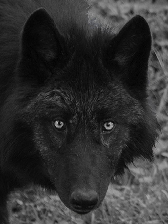
I actually prefer the look of the wolf in the original, as I find the other interpretations too dark for its fur.
To better track with your title, I cropped in tighter to the wolf's head and emphasized its eyes. Thoughts? |
Nov 22nd |
 |
| 11 |
Nov 17 |
Comment |
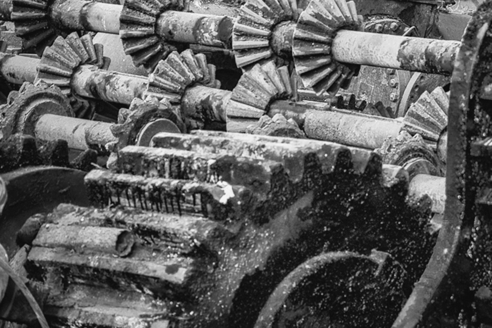
I agree with Jim H about the background - it really does clutter up the scene. I cropped it out completely to focus on the gears - the star of the image. Also worked on adding contrast. |
Nov 22nd |
 |
| 11 |
Nov 17 |
Comment |
Excellent job, Jim! The trees now pop into view and then the eye can travel to the well-textured sky. Crop worked better as well. Like Allen said, this is classic B&W! Bravo!!! |
Nov 22nd |
| 11 |
Nov 17 |
Comment |
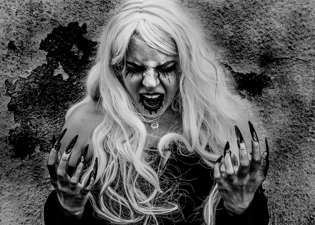
I agree about the background and took the liberty of some creative burning to help her pop out from the background. |
Nov 22nd |
 |
| 11 |
Nov 17 |
Comment |
Thanks, guys! I haven't been getting out much lately, so this chance capture has been fun to play with. d;¬{D |
Nov 22nd |
| 11 |
Nov 17 |
Comment |
<...sigh...> I personally find the original color version more appealing as it has the warmth of the golden hour to set the mood. Lacking that warmth, the main story here is the sky, which Jim H brought out more in his high contrast version. His punching of the detail in the mountains helped even out the central area of the image as well. |
Nov 22nd |
6 comments - 1 reply for Group 11
|
| 24 |
Nov 17 |
Comment |
I found your composition idea delightful! I think you should axe the vignette completely as it's not really working for me. |
Nov 22nd |
| 24 |
Nov 17 |
Reply |
Well, the greens have diminished somewhat, but I was able to pull the blues more into view. Guess there's still a lot of room to play here, eh? d;¬{D |
Nov 22nd |
| 24 |
Nov 17 |
Comment |
This is very much like an architect's projection of a plan's results. I like it a lot and can't really suggest any changes. Great job! d:¬{D |
Nov 22nd |
| 24 |
Nov 17 |
Comment |
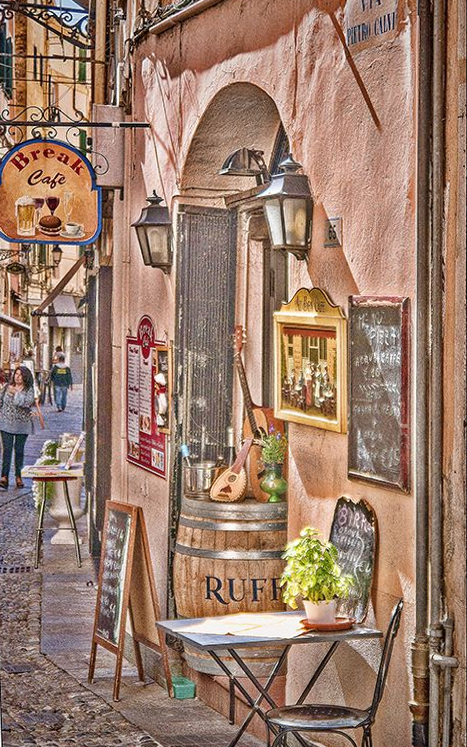
I like the look of this one, with the exception of the keystoning that was mentioned. Here's a version with that corrected, using DxO Viewpoint: |
Nov 22nd |
 |
| 24 |
Nov 17 |
Comment |
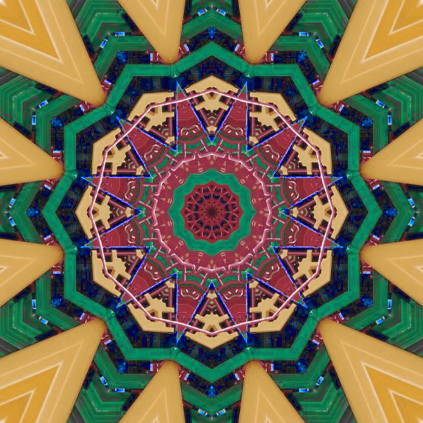
Here's the result of playing after your suggestions: |
Nov 22nd |
 |
4 comments - 1 reply for Group 24
|
| 53 |
Nov 17 |
Reply |
I applied a cooling photo filter adjustment layer masked to affect the left side, and a warming photo filter adjustment layer masked to affect the right side. |
Nov 21st |
| 53 |
Nov 17 |
Reply |
My bad - apologies. Having never seen that live, I can only follow what my color sense tells me. As a competition judge, that is what I would have suggested. <...sigh...> d:¬{( |
Nov 21st |
| 53 |
Nov 17 |
Reply |
I rotated things slightly to create a more traditional portrait triangle, of course keeping the rule of thirds in mind. d;¬{D |
Nov 21st |
| 53 |
Nov 17 |
Comment |
Excellent image, Arabella! Monochrome is definitely the way to go, IMHO. Good choice on the tone as it really pops the insect. bravo!!! |
Nov 21st |
| 53 |
Nov 17 |
Comment |
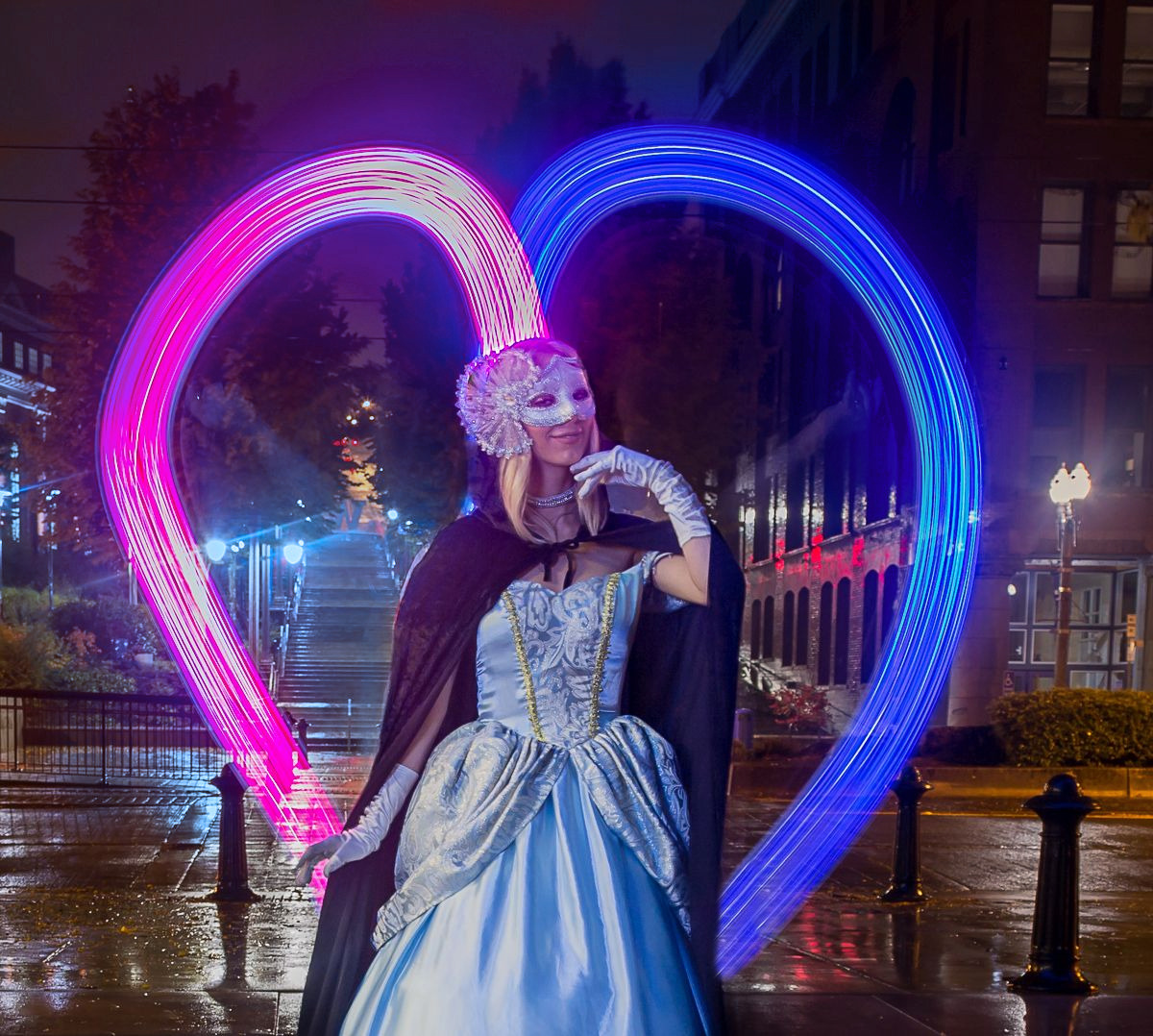
Here's a version with the blue extended ad the glow muted: |
Nov 21st |
 |
| 53 |
Nov 17 |
Comment |
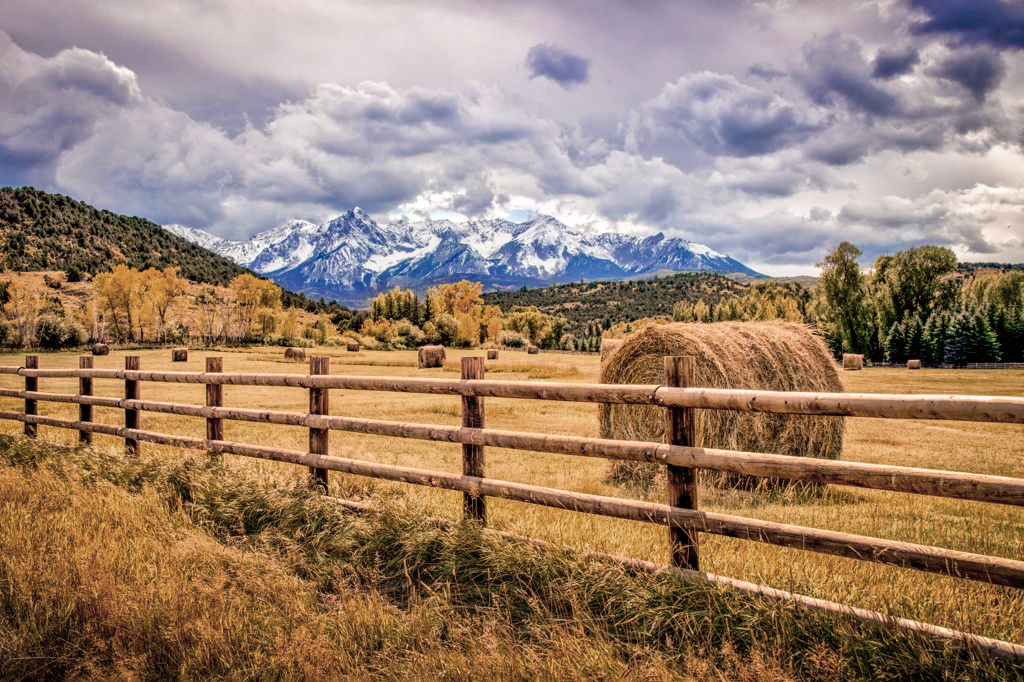
Lovely vista, Brenda! I especially like how the background mountains are in contrast to the foreground.
I do find this a bit over-saturated, along the lines of the toning from an HDR treatment, and, I must confess, find it a bit tiring to my eyes. Here's a version a little less saturated inn the foreground. |
Nov 21st |
 |
| 53 |
Nov 17 |
Comment |
I have no suggestions here! I have to look very closely to perceive the clone job, so you did an excellent job on the edit! Bravo!! |
Nov 21st |
| 53 |
Nov 17 |
Comment |
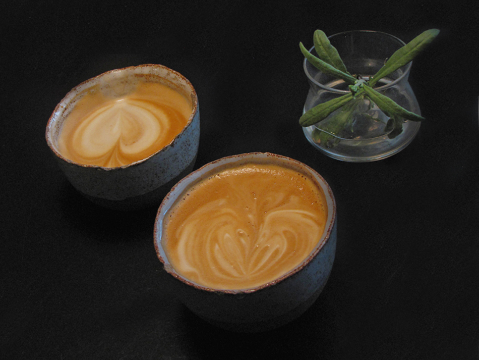
Here's my take on your lovely image. I removed the "tray" and cropped to create a nice triangle. What do y'all think? |
Nov 21st |
 |
| 53 |
Nov 17 |
Reply |
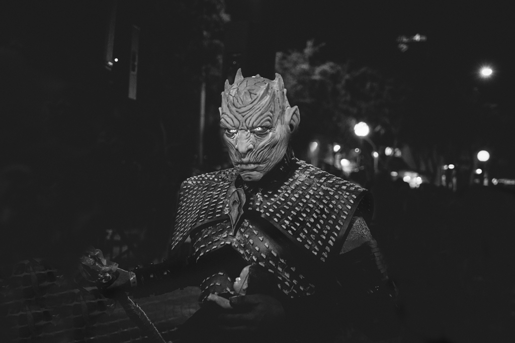
I think you're right, Brenda. Those changes would finish it off while maintaining the creepy effect. I cloned out the distractions in this version: |
Nov 21st |
 |
| 53 |
Nov 17 |
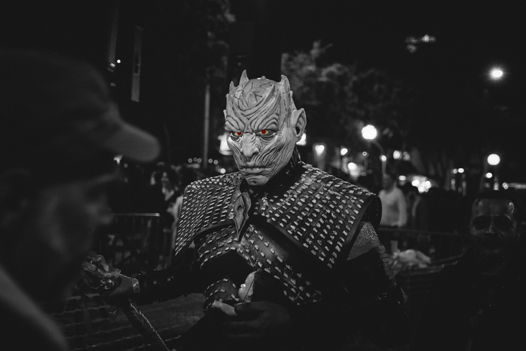
Reply |
Like this, Rusty? |
Nov 21st |
 |
| 53 |
Nov 17 |
Comment |
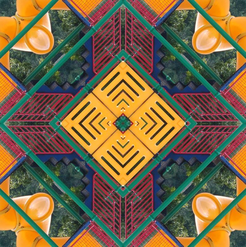
Good suggestions, y'all! I've cropped it square and boosted the reds. How does it look now? |
Nov 21st |
 |
6 comments - 5 replies for Group 53
|
| 62 |
Nov 17 |
Comment |
Awesome! You have incredible talent and imagination! I envy that! d;¬{D |
Nov 22nd |
| 62 |
Nov 17 |
Comment |
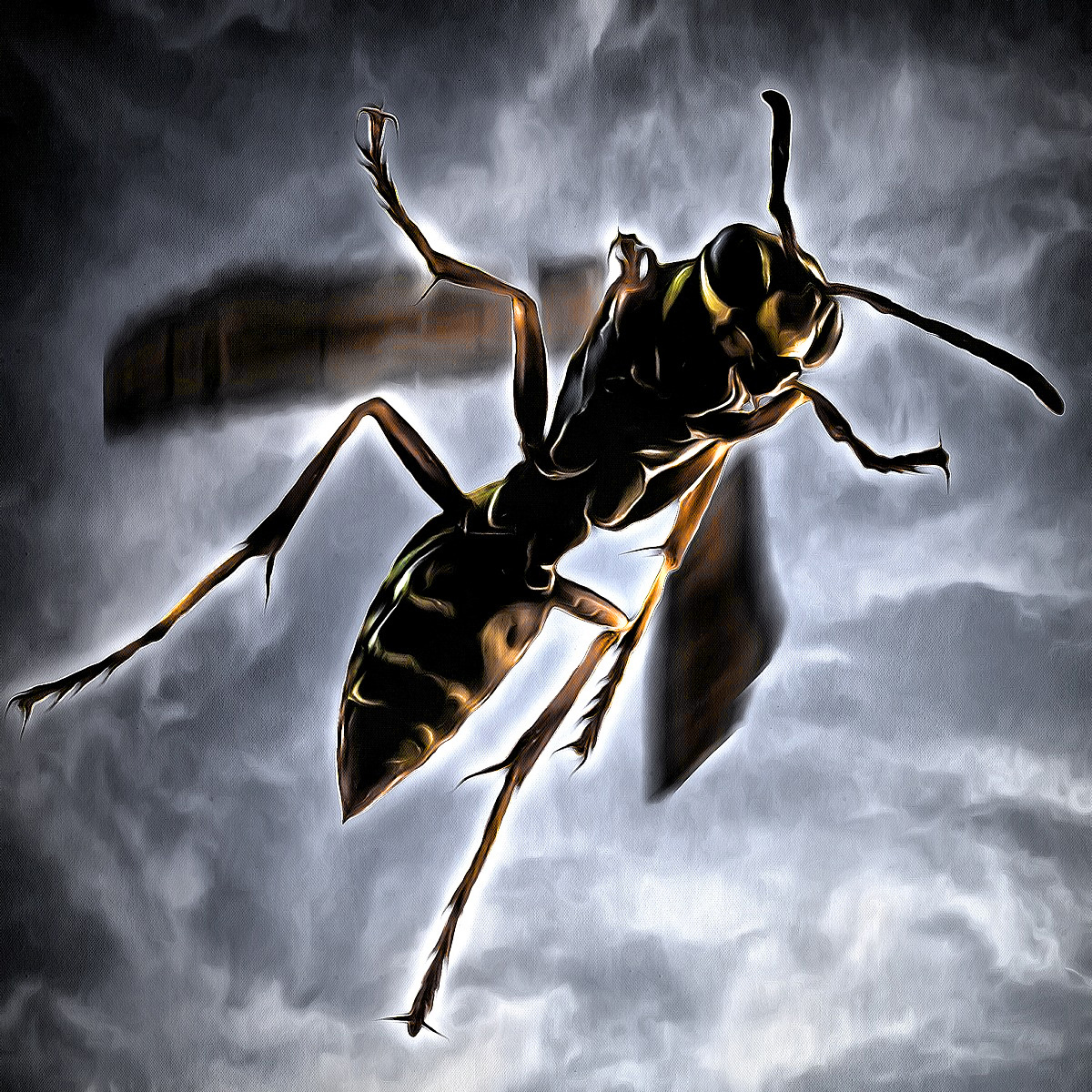
Your results are wonderful, Gerhard! Great job!!! My only issue is the orange that is so prevalent, which seems to my eye more reminiscent of a chicken than an eagle. Perhaps darkening the orange to more of a brown will improve things. |
Nov 22nd |
| 62 |
Nov 17 |
Comment |
How's this? |
Nov 22nd |
 |
| 62 |
Nov 17 |
Comment |
The kitten's face is so expressive that it pulls the viewer in right away, eventually giving way to the lovely blend of colors and bubbles you've managed! I can't think of a thing to suggest. Bravo!!! |
Nov 22nd |
4 comments - 0 replies for Group 62
|
26 comments - 9 replies Total
|