|
| Group |
Round |
C/R |
Comment |
Date |
Image |
| 6 |
Oct 17 |
Reply |
Good suggestions, certainly! d:¬{D |
Oct 22nd |
| 6 |
Oct 17 |
Reply |
LOL! |
Oct 22nd |
| 6 |
Oct 17 |
Comment |
I enjoyed this image. While Dick's crop gives a slightly better composition, the main thing about this image is the impact of eyes, which give it a whimsical quality. Perhaps a smaller aperture would have yielded more detail, but I feel it's sharp where it needs to be. Bravo! |
Oct 21st |
| 6 |
Oct 17 |
Reply |
Thanks, Janet! I hoped the sky would compensate for the lack of sharpness on the body. |
Oct 21st |
| 6 |
Oct 17 |
Reply |
I spent quite a while with the pen tool to select it out of the original. I'm glad it paid off for you! d:¬{D |
Oct 21st |
| 6 |
Oct 17 |
Reply |
<...sigh...> I agree, Tom. I thought it was pretty good for a handheld smartphone shot, though. I felt the "threat" of the wasp coming in for a landing would compensate - I guess not. d:¬{( |
Oct 21st |
| 6 |
Oct 17 |
Reply |
Thanks, Dick! This is high praise indeed!
Thanks also for your description of the parade float - it's what was in my mind but I couldn't quite put a name to it! d:¬{D |
Oct 21st |
| 6 |
Oct 17 |
Reply |
I wish the body was sharper, too. I'll have to think about where else to pose this scary creature! d;¬{D |
Oct 21st |
| 6 |
Oct 17 |
Comment |
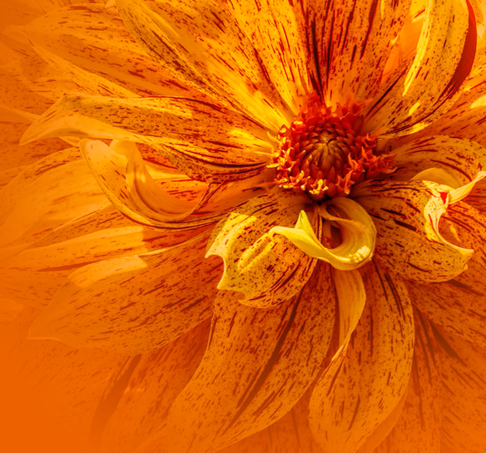
Once again you wow us with your flower images! Nothing to suggest as this is spot on. |
Oct 21st |
| 6 |
Oct 17 |
Comment |
Great capture! I like the original orientation and Dick's rotation, though the original feels more natural to me. Lovely detail. Not sure about the lavender, but it's not really a distraction for me. Bravo! |
Oct 21st |
| 6 |
Oct 17 |
Comment |
Great detail throughout, with a powerful composition and lovely background bokeh.
I agree with the others about the bright area and suggest burning there to make it less of a distraction. Here's my take on it: |
Oct 21st |
 |
| 6 |
Oct 17 |
Comment |
With the use of the extension rings, your DOF becomes so much shallower, that you might have been better off using a smaller aperture and a tripod to maximize the detail. That would add a lot more interest to your subject. |
Oct 21st |
| 6 |
Oct 17 |
Comment |
Love this flower! I also concur with Peter's crop, as it removes the distractions. I took it a step further to address the lighting, fading the left and bottom edges to a solid color. What do you think? |
Oct 21st |
 |
6 comments - 7 replies for Group 6
|
| 11 |
Oct 17 |
Reply |
I know they just released their 2nd update to Aurora, so you may want to verify you're up-to-date. I wish they were planning to have some sort of HDR merge in Lumina as I'm interested in their overall approach to post-processing. |
Oct 28th |
| 11 |
Oct 17 |
Reply |
I almost forgot Corel's AfterShot Pro, which is their answer to Lightroom, and Paintshop Pro X9, their answer to Photoshop. Not as impressive, but good. When I started editing images many years ago, I used Paint Shop Pro exclusively. |
Oct 28th |
| 11 |
Oct 17 |
Reply |
Three other programs to investigate are Alienskin's Exposure X3, On1's Photo Raw 2018, and MacPhun's Luminar. All three are non-subscription and, although they're not quite there yet, are strong contenders to eventually dethrone Adobe as king of the hill. So far, Affinity Photo is a bit ahead of the pack, but can mess with your head if you've been in the Adobe sandbox for a long time like me. d;¬{D |
Oct 28th |
| 11 |
Oct 17 |
Reply |
It's so much easier to interpret someone else's images than our own, eh? d;¬{D |
Oct 28th |
| 11 |
Oct 17 |
Reply |
I do exposure bracketing, which varies the shutter speed by 2 stops in both directions. This allows for more shadow and highlight information to be used in post-processing. Some use HDR software to combine the images and alter the tone. I don't care for the HDR 'look', but like having the extended tonal range to work with.
Affinity Photo is a program produced by Serif that combines a lot of what's in Photoshop and Lightroom into a non-subscription program that's very inexpensive. |
Oct 27th |
| 11 |
Oct 17 |
Comment |
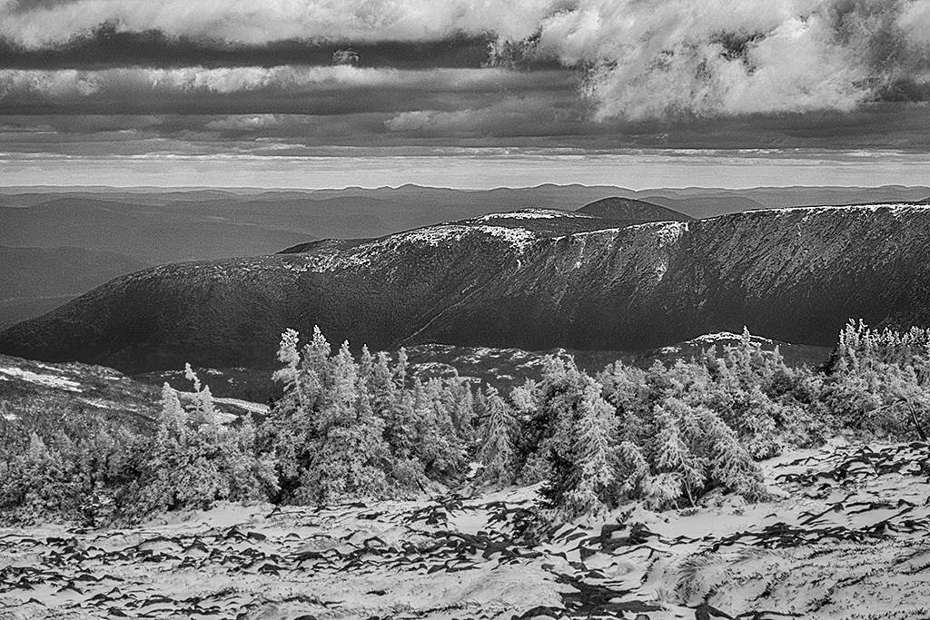
Much more detail available in the monochrome version, for sure! I think the middle of the image is a bit muddy and the clouds could use more drama. Here's my attempt: |
Oct 21st |
 |
| 11 |
Oct 17 |
Comment |
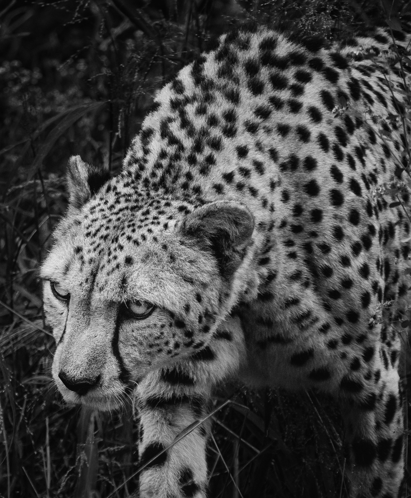
I agree with Allen that the darkened grass is not realistic but oh so important to the story of this image! The face is so ominous and I'm instantly struck with the feeling of being glad I'm not the focus of its attention!
I dodged the cat and burned the grass slightly to help separate the 2, hopefully without removing the menacing quality of the image. What do you think? |
Oct 21st |
 |
| 11 |
Oct 17 |
Comment |
Great shot, Jim! While Stephen's crop is a good suggestion, your composition works really well for my eye! Yes, the halos are a small distraction but don't diminish the overall impact of the image until you really study it closely. |
Oct 21st |
| 11 |
Oct 17 |
Reply |
If I'm not doing an image-stack, I'm typically doing an HDR bracket to get the maximum tonal range from a subject, since my camera is not the greatest. I think monochrome is an important approach to maximize detail for the viewer. |
Oct 21st |
| 11 |
Oct 17 |
Reply |
Thanks, Jim! Monochrome is good for focusing the eye on different aspects of an image. Looks like I succeeded this time! d:¬{D |
Oct 21st |
| 11 |
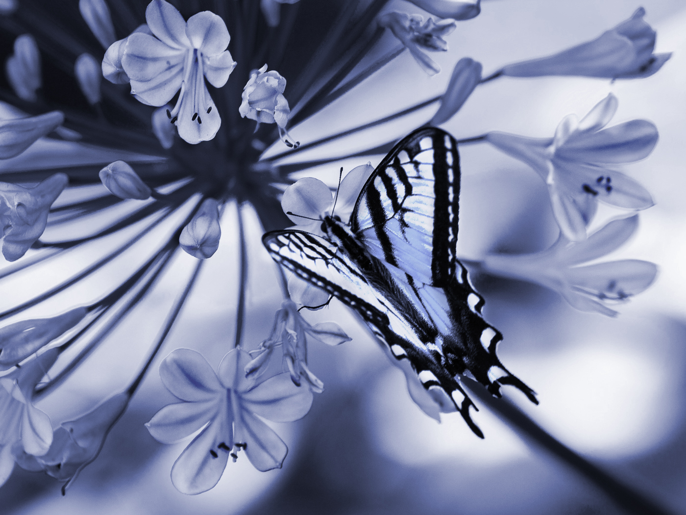
Oct 17 |
Comment |
I agree with Jim about the leading line pulling the eye to the flower - lovely composition. For me, though, I think the butterfly gets a little lost in this monochrome version, while the yellow in the original helps it to pop out prominently.
I took a slightly different direction to bring back the butterfly - chose a blue rather than grey, burned the flowers and dodged the butterfly. What do you think? |
Oct 21st |
 |
4 comments - 7 replies for Group 11
|
| 24 |
Oct 17 |
Comment |
The motion blur certainly helps. I strongly suggest you follow Alan's suggestion about the white line under the house and the feathering of the edges to help the house blend into the image more. I also agree the birds seem out of place in a storm - better to replace them with more flying debris. Finally, I agree with Jerry about the children's book illustration. |
Oct 21st |
| 24 |
Oct 17 |
Reply |
I am regularly experimenting with space scenes and learning a lot along the way. It feels good to know I'm reaching a level of realism as you suggest. d;¬{D |
Oct 21st |
| 24 |
Oct 17 |
Comment |
I would also like to know your post-processing on this. I agree with the others about the crop and have included a cropped version for comparison: |
Oct 21st |
 |
| 24 |
Oct 17 |
Comment |
I really enjoyed studying this, Jerry! There is no sense of where this originated, being a colorful play of shapes and textures. I wouldn't change a thing. |
Oct 21st |
| 24 |
Oct 17 |
Comment |
Here's a version sans lines: |
Oct 21st |
 |
| 24 |
Oct 17 |
Reply |
That would be so cool!!! |
Oct 15th |
| 24 |
Oct 17 |
Reply |
That is supposed to be a sun (aka star). |
Oct 10th |
4 comments - 3 replies for Group 24
|
| 53 |
Oct 17 |
Comment |
Great experimentation and thinking outside the box. I must admit that my favorite is Variation 1, followed by your original. Guess I'm a sucker for golden hour captures (which I never seem out and about to get). |
Oct 21st |
| 53 |
Oct 17 |
Comment |
Certainly a good commercial image. The lighting, focus, composition and story are all good. My suggestion is to remove some distracting elements - not so much the yellow cup as the wires and tubes intersecting her head and the gizmo at the top left. Here's my take with those elements removed: |
Oct 21st |
 |
| 53 |
Oct 17 |
Comment |
I love this! The simplicity almost reaches a minimalist level. As others have said, the leading line is both diagonal and receding, giving more depth. The yellow leaf, though bright, doesn't distract but rather becomes an accent, like an apostrophe. I can stare at this for a long time and float away. |
Oct 21st |
| 53 |
Oct 17 |
Reply |
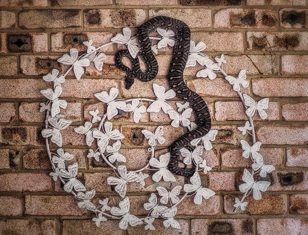
While your crop has a better position for the snake (off-center), it removes too much of the sculpture which I believe is important to the story of the image. |
Oct 21st |
| 53 |
Oct 17 |
Comment |
I like how the snake is interacting with the sculpture, becoming one with it (not that this is a good thing beyond the image). I think your composition is good, though it lacks a sense of scale that the other image has. I played around with the tones of the image, adding some clarity, contrast and warmth. What do you think? |
Oct 21st |
 |
| 53 |
Oct 17 |
Comment |
I know I'm late to the party, but here's my take on this image. I came up with a different crop that eliminates the foreground trees and puts more emphasis on the waterfall. Also adjusted the sky slightly & added contrast. What do you think? |
Oct 21st |
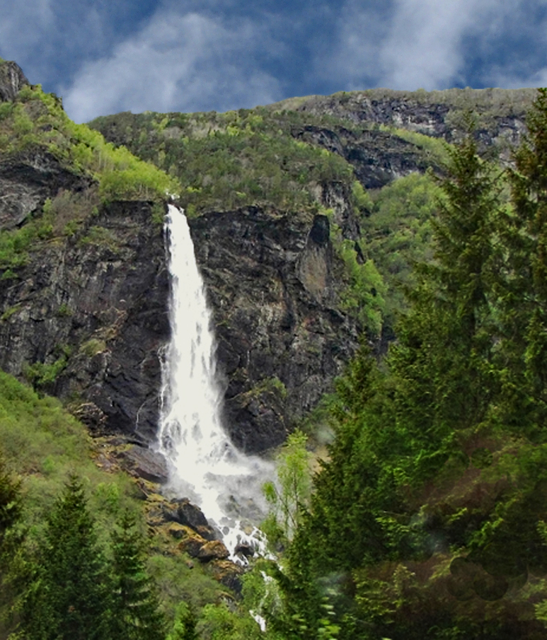 |
| 53 |
Oct 17 |
Comment |
Of the suggestions demonstrated, I prefer Brenda's. I can well imagine how magnificent this was to see live. For me, having an uncorrected wide-angle shot is a little distracting as it flattens out a view that in reality has tremendous depth. Is it possible for you to add lens correction in Camera Raw and show us the result? |
Oct 21st |
| 53 |
Oct 17 |
Comment |
Good suggestions all. |
Oct 21st |
| 53 |
Oct 17 |
Reply |
<...sigh...> I hear ya. |
Oct 21st |
| 53 |
Oct 17 |
Reply |
I'm not sure how that would look to remove part of the leaf, but I'll play with that. Thanks for the idea. |
Oct 21st |
| 53 |
Oct 17 |
Reply |
I know it's a little out of focus on the bottom, which is why I thought to go with a space theme. Guess it's back to the drawing board for this one. |
Oct 21st |
| 53 |
Oct 17 |
Reply |
I will try that! Thanks! |
Oct 21st |
7 comments - 5 replies for Group 53
|
| 62 |
Oct 17 |
Comment |
You need to start creating training videos on this stuff, Gloria! There's a lot we could learn from you. Your style is very distinct and I look forward to each new creation you share with us. d:¬{D |
Oct 21st |
| 62 |
Oct 17 |
Comment |
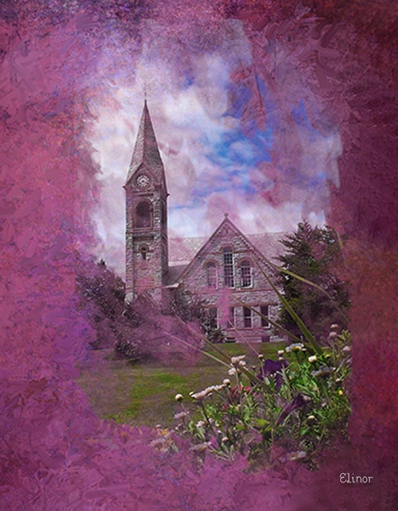
I think you've made a lovely image from a good record shot. The pink is a bit strong, but my only real issue is the large area of pink in comparison to the church, which makes for a weaker composition. Here's my "crop" to demonstrate: |
Oct 21st |
 |
| 62 |
Oct 17 |
Comment |
I agree with Angela about the positioning of the subject so it's not cut off by the frame, and Gloria about the bird facing left. Otherwise, you have a powerful image here and an enjoyable study! d:¬{D |
Oct 21st |
| 62 |
Oct 17 |
Comment |
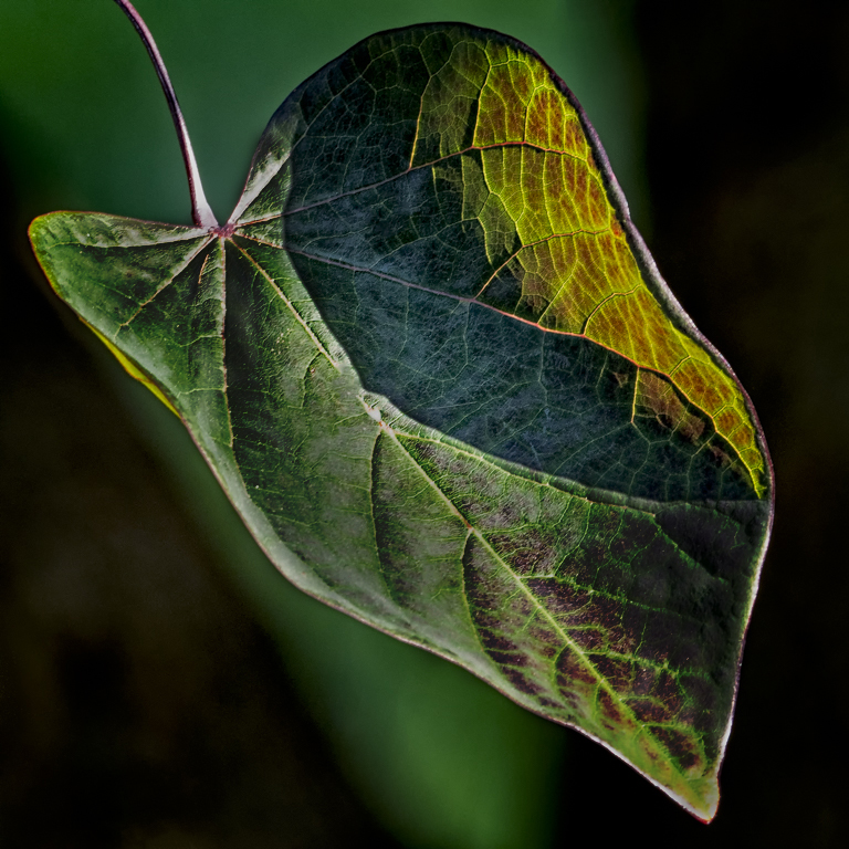
Thank you all for your important suggestions. I'm still new to this process am taking baby steps. I see that the background needs a different approach to set it apart from the leaf. |
Oct 21st |
| 62 |
Oct 17 |
Comment |
I love this. It's clear you weren't trying to simply repaint the original image, but rather give us your feelings from the fire upon the framework of the original screen capture. I wouldn't change a thing and really appreciate your pointilism style. |
Oct 21st |
5 comments - 0 replies for Group 62
|
26 comments - 22 replies Total
|


