|
| Group |
Round |
C/R |
Comment |
Date |
Image |
| 6 |
Sep 17 |
Comment |
I'm afraid I'm too late to the party here as everything that needed to be said has already been covered well by the others. Suffice it to say that we all agree that this a great image. d:¬{D |
Sep 24th |
| 6 |
Sep 17 |
Reply |
I'll have to research that, Toni! I'll add it to my list! d:¬{D |
Sep 24th |
| 6 |
Sep 17 |
Reply |
The health stuff has not been fun, for sure! I have to agree that the reflection is not working as I'd hoped. <...sigh...> |
Sep 24th |
| 6 |
Sep 17 |
Reply |
Thank you, Peter! I still have the leaves I picked up in the yard as they were already dried, so I'll have to work on a focus-stack version. d;¬{D |
Sep 24th |
| 6 |
Sep 17 |
Reply |
When my wife and I were looking for a reflective surface, the mirror was a lot less expensive than our local sources for black plexiglass, which is what I really wanted. Oh well, live and learn. d;¬{D |
Sep 24th |
| 6 |
Sep 17 |
Comment |
Magical is definitely the word for this image. I actually find the unsharpened version better as it adds to the magical nature of this capture. This is certainly not a work in progress and it's small wonder that you've done well with it.
I almost wish you had let down your hair a bit and added some fanciful elements to this to tell an even stronger story. d;¬{D |
Sep 24th |
| 6 |
Sep 17 |
Comment |
Love this! Dick's right about the rotation feeling more natural, but, otherwise, I find this very interesting to study. Great capture! |
Sep 24th |
| 6 |
Sep 17 |
Comment |
Interesting subject! For me, the structures of the flowers are reminiscent of spiders - or at least that's what my mind came up with. d;¬{D
Your overall focus is appropriate and the composition is strong. I wish there was just a bit more DOF as the focal plane in this image is very narrow. Great job! |
Sep 17th |
| 6 |
Sep 17 |
Comment |
I did a little cleanup of your image, removing the specks and wrinkles to smooth things out, and played with the color to try and match skin a little better. What do you think? |
Sep 17th |
 |
| 6 |
Sep 17 |
Comment |
Impressive capture, Toni! You used what you had and got everything right at a moment's notice. I don't think the slightly soft focus of the bee takes anything away for me as the robberfly is sharp throughout. My shakey hand would never allow me to capture something like this all of a sudden. Bravo! |
Sep 17th |
| 6 |
Sep 17 |
Reply |
This was actually on a glass mirror with a black cloth backdrop.
Strangely enough, it didn't occur to me to go for more detail on the leaf as I was "focussed" (pun intended) on reflections that day. Guess I need to get back in my studio. Been laid up with heart issues so haven't been behind the camera for a while. |
Sep 11th |
6 comments - 5 replies for Group 6
|
| 11 |
Sep 17 |
Comment |
While the halos are somewhat noticeable, I find your monochrome treatment a vast improvement over the color version, especially in the tones you came up with for the sky. Nothing to suggest except backing off the structure/clarity a smidge to remove the halos. bravo! |
Sep 24th |
| 11 |
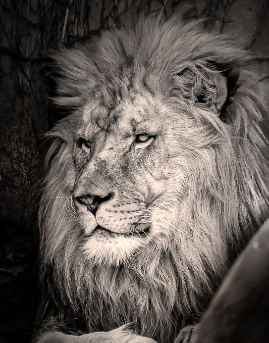
Sep 17 |
Comment |
I think we're all in agreement about the boulder in the lower right corner. Of the 2 monochrome versions you offered us to view, I prefer a blend of the 2, actually. d;¬{D
What I offer you is a version that crops out some of his paw, and part of the boulder, evens out the clarity of his main and darkens the areas around him. Thoughts? |
Sep 24th |
 |
| 11 |
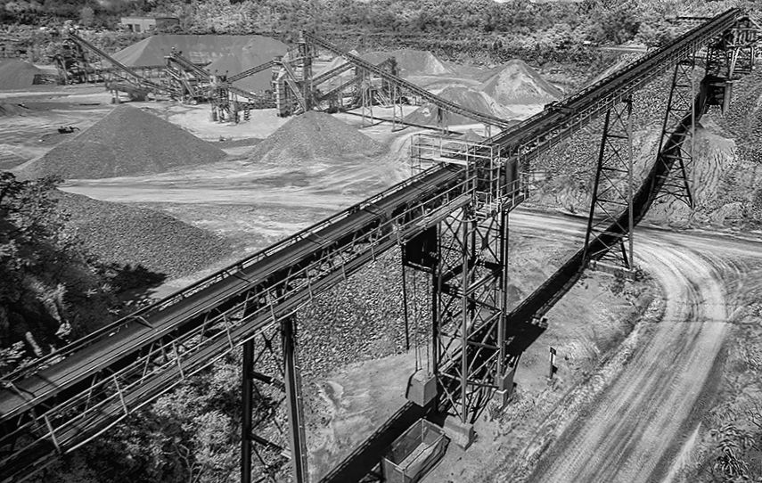
Sep 17 |
Comment |
The more I looked at this image, the busier it became for me. I find that the clouds are competing for focus with the main conveyor. To give the main conveyor more focus, I cropped out the sky & some from the right, and lowered contrast and clarity for the other conveyors. This helped my eye focus on the main conveyor. Probably not much in keeping with your vision, though: |
Sep 24th |
 |
| 11 |
Sep 17 |
Comment |
While late in the game, I offer a variation on this image, with some dodging in the very dark areas and a slight rotation to the image to minimise the featureless sky: |
Sep 24th |
 |
| 11 |
Sep 17 |
Comment |
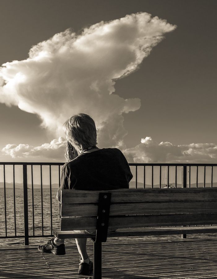
Yes, the cloud appears to be coming out of the man's head, but that's what's appealing to me about this image. I also find the warmth of the gold tone more in keeping with the story of the image.
I do agree with Jim H about the man being too central and offer the suggestion of a slight crop: |
Sep 24th |
 |
| 11 |
Sep 17 |
Reply |
Thank you, Jim! These days, I have way too much seriousness, so will reach for playful whenever it pays a visit like this. d;¬{D |
Sep 24th |
| 11 |
Sep 17 |
Reply |
I'm hardly qualified to be an instructor of creativity, unless it's to teach that we should let our imagination have its way from time to time. d;¬{D |
Sep 24th |
| 11 |
Sep 17 |
Reply |
I think there are some screws loose in my head which are letting these weird ideas to slip through onto my digital canvases. d;¬{D |
Sep 24th |
| 11 |
Sep 17 |
Reply |
I see what you mean about the contrast. I didn't want to go that "real" with this, I guess. d;¬{D
The large day moon was, in my original planning, going to be larger, but I ended up reducing its size as it was dominating the image too much. Perhaps I should have found a happy medium. The "white spot" on the right is actually the sun in a color version of this. I guess it didn't translate as well into monochrome. d:¬{( |
Sep 24th |
| 11 |
Sep 17 |
Comment |
Thank you all for your input! I am still struggling with health issues so am just now getting around to putting my 2 cents in on everyone's images. My apologies! d:¬{( |
Sep 24th |
6 comments - 4 replies for Group 11
|
| 53 |
Sep 17 |
Reply |
I can't take credit for this amazing group of artists - we'd be an amazing group even if I wasn't the admin! |
Sep 24th |
| 53 |
Sep 17 |
Comment |
I actually think more of his right arm is important for balance and agree that his eyes need to be brought out a bit more. It's always important to a portrait to have eyes for the viewer to connect with.
Working from the fuller image, I cropped out the boat's windshield and some space to the left, leaving more space to the right where he's looking, and brightened the man's teeth and eyes a bit. What do you think? |
Sep 17th |
 |
| 53 |
Sep 17 |
Comment |
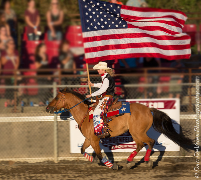
You did very well with both captures from the standpoint of exposure and focus. Your main image is problematic for me because of the crowd in the background who, at first glance are looking at the flag, but afterwards seems like they are looking at something behind the rider and the flag. This steals the show, so to speak, for me. Blurring the crowd will help ease that distraction.
Your other image is an effective portrait piece, with the background helping pop your subject well. This is definitely my preferred image.
|
Sep 17th |
 |
| 53 |
Sep 17 |
Comment |
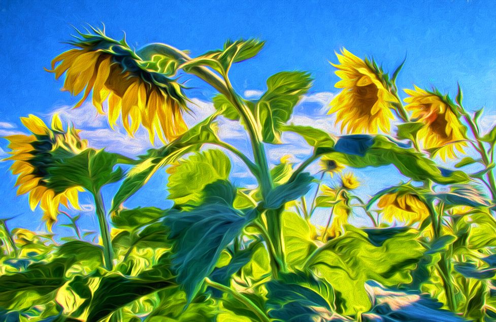
You turned a so-so image, where the sunflowers are facing away from the viewer and made it into an effective art piece. I can think of no suggestions for this other than cropping in a bit on the right and bottom to hide the distraction of the weird cutoff plant on the right edge. |
Sep 17th |
 |
| 53 |
Sep 17 |
Comment |
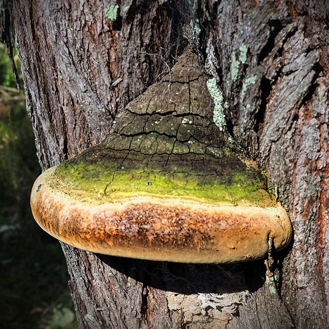
I took Rohan's redo and did a different crop, squaring it off to put the main thrust of the fungus on a third line. What do you think? |
Sep 17th |
 |
| 53 |
Sep 17 |
Comment |
The one thing that I agreed with others on a suggestion was monochrome. So I had a try, using Topaz B&W Effects & Topaz Clarity. I also cropped out the sky and some of the left-hand side in order to focus the eye on water, while still retaining some of the people to give a sense of scale. What do you think? |
Sep 17th |
 |
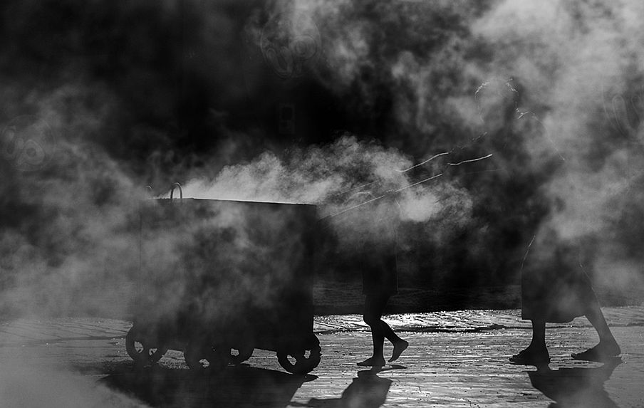
| 53 |
Sep 17 |
Comment |
I appreciate the misty, moody nature of this image, which tells a story of the conditions these 2 are working in.
I would crop from the right and bottom to focus the attention on the activity. |
Sep 17th |
 |
| 53 |
Sep 17 |
Reply |
Wow . . . your experience of this image is very different from my vision. My intent was to show what it would look like if you were at sea at night and an earthlike planet nearby was rising. Perhaps if you viewed the image larger it would hopefully look more like what I was going for - or maybe I failed utterly! d8¬{O |
Sep 17th |
| 53 |
Sep 17 |
Reply |
Thanks, Brenda! I'm thinking, in the big scheme of things, I may spend way too much time in Photoshop or the like doing strange things. d;¬{D |
Sep 17th |
| 53 |
Sep 17 |
Reply |
Well, thank you for your gracious comment. It's certainly my pleasure to share these "visions" with y'all! d;¬{D |
Sep 17th |
| 53 |
Sep 17 |
Reply |
Hmmm . . . a sailing ship, eh? I'll have to see what I can do. d;¬{D |
Sep 17th |
| 53 |
Sep 17 |
Reply |
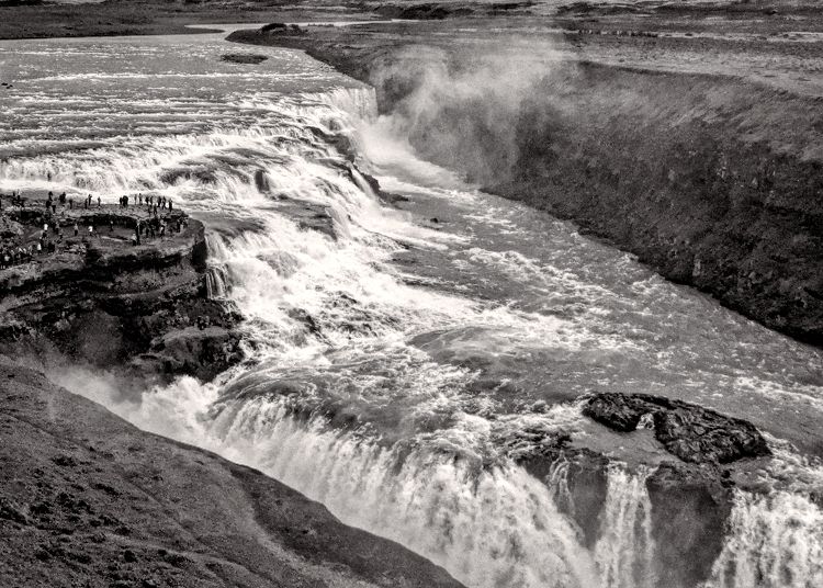
It's a bit of an illusion because of the contrast between the semi-bright planet and the darkness of space, which makes it look as though the water level is high on the left. Your fix, actually now makes the right side high. |
Sep 6th |
6 comments - 6 replies for Group 53
|
| 62 |
Sep 17 |
Comment |
Mmmmmm . . . This must become a wall print! The colors, strokes, textures are magical together! I can visualize this as part of a series decorating the walls of a room! I'm in awe! |
Sep 24th |
| 62 |
Sep 17 |
Comment |
Wow! Both approaches are added to my "Techniques To Try" list, for sure. Your choices for background and painting the flowers blend perfectly together! Bravo!!! d:¬{D |
Sep 24th |
| 62 |
Sep 17 |
Reply |
Elinor, you make a valid point about the petal edges, though this works well for me. Good idea to smudge the background leaves, though perhaps more variety in the direction would soften it more. |
Sep 24th |
| 62 |
Sep 17 |
Reply |
Thank you, Gerhard! d:¬{D |
Sep 24th |
| 62 |
Sep 17 |
Reply |
Agreed, Elinor! d:¬{D |
Sep 24th |
| 62 |
Sep 17 |
Reply |
Gloria - I see where you're going with that example. Yes, in some ways I prefer the third image as it has the most clarity, but also very strange brush strokes. I still can't decide, frankly. d:¬{( |
Sep 24th |
| 62 |
Sep 17 |
Reply |
Thanks for the positive feedback, Elinor. I agree about the last sample - I'll have to try some Clearasil to see if that will smooth out my face. d;¬{D |
Sep 24th |
2 comments - 5 replies for Group 62
|
20 comments - 20 replies Total
|


