|
| Group |
Round |
C/R |
Comment |
Date |
Image |
| 6 |
Jun 17 |
Reply |
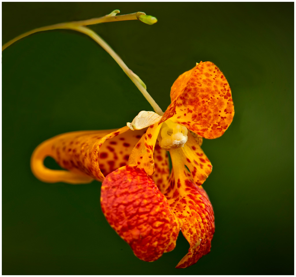
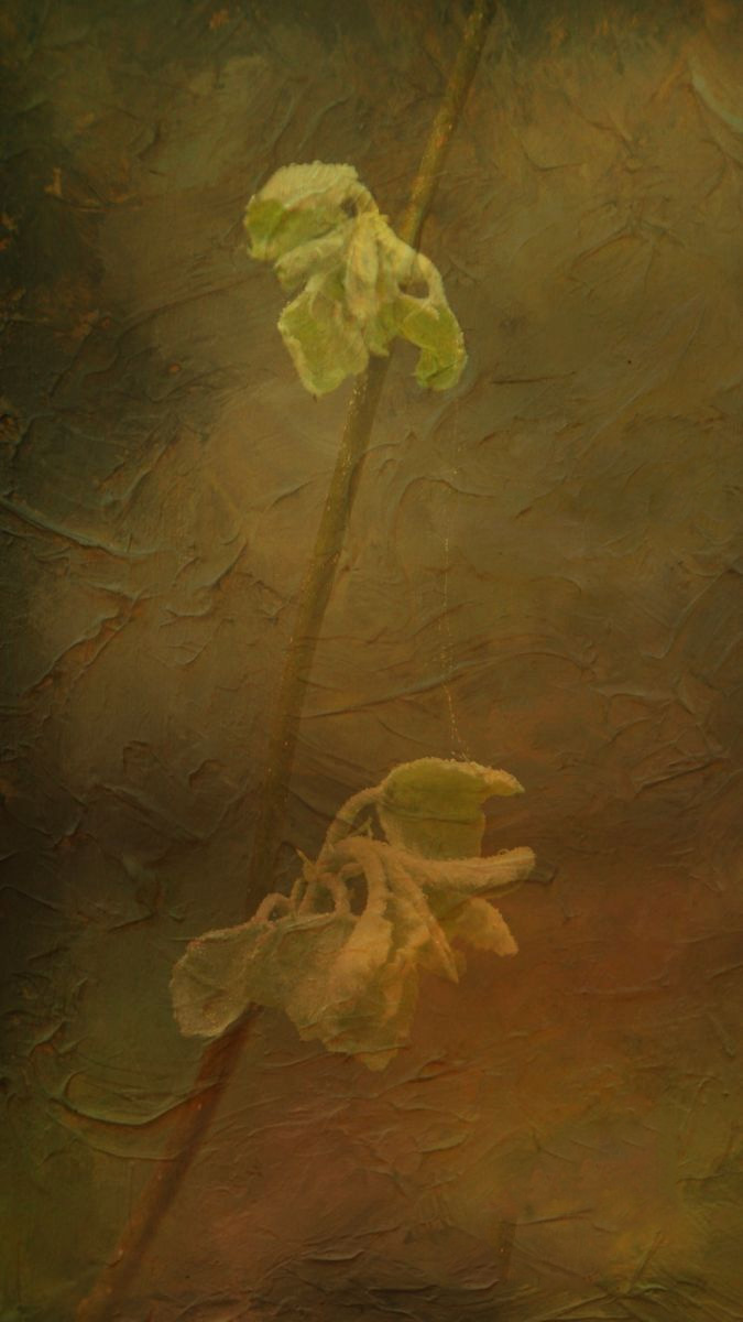
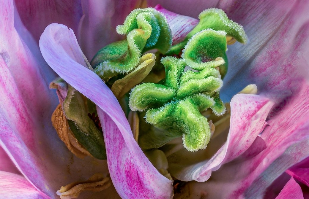
I'm assuming he's referring to the tiny leaf attached to the stem. Not really sure, though. |
Jun 25th |
| 6 |
Jun 17 |
Comment |
You almost always have an interesting flower or plant to share with us, but then, as a horticulturist, that's to be expected. d;¬{D
I find the leaf to be a big distraction, personally. If anything, it causes me to focus on the back end of the flower being out of focus. Without it, I don't think I'd mind the shallow DOF. |
Jun 23rd |
 |
| 6 |
Jun 17 |
Comment |
Welcome back, Laki!
Pretty flower, as usual. I think you should consider toning down the background and adding a bit of contrast or clarity to the flower to help bring out a little more detail in the petals. |
Jun 23rd |
 |
| 6 |
Jun 17 |
Comment |
I agree with the others about the leaf being toned down and you might also add some sharpening around the insect's head to reverse some of the softening that happened.
While viewing the original shows the image didn't start as a strictly macro shot, your result doesn't automatically indicate that. While the theme here is Macro, Digital Dialogue has chosen a loose definition for the purpose of learning to better your results. |
Jun 23rd |
 |
| 6 |
Jun 17 |
Reply |
Welcome to the group, Tom (gotta love that name)!
I didn't concern myself with the leaf, "focusing" on the petals and core of the flower. |
Jun 23rd |
| 6 |
Jun 17 |
Reply |
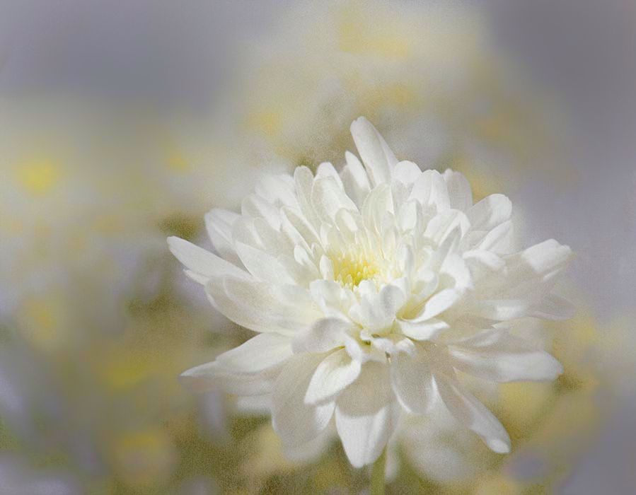
Thank you, Laki. I worked hard to get a good stack this time. |
Jun 23rd |
| 6 |
Jun 17 |
Reply |
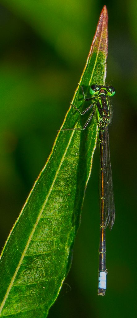
Alas, my determination to better my focus-stacking took more attention than the rest of my post-processing this time. Guess I'll just never measure up to the rest of you. d:¬{( |
Jun 23rd |
| 6 |
Jun 17 |
Reply |
I did cool it off slightly - guess I went a touch too far. d:¬{( |
Jun 16th |
3 comments - 5 replies for Group 6
|
| 11 |
Jun 17 |
Reply |
Thanks, Allen! d:¬{D |
Jun 24th |
| 11 |
Jun 17 |
Reply |
Actually, simple room lighting. I turned the flower so that the light hit it from 2 sides. |
Jun 13th |
| 11 |
Jun 17 |
Reply |
I did. Of all the options I have for processing HDR, I prefer to blend them in Lightroom. I'm starting to transition to OnOne Photo Raw from Lightroom, but am finding it hard to give up the built-in HDR merge of Lightroom. |
Jun 12th |
| 11 |
Jun 17 |
Comment |
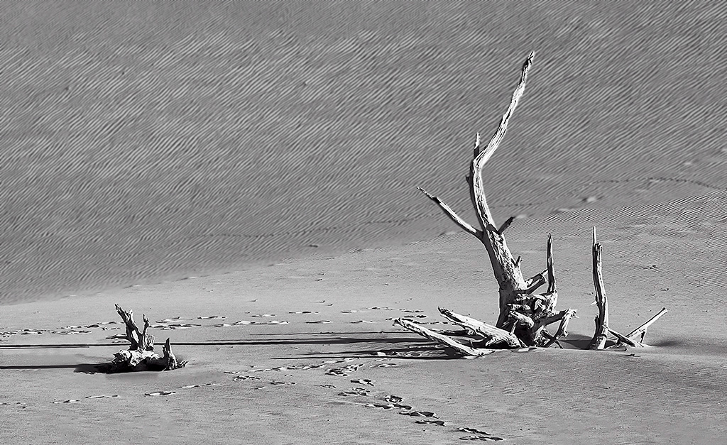
I normally don't like bright skies in monochrome, but this is definitely an exception! Love the curves and leading lines that take the eye on a pleasant journey through the image. Can't think of a suggestion that would improve upon what you've already done! Magnifique! |
Jun 11th |
| 11 |
Jun 17 |
Comment |
Perfect choices in your post-processing, in my opinion. You have the right amount of sharpening and your tones came out very rich in the monochrome. Bravo, Jim! d:¬{D |
Jun 11th |
| 11 |
Jun 17 |
Comment |
The monochrome version pops the driftwood, your subject, very nicely, while the color version it tends to blend into the background more. My issue is the striations in the upper half of the background - they are slightly over-sharpened, which is actually is hard on my eyes. I would suggest to either mask out the sharpening in that area, or apply a very tiny amount of Gaussian blur to it to soften those striations. Here's my attempt at the latter: |
Jun 11th |
 |
| 11 |
Jun 17 |
Comment |
This is a much more effective image in monochrome, Eligio. The hanging really pops out of the background. Only minor issue for me is the background is a little too sharp. |
Jun 11th |
| 11 |
Jun 17 |
Comment |
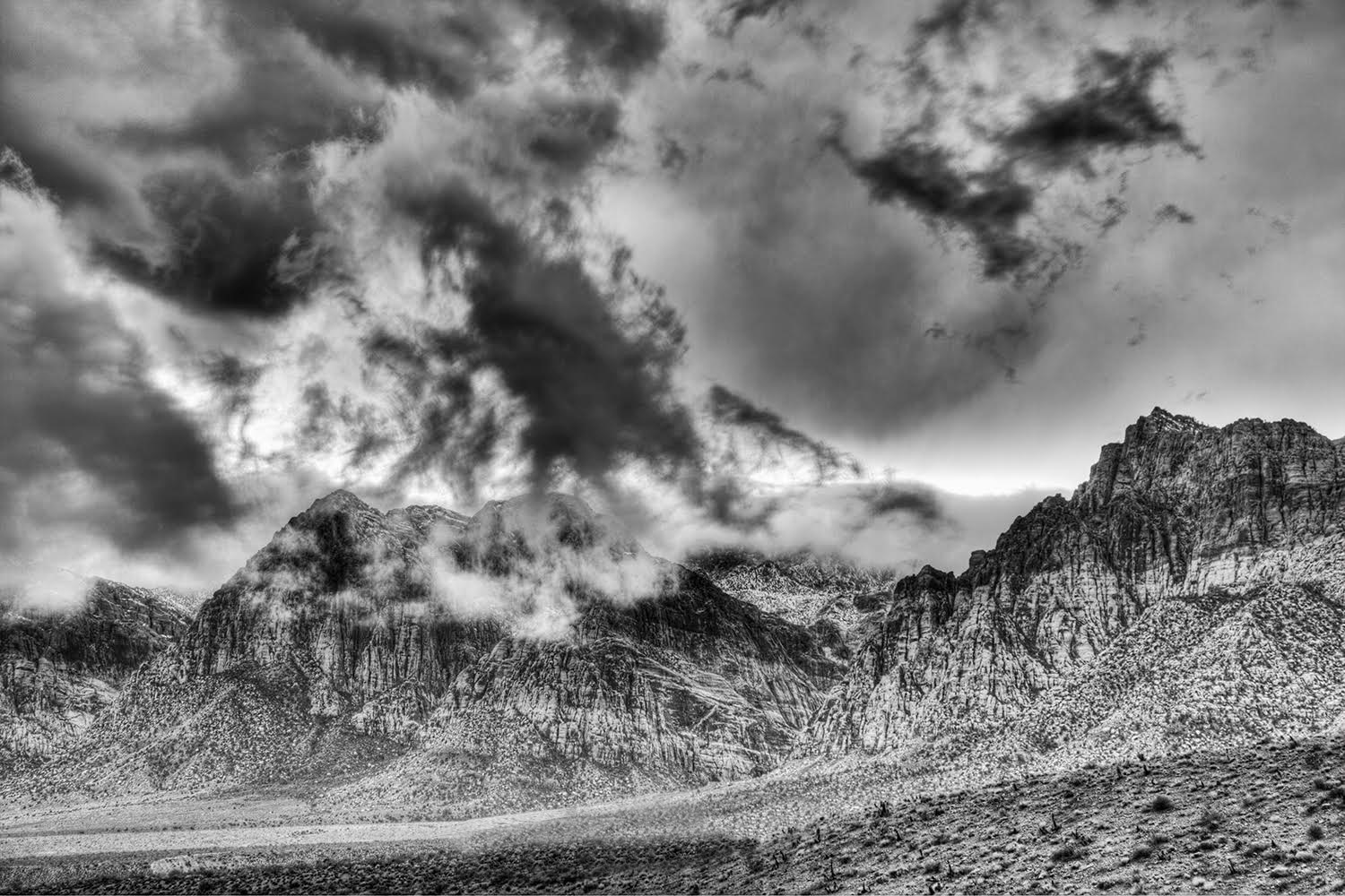
This came out very nice in monochrome, as the original looks a bit washed out. The road that begins on the bottom left looks like it will be a good leading line, but it veers behind the foreground hill, pulling the eye there and away from the main event. A slight modification of the road to merge it into what looks like another road heading into a pass might help. Here's a rough illustration of what I'm suggesting: |
Jun 11th |
 |
| 11 |
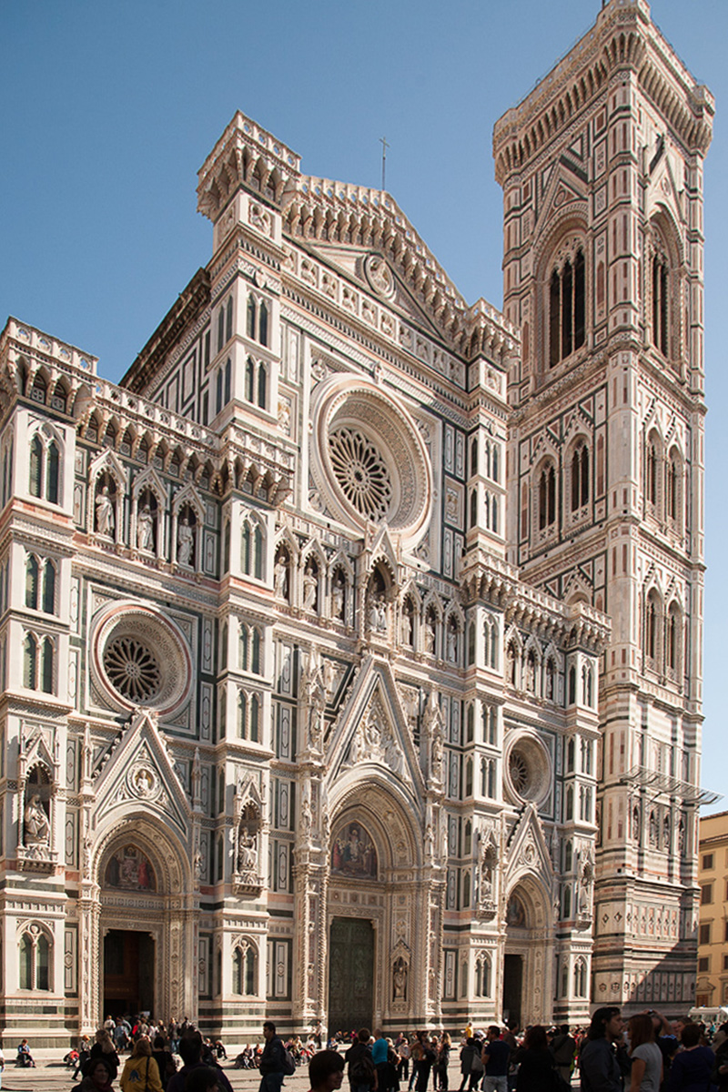
Jun 17 |
Comment |
The perspective on this shot is just not working for me, so I took the original into DxO Viewpoint and played around for a while. Didn't come up with a good adjustment that kept enough of the building in view, so I went to plan B. In Photoshop, I used Free Transform to adjust the perspective, holding down the Ctrl key (Cmnd on a Mac) while pushing and pulling the corners to "warp" the building into a better perspective to my eye. This actually worked better than I expected. I'll let you decide. |
Jun 11th |
 |
| 11 |
Jun 17 |
Reply |
Duh! Who do you think is taking the first photos of them? You have 3 guesses and 2 don't count! d;¬{D |
Jun 4th |
6 comments - 4 replies for Group 11
|
| 24 |
Jun 17 |
Comment |
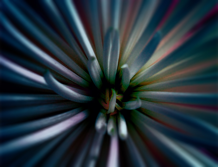
Truly, this reminds me of a phonograph record. I find the lightning bolts distracting and their placement more planar rather than spherical like the skyline. Definitely too much blue which overloads the eye and takes away from the actual subject and the skyline needs to be sharpened some. |
Jun 23rd |
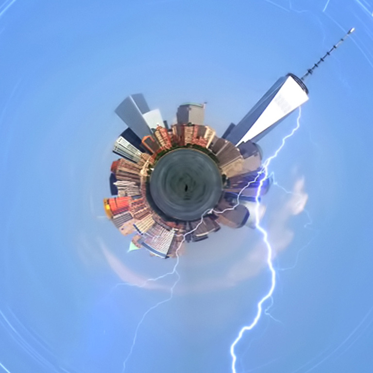 |
| 24 |
Jun 17 |
Comment |
Wonderful! The fact that you saw something like this in your mind when you came upon the manhole cover speaks to your innate creative eye. I envy you that. You've truly created a piece of art from the utterly mundane. Bravo! d:¬{D |
Jun 23rd |
| 24 |
Jun 17 |
Reply |
E.T. is busy phoning home. d;¬{D |
Jun 12th |
| 24 |
Jun 17 |
Comment |
As others have already said, the round hair "frame" really makes this image outstanding. There is much for the eye to see and nothing to really distract or take away from the image. I get what Marie is saying, but feel it loses too much impact to isolate a portion like that. I've made many mandalas from other objects but haven't tried polar coordinate angle before. This will lead to much experimentation on my part in the near future. d;¬{D |
Jun 11th |
| 24 |
Jun 17 |
Reply |
Here's a redo with your suggestions: |
Jun 11th |
 |
| 24 |
Jun 17 |
Reply |
I'll play around with the perspective like you suggest.
I have never competed in a PSA contest and don't plan to any time soon. This is not for competition, but rather for my own pleasure. d;¬{D |
Jun 2nd |
3 comments - 3 replies for Group 24
|
| 53 |
Jun 17 |
Comment |
Your result appears like a painting on a stucco wall - very creative, indeed! My only suggestion is to mute or clone out the dark green patch in the lower right which is somewhat distracting from the overall composition. |
Jun 23rd |
 |
| 53 |
Jun 17 |
Reply |
Aaron Nace is a wonderful teacher. He knows his stuff and has an upbeat personality that keeps the process interesting. His outtakes at the end are fun, too! d;¬{D |
Jun 16th |
| 53 |
Jun 17 |
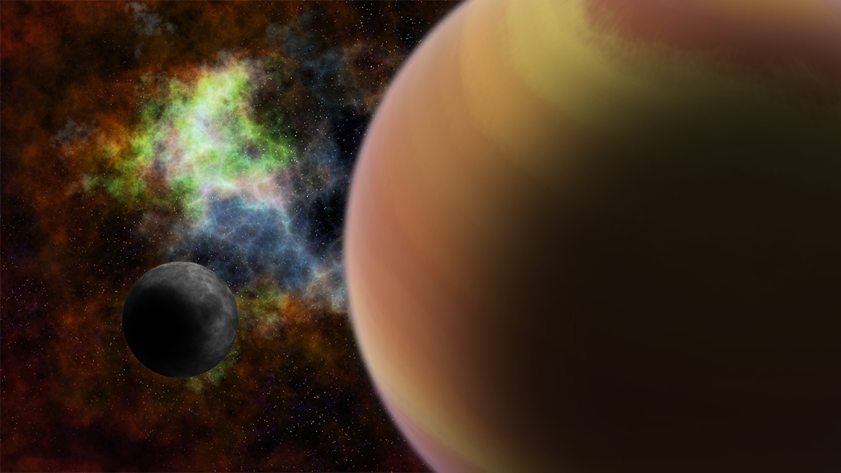
Reply |
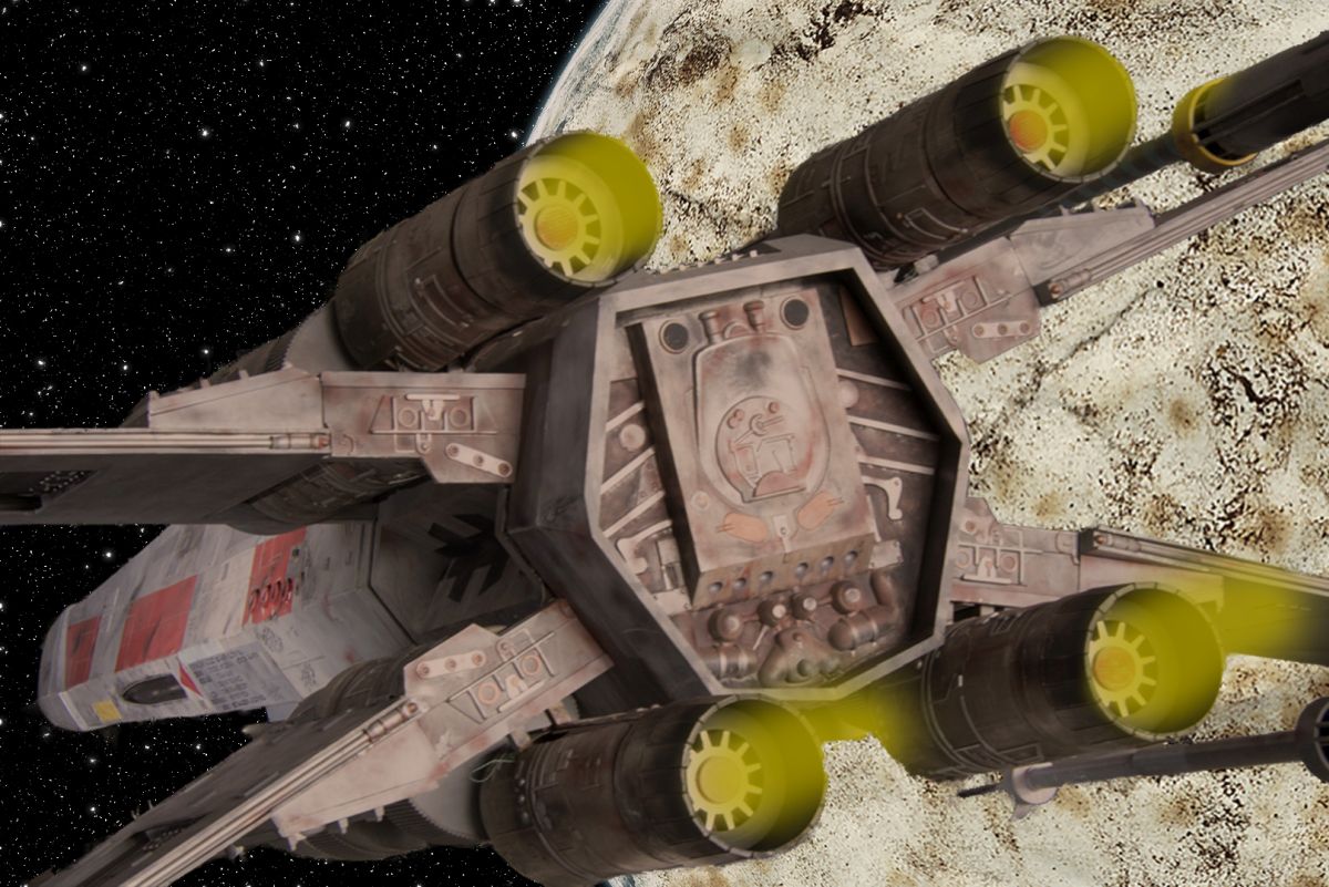
I actually use Topaz ReMask to remove the background, then put in whatever I think looks good. In this case, I actually created the star field and the planet digitally. |
Jun 12th |
| 53 |
Jun 17 |
Reply |
Now that you've posted the original, I couldn't help but use it this way: |
Jun 11th |
 |
| 53 |
Jun 17 |
Comment |
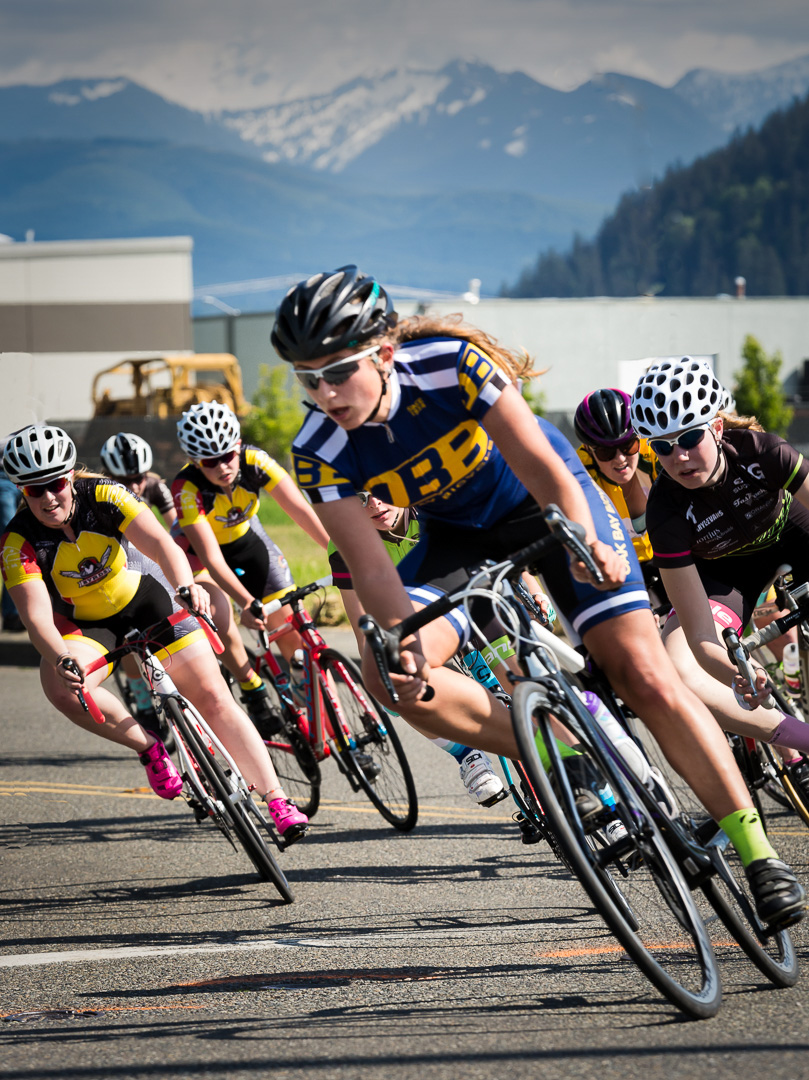
Excellent position for the shot. Great detail throughout and it was nice to capture the mountains in the distance, though I feel they were too bright and pulled a bit too much focus from the action of the riders. Here's a version with a levels adjustment on the mountains to help them stay visible but in the background: |
Jun 11th |
 |
| 53 |
Jun 17 |
Comment |
Excellent. Can't think of anything to suggest to improve this. I'm sure the original surroundings didn't work real well to sell this, but your treatment turns those surroundings into something plausible with the x-wing starfighter. Bravo! |
Jun 11th |
| 53 |
Jun 17 |
Comment |
Here's my play on the suggestions: |
Jun 11th |
 |
| 53 |
Jun 17 |
Comment |
Here's the other: |
Jun 11th |
 |
| 53 |
Jun 17 |
Comment |
I played around and created 2 separate images. Here's the first: |
Jun 11th |
 |
| 53 |
Jun 17 |
Comment |
Here's a re-process, dealing with the blown out highlights: |
Jun 11th |
 |
7 comments - 3 replies for Group 53
|
| 62 |
Jun 17 |
Reply |
d;¬{D |
Jun 23rd |
| 62 |
Jun 17 |
Comment |
Fabulous! Definitely one for the wall of any professional office - simple, colorful, whimsical! I envy your skill! d:¬{D |
Jun 23rd |
| 62 |
Jun 17 |
Comment |
Wow! I can't do that good with my dominant hand, let alone the other! I see where Angela is having difficulty distinguishing the medium, but you were successful overall with the impressionist presentation. Here's hoping you have been healing successfully! d:¬{D |
Jun 23rd |
| 62 |
Jun 17 |
Reply |
I see what you mean, and am, basically, a photographer trying to be something more. It's hard breaking free from the habits built up over years. d;¬{D |
Jun 23rd |
| 62 |
Jun 17 |
Reply |
Thanks, Gerhard! d:¬{D |
Jun 23rd |
| 62 |
Jun 17 |
Reply |
I like the word, exciting! I did think this had a lot more energy done in chalk. d;¬{D |
Jun 23rd |
| 62 |
Jun 17 |
Reply |
I didn't notice the flag until you mentioned it, now I can't take that away from my mind! d8¬{O |
Jun 23rd |
| 62 |
Jun 17 |
Comment |
Mmmmmm, scrumptious! It reads to me as a cross between watercolor and oil - the shape of the strokes say watercolor, while the vibrant colors say oil. Me likey!!!
My one nit pic from a composition standpoint is that it's crowded against the left side with a large gap on the right. That only crossed my mind after studying it for a while. d;¬{D |
Jun 23rd |
3 comments - 5 replies for Group 62
|
22 comments - 20 replies Total
|


