|
| Group |
Round |
C/R |
Comment |
Date |
Image |
| 6 |
May 17 |
Comment |
This is the quintessential Dick States flower image, ready for publication in a horticulture text. If you had to estimate, Dick, how many flower pictures have you taken in your career? |
May 13th |
| 6 |
May 17 |
Comment |
Very pretty. I've never seen anything like it - course I forget things now. d;¬{D
The circular nature of this fits well in a square format. My only issue is the left, bottom, and top blossoms are cut off, which messes with the symmetry. |
May 13th |
| 6 |
May 17 |
Comment |
WOW! There's a lot going on here! It almost defies finding something to focus on, but the purple flowers at the top 3rd intersection does eventually demand the most attention. How many images in this stack?
While there's a few small areas of fuzziness, the most distraction for me comes from the background at the top which is in between in focus and effectively blurred. |
May 13th |
3 comments - 0 replies for Group 6
|
| 11 |
May 17 |
Reply |
Yeah . . . I ran into that when playing with the dehaze slider. Sometimes the tools just don't meet the task at hand completely. <...sigh...> |
May 29th |
| 11 |
May 17 |
Reply |
Hmmm . . . I'll have to look at that. I'm sure it can be within the section that creates the displacement map. Hmmm . . . |
May 29th |
| 11 |
May 17 |
Reply |
Guess I did well according to Y'all. I thought sure there's be a ton of changes suggested. d;¬{D |
May 28th |
| 11 |
May 17 |
Reply |
And thank you, Maria! d:¬{D |
May 22nd |
| 11 |
May 17 |
Reply |
Thank you so much, Arfan! d:¬{D |
May 16th |
| 11 |
May 17 |
Reply |
If there was more space between the wall and the image edge, your angle would make more sense for me. Viva la differance! |
May 14th |
| 11 |
May 17 |
Comment |
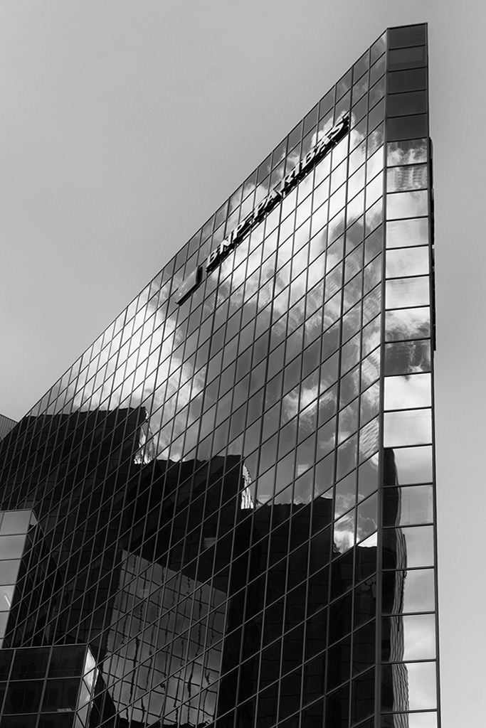
I agree wholeheartedly with Allen - great monochrome subject without a doubt. My only nit pic (and it's really a minor one) is the angle of the right edge of the building - bring a bit of negative tension. Straightening it alleviates that for me. |
May 13th |
 |
| 11 |
May 17 |
Comment |
Love this, especially the color version. There is a softness about it that makes it look like something I want to feel. Unfortunately, that softness doesn't work as well in monochrome, coming across like there's a haze over the image. I would suggest applying some dehaze to it after your conversion to solidify it a tiny bit. |
May 13th |
 |
| 11 |
May 17 |
Comment |
I really like this! I especially like the look of the sand, which is accentuated by the conversion to monochrome. Very interesting location with much for the eye to study once I let it travel beyond the sand. d;¬{D Well done! |
May 13th |
| 11 |
May 17 |
Comment |
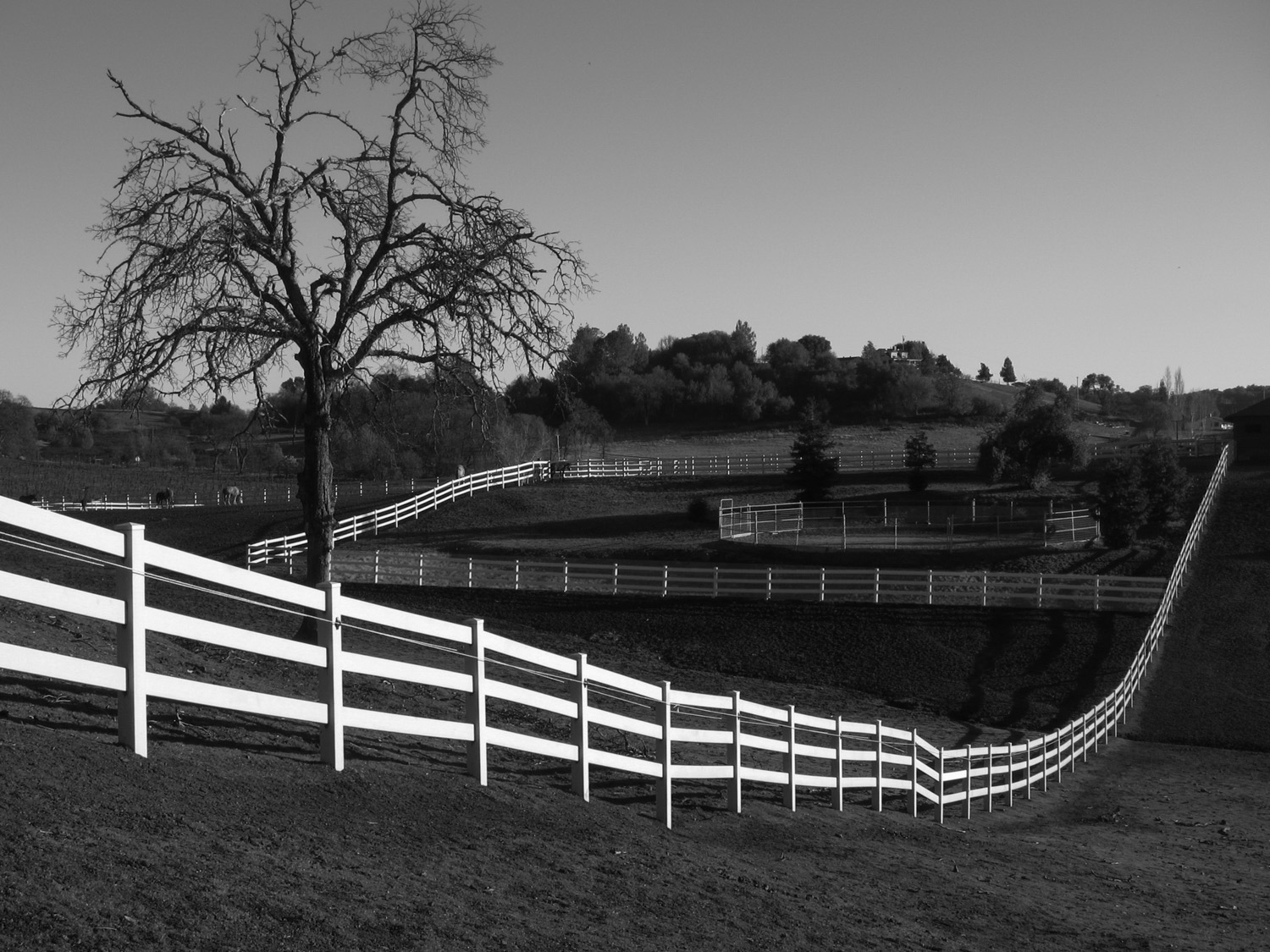
Interesting play of highlights and shadows, with lots of leading lines for the eye to travel. I think the "horizontal" fence along the center line should be a little brighter. |
May 13th |
 |
| 11 |
May 17 |
Reply |
Thank you! d:¬{D |
May 11th |
4 comments - 7 replies for Group 11
|
| 18 |
May 17 |
Reply |
Of course, but that level of security is really not needed in DD. We're not collecting or sharing personal information here so a simple username and password pair will suffice for someone to legitimize their ability to post comments. Everything else is handled by the admins, my assistant and I. |
May 16th |
| 18 |
May 17 |
Reply |
Well, in this case, it's parts of words being stripped to protect websites. Hackers will make a call to that word, followed by other code, to take control of a website for their own purposes. It's used often to perform server to server communications, such as PayPal sending transaction information to a business after their customer makes a payment, but hackers can inject code into forms to hijack the server. |
May 15th |
| 18 |
May 17 |
Reply |
And, yes, I got it posted but only because I added the comment through my webmaster interface. d;¬{D |
May 15th |
| 18 |
May 17 |
Comment |
For those that wondered, the curlicue debacle was not caused by autocorrect, but rather by a system block. 'Curl' is used with other code by hackers to do bad things to websites, so it is stripped from comments before they actually post. |
May 15th |
1 comment - 3 replies for Group 18
|
| 24 |
May 17 |
Comment |
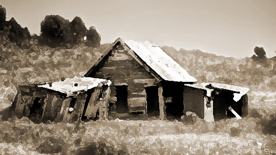
I think monochrome is very appropriate for this image, but suggest finding something different to enhance it rather than the oil paint filter. Jerry is right about the sepia tones working better for this type of scene. Here's my take on it, working from the original. |
May 13th |
 |
| 24 |
May 17 |
Comment |
Hmmm. This isn't working for me. Your original images does a great job of illustrating the aftermath of the eruption, as well as the restoration work Nature has been doing since then. By isolating this one section to work on, the second story is gone and my eye has difficulty finding a path to follow in the random lines of the fallen trees. I would love to see your treatments applied to the whole image as a comparison. |
May 13th |
| 24 |
May 17 |
Reply |
While I'll agree with you, Ian, that the blotchy sky works here, I find the bluer blotch just to the left of top center is distracting and would have liked the gold coloring consistent through the trees as well.
Overall, this brought an okay shot to an artistic level that makes it nearly ready for the wall, in my opinion. |
May 13th |
| 24 |
May 17 |
Reply |
My pleasure to share. I figure that's what we're here for. d;¬{D |
May 13th |
| 24 |
May 17 |
Reply |
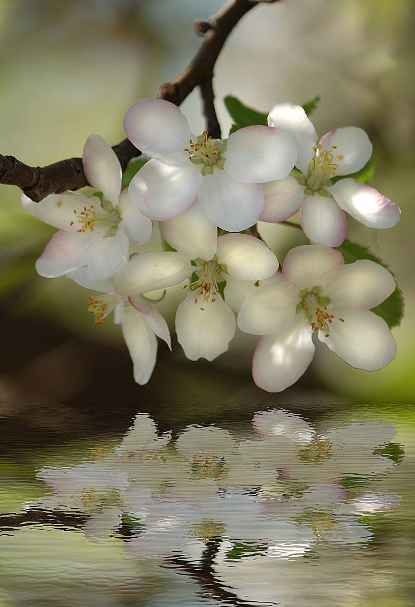
How's This? |
May 13th |
 |
| 24 |
May 17 |
Reply |
I actually like the flood filter and have used it when my action didn't suit the image, but it sometimes seems a bit heavy-handed. |
May 5th |
| 24 |
May 17 |
Reply |
Blue Lightning: https://www.youtube.com/watch?v=pZO0dFfCoiQ
PhotoshopCafe: http://photoshopcafe.com/tutorials/photoshop-reflection-water-ripples-tutorial
PSDesire: https://www.youtube.com/watch?v=0MvjWH8opK0 |
May 5th |
| 24 |
May 17 |
Reply |
It's a blending of 3, actually. If you'd like, I can post their addresses. |
May 3rd |
2 comments - 6 replies for Group 24
|
| 53 |
May 17 |
Reply |
I did that to balance the blue on the left. It leveled off the composition for me. I thought to change the eye color to add a bit of depth there, since eyes seek eyes in portraits. |
May 13th |
| 53 |
May 17 |
Comment |
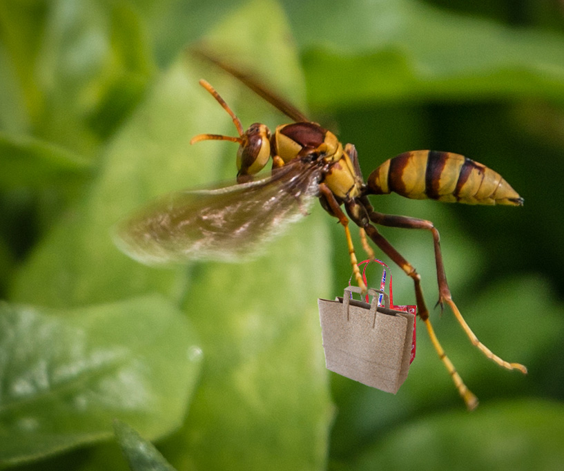
Far be it from me to walk away from a challenge: |
May 13th |
 |
| 53 |
May 17 |
Comment |
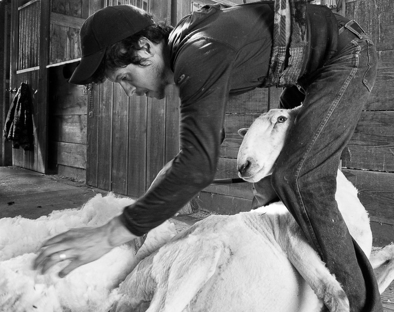
This tells a good story and I think your conversion to monochrome was a good decision. I found a lot of distractions, which is par for the course in a barn. I removed several of them and cropped from the bottom a little higher than Dan just described to focus the attention on the 2 "models" of this piece. The only thing I couldn't find was the shears - hmmm. |
May 13th |
 |
| 53 |
May 17 |
Comment |
I decided to try and move the blue spot to a more balanced position of the composition. I also gave the eyes a yellow tint to make this a bit less evil, which you managed to do quite well with your treatment. d;¬{D |
May 12th |
 |
| 53 |
May 17 |
Comment |
Love this image, Natalie. While it's a bit dark, there's nothing wrong with that, and I really like the panorama crop. I'm not too keen on the border you've chosen, though. I tried my hand at cropping it out and adding just a touch more brightness which the texture pulled out of the original. This would definitely make for a great wall hanging! d:¬{D |
May 12th |
 |
| 53 |
May 17 |
Comment |
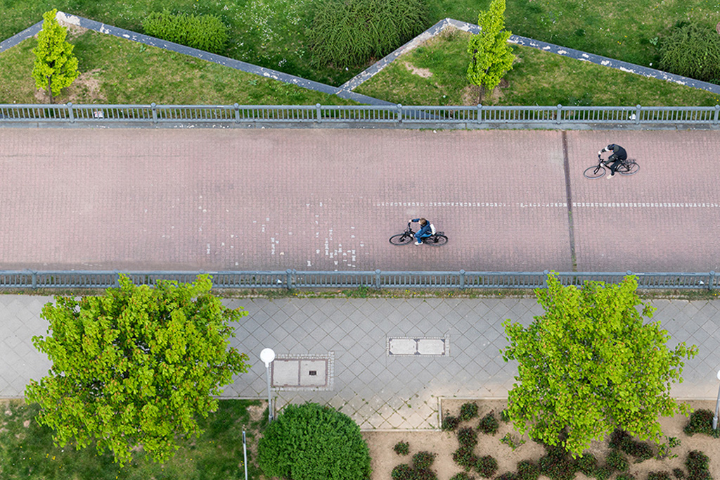
Here's my take on the composition: moving the left hand cyclist, adding more rail, cropping slightly, and adjusting the overall perspective. |
May 12th |
 |
| 53 |
May 17 |
Comment |
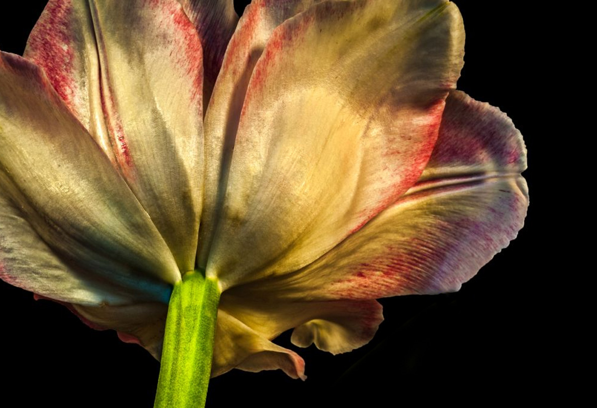
I listened and I edited. Removed the leaf and the hotspot, then cropped a bit to reposition. I guess I really liked the edges on the right side and the overall shape of the base of the flower. d;¬{D |
May 12th |
 |
| 53 |
May 17 |
Reply |
Looks fine, Rusty! You weren't offending my artistic soul - merely expressing yours! d;¬{D |
May 12th |
| 53 |
May 17 |
Reply |
I like it! |
May 10th |
| 53 |
May 17 |
Reply |
Please show me what you mean. d:¬{D |
May 9th |
6 comments - 4 replies for Group 53
|
| 62 |
May 17 |
Reply |
Thank you so much! d:¬{D |
May 19th |
| 62 |
May 17 |
Reply |
Thanks for you help. |
May 19th |
| 62 |
May 17 |
Comment |
I'm with Angela on this one. The original photo is bland, mundane, lifeless, but your creation gives it life and vitality. Bravo!!! Please be sure and hang this on a wall somewhere prominent! d:¬{D |
May 13th |
| 62 |
May 17 |
Comment |
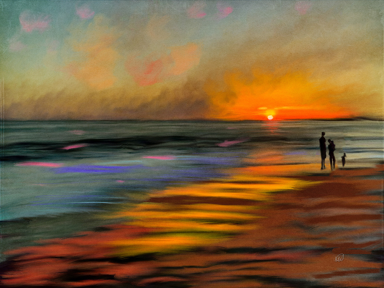
Gorgeous! Obviously, you have the knack to paint from memory - way beyond my skillset or talent level.
Regarding the trio, the only thought I have is to reverse their order so that the line of their heights would direct the eye towards to sun rather than away from it. For me, they really serve as a grounding element that helps the surreal colors and strokes hold a recognizable form, i.e. a sunset at the beach. |
May 13th |
 |
| 62 |
May 17 |
Reply |
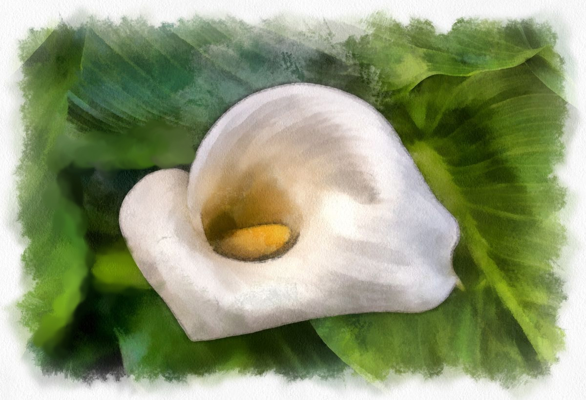
How's this? |
May 13th |
 |
2 comments - 3 replies for Group 62
|
18 comments - 23 replies Total
|