|
| Group |
Round |
C/R |
Comment |
Date |
Image |
| 6 |
Apr 17 |
Reply |
Lovely image by itself, indeed.
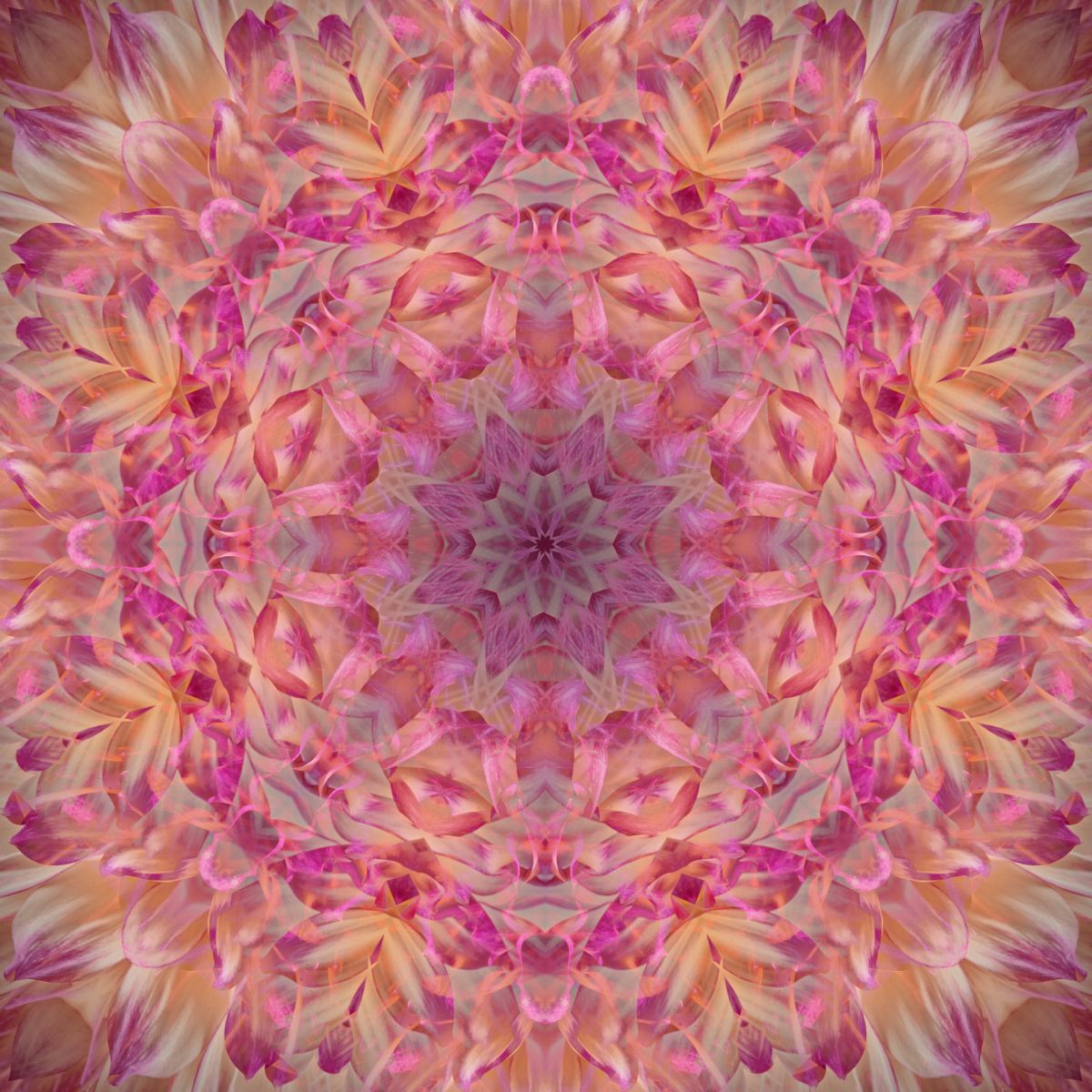
Sounds like you have a thing for the orb effect like I do for the kaleidoscope or Mandala effect. Here's my version of your flower: |
Apr 12th |
 |
| 6 |
Apr 17 |
Reply |
Janet - a little larger, though I don't recall how large the beetle was.
The spider was, indeed alive and in a plastic container shot from above. He would stop moving for a moment and I would take a few shots and then wait for him to quiet down again. I was fortunate to have an angle that went well with the beetle image. d;¬{D |
Apr 11th |
| 6 |
Apr 17 |
Comment |
WOW, Dick! I love that you did something so unexpected here! Cool use of the orb effect - I would never have thought to use it on this sort of subject. Out of curiosity, I'd love to see the original image of the flower to see where it started from. d:¬{D |
Apr 11th |
| 6 |
Apr 17 |
Comment |
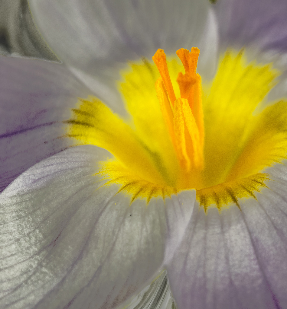
Good job, Janet. There is a lot of eye candy here, with plenty of detail to keep the eye busy. You may have over-sharpened a bit as some areas are kinda crispy, but that could also be the nature of this subject's texture. It's almost as if you added a texture layer on top. |
Apr 11th |
| 6 |
Apr 17 |
Comment |
From a botanical standpoint, you can't disagree with Dick, of course. For me, this image isn't about botany, though, and I find the textures and colors very pleasing. However, much as I love this image from an artistic point of view, I don't see this as fitting for a macro study group. |
Apr 11th |
| 6 |
Apr 17 |
Comment |
I think this subject called for a smaller aperture or stacking due to the very shallow DOF. The textures are lovely and the yellow stamen(?) remind me of a hand reaching up. I thought cropping would help hide the bowl showing through at the bottom and top left, which I found distracting, but the curves of the petals are also hidden. I slightly desaturated and increased the luminance of those sections and they became less distracting. |
Apr 11th |
 |
| 6 |
Apr 17 |
Comment |
Thanks Toni and Dick. Dick's burning certainly helped.
The image did fairly well in club Thursday night, scoring a 24 out of 27 points. They don't study the images very long so didn't note what you guys did. d;¬{D |
Apr 9th |
5 comments - 2 replies for Group 6
|
| 11 |
Apr 17 |
Reply |
I just wanted the eyes on a third line rather than in the center. I could have gone with a wider crop perhaps and may pursue that with your suggestion. d;¬{D |
Apr 29th |
| 11 |
Apr 17 |
Reply |
I understand! d;¬{D |
Apr 23rd |
| 11 |
Apr 17 |
Comment |
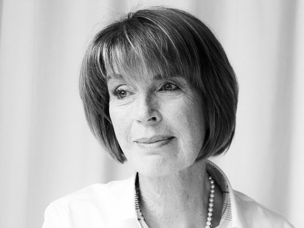
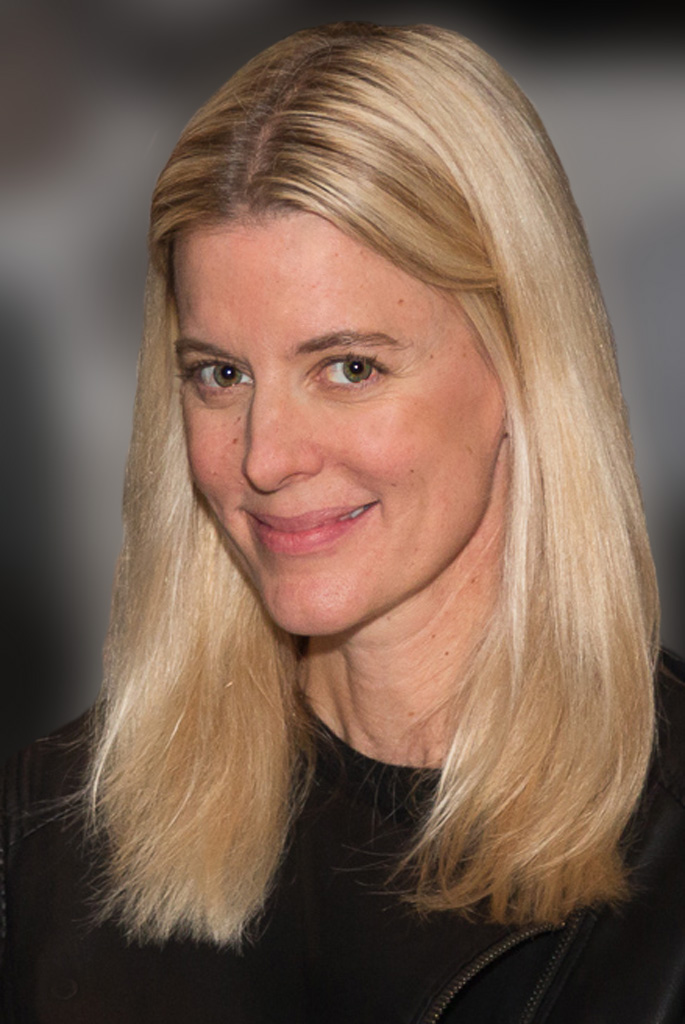
I fully understand a woman's fear of her wrinkles, but each wrinkle is a story etched into the palette of her face. You don't necessarily want to emphasize them, but you don't want to smooth things out too much either. This is where your lighting is crucial so that the wrinkles have less emphasis.
I think you succeeded for the most part in finding that sweet spot, with the exception of the wrinkles around her left (our right) eye, because they are shadowed by her hair. The best post-processing approach is to use the Dodge tool, on Shadows, and with an opacity of 5%, and gently brush over the darker wrinkles to help them recede slightly. Here's my attempt at that: |
Apr 11th |
 |
| 11 |
Apr 17 |
Comment |
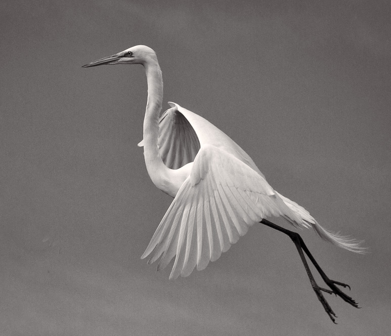
Between the 2, I much prefer the color, as there's much more detail throughout, including the legs. The monochrome version you arrived at darkened the legs too much, losing to much detail.
I also found the branches on the left distracting. In my redo, starting from the color version, I cloned out the branches, cropped to get the bird's eye on the left 3rd line, and then used a brighter monochrome conversion to retain detail. What do you think? |
Apr 11th |
 |
| 11 |
Apr 17 |
Comment |
Lovely angle for this landscape image, obviously shot as a monochrome. You managed to have a sharp foreground subject to set the perspective, and great sky and background. The midpoint of the image, the waves, are a little blurry due to a slower shutter speed than would freeze them completely, but I feel that's inconsequential here.
My only beef is a lack of shadow detail in the buildings and foliage behind them, probably a characteristic of that film.
Out of curiosity, what was the date of the original? |
Apr 11th |
| 11 |
Apr 17 |
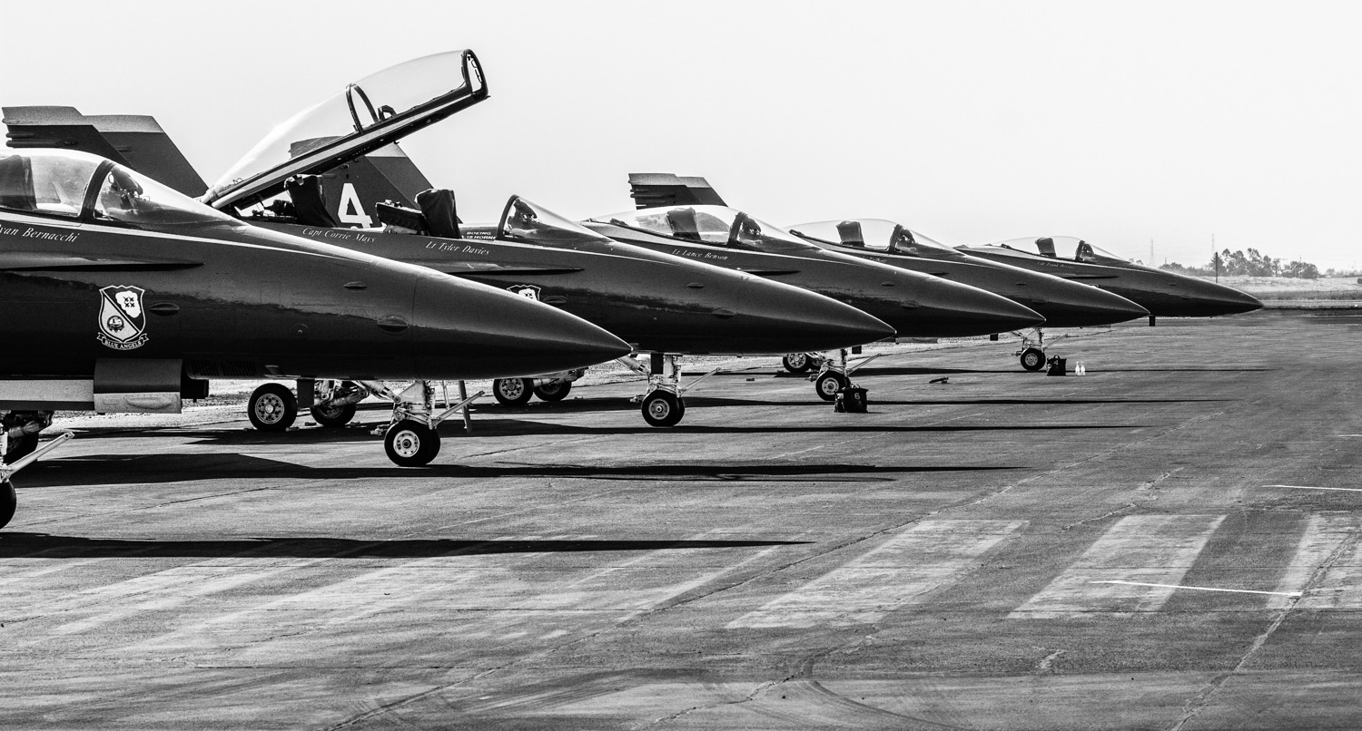
Comment |
Love the angle and the repeating shapes. This does work well as a monochrome, for sure. My only beef is the conversion over-darkened the pilots and they end up disrupting the flow of curves of the parked jets. I did a quick cloning of them out - what do you think? |
Apr 11th |
 |
| 11 |
Apr 17 |
Reply |
LOL! d:¬{D |
Apr 4th |
4 comments - 3 replies for Group 11
|
| 24 |
Apr 17 |
Comment |
I think your frame might work if there was some space around it with a hint of drop-shadow to help sell the 3D aspect. Then, the falling petal would make more visual sense without seeing the title.
As far as the painted image part, I would suggest removing the 3 dark green leaves on the bottom and the dark shadow below the rose just below center of the image. |
Apr 11th |
| 24 |
Apr 17 |
Reply |
Too many pictures? What a silly question, Jerry! d;¬{D |
Apr 11th |
| 24 |
Apr 17 |
Comment |
I like this a lot! Provides a lot to see as the eye travels about. Certainly bears absolutely NO resemblance to the original, as Marie stated.
I don't know about a silhouette with this as a background, unless the black was lightened a bit. Might work as a portrait background, though. d:¬{D |
Apr 11th |
| 24 |
Apr 17 |
Reply |
I would certainly be encouraged with those results! d:¬{D |
Apr 11th |
| 24 |
Apr 17 |
Comment |
I think this treatment works really well for this image, giving it a woodblock look. My only issues are in a couple of areas of the sky where the filter has added some subtle shading that caused my eye to focus there to determine what was going on. Here's my redo where I painted out that shading: |
Apr 11th |
 |
| 24 |
Apr 17 |
Comment |
Here's my redo based upon your suggestions: |
Apr 9th |
 |
| 24 |
Apr 17 |
Reply |
I'll have to give those a try. Thanks! d:¬{D |
Apr 4th |
4 comments - 3 replies for Group 24
|
| 53 |
Apr 17 |
Comment |
Rusty's crop has helped to finish your image well. Capturing 2 bees working a flower is quite rare, indeed, and such an interesting flower to boot! Great job. |
Apr 9th |
| 53 |
Apr 17 |
Reply |
Here in the midwest, we're enjoying mid-70's. d:¬{D
We're glad you joined the "team" - where's our cheerleading squad, though? d;¬{D |
Apr 9th |
| 53 |
Apr 17 |
Comment |
Here's my take: I cropped to portrait mode, slightly desaturated and blurred the background, burned the hotspots on her face, punched her eyes and cloned out the snap on her jacket. What do you think? |
Apr 9th |
 |
| 53 |
Apr 17 |
Comment |
Magical, simply magical. Can't think of a thing I could suggest to improve upon this. Thanks for a nice story! |
Apr 9th |
| 53 |
Apr 17 |
Comment |
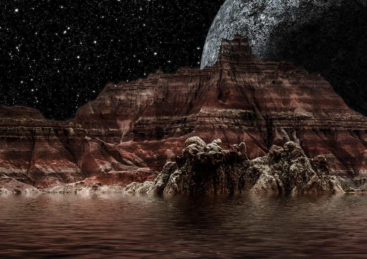
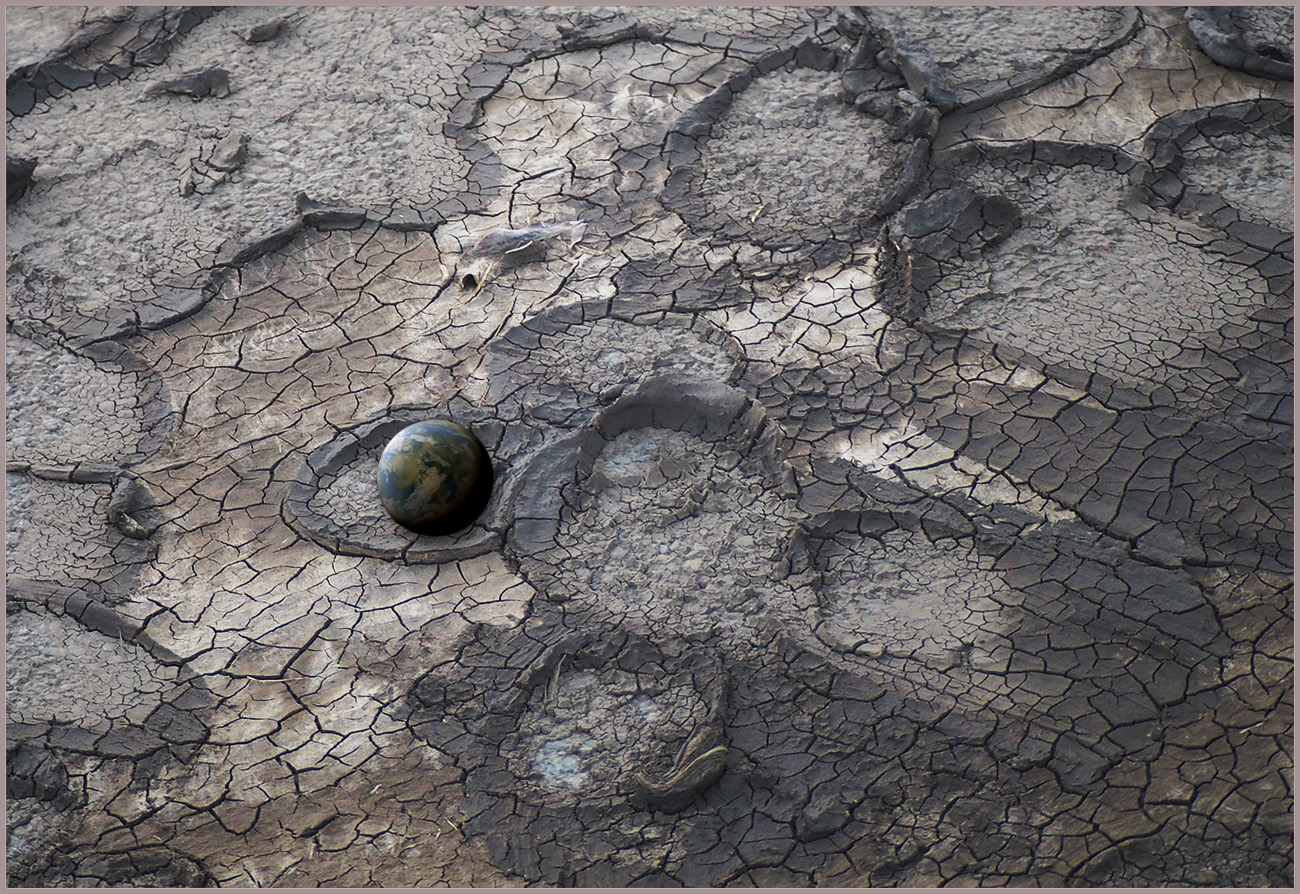
Despite my adding the globe above, I think your image is wonderful just as it is. Can't think of anything needed to make it better. |
Apr 9th |
| 53 |
Apr 17 |
Reply |
Like this, Dan? |
Apr 9th |
 |
| 53 |
Apr 17 |
Comment |
Here's my take: Cropped from the top to remove the sky, which I found pulled focus from your subject. Dodged the standing and fallen cactus, and burned the rest. Finally, punched up the magenta and blue saturation to help the flowers pop a bit more. |
Apr 9th |
 |
| 53 |
Apr 17 |
Comment |
Here's a version without the bird and a bit of warming and contrast in the sky: |
Apr 9th |
 |
| 53 |
Apr 17 |
Comment |
Here's a redo based upon your suggestions: |
Apr 9th |
 |
| 53 |
Apr 17 |
Reply |
I did shoot in RAW - actually, looking back at the original, it was an HDR bracket of 3 exposures. |
Apr 9th |
| 53 |
Apr 17 |
Reply |
Believe it or not, that IS the actual color, although I agree it doesn't look right. Hmmm. |
Apr 3rd |
7 comments - 4 replies for Group 53
|
| 62 |
Apr 17 |
Comment |
Excellent, Gloria! Great technique and you have created a great piece of wall art! I have nothing to suggest. d:¬{D |
Apr 11th |
| 62 |
Apr 17 |
Comment |
WOW, Elinor, I wouldn't have guessed this was your first time with the program. Good job.
While I agree about more detail in the petals, I don't find that as crucial as completing the painting process with the girl and boy parts of the flower, which jump out too much as foreign to the overall painted look. I have no experience with the program so cannot suggest how to about doing that. |
Apr 11th |
| 62 |
Apr 17 |
Reply |
Your version definitely emphasizes the resemblance to a flower. I like that and think it adds the finishing touch my image needed. Thanks! d:¬{D |
Apr 11th |
| 62 |
Apr 17 |
Reply |
I very much agree. My local camera club is not real big on Altered Reality images, though it's a category that is judged every month, but flies in the face of traditional photography. At least we have a platform here to discuss these things freely. d;¬{D |
Apr 11th |
| 62 |
Apr 17 |
Reply |
Thanks, Angela!
The mandala, or kaleidoscope, shown in my Original 2 image is made by increasing the canvas by 200%, copy the original and flipping it horizontal next to the original, merging those, making a copy, flipping it vertically below the original, merging them, then rotating the result 3 times to 45 degrees from the lower layer and changing the blend mode to Lighten.
Almost any image will yield interesting results via this method, which mimics what would be seen through a kaleidoscope's view of a picture. I find them fascinating and can stare at them for extended periods of time.
I just did a presentation of this process to my local camera club on the 6th, which generated a lot of interest. |
Apr 11th |
| 62 |
Apr 17 |
Reply |
Thank you so much! d:¬{D |
Apr 2nd |
2 comments - 4 replies for Group 62
|
22 comments - 16 replies Total
|


