|
| Group |
Round |
C/R |
Comment |
Date |
Image |
| 5 |
Mar 17 |
Reply |
That would indicate that the time with the white background was an interrupted load of the page. |
Mar 23rd |
| 5 |
Mar 17 |
Reply |
Most will see the image against a black background when it's clicked on, David. What browser are you using? |
Mar 20th |
0 comments - 2 replies for Group 5
|
| 6 |
Mar 17 |
Reply |
Alas, other duties kept me away long enough that it seemed like everything to be said had been said. d:¬{( |
Mar 8th |
| 6 |
Mar 17 |
Reply |
Like this? |
Mar 8th |
 |
| 6 |
Mar 17 |
Comment |
Ahhhh. Someday, I hope to get stacking results like this! d;¬{D
As usual, Dick, you have a wonderful image and there's certainly nothing I could suggest to improve it! Bravo! d:¬{D |
Mar 8th |
| 6 |
Mar 17 |
Comment |
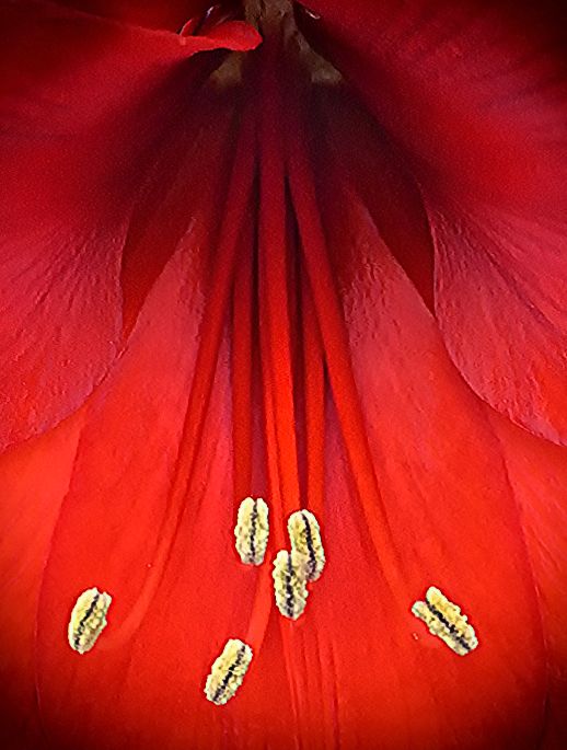
I've run into the same problem Dick talked about, too. Your composition is great and draws the eye nicely from front to back.
I added some clarity to specific areas to try and separate the filaments from the petals, as well as adjusting their color slightly to help them show up a little better. |
Mar 8th |
 |
| 6 |
Mar 17 |
Comment |
Hey, I'm not bored with your dahlias! Your images are gorgeous!
I love the detail in the foreground petals that extends throughout the image. My only wish would be for the center of the flower to be somehow pointing more towards me rather than away. Don't know if that makes any sense (even to me), but it's like I want to get the flower's attention when it's faced away like this. I think I'm losing it a bit. d;¬{D |
Mar 8th |
| 6 |
Mar 17 |
Comment |
I don't mind being an inspiration, as long as I don't get blamed if things don't go well. Fortunately in this case, it would appear they did. d;¬{D
I'm a little confused by your process. It sounds like you have altered the shape of the bead, not only in the background, but also in the foreground. I would never have thought to do something like that - very creative!
I like the colors you chose for the background, echoing the tones of the bead while helping the actual bead to pop for the eye. I think you really on to something! d:¬{D |
Mar 8th |
4 comments - 2 replies for Group 6
|
| 11 |
Mar 17 |
Reply |
Actually, my club has a revolving category that, in this case, was B&W. I'm sure it was more about the top of the flower being cut off that bugged the judges than the fact that it was a flower monochrome. |
Mar 26th |
| 11 |
Mar 17 |
Reply |
You did a great job of cloning the bottom onto the top to add on what I cut off with my shot - not a crop. Thanks for going the extra mile! d;¬{D |
Mar 23rd |
| 11 |
Mar 17 |
Reply |
Doing the same things to the original, especially with the gold eyes, will really help them pop more! |
Mar 13th |
 |
| 11 |
Mar 17 |
Comment |
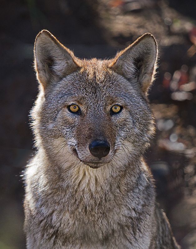
Wow! Nothing like a good wolf capture to make you stop and look. They were my goto animal while at Yellowstone several years ago. You definitely got a great "pose" out of it. d;¬{D
It's a pity you were all the way open so that there was such a shallow DOF. You might consider darkening the nose and adding clarity to the lower torso to bring back some detail, and boost the contrast and exposure slightly in the eyes to help them pop a bit more. |
Mar 13th |
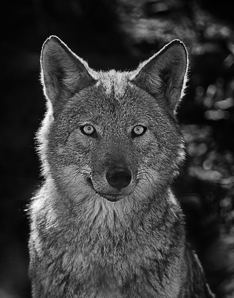 |
| 11 |
Mar 17 |
Comment |
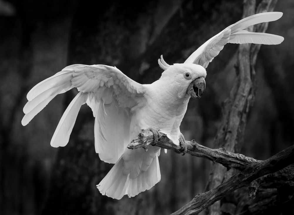
This works much better as a monochrome, for the eye can study the white easier than the yellow. This was a great moment to capture, with the wings extended as though the bird had just landed. Good detail under the wings and the feet. My suggestion is to reduce the exposure of the head and add a touch of clarity there to enhance the detail of the feathers for more uniformity. |
Mar 13th |
 |
| 11 |
Mar 17 |
Comment |
I simply like it - both versions. I must admit that I prefer the color a bit more as the gold tones tickle my eyes. This would make for a cool logo! |
Mar 13th |
| 11 |
Mar 17 |
Comment |
Jim expressed it so well, I cannot think of anything more to add. Lovely image! |
Mar 13th |
| 11 |
Mar 17 |
Comment |
This image takes some study to appreciate. Initial view lacks an instant WOW factor, but then the story unfolds as the eye wanders through the scene.
I think Jim has the right idea, though he pushed it a little too far in boosting the shadow detail of the trees. I tried to split the difference, though I don't know if I did better. |
Mar 13th |
| 11 |
Mar 17 |
Reply |
I think you are on the right track, Jim, but I feel you went a little too far in shadow detail. Though it still shows the banding, it now looks like trees in a different state rather than shadows from the clouds. I'm thinking somewhere halfway between Allen's version and yours would pop some detail but still sell the shadows. |
Mar 13th |
| 11 |
Mar 17 |
Reply |
I didn't crop the top - not so great job framing the shot I'm afraid. d:¬{( |
Mar 13th |
| 11 |
Mar 17 |
Reply |
Wow, thanks Jim! This actually scored rather low in judging, so I wondered if the top of the flower being cut off was a deal breaker. This wasn't a nature shot for various reasons, so I wasn't concerned about the darkening of the background. Guess this is one of those images that don't do well in quick study. d;¬{D |
Mar 12th |
5 comments - 6 replies for Group 11
|
| 24 |
Mar 17 |
Reply |
d;¬{D |
Mar 9th |
| 24 |
Mar 17 |
Comment |
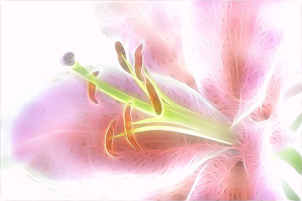
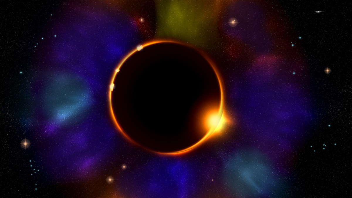
This looks like it's been processed by Topaz Glow. Very pleasing to eye - abstract while retaining the "flowerness" of the original.
I agree with Ian about the dark area. I have toned it down in the following version: |
Mar 9th |
 |
| 24 |
Mar 17 |
Reply |
Regarding the additional stars you're suggesting. I'm not getting that, as there is a rather dense star field already. Did you click on the image to see it in a larger size? |
Mar 9th |
| 24 |
Mar 17 |
Reply |
Like this? |
Mar 9th |
 |
| 24 |
Mar 17 |
Comment |
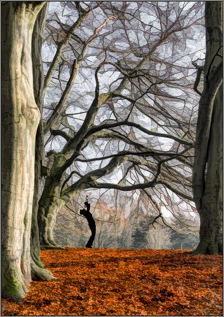
This very much has the feel of a book cover, Ian! Though you have "flattened" the image among the branches and background, the massive tree trunks still retain dimensionality, and the the red leaf ground cover creates a warmth to counteract the cold feel of the leaded glass branches. Really like this. Inspiring! |
Mar 9th |
| 24 |
Mar 17 |
Reply |
Like this, Jerry? |
Mar 9th |
 |
| 24 |
Mar 17 |
Comment |
Wow! I love this! It has a 3-dimensional feel to it. I can see this as a company logo, staring at you in their reception area. It does have the suggestion of an eye staring into the viewer as well. Haunting, actually! d;¬{D |
Mar 9th |
| 24 |
Mar 17 |
Reply |
Like this? |
Mar 9th |
 |
| 24 |
Mar 17 |
Reply |
Oooo! I'll give that a whirl! Never thought of that, but makes sense once you said it! d;¬{D |
Mar 9th |
| 24 |
Mar 17 |
Reply |
Hmmm. I will definitely play with that. Thanks, Jerry! d:¬{D |
Mar 3rd |
| 24 |
Mar 17 |
Reply |
That's one of the things that's great about DD - it's a place to explore the art. Actually, the vast majority of my space scenes involve at least one planet and those originate from texture images that have been run through Photoshop's Spherize filter. Actually, the fog brush I used in this image began life as a photograph of clouds, so, technically, there is photography involved. d;¬{D |
Mar 3rd |
3 comments - 8 replies for Group 24
|
| 53 |
Mar 17 |
Reply |
Nicely done and a good catch, Natalie! |
Mar 9th |
| 53 |
Mar 17 |
Reply |
Hmmm. I'll play around with that! Thanks! d:¬{D |
Mar 9th |
| 53 |
Mar 17 |
Reply |
Transparent? |
Mar 9th |
| 53 |
Mar 17 |
Reply |
Hmmm . . . I respectively disagree. To remove that section from the bottom would also remove that sweet purple color that is reflected from the sky, and also take away too much of the water. There are 3 sections here - water (bounded by the shoreline); hills & brighter sky; darker sky.
As far as the horizon line (shoreline), I see it actually on the lower third line - dead center is just above the silhouetted tree on the right. To cut off more of the bottom would move the shoreline further down, below the third line.
I find the composition very balanced and soothing. Guess we see the world differently, eh? d;¬{D |
Mar 9th |
| 53 |
Mar 17 |
Reply |
Like this? |
Mar 9th |
 |
| 53 |
Mar 17 |
Reply |
Thanks, Arabella! This only got a marginal response in judging, so I wondered what it was missing. Maybe I simply scared the judges! d;¬{D |
Mar 9th |
| 53 |
Mar 17 |
Comment |
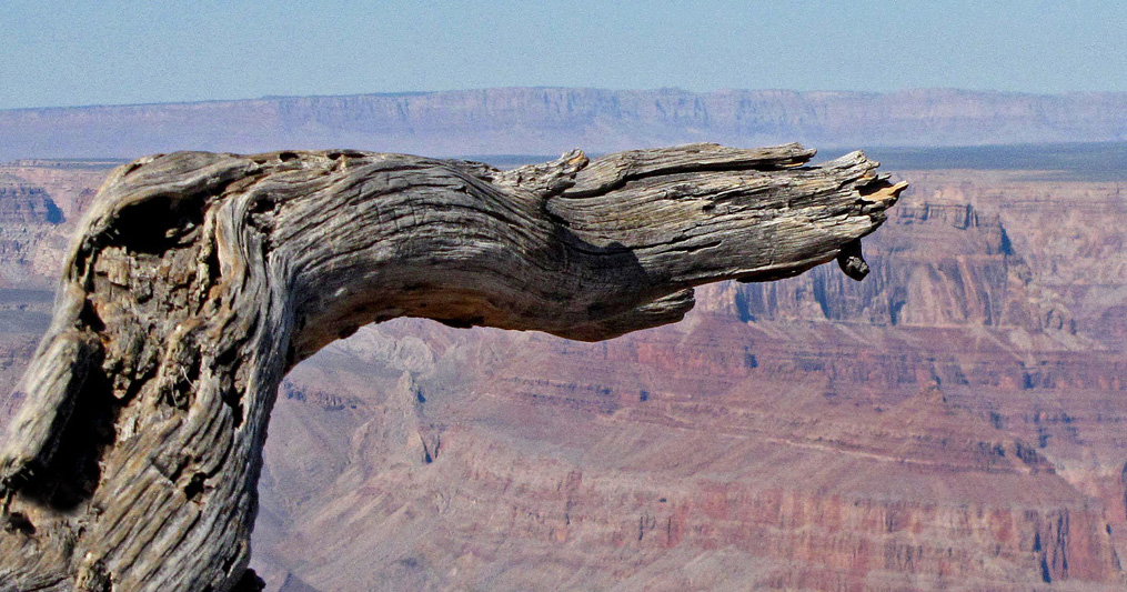
I think Dan is right about the crop - your tree was too centered and, thus, too much the focus. Cutting some of the sky out helps the canyon background to have a bit more relative real estate in the composition. I personally would wish to see more detail in the canyon - it's a magnificent sight in its own right to be merely a background for the tree. |
Mar 8th |
 |
| 53 |
Mar 17 |
Comment |
This is the bomb, Arabella! The building itself is a piece of art, but your treatment transformed it into something more interesting and visually stimulating! Bravo! No suggestions for improvements. |
Mar 8th |
| 53 |
Mar 17 |
Comment |
Excellent work on this portrait. My only issue is the monitor & globe (?) in the background that distract a bit. I also think a little narrower crop would finish it better: |
Mar 8th |
 |
| 53 |
Mar 17 |
Comment |
Exquisite! What an experience to see it live! I can't imagine. I've got nothing to suggest for improvements, that's for sure. |
Mar 8th |
| 53 |
Mar 17 |
Reply |
d:¬{D |
Mar 8th |
| 53 |
Mar 17 |
Comment |
I think Dan is on to something about the crop. I gave that a try and it did help the moth to have more presence and gave a bit of symmetry as well. I also boosted the moth's contrast and saturation a bit. |
Mar 8th |
 |
| 53 |
Mar 17 |
Reply |
Wow! I never noticed that! All the stained glass sections have those dots, so I didn't pay them any mind. Once you pointed that out, I can't help but see them as eyes, with the pipes now looking like teeth in a caricature face. I don't know if I can see it serious again. Hmmmm. |
Mar 8th |
| 53 |
Mar 17 |
Comment |
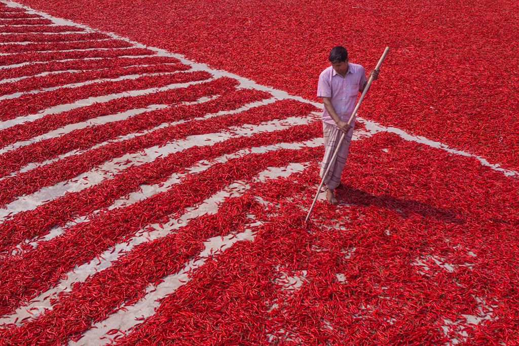
I agree with Dan - this image has excellent composition! Red is always an attention getter and the story value of the man in light colors against all that bright red is great, too.
I also agree about the man's face reading a bit dark. I have included my brightening of his face and shirt: |
Mar 8th |
 |
| 53 |
Mar 17 |
Reply |
I appreciate that! Is there something more I can do to improve this? |
Mar 8th |
| 53 |
Mar 17 |
Reply |
Thank you so much! d:¬{D
What can I do to make this better? |
Mar 8th |
6 comments - 10 replies for Group 53
|
| 62 |
Mar 17 |
Reply |
Thanks for the extended explanation, Elinor! I knew this was the place to get myself edumakated! d;¬{D |
Mar 14th |
| 62 |
Mar 17 |
Reply |
I had a copy on my previous computer and thought it was quite good. |
Mar 14th |
| 62 |
Mar 17 |
Reply |
That finishes the flower centers appropriately, Angela! Now it looks complete. d;¬{D |
Mar 13th |
| 62 |
Mar 17 |
Reply |
Here's a redo with your suggestions: |
Mar 13th |
 |
| 62 |
Mar 17 |
Reply |
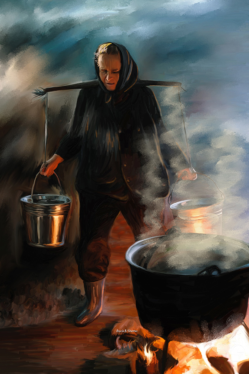
I do get what you're saying, but don't totally agree from the standpoint of composition. I found the area between her legs a distraction from what I understood as the subject of the painting, her toil and pain. My eye went there first and I struggled to figure out what I was looking at. The glow of the fire is still on her boot, buckets, hand & face, which are focused on first without the hot spot between her legs. You're the maker, so what you say goes, but my eye is trained to examine the overall composition in terms of story and focus. Guess we'll have to agree to disagree on this. Hope you don't regret letting me into the group because of it. d;¬{D |
Mar 13th |
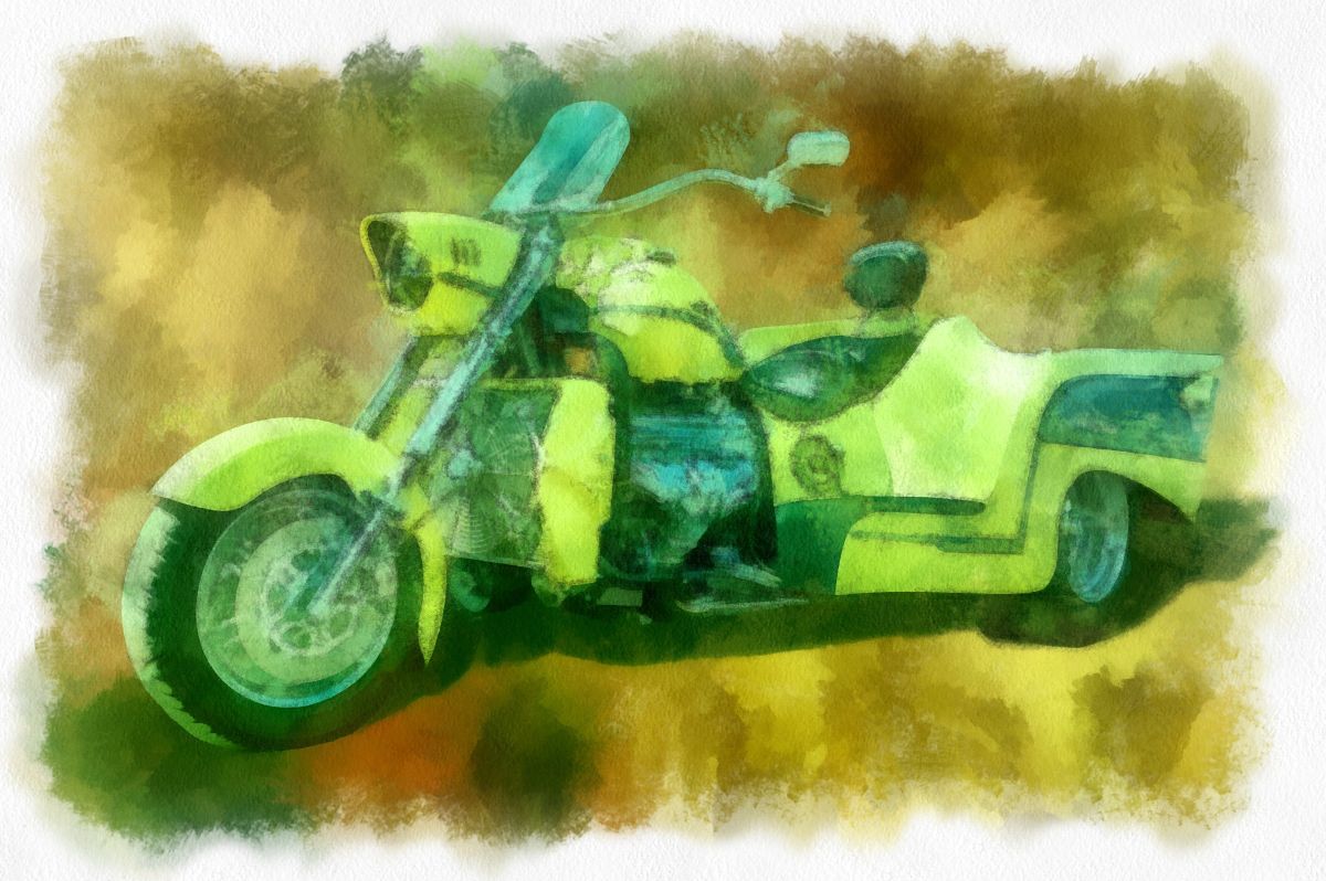
| 62 |
Mar 17 |
Reply |
Now that you've pointed it out, I see what you're saying about the background edging into prominence. Before the final painting, I think it helped the bike pop, but doesn't quite work when painted with the bike. d:¬{( |
Mar 13th |
| 62 |
Mar 17 |
Comment |
Good composite work, Gloria - the 2 images fit well together and show no signs of having been stitched together. Can you recommend any tutorials on the mixer brush? You definitely sell pint on canvas with this. d:¬{D |
Mar 8th |
| 62 |
Mar 17 |
Comment |
I like that you added a third flower to make a stronger composition. The background and flower petals came out really well with these new brushes. For me, the yellow centers of the flowers are too detailed to fit with the rest, though I'm not sure how to rectify that. I have so much to learn. |
Mar 8th |
| 62 |
Mar 17 |
Comment |
I would love to know more about your process, Gerhard! Your result definitely looks painted without looking processed! Lovely! |
Mar 8th |
| 62 |
Mar 17 |
Comment |
You definitely captured the pain - I cringed when I looked at her face!
You removed the bulk of the distracting elements and added some interest with your steam and moisture. My only suggestion is to soften the area between her legs which glowed too bright and pulled too much focus. I cloned from the ground in front of her to make it recede. |
Mar 8th |
 |
4 comments - 6 replies for Group 62
|
22 comments - 34 replies Total
|


