|
| Group |
Round |
C/R |
Comment |
Date |
Image |
| 6 |
Feb 17 |
Reply |
Then my job here is done! d;¬{D |
Feb 26th |
| 6 |
Feb 17 |
Reply |
I'm working on that. Next month's image will be proof of that. d;¬{D |
Feb 25th |
| 6 |
Feb 17 |
Reply |
Not only does this lens make for a shallow DOF, its focus area is not across the whole field, but rather mainly in the center. still, it got in very close so I'm locked in to playing with it some more. d;¬{D |
Feb 22nd |
| 6 |
Feb 17 |
Reply |
I think you're right about the stacking, but I can't help but try to get more out of the camera in my phone. Guess I'm a glutton for punishment. d;¬{D |
Feb 22nd |
| 6 |
Feb 17 |
Comment |
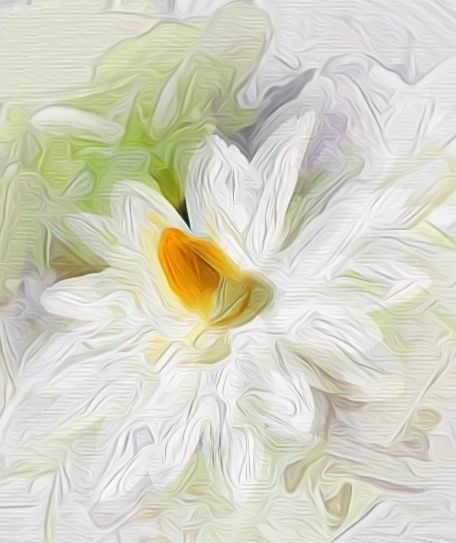
As usual, Laki, you have presented us with a gorgeous study of flower petals. The core of the flower being offset to the upper left corner made for a very different presentation, and the swirls of color that the petals create is very soothing.
You should remind your wife that she gets to enjoy the beauty of your gifts long after the flowers have been discarded by admiring the images you create for her (and we get to enjoy each month). |
Feb 13th |
| 6 |
Feb 17 |
Comment |
OMG, Toni! What a great subject for macro work! Dick certainly said it all, and his rework finished it nicely. Can't think of any suggestions. Great job! d;¬{D
|
Feb 13th |
| 6 |
Feb 17 |
Reply |
Wow . . . I never would have thought of doing a composite image in macro like this. Hmmm . . .
As I replied to Dick, above, taking anything handheld is a problem for me because of shake in my paws, so, yes, it's not tack sharp by any means. It was an experiment in phonography with a macro lens. Guess it's back to the drawing board. d:¬{( |
Feb 12th |
| 6 |
Feb 17 |
Reply |
You're right, of course. This was actually the sharpest one of the bunch. Don't have much control of the phone specs and doing this handheld is definitely a problem for me with a fair amount of shake in me mitts. I thought, for the sake of the experiment, the results were surprisingly good. Oh well. d:¬{( |
Feb 12th |
2 comments - 6 replies for Group 6
|
| 11 |
Feb 17 |
Reply |
Not 10 seconds, 1/10 second. At 10 seconds handheld, there would be nothing but blur. d;¬{D |
Feb 27th |
| 11 |
Feb 17 |
Comment |
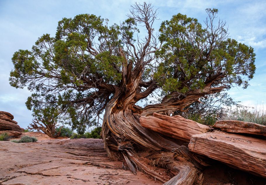
Allen is right - BRRRR! Both color and monochrome tell the story of cold really well. To a certain degree, I think Allen is right about the crop, as the left half loses its impact in monochrome. For me, though, the issue is deciding what the focal point is supposed to be here. By composition, it almost appears to be the bare branch in front of the large 'stalactite', but it's too small to hold one's interest. My eye then jumps to the small snow-covered bush to the left, but it also is too insignificant in the composition. So now I'm left looking for a blanket and wondering why you did this to us. d;¬{D |
Feb 14th |
| 11 |
Feb 17 |
Comment |
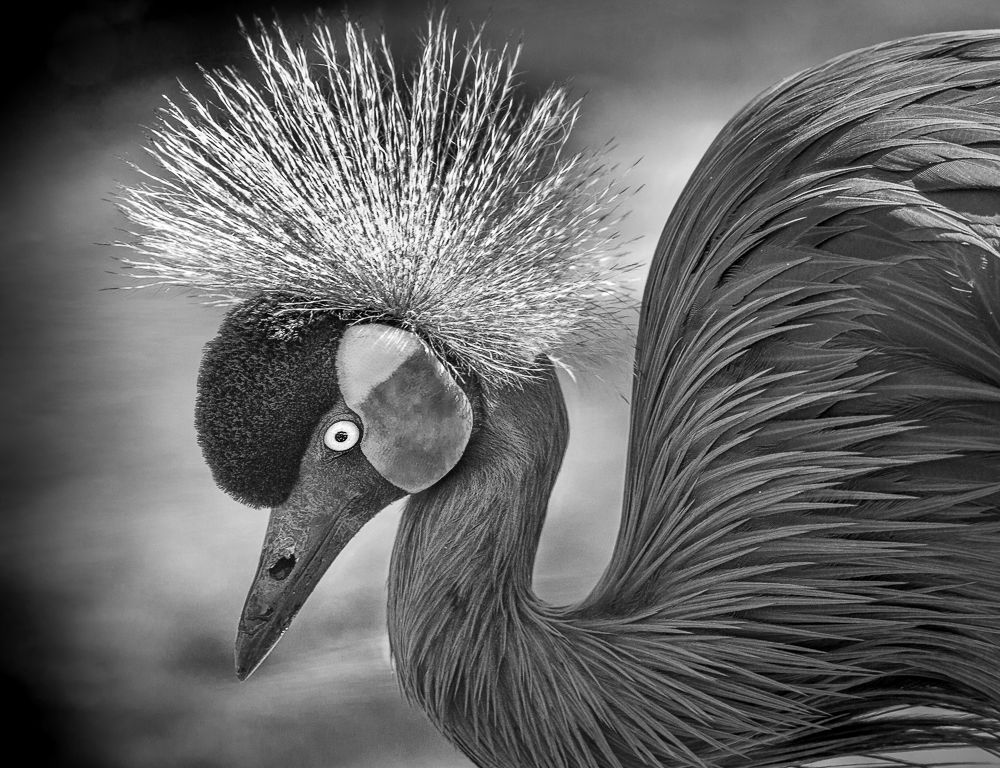
This is way cool, Jim! I like that you flipped it - really helps. Only suggestion from me is to bring out more detail in the neck and face, which were a bit soft to my eye. Here's my rework: |
Feb 14th |
 |
| 11 |
Feb 17 |
Comment |
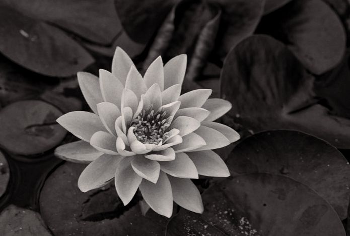
The conversion really robbed the center of the lily of its detail and, as Allen indicated, gave too much emphasis on the lily pads, which take away from the object of interest. One other minor nitpick is the orientation of the lily, which is a little uncomfortable for me.
I flipped the lily to point to the right, pulled out more detail in its center and broadened the crop that Allen did to bring the lily slightly off center. What do y'all think? |
Feb 14th |
 |
| 11 |
Feb 17 |
Reply |
You also managed to bring back some of the detail in the center of the lily that got lost in Dave's conversion. |
Feb 14th |
| 11 |
Feb 17 |
Comment |
I'm a sucker for a good still life. Alas, many do not translate so well into monochrome. The nature of still life is a quiet visual stimulation, which typically involves several interrelated objects that give record to the purpose of that tableau. With 3 unrelated objects here, I am having difficulty deciphering what was going on. In addition, some of the tonal richness of the original has been lost in the conversion to monochrome, and your crop has reduced the visual impact of the lamp.
As much as I love still life, I am a complete idiot when it comes to assembling them. Taking the picture is really only about one third of the image process - the important part is the construction of the tableau. You've gotten a lot closer than I ever have, that's for sure. |
Feb 14th |
| 11 |
Feb 17 |
Reply |
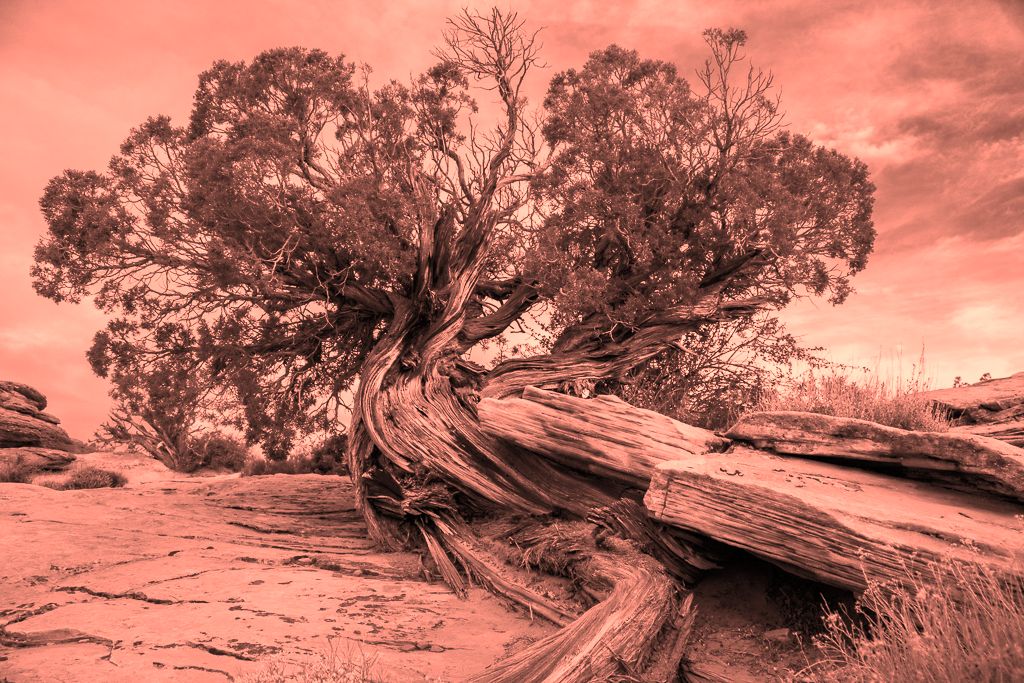
I played around a bit with the monochrome version, and ended up softening the leaves of the tree and the corner bush and adding red overall to get back somewhat to the original hue of the rocks. The leaves thus become more of a backdrop to the interest of the diagonal flow of the trunk and rocks. Not quite there, but better for my eye. |
Feb 14th |
 |
| 11 |
Feb 17 |
Reply |
The monochrome version doesn't suffer from the bushes as they tonally merge with the rocks. You brought out a lot more detail which begs more time to examine. In the end, though, the overall impact is diminished for me in comparison to the visually rich original. |
Feb 14th |
| 11 |
Feb 17 |
Comment |
Both versions have merit and I enjoyed studying each. While I like the color version a bit better, the bush in the lower right corner breaks the diagonal flow and the one in the bottom center is a distraction. That can be dealt with by a subtle crop and a tiny bit of cloning: |
Feb 14th |
 |
| 11 |
Feb 17 |
Reply |
Wow! You almost make it sound like I planned this outcome! I'm nothing if not out there! d;¬{D |
Feb 14th |
| 11 |
Feb 17 |
Reply |
I pretty much shot this on the equivalent of Auto, so haven't tried to vary the settings yet. You're right, of course, that by increasing the shutter speed of the phone's camera would have compensated for my hand shake. Definitely a learning experience. d;¬{D |
Feb 13th |
| 11 |
Feb 17 |
Reply |
I agree, Bev! Until I work out a way to take the shot without it being handheld, I doubt it will get better. |
Feb 12th |
| 11 |
Feb 17 |
Reply |
Thanks, Jim. This was definitely my first effort and I'm planning on working on a way to get my hand out of the mix. |
Feb 12th |
5 comments - 8 replies for Group 11
|
| 24 |
Feb 17 |
Reply |
<...smacking forehead...> DOH! Figures the new kid would make a bonehead mistake like that! SMH d;¬{D |
Feb 19th |
| 24 |
Feb 17 |
Reply |
Oh my - Vacant, indeed!!! What you did with it tells a wonderful story that certainly wasn't there in the original! I say again, "Bravo!!!" d:¬{D |
Feb 15th |
| 24 |
Feb 17 |
Comment |
Simply gorgeous!!! Would love to see the original portrait you started with and what inspired you to take this direction with it. The glow on her face as created by all the lights floating around her, with her expression demonstrating to me "wonder" at where she finds herself. Bravo!! I don't think you should change a thing, personally. d:¬{D |
Feb 15th |
| 24 |
Feb 17 |
Comment |
As all agree, I simply offer my quick application of everyone's suggestion: |
Feb 15th |
 |
| 24 |
Feb 17 |
Comment |
While I don't normally care for Topaz Glow's results for the most part, I'll admit it worked very well in this instance. Color me crazy (but not with Topaz Glow), but I like that you left the opening of the piece's 'horn', as it provides an entry point for the eye's travel into the image, after the initial impact of all the neon colors, and held me there longer. That's the cool thing about art, each viewer has a different experience. d;¬{D |
Feb 15th |
| 24 |
Feb 17 |
Comment |
Wonderful composition, Ian. You demonstrated skill in removing the distracting elements that conceals your alterations. Like Marie, I'm not too fond of the filter's effect on the sky, and agree it works very well on the horses.
I must ask, and please excuse again my ignorance, but what is RHS that you refer to that you used to remove the branches? |
Feb 15th |
| 24 |
Feb 17 |
Reply |
I see now that you did this and wonder why. Would it not have been better to only partly mask it off so as to have a more cohesive look throughout? Excuse my ignorance here. |
Feb 15th |
4 comments - 3 replies for Group 24
|
| 53 |
Feb 17 |
Reply |
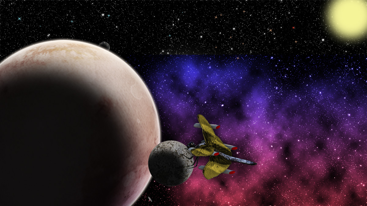
Here's your rocket packs, Dan. d;¬{D |
Feb 14th |
 |
| 53 |
Feb 17 |
Comment |
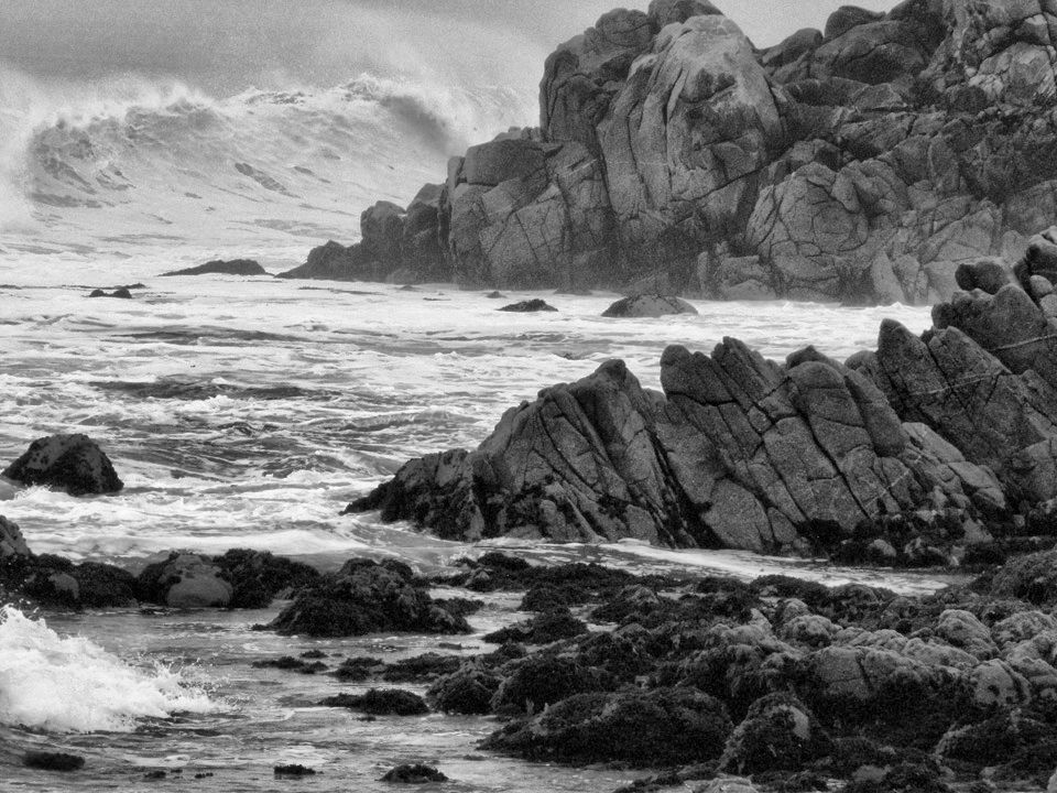
For me, your version became a bit too dark and foreboding. Add to this the loss of the detail in the wave in the upper left, made me step back and think. I finally decided to play with it some, so I started with the original, converted to monochrome in Topaz B&W Effects, then into Nik's Viveza to bring out more detail overall. |
Feb 14th |
 |
| 53 |
Feb 17 |
Reply |
Hmmm. Hadn't looked at it from that perspective. I've spent a lot of time taking pictures of dragonflies and have always seen them as delicate and rather flighty (no pun intended). They perch on small places to rest for a moment and then are off to the next thing. This is why I sized it as I did here - the celestial equivalent of a blade of tall grass.
Powerful . . . That would change the dynamic quite a bit. What do you envision? |
Feb 13th |
| 53 |
Feb 17 |
Reply |
Thanks, Brenda! d:¬{D |
Feb 12th |
| 53 |
Feb 17 |
Reply |
I think that crop works fine, Rusty. Thanks for fixing that! d:¬{D |
Feb 12th |
| 53 |
Feb 17 |
Comment |
Here's a look at a crop: |
Feb 12th |
 |
| 53 |
Feb 17 |
Comment |
Definitely an improvement over the busy scene of the original. I think the shade of blue you used is emphasizing the cutout, giving it a more artificial feel. It needs to be grounded to something. I threw something together to illustrate: |
Feb 12th |
 |
| 53 |
Feb 17 |
Comment |
Texture treatment was the right way to go - it warmed up a rather bleak image. Nice! |
Feb 12th |
| 53 |
Feb 17 |
Comment |
Lovely! I couldn't tell either that this was a composite. The colors and sizing of the 3 different flowers work really well together. Aside from the tiny fix Dan pointed out, I have no suggestions. |
Feb 12th |
| 53 |
Feb 17 |
Reply |
I really like your rework, Natalie. You brought back detail in areas that had been lost. |
Feb 12th |
| 53 |
Feb 17 |
Comment |
I agree with the other comments. Her eyes are powerful and your capture of her face is wonderful.
I have cropped the image, darkened the background & her cheek and boosted her eyes. What do y'all think? |
Feb 12th |
 |
| 53 |
Feb 17 |
Reply |
Can you expand a bit on the exaggeration you're envisioning? |
Feb 12th |
| 53 |
Feb 17 |
Reply |
The top right object is supposed to be a sun (star), but apparently doesn't come across right. Hmmm. d:¬{( |
Feb 12th |
| 53 |
Feb 17 |
Reply |
I like the colors on the dragonfly and moving the sun closer, but not so much the yellow on the planet. That's just me. d;¬{D |
Feb 12th |
| 53 |
Feb 17 |
Reply |
Hahaha, Dan! I'll have to work on that one! d:¬{D |
Feb 12th |
6 comments - 9 replies for Group 53
|
| 62 |
Feb 17 |
Reply |
Thank you, Marie. Will definitely work on bringing more of the mirror back! d:¬{D |
Feb 19th |
| 62 |
Feb 17 |
Reply |
Thanks, Gerhard! I've not tried that approach before and will certainly investigate it further. d:¬{D |
Feb 17th |
| 62 |
Feb 17 |
Reply |
Thank you so much, Gerhard! As I said to Gloria, I do feel welcome. I was quite hopeful of that after reviewing past rounds and I haven't been disappointed. d;¬{D |
Feb 17th |
| 62 |
Feb 17 |
Reply |
Lol! About the only thing that motivates Casmir is the ring from a plastic milk jug or one of his plastic balls that have a bell inside, and even then, his attention span is extremely short. d;¬{D |
Feb 17th |
| 62 |
Feb 17 |
Reply |
I do feel welcome, thanks!
With certain images, I do several things. The work in progress image (Original 3) was put into competition and received a third place. The result you see before you was the best painted one I came up with.
Digital Auto Painter is a standalone program by MediaChance. It works sorta like ArtRage but on a mega-dose of steroids. There are lots of "presets" created by users to start with and you can create your own presets by establishing color palettes, brush strokes, brush types, etc. While one is running, you can pause it an change up the strokes, brushes, etc., as well bring back details from the original image as you see fit during the painting process. I find it allows me to speed up the process tremendously, while still controlling the end result. In this image, I chose to feature broader strokes and brought back less detail than I might for a different image. Perhaps I stopped a bit too soon, eh? |
Feb 17th |
| 62 |
Feb 17 |
Reply |
Thank you so much! d:¬{D You guys are so good at this, so your remarks really made me smile. |
Feb 16th |
| 62 |
Feb 17 |
Reply |
Hmmmm . . . I didn't notice that. That's what I love about DD study groups - friendly eyes that see what I cannot. d;¬{D |
Feb 16th |
| 62 |
Feb 17 |
Comment |
Yes! I appreciate your creating this completely digitally without any original to start with. I hope to get there someday, though I have been experimenting.
I look forward to learning from this group. d;¬{D |
Feb 15th |
| 62 |
Feb 17 |
Comment |
Love what you did with the background and their hair came out especially nice to my eyes. I felt that, perhaps, their skin should be darkened a little bit as it appears somewhat 'hot' to me. I've made a subtle adjustment here: |
Feb 15th |
 |
| 62 |
Feb 17 |
Comment |
I am intrigued by your result. As I am somewhat new to digital painting, can you tell me a bit more about your process, such as the filters you used and what blend modes for which layers? There's so much to learn!!! |
Feb 15th |
| 62 |
Feb 17 |
Comment |
Mmmmm, lovely result, Angela. There really is no hint that this image began as a photo. The background is soft and helps the flower to pop, and I can easily imagine how touching the canvas at the flower would feel.
This group will certainly push my meager skills to catch up, but I look forward to the challenge. d;¬{D |
Feb 15th |
4 comments - 7 replies for Group 62
|
21 comments - 33 replies Total
|


