|
| Group |
Round |
C/R |
Comment |
Date |
Image |
| 70 |
Feb 19 |
Reply |
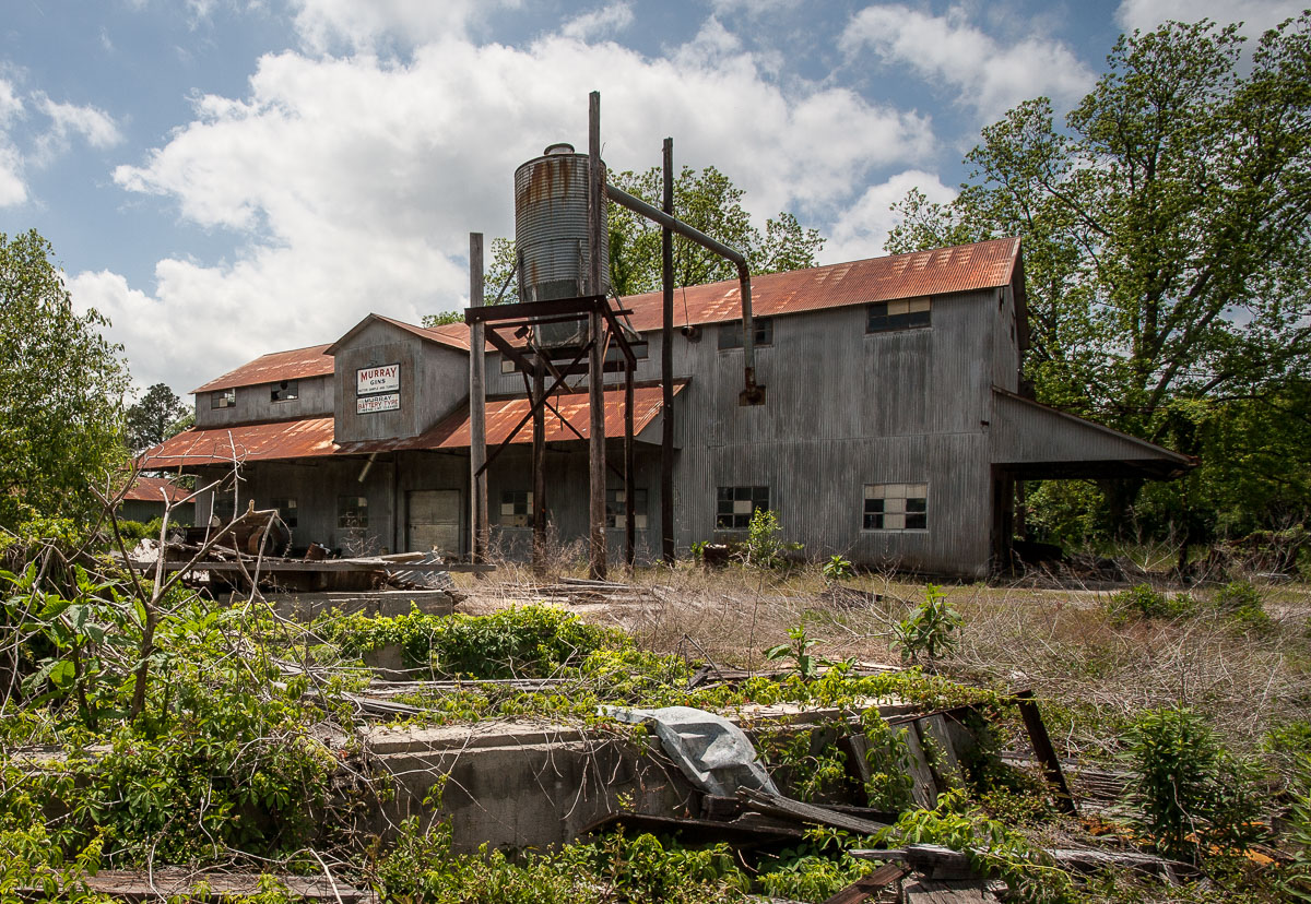
The front-side elevation is a particularly nice composition which provides a sense of context and completeness that I did not get from the front elevation. well seen and captured!
|
Feb 15th |
| 70 |
Feb 19 |
Comment |
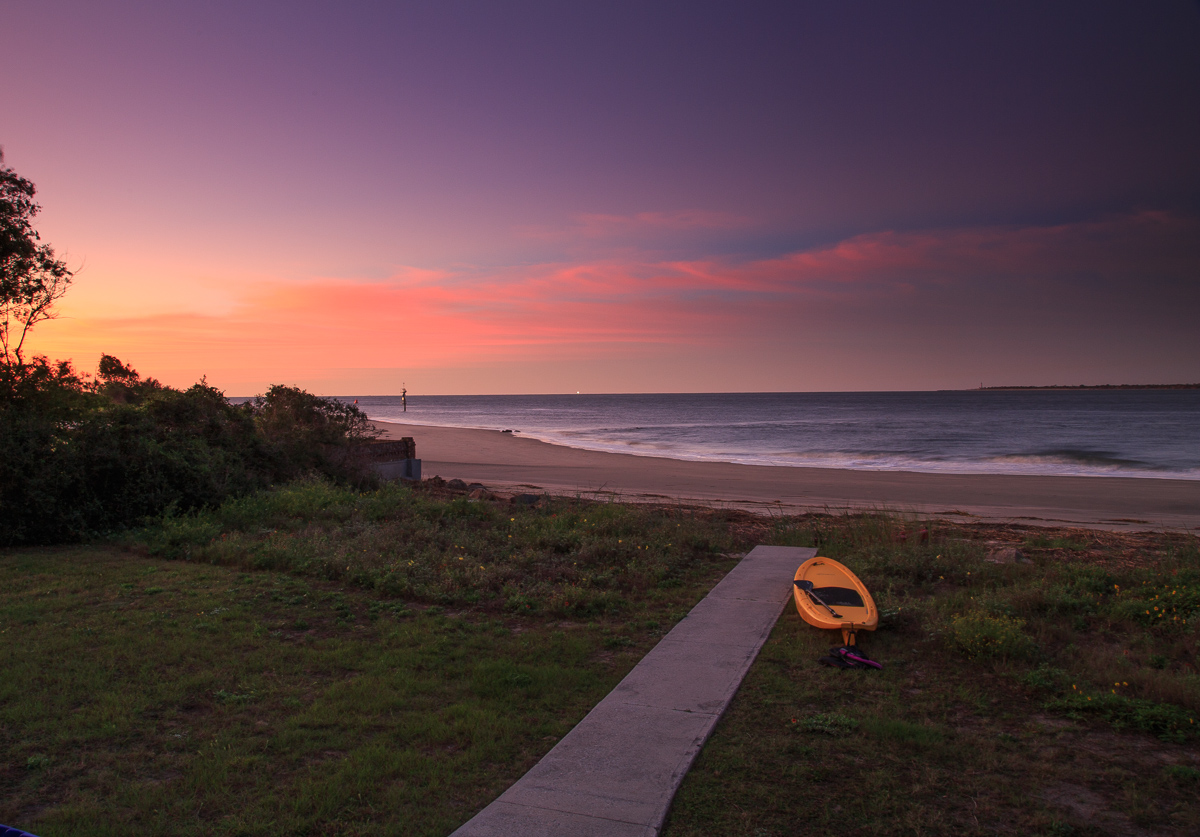
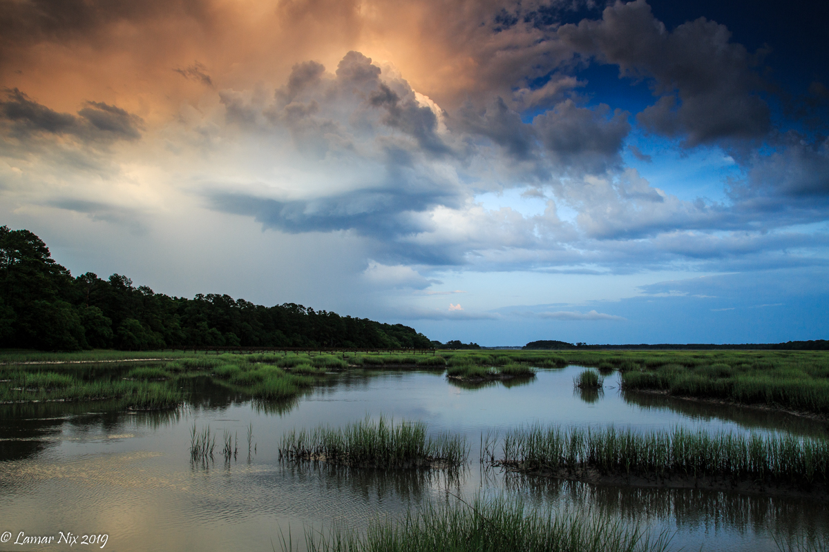
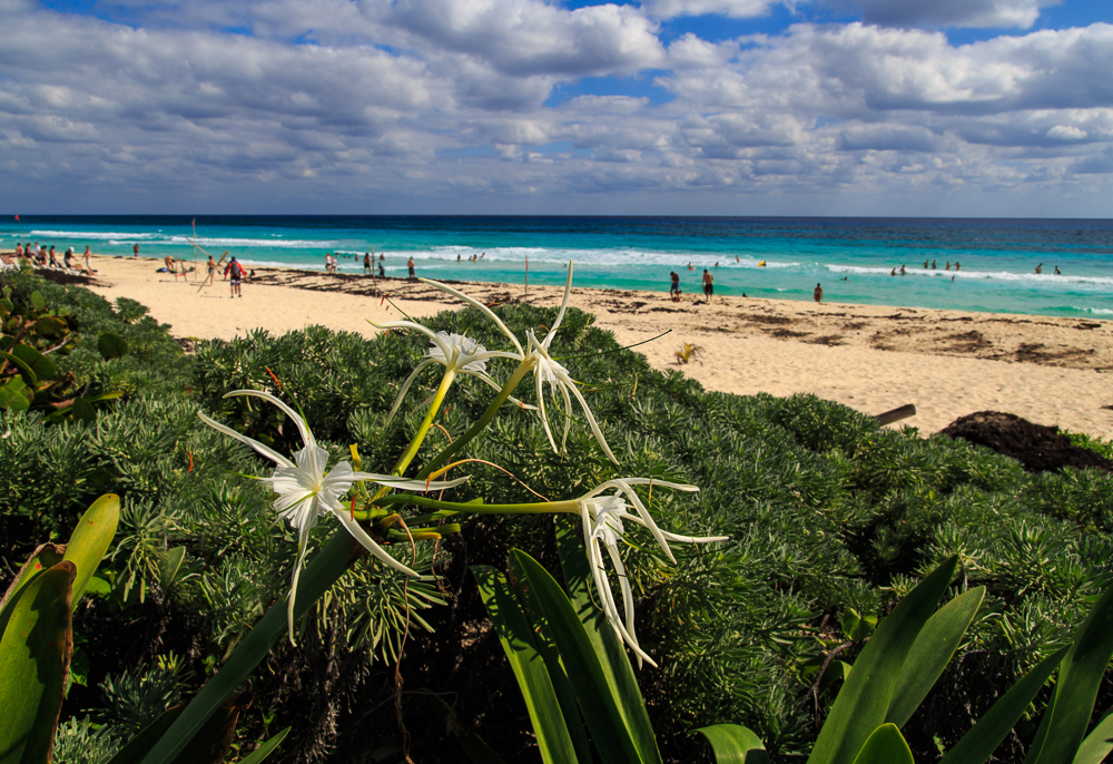
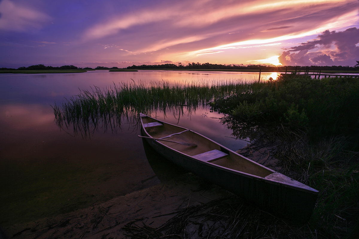
Very dramatic and beautiful environs! With those red paddles and life jackets, I'll bet those kayakers stand out even against the colored background. The overhang in the foreground makes an interesting element!
|
Feb 7th |
| 70 |
Feb 19 |
Comment |
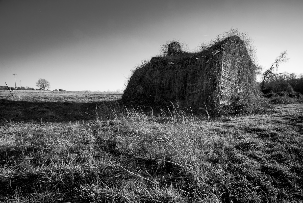
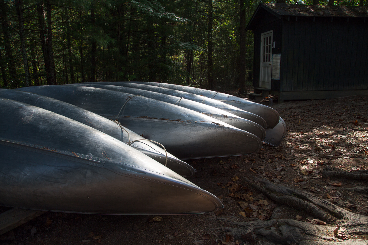
Pretty neat little house with a facade like a face and grass roof that covers it like a head of hair! Even seems to have its own grave plot in back. If you have another exposure with a little more "headroom" on left and top, I think that would be usefu as it appears just a bit cramped there to my eye. |
Feb 7th |
| 70 |
Feb 19 |
Comment |
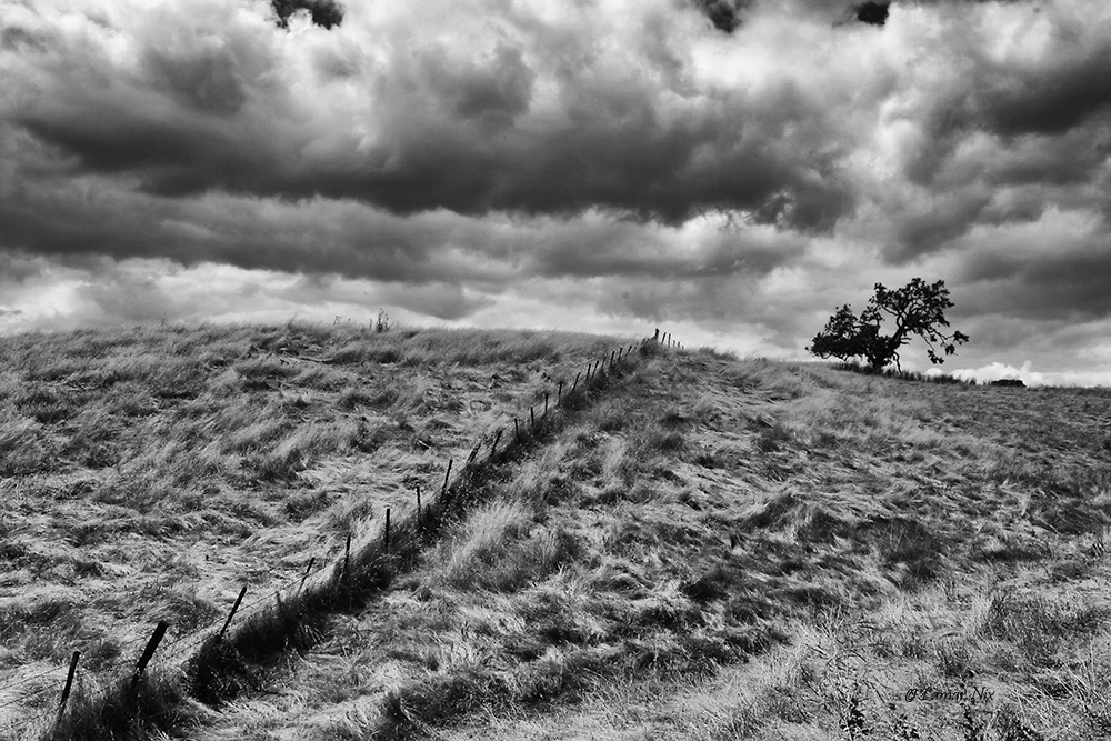
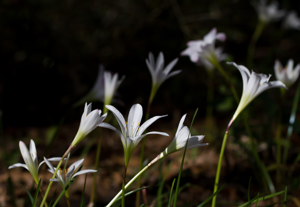
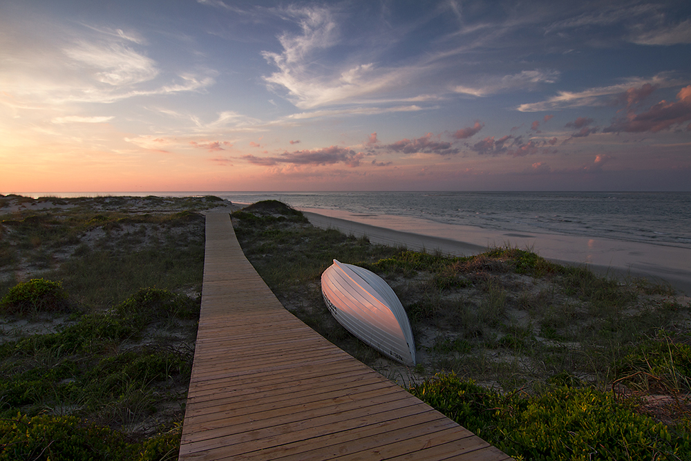
The image is sparkling sharp everywhere. The path provides a visual anchor to the composition, and the careful dodging of selected foreground flora gives life to the image. |
Feb 7th |
| 70 |
Feb 19 |
Comment |
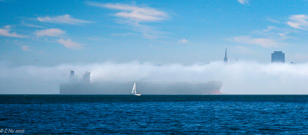
Very nice selection of scenery! The foggy setting produces a strong sense of mood and is a somewhat unique image. Getting the camera in closer to the nearest white water would give more prominence to that element of the image in my opinion, and give the image a boost in impact. |
Feb 7th |
| 70 |
Feb 19 |
Comment |
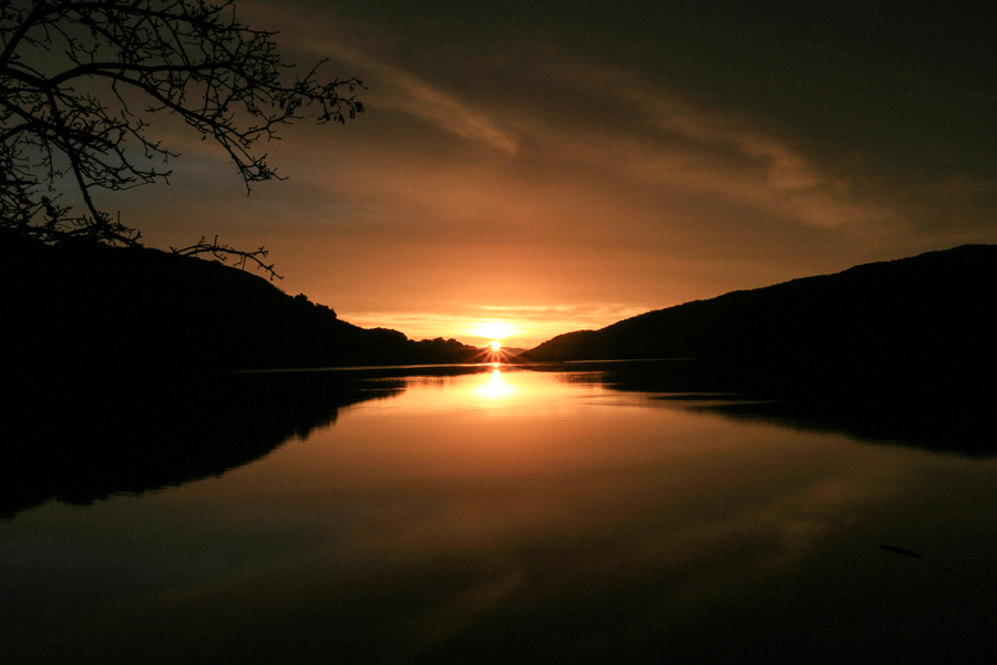
It is an interesting technique to apply in this setting. The radiant moon from the small aperture is a good element. At first blush the foreground appears to be two-dimensional similar to a result that might be produced using camera flash. |
Feb 7th |
| 70 |
Feb 19 |
Comment |
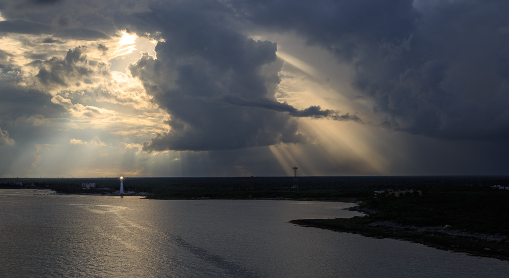
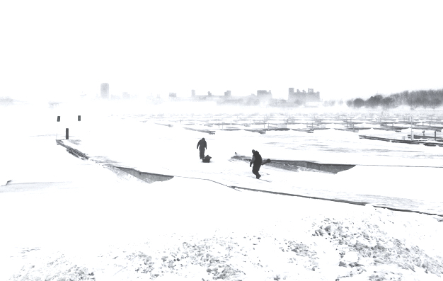
The image strongly conveys the sense of bitter cold - the cool blue cast, the diminished visibility of the distant skyline, the clouds of fog on the lake, and the ice fishermen at work!
Since the image is monochrome, I tired out an idea that came to mind of just using black and white, and giving the image a high-key tonality - something that would appear more like a pen and ink sketch. I would not call this result better, but it might be a direction to pursue in addition. |
Feb 7th |
 |
| 70 |
Feb 19 |
Reply |
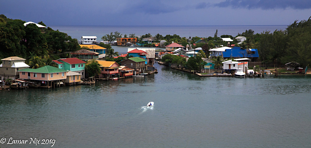
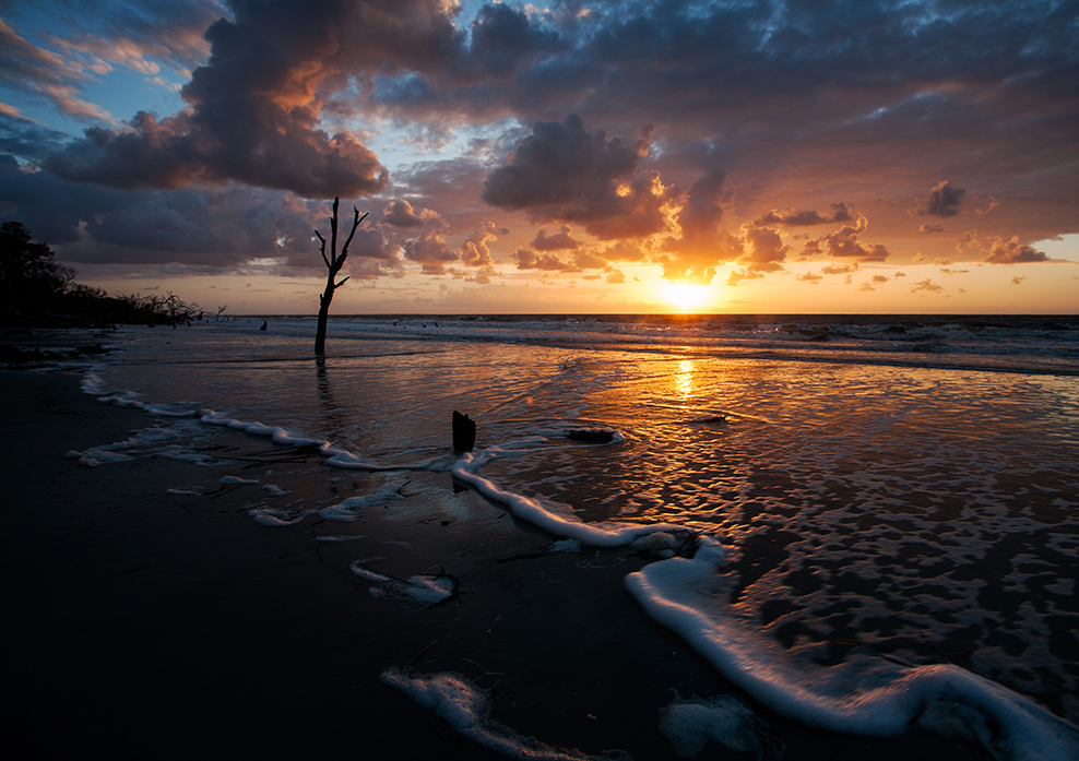
Yes, we were on a bluff across the bay. I used the "Adobe Landscape" preset in "Camera Calibration" tab of Lightroom, which adds a little "punch" to the colors and mid-tone contrast. It is a preset I use frequently. Thanks for tip on travel. We felt quite safe on Roatan Island. |
Feb 4th |
6 comments - 2 replies for Group 70
|
6 comments - 2 replies Total
|