|
| Group |
Round |
C/R |
Comment |
Date |
Image |
| 70 |
Jan 17 |
Reply |
Check out the "Gold-N-Blue" polarizer at singh-ray.com. Tiffen also has color polarizers (red-green) and maybe (gold-blue). |
Jan 12th |
| 70 |
Jan 17 |
Comment |
Sky exposure and color are very nice. To me it would be good to compose the moon clear of the forest tops. The humans in the foreground do not seem to be related to your super moon theme and are superfluous to your image. |
Jan 12th |
| 70 |
Jan 17 |
Reply |
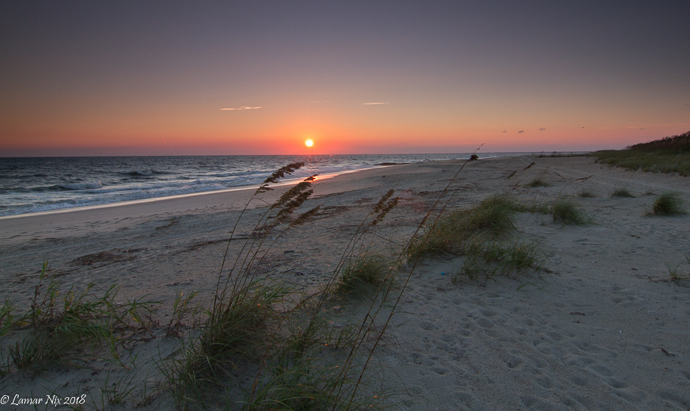
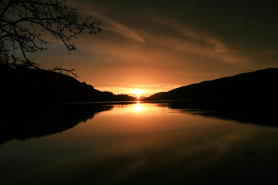
Thanks, Judy! Just after the winter equinox the rising sun lines up in the notch of this canyon. Having the sun in that position makes a big difference in sunrise captures of this mountain lake. e.g. the shadows cast. I choose to post this particular image to illustrate a point from a discussion in the group last month: it generally takes planning ahead to get good sunrise images. |
Jan 12th |
| 70 |
Jan 17 |
Reply |
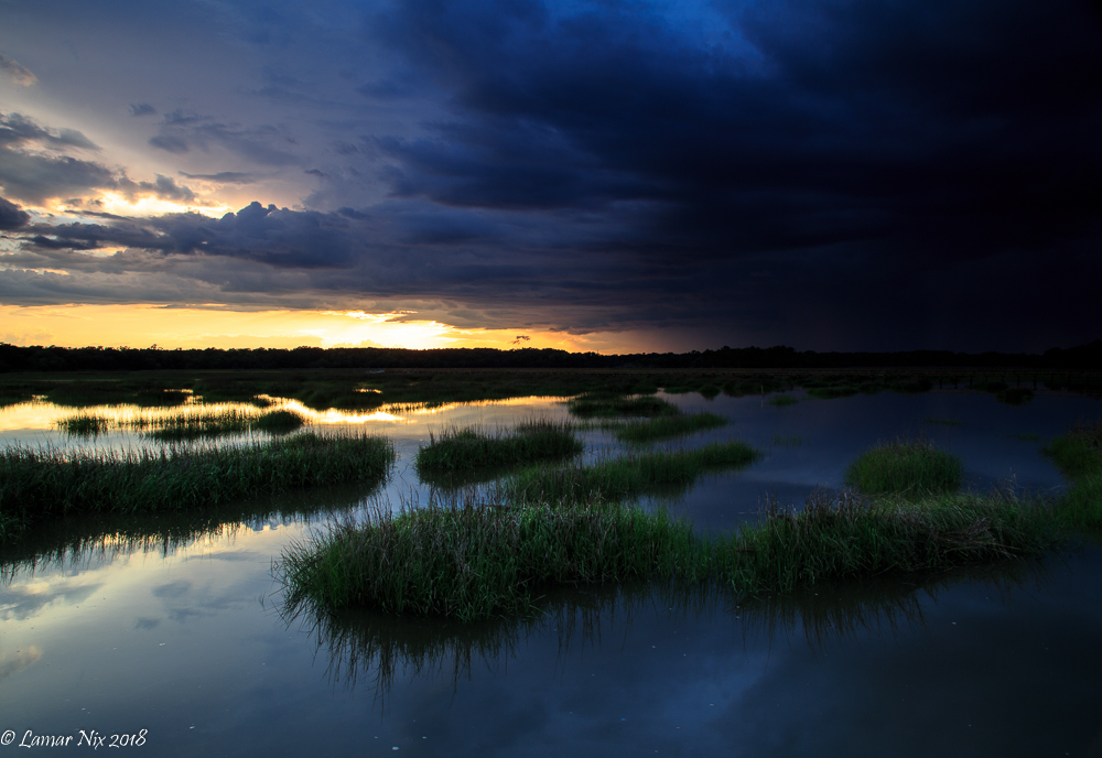
Thanks, Pierre! This would not have been a good candidate for HDR. Here's why:
- The shadows here are completely blocked up. You can see that they are totally shielded by mountains from the emerging sun, which is essentially a point source of light. The only light reaching these shadowed areas comes from the minimal scatter from clouds. If one is determined to expose the shadows here, they will be very noisy : the sensor responds to photons (light rays) reflected or emitted from a particular sector within the field of view- signal power per pixel goes as the number of photons collected while noise goes as the square root of the number of photons collected. The best one can say for these deep shadows is that not that many photons will be collected unless the shutter is open for times measured in minutes.
- From my expeience these shadows are more than 5 EVs lower than the rest of the image. Beyond the noise in the shadows ,that is asking a lot of an HDR technique. I personally would not be able to make a pleasing digital composite from such a broad dynamic range that would be required here.
- From an artistic standpoint I captured the scene exactly as I wanted and pretty nearly how the scene appeared in real time. The deep shadows lining this narrow canyon are to my eye a much stronger statement than if they were replaced by half exposed, winter trees and their reflections on the lake. |
Jan 12th |
| 70 |
Jan 17 |
Reply |
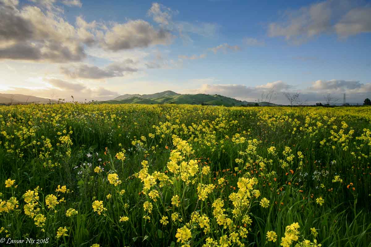
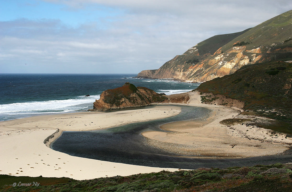
This was on my route to work each day. I always had a camera in the car and stopped off when things looked interesting. We were in California for appx. 10 years. This is just over the Santa Cruz mountains from the coast - probably 10 miles as the crow flies. |
Jan 12th |
| 70 |
Jan 17 |
Comment |
It certainly conveys a feeling of winter weather! Did you consider capturing some of the snowflakes falling close to your lens? That might enhance the impact of the winter storm to your viewer. It would require a shot that was focused close in but with focus stacking technology around today, one might well be able to have both the impact of falling snowflakes and dof . |
Jan 8th |
| 70 |
Jan 17 |
Comment |
The waterfall has no scale element and so in the mind's eye might well represent a fall from an immense cliff face. To that end I would be inclined to rename it to something more enigmatic like "hidden cataract". While the falling water seems adequately exposed, the foamy water in the pool needs a boost in from its present gray tone.
What were your conclusions as to the product of the rather complex processing path you have taken here - were they worthwhile and do you recommend them? |
Jan 8th |
| 70 |
Jan 17 |
Comment |
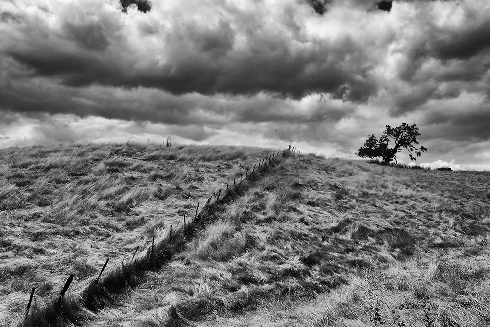
A quite absorbing image! The high point of view captures a large swath of this magic landscape. The squiggly line running through the foreground provides a definite visual axis and leads to the more shadowed contours and single tree in the distance. It seems natural and definitely not overprocessed to my eye. I tend to like the more nuanced contours in the background here, but there is plenty of substance for the present composition also. |
Jan 8th |
| 70 |
Jan 17 |
Comment |
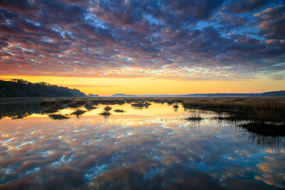
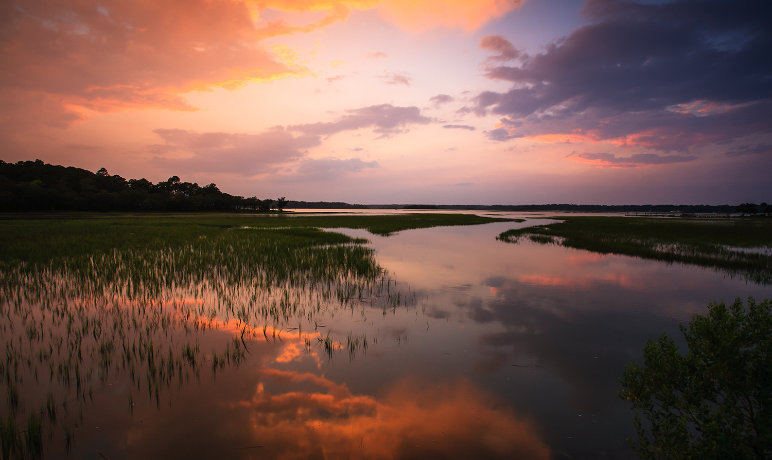
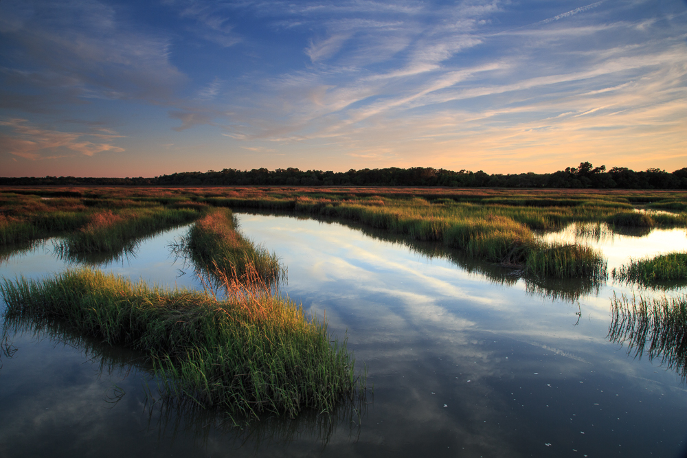
The graduated tonalities increasing monotonically as the eye moves from foreground outward is a striking feature of the composition. And the blues and golds are complementary colors and thus are visually satisfying.
Your question: is the color saturation pushed too far? If I draw an imaginary line at the boundary between what seems natural on the left as opposed to what seems processed on the right, then Clingman's Dome would fall to the right based on my own experience and my individual eye. However art and its expression is a highly individualistic statement, and to me this is "good art".
Your motivation you say is that the sunset was "bla". A sometimes useful device in that situation is the color polarizing filter, which chooses between two complementary hues depending the degree of polarization of the light. The Singh-ray "Gold and Blue Polarizer" is the one I have used in the past. It would produce approximately the color progression that you have in your Clingman's image, and if used carefully can do wonders for the "blahs" on a gray day. |
Jan 8th |
5 comments - 4 replies for Group 70
|
5 comments - 4 replies Total
|