|
| Group |
Round |
C/R |
Comment |
Date |
Image |
| 83 |
Jun 25 |
Reply |
Thanks Adi, I appreciate your insights! |
Jun 29th |
| 83 |
Jun 25 |
Comment |
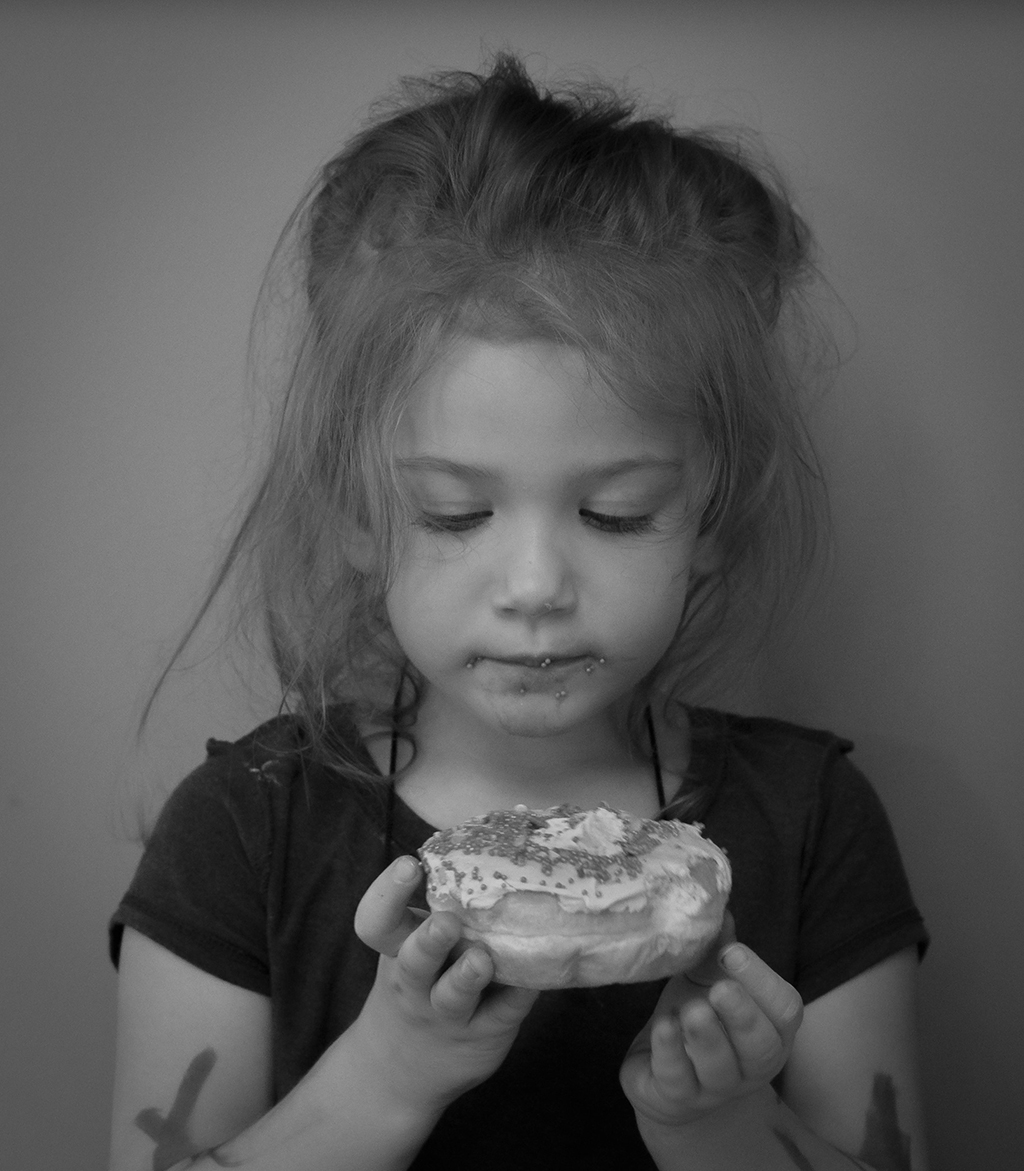
Excellent photo Hanna! The light/shadow on her face is very good. The overall details are very sharp, especially her hair. In my opinion your goal for this photo has been accomplished as my attention was immediately focused on her eyes. Thanks for sharing this. |
Jun 12th |
| 83 |
Jun 25 |
Comment |
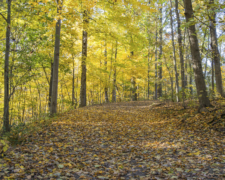
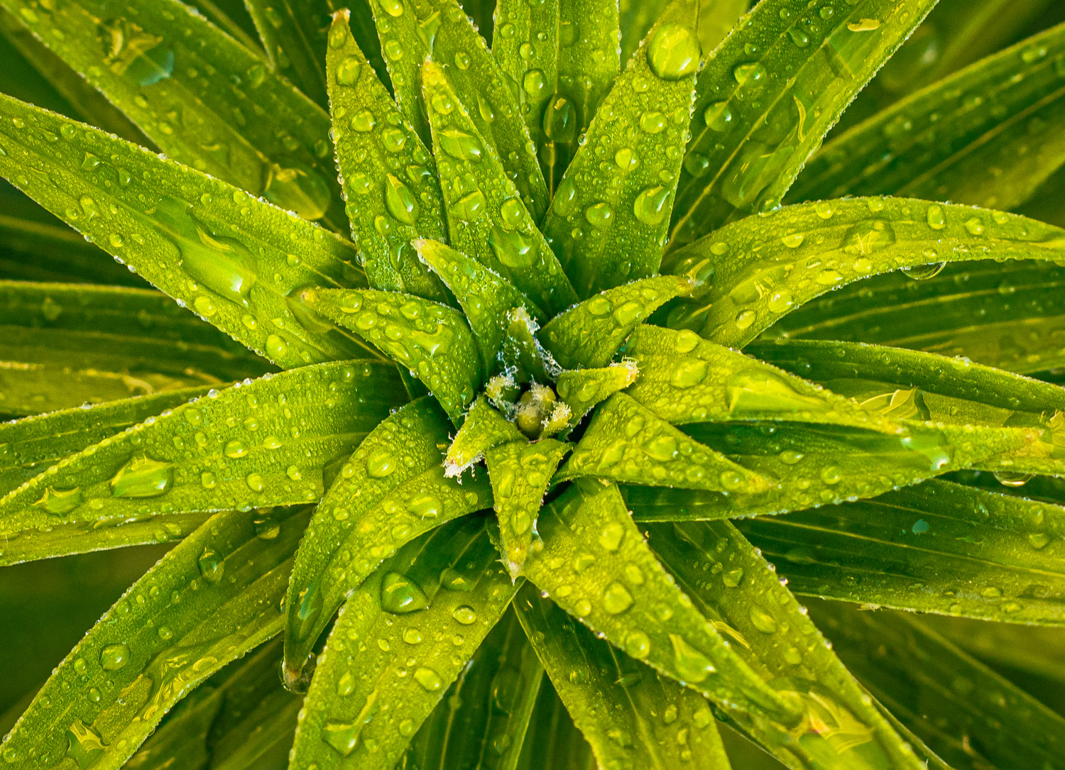
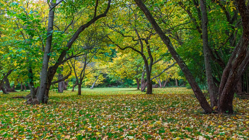
Very nice photo Elsie! The details are excellent! I like the tonal contrast of the leaves against the background. I also like the tonal contrast on the vertical leaf. A suggestion... perhaps look into slightly darkening the horizontal foreground leaves to provide some additional contrast with the vertical leaf. Very nicely done, thanks for sharing! |
Jun 12th |
| 83 |
Jun 25 |
Comment |
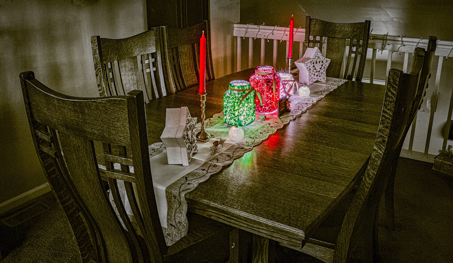
Very creative photo Adi! Thanks for explaining your technique for this image. This photo has an excellent story line and allows my eyes to focus on the subject and to wander throughout the image! Very nice, thanks for sharing! |
Jun 12th |
| 83 |
Jun 25 |
Comment |
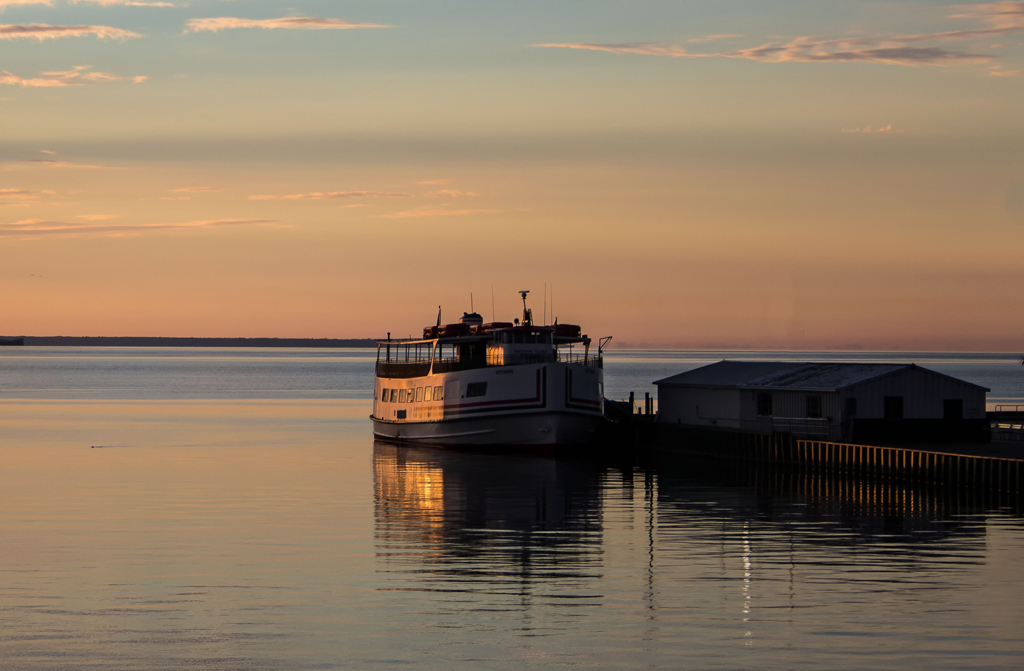
Excellent image Michael! The overall contrasts are perfect. I also like the details throughout the photo. The story line fascinates me. The woman, perhaps taking a break, talking on her phone. The shoes in front gives a personal feel to the image. Possibly many other story lines as well. Thanks for sharing this! |
Jun 12th |
| 83 |
Jun 25 |
Reply |
Thanks Elsie, I appreciate your insights! |
Jun 12th |
| 83 |
Jun 25 |
Reply |
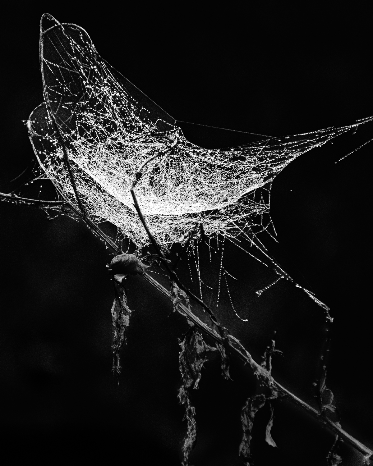
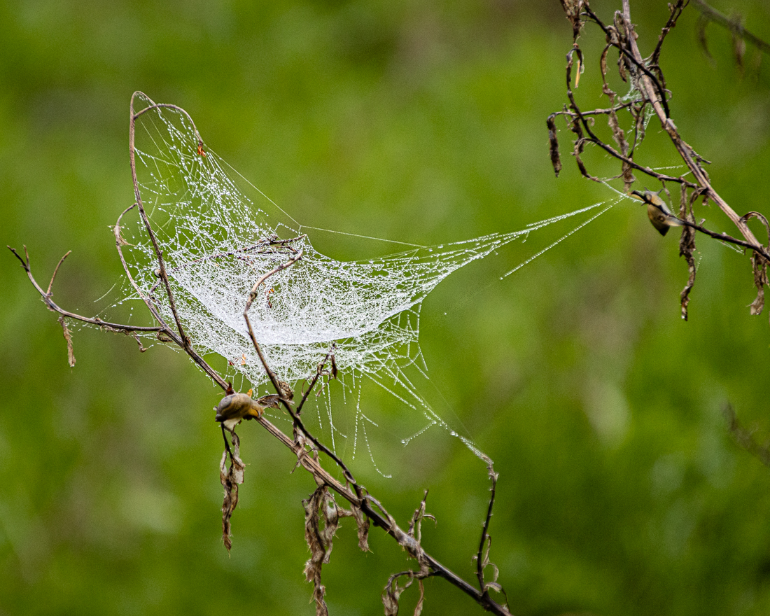
Michael...thank you for your insight and comments, which allows me to take note and learn. Here are some of my thoughts: (1) Interestingly, in another study group a long time ago, someone indicated they didn't like titles at all, to let the viewer decide. I do not agree with this view at all. I agree with what you are saying regarding titles. I used a title format similar to the artists of old (painters, etc) which they just identified the painting. I like your thoughts on this as it adds another layer of creativity. Perhaps something like "A Web of Intrigue" since I have never seen a spider web like this; (2) as far as the layout, I just went with the photo as taken in the field, purposely utilizing a diagonal layout. I agree with the left/right reading pattern. However, in a rule of thirds composition, the upper left view point is the strongest which is what I tend to view first. As far as leading lines, the left to right pattern works extremely well. This is something I will definitely take note of next time. Thanks!; (3) Agree completely. I tried to bring up the shadows, but not enough; (4) agree completely! I also like the thin border for this. Thanks again for your insights and this discussion! |
Jun 2nd |
4 comments - 3 replies for Group 83
|
| 87 |
Jun 25 |
Comment |
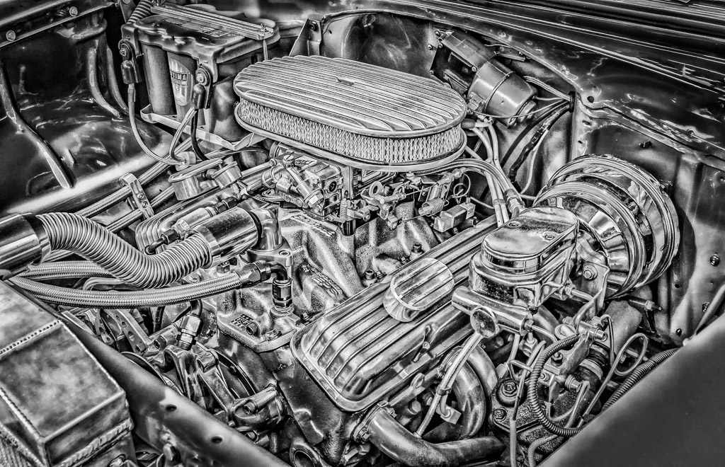
Very nice image! The high dynamic range is handled very well. The details are also excellent. Good eye in seeing and capturing this! Regarding the fill in, I am not very proficient in PS and would have used LR as well. It looks like Steven done well in showing us how to do this in PS and is a lesson for us all. Thanks for sharing this and providing more opportunities to learn! |
Jun 12th |
| 87 |
Jun 25 |
Comment |
Very nice photo! Monochrome is perfect for this and the details are excellent. The composition is also excellent and draws my attention to the eyes and other details of these rhinos. Nicely done, thanks for sharing! |
Jun 12th |
| 87 |
Jun 25 |
Comment |
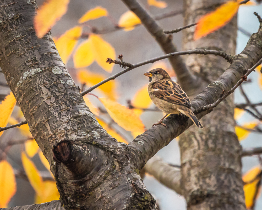
Excellent photo! In your comments on my wildlife photos you have encouraged me to take the photo of bird or animal doing something. This image conveys this concept very well. The details are sharp and the difference in eye color adds to the story line. I agree with the others to keep the osprey photos coming! Thanks for sharing this! |
Jun 12th |
| 87 |
Jun 25 |
Comment |
Excellent image! The choice for B&W is perfect for this photo. While I agree that the color version emphasizes the new/old contrasts, in my opinion the B&W also does this as well. In studying the B&W photo the older, weathered wood is nicely captured and contrasts the newer, more detailed wood. The overall tonal contrasts in this image is also very good. I have no suggestions other than this photo would look very nice hung on a wall in your home!
The haiku poem works well with this image and sends a very strong message! |
Jun 12th |
| 87 |
Jun 25 |
Reply |
Thanks Steven, I appreciate your comments and insights! This my first real attempt to take a photo of a spider web (I tried in the past, but gave up). I agree with your thoughts about detail and close-up views. Regarding B&W, I submitted this image to Group 83-Monochrome, of which I am also a member (same subject, different photo). This was also experimental as I am still learning. Thanks again! |
Jun 12th |
 |
| 87 |
Jun 25 |
Reply |
Thanks Jennifer! |
Jun 12th |
| 87 |
Jun 25 |
Reply |
Thanks Cindy! |
Jun 12th |
4 comments - 3 replies for Group 87
|
8 comments - 6 replies Total
|