|
| Group |
Round |
C/R |
Comment |
Date |
Image |
| 87 |
Jul 21 |
Comment |
Lance, my apologies for the late reply. This is a great image that makes me think. This image makes me stop and really take my time to view and interpret. This is very creative and really engages the viewer. Again, another learning experience...thanks for posting this! |
Jul 26th |
| 87 |
Jul 21 |
Comment |
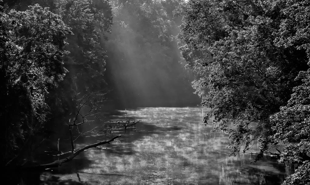
Cindy, my apologies for the late reply. Nice image, I like the historical significance. I agree with the comments by others on trying a different crop to eliminate some of the bright portions. The shadows are very interesting and add to the intrigue of the image. Nice work! |
Jul 26th |
| 87 |
Jul 21 |
Comment |
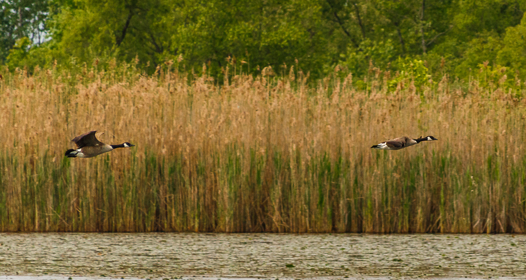
Sorry for the late reply...nice image! The eyes are sharp and clear, however I agree with your later comments that the image is perhaps a little soft. To answer your questions, in my opinion, yes it is an interesting image (anything with birds, especially birds in action is interesting). The water drops in my opinion add to the interest of the action in the image. Well done! |
Jul 26th |
| 87 |
Jul 21 |
Comment |
Excellent photo! I like the perspective of looking up and the composition is very good. I agree with others to not change anything regarding distortion. Sky photos are at times difficult...this one is done very well! |
Jul 5th |
| 87 |
Jul 21 |
Comment |
Nice photo! The details are excellent as is the overall image sharpness. The capture of the blue streak in the wing adds to the quality. Well done! |
Jul 5th |
| 87 |
Jul 21 |
Comment |
Excellent photo! The composition is spot on. I like the detail shown in the wall and the tonal contrast. I also use LrC and am still learning this tool. This image is a good example to learn from. Thanks for the post and the education. |
Jul 5th |
| 87 |
Jul 21 |
Reply |
Thanks! Never thought of the radial filter��will give it a try! Probably the biggest issue is my lack of proficiency with these tools�� |
Jul 5th |
| 87 |
Jul 21 |
Reply |
Thanks Lance, I appreciate your comments! I really like what you did with this image. It looks cleaner and more natural. I also like the white light as opposed to the yellow light in my image. Thanks for giving me this alternative solution...it causes me to think and learn. This is why I like our study group...getting feedback, looking at things a little different, and learning! |
Jul 5th |
| 87 |
Jul 21 |
Reply |
Hi Steven...here is the original Raw file(with minor LR adjustments). The original image was converted to black & white, then I used the adjustment brush in LR to paint some yellow in the area of the lighthouse as shown. I agree that there is probably a better and more efficient way to do this, such as your suggestion of masking or perhaps Nik filter Silver Efex Pro, with control points. In the future I will probably try these as they should be more efficient that what I did with this image. Thanks for your comments and suggestions...truly appreciated! |
Jul 5th |
 |
| 87 |
Jul 21 |
Reply |
Thanks Cindy! I basically converted this to black & white using a Nik filter (plug in to Lightroom). Then, having this black & white image in Lightroom I selected the Adjustment Brush, moved the temperature slider to all yellow, and painted the areas for the light to show. There are more than likely better and more efficient ways to do this, but this is what I experimented with. |
Jul 5th |
| 87 |
Jul 21 |
Reply |
Thanks Chan! I also wondered about extending the glow of the light. I tried to do this with the adjustment brush, but wasn't satisfied with the outcome. I then decided to leave it as is and get the opinion of the group. Thanks for mentioning this, I will give it another try! |
Jul 5th |
6 comments - 5 replies for Group 87
|
6 comments - 5 replies Total
|