|
| Group |
Round |
C/R |
Comment |
Date |
Image |
| 87 |
May 21 |
Reply |
Thanks Steven! |
May 17th |
| 87 |
May 21 |
Reply |
Thanks Jennifer! |
May 17th |
| 87 |
May 21 |
Reply |
Thanks Lance! |
May 10th |
| 87 |
May 21 |
Reply |
Thanks Cindy! |
May 10th |
| 87 |
May 21 |
Reply |
Thanks Chan...high dynamic range images are one of the many areas I need to work on. If I meter on the bright area, then the image is overly dark and I have a lot of work to do; if I meter on the dark, the highlights are too strong, and even more work to do. Another area of weakness for me is image noise. My apologies, the term 'blown out' was an improper term to use. This is an excellent image for your wall due to its quality as well as the memories! |
May 10th |
| 87 |
May 21 |
Comment |
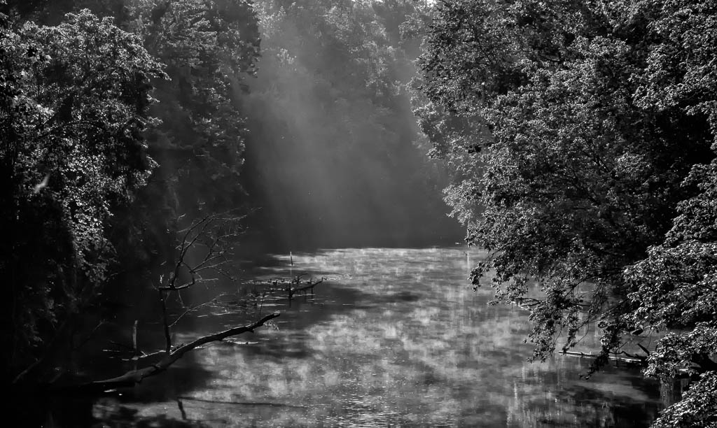
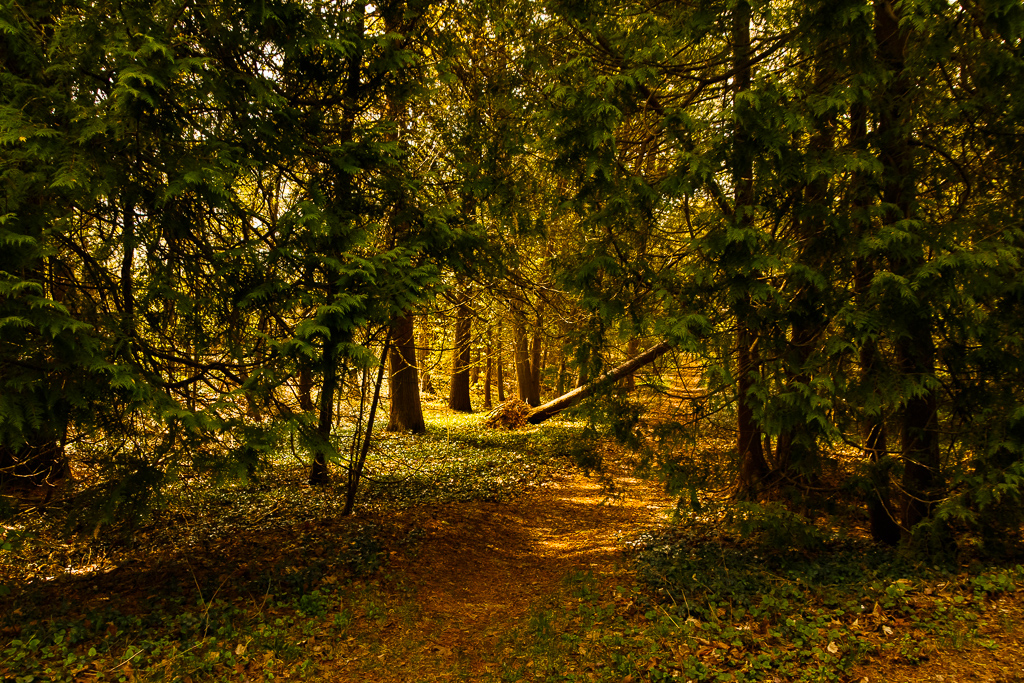
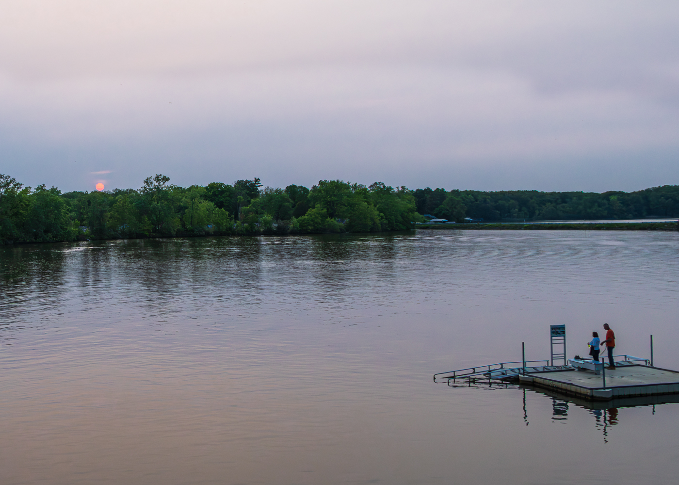
Hi Lance...thanks for submitting this image. I agree with the others that the lamp image best represents the shadows and I also agree that the sunlight provides the best shadows.
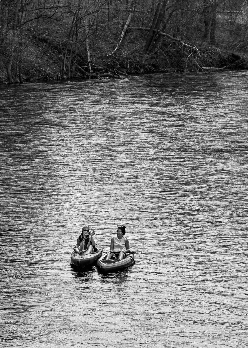
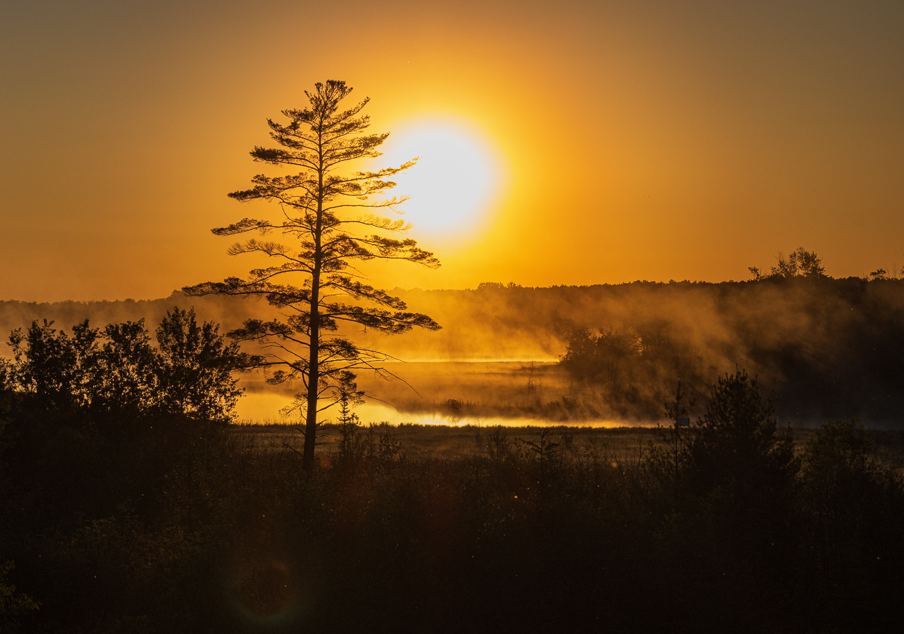
I always learn from your images...they make me think, which I truly appreciate. I am currently attempting to learn the proper use of shadows and the difference between harsh shadows and soft shadows and the benefits of each. I understand that shadows create depth and dimension, however when and how to use is the question for me. Thank you for this exercise and the learning opportunity. I missed this exercise with my submittal this month, but look forward to participating next month. |
May 9th |
| 87 |
May 21 |
Comment |
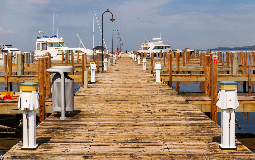
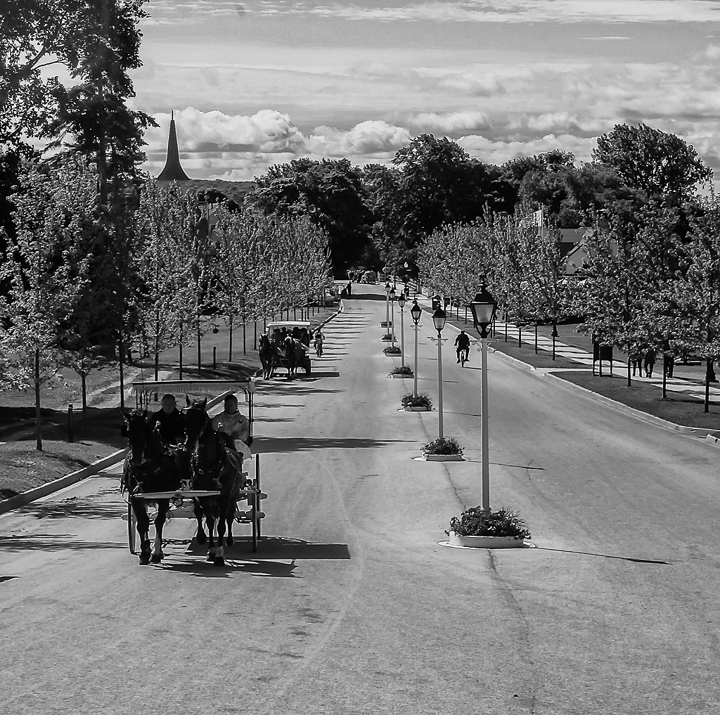
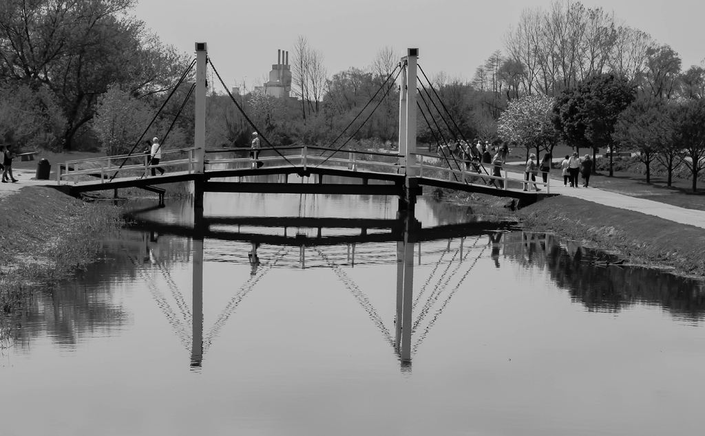
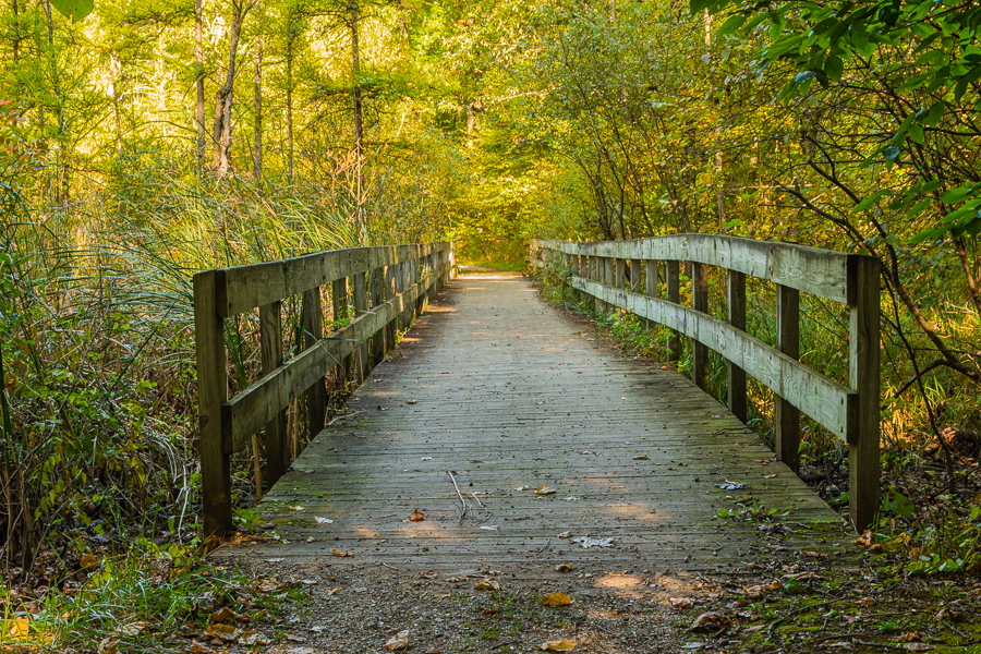
Nice image. I like the leading lines of the image that directs my eye to the people walking up the stairs. The architectural detail is excellent and the overall photo has been well done in post processing.
You, Lance, and Steven have provided an excellent discussion on this image, one that I will learn from as well. My only comment is that to me the light at the end of the walkway (top of the image) appears a little blown out. Understanding that you more than likely did not have time to compose the image properly due to the group setting, perhaps metering on this light as the brightest part of the image (expose to the right, ETTR) and fix the shadows in post processing may be an option. Just thinking, however an excellent image overall. |
May 9th |
| 87 |
May 21 |
Comment |
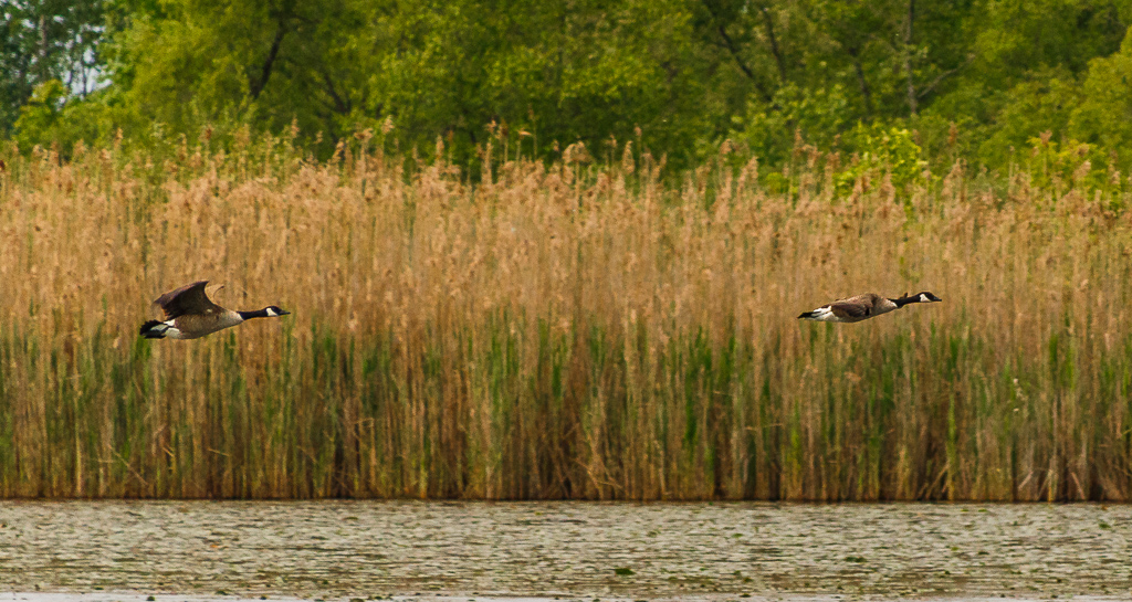
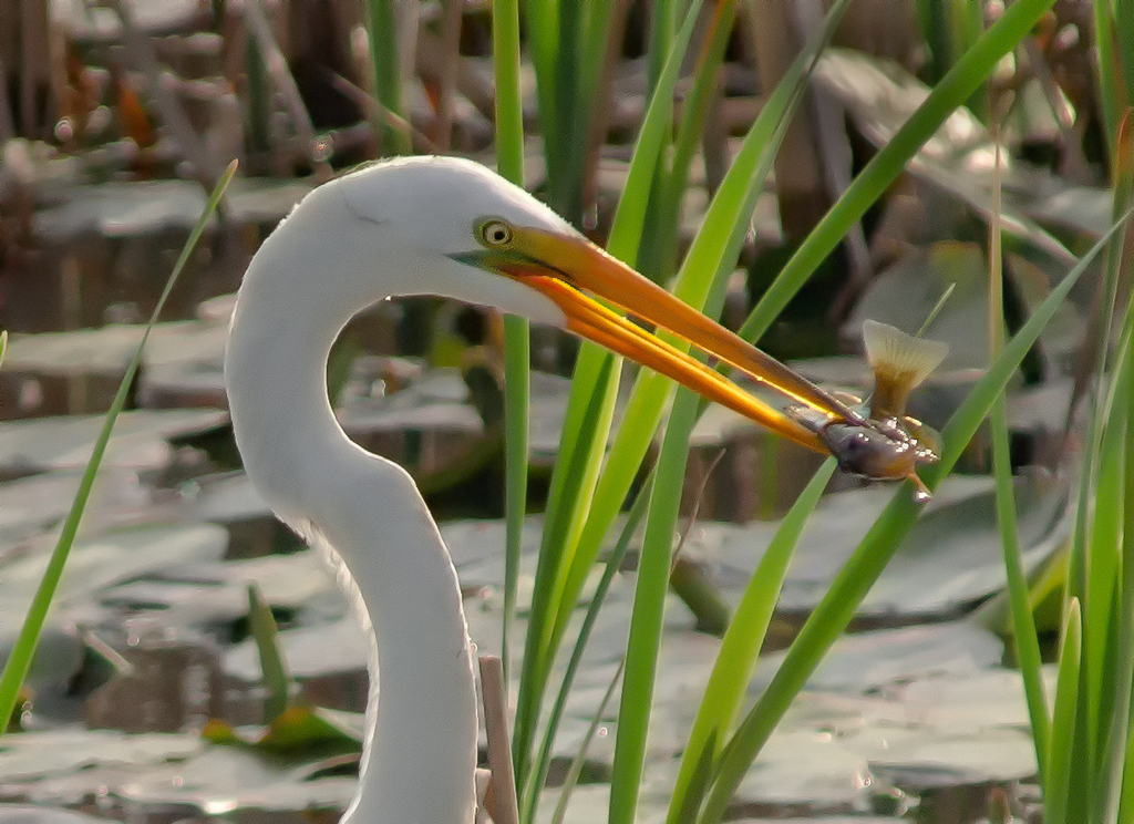
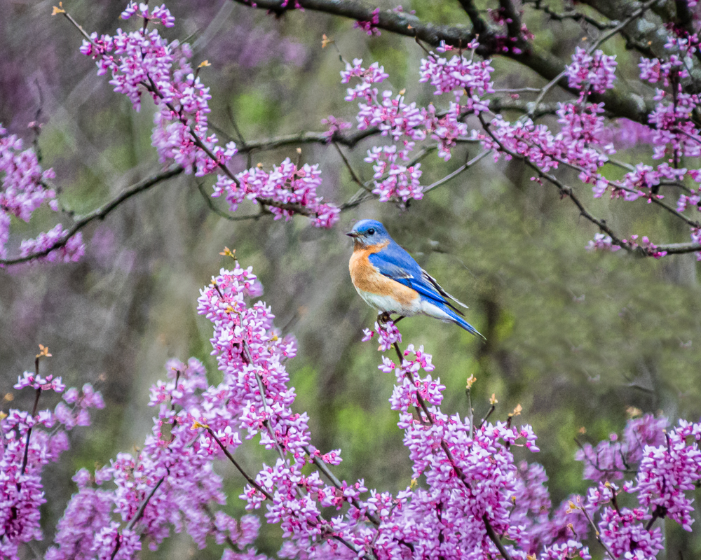
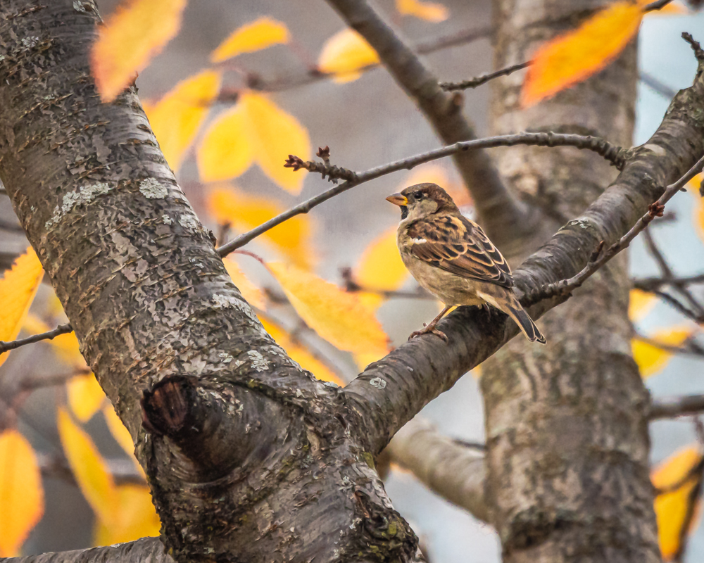
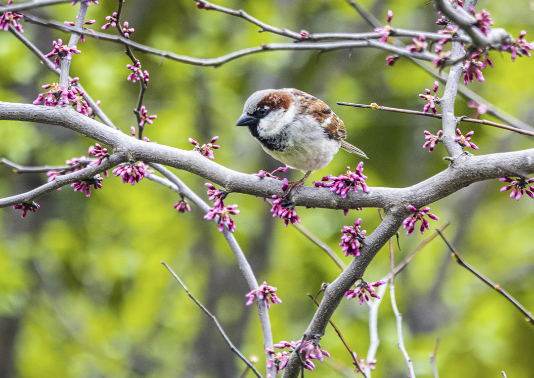
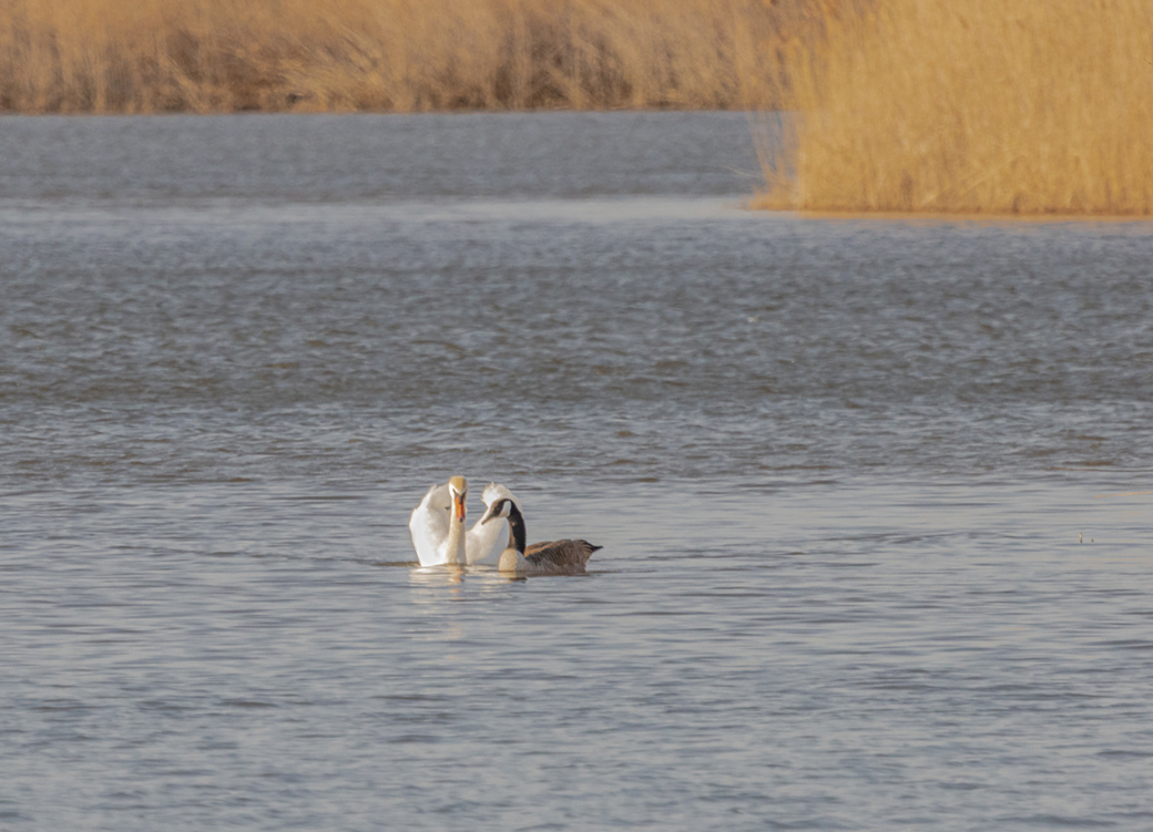
Hi Cindy...welcome to the group! Nice bird photo! I like the alternate position of the bird (as opposed to taking the photo from the front) and the positioning of the bird toward the top of the image. Lance, Steven, and Chan have provided excellent points regarding bird photography and there is nothing more that I could add. Nice work, and again, welcome. |
May 9th |
| 87 |
May 21 |
Comment |
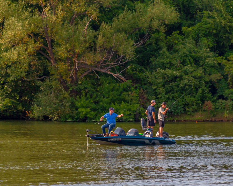
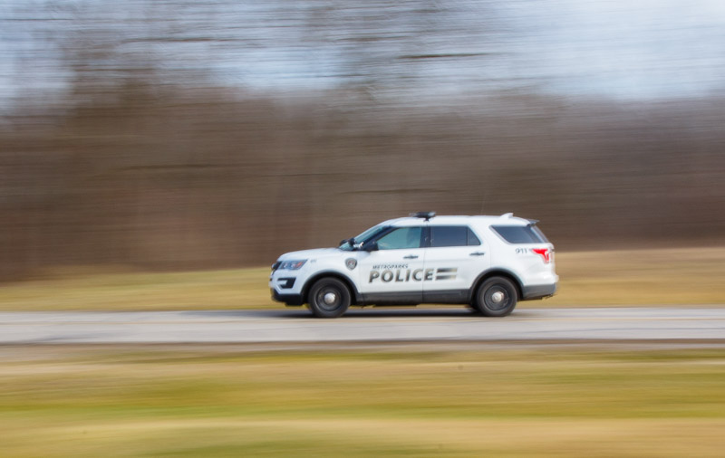
Excellent image! Panning is in my opinion one of the hardest things to do in photography. I had to submit a panning photo for a recent class and had to work very hard to get one. This is an excellent photo with the sharpness where needed and the sense of motion well established. An additional plus for me is the expression of the man's face that you were able to capture. Excellent work!
Lance in his comments had asked us to submit any like photos...here is the one that I referenced... |
May 9th |
 |
| 87 |
May 21 |
Comment |
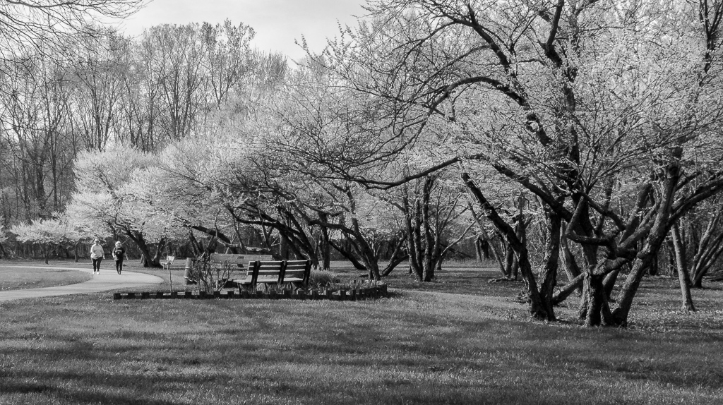
Excellent image! I think the black and white conversion was the right move for this image. The bench is sharp with excellent details. I personally like the use of shadows in this image and especially the "puzzle" created by the adjoining shadows from the adjacent bench. With the shadows as noted, this is an image that makes me think, which I truly like in a photo. Nice work! |
May 9th |
| 87 |
May 21 |
Comment |
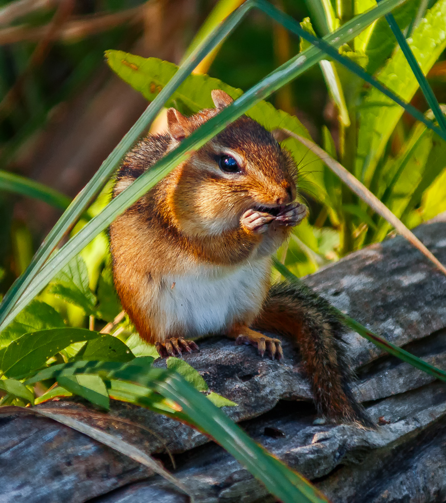
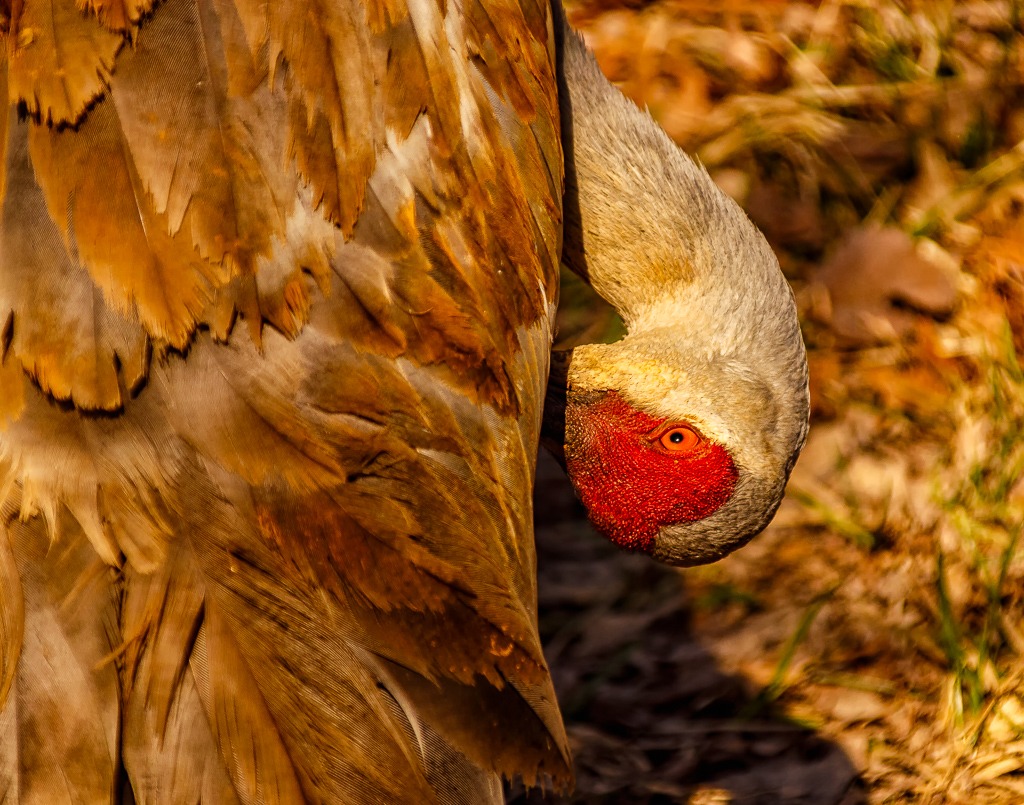
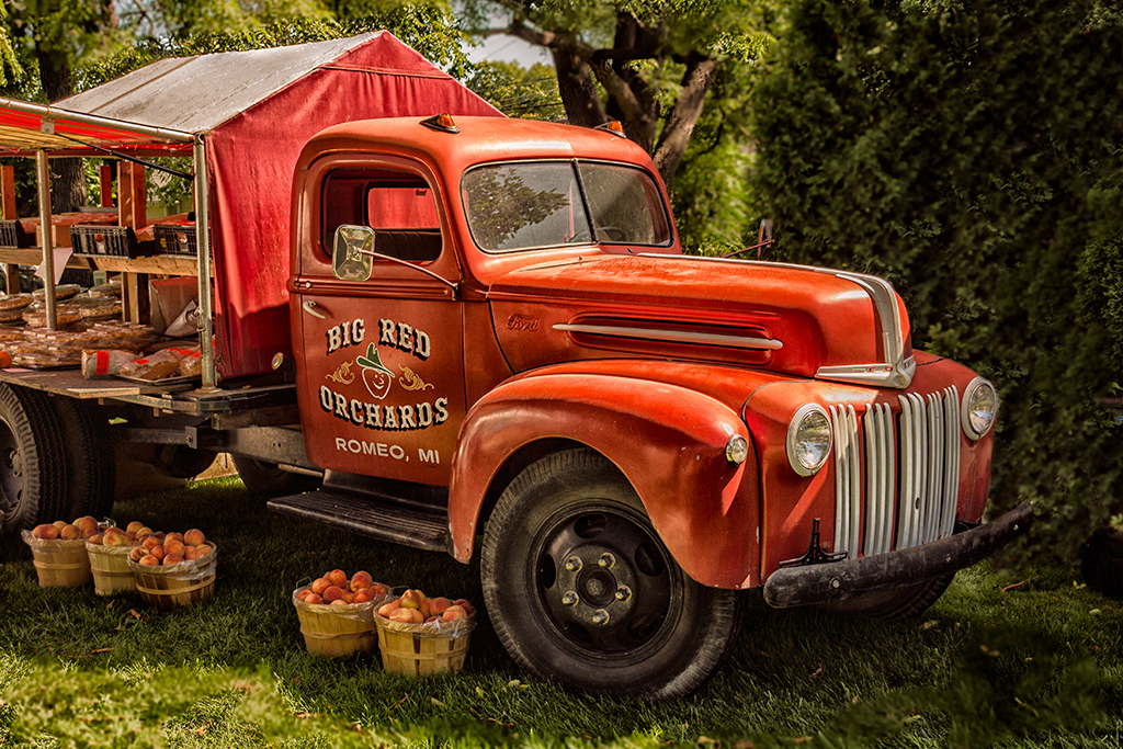
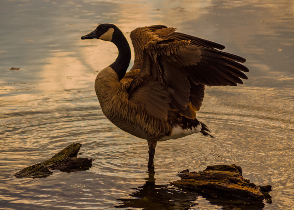
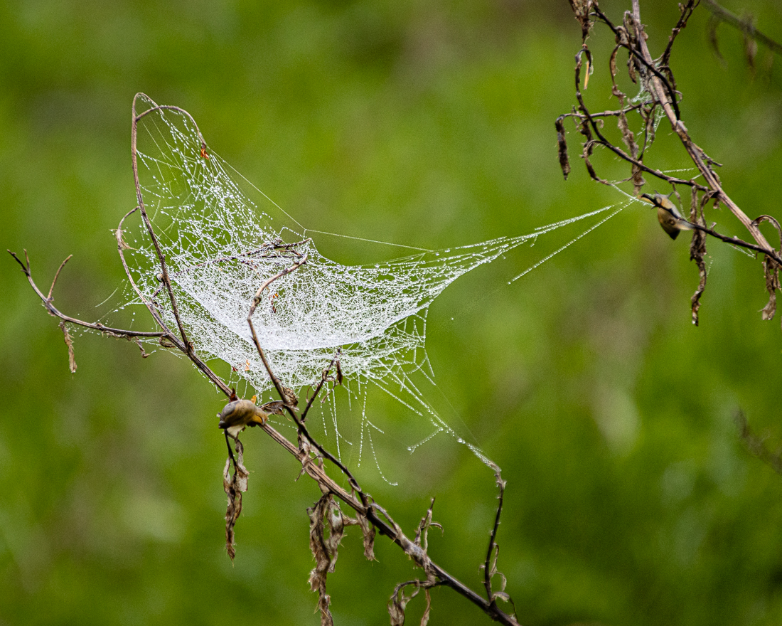
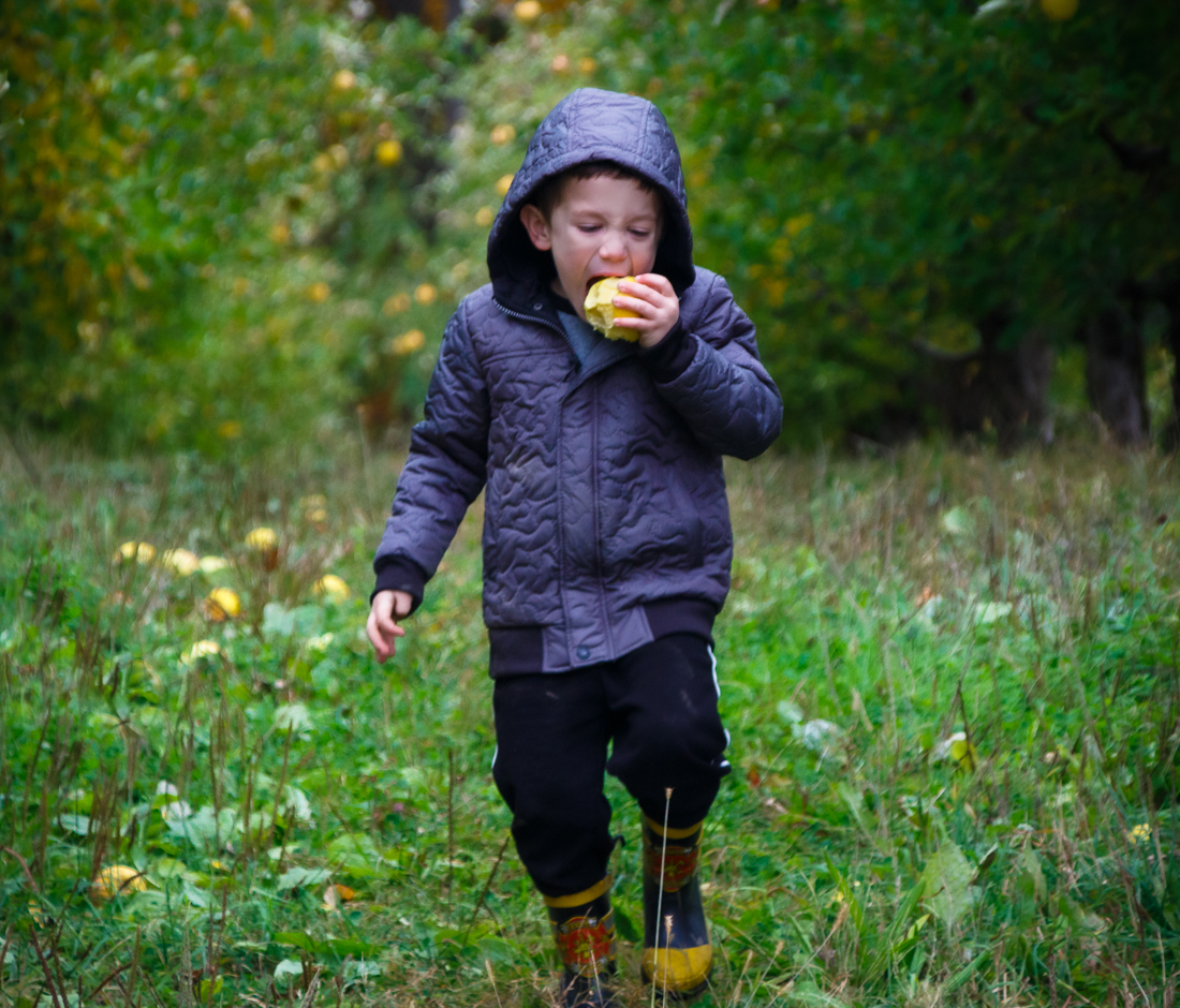
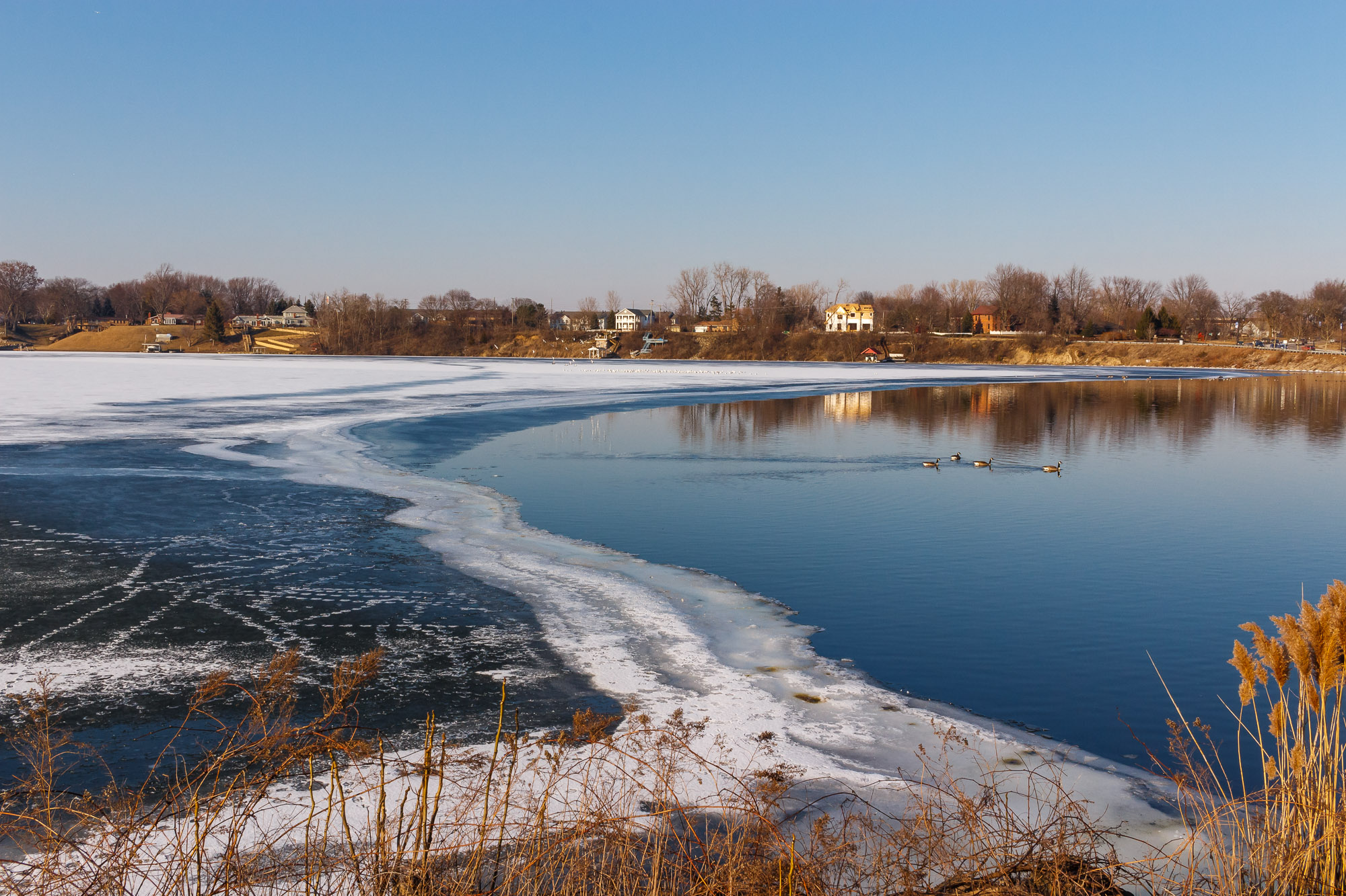
This is a great image! The details and overall sharpness are great, especially the eye of the bird. I personally like the shadow effect for the creativity. I have recently taken a photo of a goose similar to this scenario where his head is completely missing due to the wingspan, but the shadow of his head is visible. Overall I really like this image and the overall detail and creativity. Nice work! |
May 9th |
6 comments - 5 replies for Group 87
|
6 comments - 5 replies Total
|