|
| Group |
Round |
C/R |
Comment |
Date |
Image |
| 87 |
Apr 21 |
Comment |
Excellent! I like the detail and the colors within the ice. This is the type of image that allows the viewer (me) to think and study the image over and over. The background with the flowing water and bubbles adds to the story. Very nice! |
Apr 7th |
| 87 |
Apr 21 |
Comment |
This is an outstanding photo! I really like your creativity in making this image. I also appreciate you sharing how you did this, including a picture of your set-up. Very nice! |
Apr 7th |
| 87 |
Apr 21 |
Comment |
This is a great photo! I really like the creativity and the work involved in creating this image. Based on this image it looks like you are doing very well in your class. Excellent work... |
Apr 7th |
| 87 |
Apr 21 |
Comment |
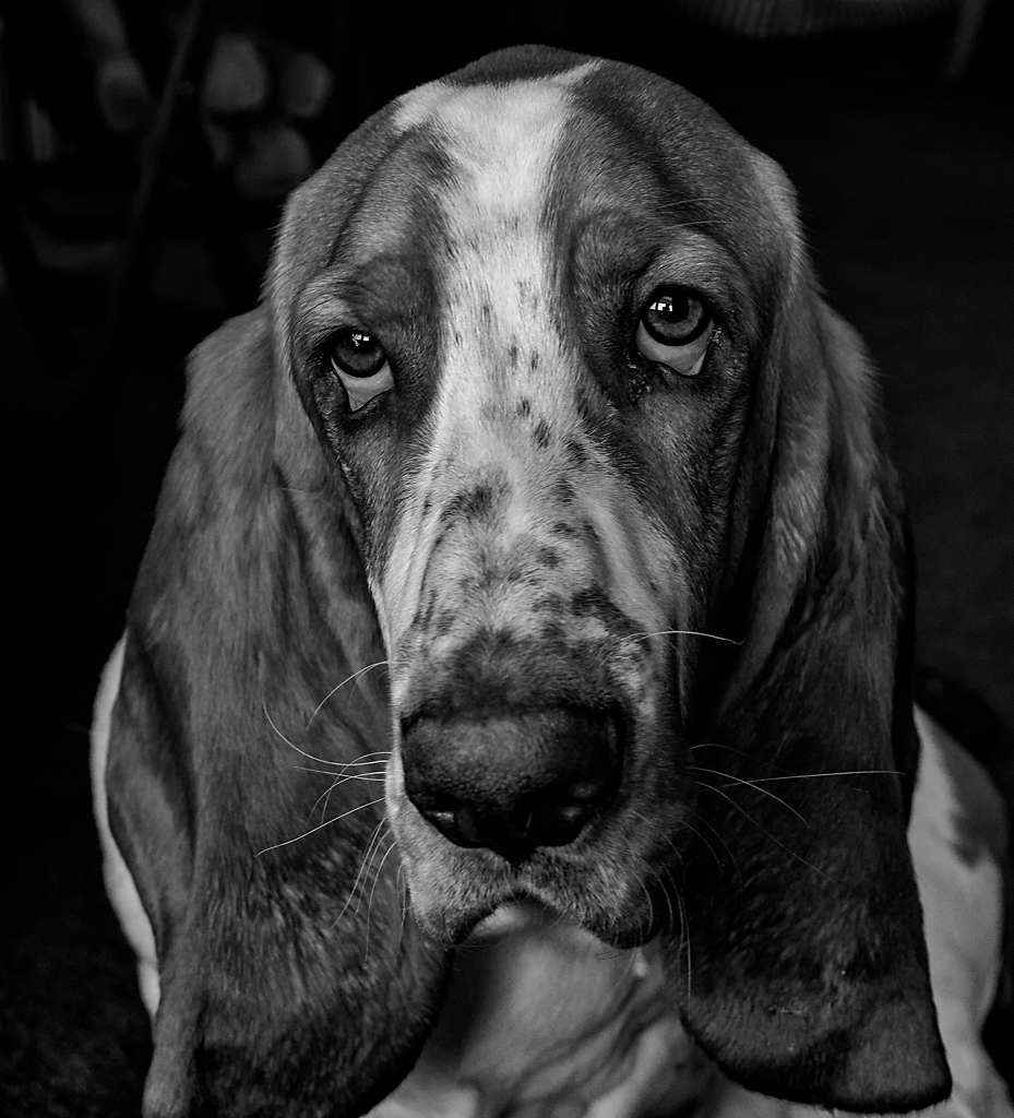
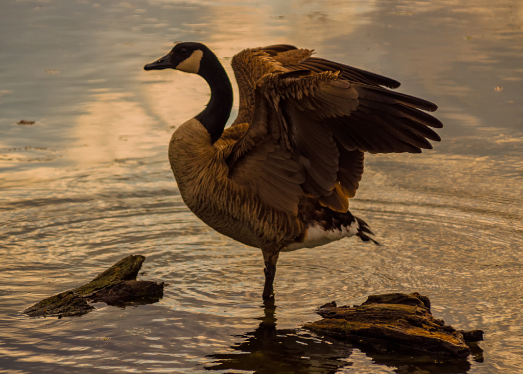
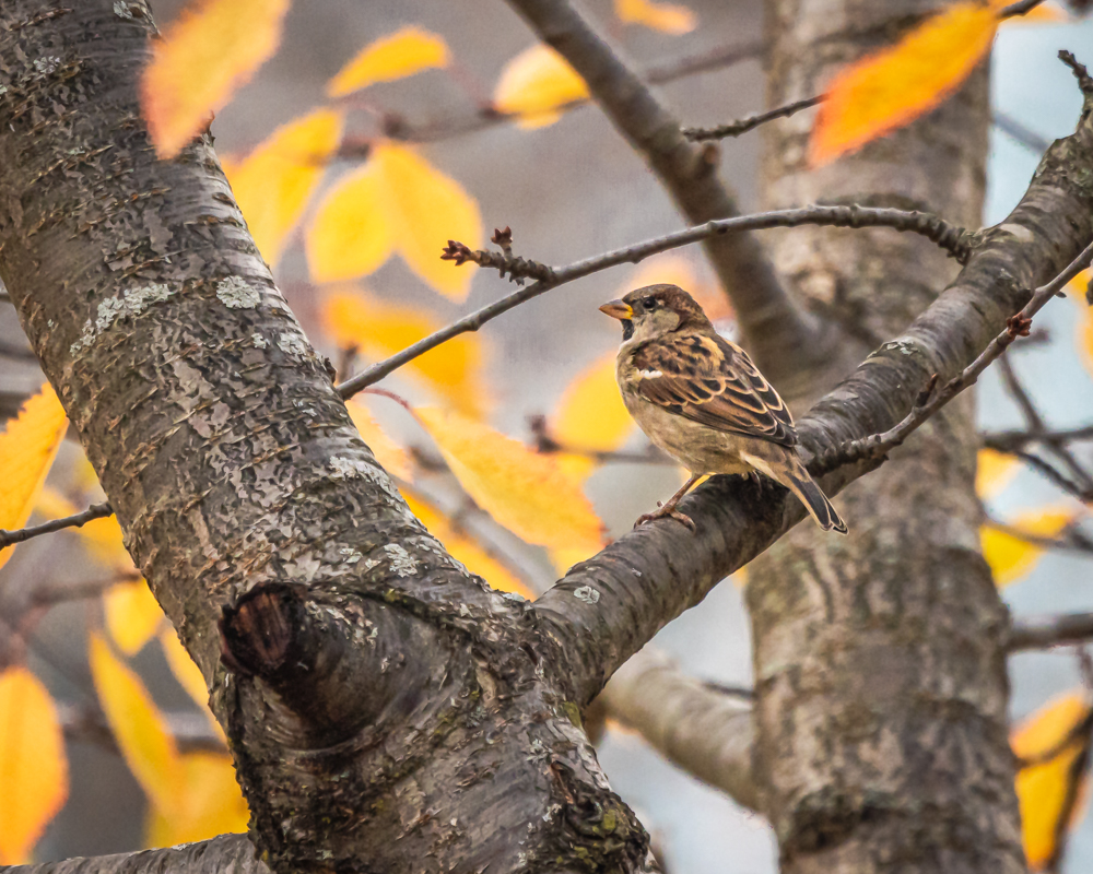
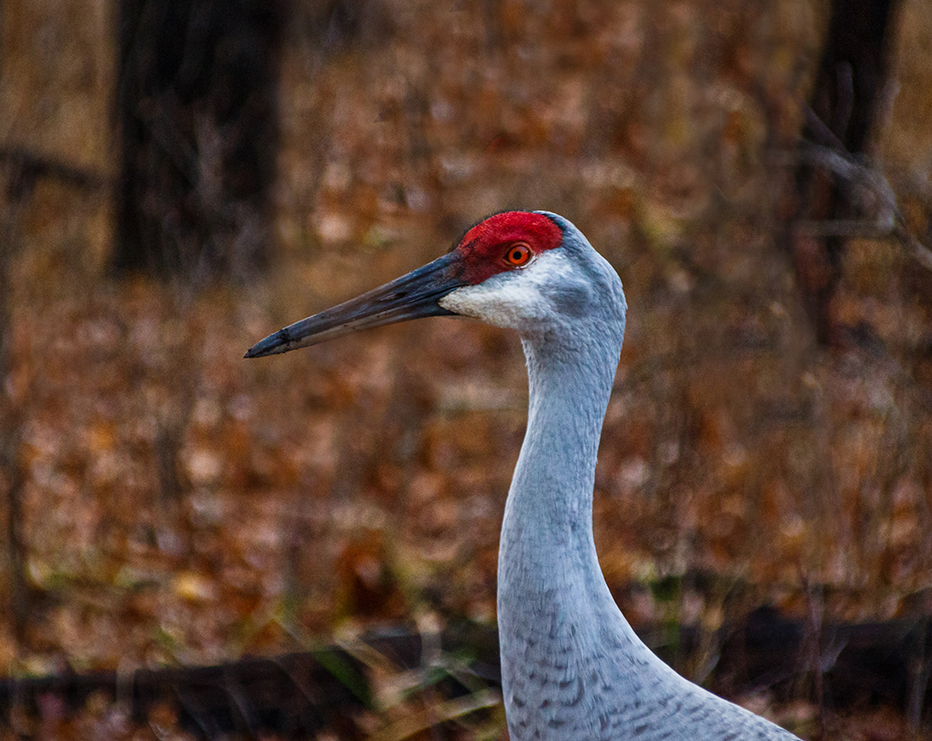
Excellent shot! The close up detail is very good, especially the eye. The lens seems to be a good fit for bird and other wildlife photography. I just purchased a new Sigma 100-400 lens (Canon) and am still trying to get used to it. Nice work! |
Apr 7th |
| 87 |
Apr 21 |
Comment |
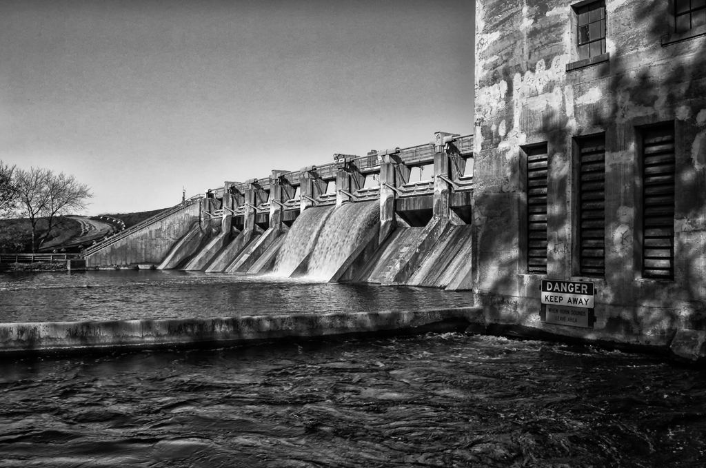
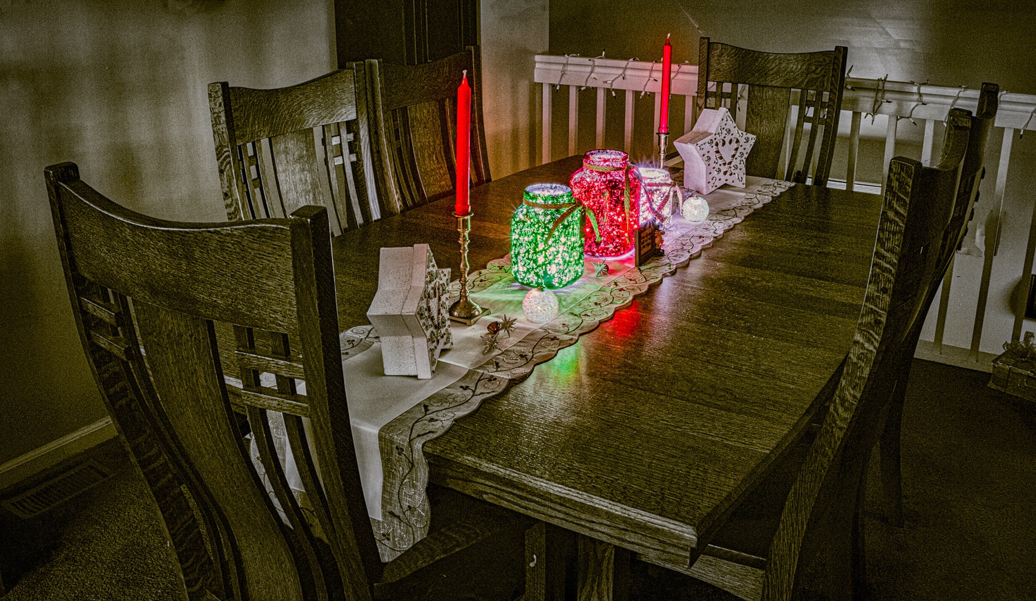
This is an excellent image! I really like the details throughout and the composition is excellent. I also think this photo is perfect for BW. The only suggestion to possibly consider is to darken the back wall and top of the bookcase slightly, either as a stand alone modification or in conjunction with the darkening of the archway and floor. Well done! |
Apr 7th |
| 87 |
Apr 21 |
Comment |
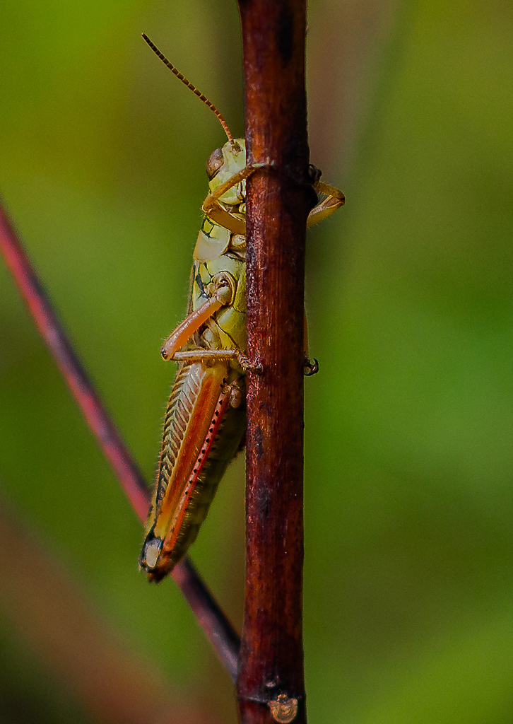
Thanks Steven! I agree that the bug is an option...its either a good conversation starter or a distraction. I truly appreciate your insights! |
Apr 7th |
| 87 |
Apr 21 |
Reply |
Thanks Jennifer! |
Apr 7th |
| 87 |
Apr 21 |
Reply |
Thanks Lance! Regarding the bug, I was lucky...it was there when I took the shot. Thanks for the BW conversion...I like it very much and is a good option for this image. I need to look more diligently at the possibility of BW for more of my photos. |
Apr 7th |
6 comments - 2 replies for Group 87
|
| 96 |
Apr 21 |
Reply |
Dan....wow!? |
Apr 19th |
| 96 |
Apr 21 |
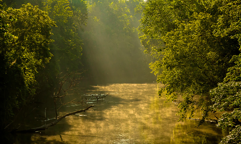
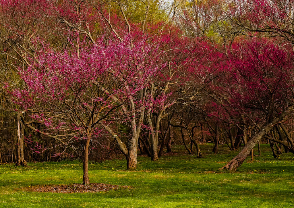
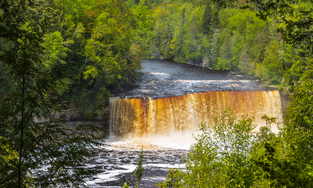
Reply |
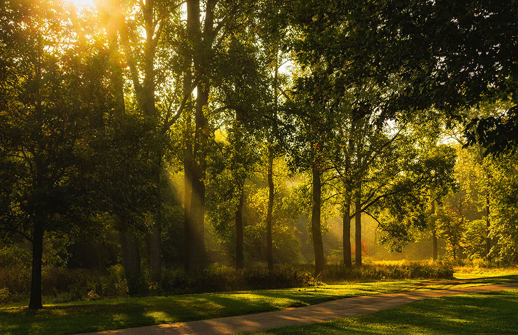
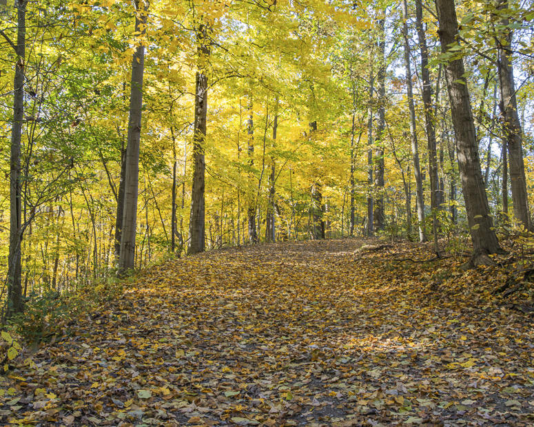
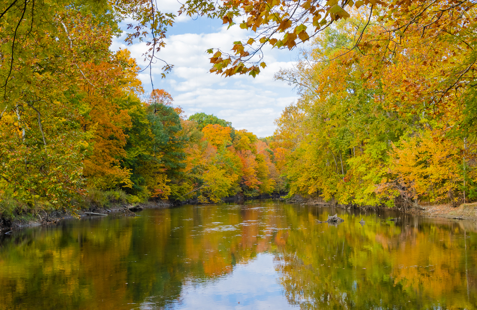
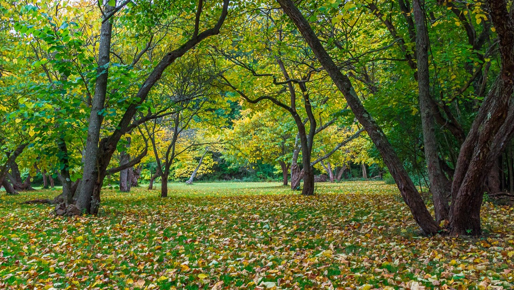
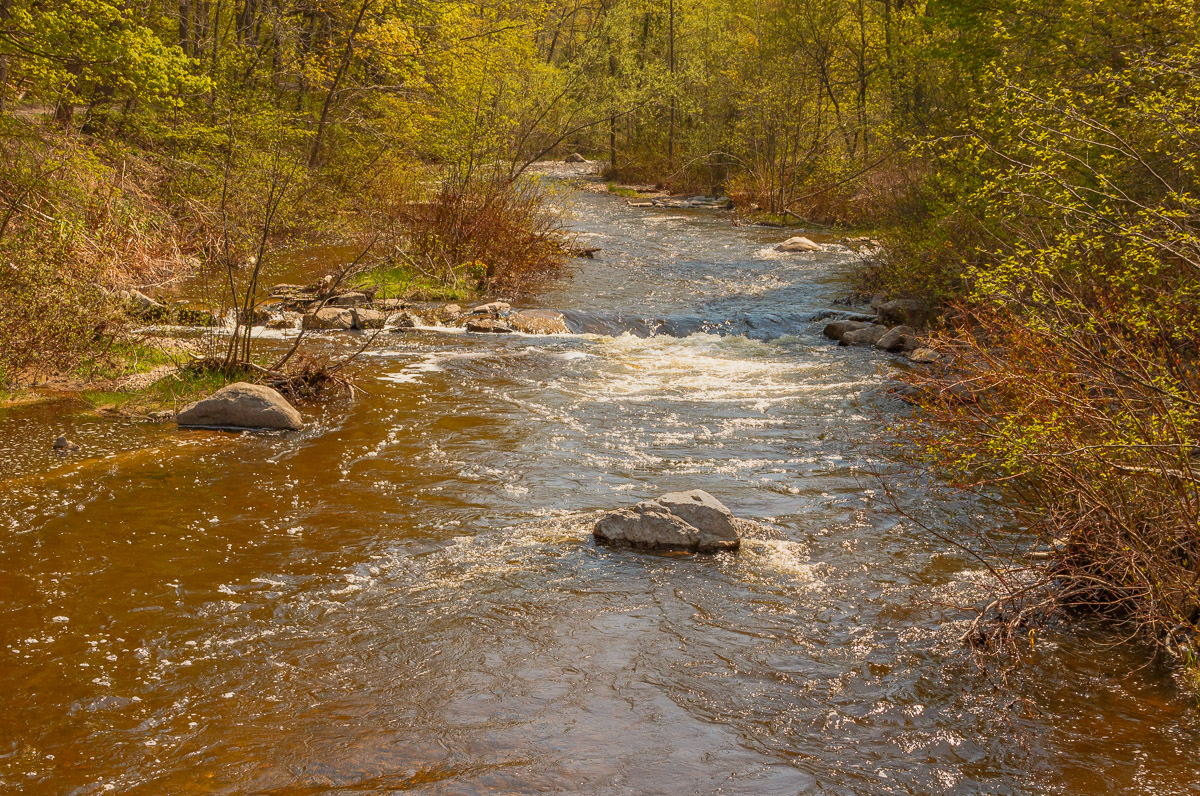
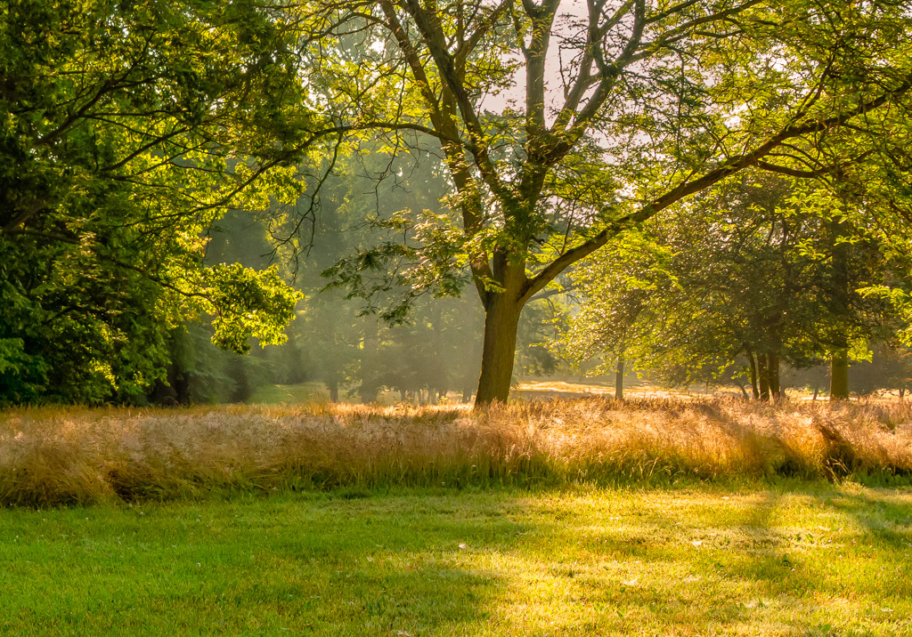
Thanks Cheryl, I appreciate your input. I agree that the colors are a little warm, but I was trying to preserve the early spring feeling where here in Michigan the leaves are a yellowish/green. I may have overdone it somewhat. I like your suggestion for the black & white version which really enhances the river. Thanks again. |
Apr 19th |
| 96 |
Apr 21 |
Reply |
Thanks Robert, I really like your suggestions. Your enhanced colors in your photo really enhances the image. I agree that the colors in my image are a little warm, however I was trying to preserve the early spring feeling where here in Michigan the leaves are a yellow/green tone. I added a little light to this as well, but may have overdone it. Thank you again for your input, it gives me something to experiment with. |
Apr 19th |
| 96 |
Apr 21 |
Reply |
Gerard - thanks for your input. I really like your suggestions, especially the crop which emphasizes the river more. Thanks again! |
Apr 19th |
| 96 |
Apr 21 |
Reply |
Thank you Bev! |
Apr 19th |
| 96 |
Apr 21 |
Comment |
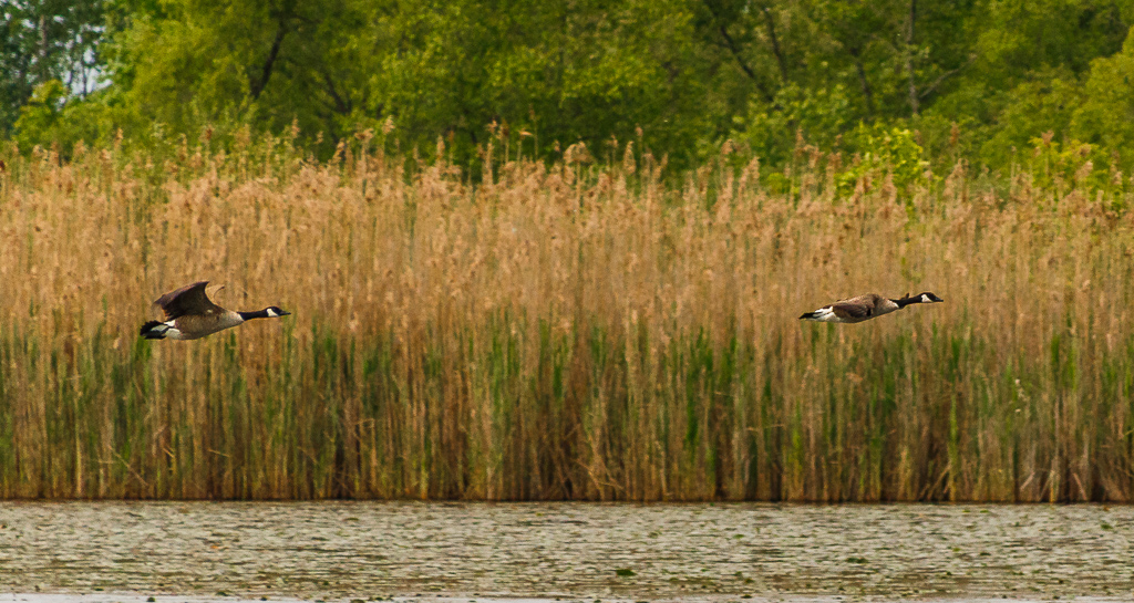
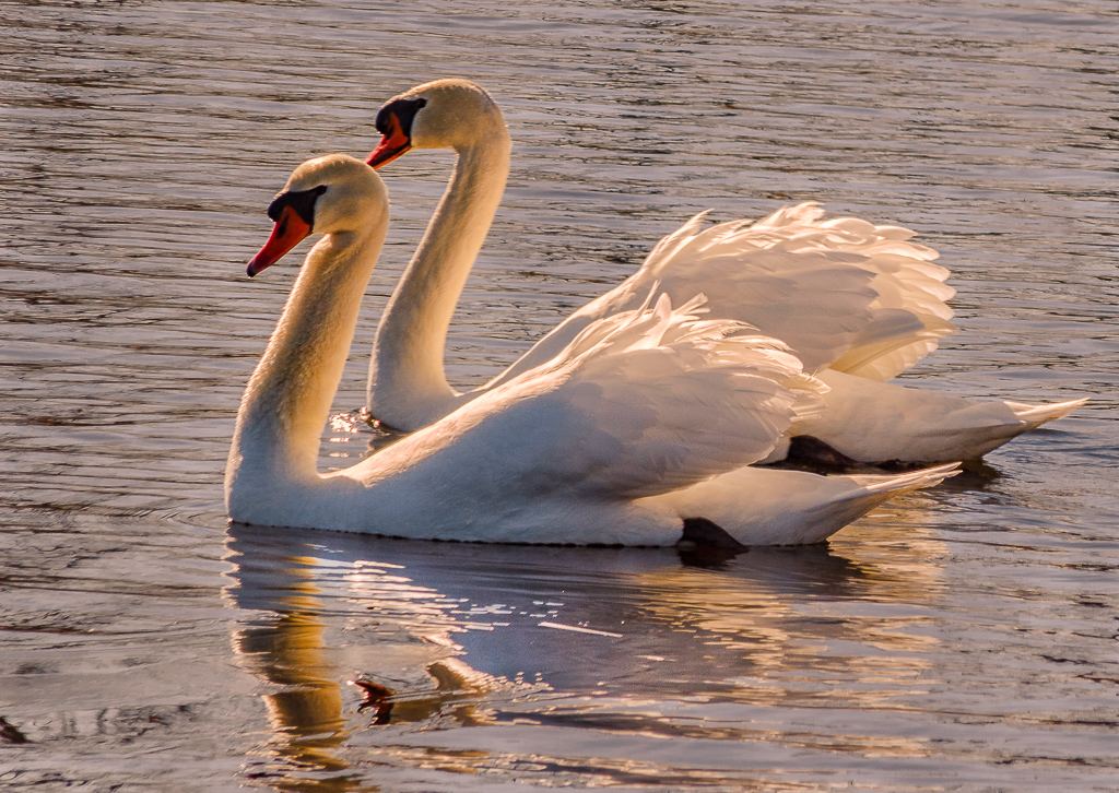
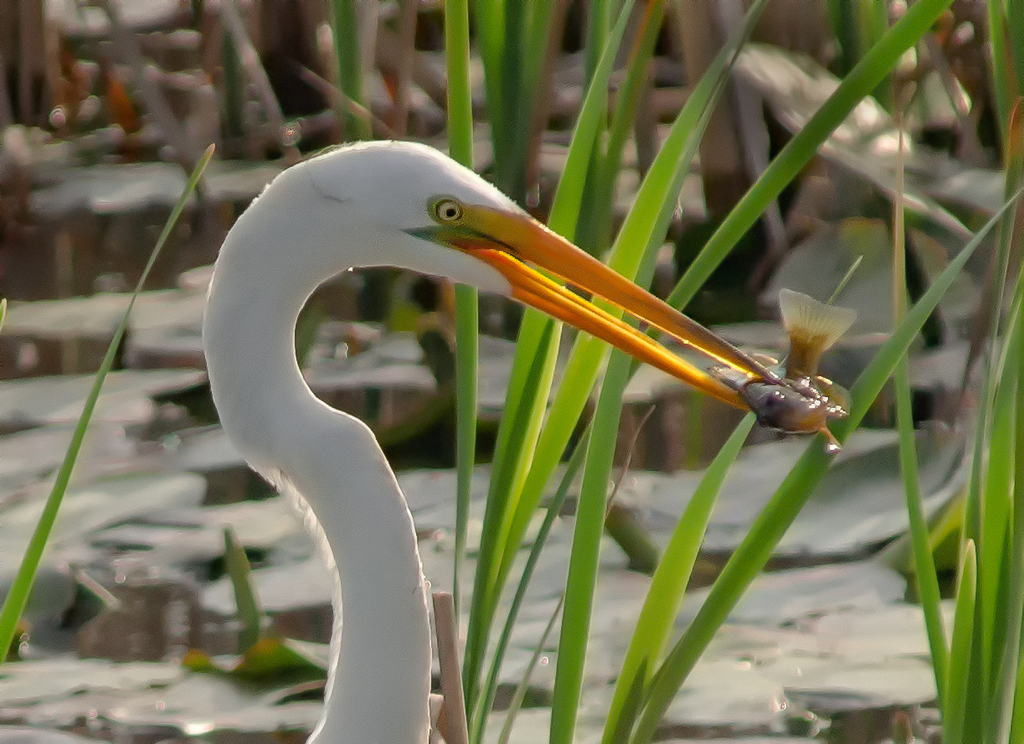
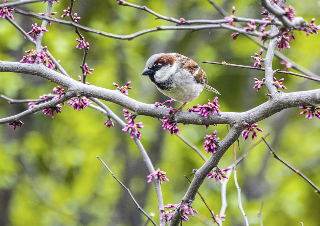
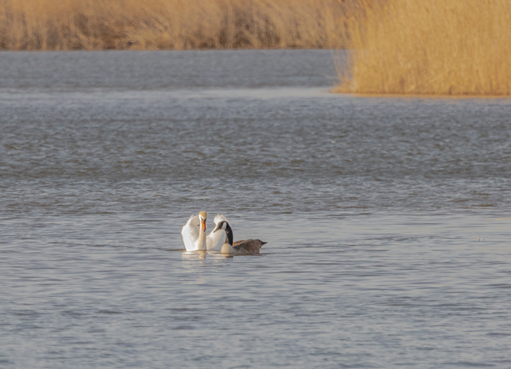
Hi Gerard - nice image. I like the composition, especially the symmetry of the placement of the birds. In my opinion the detail and depth of field turned out well for a f/5 aperture. My only suggestion would be to possibly darken the sky to provide a little more overall contrast. Well done! |
Apr 19th |
| 96 |
Apr 21 |
Comment |
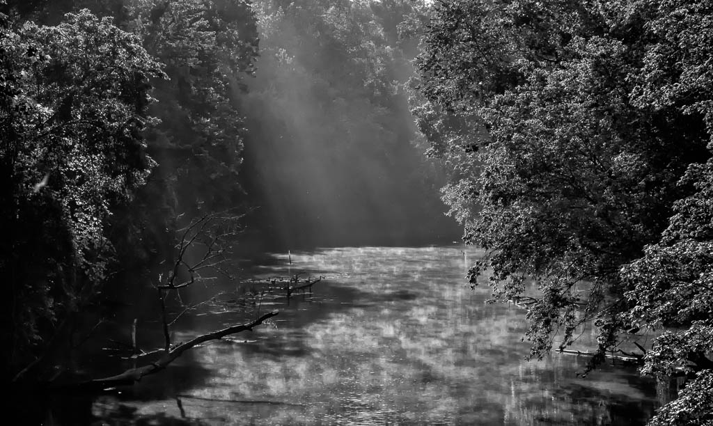
Hi Cheryl - this is another excellent black & white image that you have provided for us to view. The detail is outstanding throughout the image, especially noted in the mountains and the clouds. The low level fog really makes this photo very interesting. The only suggestion I would have is to experiment with slightly lightening the foreground trees to provide a little more tonal contrast. However, I am not sure that this is even needed as this photo stands very well as you presented it. Very well done! |
Apr 19th |
| 96 |
Apr 21 |
Comment |
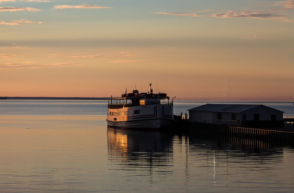
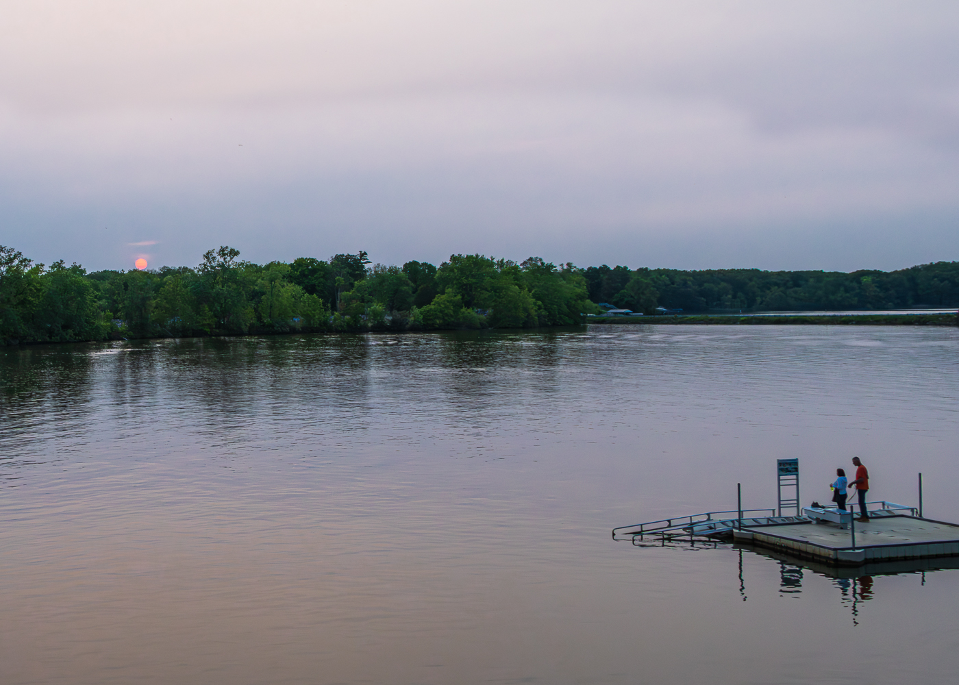
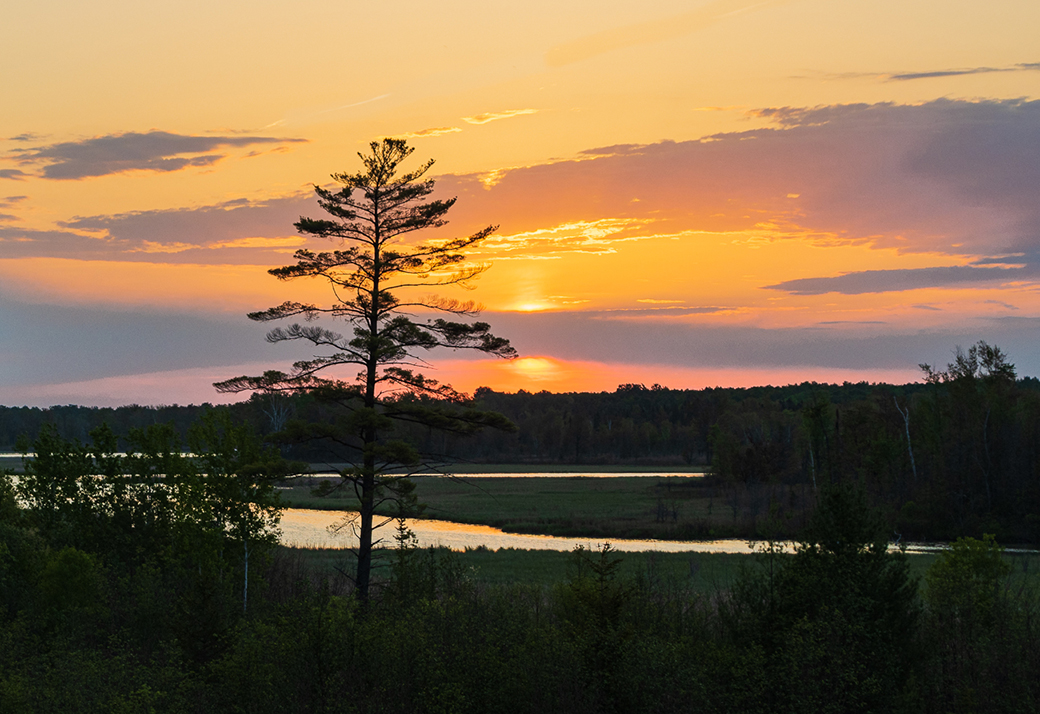
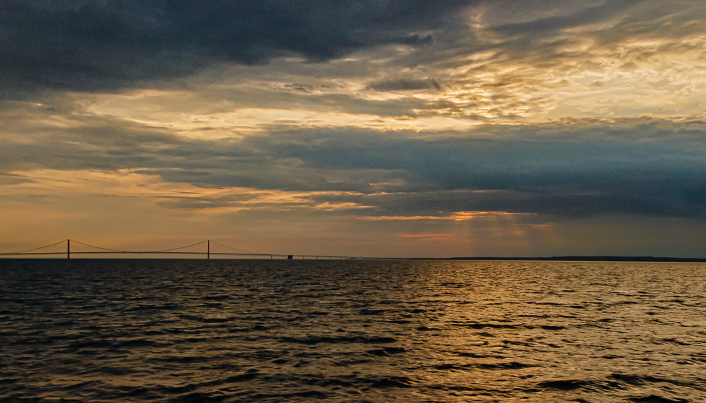
Dan - this is a very good landscape image! I like the detail throughout and the foreground/background contrast. The color of the sky, especially the background reds adds to the quality of the photo. Well done. |
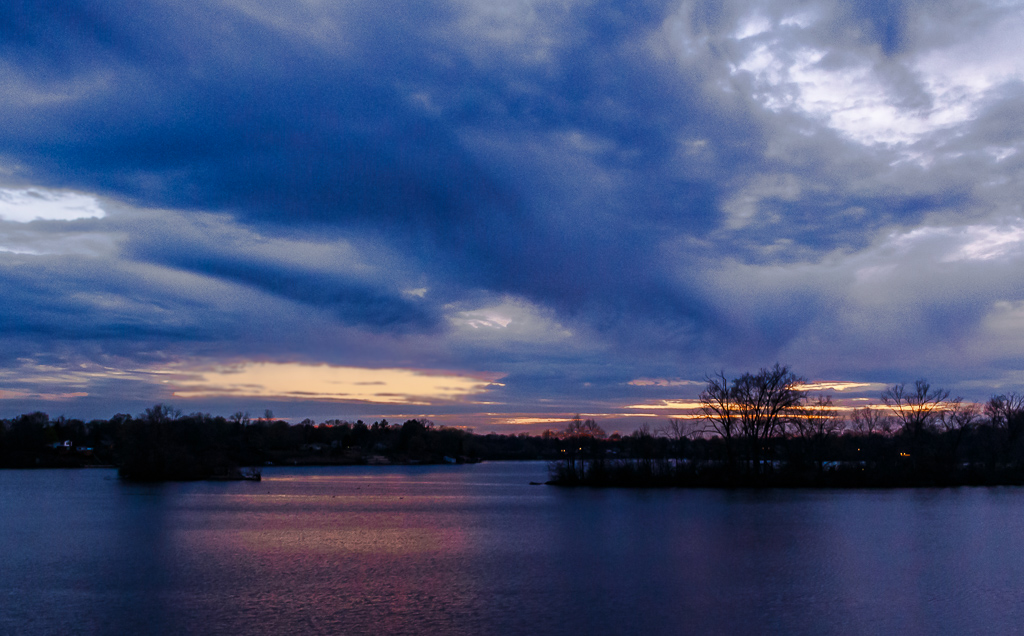
Apr 19th |
| 96 |
Apr 21 |
Comment |
Hi Robert - this is an excellent image that shows the ethereal quality that you are wanting to preserve. The colors are excellent and the foreground detail adds to the quality of the image. My personal thoughts are to have the image as a pano as you suggested in one of your comments. I also believe that a slight increase in saturation and possibly contrast could be considered. However, this image is excellent and worthy of hanging on your wall. |
Apr 19th |
| 96 |
Apr 21 |
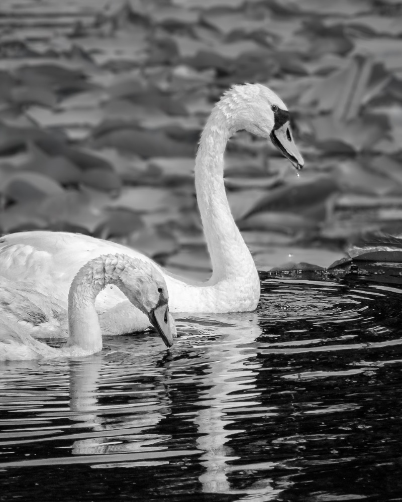
Comment |
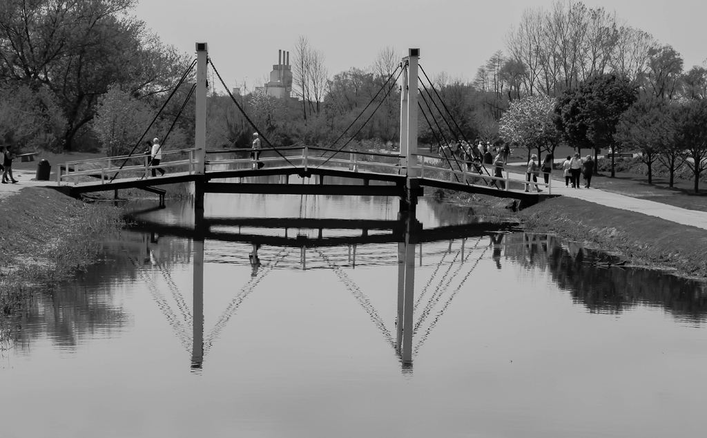
Hi Emily - this is a very good photo with many interesting details. I like the patterns created by the overhead bridges and my eyes tend to follow them to the various parts of the photo. I also noticed the tilted traffic light, but attempting to straighten it would affect other parts of the photo. I personally do not see this as an issue.
Regarding your question about the color or black & white version, I personally prefer the black & white. The tonal contrast is excellent as are the details of the various structures. Very well done. |
Apr 19th |
5 comments - 5 replies for Group 96
|
11 comments - 7 replies Total
|