|
| Group |
Round |
C/R |
Comment |
Date |
Image |
| 87 |
Mar 21 |
Comment |
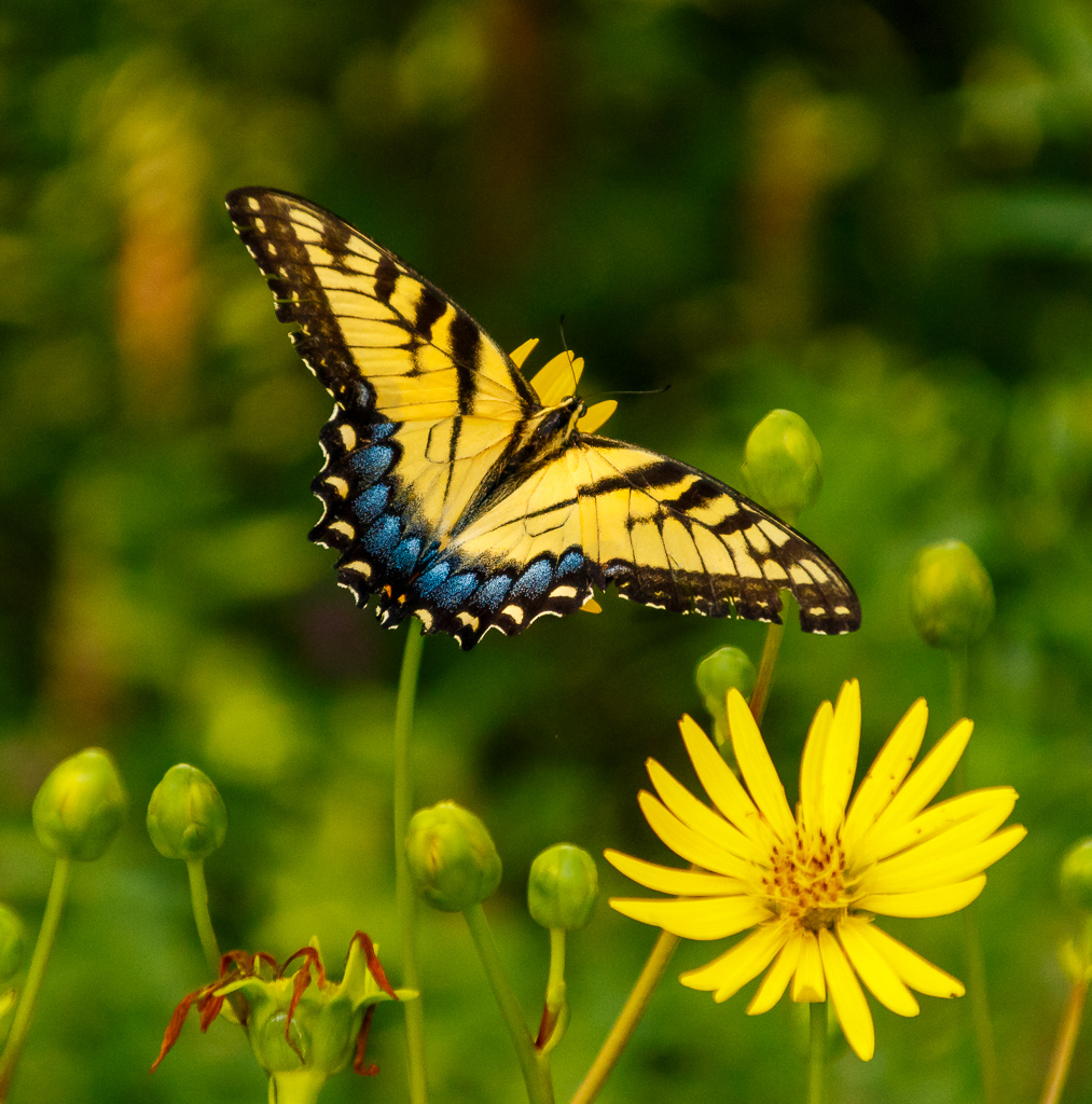
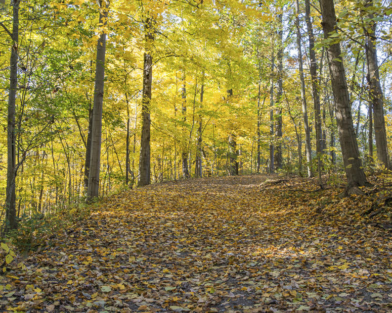
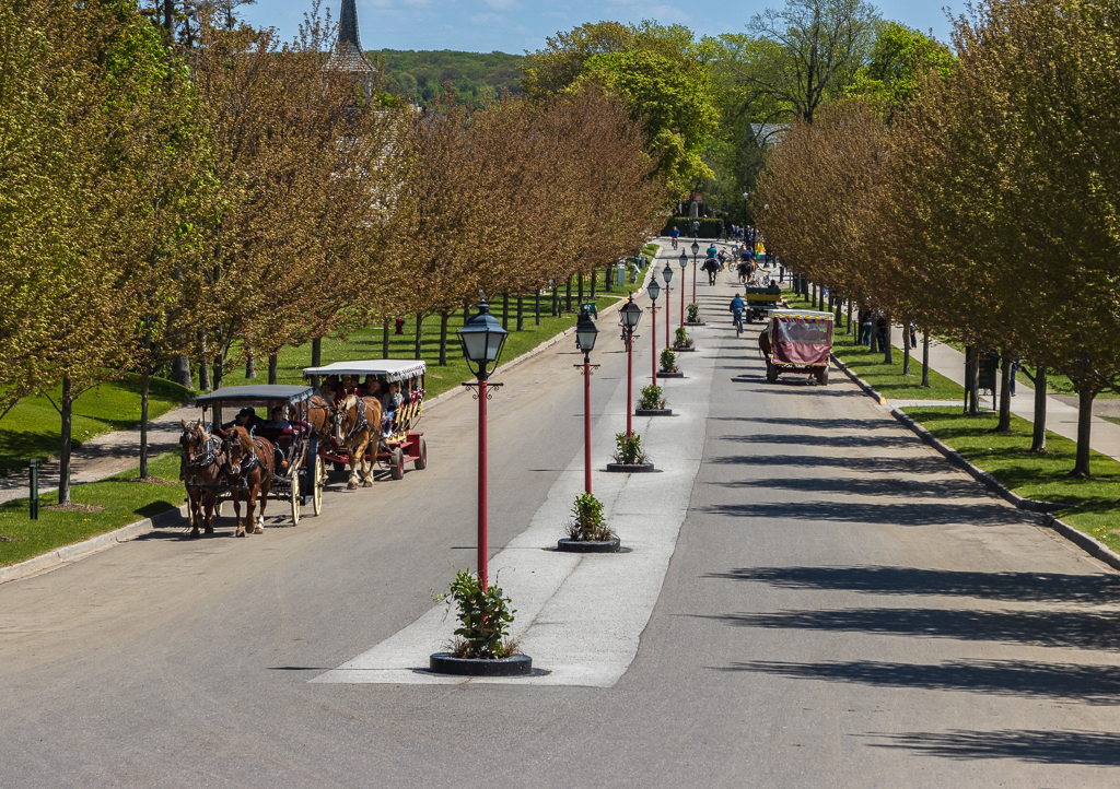
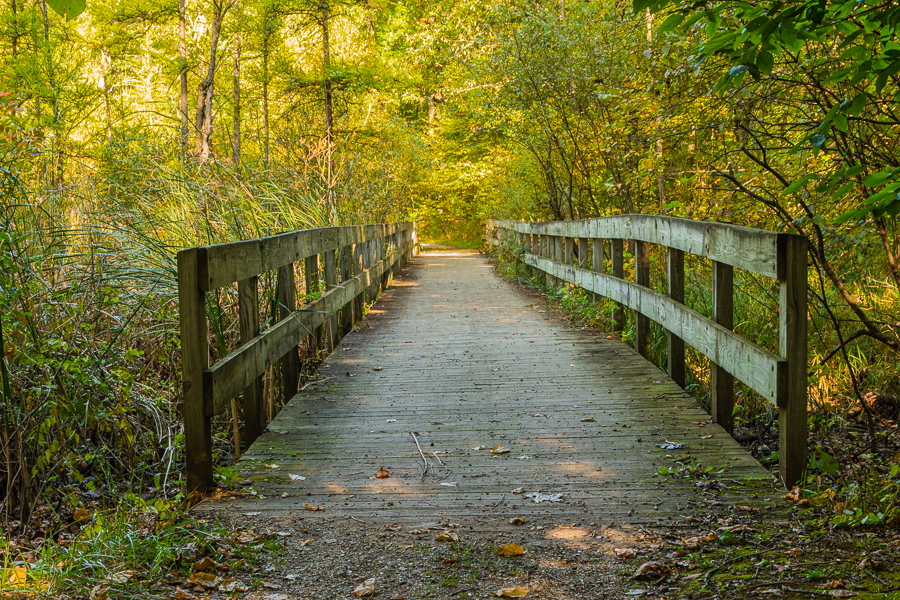
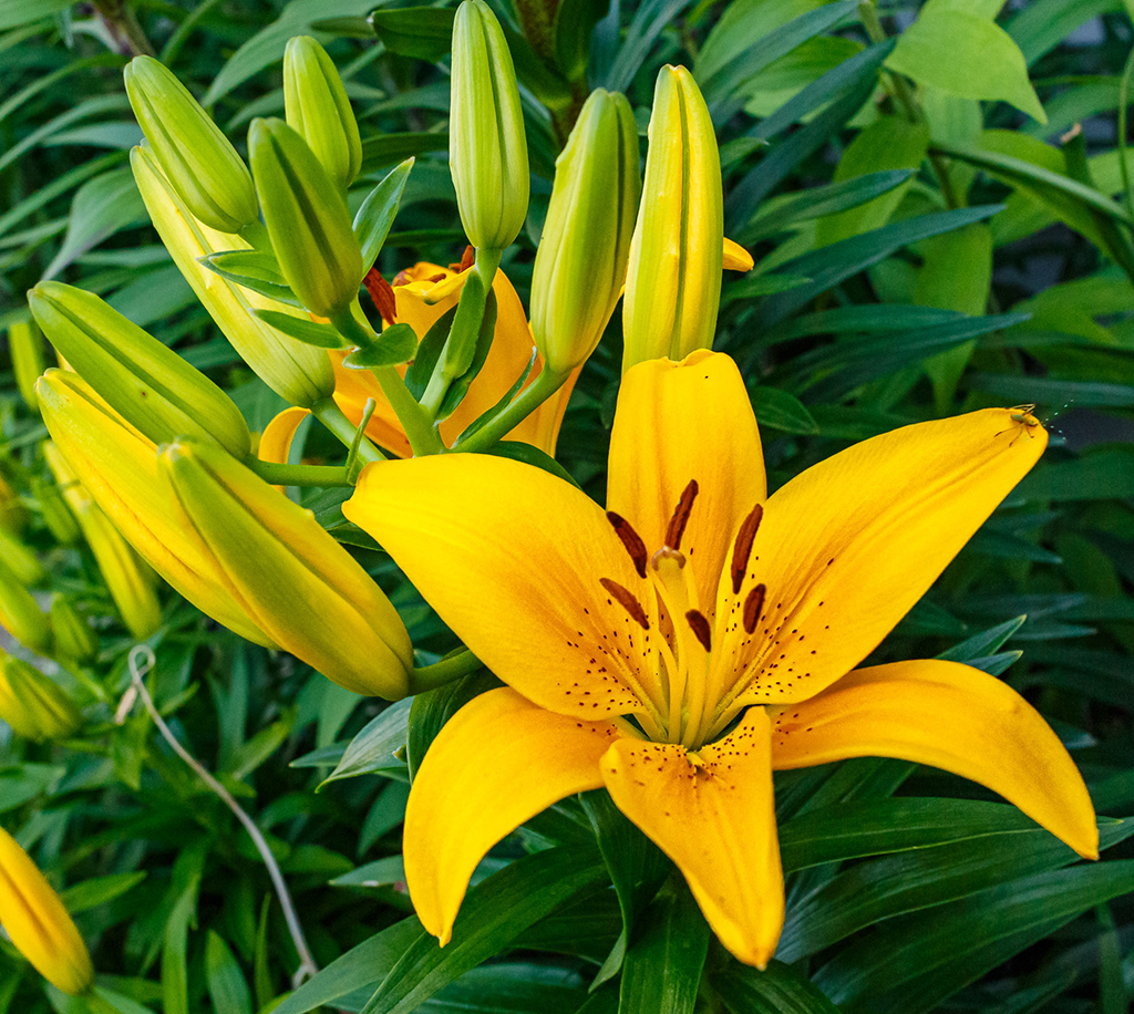
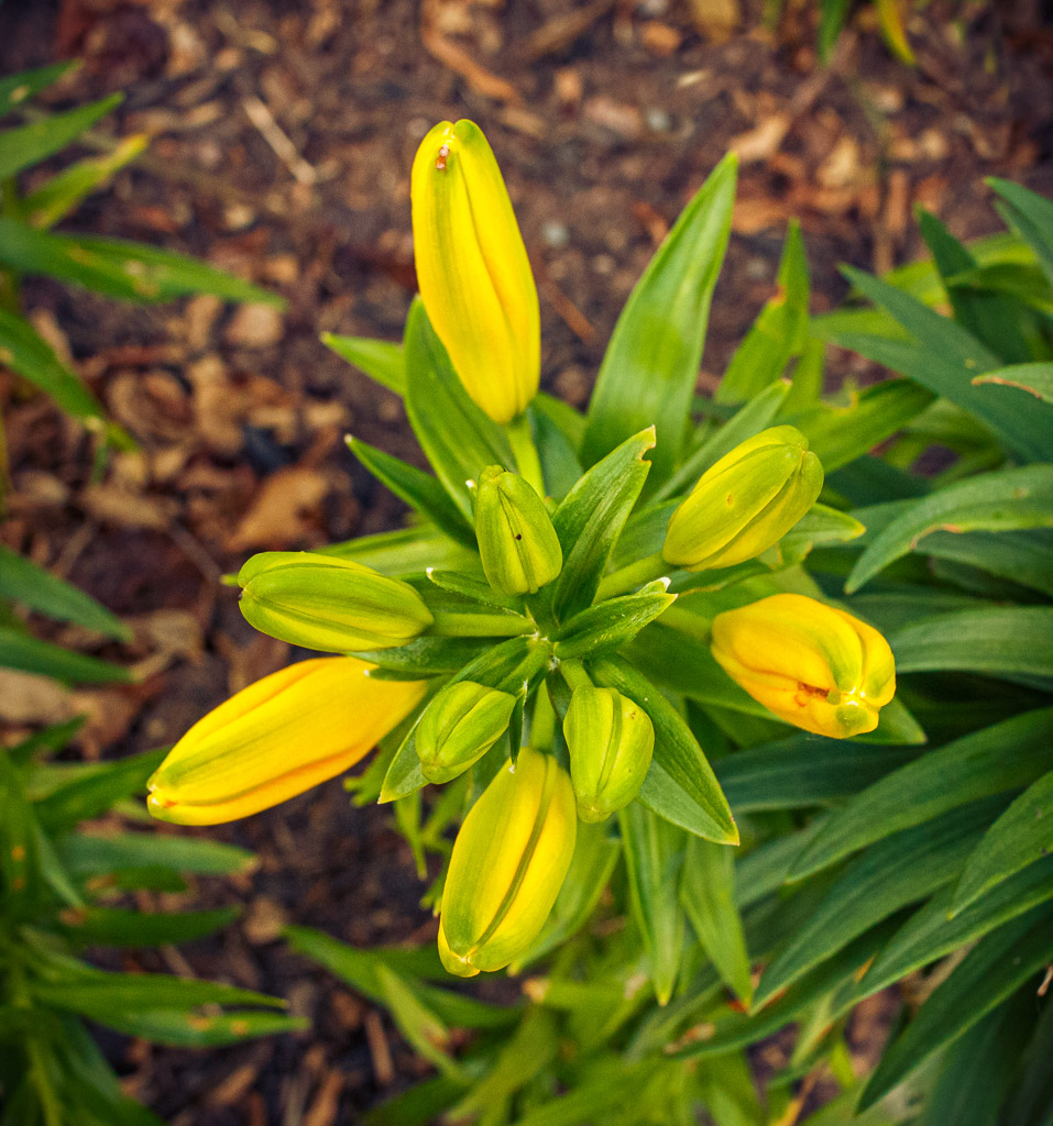
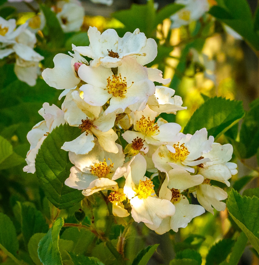
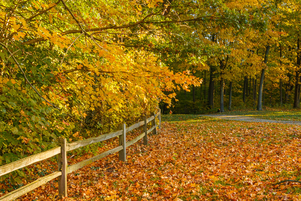
Hi Jennifer - great image! I really like the composition with the various leading lines and the symmetry on each side of the road. I agree with the comments above on the colors, especially the yellows. I always have trouble with yellow colors as they are so strong. In my opinion, dialing down the yellows a little and adding some detail to these flowers will enhance the photo. This is a great shot, thanks for posting this! |
Mar 18th |
| 87 |
Mar 21 |
Comment |
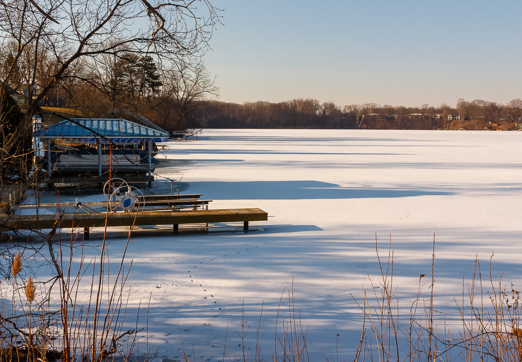
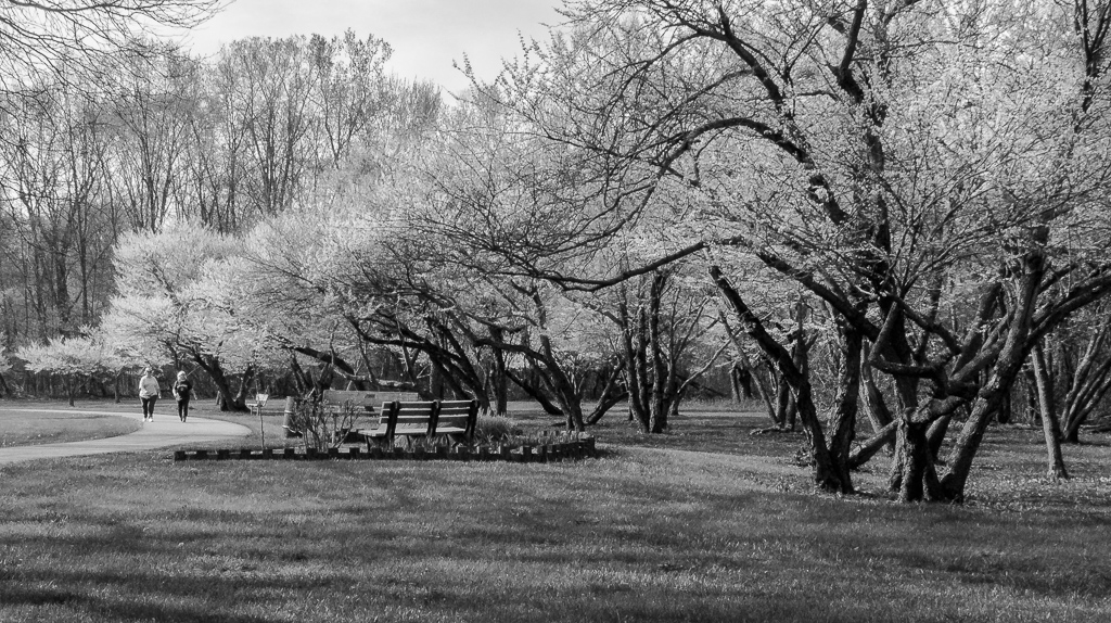
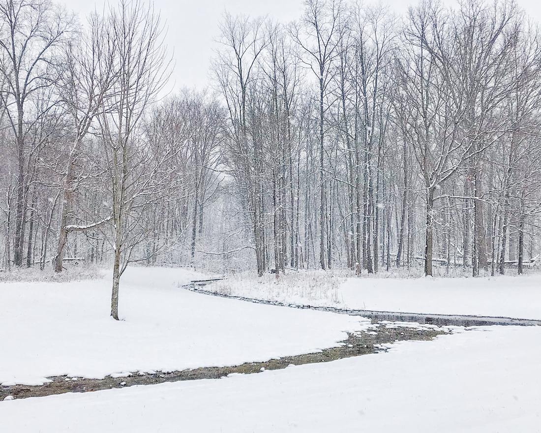
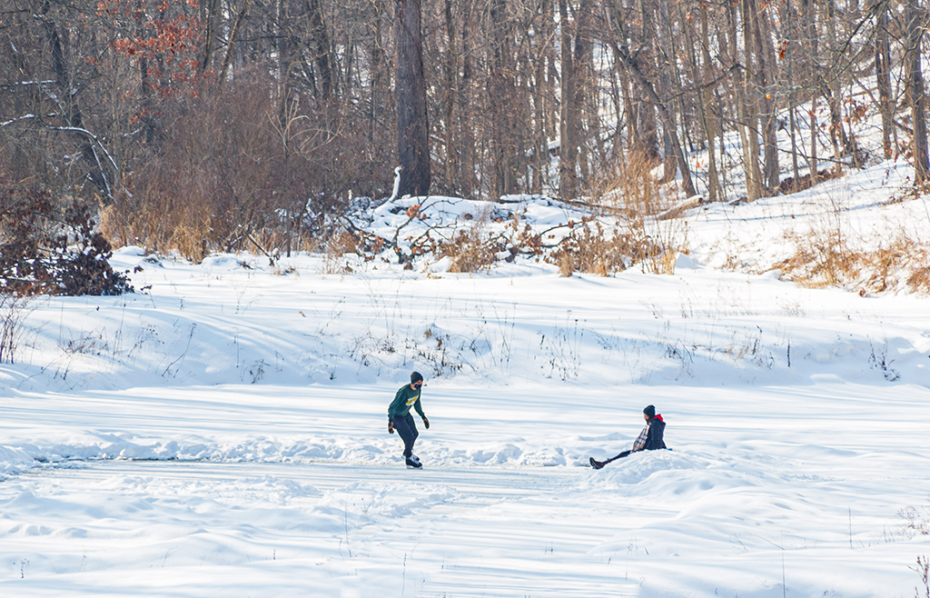
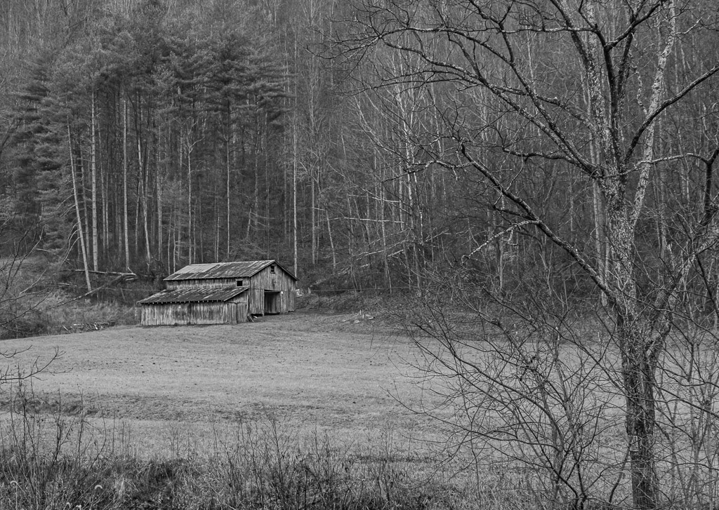
Hi Steven - this is a great winter scene, very well composed and a great tonal contrast. I am trying to learn winter landscapes and how to make them appealing. This is a great example for me to learn from! Thank you for posting... |
Mar 18th |
| 87 |
Mar 21 |
Comment |
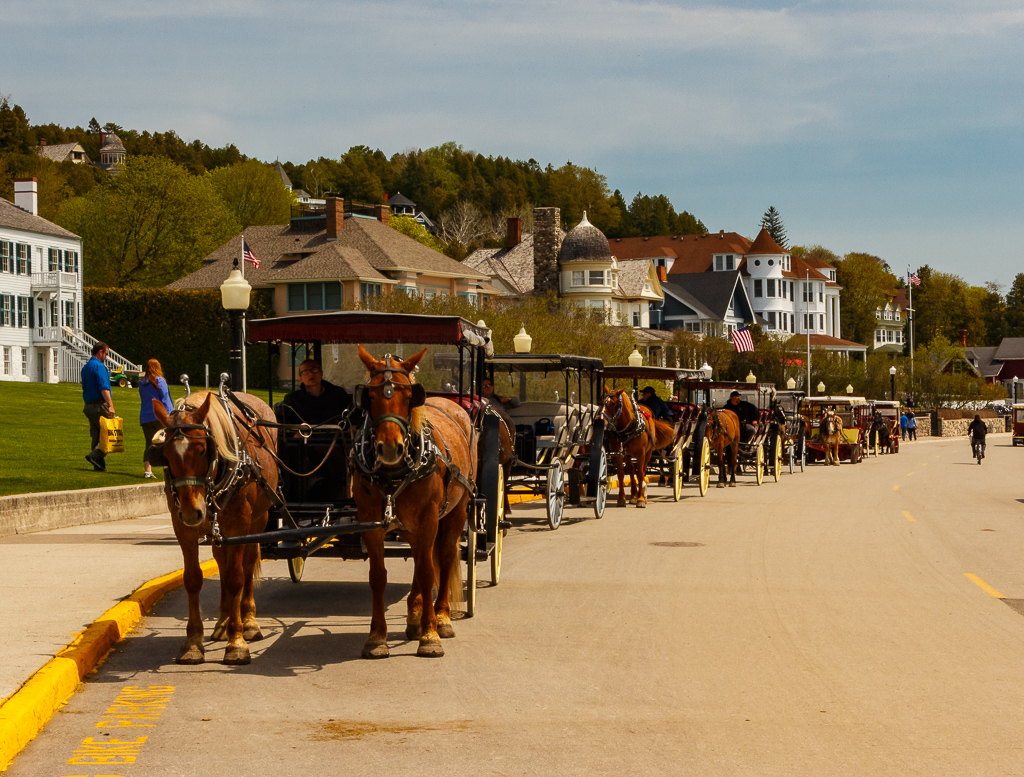
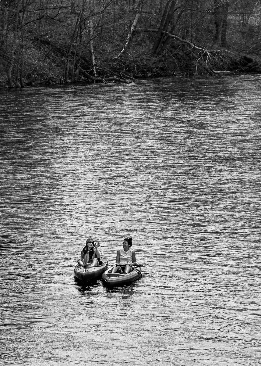
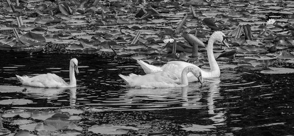
Hi Chan - this is a great photo, showing us that there is always something we can make a beautiful photo out of. The colors are beautiful and well handled. There is a lot of very interesting discussions above on the crop of the photo. All are great options on your photo. Personally, I like the last crop you did where you reversed the photo. This appears more natural to me (probably culture as mentioned) and I especially like the vignette to draw my eyes to the main point of the image. Thanks for posting this! |
Mar 18th |
| 87 |
Mar 21 |
Comment |
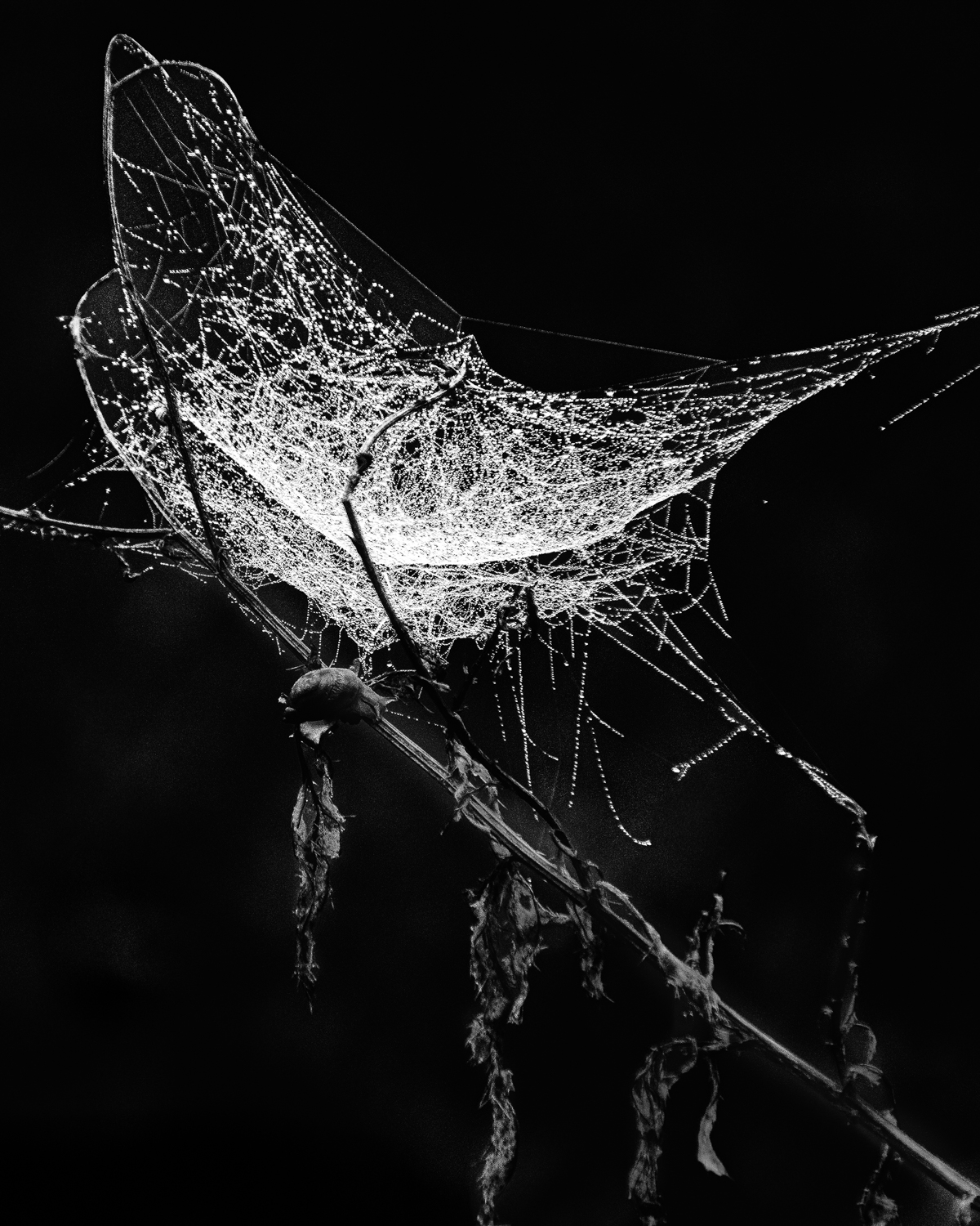
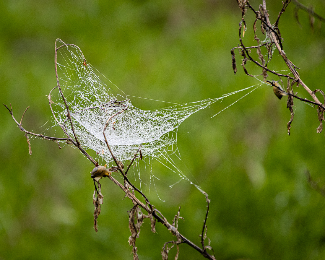
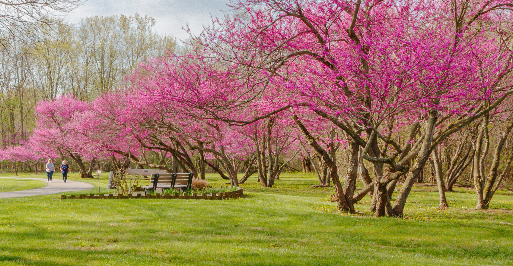
Hi Lance - very interesting, creative image! I like the photo itself, but especially the challenge to see art more creatively. As you mentioned, this will look great printed separately and hung side by side. Thank you for giving us this very creative image! |
Mar 18th |
| 87 |
Mar 21 |
Reply |
Thanks Steven! Regarding removing the license number, I wasn't sure what to do with this. I agree that an argument can be made that this is in the public and is fair game. However, some areas that I researched seemed to indicate that the number should be removed. I truly wasn't sure what to do and went ahead and removed it in order to cover all basis. It was a last minute decision that in hindsight I probably shouldn't have done since the image is shared only between us in the group. |
Mar 6th |
| 87 |
Mar 21 |
Reply |
Thanks Chan! I now see and agree that the background may be a distraction. Perhaps reducing saturation somewhat will help. |
Mar 5th |
4 comments - 2 replies for Group 87
|
| 96 |
Mar 21 |
Comment |
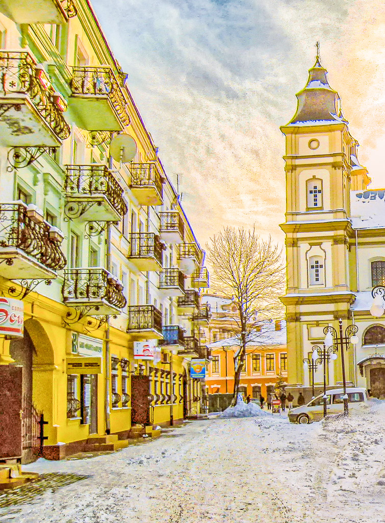
Hi Emily - this is a great cityscape photo! I like the detail and clarity throughout as well as the sweeping wide angle composition. In my opinion, the only thing to look into is the tall buildings on the horizon and their tilting. This is common with a wide angle lens and can be corrected in Photoshop (or perhaps other programs as well). Nice work! |
Mar 18th |
| 96 |
Mar 21 |
Reply |
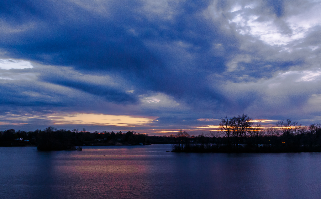
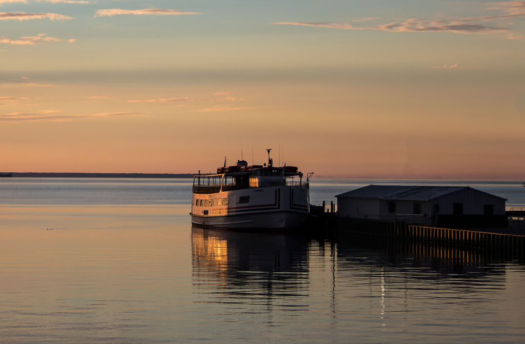
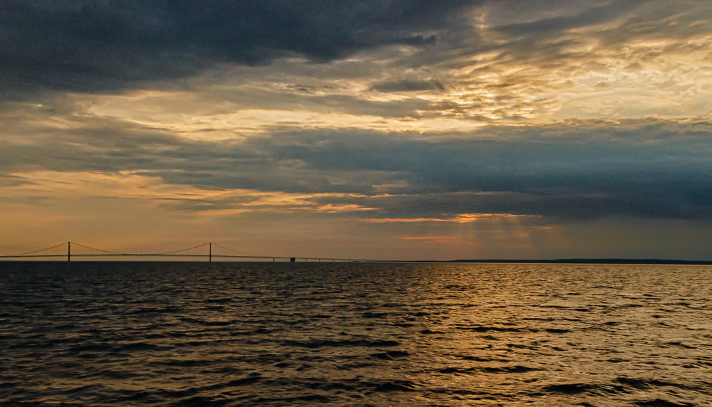
Personally I like the crop as you submitted it. The sky and cloud structure is fantastic. In the original color version, the foreground contains some vegetation. While I generally like objects in the foreground, in this case I believe that this foreground vegetation is somewhat distracting. Cropping it out in my opinion is the better option. Your photo as submitted gives me (the viewer) the feeling of being in a boat, sitting in the lake and observing this wonderful view. I believe you will do well in a competition with this image. |
Mar 13th |
| 96 |
Mar 21 |
Comment |
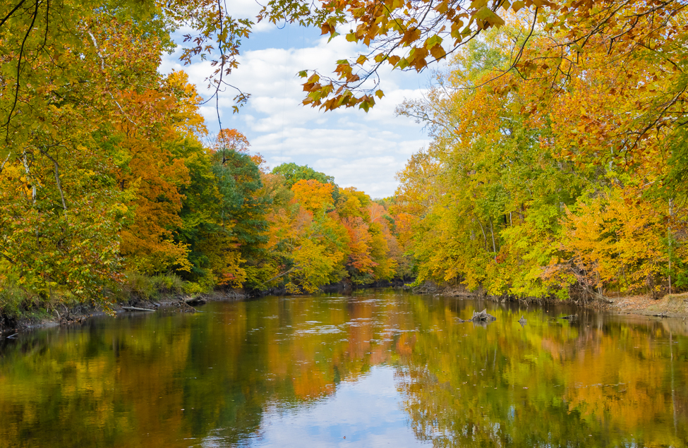
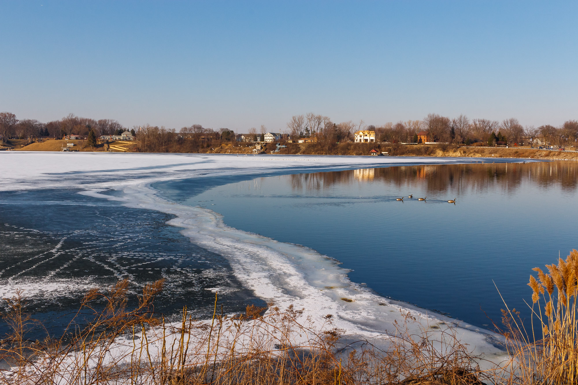
Gerard, this is a great image that captures the mood of the area. I have been to this area many times during my work years and this photo captures the area very well. I like the framing composition with the parts of the steel mill on the sides and to some extent the houses along the bottom. In my opinion, the only thing you may want to look into is possibly removing the utility wires across the bottom part of the photo to avoid any distractions. This photo has an excellent story to it...nice work! |
Mar 7th |
| 96 |
Mar 21 |
Comment |
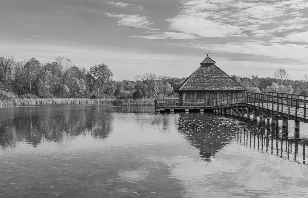
Hi Cheryl...I agree with everyone that this is an excellent photo! The B&W rendering is excellent, especially noting the tonal contrasts. The composition is just right. In my opinion, you may want to look into entering this image in a photo contest and/or print it out to hang on a wall! Nice work! |
Mar 7th |
| 96 |
Mar 21 |
Comment |
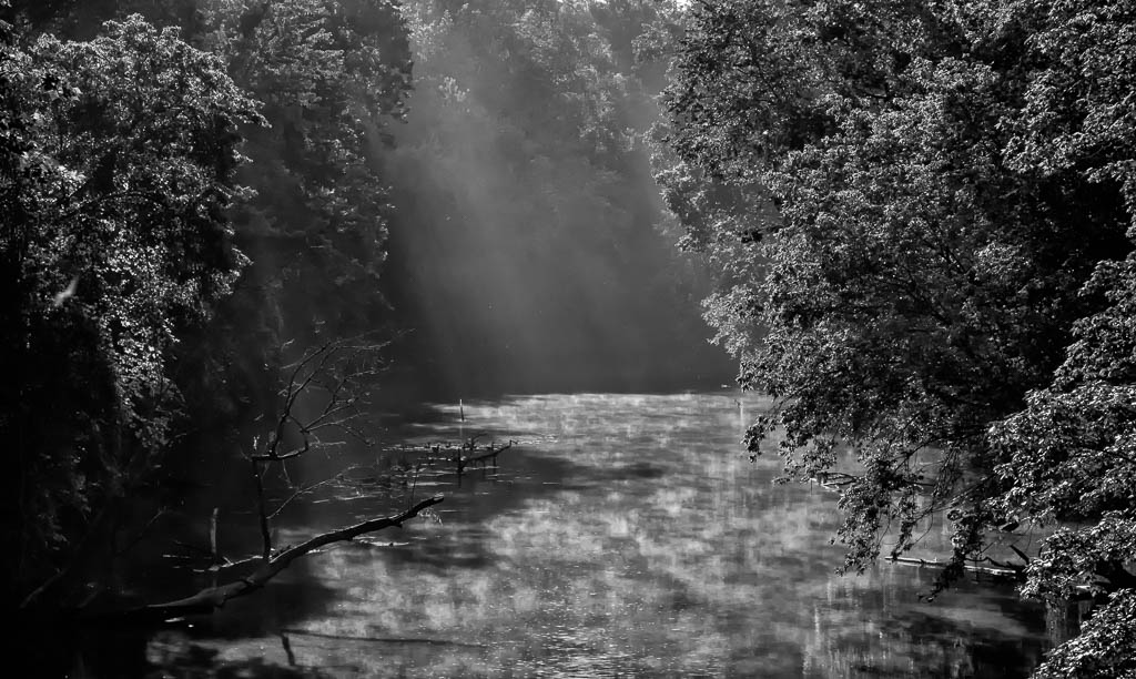
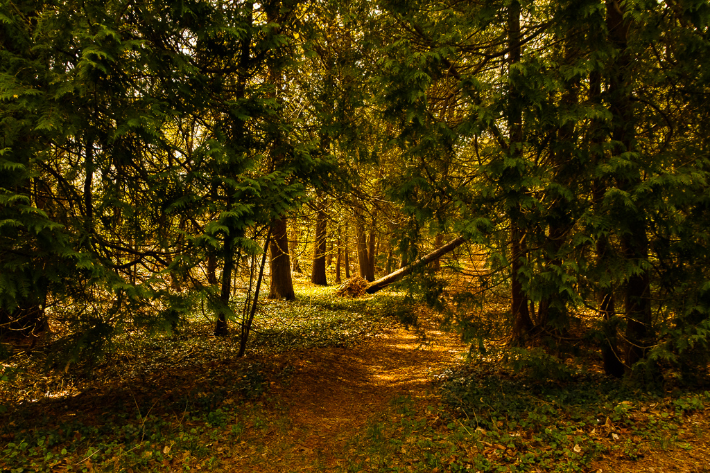
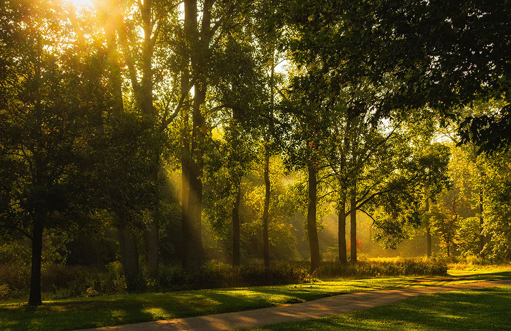
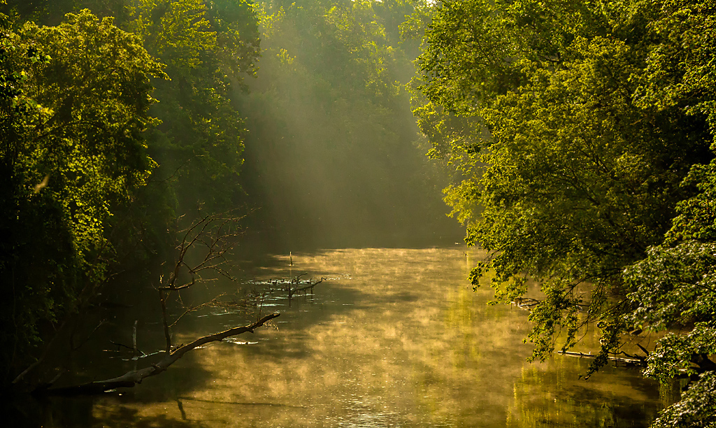
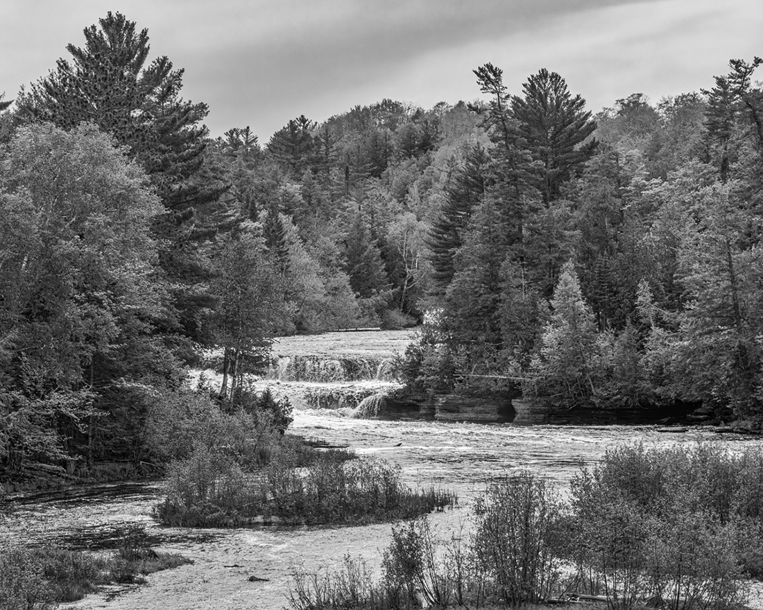
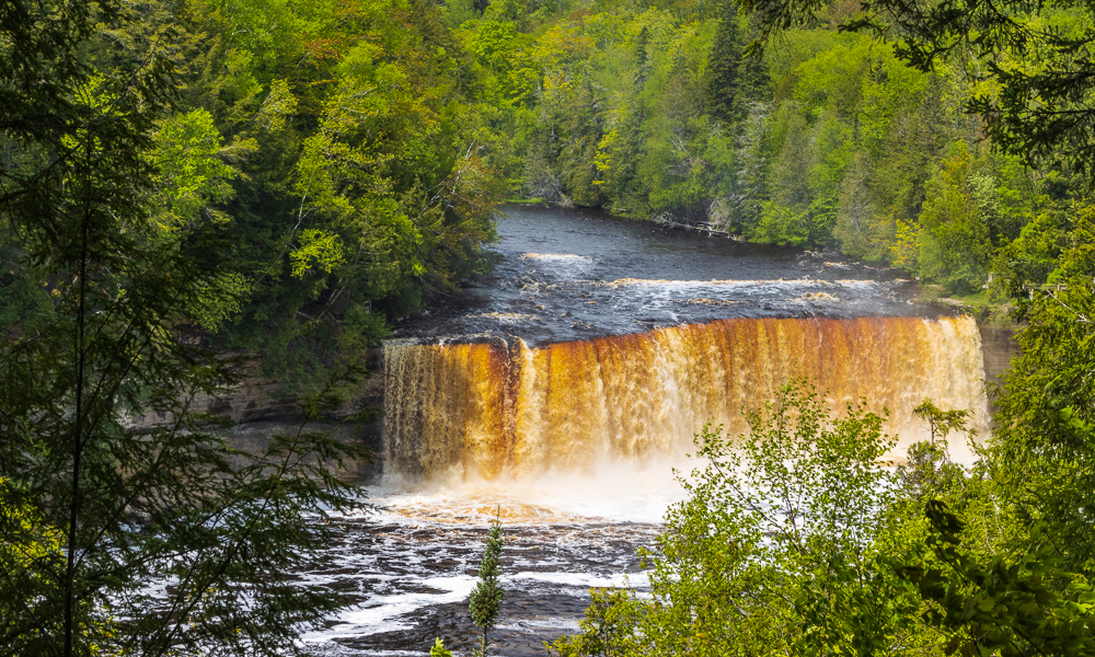
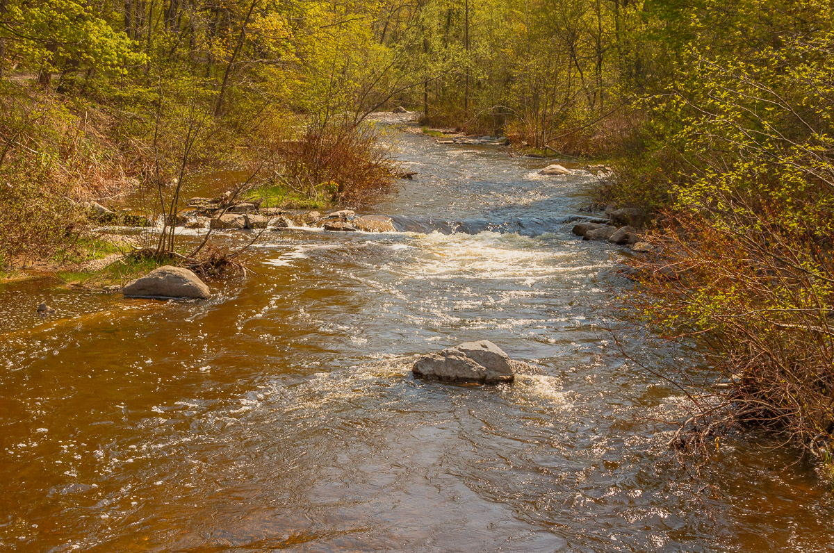
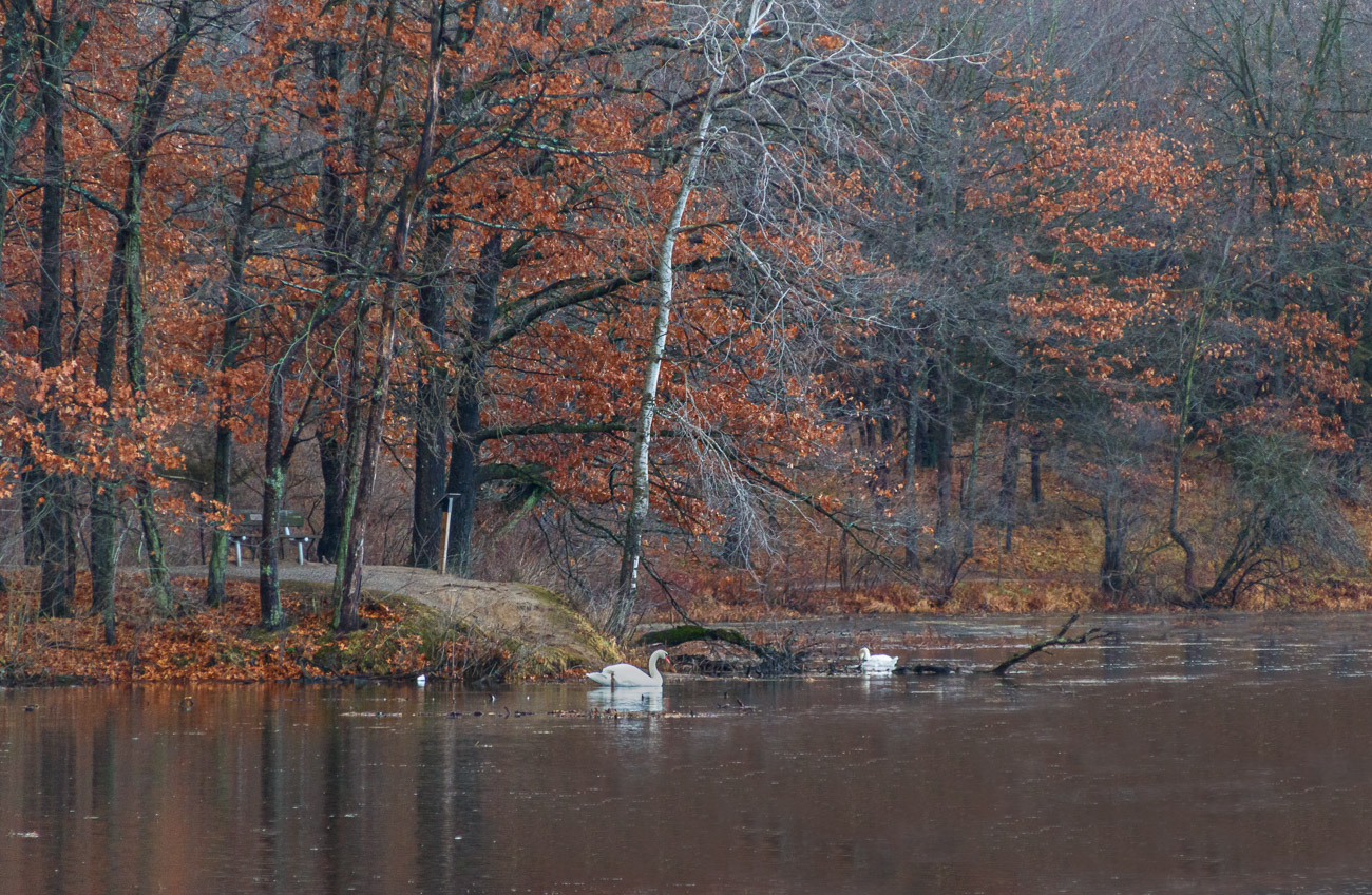
Excellent image Dan! The composition in my opinion is perfect. I like the use of the S-curve of the creek. I love the depth and dimension of this photo with the trees in the foreground compared with the trees and fog in the background. As far as your statement about being over-cooked, I don't see this image as over-cooked. I agree that wintertime provides an opportunity for great photos. This is one of my weaker areas that I need to work on and as such, your insight into post processing is appreciated. Nice work! |
Mar 7th |
| 96 |
Mar 21 |
Comment |
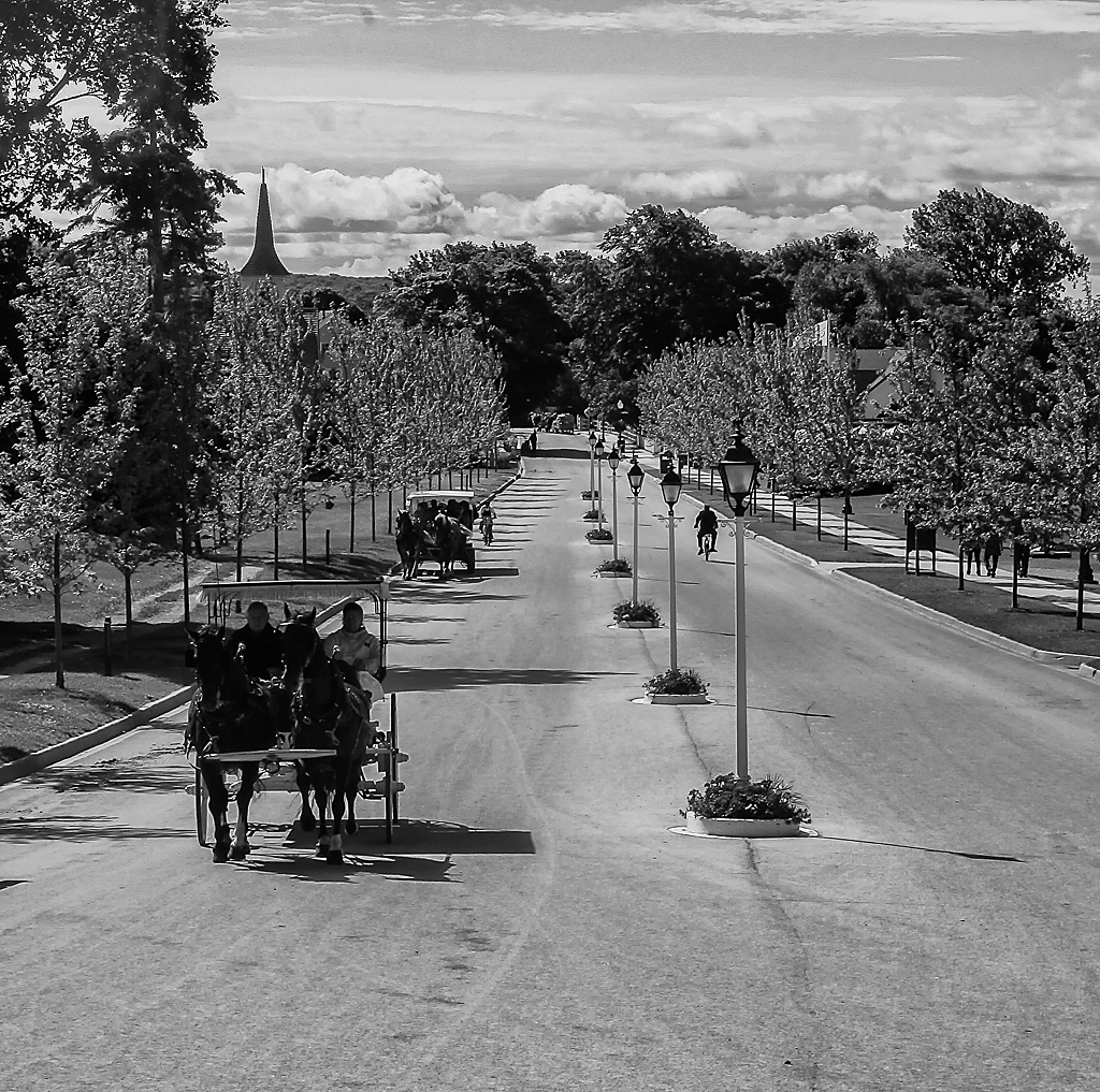
Great image Robert! Excellent texture and great use of the S-curve. The light and shadow contrast provides very good depth and dimension. This is a very artistic image that makes me think, which shows the value of the photo. Nice work! |
Mar 7th |
| 96 |
Mar 21 |
Reply |
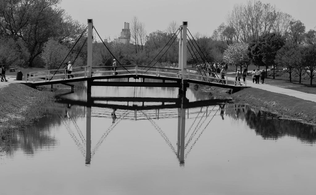
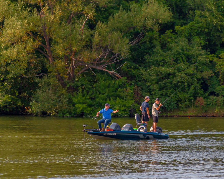
Thanks Dan! I appreciate your comments and truly appreciate your opinion on the human element. I normally don't include human elements, but on this one I wasn't sure. I agree that looking at others images are exiting, as well as receiving constructive feedback on your own photos. This is how I/we learn and also shows the benefits of our group. Thanks again... |
Mar 7th |
| 96 |
Mar 21 |
Reply |
Thanks Robert! Thanks for the insight about B&W, I'll give it a try. Also thanks for your comment about the human element. I normally do not like to include the human element, but on this one I wasn't sure. Appreciated... |
Mar 7th |
5 comments - 3 replies for Group 96
|
9 comments - 5 replies Total
|