|
| Group |
Round |
C/R |
Comment |
Date |
Image |
| 87 |
Feb 21 |
Comment |
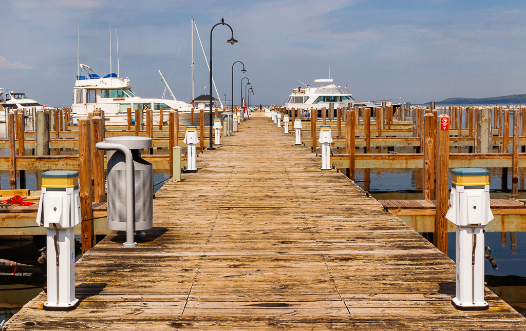
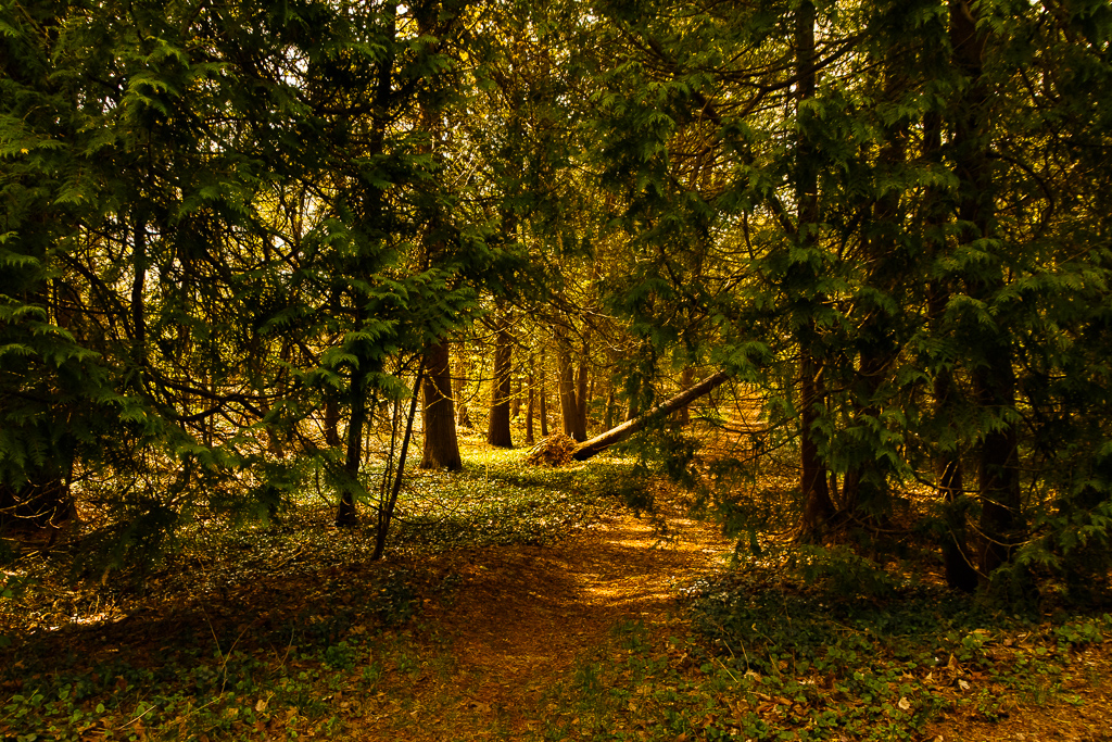
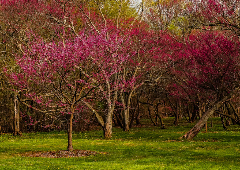
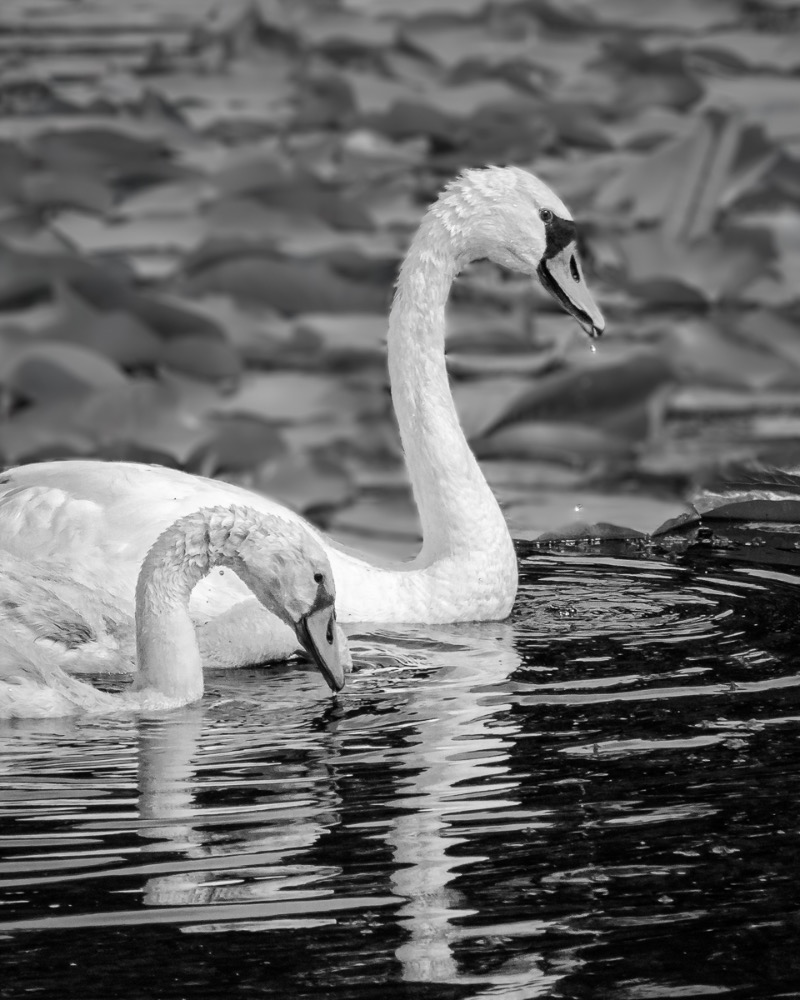
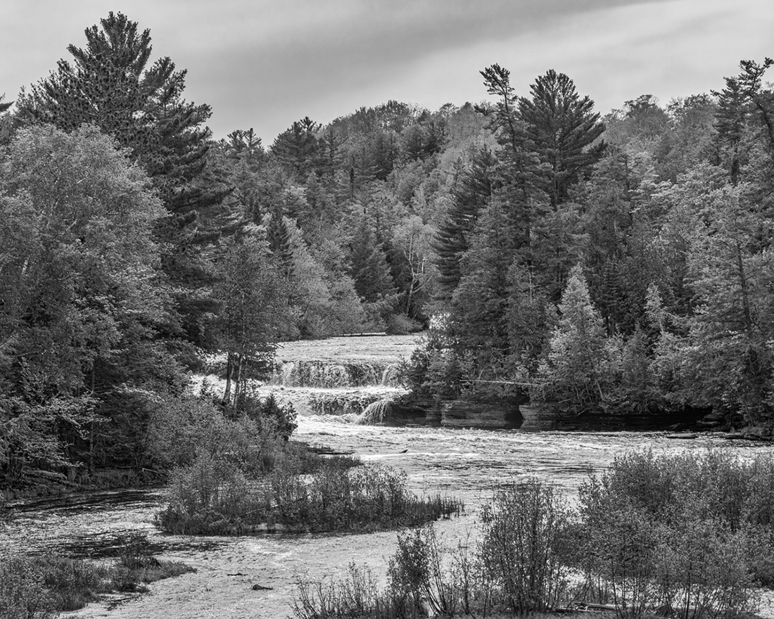
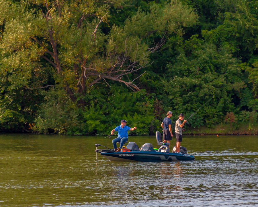
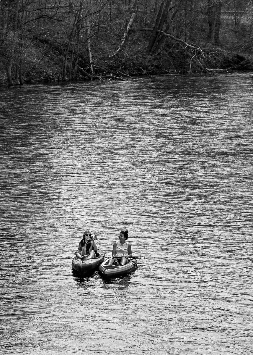
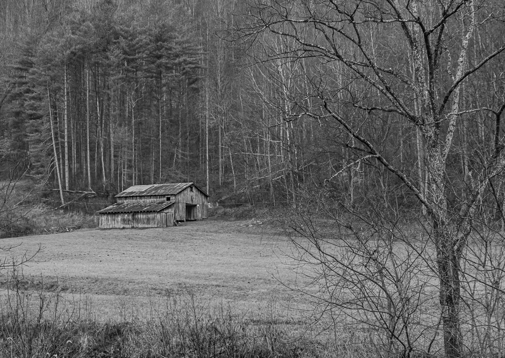
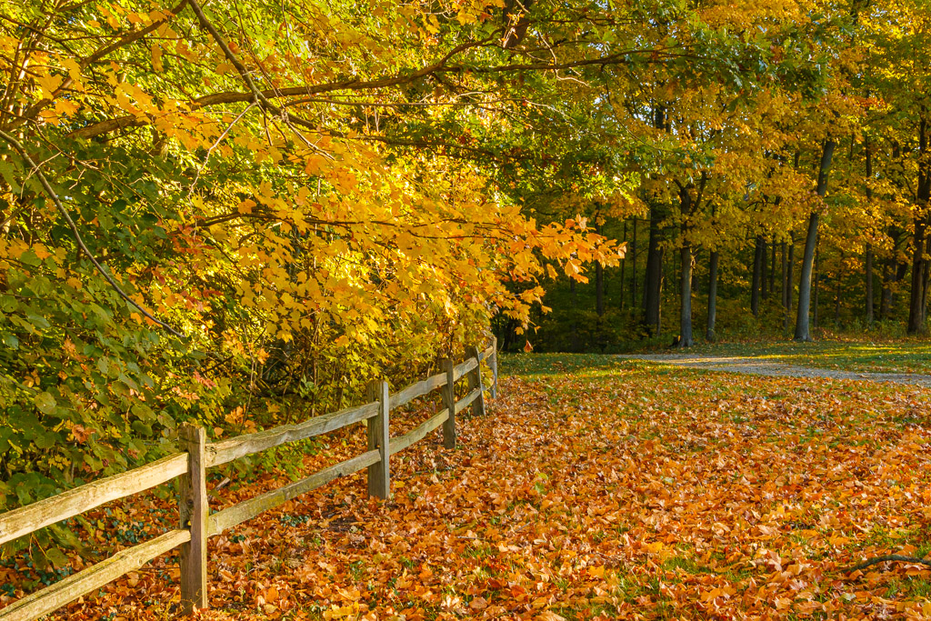
Hi Jennifer...this is an excellent image. The viewer has many story lines to ponder. The depth of field and sharpness are very good. The composition with the leading lines and patterns are also very good. I agree with Lance that experimenting with black & white with this one may be a consideration. Very well done... |
Feb 23rd |
| 87 |
Feb 21 |
Comment |
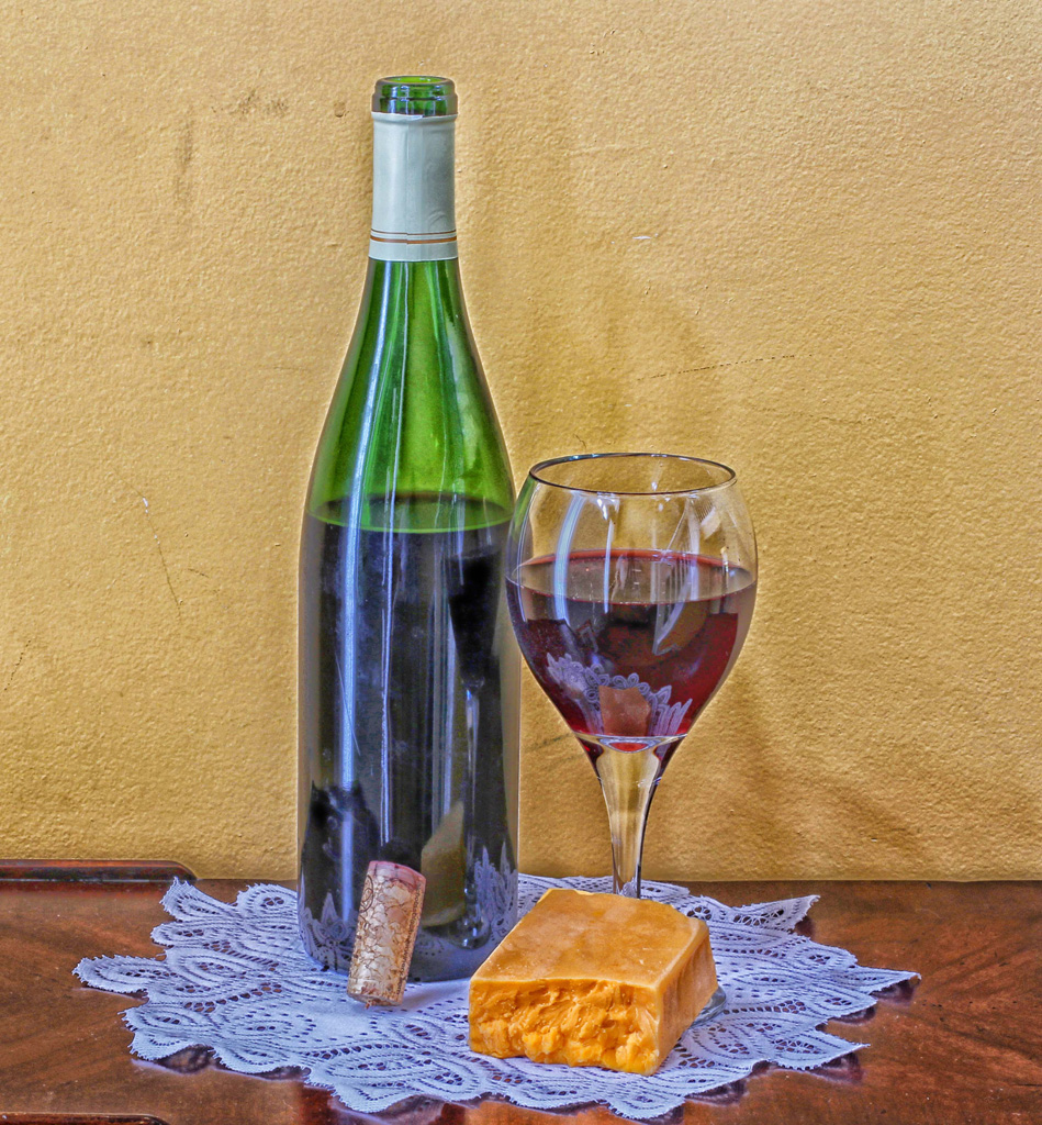
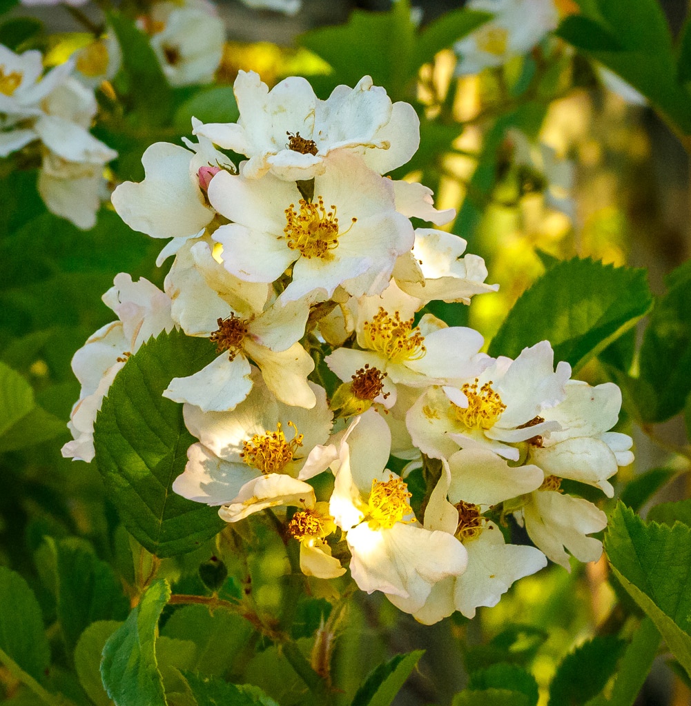
Hi Steven...I love this image and the creativity. The colors are superb! I appreciate the work that you had to do to make this image. In my opinion, this would look good as a print on the wall at all times, but especially during the holidays! Excellent! |
Feb 23rd |
| 87 |
Feb 21 |
Comment |
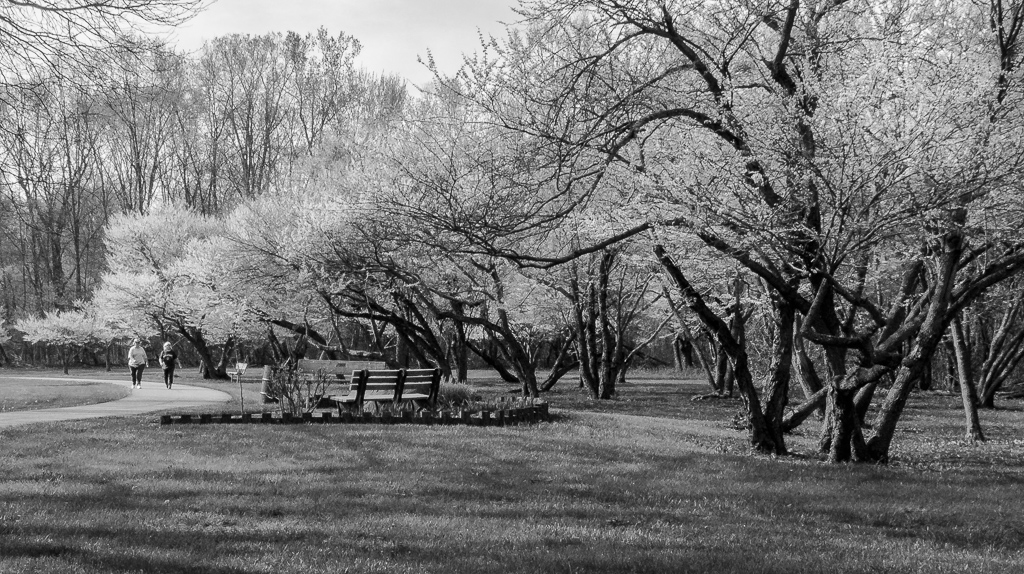
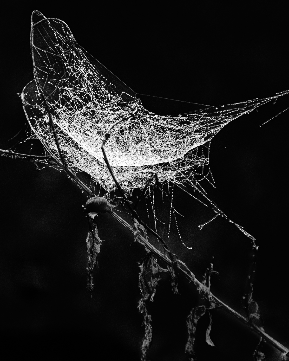
Great image! I really like the sharpness and detail. I agree that the black & white is a stronger photo. Very nice capture of the everyday things in life...good eye! Well done... |
Feb 23rd |
| 87 |
Feb 21 |
Comment |
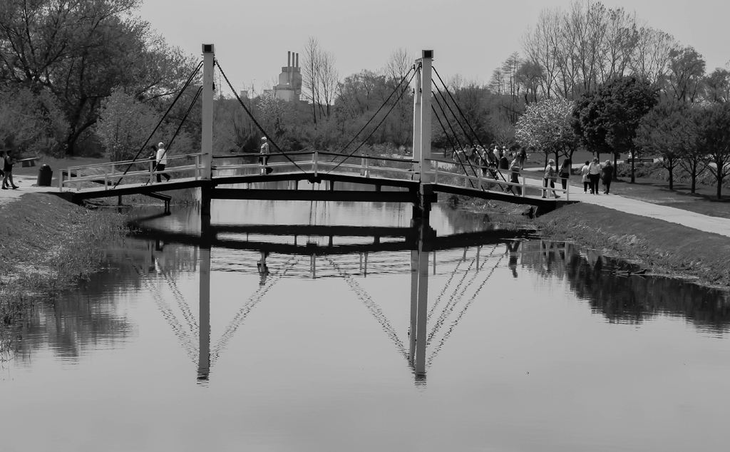
Great image! Very thought provoking. I really like the creativity on this photo. The foreground flag sets the tone for the entire image. Very nice... |
Feb 23rd |
| 87 |
Feb 21 |
Reply |
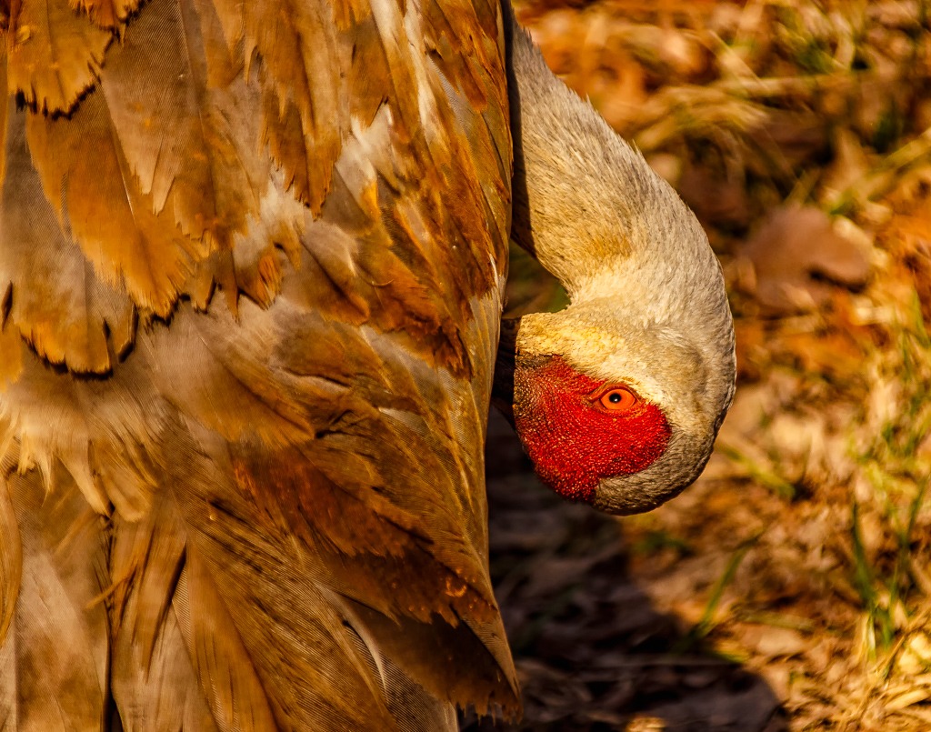
Thanks Steven! I agree that that the red is perhaps a little too bright and I should have toned it down a bit. The image I downloaded for Jennifer's comments perhaps shows the more realistic color. Thanks again! |
Feb 6th |
| 87 |
Feb 21 |
Reply |
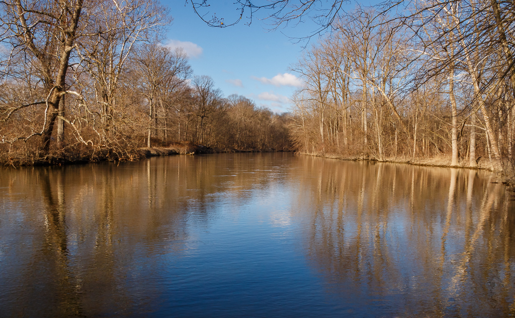
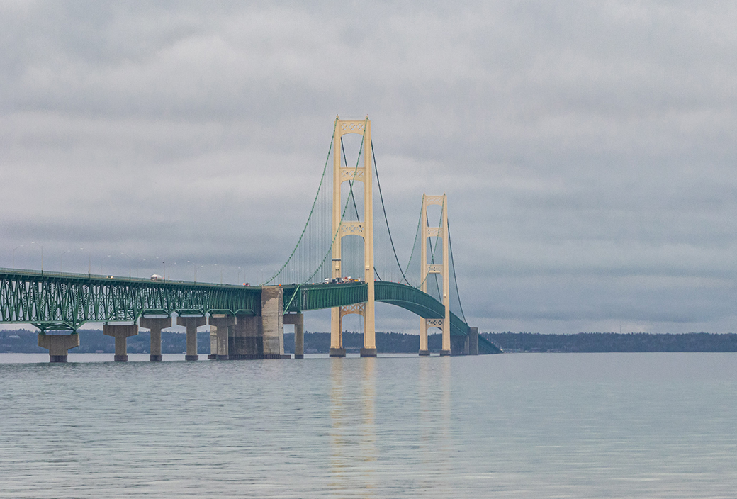
Hi Jennifer - thanks! Here is a photo I took a few years ago. I could have possibly done a better job in Lightroom on this one, but it does show the difference the CPL makes. I was cautioned by my instructor in using the CPL randomly as it reduces the light reaching the sensor, to be used mostly for photos that include the sky or water. By the way, the class was PSA's Creating Competitive Images course...very good and challenging. Thanks again! |
Feb 6th |
 |
4 comments - 2 replies for Group 87
|
| 96 |
Feb 21 |
Reply |
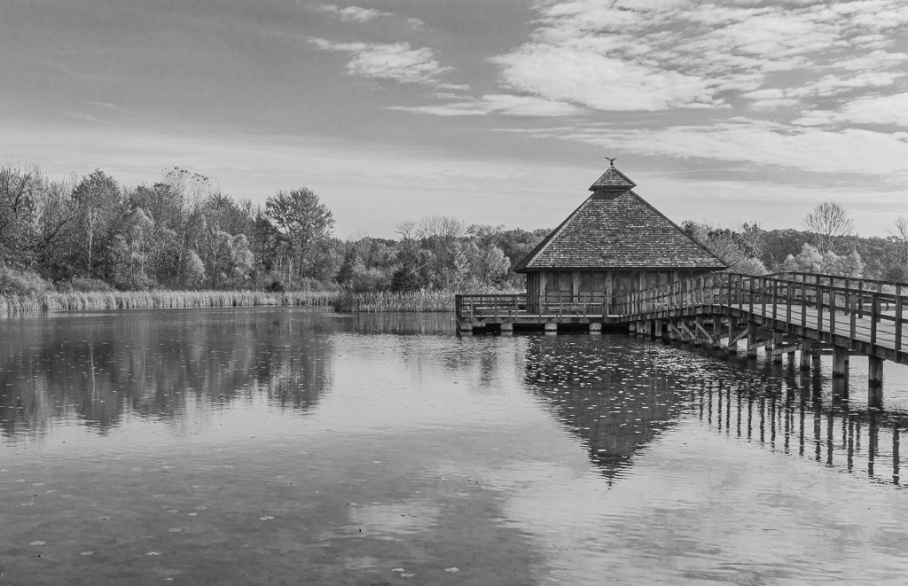
Hi Emily...the additional images you provided are excellent! In my opinion, I like the last one the best. It has great cloud structure and composition. The black & white image fits the scene very well. Well done... |
Feb 23rd |
| 96 |
Feb 21 |
Comment |
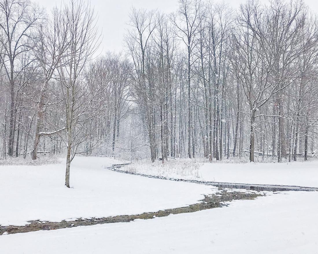
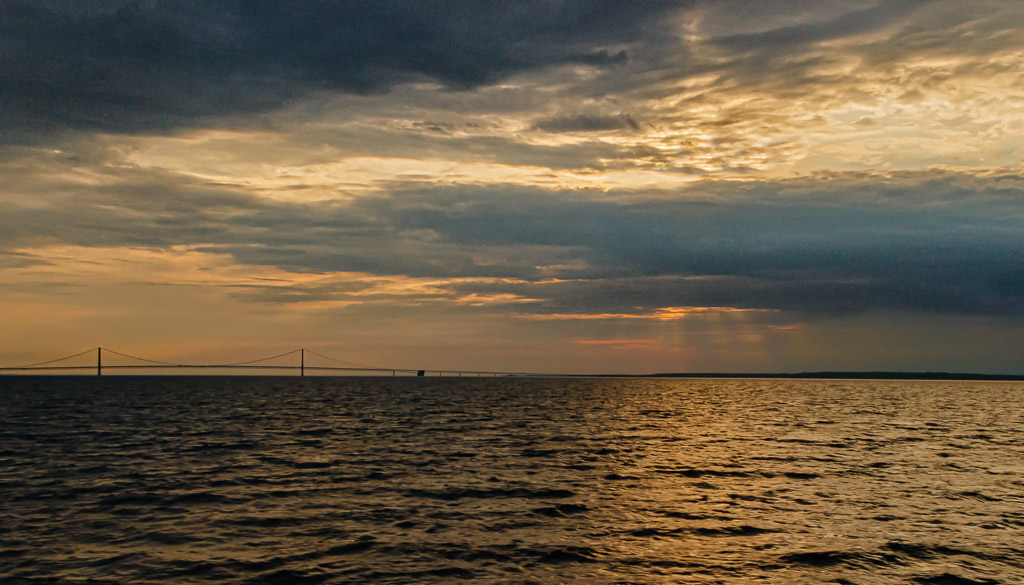
Hi Emily...very nice photo! I like the overall composition with the near horizontal lines which, along with the treeline form a triangle. I especially like the cloud structure. The blue tint to the image gives the feeling of being cold, which is more than appropriate for this image. A couple of things to consider...perhaps lighten up the treeline to show some detail of the trees. Also, the slight appearance of vegetation along the lower snow line appears somewhat distracting. A suggestion is to remove this vegetation and bring more emphasis to the snow line itself or change the angle of the photo slightly to include more of the vegetation in view.
In my opinion this photo will look good in either color or black & white. With the limited color palette, black & white will do well.
Relative to putting a title on your images, here is my opinion...I believe it was Ansel Adams who said that there are 2 people in every photo, the viewer and the photographer. The viewer will interpret the photo relative to what they see. The photographer has a story to tell with each photo and will produce a photo based on this story. While I completely agree with the non-descriptive title approach, sometimes putting in a descriptive title gives the viewer a hint or glimpse of the story being told by the photographer. The viewer can then either agree with the photographer, or can come up with their own interpretation of the image, or a combination of both. Just some thoughts...excellent work! |
Feb 20th |
| 96 |
Feb 21 |
Comment |
Hi Gerard...Excellent image. I too feel the cold as portrayed here. I like the overall sharpness and DOF in this image (I am impressed that you are able to use an f/32 aperture with little to no noticeable diffraction). The corn rows provide both good leading lines and a good pattern for the viewer's eyes. The power poles on the right (which I generally do not like) does provide a good balance to the image. I agree with Dan that the horizontal tire tracks in the foreground can be somewhat distracting. Also, to me, some of the blue color of the sky appears over saturated. Nice work! |
Feb 20th |
| 96 |
Feb 21 |
Comment |
Hi Cheryl...Excellent photo! The final version of your image is the one that I would prefer. I like the soft shadows of the early morning along with the bright cloud and sky. This provides an excellent contrast which emphasizes the sunrise. As far as your last question regarding soft focus and saturation, I personally like the sharper, detailed image more that a soft focus image. My personal opinion is that your saturation level is spot on. I don't recall any of your images being over saturated. |
Feb 20th |
| 96 |
Feb 21 |
Comment |
Dan...excellent image. The overall composition is great and the detail/sharpness throughout is excellent. The adjustments provided by both Robert and Witta are excellent. However, I personally like what you have done with your image which has a very calming effect as Emily noted. In my opinion, this image has a "pop" to it as one of my former group members would occasionally note, and I wouldn't change a thing. |
Feb 20th |
| 96 |
Feb 21 |
Comment |
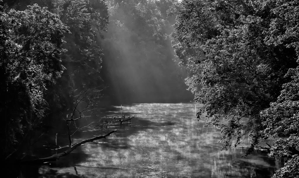
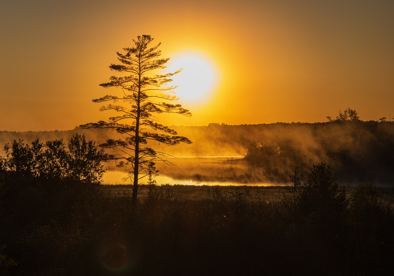
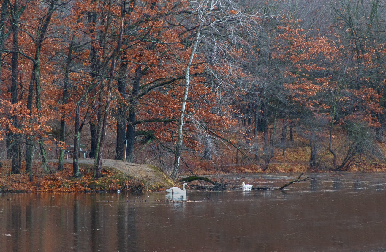
Hi Robert...this is a beautiful image! I like the overall mood of the image and the excellent use of light and shadow. The image has a mystic feel about it. The Orton Effect was done well and adds to the mood. Personally I would not change a thing! Excellent work!
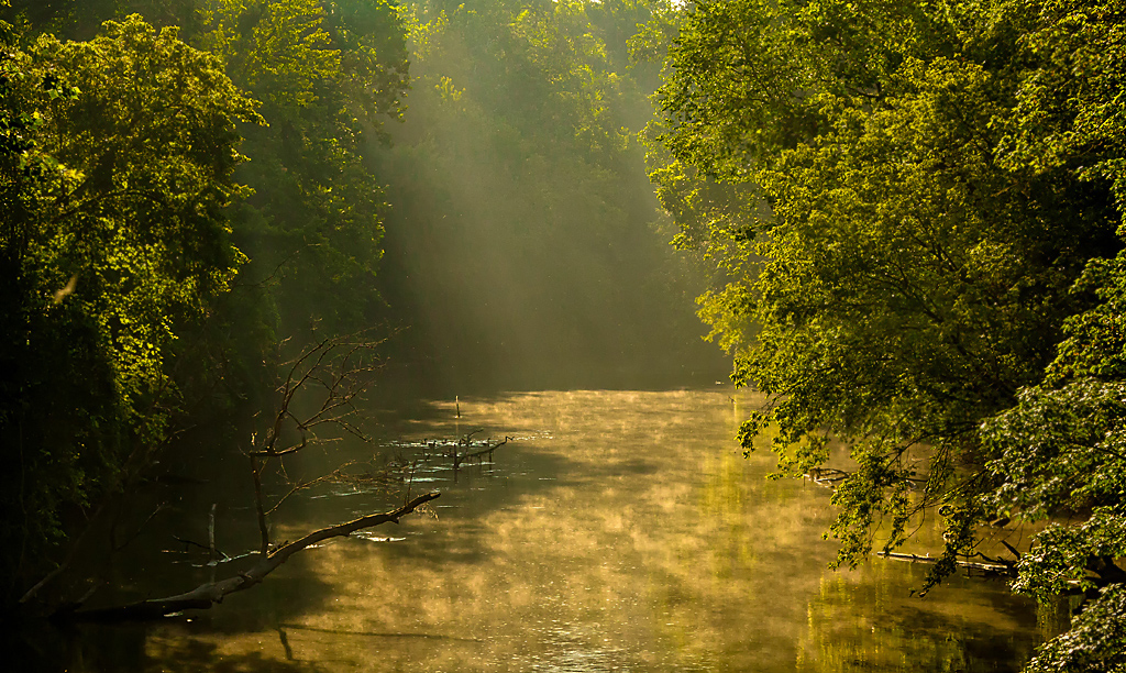
In looking at your original image, I like the overall depth and dimension provided by the fog along with the light/shadows. The river/creek running through the image provides a good leading line. The bottom line is the composition is very good! In my opinion, you could also develop this image as well by bringing overall enhancement to the light/shadows and the fog and perhaps apply the Orton Effect not only to the patch of frost as shown in the final image, but also to the slight snow in the foreground and along the river bank. Just some thoughts... |
Feb 20th |
| 96 |
Feb 21 |
Reply |
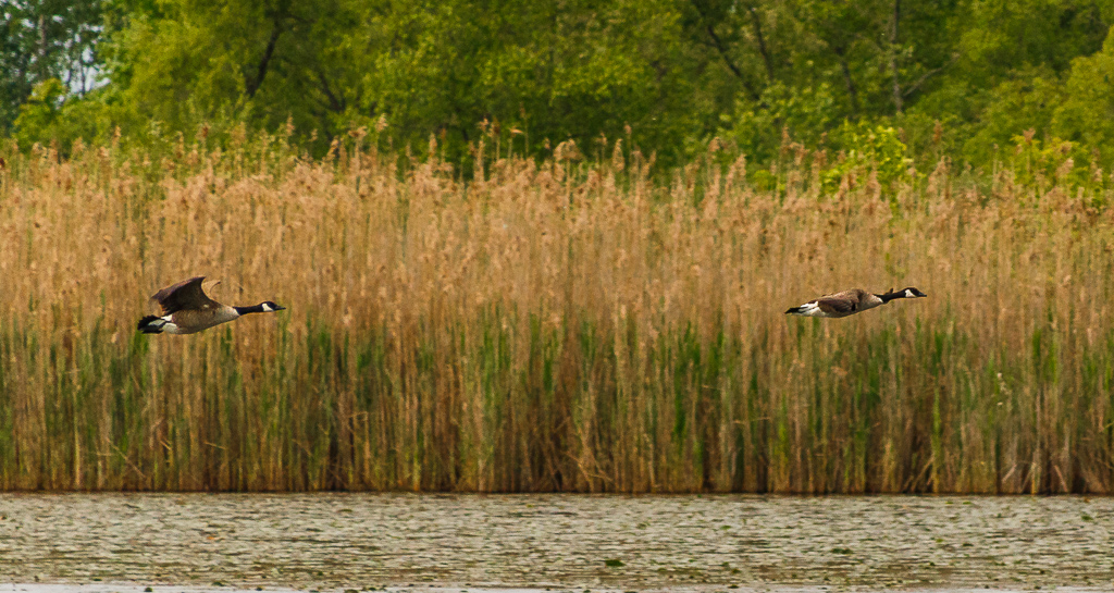
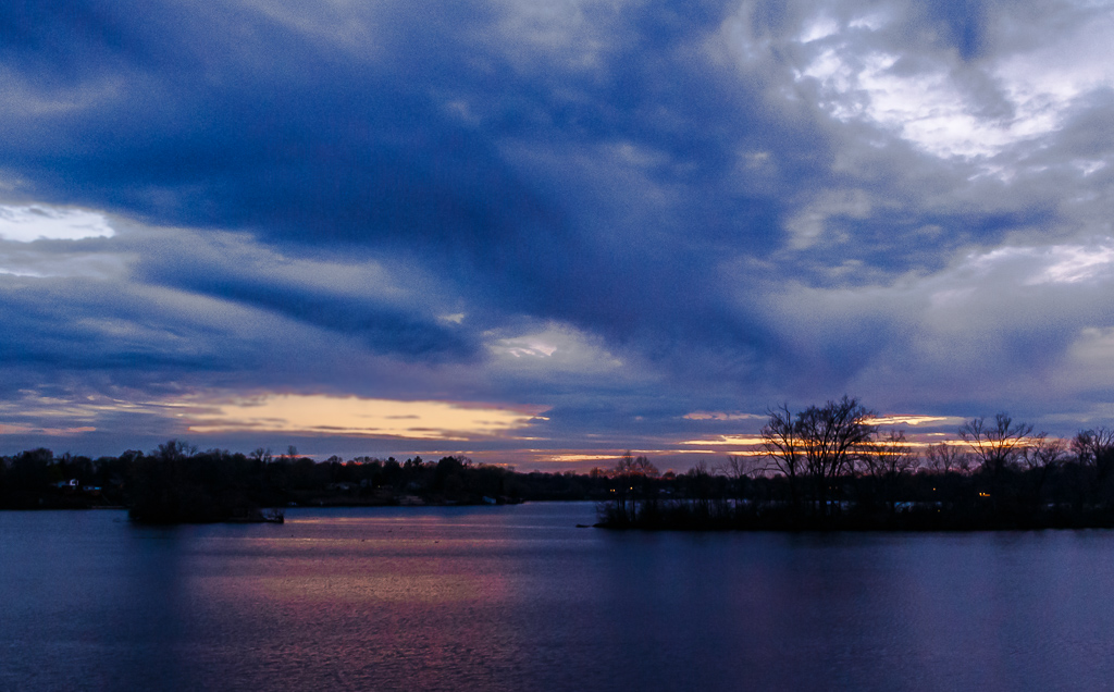
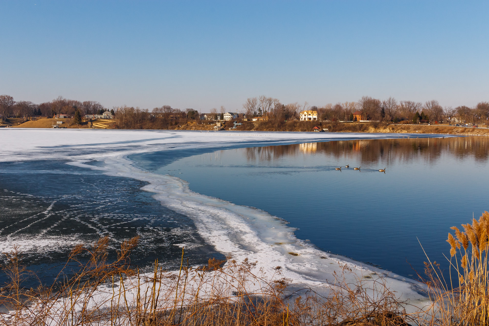
Thanks Dan! I appreciate your comments and agree that with a 2nd look, the photo appears too busy. However, I believe a question must be asked, namely "Is tension in a photograph a bad thing"? I understand and agree with the concept of a single point of interest in an image. However, I also believe that an image can have multiple points of interest as well. I agree that my photo is perhaps too busy, but there are contrasts that I believe the viewer can take into consideration...the haphazard footprints, the ugly looking ice formation, the houses along the shoreline contrasted with the serene geese doing what they always do, swimming within the lake. Even in the hectic life we at times have, life goes on. I am not defending my photo and agree with your comments. I am only thinking out loud as to whether tension in an image is a bad thing. I welcome your comments. Thanks again! |
Feb 6th |
5 comments - 2 replies for Group 96
|
9 comments - 4 replies Total
|