|
| Group |
Round |
C/R |
Comment |
Date |
Image |
| 87 |
Dec 20 |
Comment |
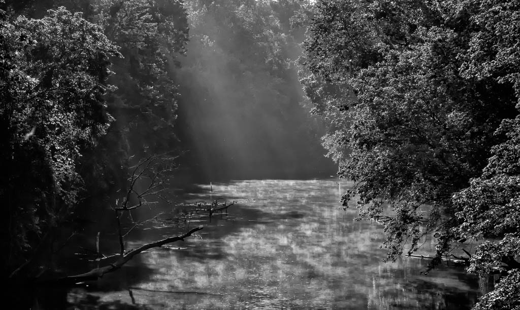
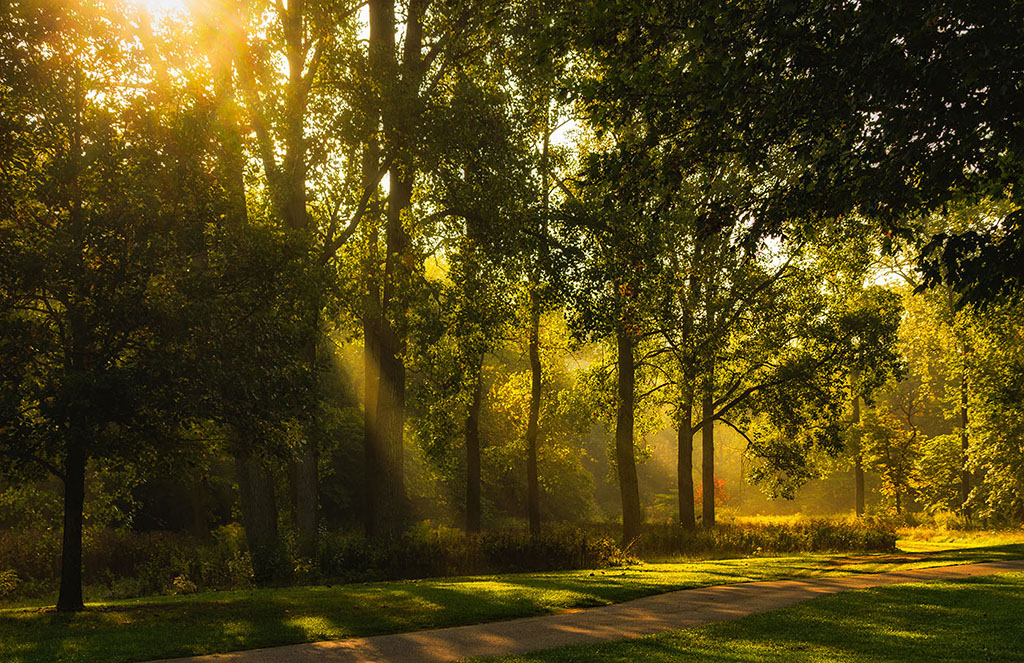
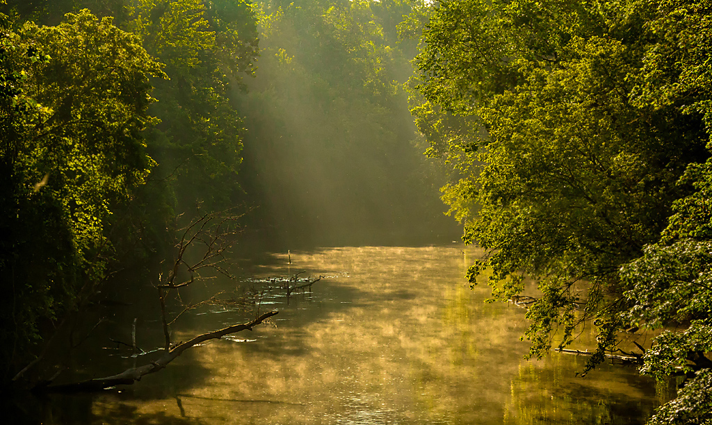
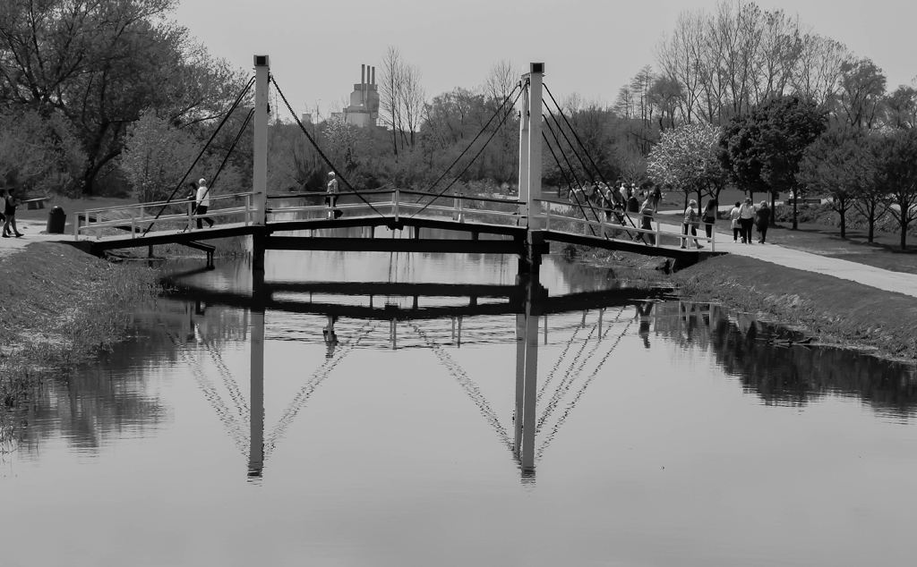
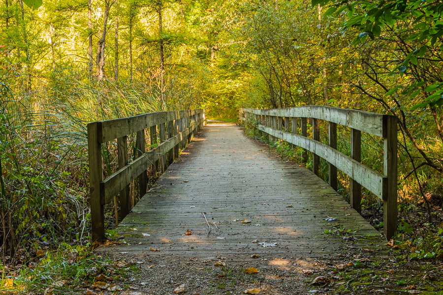
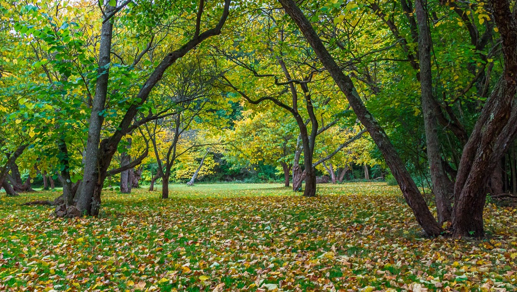
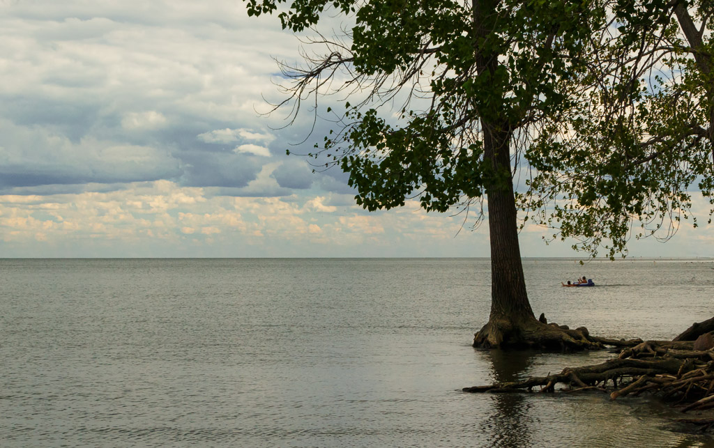
Hi Jennifer - Nice photo! The composition is excellent with effective use of leading lines. As far as the branches on the right, I also agree with others that these could possibly be removed as they are out of focus. In my opinion, if they were more in focus and sharp, I would consider leaving them to add dimension to the image. Nice work! |
Dec 21st |
| 87 |
Dec 20 |
Comment |
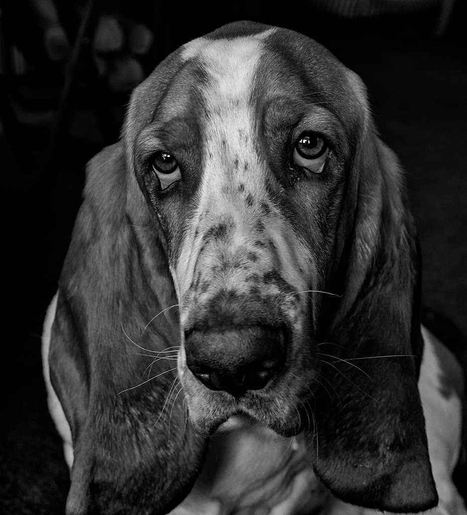
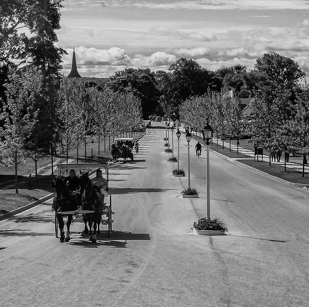
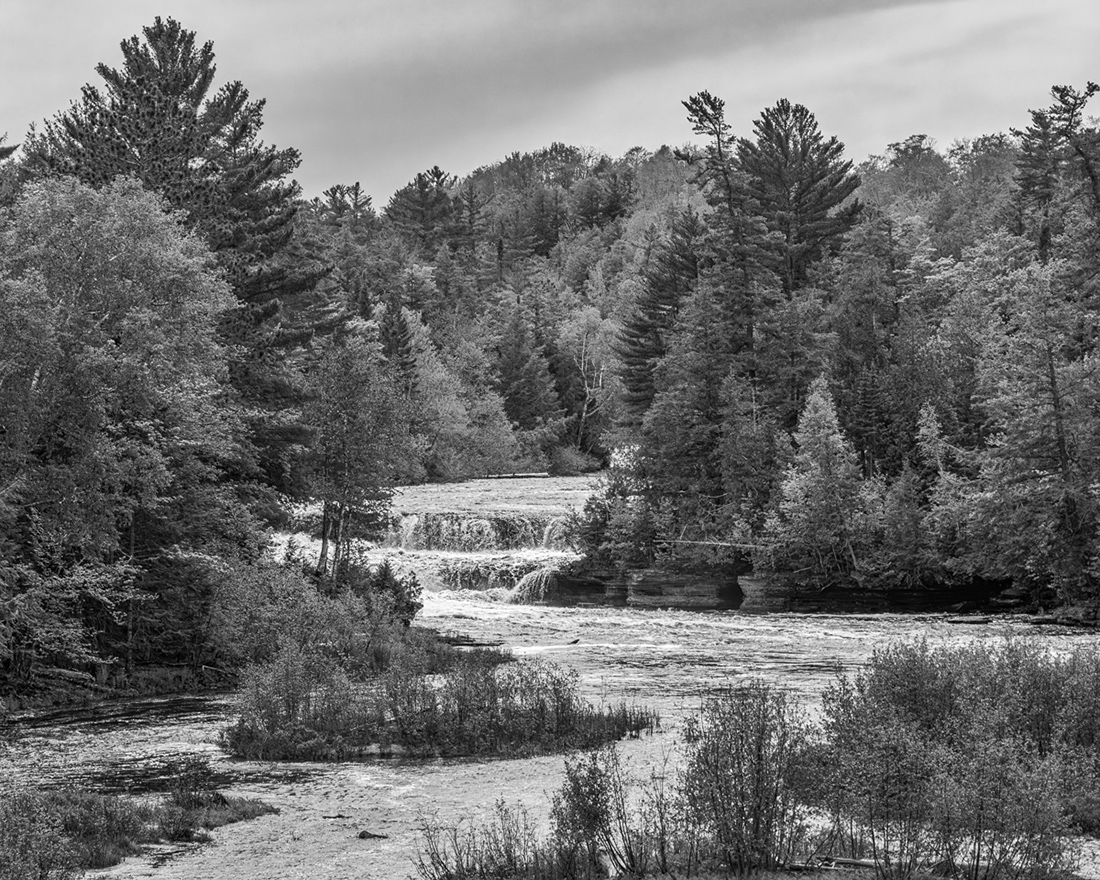
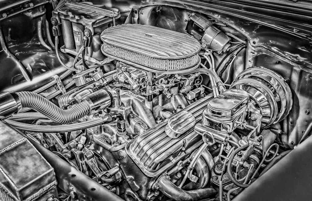
Hi Steven - this is a great image. I really like the sharpness throughout and composition. The conversion to black and white, along with the dodging and burning is perfect. In my opinion this photo would do very well in any competition! Nice work! |
Dec 21st |
| 87 |
Dec 20 |
Comment |
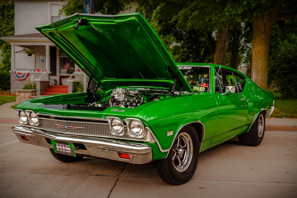
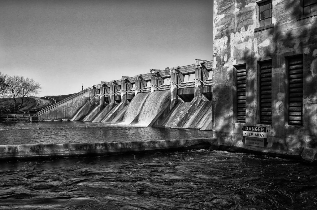
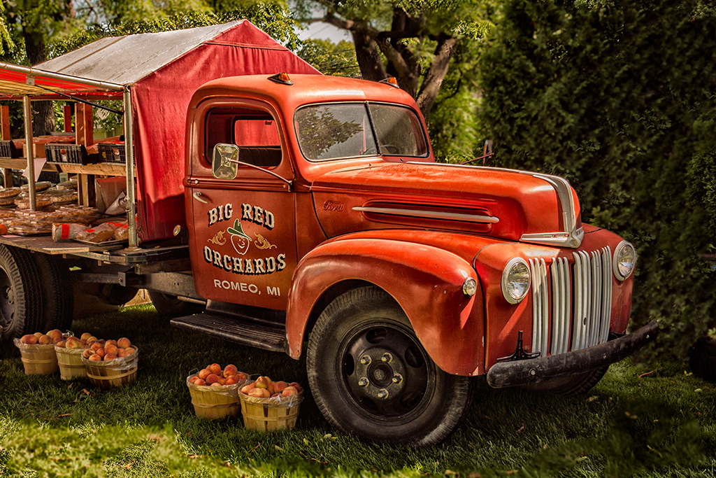
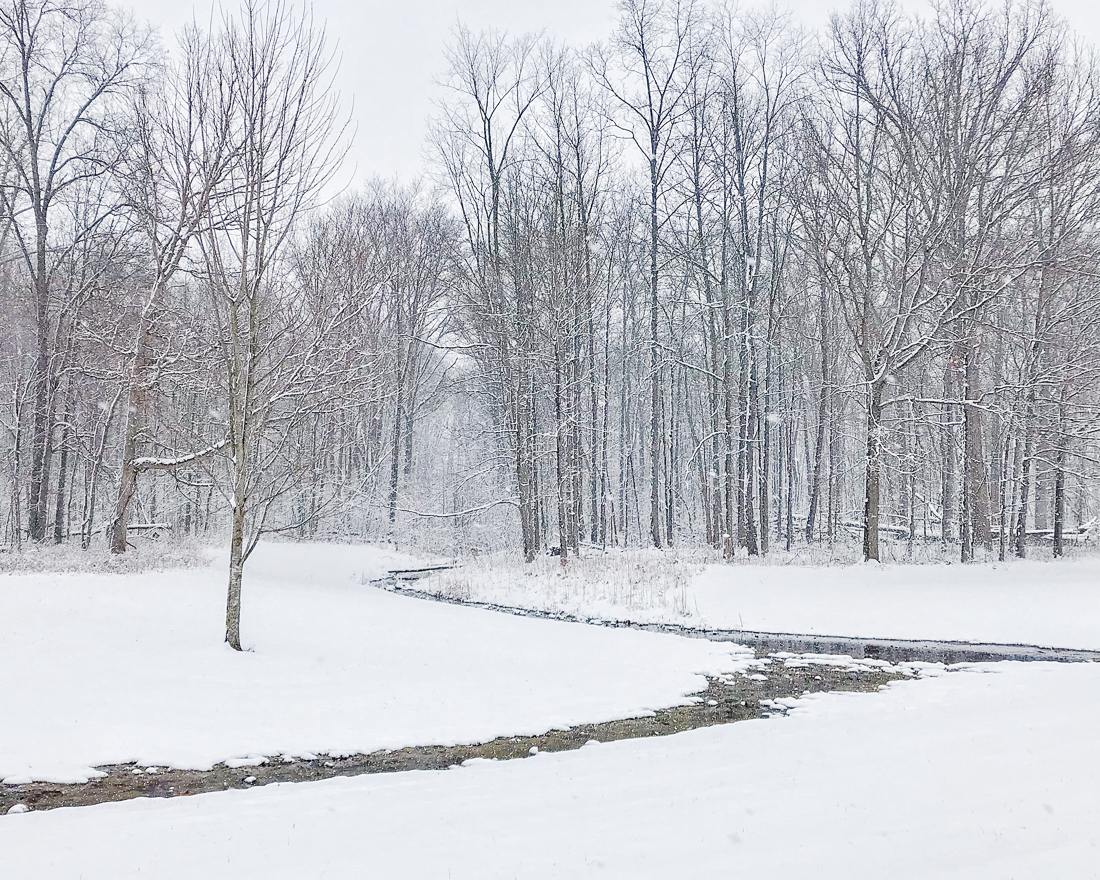
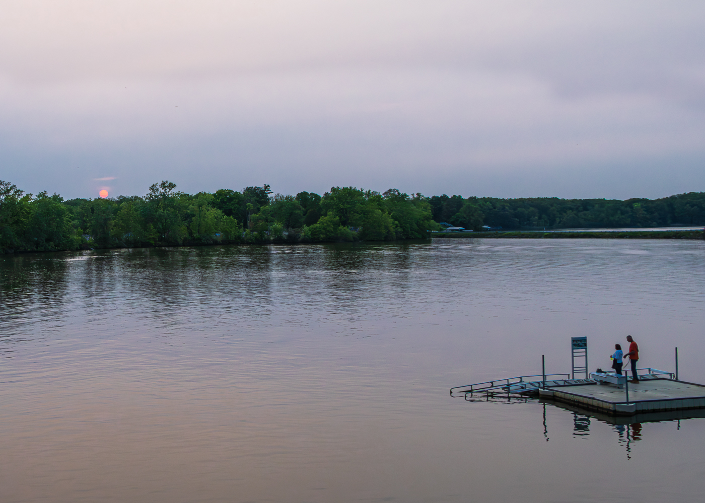
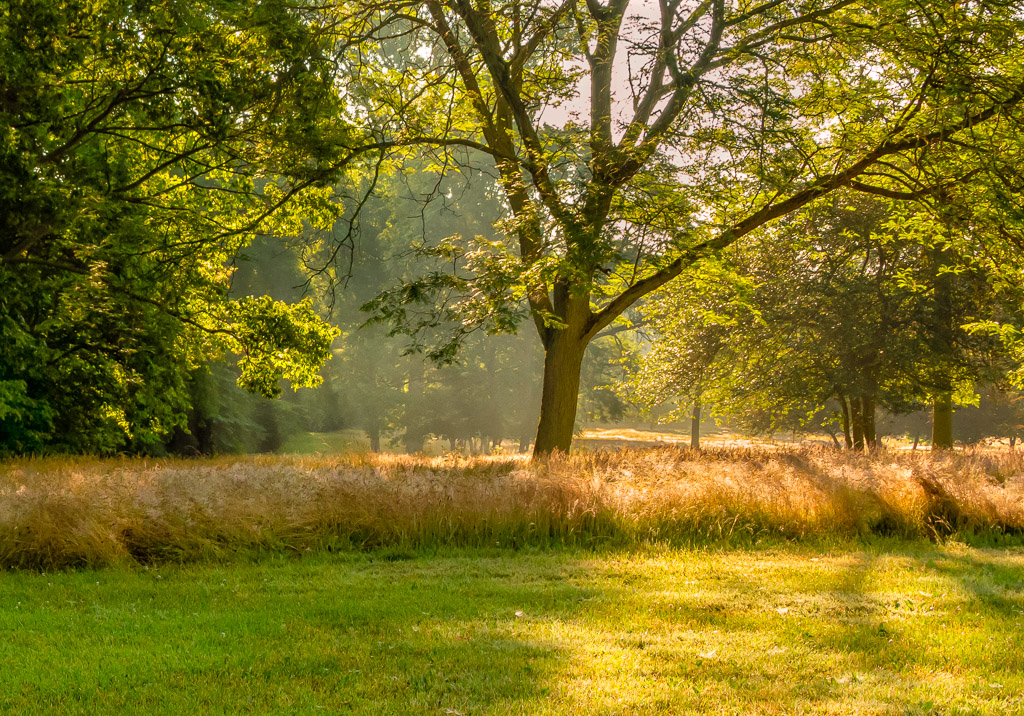
Hi Chan - nice photo. I like the composition with the leading lines to guide my eyes. The image is sharp throughout with excellent DOF. Good color management. As someone living in Michigan, this is a very refreshing Florida image! Nice work! |
Dec 21st |
| 87 |
Dec 20 |
Comment |
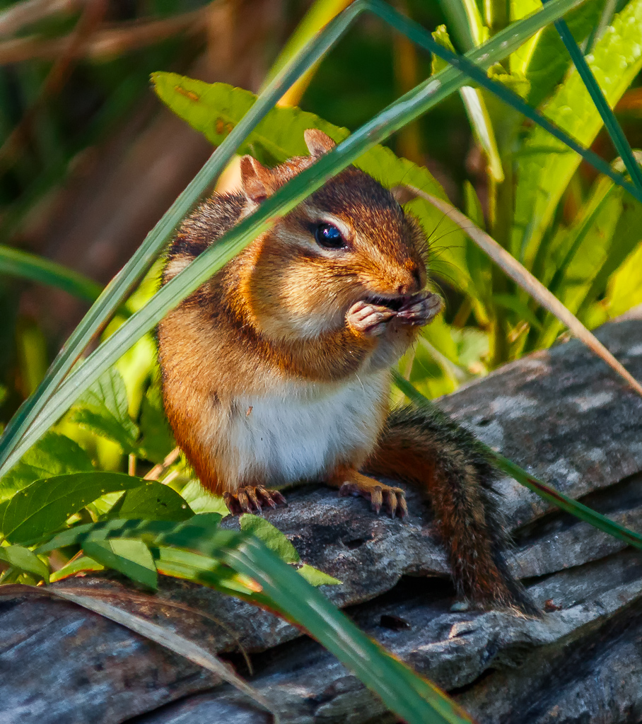
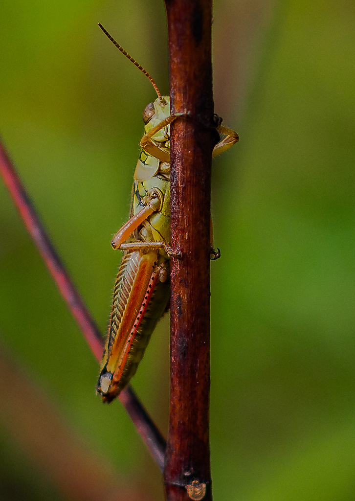
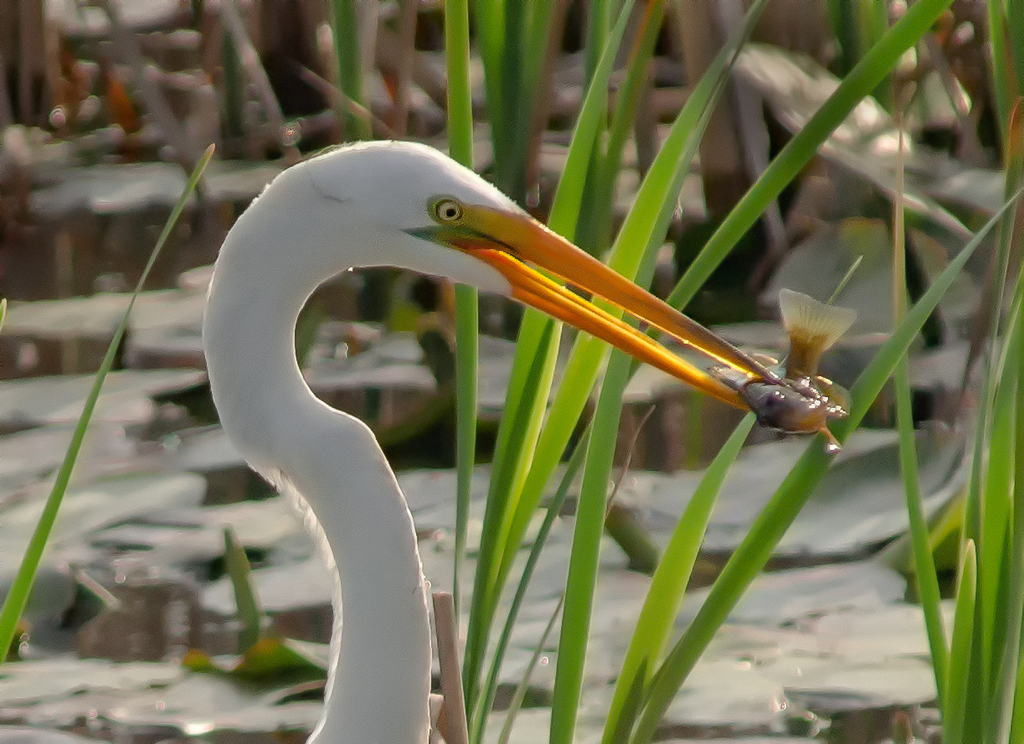
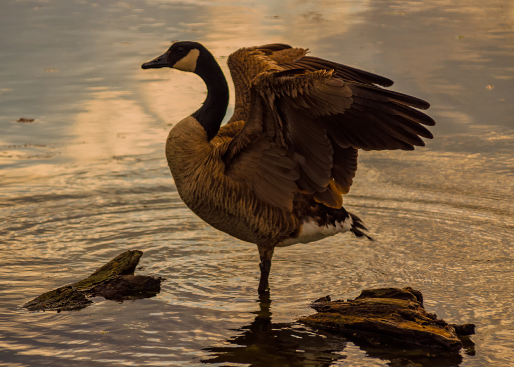
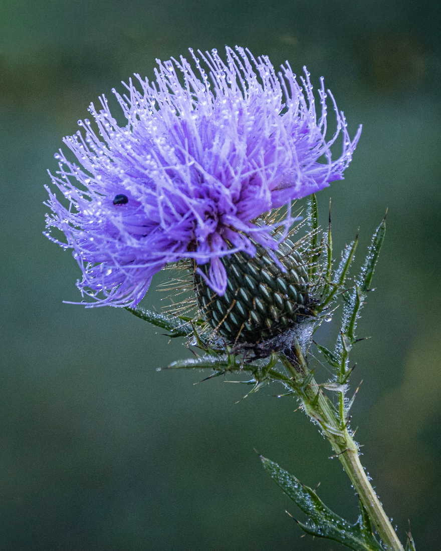
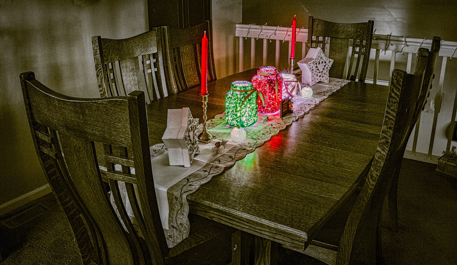
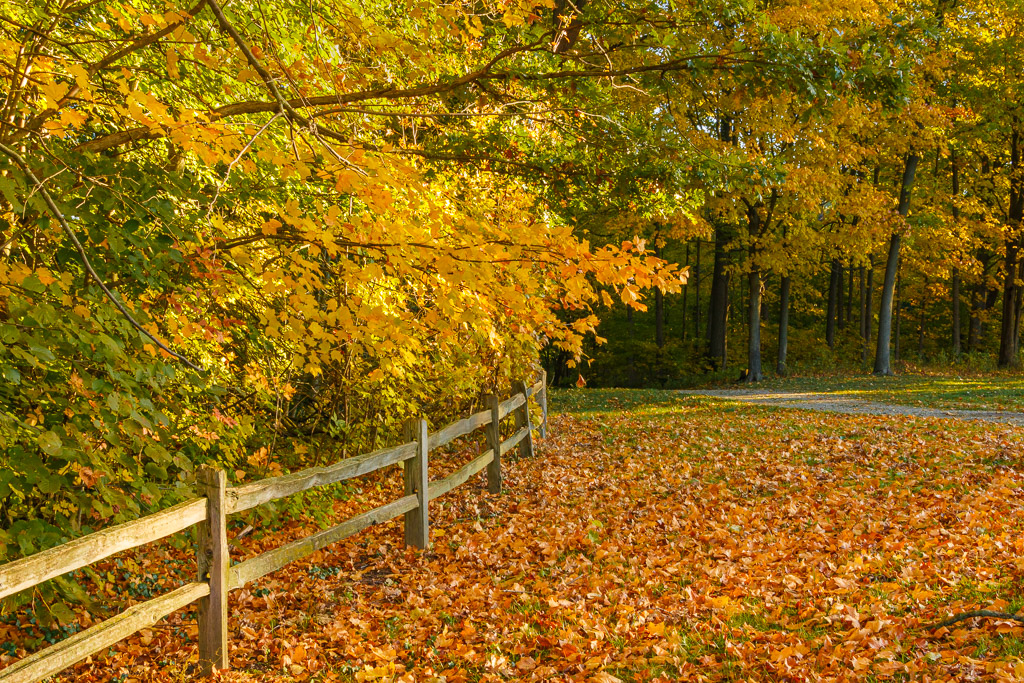
Lance - nice photo! I like the simplicity and the message this image generates. The DOF is excellent with very good bokeh. The perspective is spot on. There are other leaves in the image, however this one is the one in focus, which to me means that the others will soon follow. Thanks for a photo that causes me to think! |
Dec 21st |
4 comments - 0 replies for Group 87
|
| 96 |
Dec 20 |
Reply |
Hi Gerard - this is an older image in JPG format with post processing done at a time when I was still learning LR, PS, and Nik filters (thus a lot of experimentation). In general, I made basic edits in LR (contract, color, etc), then went to PS to perform more precise edits, especially to luminance and color saturation. I saved the photo back to LR. From here the data is limited. From memory I went to Nik Color Efex Pro and utilized the Color & Warmth and the Detail Extractor presets to get the final image. I have since found that utilizing the Nik presets mentioned, along with color contrast and saturation adjustments will provide similar results. I also believe PS has a filter for converting to a painted effect. Hope this helps! |
Dec 24th |
| 96 |
Dec 20 |
Comment |
Hi Gerard - Excellent photo! I like the depth and dimension created by the layers of ground detail and the clouds. The foreground elements also add to the depth. Nice use of leading lines in this composition. The only thing I see is possibly a slight over-saturation in the greens and blues. As far as impact vs. realism, in my opinion this is a very tough issue to navigate. I personally am a big fan of realism, however I have had many photos criticized for a lack of "pop", which at times causes me to overwork the photo in post processing. I believe that you've done a good job navigating this issue with this photo. Nice work! |
Dec 21st |
| 96 |
Dec 20 |
Comment |
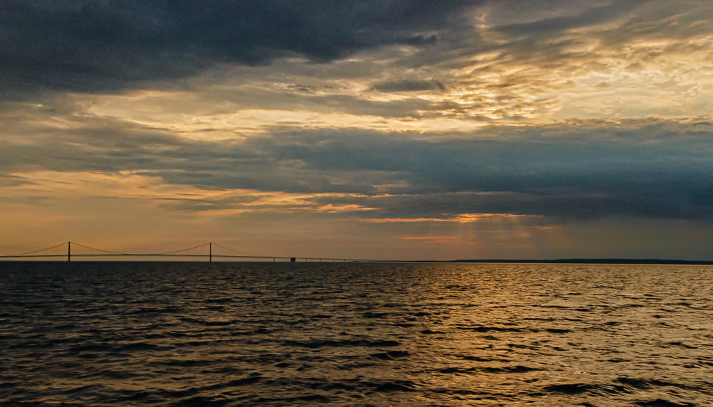
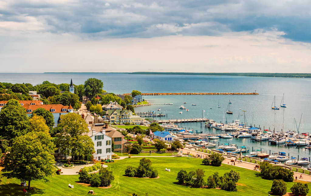
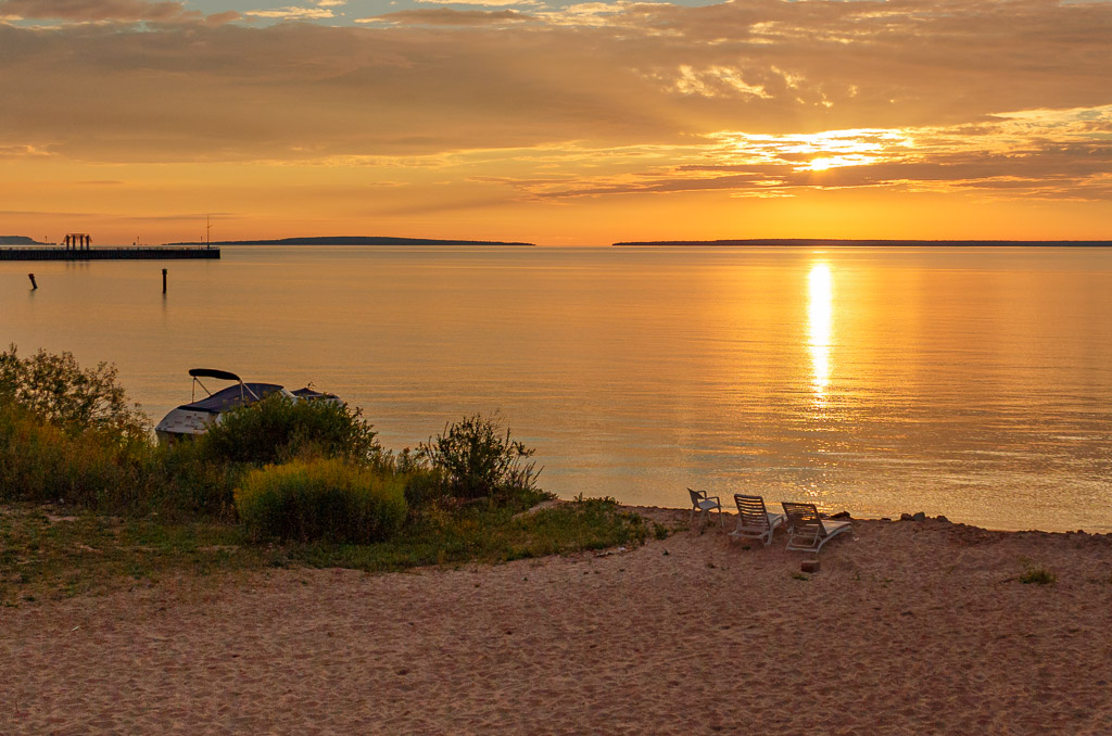
Excellent image Dan! I like the composition and the color harmony. The sun flare at f/22 is spot on and adds to the quality of the image. The only thing that I am undecided about (a very MINOR thing) is the white streak in the sand on the right of the image. On one hand I like it as there are other streaks in the image. On the other hand I wonder if it could be a little distracting. This is basically splitting hairs as this is an excellent image that would do very well in any composition. Excellent work! |
Dec 21st |
| 96 |
Dec 20 |
Comment |
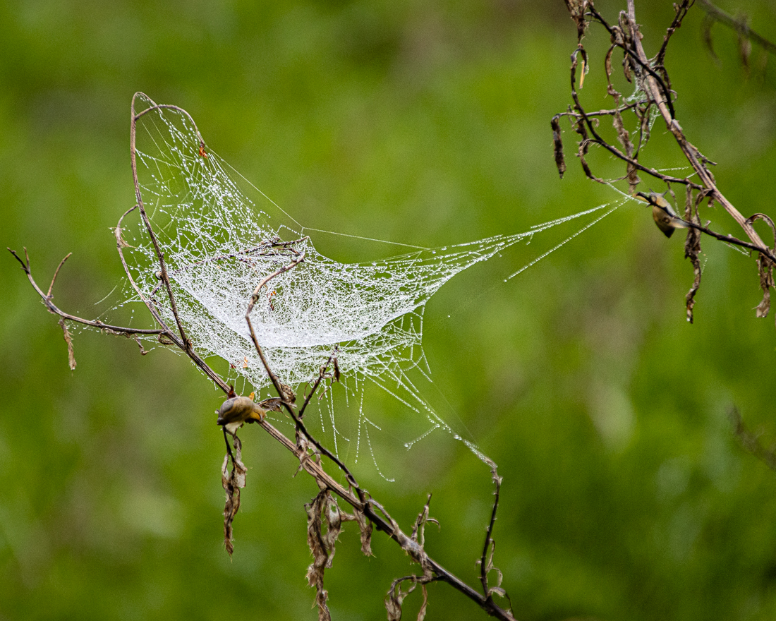
Hi Robert - excellent image! I like the creativity that you utilized with this image and, as Dan said, a different perspective. I like the light rays and believe they add to the creativity of the image. I also like the light/dark contrast on the tree and the background due to these rays. In my opinion, light rays are one of the most difficult things to edit in post processing. I usually use Lightroom and in particular the highlight, shadow, and white point sliders and experiment. I'll also use a little contrast and sharpness if needed for what I am looking for. Also, regarding iPhone photos, I will use them when I'm out without a camera. Some of the better editing tools for iPhone photos are Snapseed and PS Express. |
Dec 21st |
| 96 |
Dec 20 |
Comment |
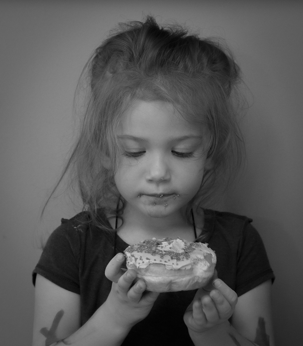
Hi Emily - nice image. Good sharpness and DOF throughout. I agree with both Robert and Dan on this...due to the limited color, converting to black and white is a good route to take. Even though I like Robert's sepia, I also agree to experiment with different tones. Personally, what I look for in whether to convert to black and white is limited colors in the original, tonal contrast that can be enhanced in black & white, and texture. Nice work! |
Dec 21st |
4 comments - 1 reply for Group 96
|
8 comments - 1 reply Total
|